Starpack Competition: Qatar World Cup Promotional Bottle
⚽️ "The World Cup 2022 has been and gone. Soft Drinks companies are always looking for novel and innovative ideas to promote their products and brands."
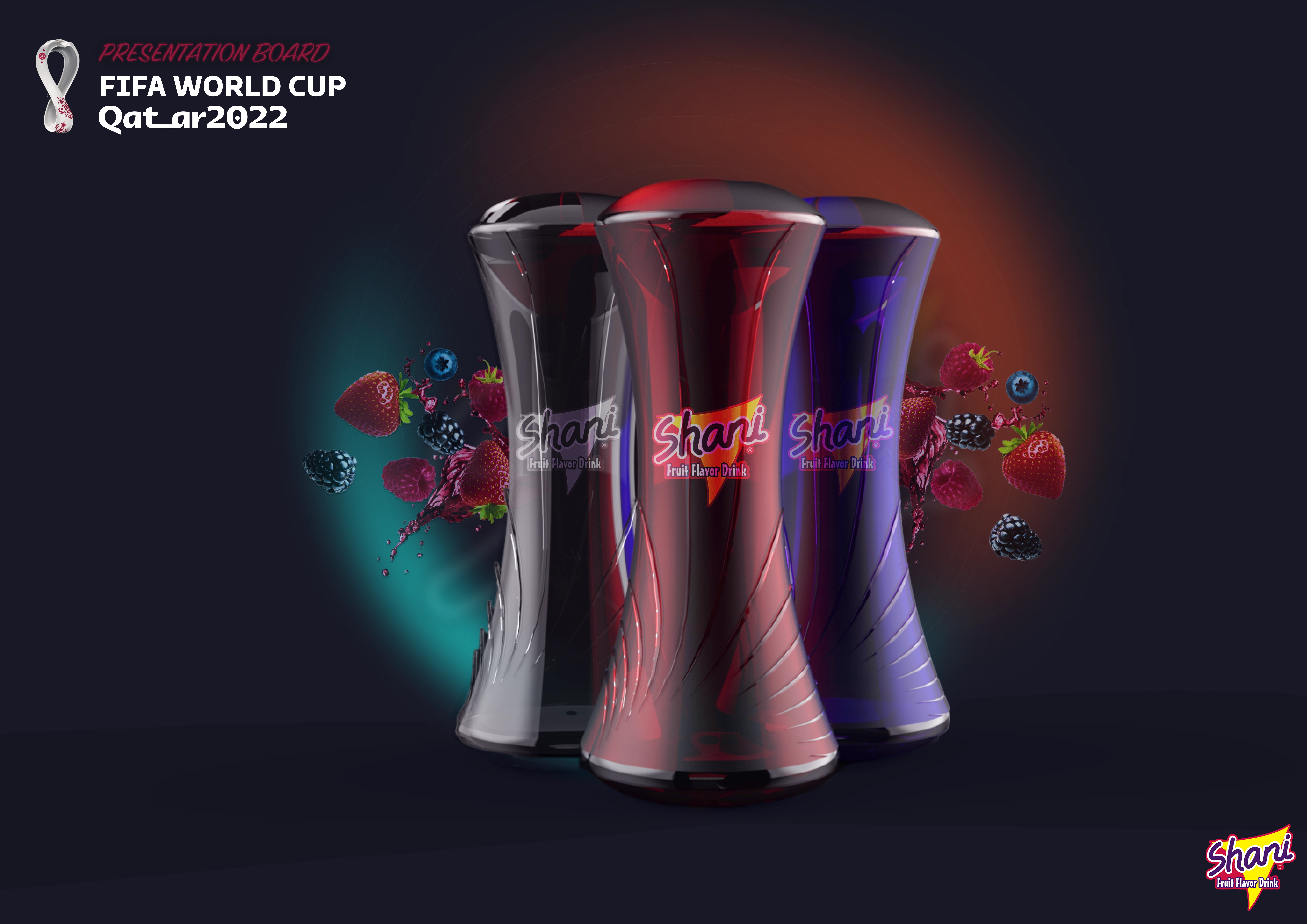
Overview 🔎
The brief was to design a promotional soft drinks bottle that will elevate your chosen brand, and allow consumers to identify with the World Cup euphoria. Size can be between 330ml and 750ml.
What can be done to drive shelf stand-out and pack recognition via an iconic design? How could superior functionality be incorporated?
Points to consider
What can be done to drive shelf stand-out and pack recognition via an iconic design How could superior functionality be incorporated
Innovative
Evidence of research into selected brand, and why you have chosen it
Consumer Convenience - Functionality – opening, closing, handling, disposability and suitability of the product.
Environment -recycle and reduce. Show consideration to environmental issues.
Relevance to target marketing group
Creative use of structure and form
Maximum shelf impact & material selection
Ease of use or other improved functionality
Without compromising creativity, transportation should be considered
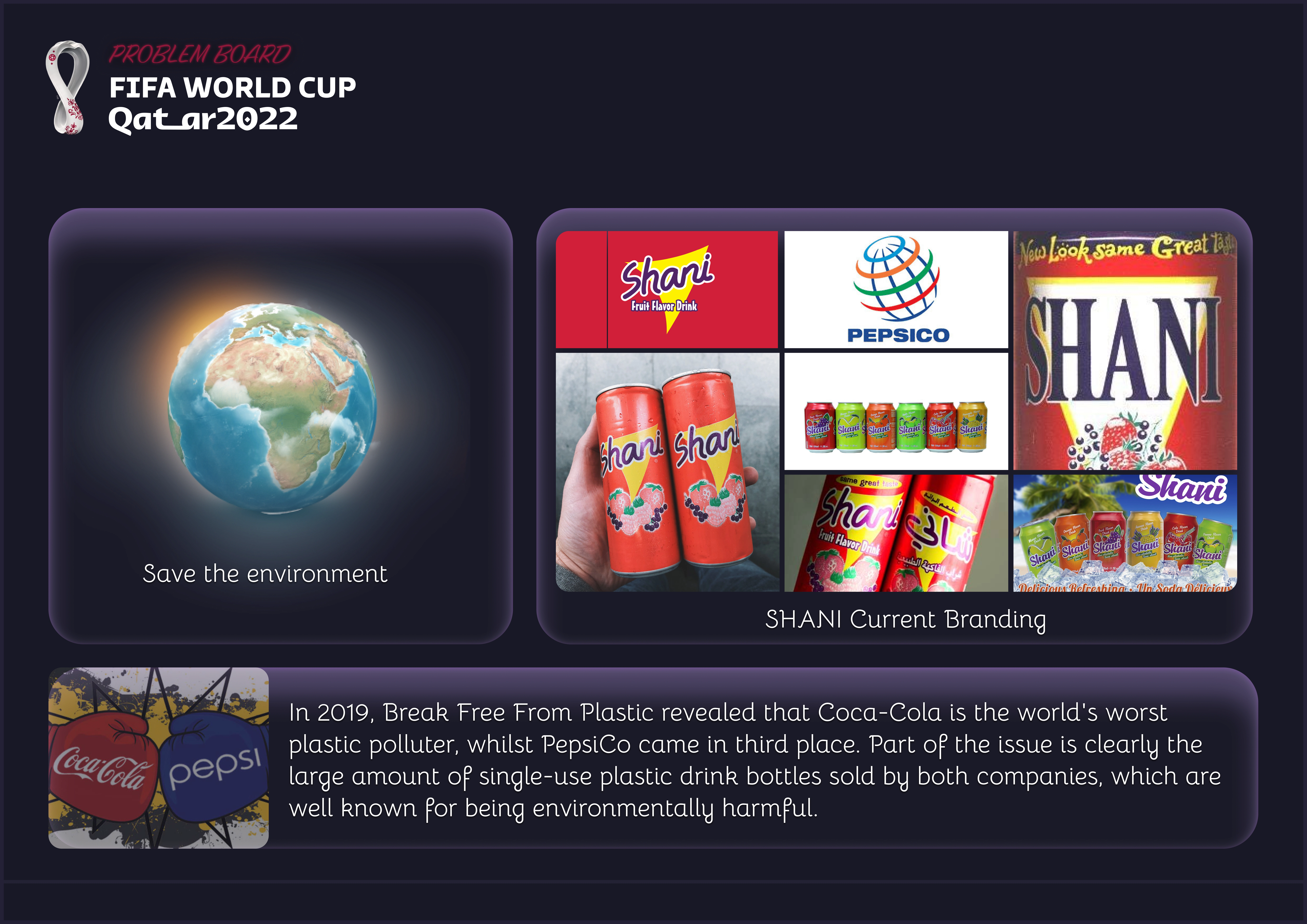
Process 👣
Qatar Inspiration
Gathering insights into Qatar's rich history and culture served as my starting point, aligning with the upcoming World Cup. Drawing inspiration from Qatar's architectural diversity, cultural festivals, traditional attire and the innovative stadium designs, I aimed to infuse these elements into my sketches. My goal is to celebrate Qatar's heritage while contributing to the design of the selected brands bottle design.
Sketches
After researching and gaining inspiration from Qatar's culture and history, I began sketching bottle designs. These designs aimed to incorporate Qatar's cultural elements while also elevating and refining the Shani's bottle aesthetics, creating a harmonious fusion of culture and design.
Photoshop Renders
The next step in my creative process involved generating Photoshop renders to explore potential colour schemes for the bottle designs. These digital renders allowed me to experiment with various colour palettes, enabling me to visualise how different combinations would complement the overall design and evoke the desired cultural and aesthetic elements.
3D Modelling (CAD)
The final step in my creative process was to take me sketches and turn them into 3D models. To achieve this, I used a CAD software to craft detailed 3D models of the bottle designs. This stage was essential for visualising the form, shape, and proportions, bringing the designs as close to the final product as possible. By using CAD software, I could ensure that the bottles not only looked realistic but also considered the practical aspects of manufacturing and functionality, ultimately refining and perfecting the designs for the brand's future production.
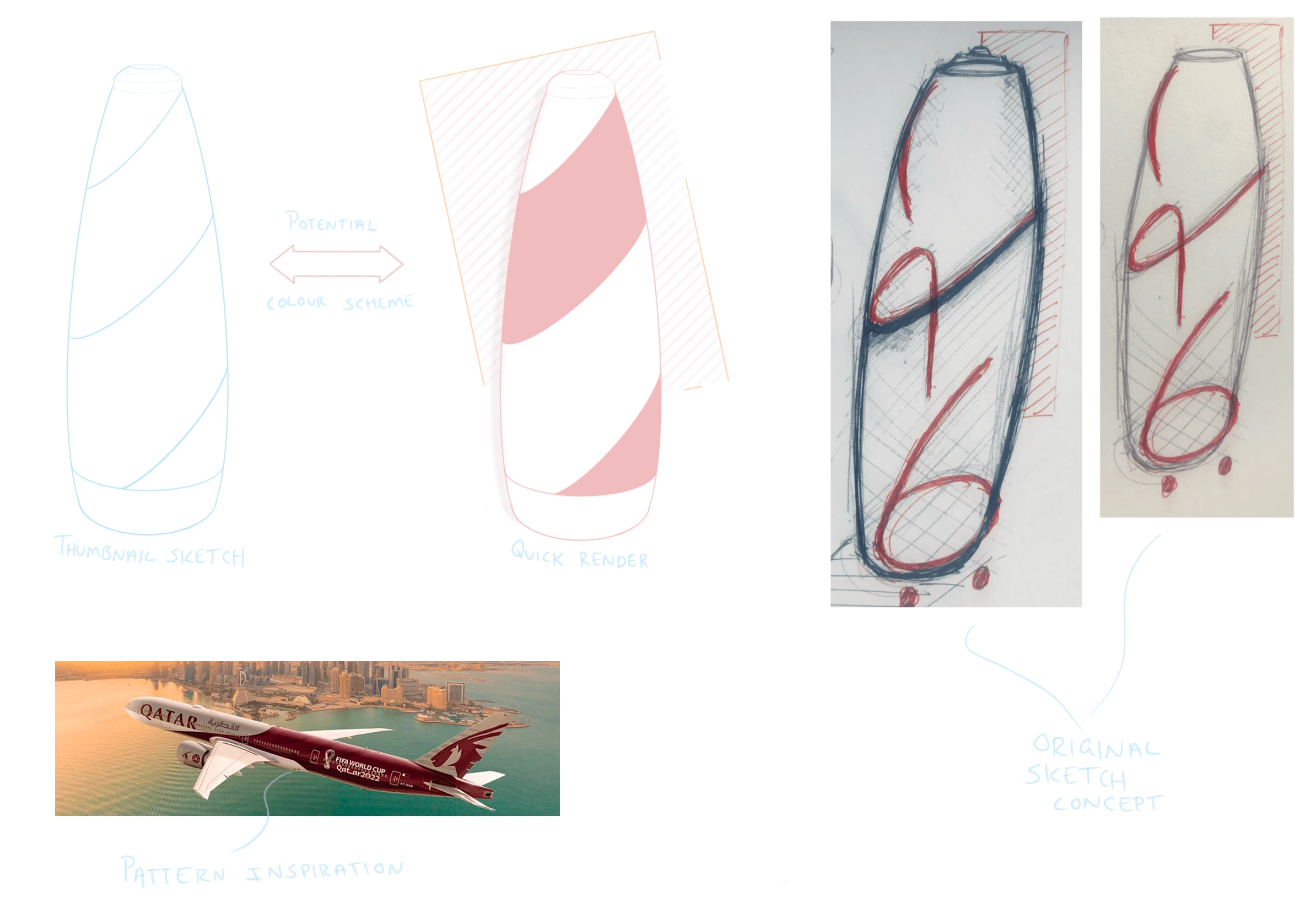
For this sketch page I used the Qatar Airways as a source of inspiration for both form and pattern design.
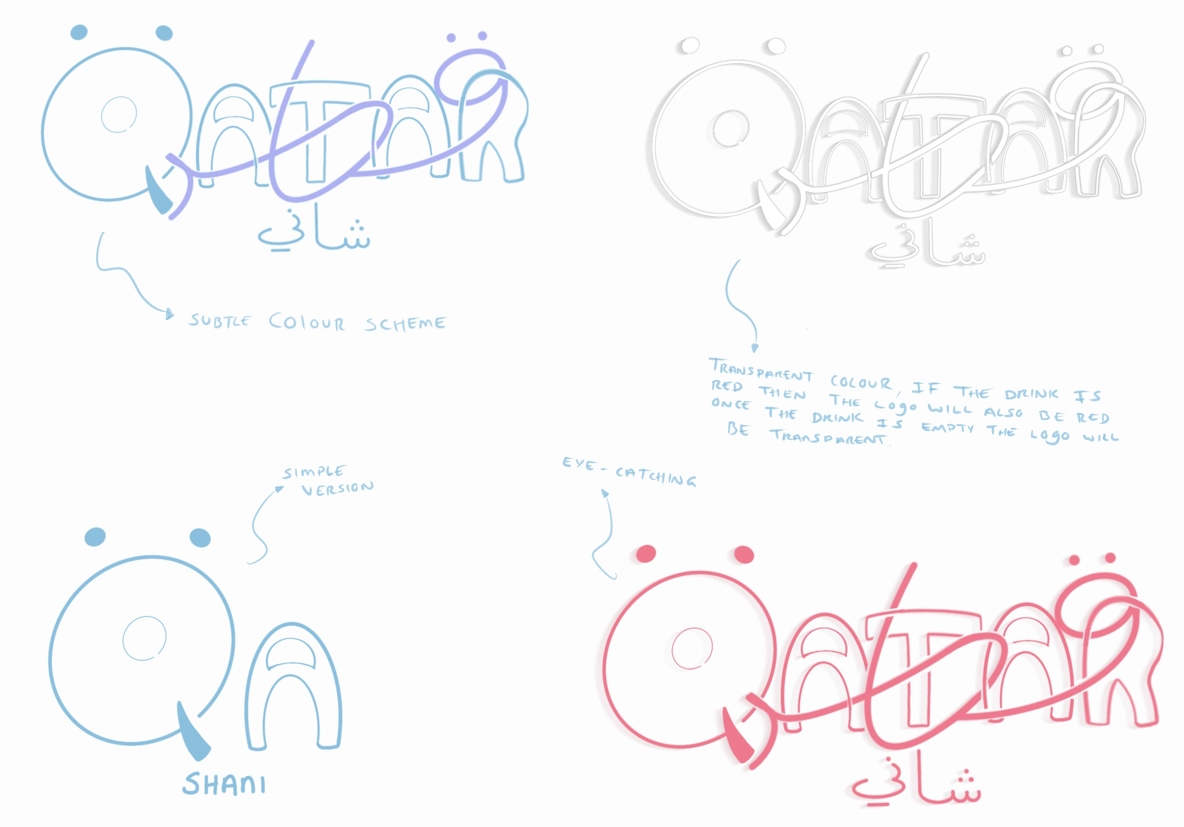
This is one of my favourite sketches I created for this project because I had the opportunity to slightly rebrand and modify Shani's logo, making it more relatable to the Qatar World Cup.
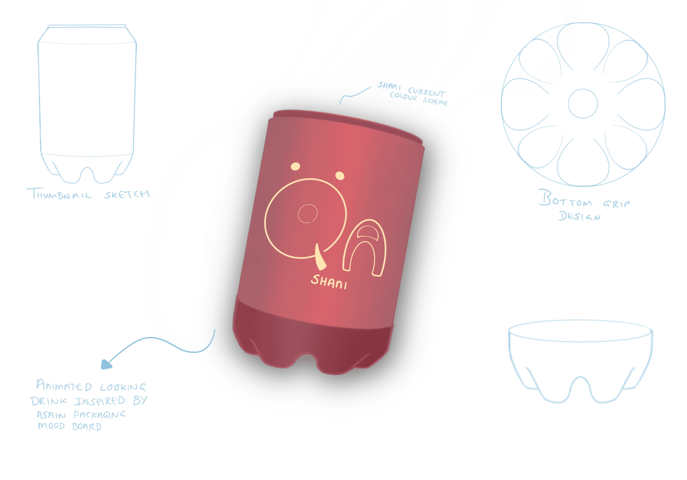
This is a basic design but mostly focusing on the shape and form of the can.
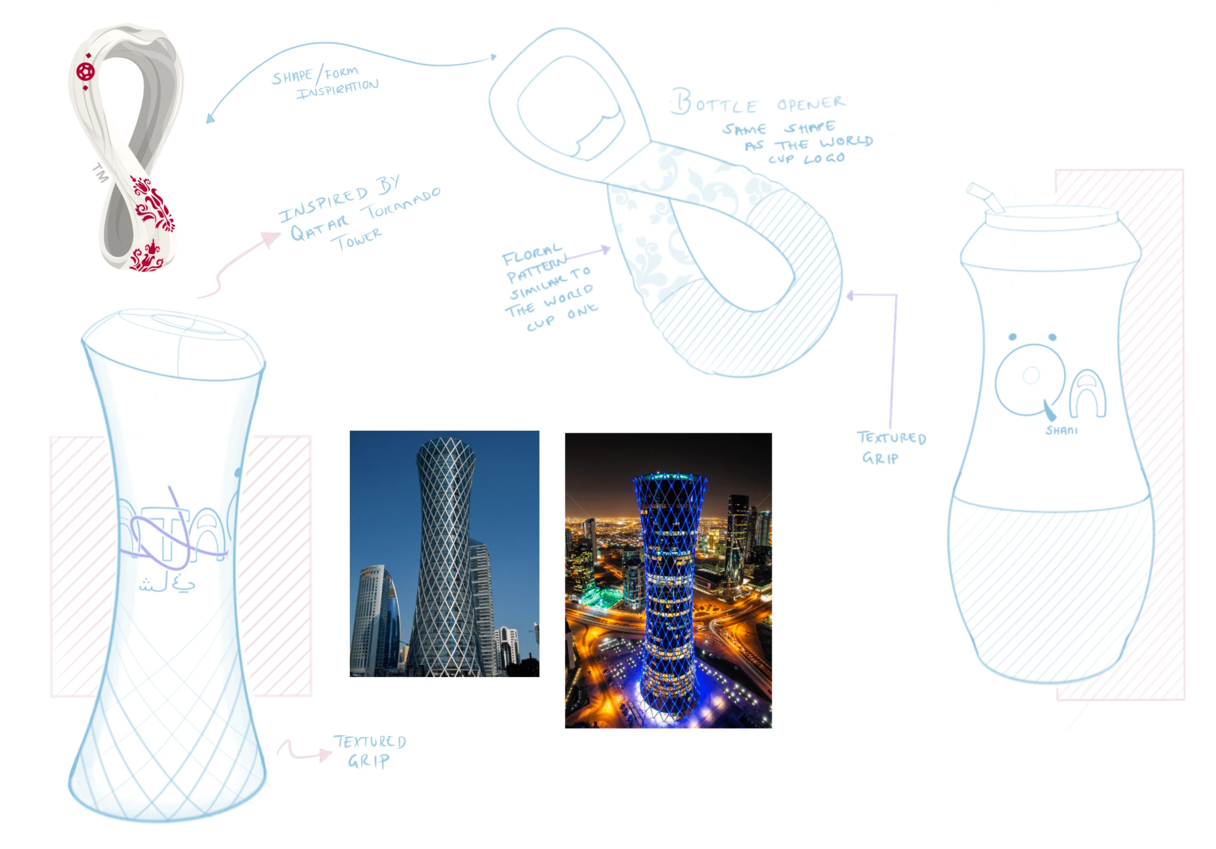
I used the Tornado Tower as a source of inspiration. I really liked the lines surrounding the building, so I decided to incorporate them into the design. Additionally, I sketched a bottle opener design using the Qatar World Cup logo as another source of inspiration.
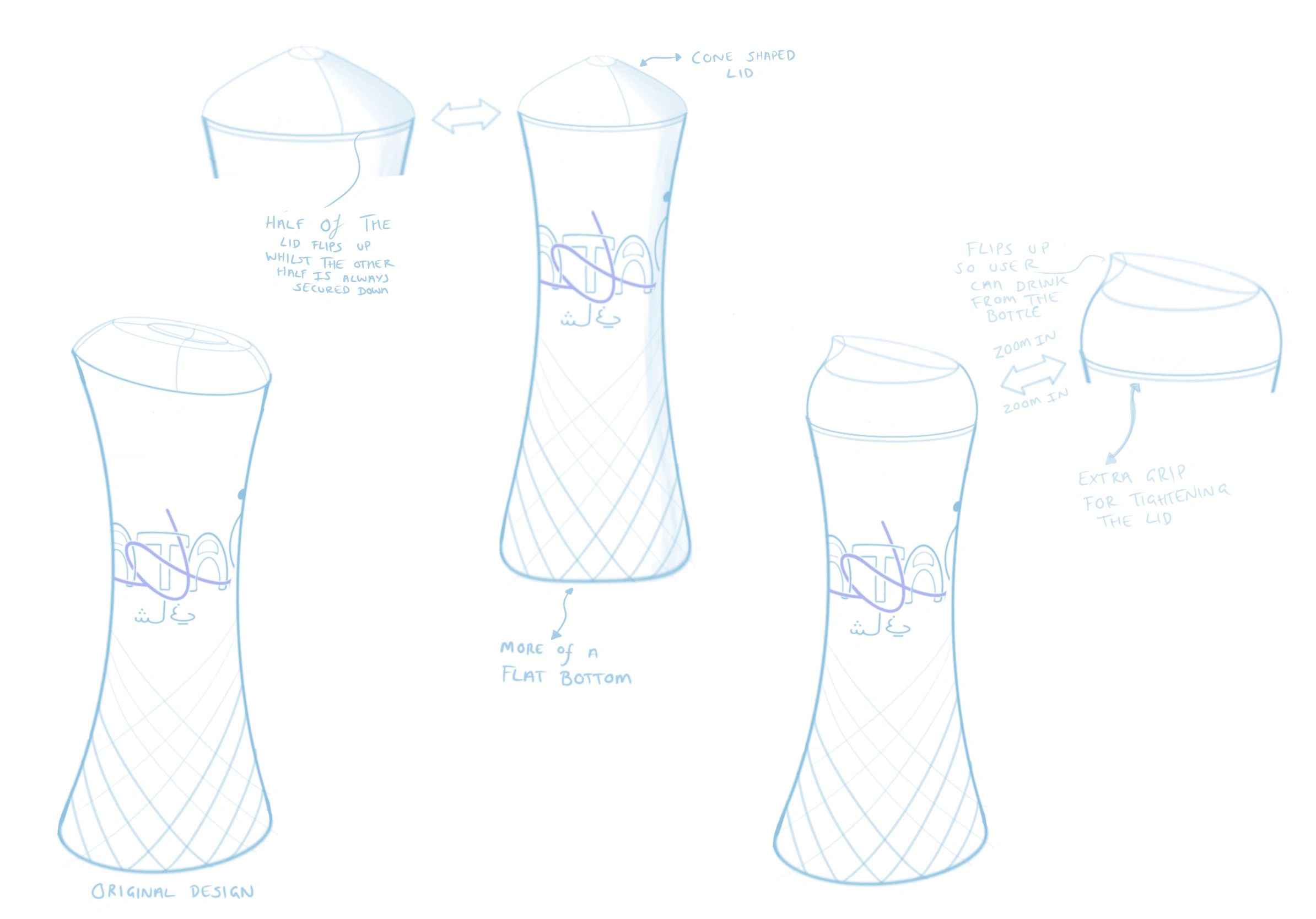
Here, I experimented and developed the bottle's lid, with a strong focus on the user experience and how they would open the bottle.
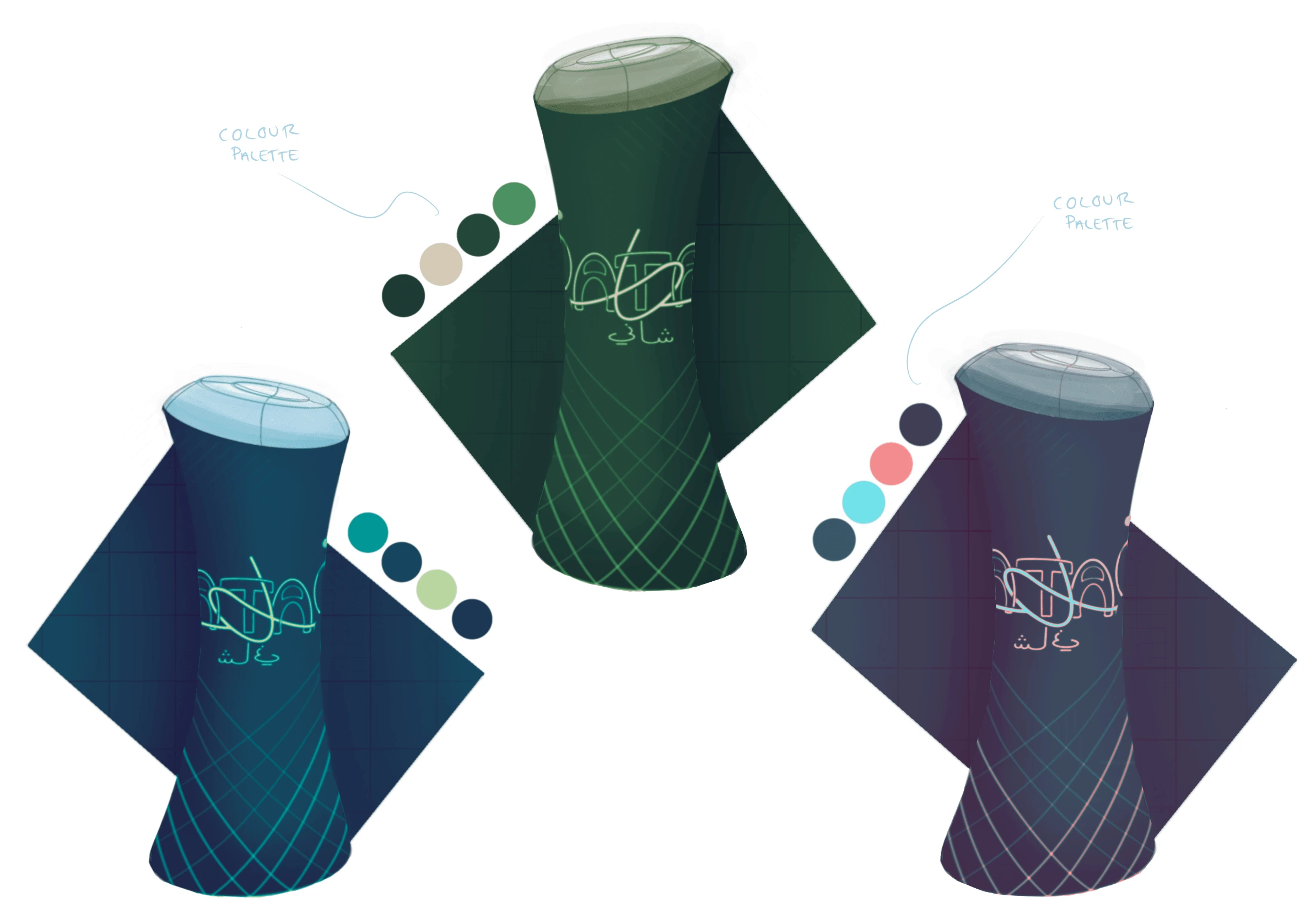
Experimenting with different colours.
Experimentation 🔬
In preparation for the 3D model, I began by experimenting with the bottle's form, crafting a sketch model to gain hands-on insight into its shape and structure. This method helped by, allowing me to create a 3D model that closely resembled the final product. As part of the creative process, I also experimented with the background colours for the presentation image, exploring various hues and tones to find the perfect visual backdrop that would both accentuate the bottle's design and create a captivating and harmonious overall visual presentation.
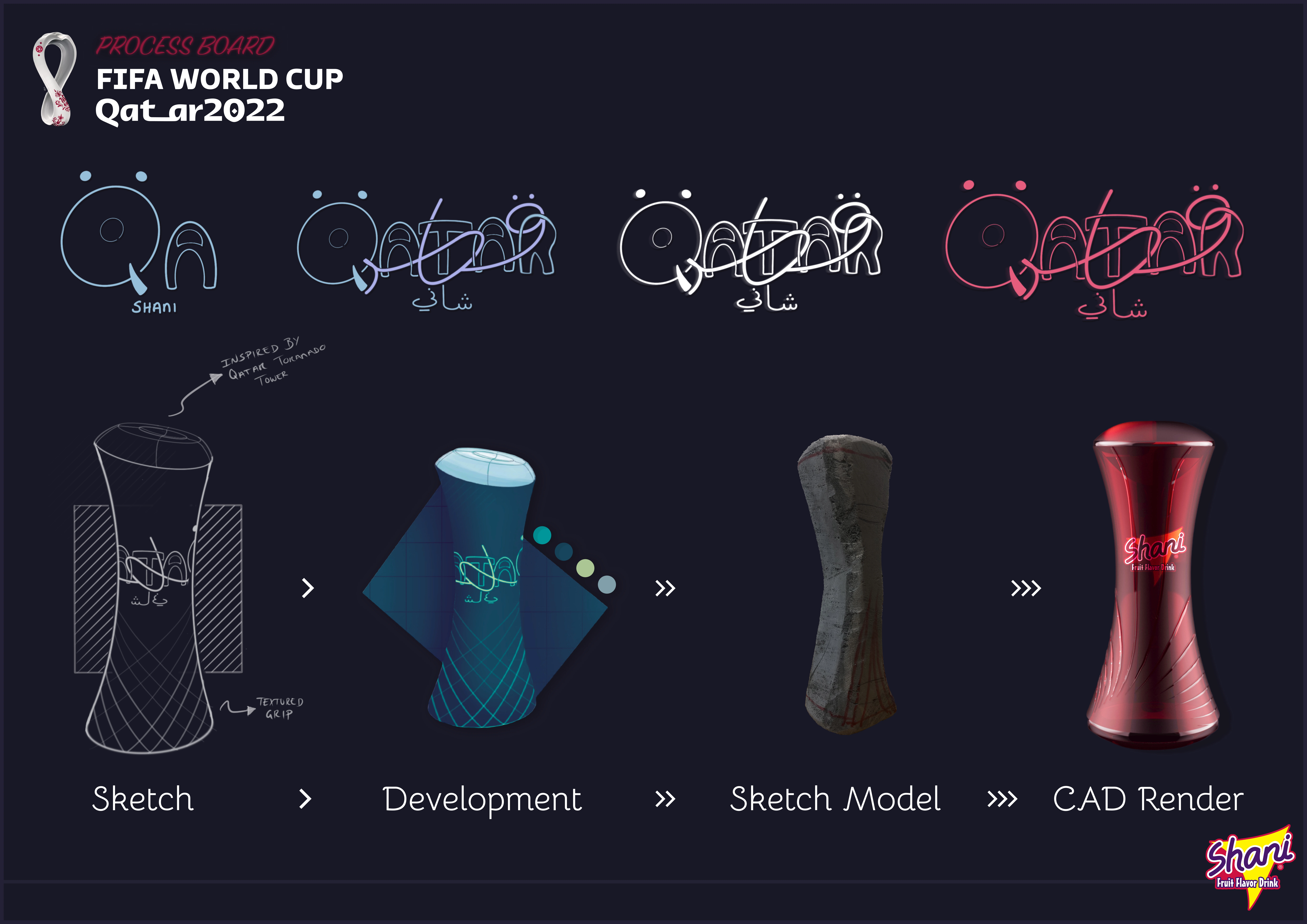
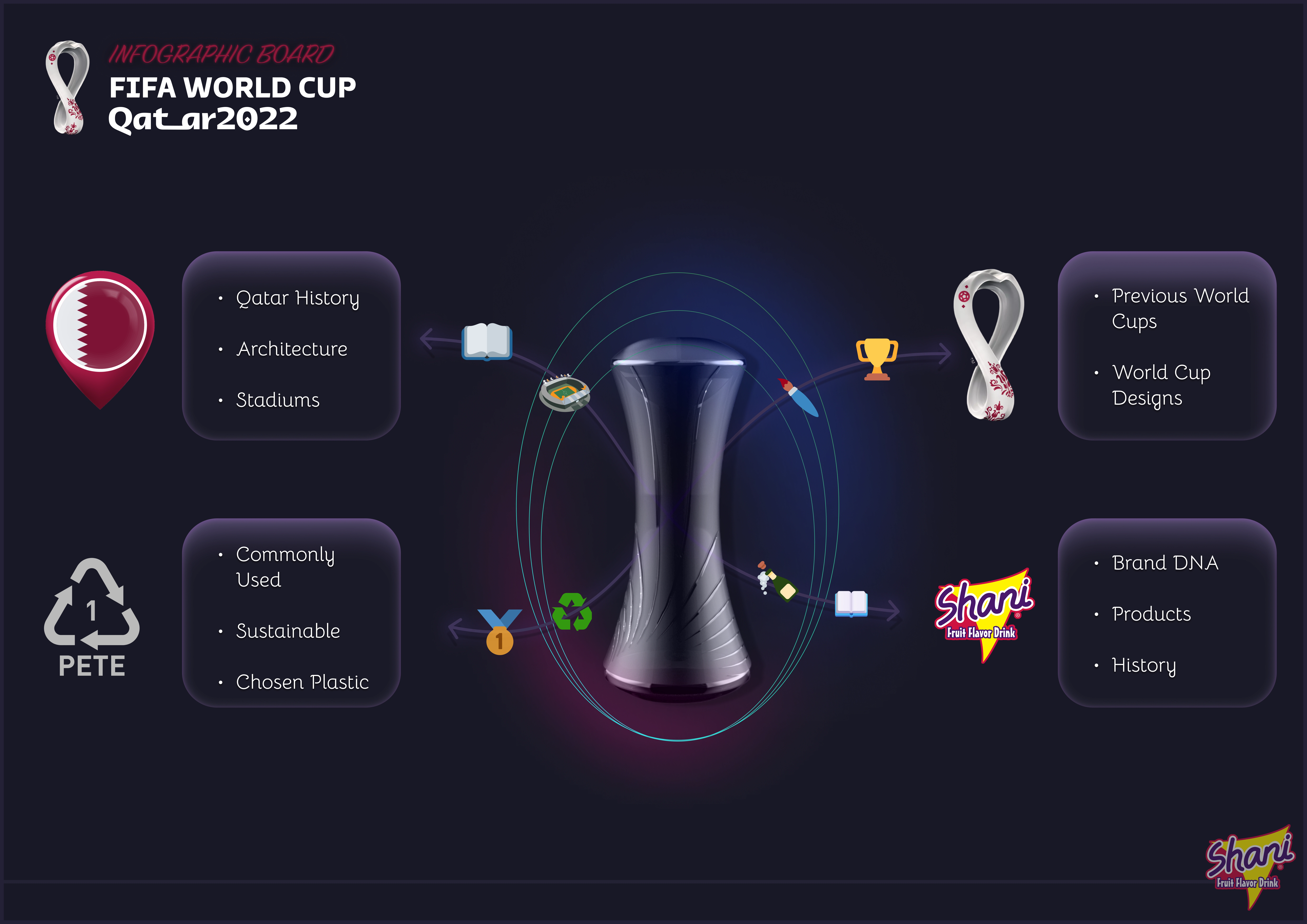
This infographic showcases all the elements I considered when approaching the final design of the bottle.
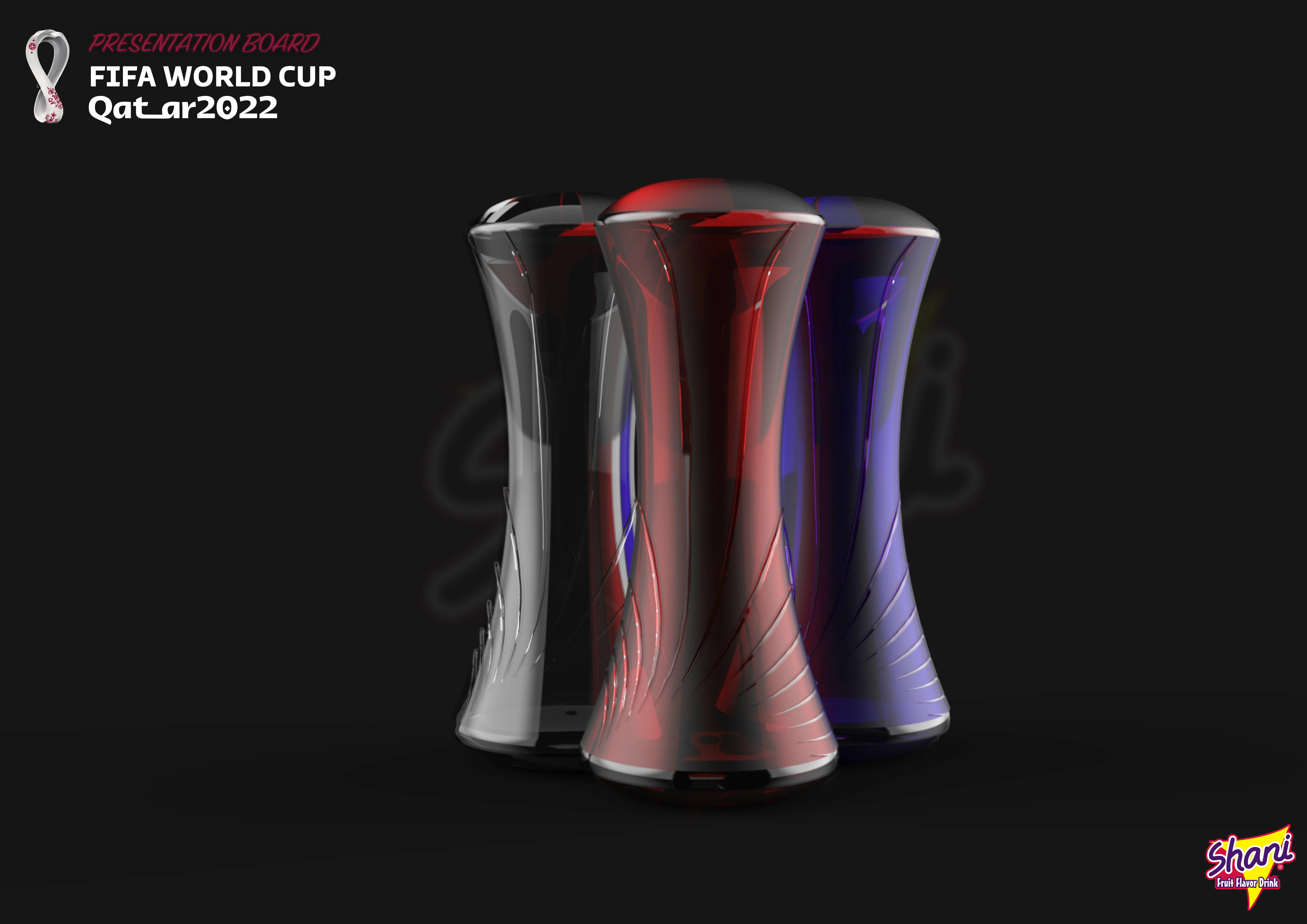
I wanted to incorporate the Shani brand logo into the design, so I decided to include it as a subtle backdrop.
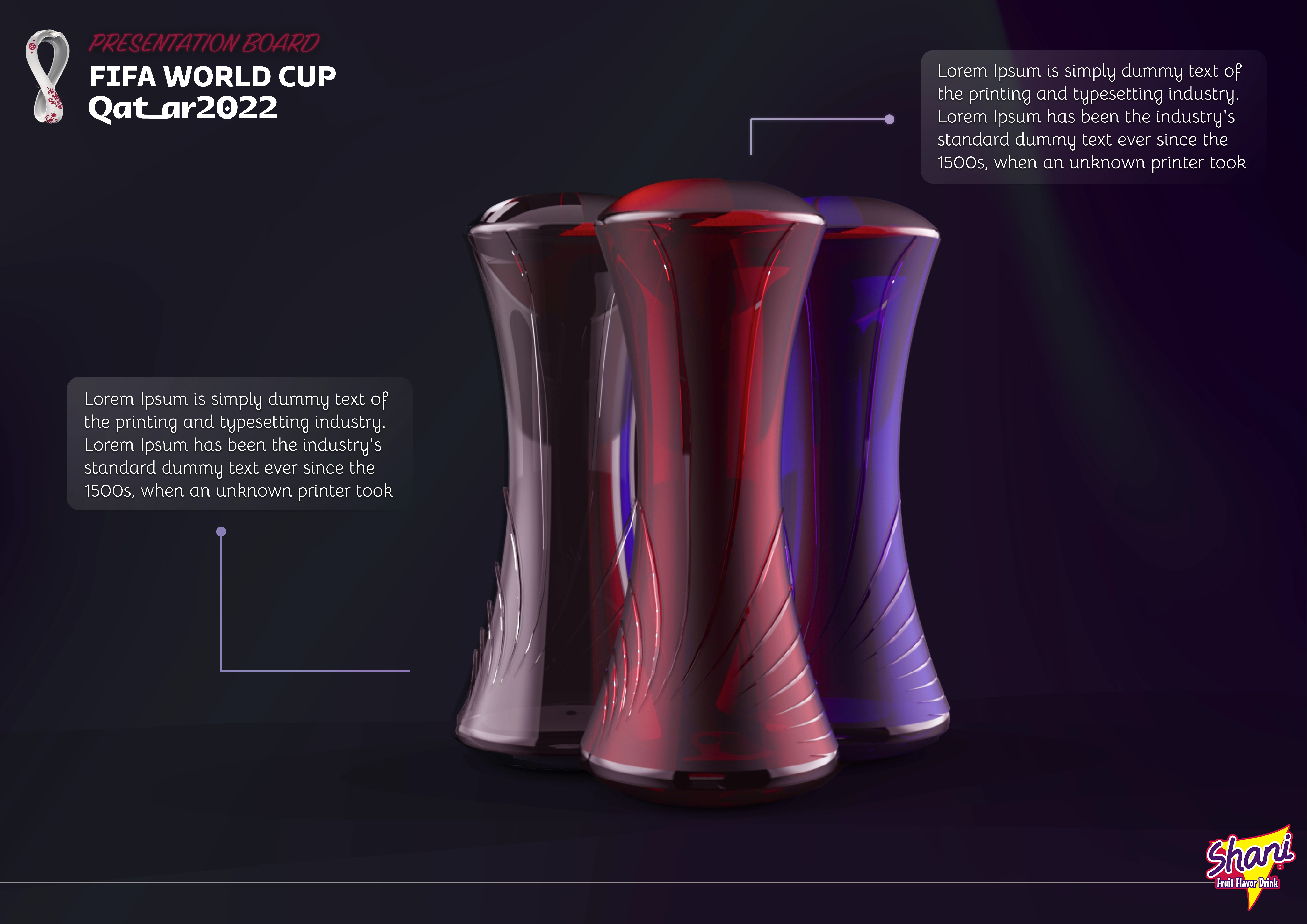
Here, I was exploring potential background colour options and determining suitable placements for the text boxes.
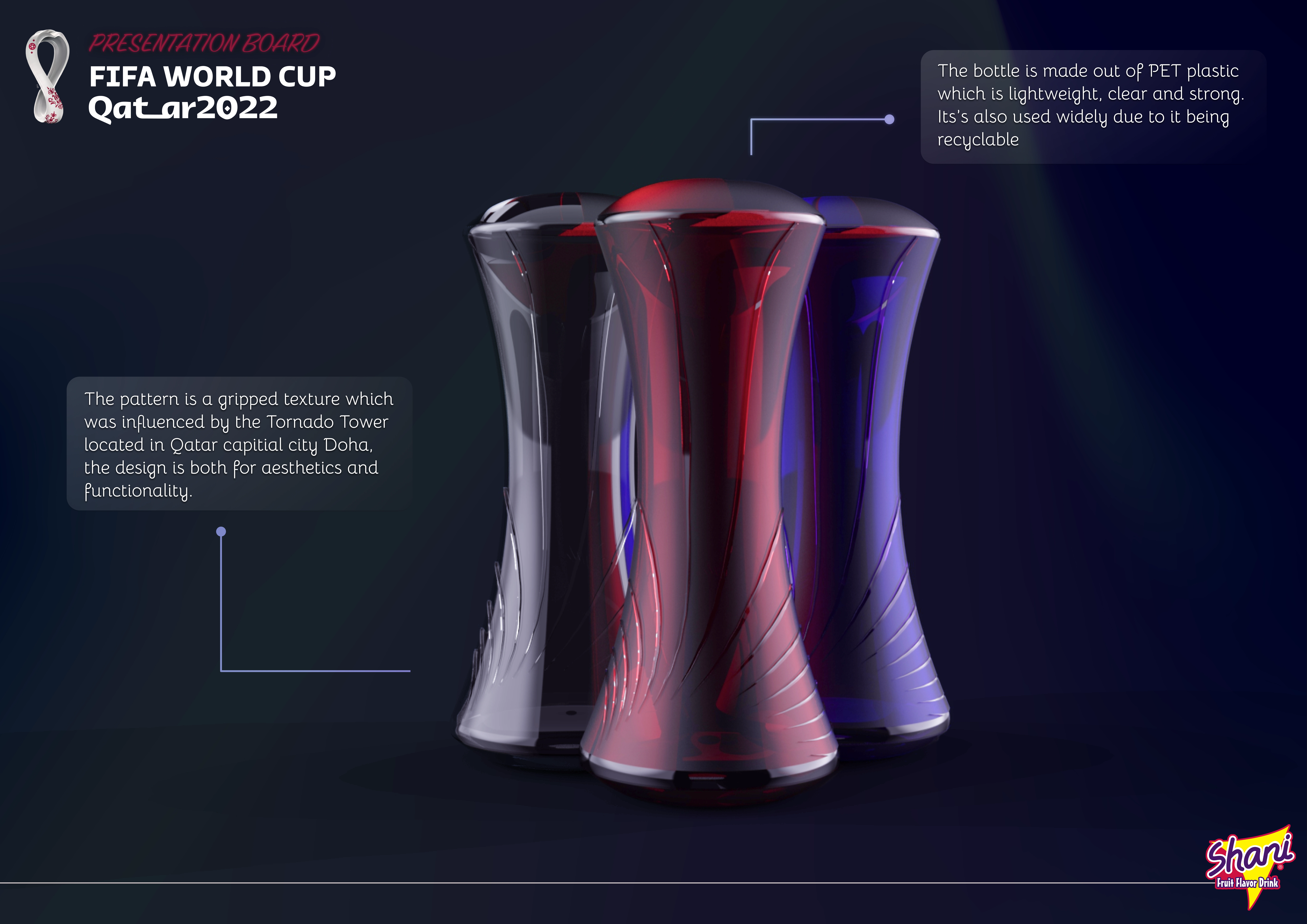
More background experimentation.
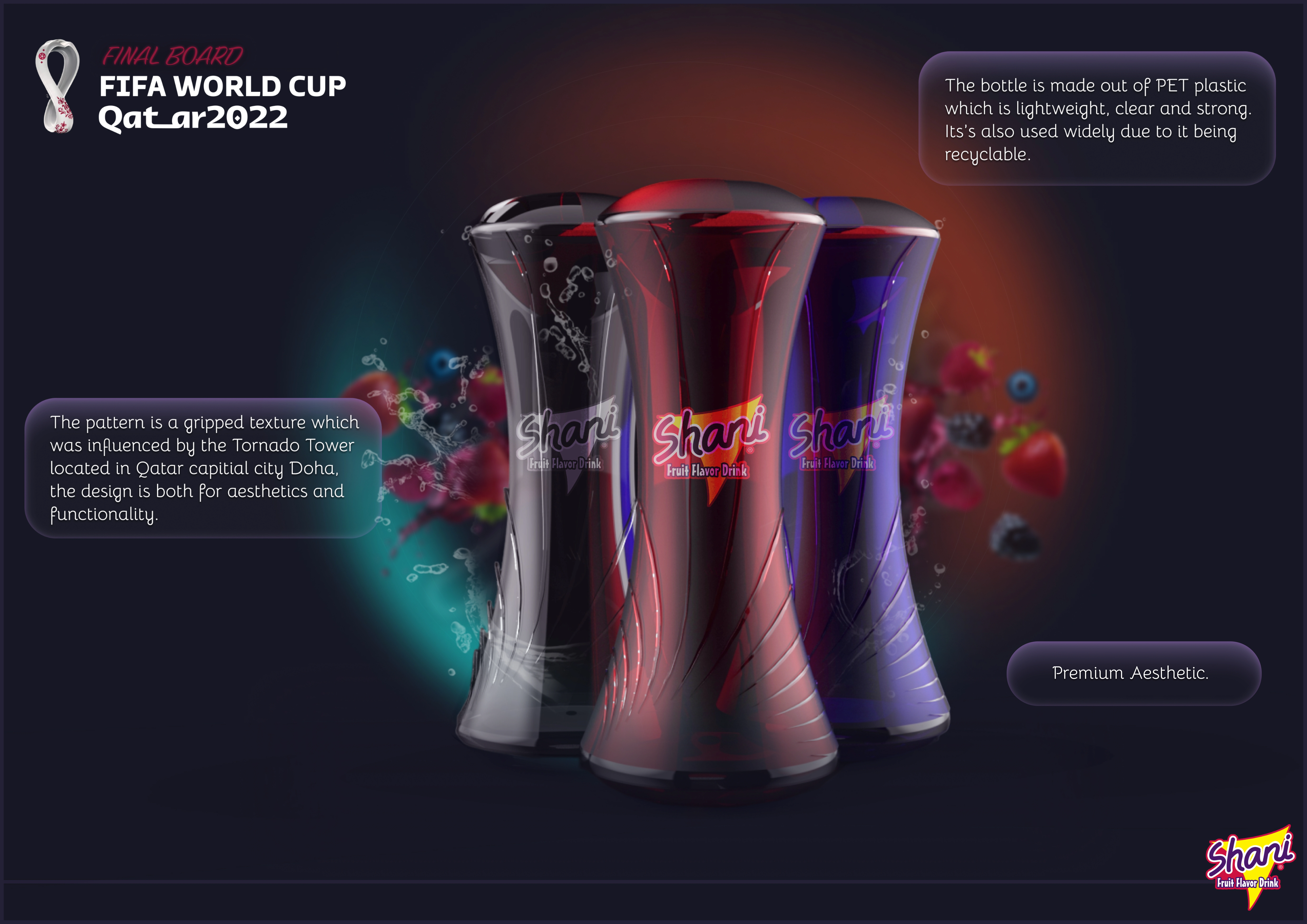
Here is the ultimate design where I replaced the text boxes with a bubble-inspired aesthetic to harmonize with the bottle's theme. Additionally, I introduced a subtle water splash effect around the bottle, and the brand logo was incorporated onto the bottle itself, I replaced the Shani logo as a subtle background drop with fruit bursting out from the sides.
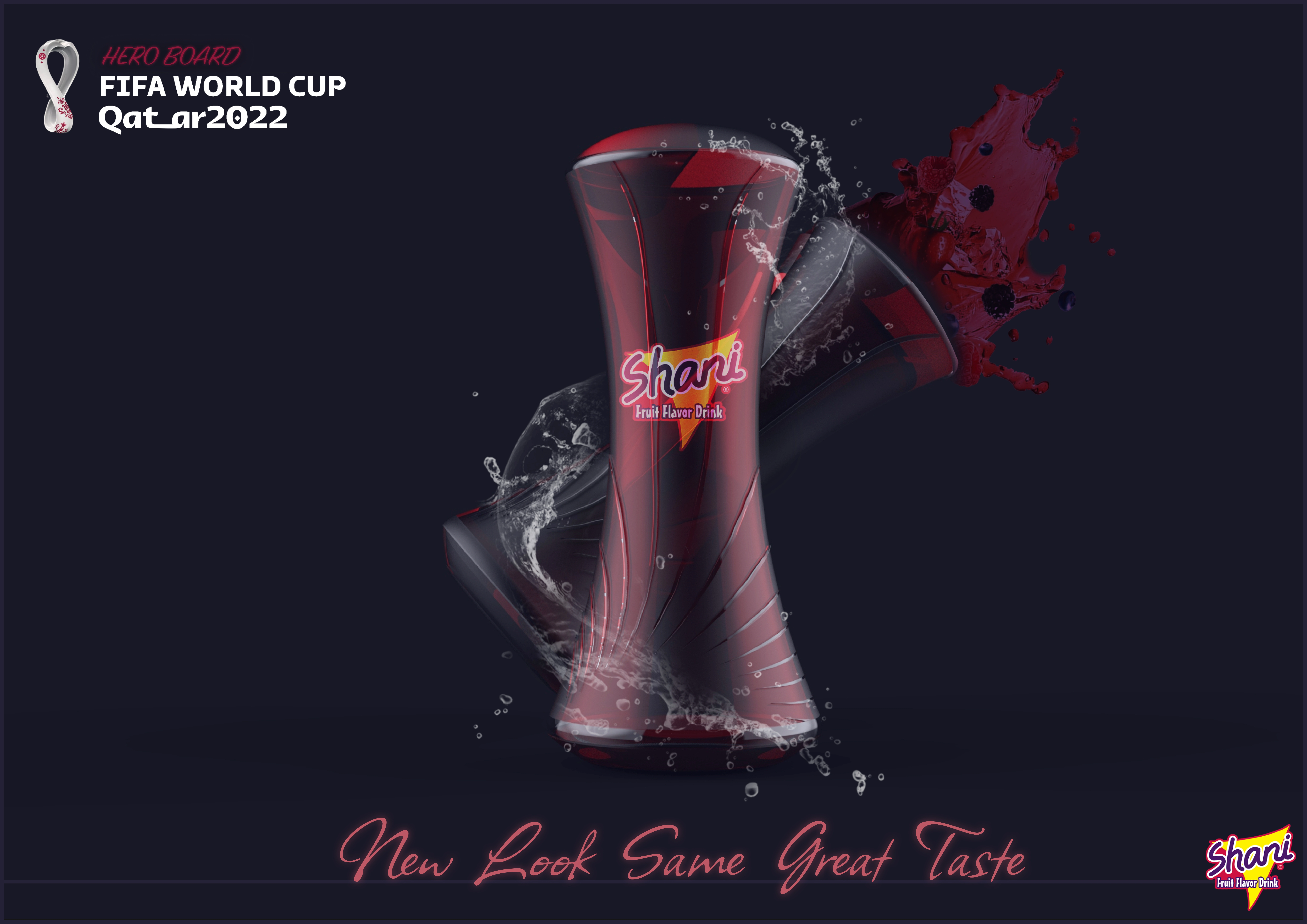
This is another final concept design, intended for use as an advertisement or promotional banner.
Like this project
Posted Aug 27, 2023
Crafted a standout Shani promo bottle design for the Starpack 2022 competition, blending culture, sports, and innovation.
