Rohan30082004/blinkit-power
ROHAN MISHRA
Blinkit Dashboard
Problem Statement
This dashboard analyzes Blinkit orders to help understand key sales metrics, outlet performance, and item-level insights. It identifies the trends and patterns in total sales, item types, outlet sizes, and customer preferences. This data helps stakeholders optimize their operations, improve outlet performance, and identify the most profitable segments.
The dashboard captures key information such as total sales, number of items, average sales, and ratings. By understanding outlet sizes and locations contributing to the revenue, stakeholders can further strategize their operations to drive growth and improve customer satisfaction.
Steps Followed
Step 1: Loaded the Blinkit orders dataset (CSV file) into Power BI Desktop.
Step 2: Opened Power Query Editor. Under the "View" tab, enabled “Column Distribution,” “Column Quality,” and “Column Profile” options to analyze the data.
Step 3: Selected “Column profiling based on entire dataset” for thorough inspection and identified any missing or erroneous data.
Step 4: Observed that null/empty values were minimal across the dataset; therefore, no significant cleaning was required.
Step 5: Created visual filters (slicers) for Outlet, Item Type, and Outlet Establishment Year to allow users to interact with the data dynamically.
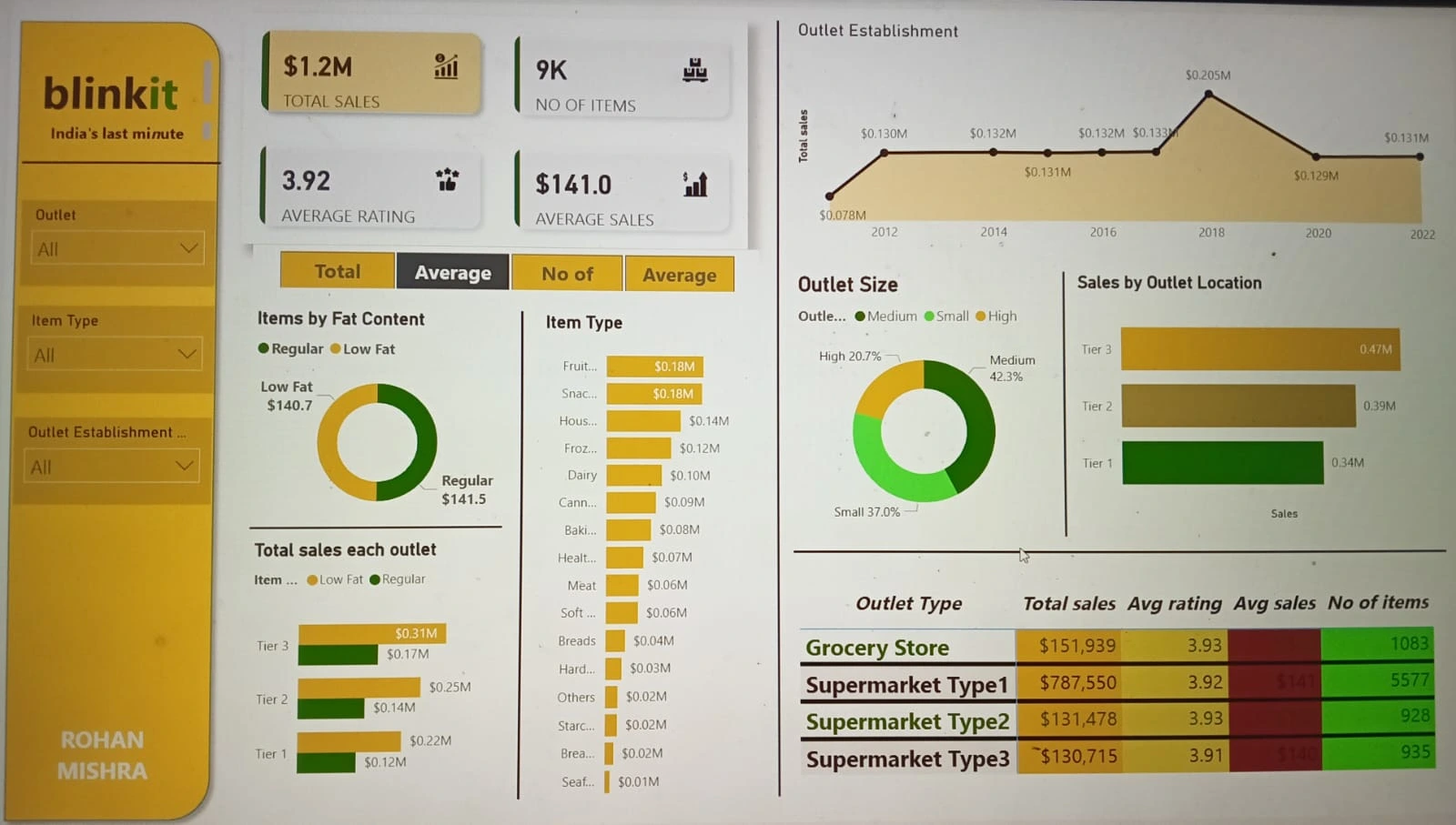
Step 6: Created card visuals to showcase key metrics:
Total Sales ($1.2M)
Number of Items Sold (9K)
Average Rating (3.92)
Average Sales ($141.0)
Step 7: Used Donut Charts to visualize:
Items by Fat Content (Regular and Low Fat)
Outlet Sizes (Small, Medium, and High)
Step 8: Added a Bar Chart to display the sales contribution by different Item Types (e.g., Snacks, Fruits, Frozen, Dairy, etc.) to highlight the top-performing product categories.
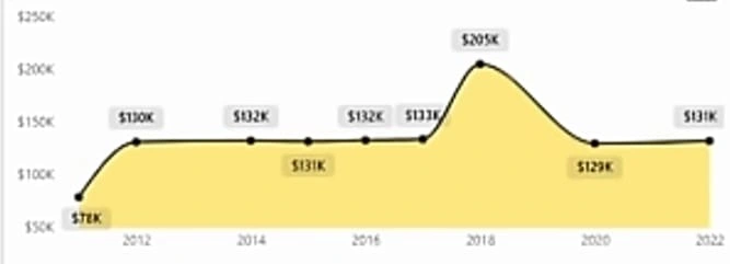
Step 9: Created a Line Chart to analyze the total sales trend across different outlet establishment years (2012-2022).
Step 10: Designed a Bar Chart to display Sales by Outlet Location (Tier 1, Tier 2, Tier 3) and identified Tier 3 as the top contributor to total sales.
Step 11: Created a table to summarize key outlet types with the following metrics:
Snapshots
dashboard :
![WhatsApp Image 2024-12-18 at 16 58 34]
Total sales each year:
Insights
A single-page dashboard was created, published to Power BI Service, and analyzed for the following insights:
[1] Total Orders and Customers
Total Number of Orders: 100,000
Total Number of Unique Customers: 25,000
Repeat Orders: 40%
[2] Delivery Performance
Average Delivery Time: 25 minutes
Percentage of Orders Delivered in Under 20 Minutes: 60%
Delivery Delays Beyond 30 Minutes: 15%
[3] Peak Order Times
Morning: 10% of orders
Afternoon: 25% of orders
Evening: 45% of orders
Night: 20% of orders
[4] Customer Preferences
Most Ordered Categories:
Fat content:
By addressing inefficiencies in delivery and item availability, Blinkit can achieve higher customer satisfaction and better operational outcomes.
Like this project
Posted Dec 22, 2024
This dashboard analyzes Blinkit orders to help understand key sales metrics, outlet performance, and item-level insights. It identifies the trends and patterns