MuslimQuest - A digital experience for the modern muslim
Jorge Gutiérrez Marco
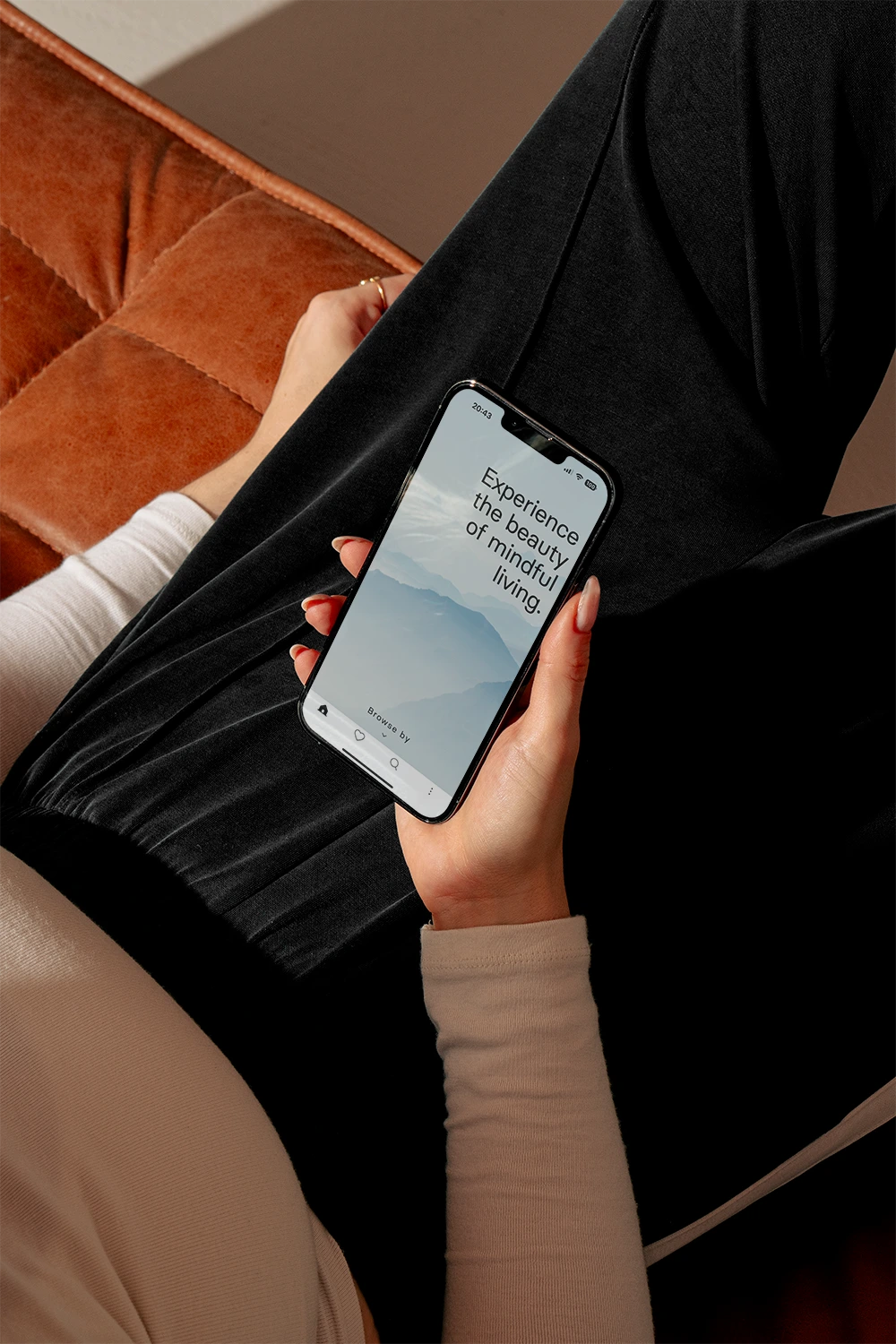
A quick overview of the main screen and login
A digital experience for the Modern Muslim
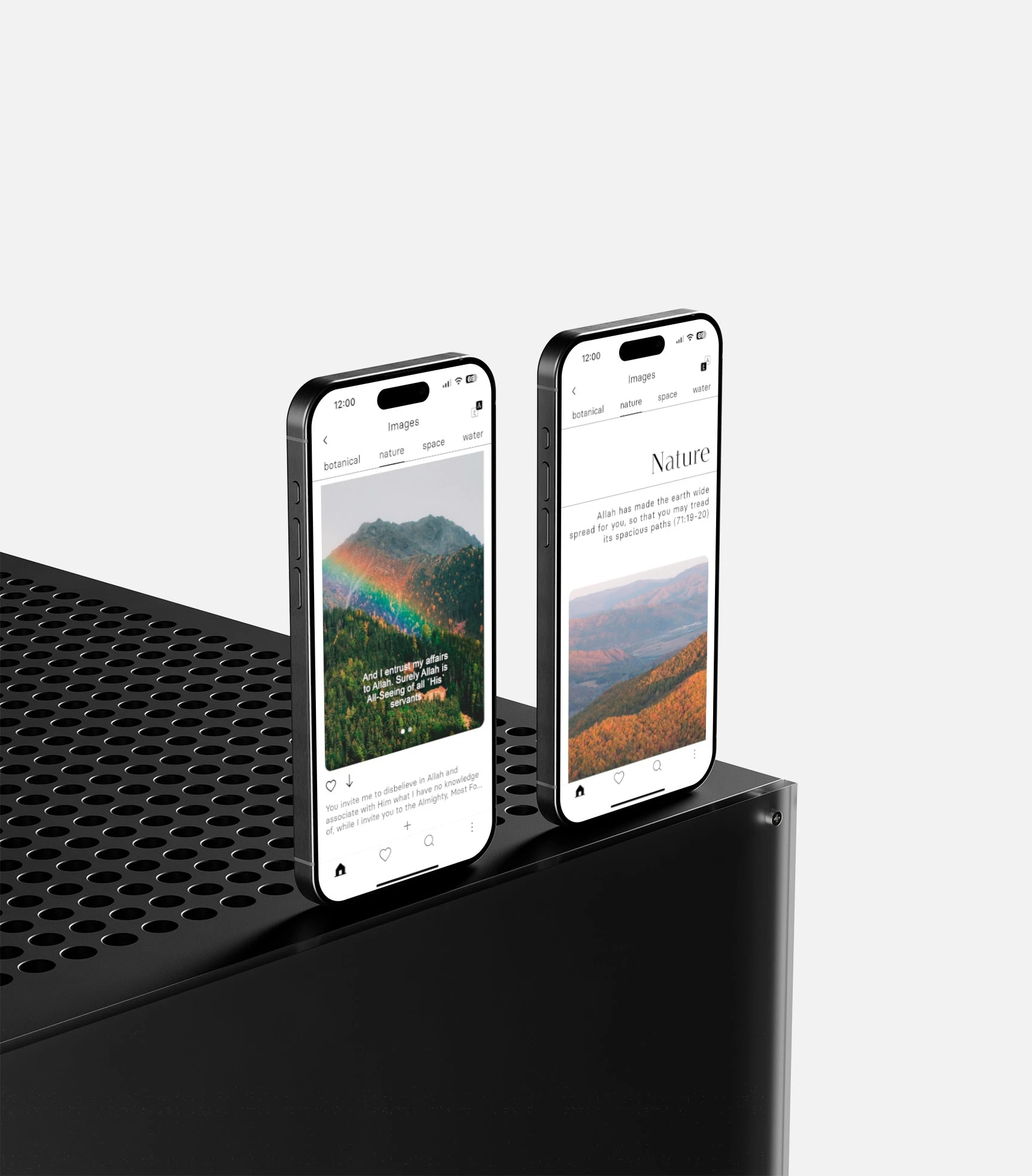
Back in 2020, I was contacted through Behance (surprisingly!) to design the entire brand identity and UX/UI of an upcoming app to help Muslims not miss Remembrance by using a set of well-designed wallpapers
The idea was to create something clean and with a calming feel. Something minimalistic, but good enough to be powerful.
The identity
A simple, yet usable color palette. The aim was to not distract the user from the messages in the wallpapers.
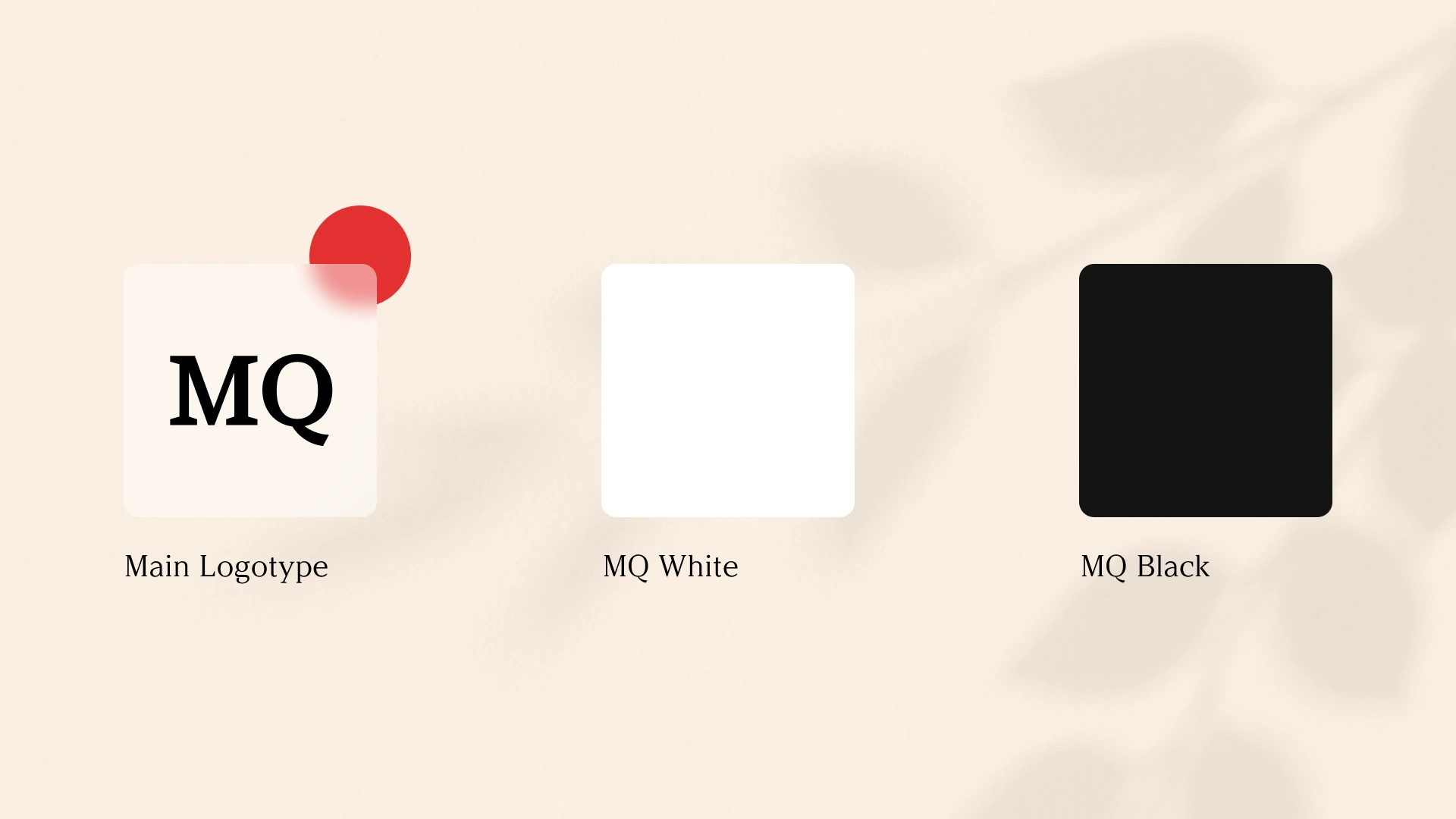
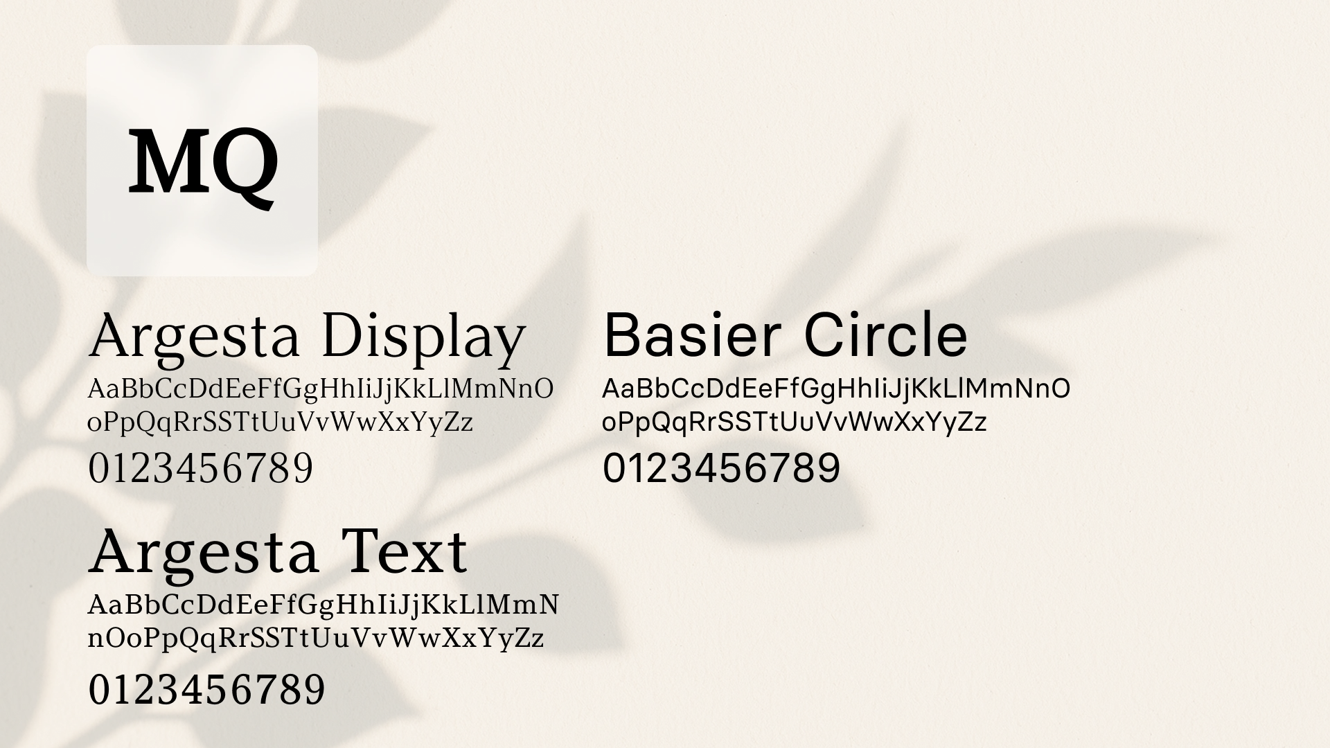
The logotype, a simple wordmark with the letters MQ set in Argesta Medium, contrasts with the usual sans-serif world we are living in.
The typography was based on Basier Circle and Argesta Font, both made by Atipo Foundry. Good contrasted typefaces with beautiful letterforms.
The App
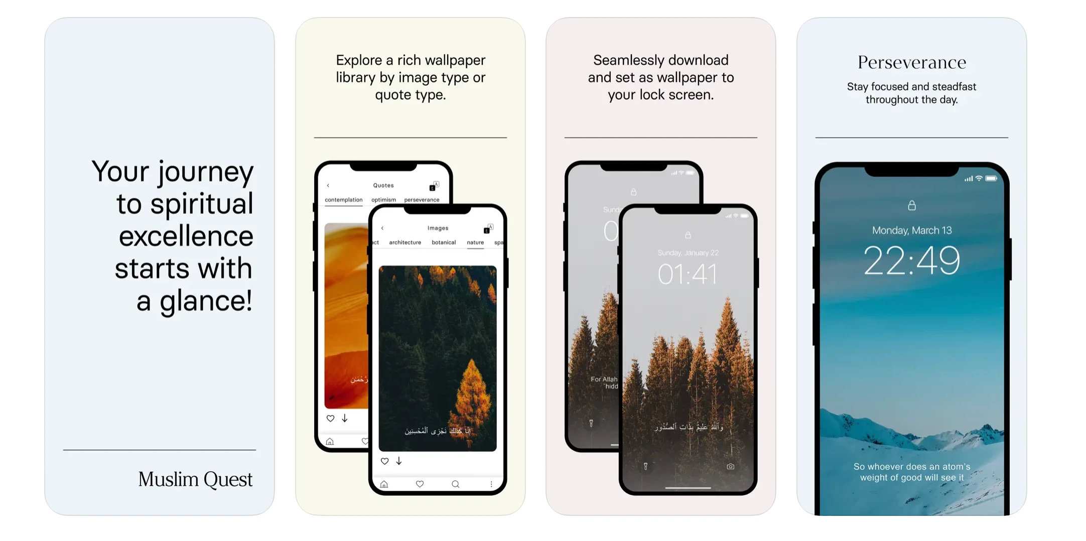
To take off distractions, the clean and minimal style was applied throughout the app, from the onboarding to the menus and subscription pages.
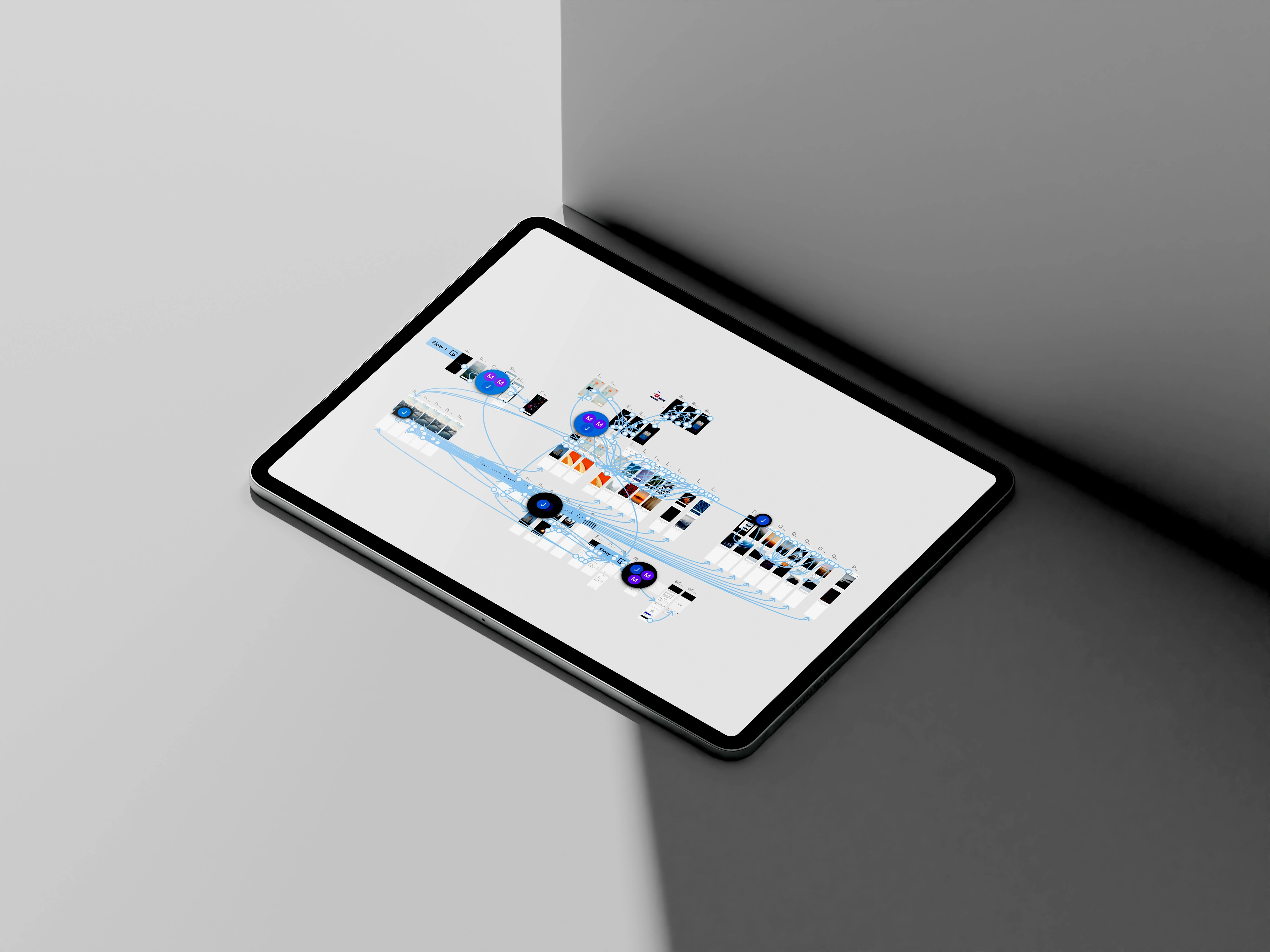
In total, over 30 screens were designed, prototyped and shipped to the development team
My Role
As the Brand & Product Designer, I led the development of MQ’s visual identity and user interface. My responsibilities included:
Logo and brand design for the app
Art direction for the look and feel
User Experience and Interface of the app
Prototyping and testing
Promo materials that showcase the app features (not done by me, but wanted to include them)
Like this project
Posted Jul 18, 2025
Full brand identity and UX/UI design for a Muslim lifestyle app. Logo, color system, typography, and end-to-end app screens, from onboarding to daily use.