Sofar Sounds re-design
Tanya Castro
Helping Sofar Sounds improve their search experience.
Sofar Sounds is a business dedicated to curating intimate concerts in unique spaces.
Timeline: 5 Weeks
Role:
— User Researcher
— Product Strategy
— UI Design
— Interaction Design
— Usability Testing
The Problem
Currently searching for available intimate concerts is very limited with a single dropdown menu. New users searching locally are at a disadvantage using the current feature which only allows to search by city.
The Solution
Our aim is to conduct research interviews, synthesize the data and map the information architecture of the product to action a better search experience for Sofar. The business needs of this case study will be measured by an increase in bookings while music lovers experience an easier way to book local gigs.
Usability Review
Our first step was to perform a usability audit of the current website where we highlighted pain points and wow moments focusing on the search feature and overall aesthetic of the website.
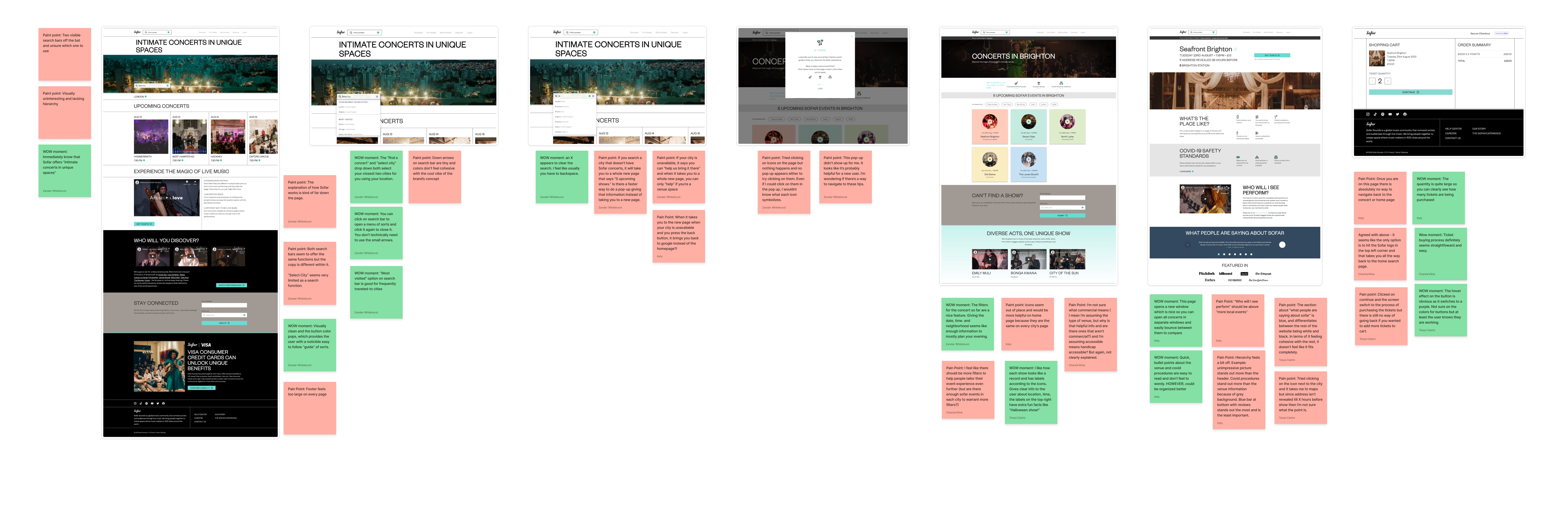
Business & User frustrations
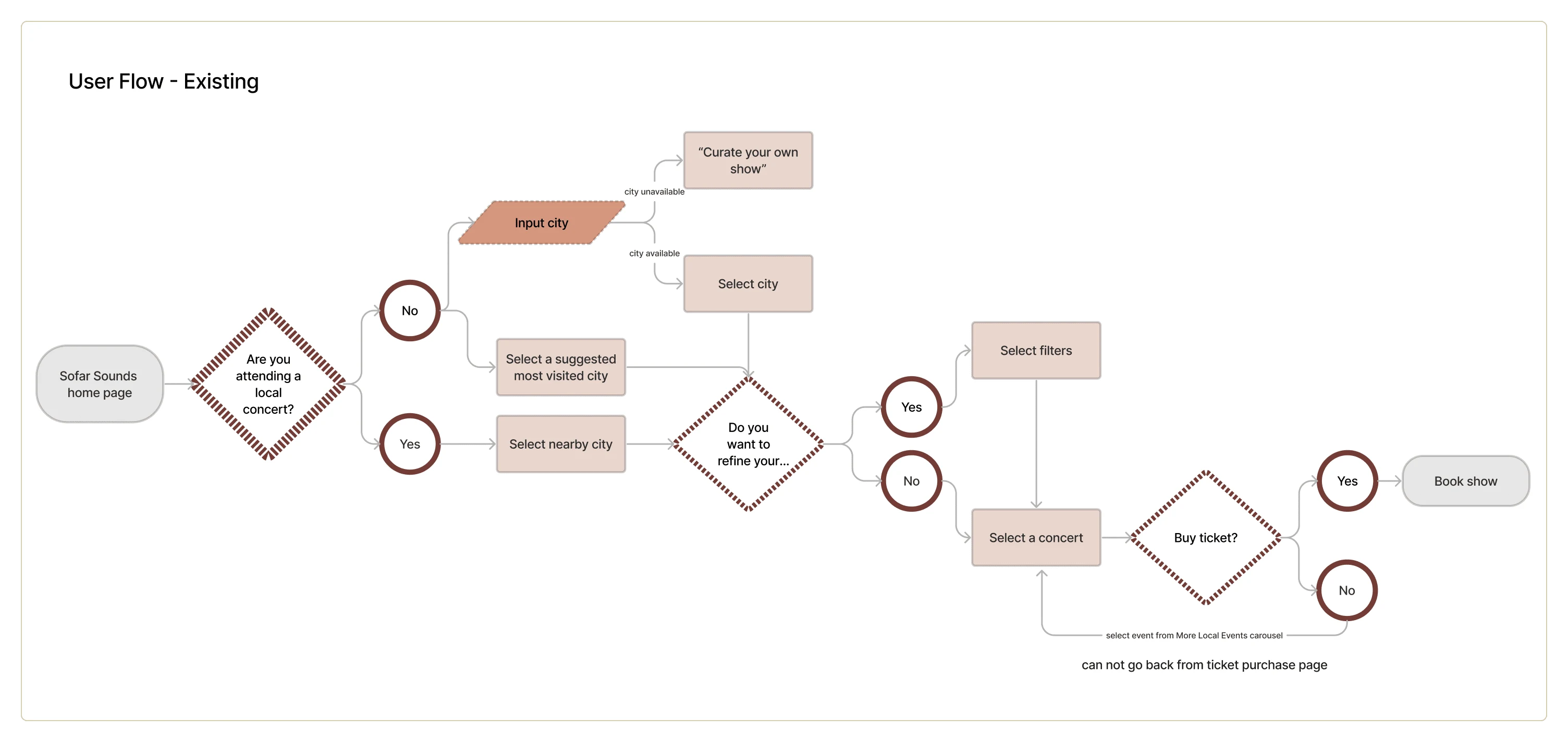
During the usability review, we found that there was a sense of hierarchy and organization but it wasn't designed to encourage users to search for an event. The search feature only allows to search by city and nothing else. If there are no concerts in the selected city available, it won't provide nearby concerts as an option.
Primary Frustration
When searching, users are prompted to select a city which results in a new screen. If there are no concerts available in the selected city, the new screen asks users to apply to become a curator of shows instead of recommending a nearby show.
Secondary Frustration
When landing on the city page users are met with a number of concerts available where they can filter through six random options which results in a limitation of information and unfamiliarity to the user.
Competitor Benchmarking
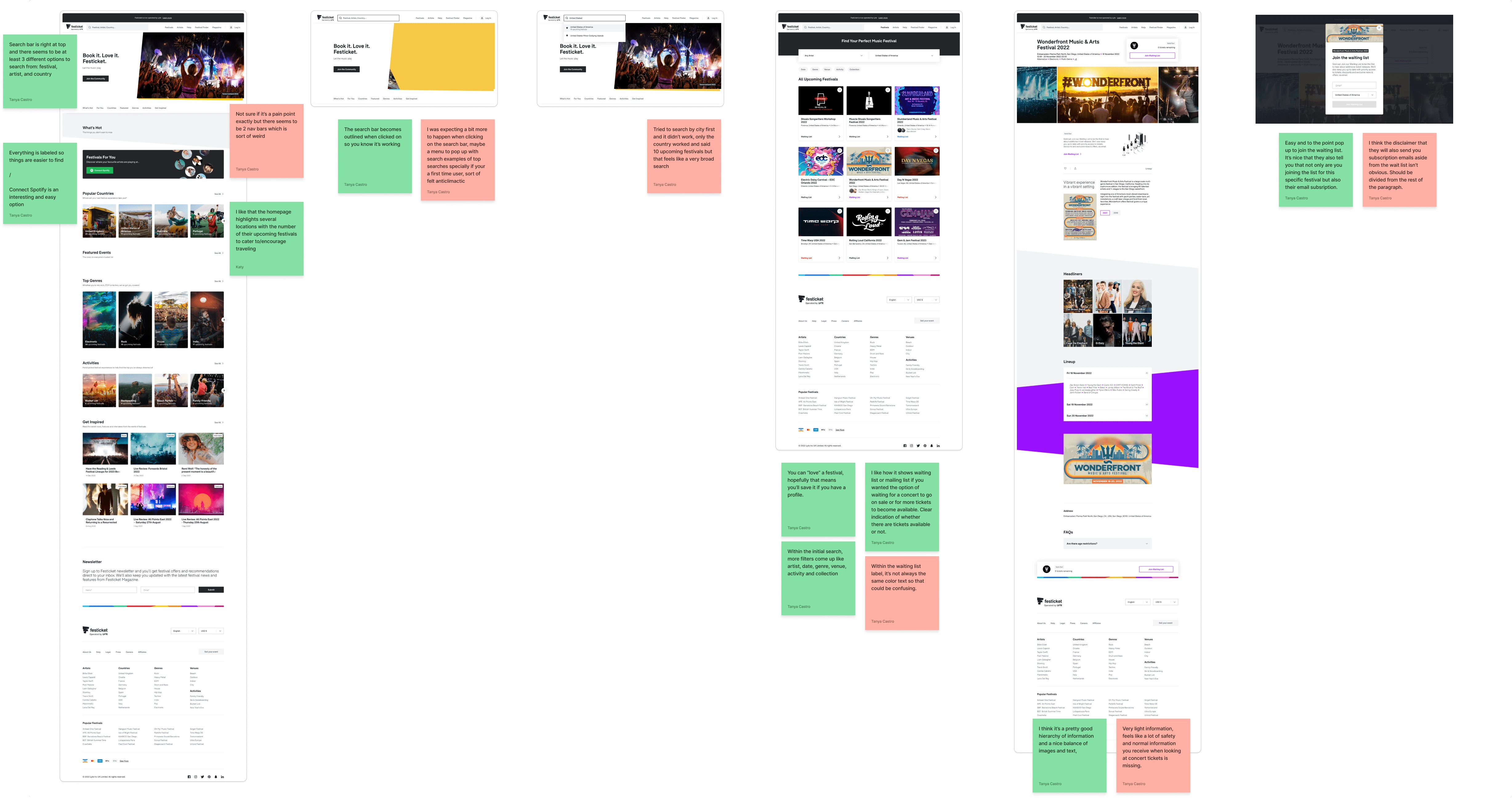
Next, we proceeded to conduct three indirect and direct competitor benchmarking on Festicket, Ticketmaster and eventbrite. We labeled Festicket a direct competitor for its niche service of a festival ticket service while labeling Ticketmaster and eventbrite as indirect competitors for its wide array of ticket services to concerts, sports events, comedy shows, and so on. We highlighted the pain points and wow moments of all three websites.
Problem Space
After producing the usability review and competitor benchmarking, we found that the problem although revolved around the search feature, it then lead to a string of issues the user could encounter like not enough proper filters, errors if city is unavailable, and inability to navigate back and forth between pages. These problems guided our How Might We questions and so, we formed:
How Might We Create A Functional Search Experience?
Affinity Mapping
Our team conducted six interviews and added them to Dovetail to transcribe them. We then created a tagging taxonomy, synthesized the data gathered in order to highlight the nuggets and assembled the information into an affinity map.
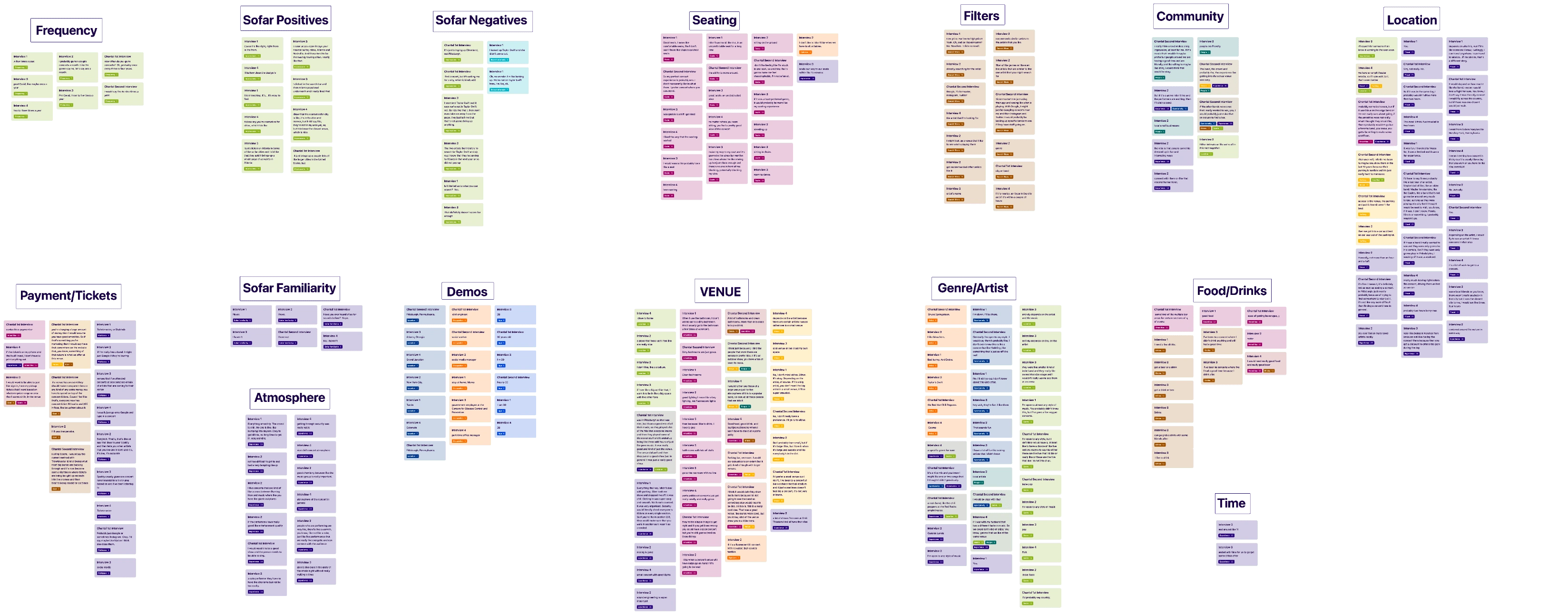
Highlights
There were two main highlights we found while assembling the affinity map.
The first was centered around experience; most people commented on their experience of a concert, leading to it, during, and afterwards. Making the experience overall an important factor.
The second was centered around travel; for the most part people wouldn’t travel more than 2 hours for a concert.
Other factors that would impact the choice of attending a concert included artist performing, day of concert, and location.
Ideation
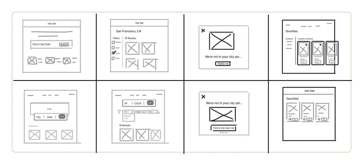
After we defined the problem, and conducted research, it was time to start the ideation phase. Our team decided to start by listing our ideas and using a Priority Matrix to decide what ideas took precedent. We then did a crazy 8's session of the search feature, the search results screen, the city unavailable pop-up screen, and a favorites screen. Once this was done, we were ready to map the user flow.
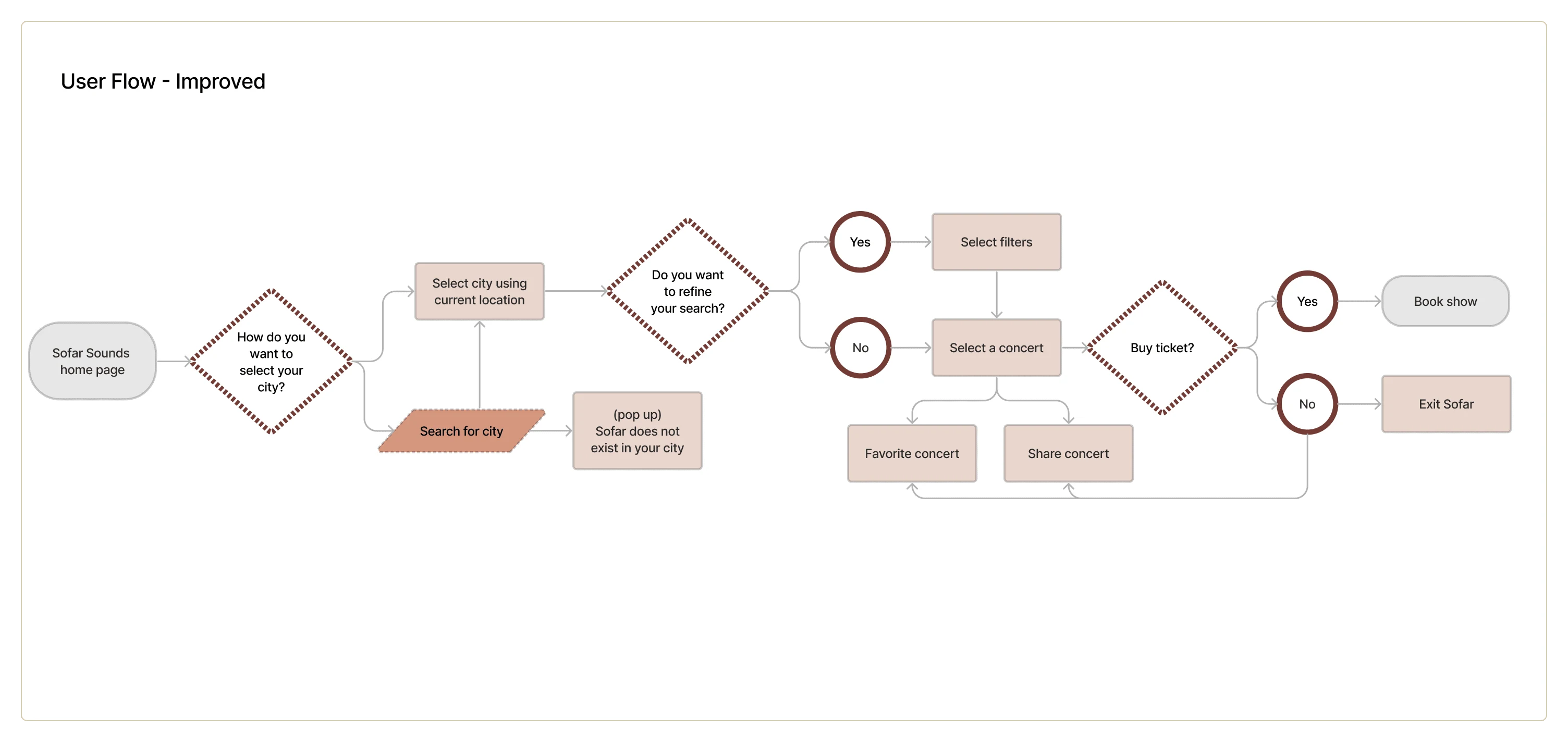
User Flows
We started out by mapping the existing user flow to locate the specific problems to see where we could implement our solutions. Once the existing user flow was mapped, we moved on the improved version where we further defined the problem spaces and replaced them to display an easier and functional user flow.
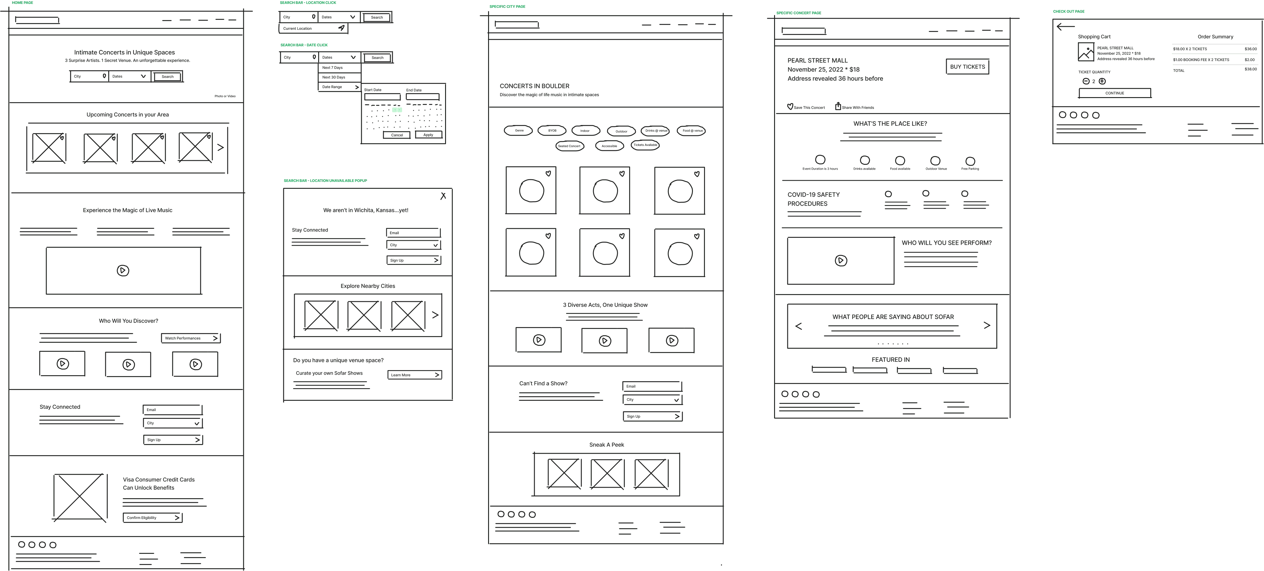
Rapid Prototyping
Our focus was the search feature and filters, therefore, we found that we would work with the current layout for the majority of the webpages but made sure to wireframe the screens according to the user flow and annotate what components we would need to ensure we would capture the whole experience.
Styles & Components
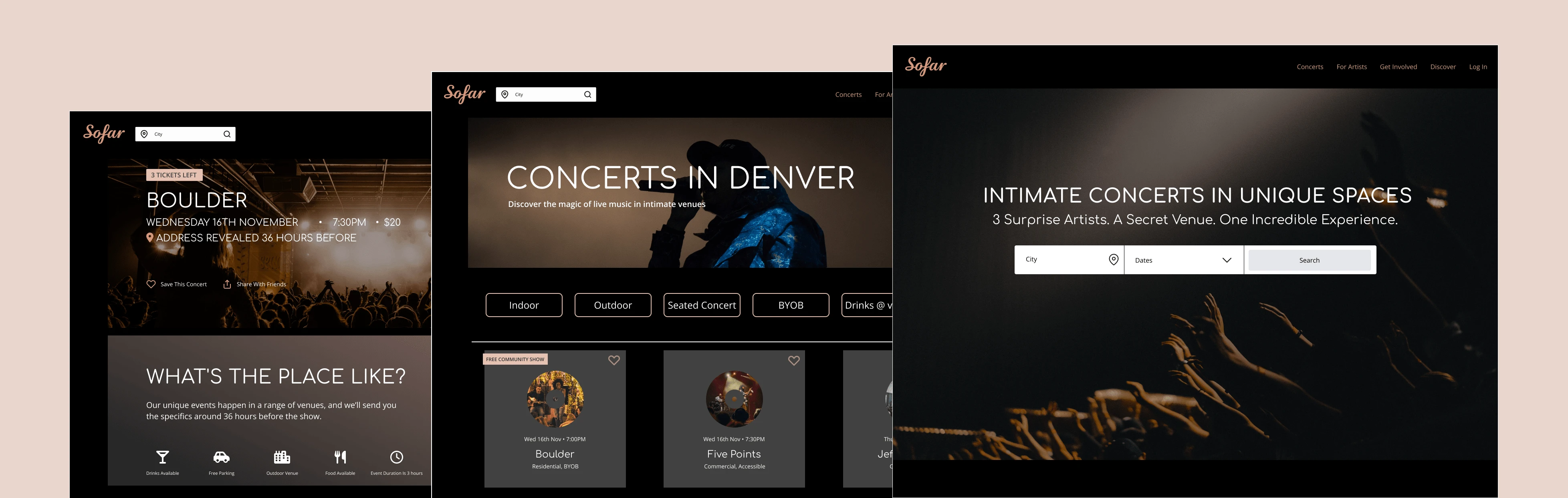
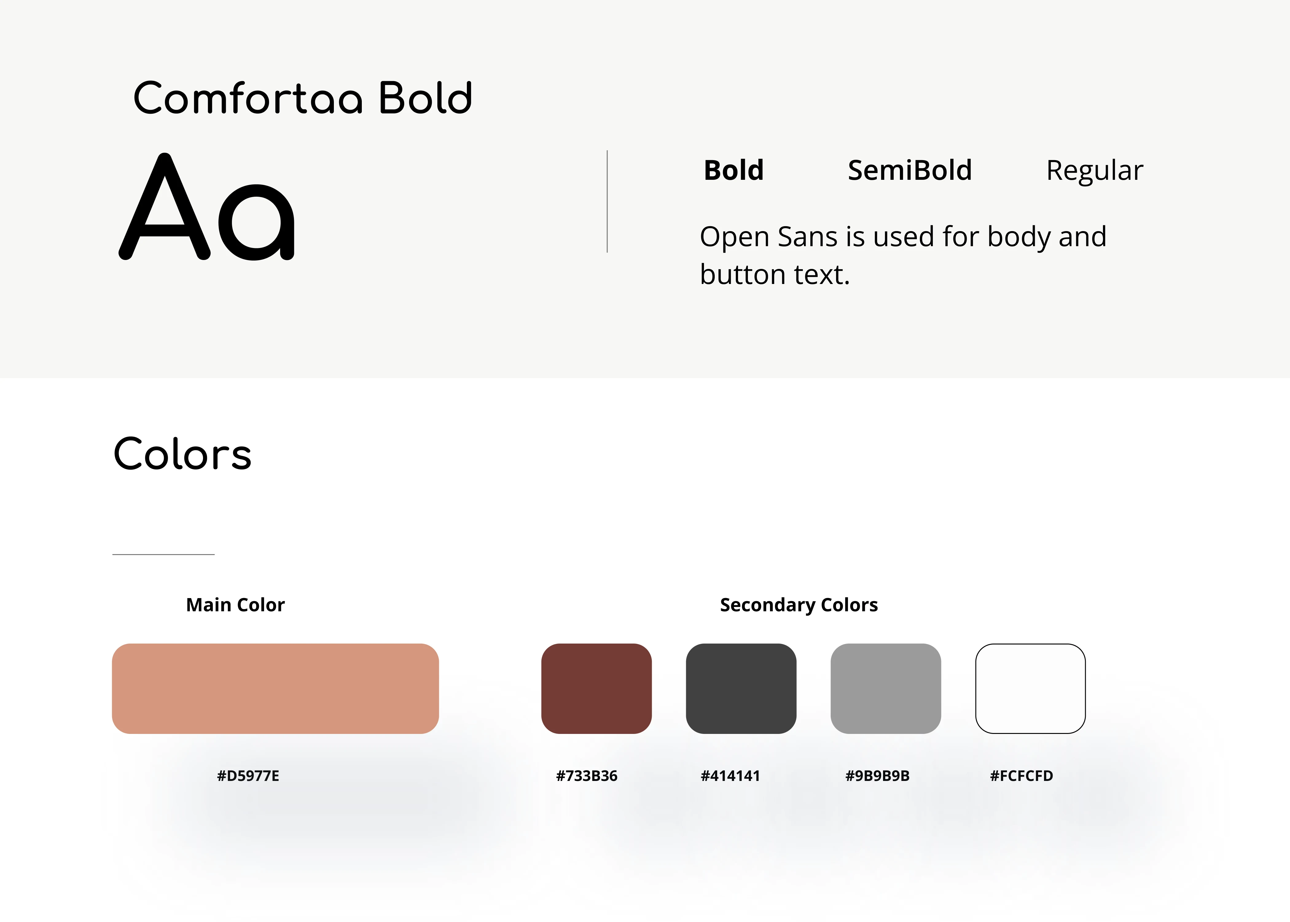
One of our first decisions when thinking of aesthetic of the website was working in dark mode. This meant we had to find a way to keep the sense of intimacy and softness that the concerts provide. We did this through the color palette with shades of brown and gray.
For our text styles, we wanted to be sure it felt fun but was also readable. We landed on Comfortaa for the heading and brand typeface and Open Sans for the supporting body and button text.
High Fidelity Prototype
Our final prototypes present the improved user flow, a new color palette in dark mode, an improved search feature, and additional filter options. We also added a save to favorites and share with friends features to engage users into coming back to Sofar Sounds.
Next steps
If I had more time to iterate, I would conduct a usability test. I would also design a favorites screen to supplement the save to favorites button and the unavailable city pop up screen to separate it from the curate a concert screen. My aim would be to focus on these tasks to develop a long term relationship between Sofar Sounds and the user.
Like this project
Posted Dec 18, 2022
Helping Sofar Sounds improve their search experience.
Likes
0
Views
27