Wim Hof Method App
Tanya Castro
Helping Wim Hof app improve their Cold Shower Challenge experience.
The Wim Hof app is a service that delivers a consistent practice of breathing techniques, meditation, and cold shower therapy.
Timeline: 5 Weeks
Role:
— User Researcher
— Product Strategy
— UI Design
— Interaction Design
— Usability Testing
The Problem
Currently, the Wim Hof app is overwhelming for new users, with too many options for them to start their cold water habit. This case study targets new users who are interested in forming a new healthy habit. From a business perspective, Wim Hof is focused on improving the conversion rate for new users to paid members.
The Solution
Our focus was to target Wim Hof’s new users by creating an accessible-friendly interface that is easier to navigate. While offering additional features to customise, complete and track users cold shower challenge, in order to convert users to paid members.
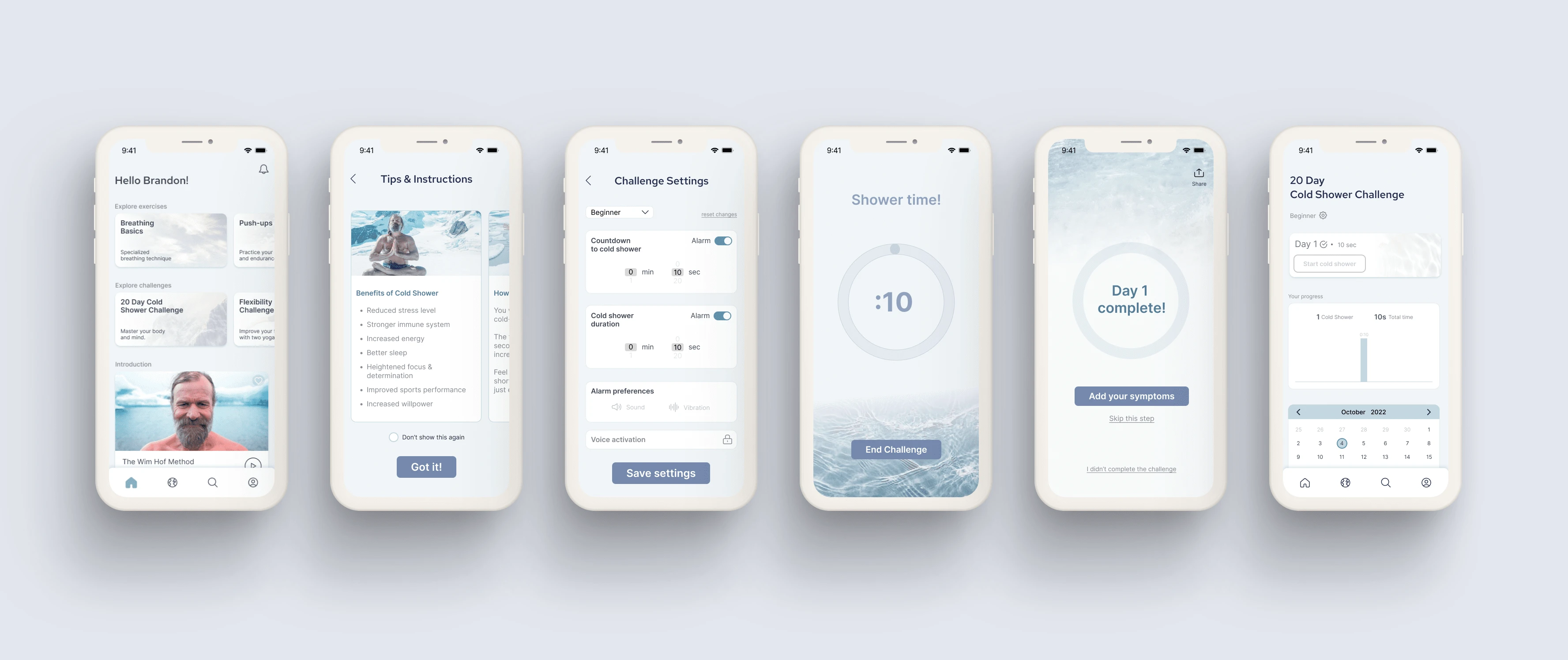
Final Mockups
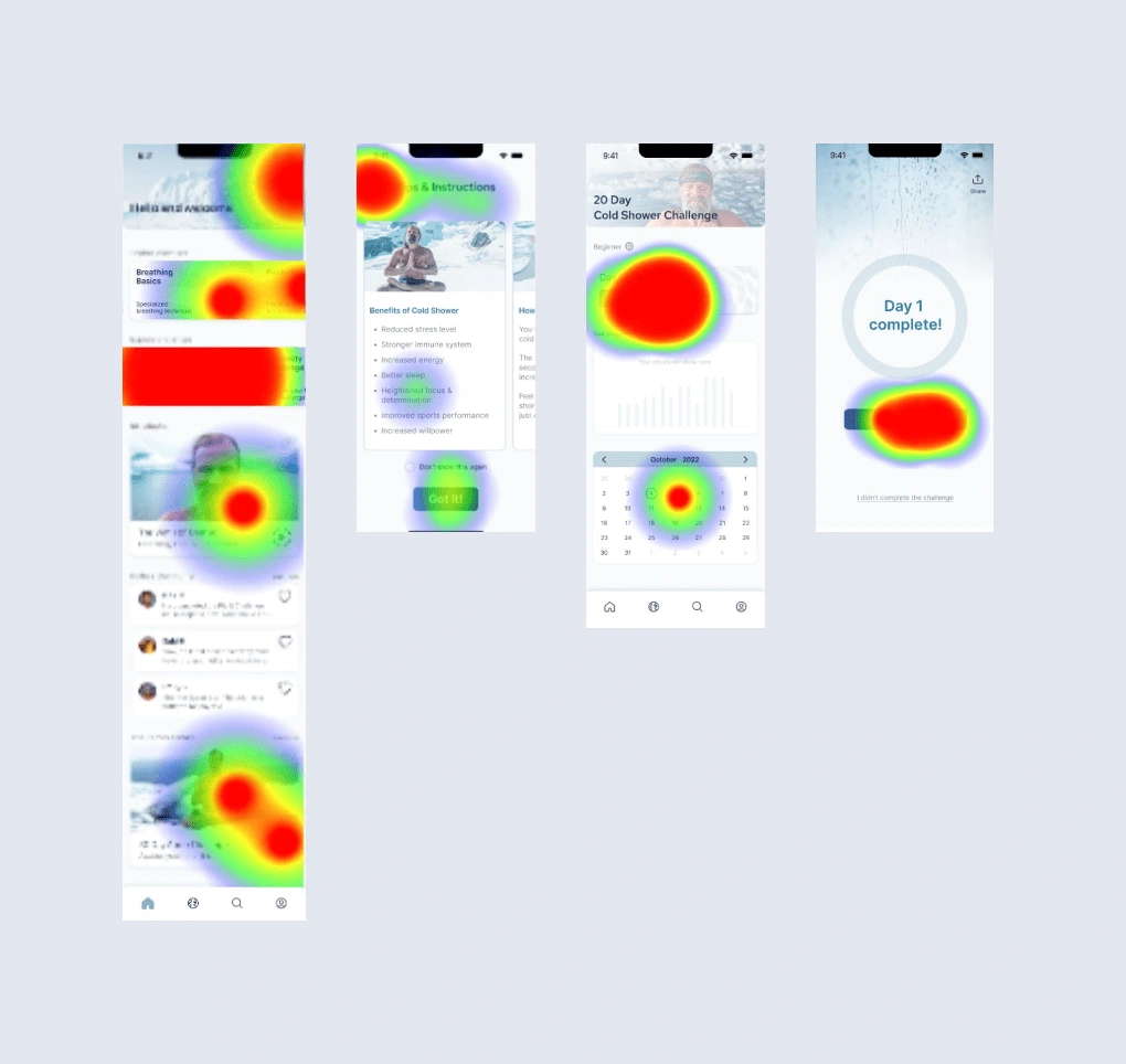
Usability Review
Our first step was to perform a usability audit of the current app where we highlighted pain points and wow moments.
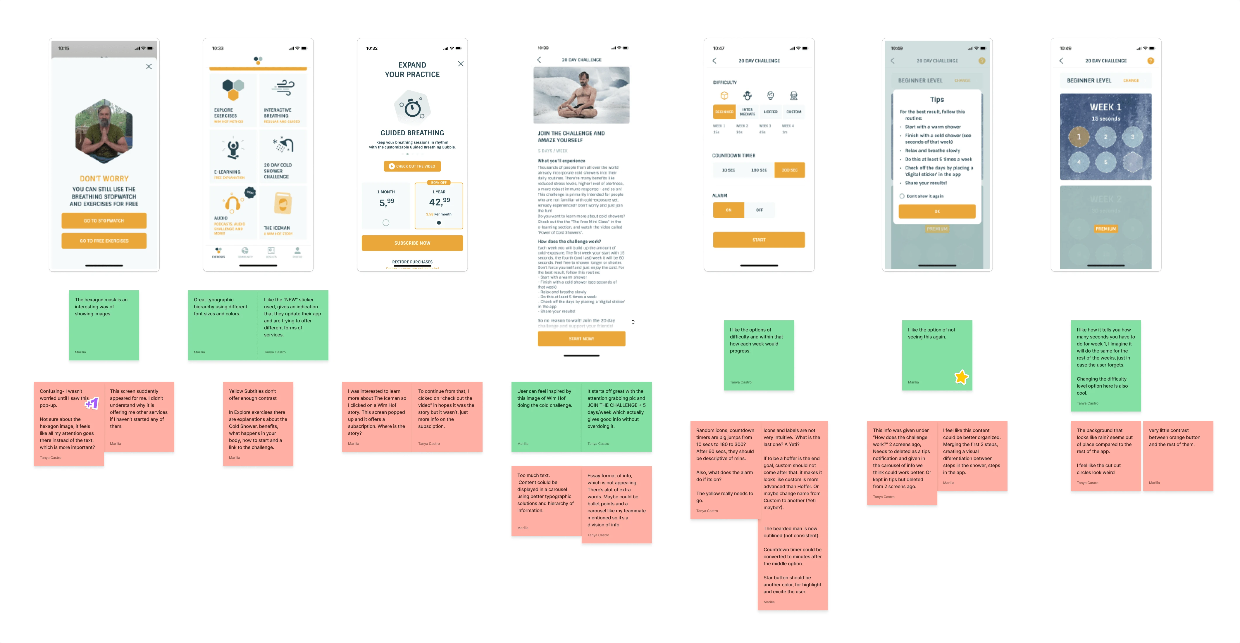
Business & User frustrations
We found that there was an ineffective user flow and failed color contrast accessibility, the CTA hierarchy was futile, and there was no effective data tracking of the cold shower challenge.
Primary Frustration
When logging into the app, users are expected to start the cold shower challenge which results in a problem when there is no CTA hierarchy that would persuade the user to do so.
Secondary Frustration
When using the Wim Hof app, users are seeing too much of one color which results in not only a problem with the hierarchy of the components but the orange color also fails the color contrast checker resulting in an inaccessible app overall.
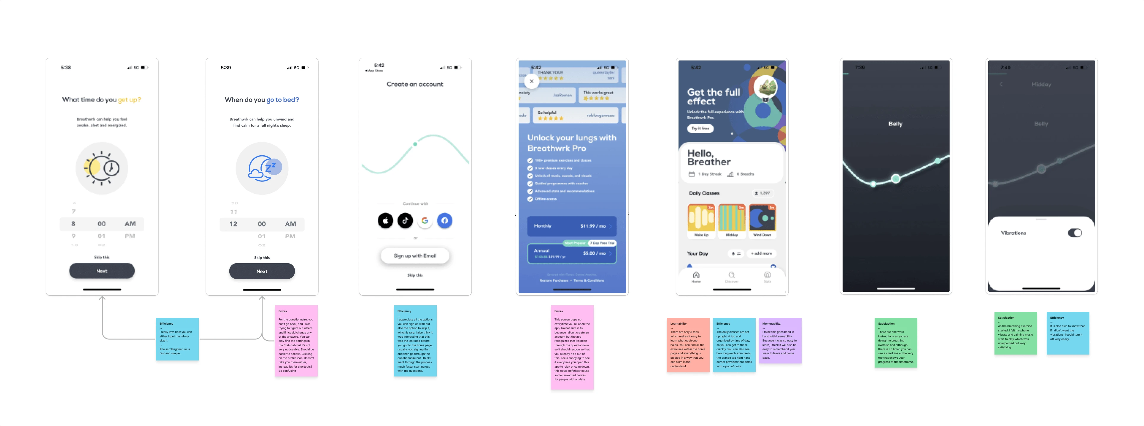
Competitor Benchmarking
We proceeded to conduct both indirect and direct competitor benchmarking on Breathwrk and the Cold Therapy apps by focusing on the 5 core qualities of usability; Learnability, Efficiency, Memorability, Errors and Satisfaction.
Problem Space
After conducting the usability review and competitor benchmarking, we identified that the problem was the overall functionality of the app which involved the business and user frustrations. We came up with various How Might We questions to better understand the problem and in turn, create a solution.
How Might We Improve User Engagement?
Ideation
In the ideation phase, we started with a Mind Map and quickly followed it with a Crazy 8's session where we brainstormed ideas on different features of the app. We then used a Priority Matrix to prioritize which idea we thought could solve the problem.
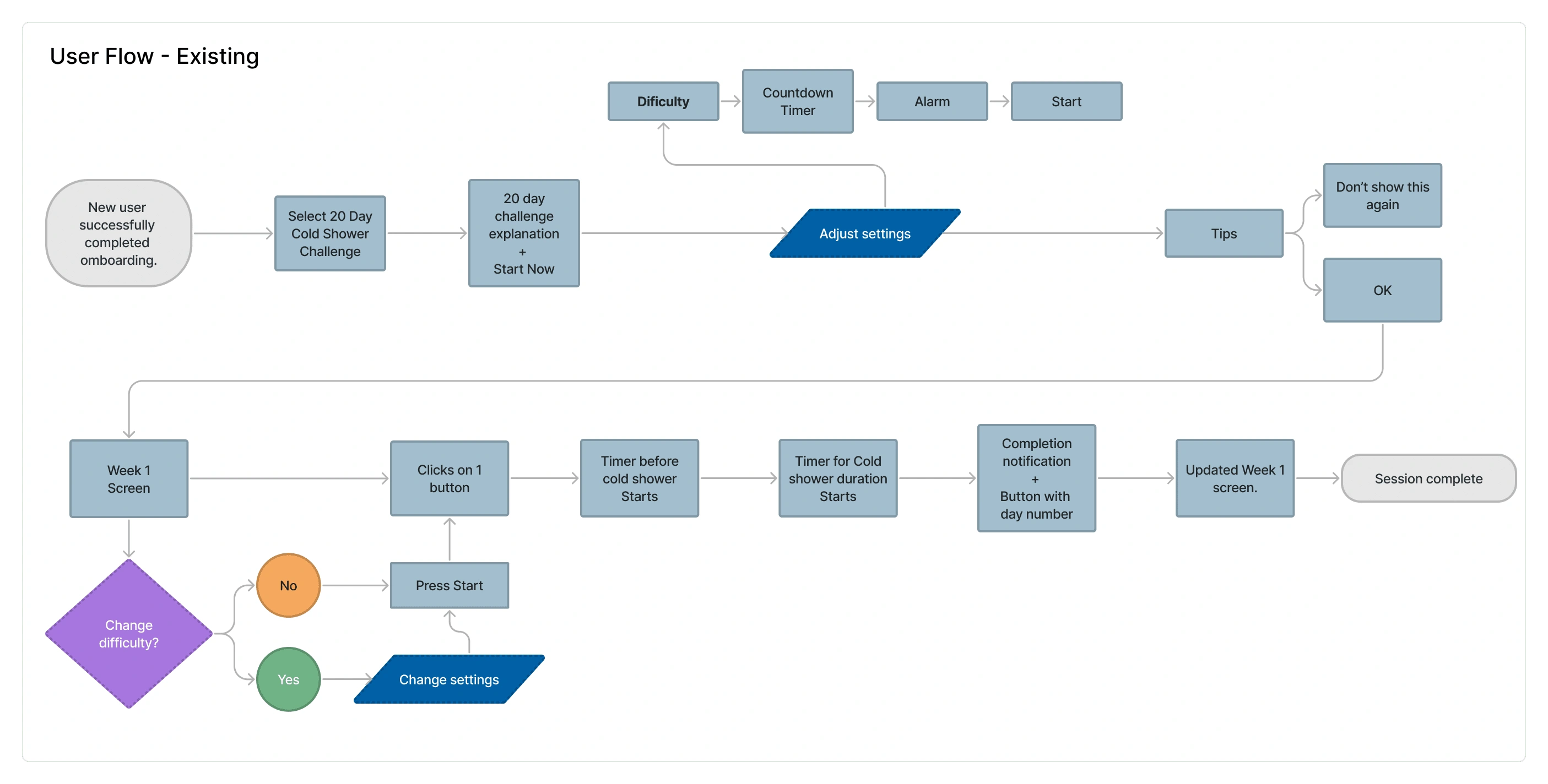
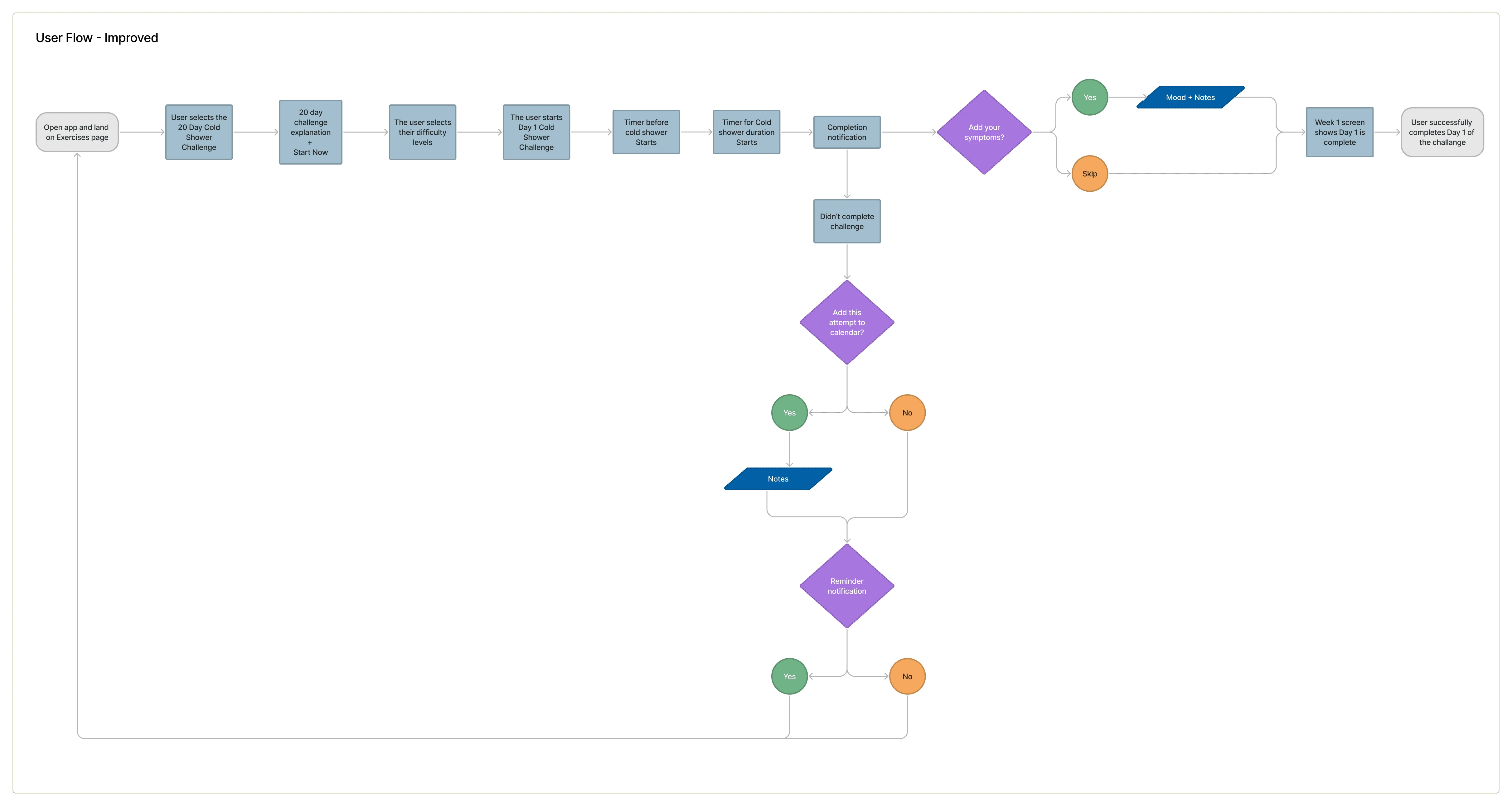
User Flows
To build a functional user flow, we first had to map the existing user flow to better understand the user and the where they might encounter issues. We then mapped a new version that included the added and improved features such as the symptoms screen.
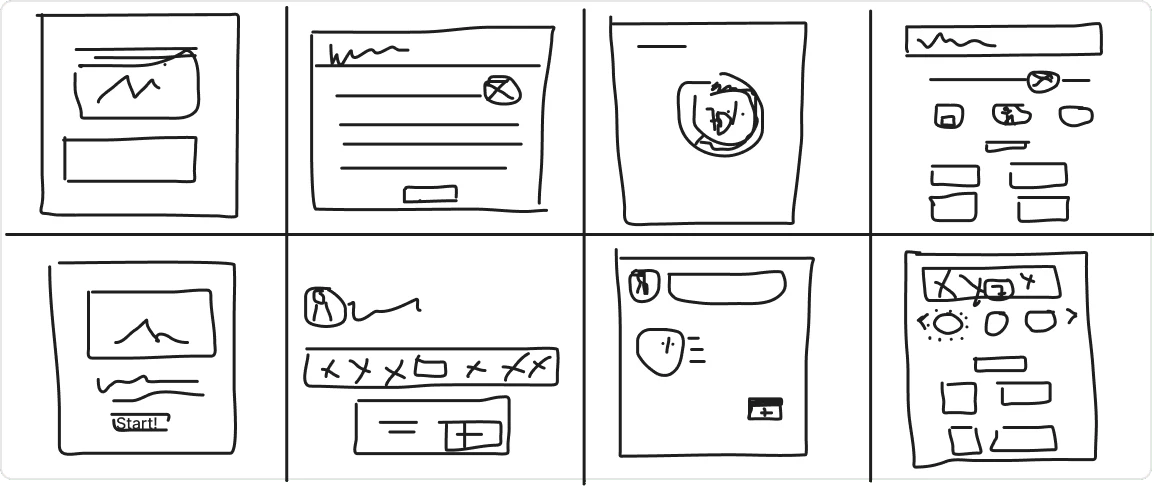
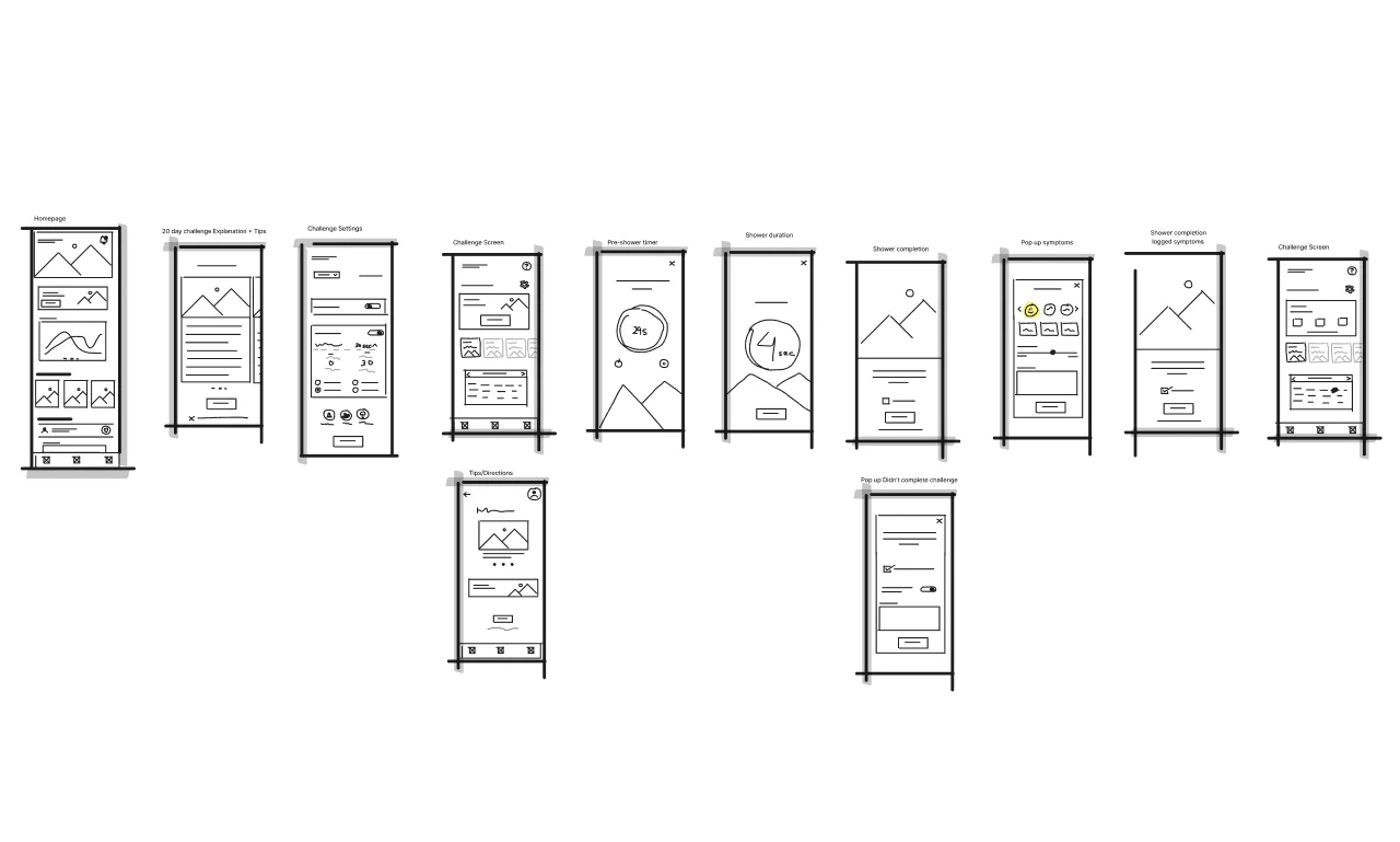
Rapid Prototyping
We needed visual direction of the layout, which lead us to sketch the key screens from the user flow and then annotate what components were needed for the key screens.
Styles & Components
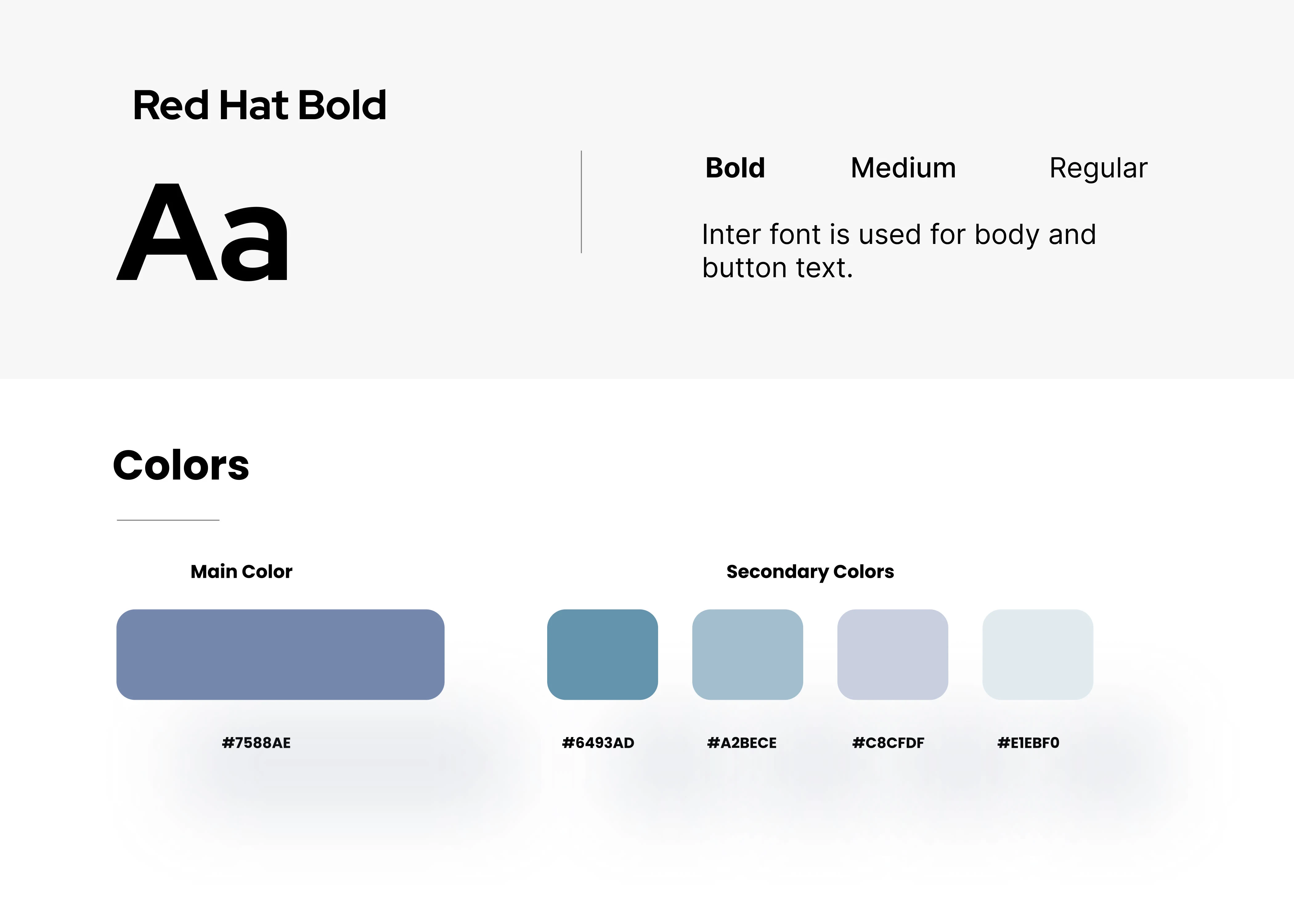
The current color palette of the app failed the color contrast checker, which meant accessibility was at risk. We wanted to be sure the new color style kept the spirit of the app but was also accessibility friendly. The different hues of blue were inspired by the ocean and the sky, which fit the theme of the Wim Hof Method.
For our text styles, we looked at various options to make sure the font style of choice was readable. We landed on Red Hat for the heading and brand typeface and Inter for the supporting body and button text.
High Fidelity Prototype
Our final prototypes showcase the improved user flow, a new color palette, a CTA hierarchy, and premium features to convert new users to paid members.
Usability Testing
In our final step, we focused our usability test on how the user went about finding the the cold shower challenge and any tasks where the user might lose interest. Our usability testing script provided an introduction, segmentation questions, scenarios, usability tasks, and wrap up questions about the product overall. The usability test was conducted using Maze where we were able to track data from our desired path.
Test outcomes
Having tested the prototype, I learned that the app immediately gave users a sense of wellness, which should motivate users into starting the challenge where they will encounter an easier interface to navigate and in turn completing the cold shower challenge. This will also benefit the business goals, as users will come across premium features converting them to paid members.
Three key learnings
CTA hierarchy was easy to follow and cold shower challenge was easy to find
1/3 of testers cut shower duration short due to the "End Challenge" button
87.5% of testers clicked on the back button on the Tips & Instructions screen, which took them back to homepage instead of clicking the main CTA
Next steps
If I had more time, I would dive deeper into the details of the Symptoms screen to adjust the data users would want tracked. I would also add more features to the Shower Duration timer screen to improve engagement and add customizable features to convert new users to paid members.
Like this project
Posted Dec 18, 2022
Helping Wim Hof app improve their Cold Shower Challenge experience.
Likes
0
Views
60