Fedex sign-up form redesign
Tanya Castro
Header Image
Helping FedEx improve the accessibility on their sign-up form experience.
Fedex is a package delivery service focused on transportation, e-commerce and business services.
Timeline: 5 Weeks
Role:
— User Researcher
— Product Strategy
— UI Design
— Interaction Design
Tools:
— Figma
— WAVE (Web Accessibility Evaluation Tool)
— Contrast plug-in (Comparable to Stark)
Business Goals
From a business perpsective, the business is interested in improving the accessibility of their product to increase their user base.
The Problem
Currently, Fedex’s accessibility is average and the business would like to perform an audit and iteratively improve the accessibility of their product.
The Solution
My focus was to target FedEx new users by creating an accessible-friendly interface that is easier to navigate.
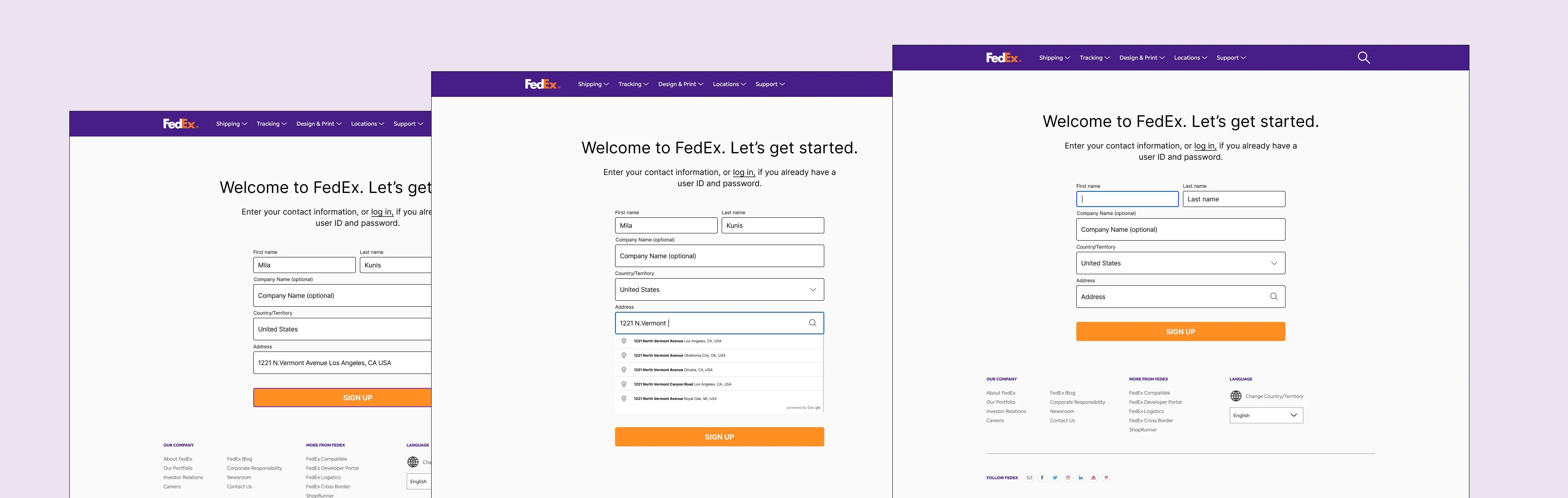
Prototype Screens
Accessible Audit
Our first step was to perform an accessible audit of the current sign up page where I tested for the compliance of various sections such as technical, navigation, control, visual, and form.
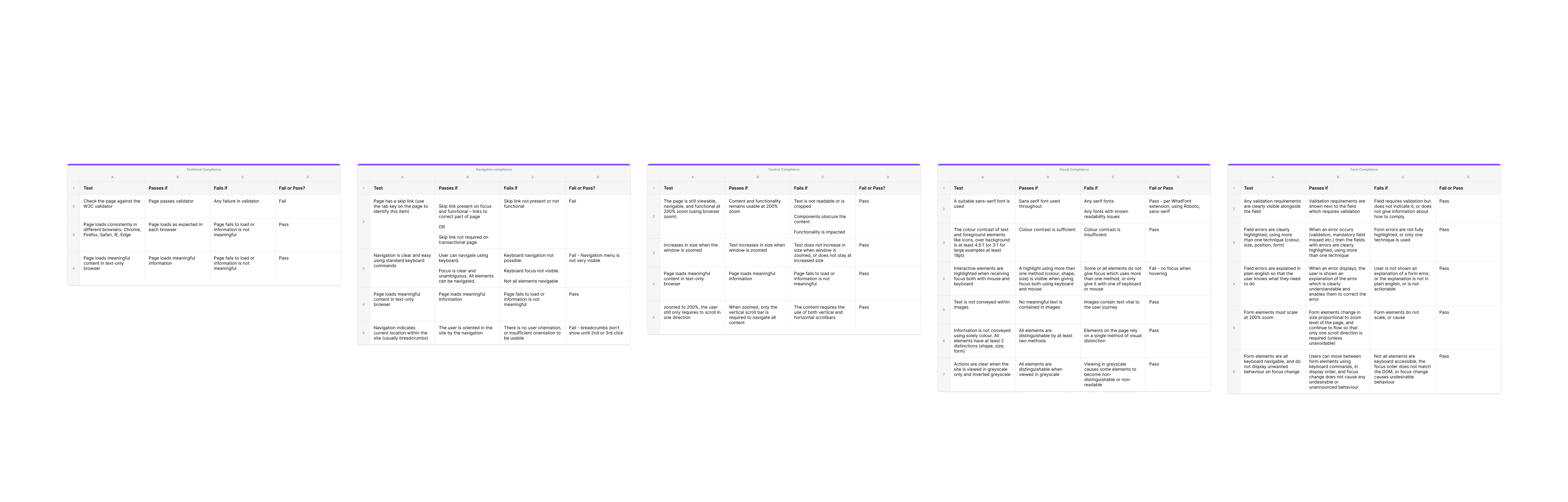
Problem Space
After conducting the accessibility audit, I identified that the sign up page although fully passed the form compliance, and control compliance, it also failed the W3C validator, most of the navigation compliance, and a test from the visual compliance, in which interactive elements failed to be highlighted when receiving focus both with mouse and keyboard.
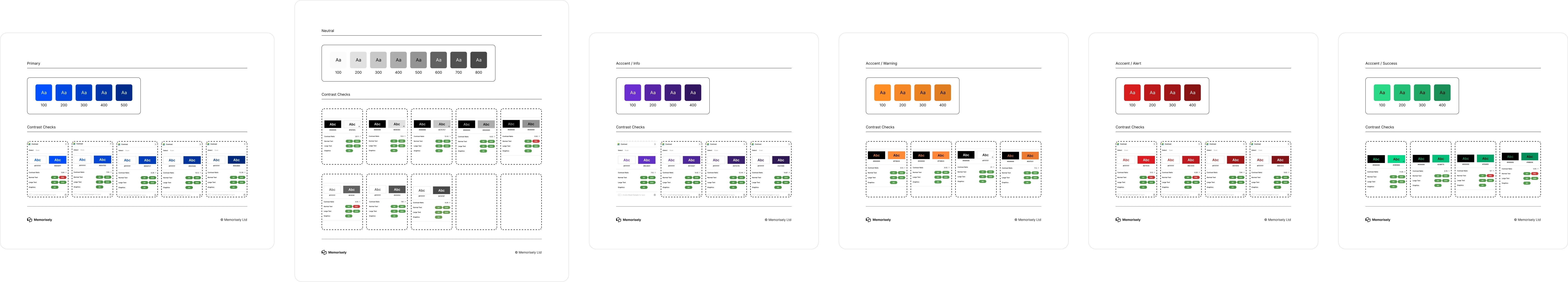
Color Palette
After identifying the problem space, there was a need to create a high contrast palette for users to be able to navigate the product. There was no need to make dramatic changes, just tweaks in hue, saturation and brightness for the color palette to pass the AA standards.
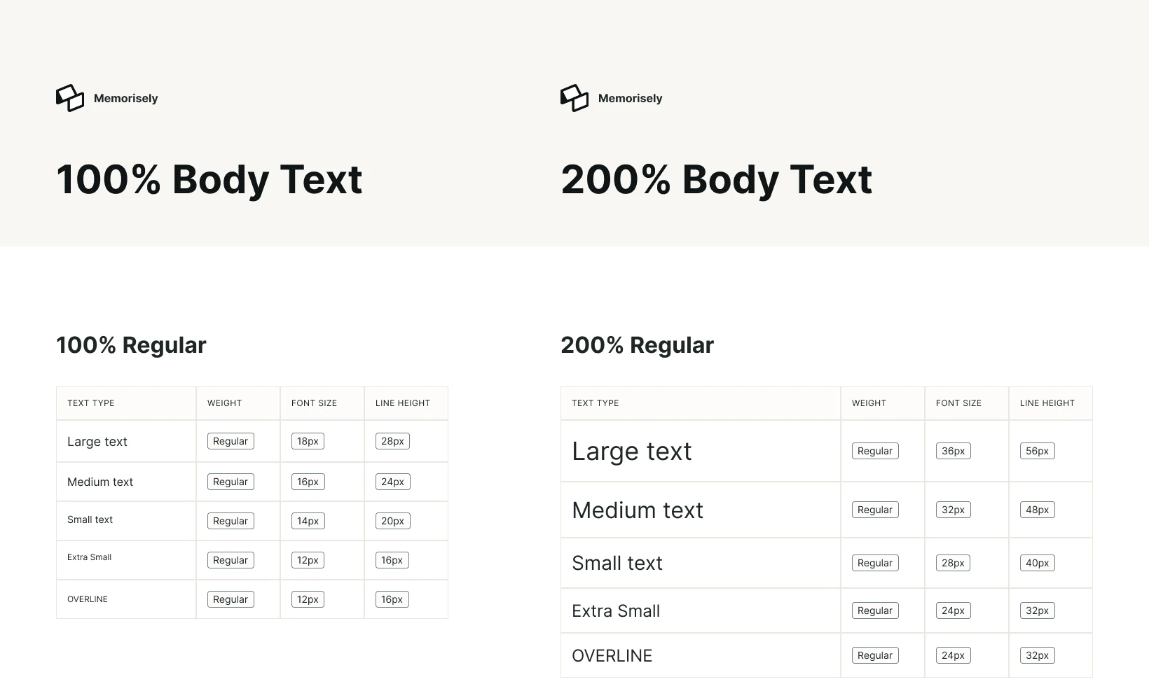
Type Scales
The next task was to create an accessible body type scale with 100% and 200% styles that include regular, bold, italic, and underlined weights. All of this is to ensure that text passes contrast standards when layered on backgrounds.
Note: It’s crucial that users can resize text by 200% without assistive technology.
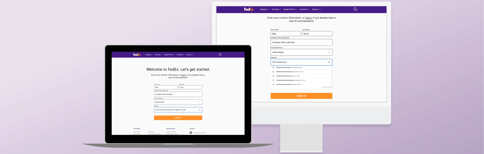
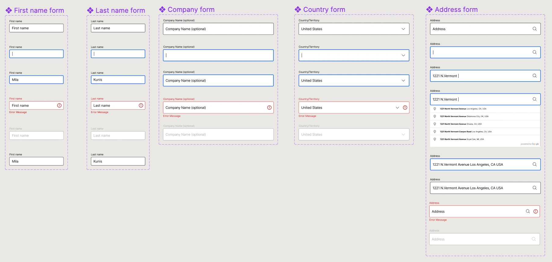
Forms
Once the color styles and type scales were complete, it was safe to start working on an accessible auto layout form. There are a few things to keep in mind when designing forms such as screen readers, focus states, and tab index.
We ensured every text field had a label making it easier for screen readers to navigate, displayed the suggested format for users to easily complete, highlighted required fields, ensured feedback had both inline error messaging and an alert color set on border, and set focus states for keyboard navigation.
Component Sets
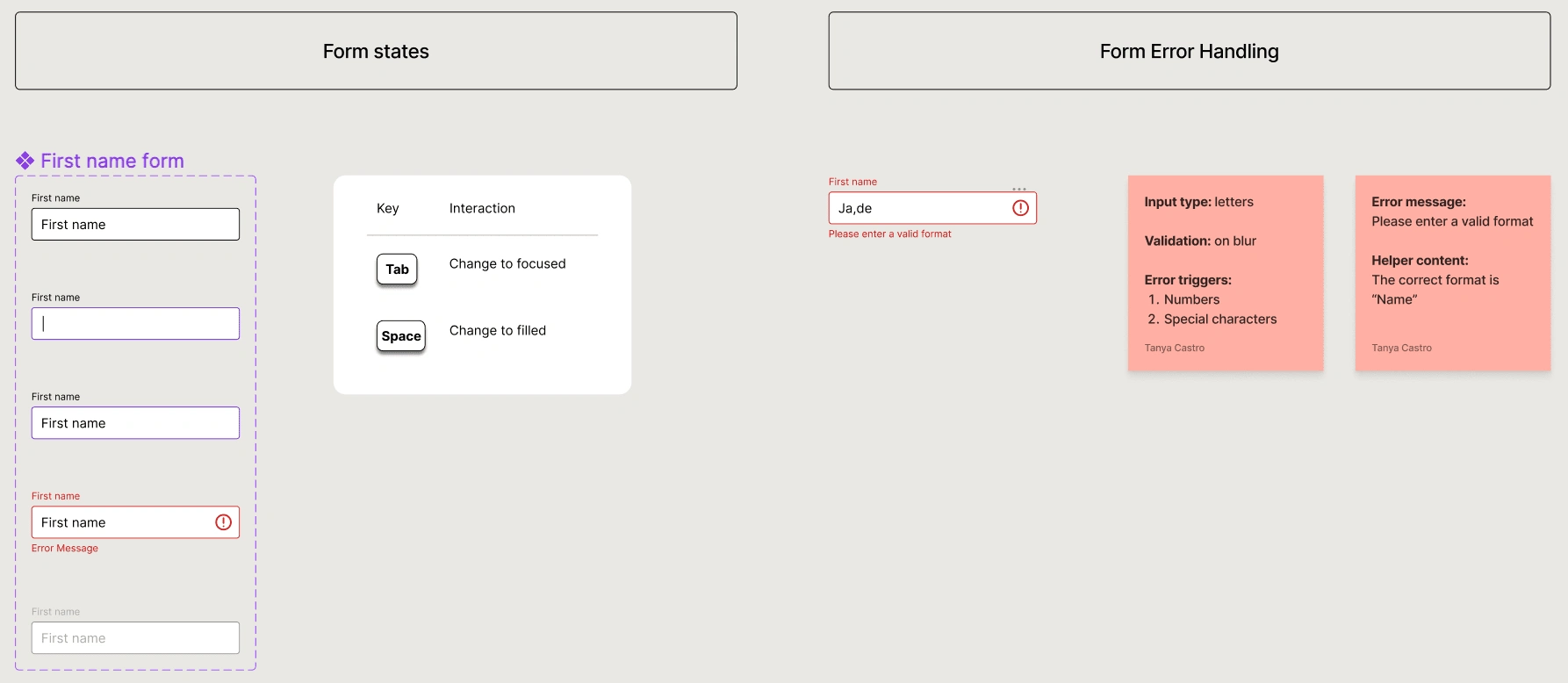
Documentation
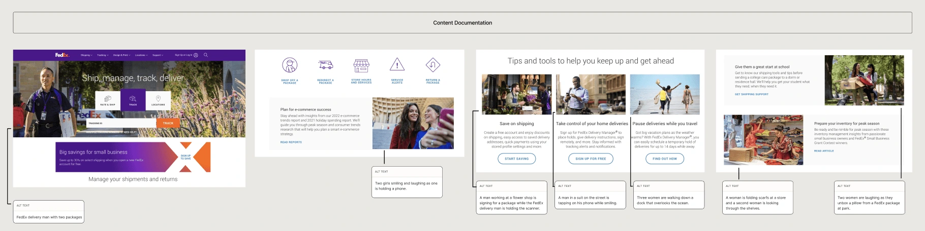
To ensure the product is accessible, we documented key elements for our components such as all states and error handling. We also document interactions, announced content order, wayfinding including focus state, heading structure, and visuals by providing sufficient descriptive alt text.
High Fidelity Prototype
The final prototype takes the user through the sign up process by using the "Key/Gamepad" interaction with a "Tab" and "Enter" sequence and the down arrow to pick an address.
Three key learnings
Designing with accessibility in mind from the start means you are designing to be inclusive— designing for people with disabilities ends up helping everyone
Small changes can make a big difference— think contrast standards, clear text
3. Accessibility often improves overall usability of the product
Like this project
Posted Apr 24, 2023
Helping FedEx improve the accessibility on their sign up form experience.
Likes
0
Views
15