Top 5 UI Trends of 2025 (Glassmorphism Included) to Discuss with Your Designer
Randall Carter
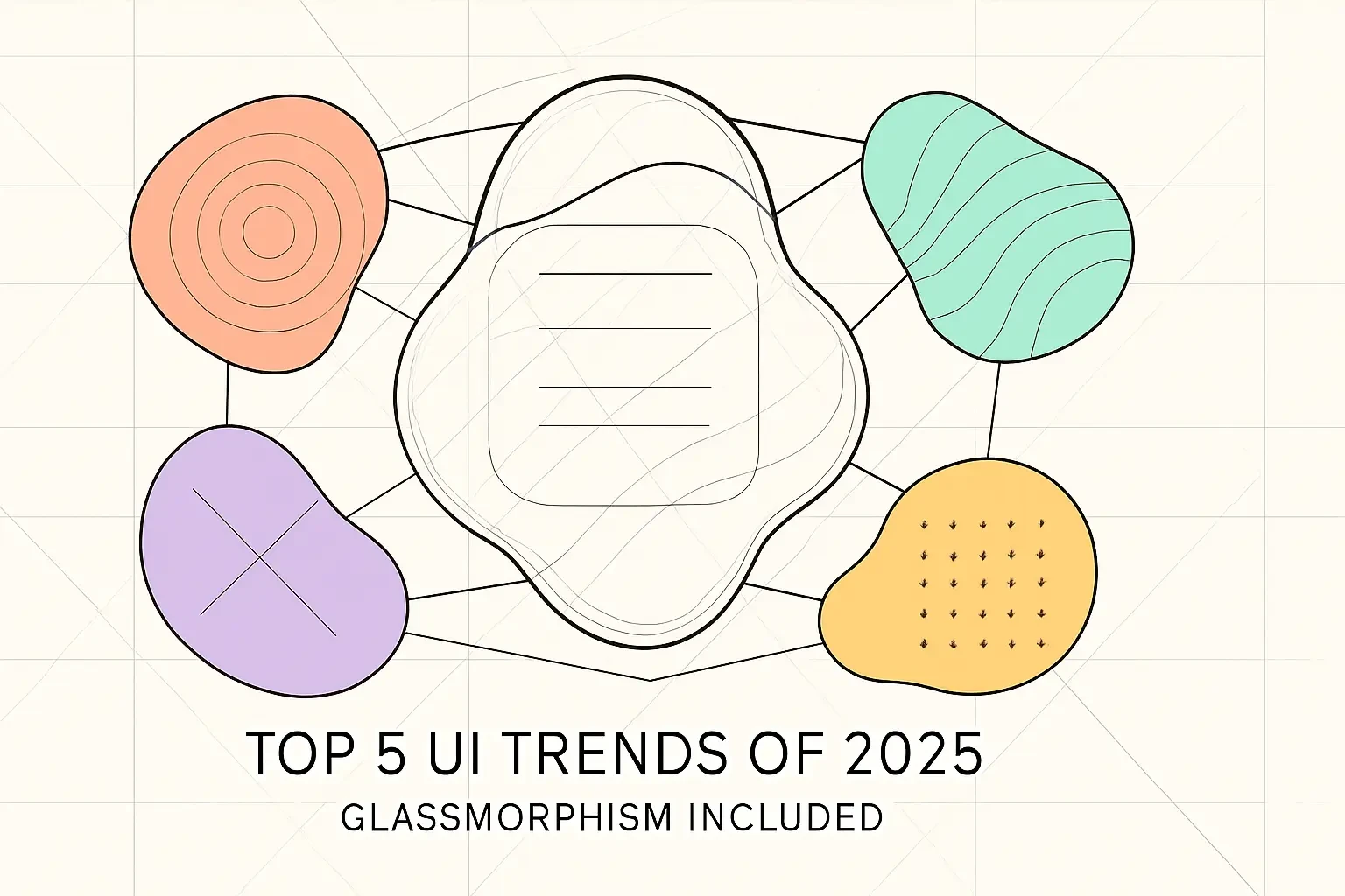
Top 5 UI Trends of 2025 (Glassmorphism Included) to Discuss with Your DesignerTrend 1: Glassmorphism 2.0What It Is and Why It WorksPotential PitfallsTrend 2: Immersive 3D and Spatial DesignBeyond Flat DesignTools and TechniquesTrend 3: Kinetic and Expressive TypographyMaking Text a Dynamic ExperienceBold MinimalismTrend 4: Advanced MicrointeractionsPurposeful MotionThe Role of Haptic FeedbackTrend 5: AI-Powered and Generative UIPersonalized InterfacesThe Rise of Generative ArtHow to Discuss Trends with Your DesignerReferences
Top 5 UI Trends of 2025 (Glassmorphism Included) to Discuss with Your Designer
In the fast-paced world of digital products, a modern user interface is not just a luxury—it's a necessity for user engagement and retention. As we head into 2025, several exciting UI trends are emerging that will define the look and feel of websites and apps. For anyone looking to build a successful product, understanding these trends is the first step. This is especially true when working with designers who code, as they can bring these concepts to life.
It's also vital to ensure these modern aesthetics are implemented with a focus on accessible design. This guide breaks down the top 5 UI trends you need to know and how to discuss them when you hire Figma designers. Whether you're a startup founder, product manager, or business owner, these insights will help you have more productive conversations with your design team.
Trend 1: Glassmorphism 2.0
Remember when Apple introduced those beautiful frosted glass effects in iOS? That was just the beginning. Glassmorphism has evolved from a simple aesthetic choice to a powerful design tool that creates depth and hierarchy in modern interfaces.
This trend is everywhere now. From banking apps to creative portfolios, designers are using transparency, blur effects, and vivid backgrounds to make interfaces feel more layered and sophisticated. But here's the thing—it's not just about looking pretty. When done right, glassmorphism actually helps users understand what's important on a page.
What It Is and Why It Works
At its core, glassmorphism uses a multi-layered approach to create visual interest. Think of it like stacking sheets of frosted glass on top of each other. Each layer has transparency, allowing you to see what's behind it, but with a soft blur that keeps things readable.
The key elements include:
Transparency levels that let background colors and images show through
Blur effects that create that signature frosted look
Subtle borders on translucent elements to give them definition
Vivid backgrounds that make the glass effect pop
Why does this work so well? Our brains naturally understand depth and layering. When we see a semi-transparent card floating above a colorful background, we instantly know it's interactive or important. It's like having a visual hierarchy without shouting at users with bold colors or huge text.
Potential Pitfalls
But here's where things get tricky. Glassmorphism can be a nightmare for accessibility if you're not careful. I've seen beautiful designs that look amazing in Figma but become unreadable in real-world conditions.
The biggest issue? Contrast. When text sits on a semi-transparent background, it can become nearly impossible to read, especially for users with visual impairments. Imagine trying to read white text on a glass panel over a light background—frustrating, right?
To avoid these problems:
Always test your designs with different backgrounds
Use contrast checkers to ensure text remains readable
Consider adding subtle shadows or darker overlays when needed
Have fallback styles for users who prefer reduced transparency
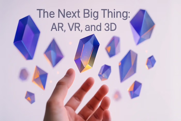
Trend 2: Immersive 3D and Spatial Design
Flat design had its moment, but 2025 is all about bringing depth back to digital experiences. With browsers getting more powerful and AR/VR becoming mainstream, 3D elements aren't just decorative anymore—they're functional parts of the user experience.
Think about the last time you shopped online. Did you wish you could rotate that product to see all angles? That's exactly what 3D design enables. From spinning sneakers to interactive room planners, spatial design is changing how we interact with digital products.
Beyond Flat Design
We're not talking about cheesy 3D effects from the early 2000s. Modern 3D design is subtle, purposeful, and incredibly engaging. Here's what's happening:
Product showcases are getting the Hollywood treatment. Instead of static images, users can interact with 3D models, zoom in on details, and even see how products look in different colors or configurations. Furniture companies let you place virtual sofas in your living room. Fashion brands show clothes on 3D avatars that match your body type.
Interactive storytelling is reaching new heights. Websites are becoming experiences. Scroll down a page, and watch as 3D elements respond to your movement. It's like being inside a story rather than just reading one.
The best part? These aren't just gimmicks. They solve real problems. A 3D product view reduces returns because customers know exactly what they're buying. Interactive stories keep users engaged longer, improving conversion rates.
Tools and Techniques
Gone are the days when you needed a Hollywood budget to create 3D interfaces. Today's designers have incredible tools at their fingertips.
Spline has become the go-to for creating web-ready 3D designs. It's like Figma for 3D—intuitive, collaborative, and designed for the web. Designers can create complex 3D scenes and export them as lightweight files that load quickly.
Even Figma is getting in on the action with 3D features. While not as robust as dedicated 3D tools, it's perfect for adding depth to UI elements without leaving your favorite design environment.
The key is knowing when to use 3D. Not every button needs to spin, and not every hero section needs a floating astronaut. The best designers use 3D elements strategically, enhancing the experience without overwhelming users.
Trend 3: Kinetic and Expressive Typography
Typography isn't just for reading anymore. In 2025, text moves, morphs, and interacts with users in ways that would make traditional typographers dizzy. But this isn't about flashy effects—it's about communication that goes beyond words.
Kinetic typography turns text into a design element that can guide attention, create emotion, and tell stories. Meanwhile, bold minimalism is making statements with oversized fonts that dominate the screen. Both approaches share one goal: making text impossible to ignore.
Making Text a Dynamic Experience
Picture this: You land on a website, and the headline assembles itself as you watch, each word sliding into place with perfect timing. Or maybe key phrases glow and pulse gently, drawing your eye exactly where the designer wants it.
This is kinetic typography in action. It's not just movement for movement's sake. Every animation serves a purpose:
Guiding attention by highlighting important information at just the right moment
Creating rhythm that matches the user's reading pace
Building anticipation as text reveals itself gradually
Adding personality through playful or sophisticated animations
The magic happens when these animations feel natural. A slight bounce when text appears. Words that fade in as you scroll. Headlines that respond to your mouse movement. These subtle touches make interfaces feel alive without being distracting.
Bold Minimalism
On the flip side, some designers are going big—really big. We're seeing homepage heroes with nothing but enormous typography. No images, no videos, just words that fill the entire screen.
This trend works because it's confident. When you see 200-pixel text declaring "We Build Dreams," you pay attention. It's minimalism with maximum impact.
The trick is pairing these massive headlines with clean, simple layouts. Too much else on the page, and it becomes chaos. But get the balance right, and you create designs that are both striking and sophisticated.
Custom fonts are playing a huge role here too. Brands are investing in unique typefaces that become part of their identity. When your font is distinctive enough, you don't need a logo on every page—the typography itself becomes recognizable.
Trend 4: Advanced Microinteractions
Those tiny animations that happen when you hover over a button or toggle a switch? They're not so micro anymore. In 2025, these small moments are becoming sophisticated experiences that make interfaces feel responsive and alive.
Microinteractions have evolved from nice-to-have polish to essential UX elements. They provide feedback, prevent errors, and add personality to digital products. The best ones are so smooth and natural that users don't consciously notice them—they just feel that the interface is working perfectly.
Purposeful Motion
Every microinteraction should have a job. Here's what the best ones accomplish:
Button transitions that confirm actions are huge right now. Click "Add to Cart," and watch as the button transforms into a checkmark, then morphs into a mini cart icon. It's visual confirmation that eliminates doubt.
Loading indicators have gotten smart. Instead of a spinning circle, you might see a progress bar that actually shows what's happening: "Checking inventory... Processing payment... Confirming order." Users stay informed and patient.
Hover effects are becoming more sophisticated. Move your cursor over a card, and it doesn't just change color—it lifts slightly, casting a subtle shadow. Other elements might shift to make room. It's like the interface is responding to your presence.
The key is restraint. Too many microinteractions, and your interface feels jumpy and nervous. The best designers choose their moments carefully, adding motion only where it improves the experience.
The Role of Haptic Feedback
Here's something exciting: microinteractions aren't just visual anymore. With haptic technology in phones and trackpads, we can feel our interactions.
Toggle a switch in a well-designed app, and your phone gives a satisfying click. Drag something to the trash, and feel a subtle thud when it lands. These tactile responses make digital interactions feel more real and satisfying.
Apple's been leading the charge here, but Android devices are catching up fast. As haptic technology improves, expect to see (and feel) more designers incorporating touch feedback into their interfaces.
The combination of visual and haptic feedback creates incredibly satisfying experiences. It's like the difference between typing on a touchscreen and a mechanical keyboard—both work, but one just feels better.
Trend 5: AI-Powered and Generative UI
Artificial intelligence isn't just changing how we create designs—it's changing how designs behave. In 2025, interfaces are getting smarter, adapting to each user in real-time and creating unique experiences for everyone.
This isn't science fiction. AI-powered interfaces are already here, quietly learning your preferences and adjusting accordingly. The trend is accelerating as designers figure out how to harness AI without making interfaces feel creepy or unpredictable.
Personalized Interfaces
Imagine opening an app that remembers not just your settings, but your habits. It knows you prefer dark mode after 6 PM. It realizes you always search for the same features and puts them front and center. It even adjusts button sizes based on how accurately you tap.
This is personalization beyond simple preferences. AI analyzes how you actually use an interface and optimizes it for you. Some examples already in the wild:
Smart layouts that reorganize based on your most-used features
Predictive actions that anticipate what you'll do next
Adaptive content that shows information relevant to your context
Intelligent defaults that learn from your choices
The challenge is making this feel helpful, not invasive. Users need to understand what's happening and maintain control. The best AI-powered interfaces are transparent about their adaptations and let users override them easily.
The Rise of Generative Art
Here's where things get really interesting. AI isn't just organizing interfaces—it's creating visual elements on the fly. Generative art uses algorithms to create unique patterns, backgrounds, and even icons.
Every user might see slightly different visuals. Backgrounds that shift and evolve based on the time of day. Patterns that respond to user behavior. Color schemes that adapt to match uploaded content. It's like having a designer creating custom assets for each session.
This trend solves a real problem: how do you make digital products feel fresh and unique when millions of people use them? Generative elements ensure that no two experiences are exactly alike.
Some brands are taking this further, using AI to generate entire design systems. Feed it your brand guidelines, and it creates countless variations while maintaining consistency. It's not replacing designers—it's giving them superpowers.
How to Discuss Trends with Your Designer
So you're excited about these trends. Great! But before you rush to your designer demanding glassmorphism everything, let's talk strategy. The best designs don't just follow trends—they use them purposefully to solve real problems.
Start with your goals, not the trends. What are you trying to achieve? More engagement? Better conversions? Clearer communication? Once you know your objectives, you can discuss which trends might help reach them.
Bring examples, but stay flexible. Show your designer interfaces you love, but be open to their expertise. Maybe glassmorphism looks amazing in that banking app, but your outdoor gear site needs something more rugged. Good designers know how to adapt trends to fit your brand.
Think about your users first. A trend that works for tech-savvy millennials might confuse your retirement-planning audience. Discuss your user demographics and needs before jumping into aesthetic choices.
Consider technical constraints. That beautiful 3D animation might not work on older devices. Those microinteractions could slow down your site. Have honest conversations about performance trade-offs.
Budget for iteration. Trends are starting points, not endpoints. Plan to test and refine. What looks perfect in Figma might need adjustments once real users interact with it.
Ask about accessibility from day one. Every trend can be made accessible, but it's easier to build it in from the start than retrofit later. Make sure your designer prioritizes usability alongside aesthetics.
Remember, the best designers don't just implement trends—they interpret them. They'll take these 2025 movements and adapt them to create something uniquely yours. Trust their expertise while staying involved in the process.
The interfaces of 2025 will be more beautiful, interactive, and intelligent than ever before. By understanding these trends and knowing how to discuss them effectively, you're setting yourself up to create digital products that don't just look modern—they deliver exceptional user experiences.
Whether you embrace the ethereal beauty of glassmorphism, the depth of 3D design, the expressiveness of kinetic typography, the polish of microinteractions, or the intelligence of AI-powered interfaces, remember that trends are tools. Use them wisely, and your users will thank you.
References
Like this project
Posted Jul 6, 2025
From the sleek look of Glassmorphism to immersive 3D elements, discover the top 5 UI design trends for 2025. Learn how to discuss them with your Figma designer.