Boken E-commerce Revamp for CRO Optimization
Eneas Aldabe
Case Study - Boken
A fashion e-commerce build designed to reduce bounce rates and increase page views through video, pacing, and a layout that earns attention before asking for a purchase.
Industry: Fashion & Leather Goods
Scope: UX/UI Design, E-commerce Development, Animation & Video Integration
Context
Boken is an Argentine fashion brand built on Italian leather, linen, denim, and knitwear. They have a physical store in Buenos Aires, ship to over 15 countries, and carry a 305K+ following on Instagram. The product quality and brand identity were already strong, it was their online store that wasn't keeping up.
Users, most of them arriving from Instagram or paid campaigns, were bouncing before they ever reached the catalog. The experience felt like a template. For a brand that sells at this price point and with this level of craft, that gap between product and platform was costing them.
Approach
The work was about pacing and atmosphere on the homepage, and clarity and confidence on the shop and product pages. Getting people to stay, browse deeper, and buy without second-guessing.
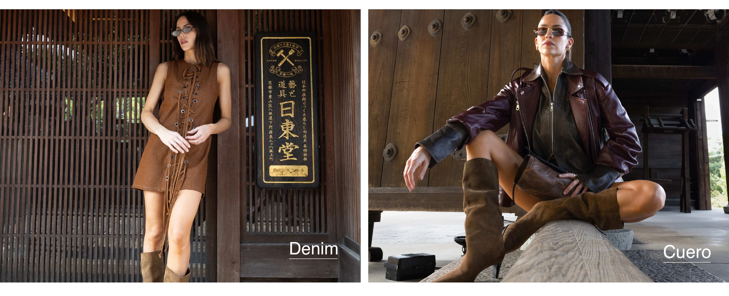
Video-led hero: A full-bleed video replaced the static banner. It sets the tone immediately and gives users a reason to scroll rather than leave. It works as an editorial opening, not a promotion.
Material-based category routing: Instead of dumping the full catalog on the homepage, users are guided through categories by material — leather, denim, linen, knitwear. This reduces decision fatigue and lets people self-select based on what they already want.
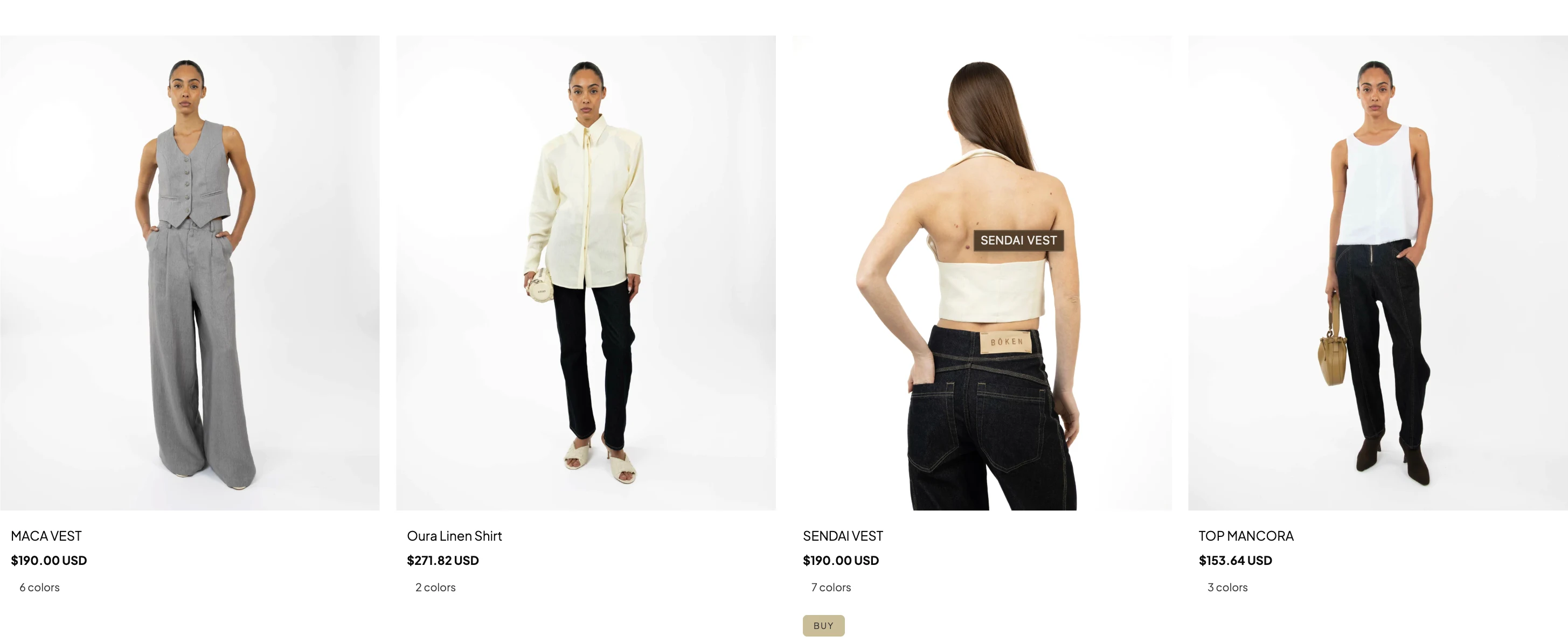
Shop page structure: The collection pages are built to let product photography do the work. Grid layout is clean and spacious, giving each piece enough room to read without competing with everything around it. Filtering by subcategory keeps users from scrolling through an undifferentiated feed and gets them closer to purchase-ready product faster.
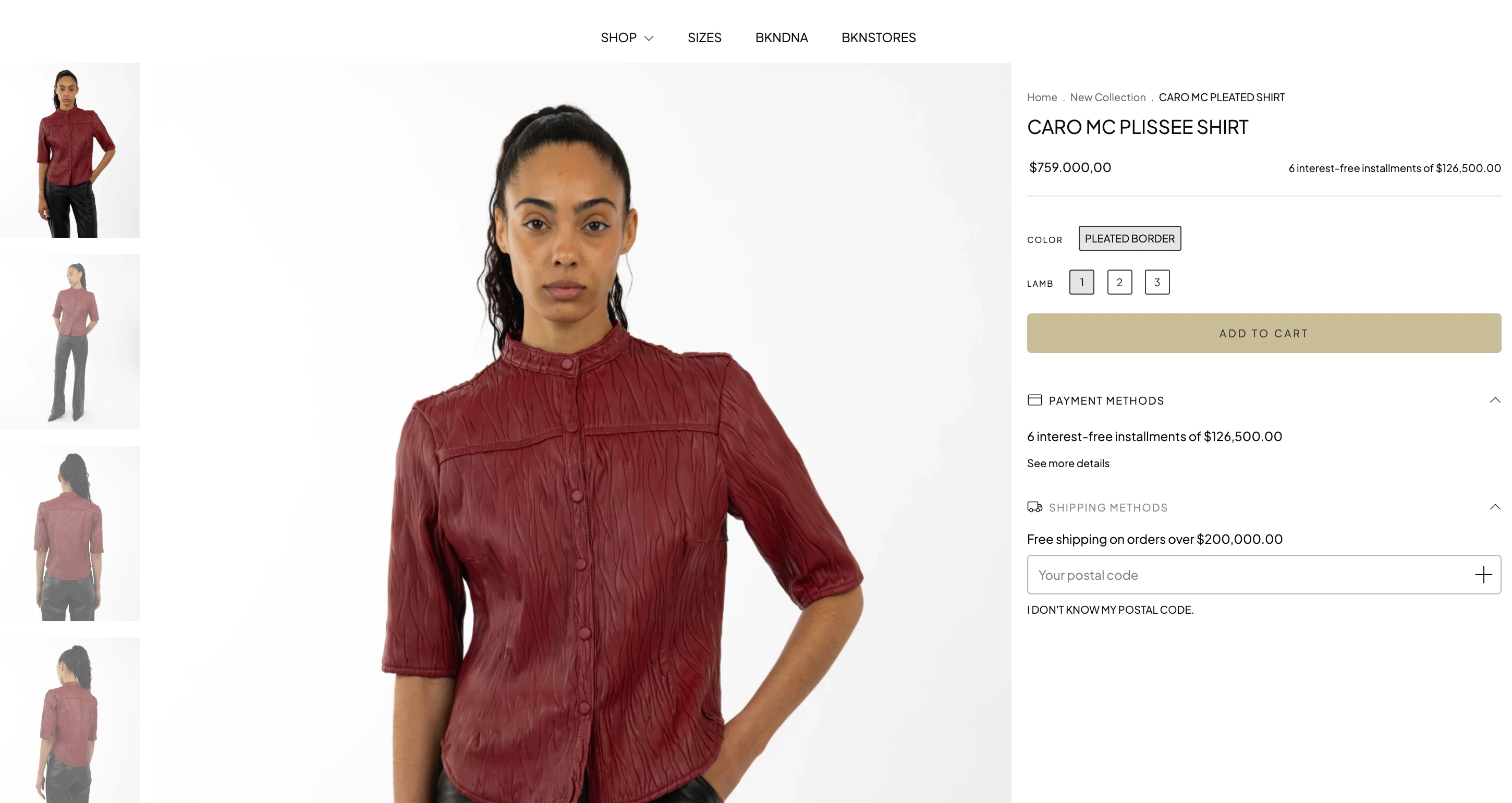
Product detail pages: The PDP was designed to close the sale, not just display information. Large-format imagery leads the page, with multiple shots showing the piece on-body, in detail, and in context. Sizing, material composition, and care instructions are accessible without cluttering the view. The free shipping threshold reinforces cart-building behavior at the point of highest intent.
Scroll rhythm: Banners and category blocks are paced intentionally. Each section earns attention before the next one loads in. The page breathes instead of stacking.
International buying flow: A country selector and currency handling are surfaced early. Free shipping thresholds show up persistently to incentivize cart value without feeling aggressive.
Execution
The final site works within Tiendanube's constraints while pushing past what the platform typically delivers.
Hero video integration that creates an editorial-grade first impression on a template-based platform
Custom animation work adding depth and pacing without hurting load performance
Shop grid designed for visual breathing room, letting product photography sell without layout noise
PDP structured around purchase confidence: large imagery, visible installment pricing, material and sizing detail surfaced without friction
Category and subcategory filtering that reduces browsing fatigue and moves users toward high-intent pages
Cart UX that surfaces installment options and free shipping thresholds right at the decision point
Mobile experience that holds the visual hierarchy and scroll pacing across screen sizes
Brand identity carried through every touchpoint without relying on default platform styling
Results
The rebuilt store brought Boken's online presence up to the level of their physical retail and editorial output.
Bounce rate dropped. The video hero gives people a reason to stay past the first fold.
Page views per session increased as users moved deeper into collection and product pages.
The shop layout and PDP structure reduced the distance between browsing and buying, leading to fewer exits on product pages and more add-to-cart actions from users who made it past the grid.
The brand reads as premium on a platform most shoppers associate with generic storefronts.
International purchase flow got simpler with early country selection and visible shipping logic.
The structure supports seasonal drops and new categories without needing to rebuild anything.
Like this project
Posted Mar 9, 2026
Premium fashion e-commerce build for Argentine leather brand. Video-led homepage, refined PDP, and conversion-focused UX.
Likes
0
Views
3