Boca de Agua Restaurant Website Design
Eneas Aldabe
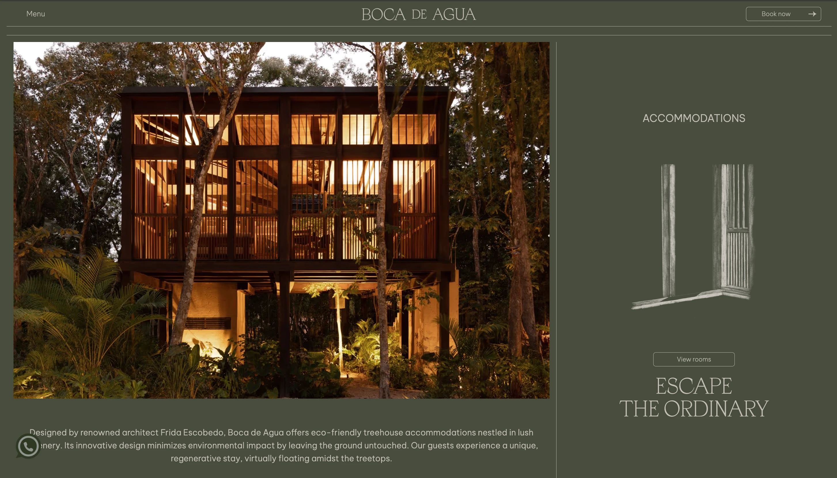
Boca de Agua
Industry: Hospitality
Platform: Webflow
Scope: UX/UI Design, Website Design, Webflow Development
Context
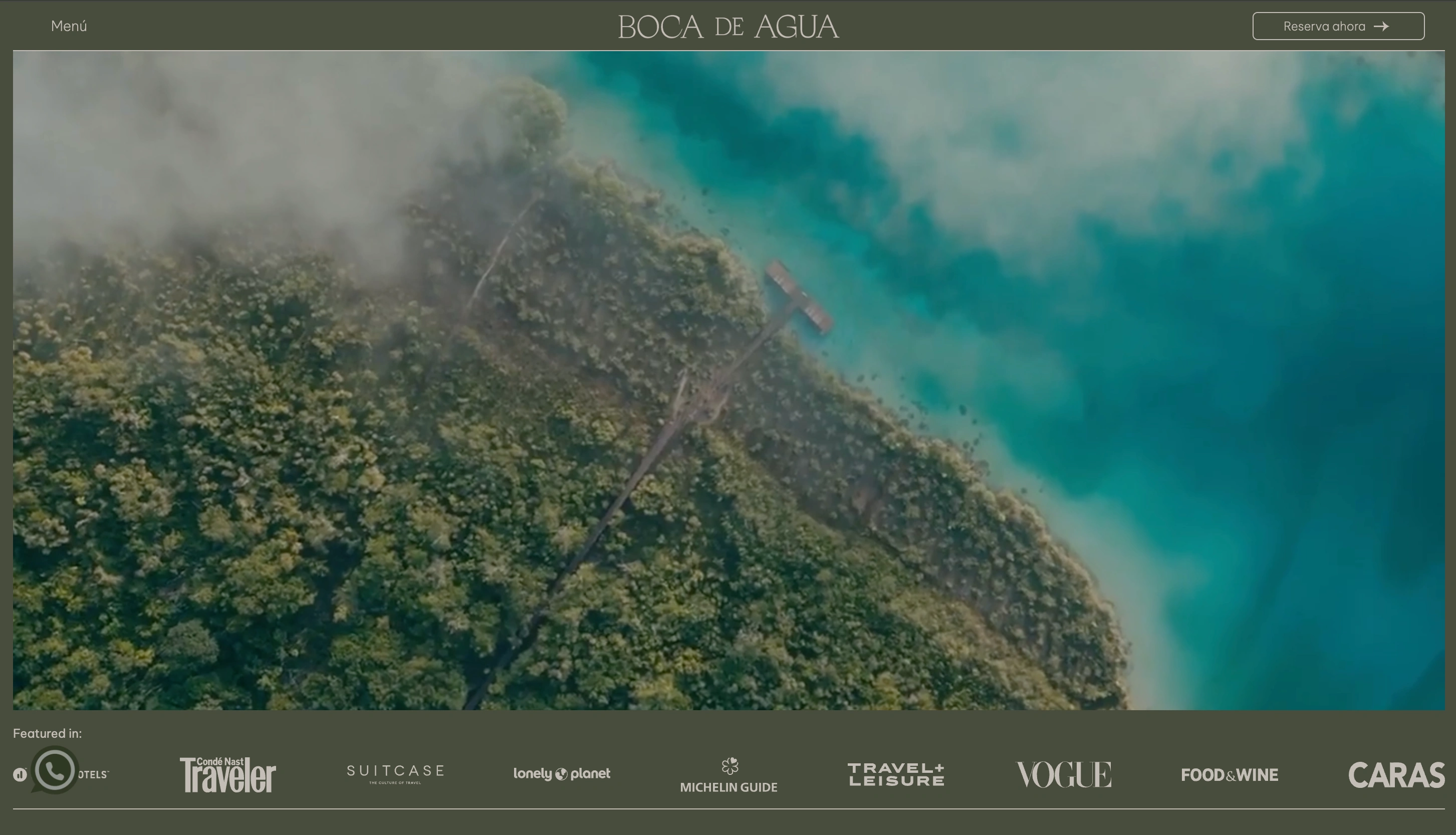
Boca de Agua is a restaurant and hospitality project where food, events, and atmosphere are closely tied to the overall experience. The website acts as the main entry point for guests, many of whom arrive with a clear goal: check the menu, understand what the place is about, or make a reservation.
The site needed to communicate this quickly, without relying on long explanations or promotional language, while still reflecting the character of the space.
Core Challenges
Communicating the restaurant’s identity without overexplaining
Making key information easy to find (menus, reservations, events)
Balancing strong visual content with usability
Supporting both browsing and quick decision-making
Ensuring the experience works consistently across devices
Approach
The work focused on clarity, pacing, and structure.
Clear entry points:
The homepage establishes what Boca de Agua is and surfaces primary actions early, so users don’t need to search for menus or reservation options.
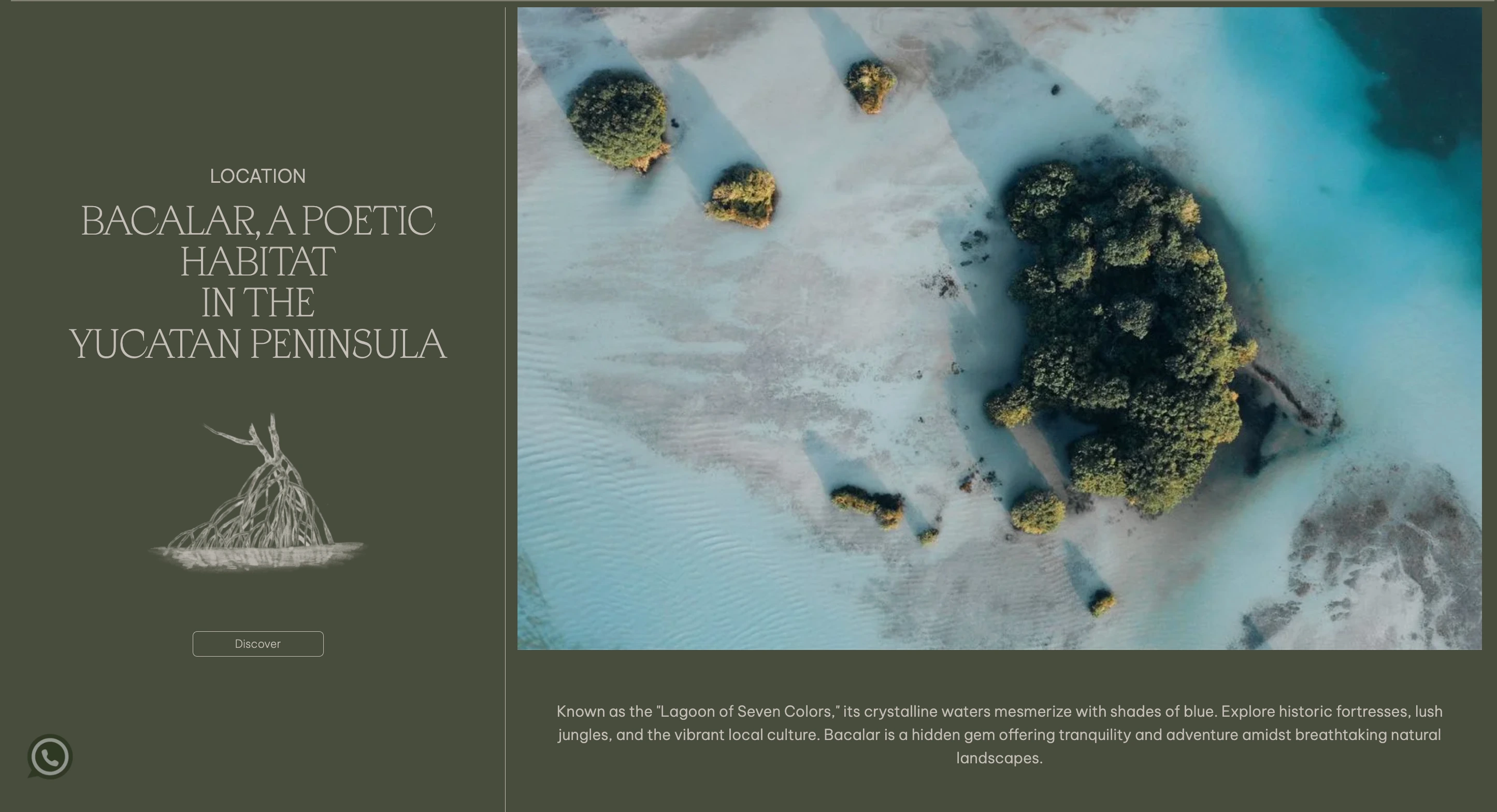
Simple content structure:
Menus, events, and background information are grouped into clear sections, allowing users to scan and move through the site without friction.
Measured use of motion:
Transitions and scroll behavior are used sparingly to guide attention and introduce content gradually, without slowing down navigation.
Decision-aware layout:
Reservation and contact actions appear where users naturally expect them, rather than being repeated or forced throughout the page.
Execution
The final Webflow site prioritizes usability while allowing visual content to lead.
A restrained visual system that supports photography and typography
Modular sections that allow for updates to menus and events
Straightforward navigation focused on common user needs
Responsive layouts that remain usable on desktop and mobile
Result
Visitors can now explore menus or events, and make reservations without confusion. The structure supports real user behavior and keeps the focus on the experience itself, rather than on decorative elements.
Like this project
Posted Jan 16, 2026
Hospitality website designed around clear structure and pacing, helping users explore menus, events, and reservations without friction.
Likes
0
Views
11