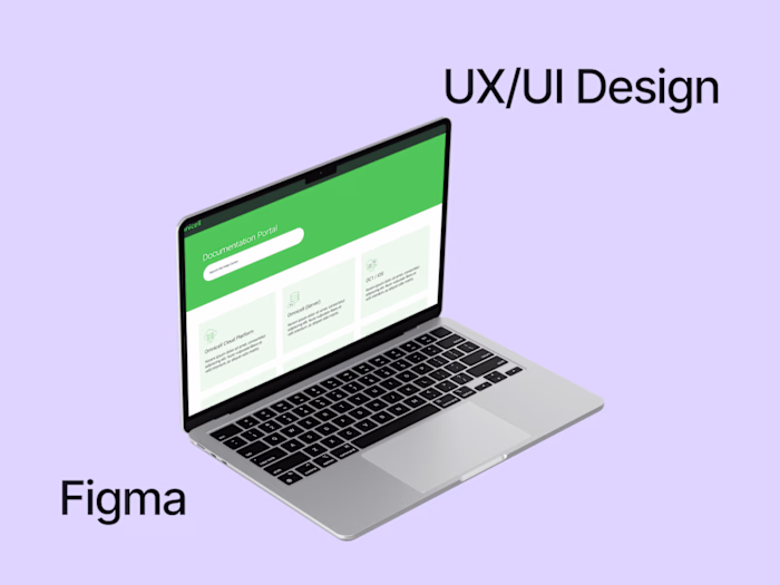
UX Design documentation portal
Vittoria Anastasia Valentini
Overview 🔎
Joséphine Remy and I have been involved in its realization. Alongside Chris DeTurk from Heretto, we have been using our Product Design capabilities in shaping the overall look and feel of Reltio documentary portal. through completely restructured content and redesigned information architecture that's aligned with their new enterprise taxonomy, we're improving the way customers can navigate the site to get the content they need.
Problem & Solution 🤝
When we were first brought onto the Reltio documentary portal project, the problem was clear: pieces of information were not listed in just one place and were not easy to navigate. The solution was to improve the way customers can navigate the site to get the information they need.
Requirements: Maintaining the overall look and feel of Reltio's main website.
• Using Brand Guidelines
• Implementing existing Icons and Content in a new structured appearance
• Facilitate the understanding of the documentation for both customers and new clients
Process 🛣
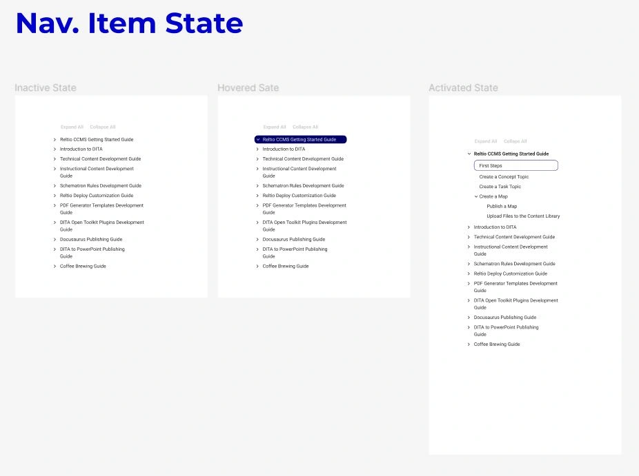
We began by examining the current site architecture and user flow. We discovered that there were several places on the page where people would be scanning for content, but it wasn't easy to find because they were buried within other content blocks or hidden behind links or tabs.
Afterward, we have been doing some research and came up with a few different ideas for how we might solve this problem. We decided that we would focus on content re-organization and new information architecture, we wanted to make sure that all of our content was organized according to the enterprise taxonomy, which would allow us to have a consistent way of categorizing everything on the site. We also wanted to make it easier for users to find what they needed by separating content into appropriate categories based on their needs.
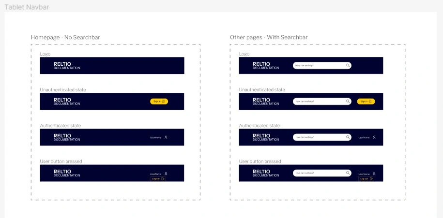
To do this, we created a new structure for the navigation that allowed users to easily sort through all of the content while still being able to locate specific pieces of information quickly when needed. We also made sure that users could easily access images and other multimedia files stored within article pages.
We also created a new template design that allowed us to take advantage of the visual hierarchy so users could easily scan what was most important on each page without having to dig around for it. Then we rebuilt all existing content blocks using new designs that were consistent across all pages so everything looked uniform instead of disjointed.
Results 🎁
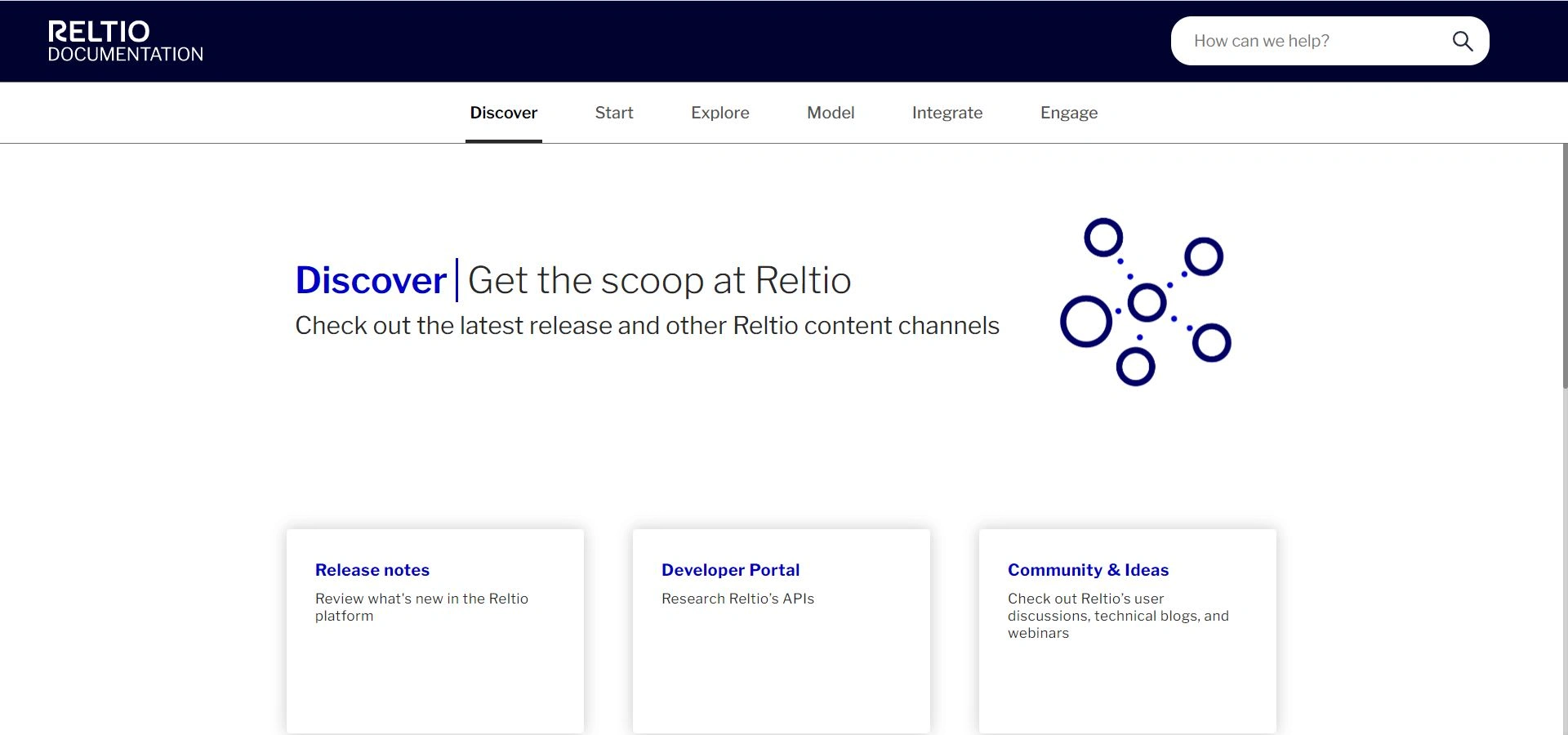
Take a look at the final result by surfing through Reltio's portal: https://docs.reltio.com/en
Fantastic job. Super clean experience. The content is laid out really nicely. 🗣- Patrick Bosek
Takeaways 📣
Our newly designed docu portal page increased the conversion rate by 20%. Our admin team also reported a marked drop in the number of inquiries about how the platform works, which demonstrates an increase in ease of understanding.
Main challenge and lesson learnt:
This was the first time I led a project. Although I was nervous at the beginning, I soon learnt to trust my team-mates. I also learnt that active communication and short daily stand-up meetings were key to ensuring the project’s success.
Like this project
Posted Oct 18, 2022
Through completely restructured content and redesigned information architecture, I've been improving the way customers can navigate the site to get the info