Comprehensive Healthcare Analytics and Patient Management
Muhammad Tayyab
Focal Point Dashboard: Comprehensive Healthcare Analytics and Patient Management
Description:
As a UX/UI designer, I approached the design of this healthcare dashboard with the goal of creating an intuitive and data-driven interface that empowers medical professionals to manage patient care, track health trends, and make informed decisions. The design focuses on clarity, accessibility, and actionable insights to enhance efficiency in healthcare management.
User Research :
The target audience includes doctors, nurses, administrators, and public health officials who need quick access to critical health data, patient statistics, and global health trends.
Key insights revealed the need for a clean, organized layout, real-time updates, and interactive visualizations to support decision-making.
Information Architecture :
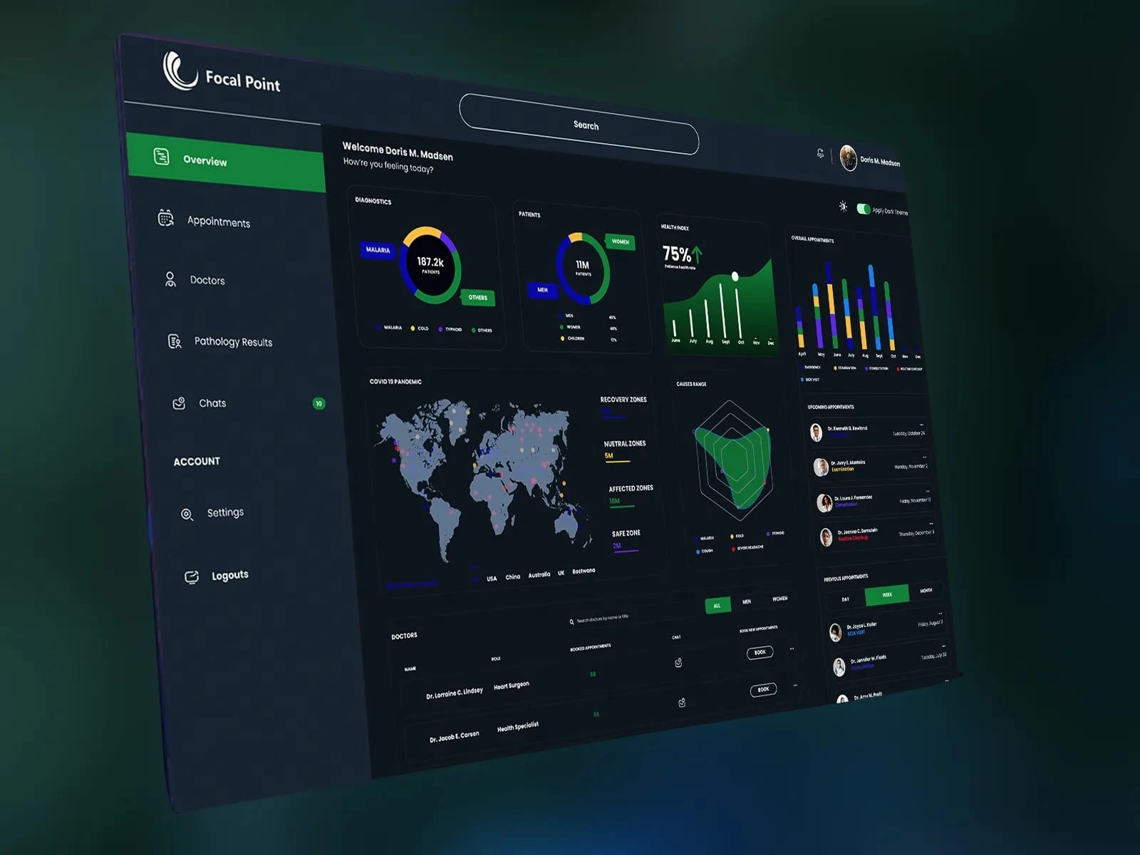
The dashboard is divided into clear sections to provide a structured workflow:
Sidebar Navigation : Includes categories like Overview, Appointments, Doctors, Pathology Results, Chats, Account, and Logout, ensuring easy access to different functionalities.
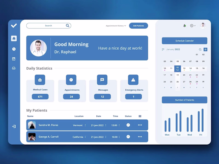
Welcome Section : Greets users personally ("Welcome Doris M. Madsen") and asks how they're feeling today, adding a human touch.
Key Metrics : Displays critical health indicators such as diagnostics (e.g., malaria cases), patient demographics, and health index trends.
Global Health Insights : Features a world map highlighting COVID-19 pandemic zones (recovery, neutral, affected, safe) to provide a global perspective.
Appointments and Scheduling : Shows upcoming and previous appointments with detailed information about doctors and booking options.
Interactive Charts : Includes bar graphs and line charts to visualize overall appointment trends and causes of illness.
Visual Design :
Color Palette : Uses a dark mode theme with shades of green and blue to create a professional and calming atmosphere. Bright accents (like green for positive metrics and red for alerts) ensure high contrast and readability.
Typography : Chose clean, readable fonts for clarity and consistency across all elements.
Icons and Imagery : Included simple, recognizable icons for each section (e.g., calendar for appointments, globe for global health insights) to enhance usability.
Personalization : Displayed the user's profile picture and name at the top to create a personalized experience.
Interactive Elements :
Search Bar : Positioned prominently at the top for quick filtering and searching within the system.
Dashboard Widgets : Designed interactive tiles for key metrics (e.g., diagnostics, patient demographics, health index) with hover effects and drill-down capabilities for deeper analysis.
Map Visualization : Implemented an interactive world map with clickable regions to explore COVID-19 pandemic zones and related data.
Appointment Management : Added buttons for booking new appointments and viewing details, ensuring seamless scheduling and follow-up.
Usability :
Navigation : Kept the sidebar navigation simple and intuitive, with icons for easy identification of different sections.
Accessibility : Ensured sufficient contrast between text and background for readability and included large, tappable buttons for better interaction on touch devices.
Responsiveness : Designed the layout to adapt well to different screen sizes, maintaining readability and functionality on both desktop and mobile devices.
Data Visualization :
Metrics Cards : Showed critical health data (e.g., 187.2k malaria patients, 11M total patients) in concise, visually appealing formats.
World Map : Combined geographical data with color-coded zones to provide a comprehensive view of global health trends.
Charts and Graphs : Used bar graphs and line charts to display appointment trends and cause-of-illness distributions, making complex data easy to understand.
Engagement :
Greeting Message : Personalized the interface with a friendly greeting ("Welcome Doris M. Madsen"), enhancing user satisfaction and engagement.
Real-Time Updates : Included live data feeds for metrics like patient counts, health indices, and appointment schedules to keep users informed.
Notifications : Highlighted important updates (e.g., new pathology results or urgent appointments) with clear visual cues to ensure timely action.
By focusing on clarity, interactivity, and data-driven insights, this design aims to provide healthcare professionals with a powerful tool for managing patient care, tracking health trends, and responding to global health challenges. The combination of vibrant visuals, intuitive navigation, and actionable data ensures a seamless and productive user experience.
Like this project
Posted Jun 8, 2025
Designed a data-driven healthcare dashboard for medical professionals.