Breakfast Delivery Website
Muhammad Tayyab
Organic Breakfast Delivery Website: Fresh, Convenient, and Nutritious
As a UX/UI designer, I approached the design of this organic breakfast delivery website with the goal of creating an inviting and user-friendly interface that highlights the convenience and quality of their products. The design focuses on clarity, visual appeal, and engagement to encourage visitors to shop for healthy, organic cereals.
User Research :
The target audience includes health-conscious individuals who value organic, nutritious food options and prefer convenient delivery services.
Key insights revealed the need for a clean, modern design with clear calls-to-action (CTAs), engaging visuals, and social proof elements like customer testimonials and ratings.
Information Architecture :
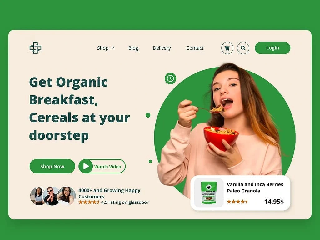
The landing page is divided into sections to guide users through the content:
Header : Includes navigation links (Shop, Blog, Delivery, Contact) and icons for cart, search, and login, ensuring easy access to different sections.
Hero Section : Features a bold headline ("Get Organic Breakfast, Cereals at your doorstep") with a visually appealing image of someone enjoying a bowl of cereal, immediately capturing attention.
Call-to-Action Buttons : Positioned prominently below the headline with "Shop Now" and "Watch Video" buttons to encourage immediate action.
Social Proof : Displays customer testimonials and a Glassdoor rating (4.5 stars) to build trust and credibility.
Product Highlight : Shows a featured product (Vanilla and Inca Berries Paleo Granola) with pricing and a star rating, providing a clear next step for potential buyers.
Visual Design :
Color Palette : Uses a fresh green color scheme to evoke feelings of health, freshness, and natural ingredients. Bright accents (like green buttons) ensure important elements stand out.
Typography : Chose clean, readable fonts for headings and body text to ensure clarity and professionalism.
Imagery : Included a high-quality photo of a person enjoying cereal, making the product relatable and appetizing.
Icons and Imagery : Added simple, recognizable icons (e.g., shopping cart, clock for delivery) to communicate key features quickly.
Interactive Elements :
Subscription Form : Although not visible in the image, the design likely includes a subscription form or newsletter sign-up option to capture leads.
Call-to-Action Buttons : Designed prominent buttons with clear labels ("Shop Now," "Watch Video") to guide users toward desired actions.
Social Proof : Displayed customer testimonials and ratings to build trust and encourage conversions.
Usability :
Navigation : Kept the header navigation concise and intuitive, allowing users to easily access different sections of the site.
Accessibility : Used sufficient contrast between text and background for readability, especially for CTAs and product details.
Responsiveness : Ensured the layout adapts well to different screen sizes, maintaining readability and functionality on both desktop and mobile devices.
Engagement :
Headline and Subheading : Used a compelling headline ("Get Organic Breakfast, Cereals at your doorstep") to grab attention and convey the core benefit.
Visual Metaphors : Leveraged a real-life image of someone enjoying cereal to make the product feel approachable and desirable.
Social Proof : Showcased customer testimonials and a high Glassdoor rating to build credibility and trust.
By focusing on simplicity, interactivity, and visual storytelling, this design aims to engage users, build trust, and encourage them to purchase organic breakfast cereals. The combination of vibrant visuals, clear messaging, and actionable elements ensures a seamless and persuasive user experience.
Like this project
Posted Jun 8, 2025
Fresh healthy cereals are delivered daily with easy browsing, clear pricing, and a smooth path to purchase for conscious consumers.