Healthcare Dashboard Interface
Muhammad Tayyab
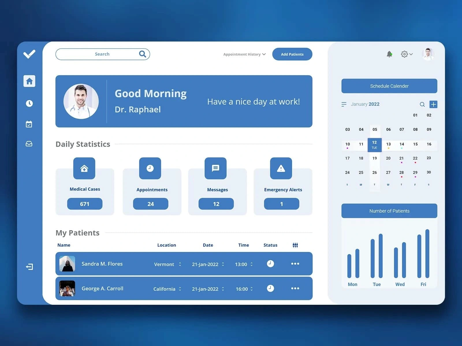
Medical Dashboard: Streamlined Healthcare Management Interface
Description:
As a UX/UI designer, I approached the design of this medical dashboard with the goal of creating an intuitive and efficient platform that empowers healthcare professionals to manage patient appointments, track daily statistics, and stay organized. Here’s how I designed it step by step:
User Research:
The target audience includes doctors, nurses, and administrative staff who need quick access to patient information, appointment schedules, and critical alerts.
Key insights revealed the need for a personalized experience, clear visual indicators, and easy navigation to essential features.
Information Architecture:
The dashboard is divided into clear sections to provide a structured workflow:
Header: Includes a greeting message ("Good Morning, Dr. Raphael") and a search bar for quick access to patient records or other data.
Daily Statistics: Displays key metrics like Medical Cases, Appointments, Messages, and Emergency Alerts in a concise, visually appealing format.
My Patients: Shows a list of patients with details such as name, location, date, time, and status, ensuring easy tracking of appointments.
Schedule Calendar: On the right side, provides a monthly calendar view with highlighted dates for upcoming appointments and patient counts.
Visual Design:
Color Palette: Used a clean blue and white color scheme to create a professional and calming atmosphere, reflecting the medical context.
Typography: Chose clear, readable fonts for all text elements, ensuring important information (e.g., daily statistics, patient names) stands out.
Icons and Imagery: Included simple, recognizable icons for each section (e.g., house for Medical Cases, clock for Appointments) to enhance usability and reduce cognitive load.
Personalization: Displayed the user's profile picture and name at the top to create a personalized experience.
Interactive Elements:
Search Bar: Positioned prominently at the top for quick filtering and searching within the system.
Daily Statistics Cards: Designed as interactive tiles with hover effects and clear labels to provide quick insights into critical metrics.
Patient List: Made the patient table sortable and filterable, allowing users to easily manage and prioritize appointments.
Calendar View: Implemented a responsive calendar with clickable dates and event indicators, enabling seamless scheduling and rescheduling.
Usability:
Navigation: Kept the sidebar navigation simple and intuitive, with icons for Home, Search, Schedule, and Settings, ensuring easy access to different sections.
Accessibility: Ensured sufficient contrast between text and background for readability and included large, tappable buttons for better interaction on touch devices.
Responsiveness: Designed the layout to adapt well to different screen sizes, maintaining readability and functionality on both desktop and mobile devices.
Data Visualization:
Statistics Tiles: Showed daily metrics (e.g., 671 Medical Cases, 24 Appointments) in a grid format, making it easy for users to scan and understand key data points.
Calendar Integration: Combined a monthly calendar with a weekly bar chart to provide a comprehensive view of patient volume trends over time.
Patient Details: Included avatars and brief summaries for each patient, ensuring users can quickly identify and manage their appointments.
Engagement:
Greeting Message: Personalized the interface with a friendly greeting ("Good Morning, Dr. Raphael"), enhancing user satisfaction and engagement.
Emergency Alerts: Highlighted critical notifications (e.g., Emergency Alerts) with distinct colors and icons to ensure they are noticed immediately.
Notifications: Added a bell icon in the top-right corner for real-time updates, keeping users informed about new messages, appointments, or alerts.
By focusing on clarity, personalization, and efficiency, this design aims to provide healthcare professionals with a streamlined and user-friendly platform for managing their daily tasks. The combination of vibrant visuals, intuitive navigation, and actionable data ensures a seamless and productive experience.
Like this project
Posted Jun 8, 2025
A clean, intuitive dashboard for managing patient appointments, alerts, and daily medical stats with ease and efficiency.
Likes
0
Views
6