Yoga Ecommerce
Designing a local shop’s website in order to boost its online visibility.
Redesigning an existing business

Challenge
Local E-Commerce was the second-week project at Ironhack, which involved re-designing a local shop’s website in order to boost its online visibility. As a result, they may be able to compete more effectively in the market. We had four days to study and analyze the problem, design answers, and present goods in the form of low- and mid-fi prototypes for this assignment.
Alongside my Team Mates, Bastie & Medha, we decided on Green Yoga, a local Yoga Studio with locations in Berlin Prenzlauerberg & Berlin Kreuzberg. Fortunately, we were able to speak with Nora, the manager, who shared her aims and thoughts.
Process
The research was two-pronged.
On one hand, we used a survey and personal interviews to identify the pain points of the users (people who work out/ practice Yoga/ and specifically practice yoga at Green Yoga Berlin).
On the other hand, we had a stakeholder interview to understand their requirements, limitations, and priorities. The goal was to tackle the problem that lay at the intersection of the user and the stakeholder needs.
Business Analysis for Green Yoga
As a member of the product team, my duty is to figure out what measures a firm should take to enhance profit and achieve its goals. We can ensure that a firm achieves these benefits by using business analysis effectively, thereby changing the way they do business.
How we maximized the value delivery:
Business Objectives:
- Boosting earnings (number of users or revenue per user)
- Cost-cutting (create or optimize processes)
- To achieve their business goals (differentiate, expand, etc)
Business Analysis
- Spotting new possibilities
- Requirements documentation
- Cost-cutting
- Organizational modeling

Problem Statement:
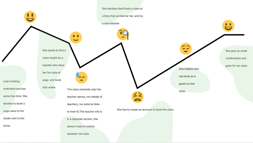
We have observed that the target audience is not able to easily find information about teachers leading them to not book the same. Our goal is to ensure that the user always finds updated information about teachers and ensure that they can easily book it.
Hypothesis
We believe that ensuring that information about teachers is easily available to the user, along with an easy way to book, will achieve our goal of higher bookings. We will know we are right with a 35% increase in the no. of booked classes via the website.
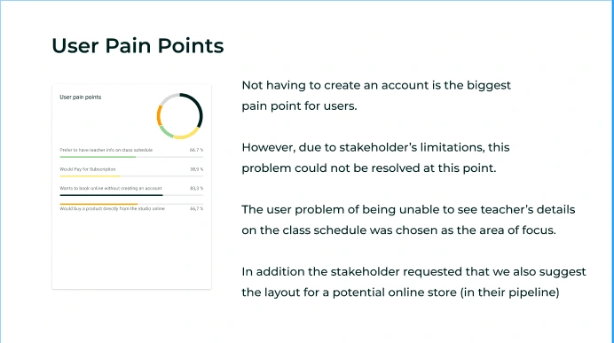
User Pain Points
Not having to create an account is the biggest pain point for users.
However, due to stakeholders’ limitations, this problem could not be resolved at this point. The user's problem of being unable to see the teacher’s details
on the class schedule was chosen as the area of focus.
In addition, the stakeholder requested that we also suggest the layout for a potential online store (in their pipeline).
Action
Information Architecture
Information architecture is concerned with the meaningful arrangement, structure, and labeling of material. The content of a platform is referred to as ontology in design.
The grouping, naming, and categorization of material on a platform is referred to as taxonomy in design. In design, choreography refers to the rules of interaction that govern how the user interacts with the material.
Information architects create four different types of artifacts. Dan Brown devised a set of guidelines for creating effective information architecture.
Site Map
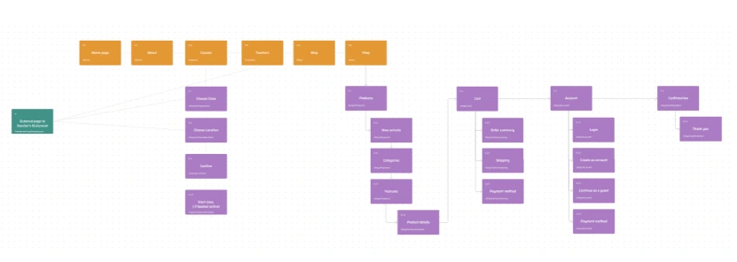
Sitemaps are used to illustrate relationships between pages on a platform or website, as we’ve discovered. After establishing all of the project’s Information Architecture, a Sitemap is created during the Information Architecture design stage.
A website’s information architecture is made up of many deliverables and tools: Sitemaps, Flows, and Navigation, for example, the Information Architecture informs sitemaps. The sitemap identifies all of the pages and displays their hierarchy, structure, and, in many cases, page goals and content/functionality.
Multiple pathways to a page can be provided by navigation systems (for example, links that guide people to the homepage can live in the footer or the header) Sitemaps can aid in the definition of each web page’s objective and purpose.
To create sitemaps, we must first determine all of the content that will be included, and then arrange that content into pages. These pages will be organized to allow for easy primary and secondary navigation. Finally, repeat the process.
User Flow
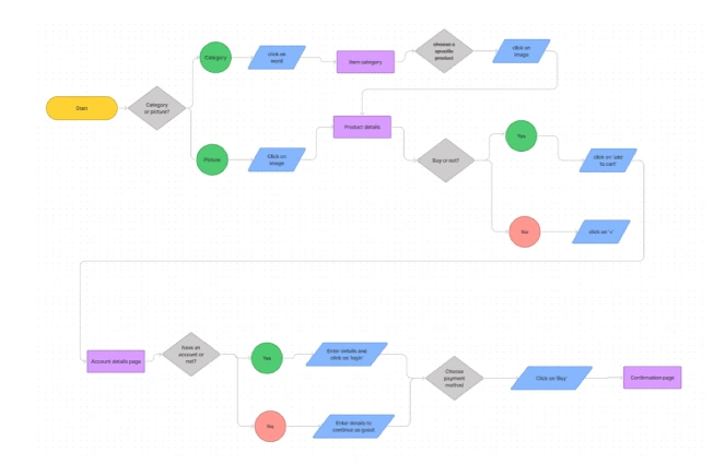
The user flow depicts the path(s) used by a user to perform a job.
Unlike the sitemap, pages are shown in the order in which they would be seen by a user. This diagram can also feature decision logic (either user decisions or system decisions)
Prototype
When we get an idea, the first thing that comes to mind is to sketch something. We are sometimes better at conveying concepts with drawings than we are with words. And it’s understandable: pictures convey information more effectively than words.
When we’re working on a concept, the first thing we do is do a series of drawings or sketches. These tools, however, are yet prototypes.
It’s fairly typical to mix up drawings and wireframes with prototypes. It’s also like believing that a blueprint and a display house are the same things. Because these are separate modes of communication, it is critical for us to recognize the distinction from the start.
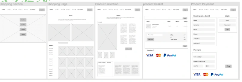
Although both wireframes and prototypes are representations of the final product, they communicate and serve distinct functions.
A prototype is a product’s primitive functional model. It isn’t an actual product, therefore it doesn’t need to be flawless.
When prototyping, we should start with a very basic version and iterate on it to improve the quality.
Prototypes are commonly used in the design and engineering professions to test and evaluate concepts prior to developing genuine items.
We should prototype as early as feasible and as frequently as possible.
We can use prototyping tools to make interactive prototypes from hand drawings.
We ideate two separate prototypes: 1) for the Teacher Lookup and 2) for the eCommerce, take a look at the following link for the HI-FI prototype:https://bit.ly/3jog11L
Take-Aways
This functionality being deployed on the website to check whether it works would be a fantastic next step. Is it truly effective? You never truly know until it’s put into action. Iterating the process to come up with new problem-solving options. Investigating alternative options for assisting the user in obtaining their goods more quickly.
Like this project
Posted Sep 7, 2022
Designing a local yoga studio shop’s website in order to boost its online visibility.
Likes
0
Views
68
Timeline
Mar 1, 2022 - Mar 31, 2025
Clients

Green Yoga


