City District Brand Identity & Logo Design | Zugló

Tamás Kurucz


Zugló
City District Brand Identity & Logo Design
Case study of a city district brand identity and logo design concept for Zugló, Budapest's 14th district – the city's "green heart" – balancing tradition, nature and vibrant urban life in a welcoming, contemporary visual system.
CLIENT: Zugló
YEAR: 2025
INDUSTRY: Public Sector; District Branding
AWARDS & RECOGNITION: Exhibited, 23rd Golden Drawing Pin Award and Exhibition - 2026, Hungary
Project Overview
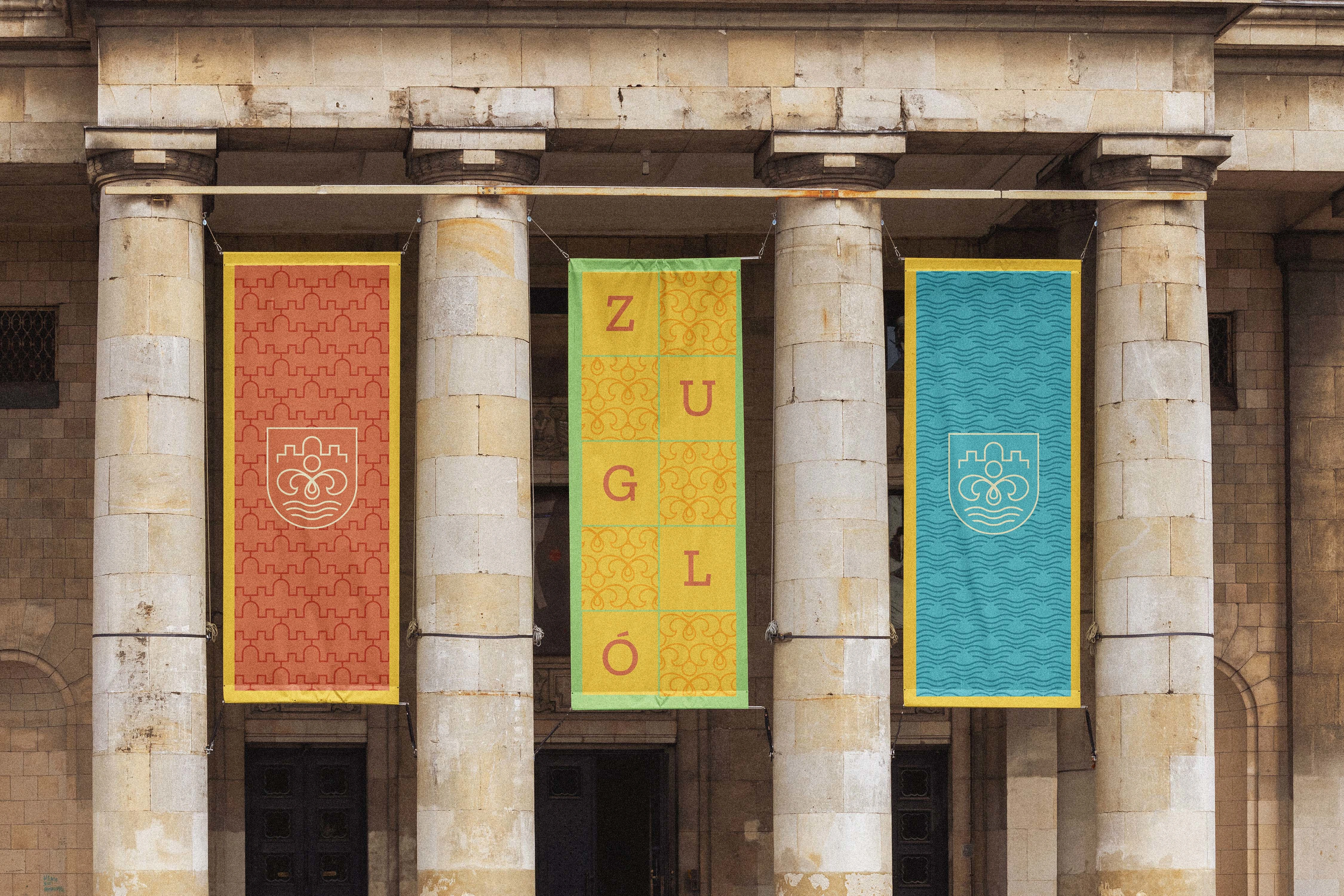
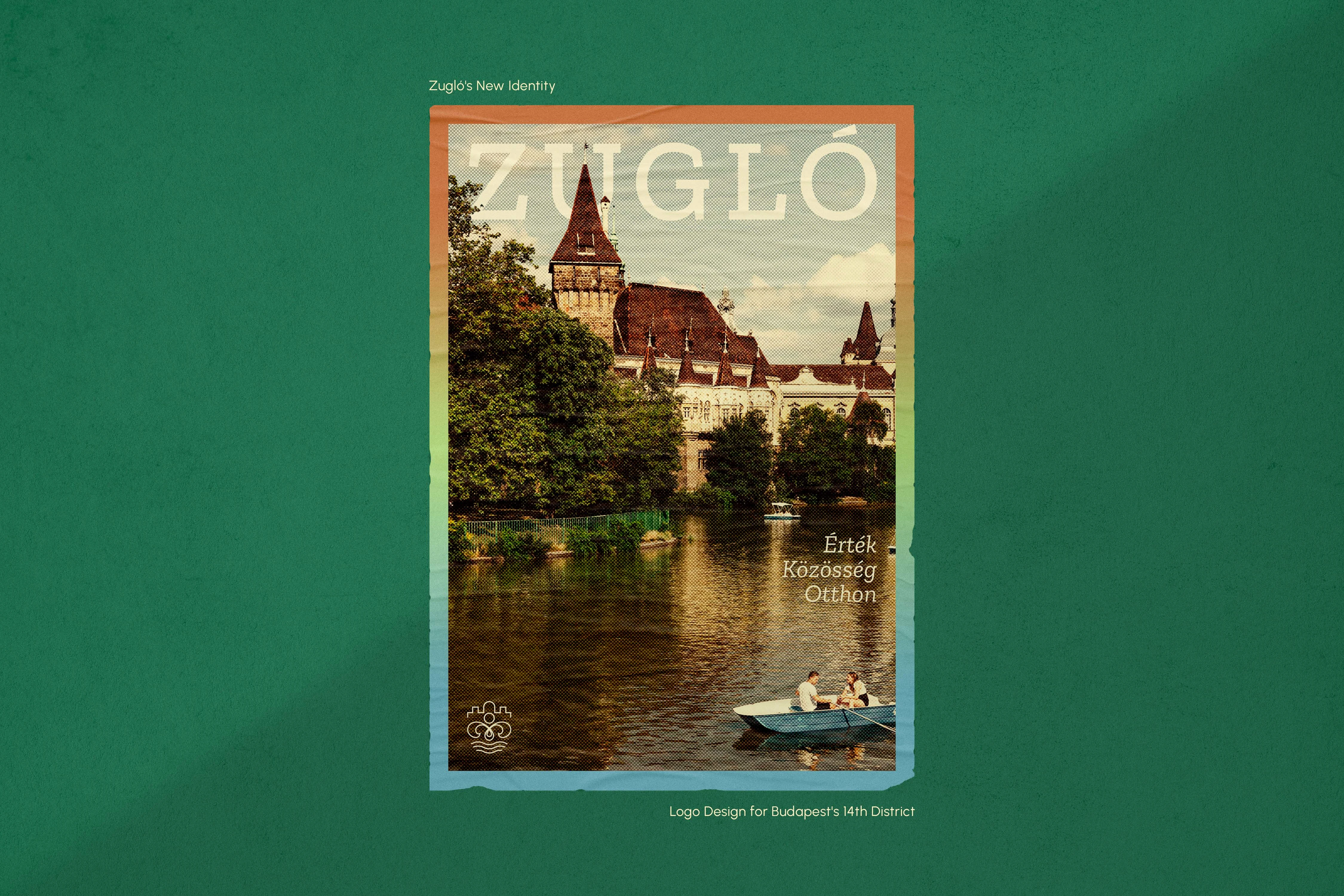
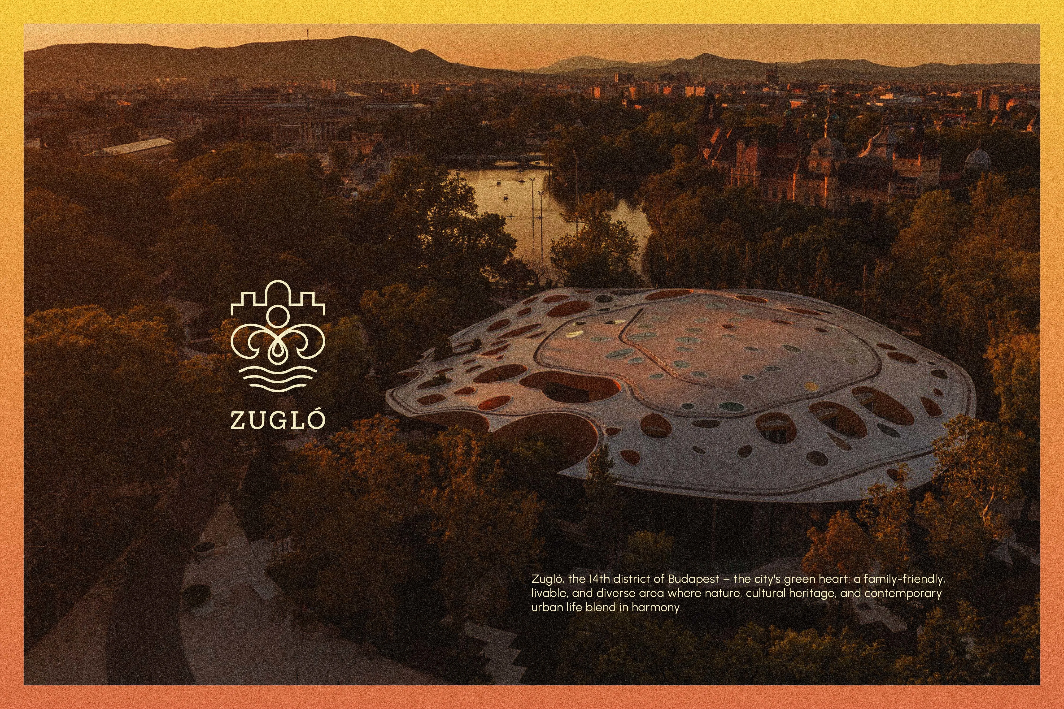
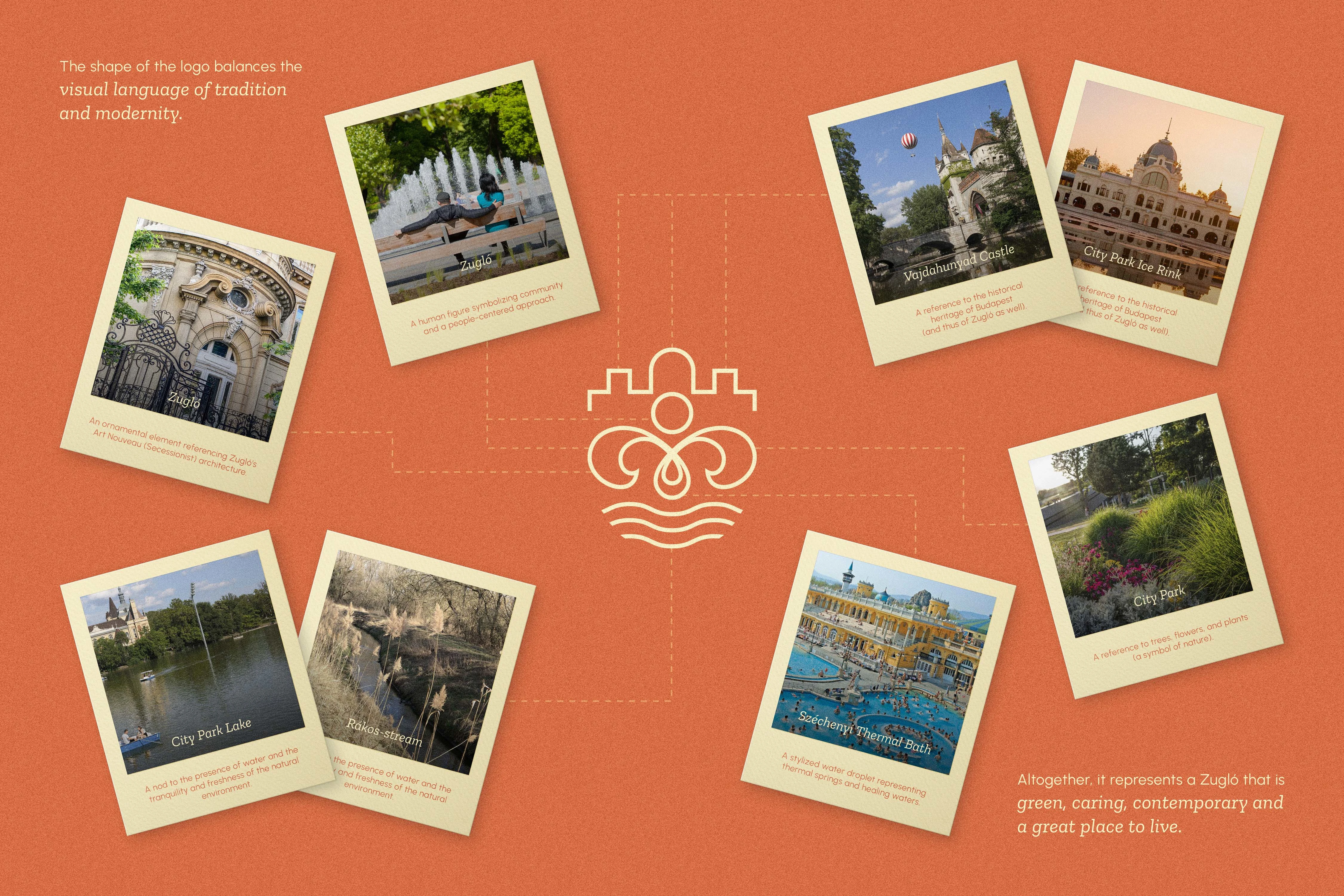
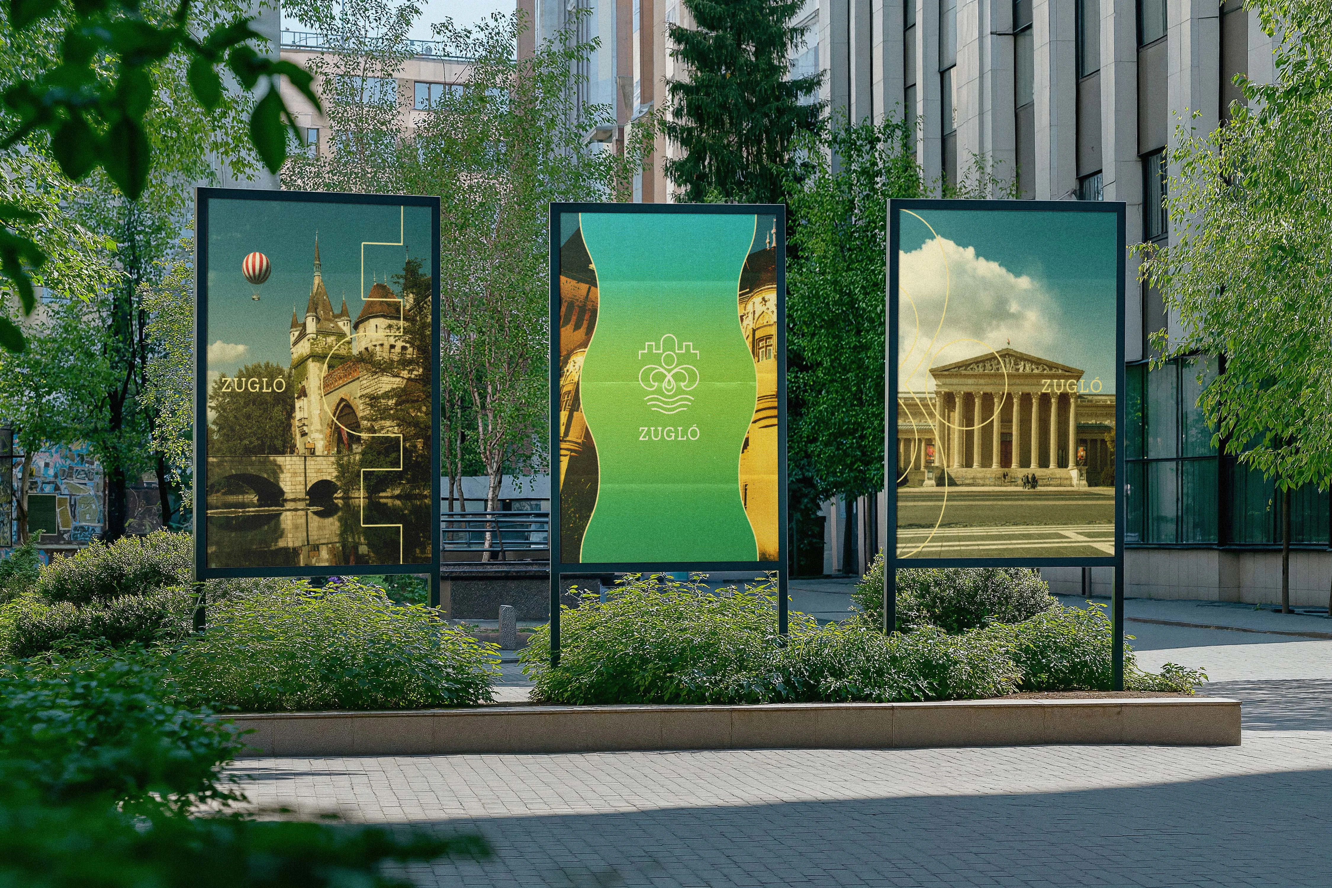
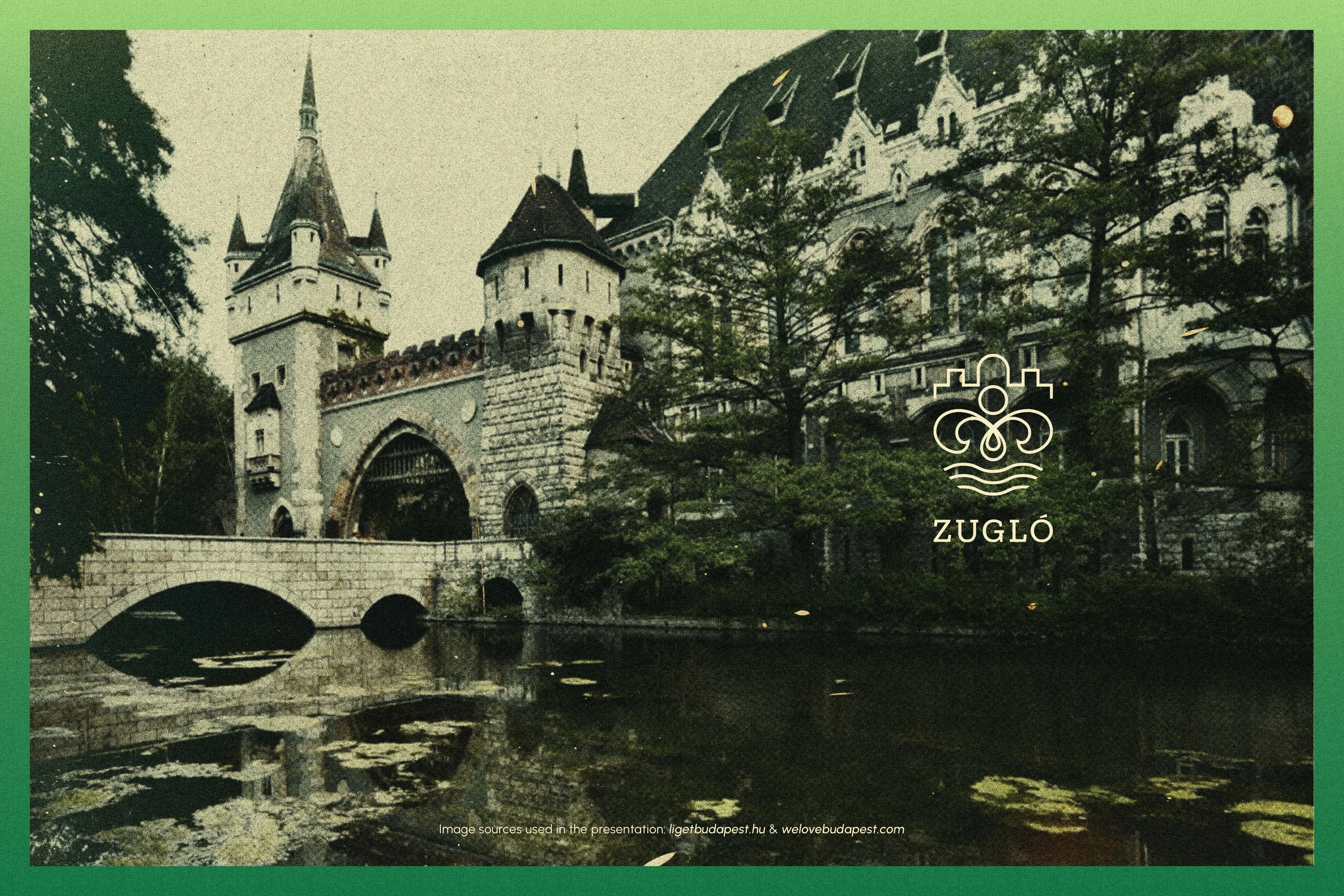
Designing a brand identity for Zugló, Budapest's 14th district, required capturing the true essence of the city's "green heart." The core challenge of this competition concept was to develop a visual language that expresses a family-friendly, livable, and diverse district where nature, cultural heritage, and contemporary urban life seamlessly coexist. Defined by a beautiful duality—architectural heritage on one side and lush green parks on the other—Zugló is held together by an active, inclusive, and eco-conscious local community. The resulting design provides a clear, flexible system that perfectly balances tradition and modernity, creating an approachable identity for both municipal and community-facing applications.
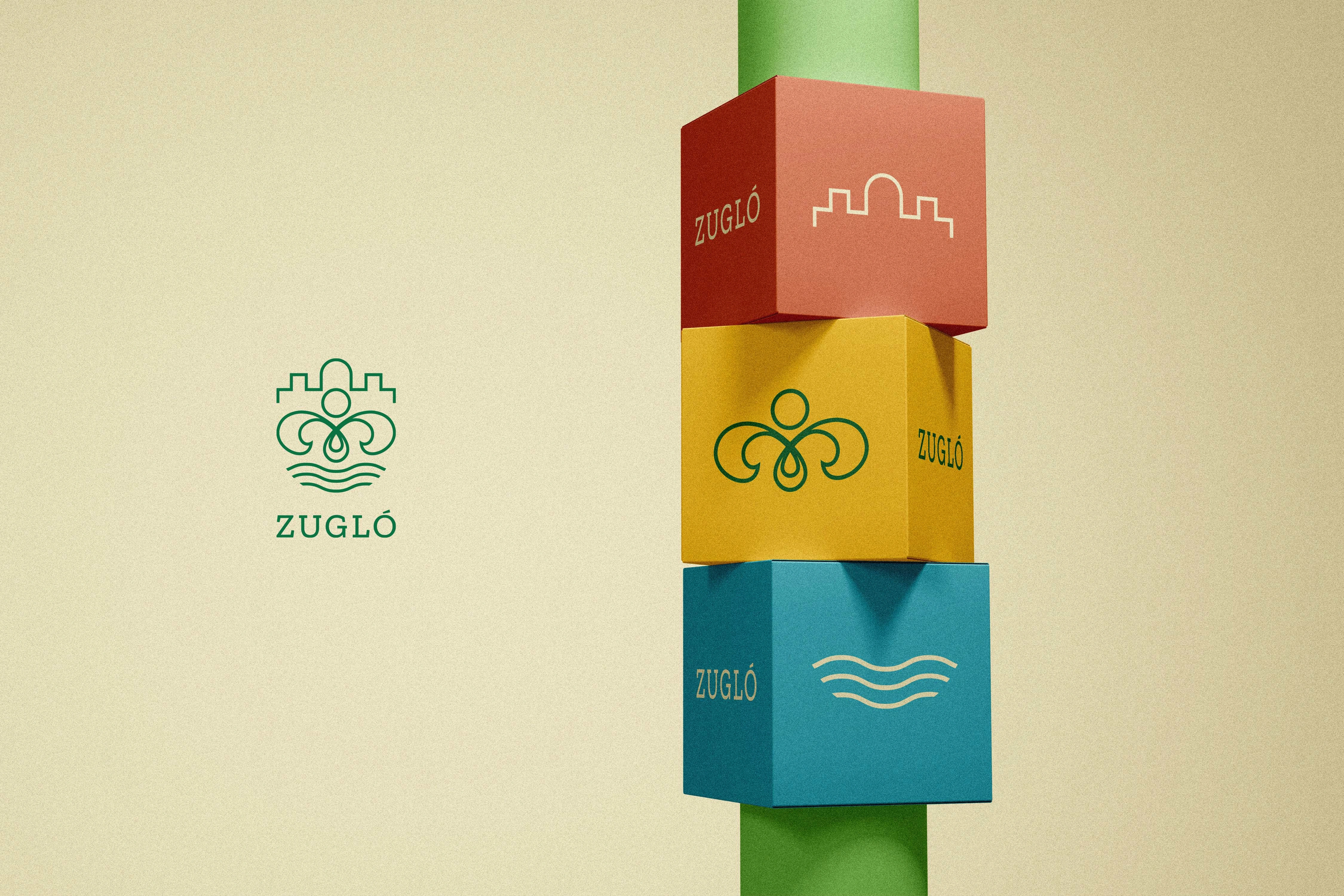
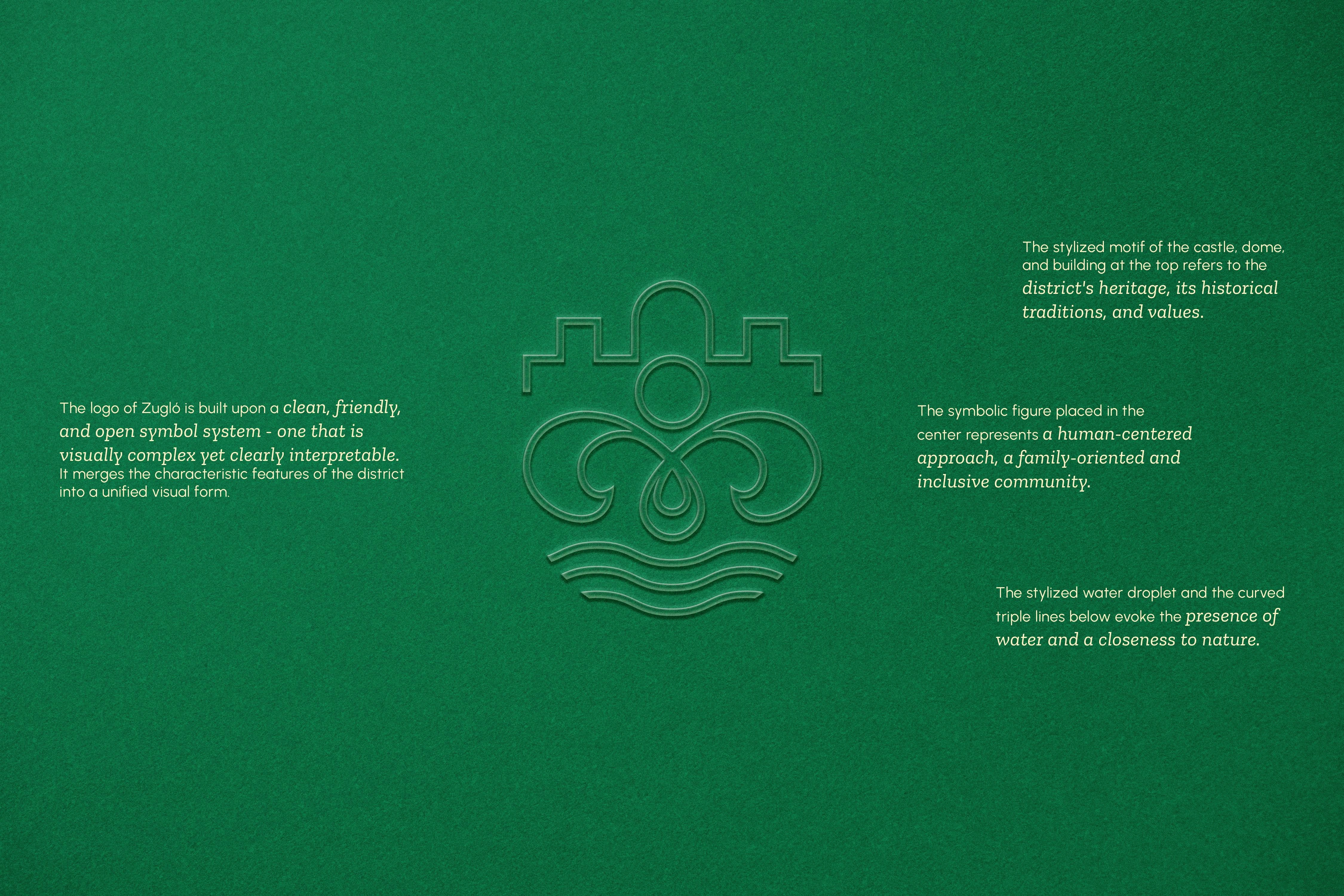
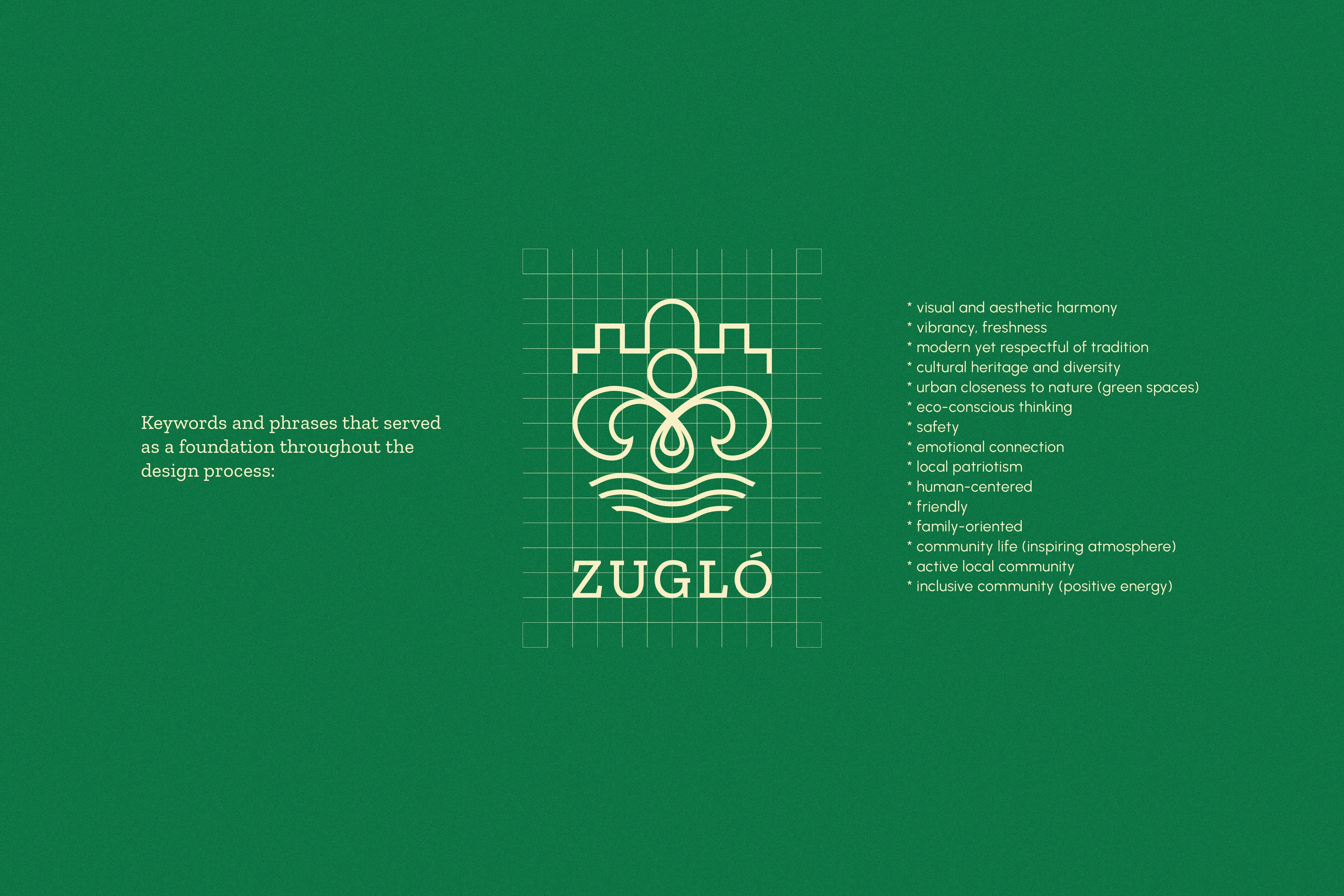
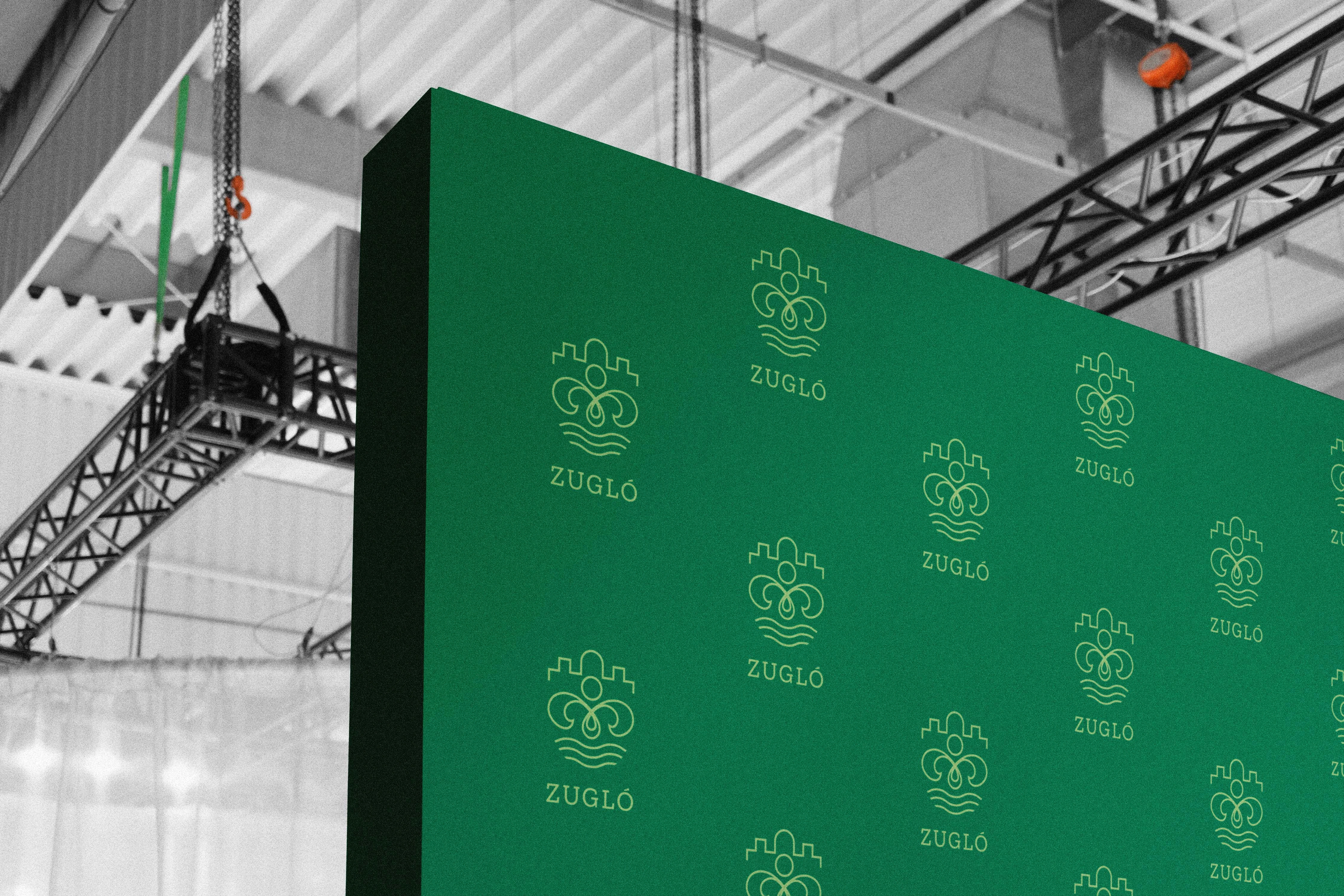
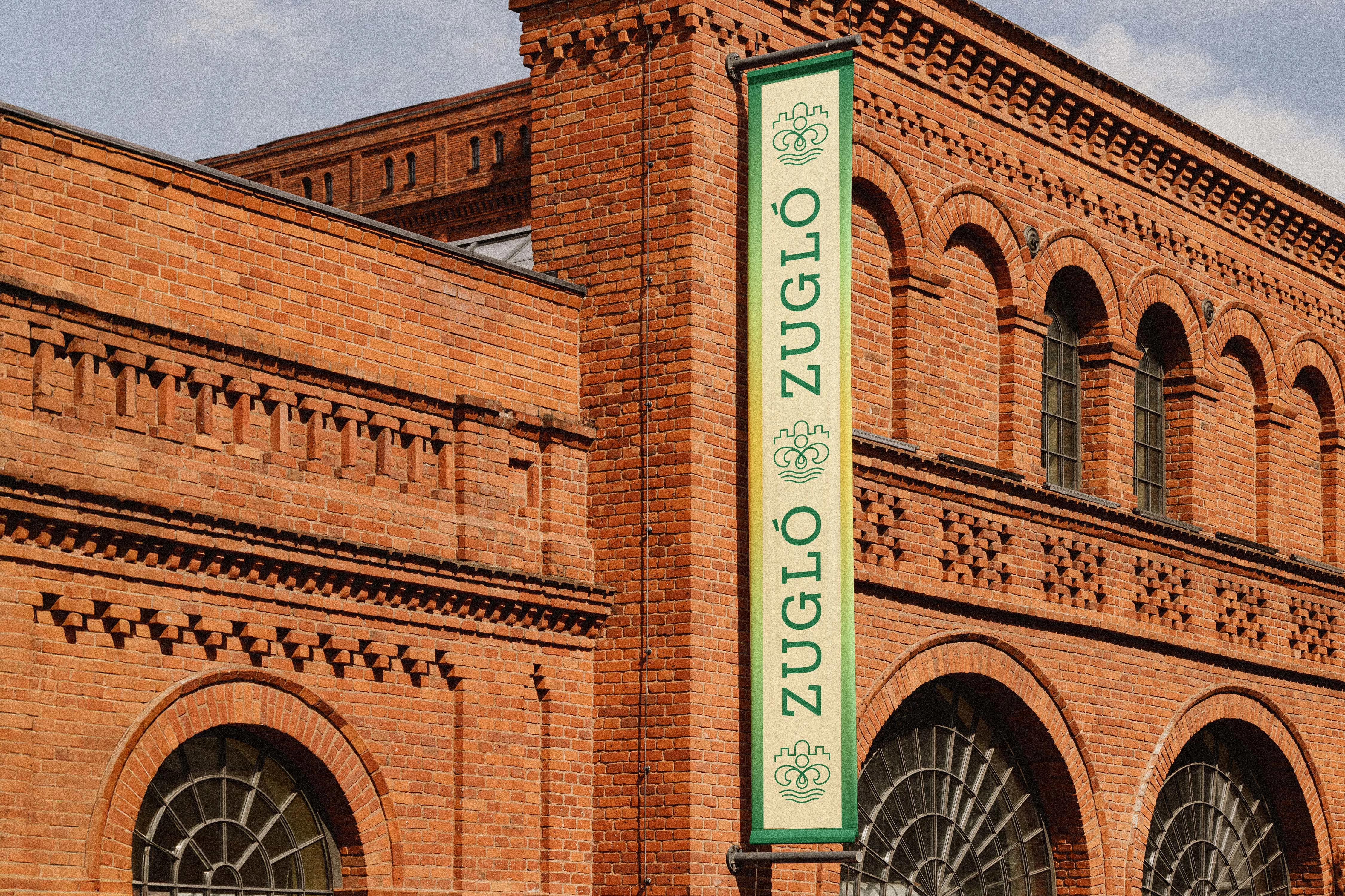
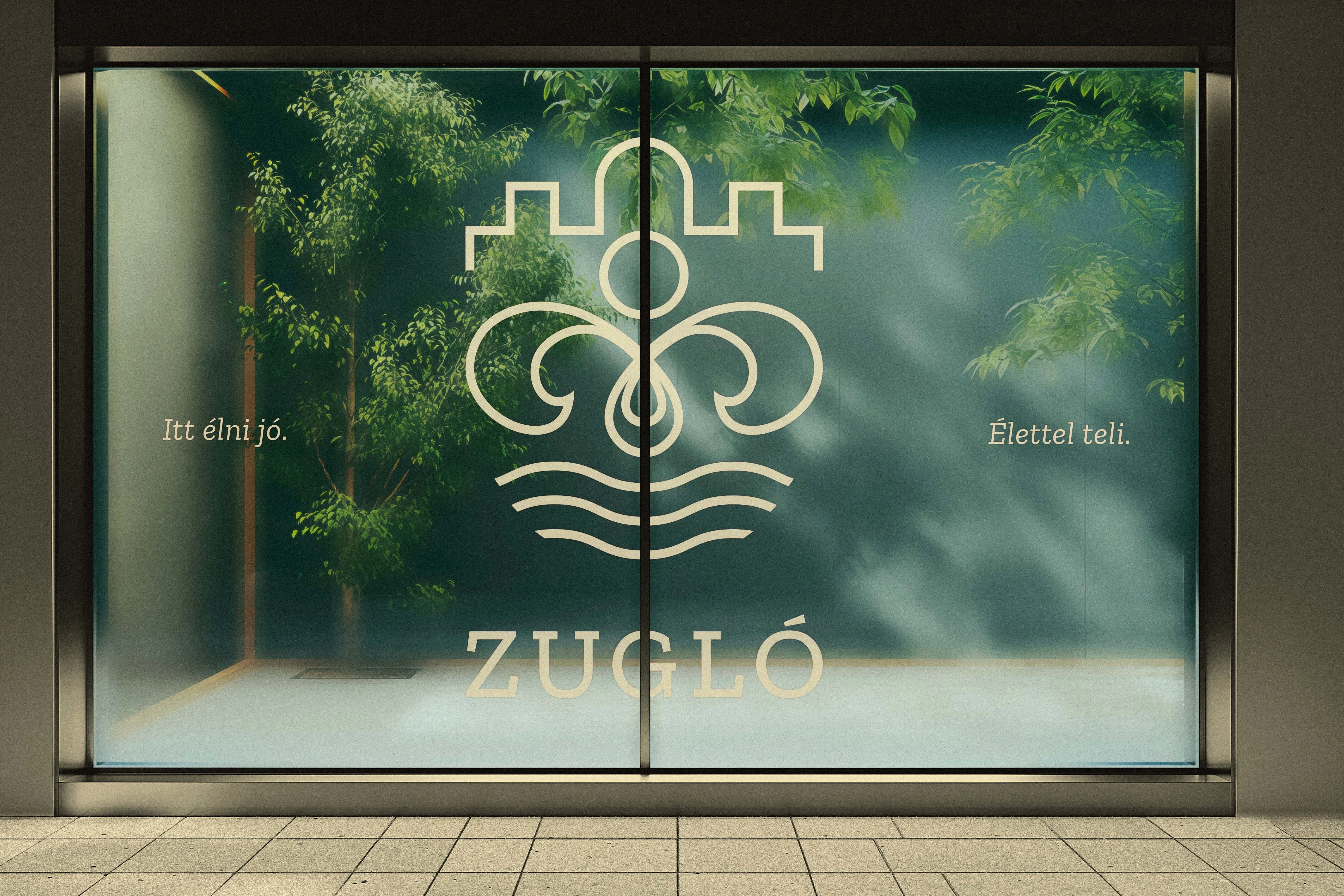
The centerpiece of the identity is a clean, open logo that merges the district's key elements into a single coherent mark, structured thoughtfully from top to bottom. At the apex, stylized motifs of a castle, dome, and building pay homage to Zugló's architectural textures and historical traditions. In the center, a symbolic human figure represents the district's people-first mindset, highlighting an inclusive, welcoming, and family-oriented community. Finally, the base introduces a stylized water droplet and three curved lines, evoking the everyday presence of lakes, spas, and green parks. This vertical composition ensures the mark is friendly and human-centered, yet precise and highly readable in everyday use.
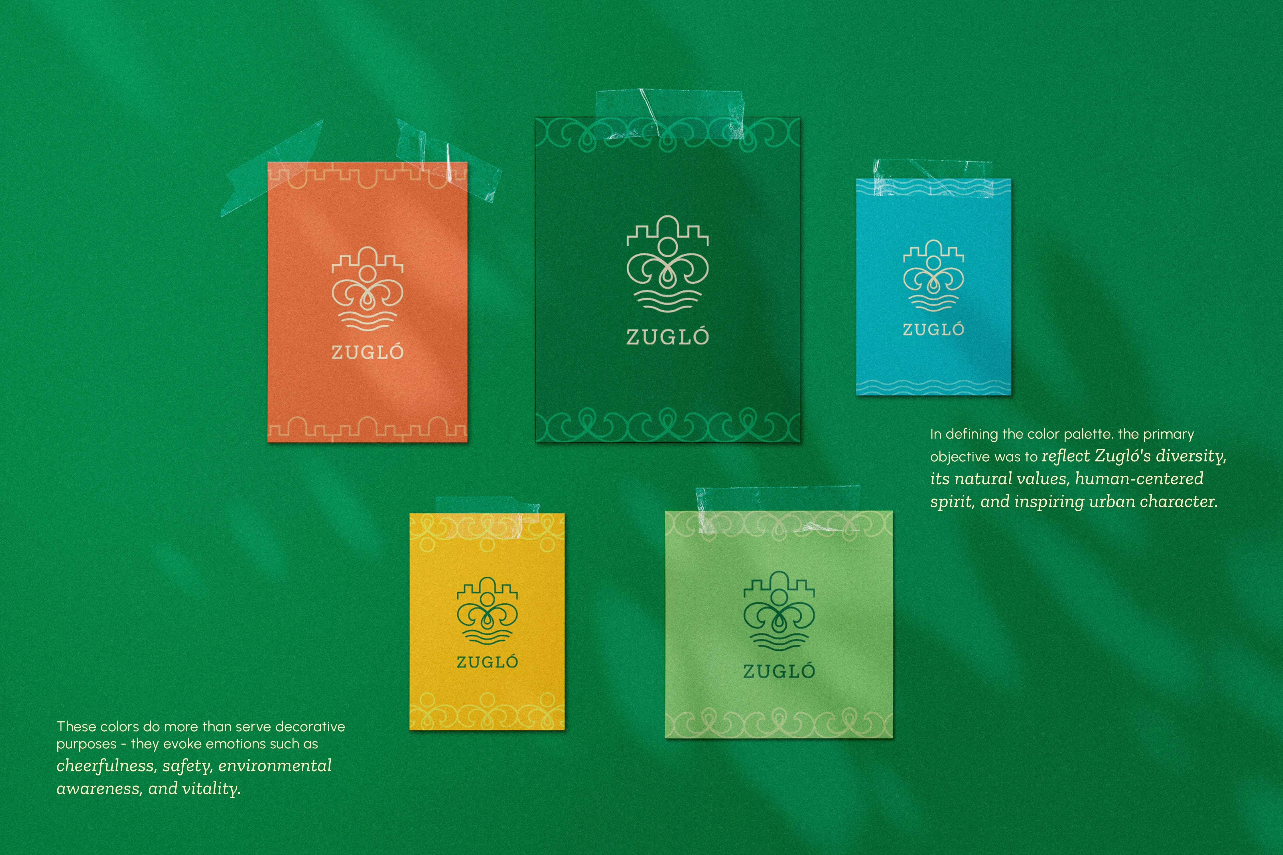
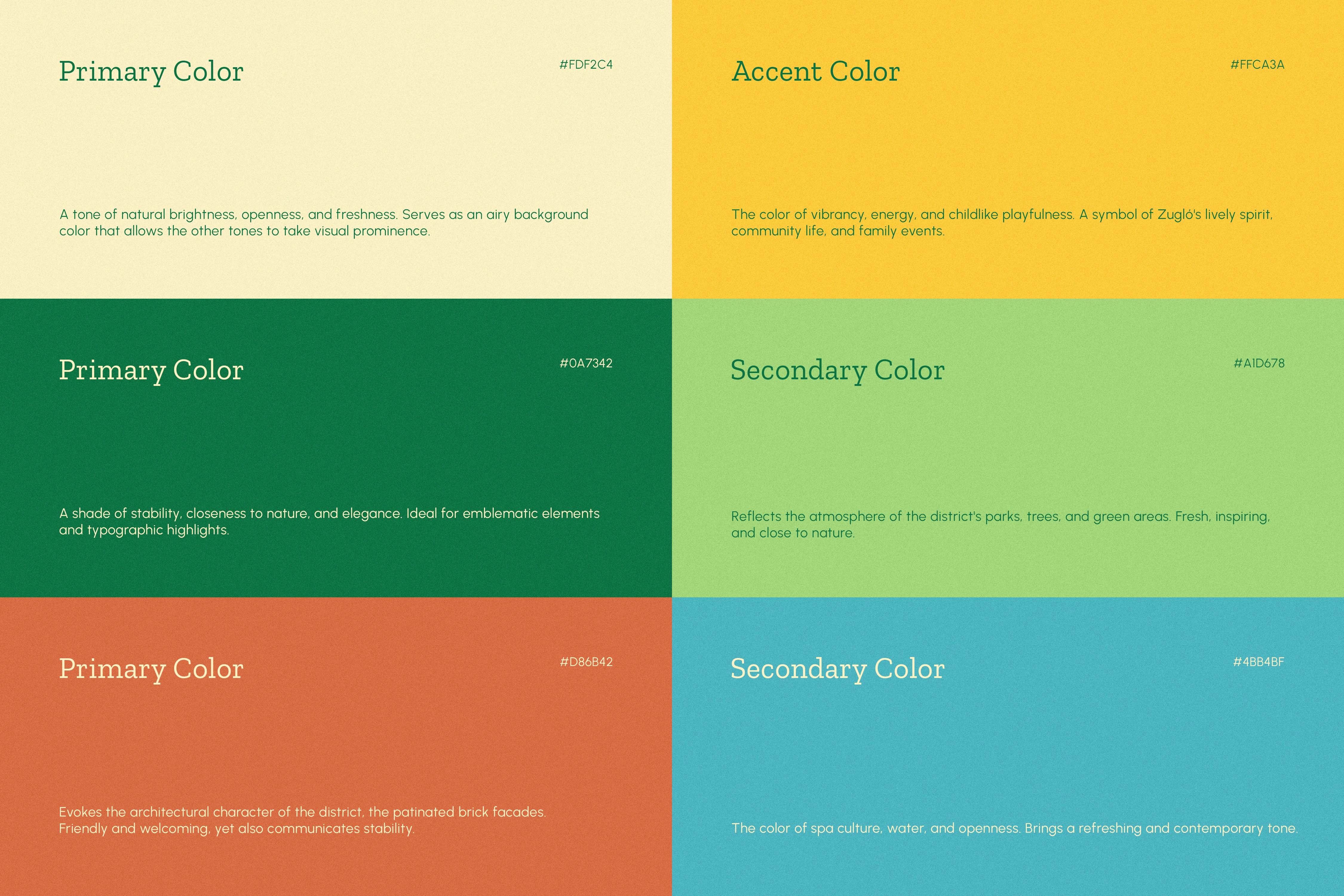
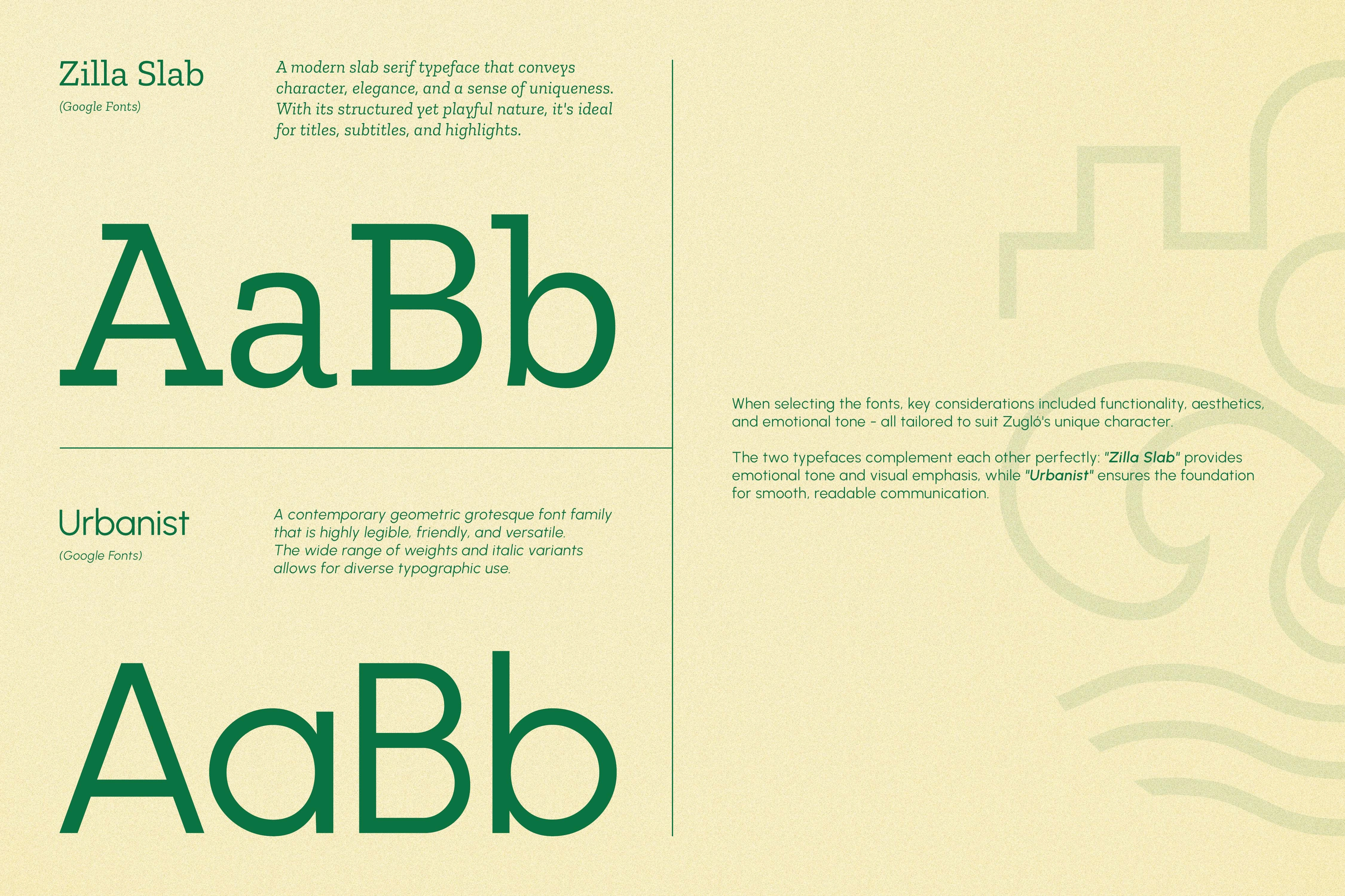
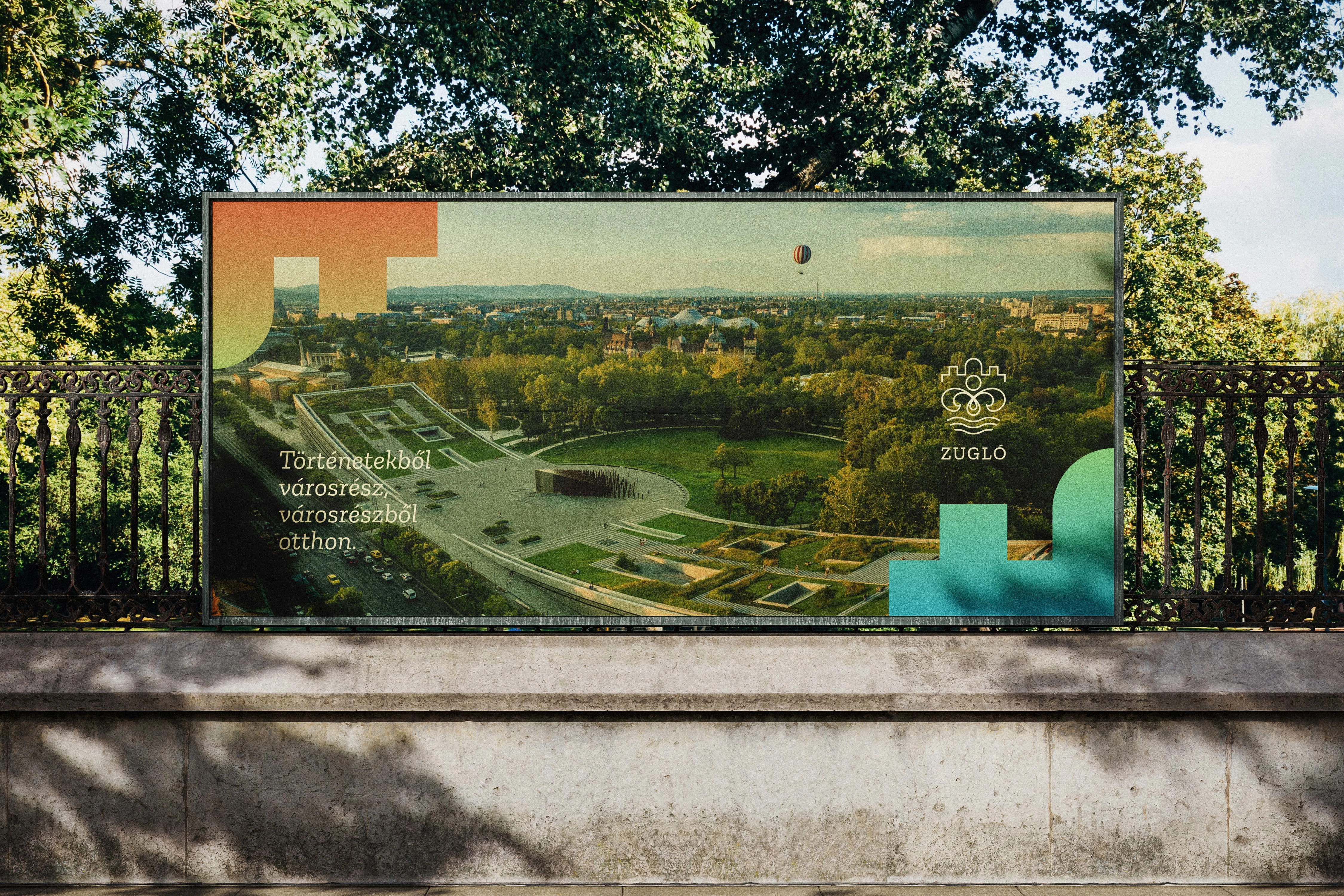
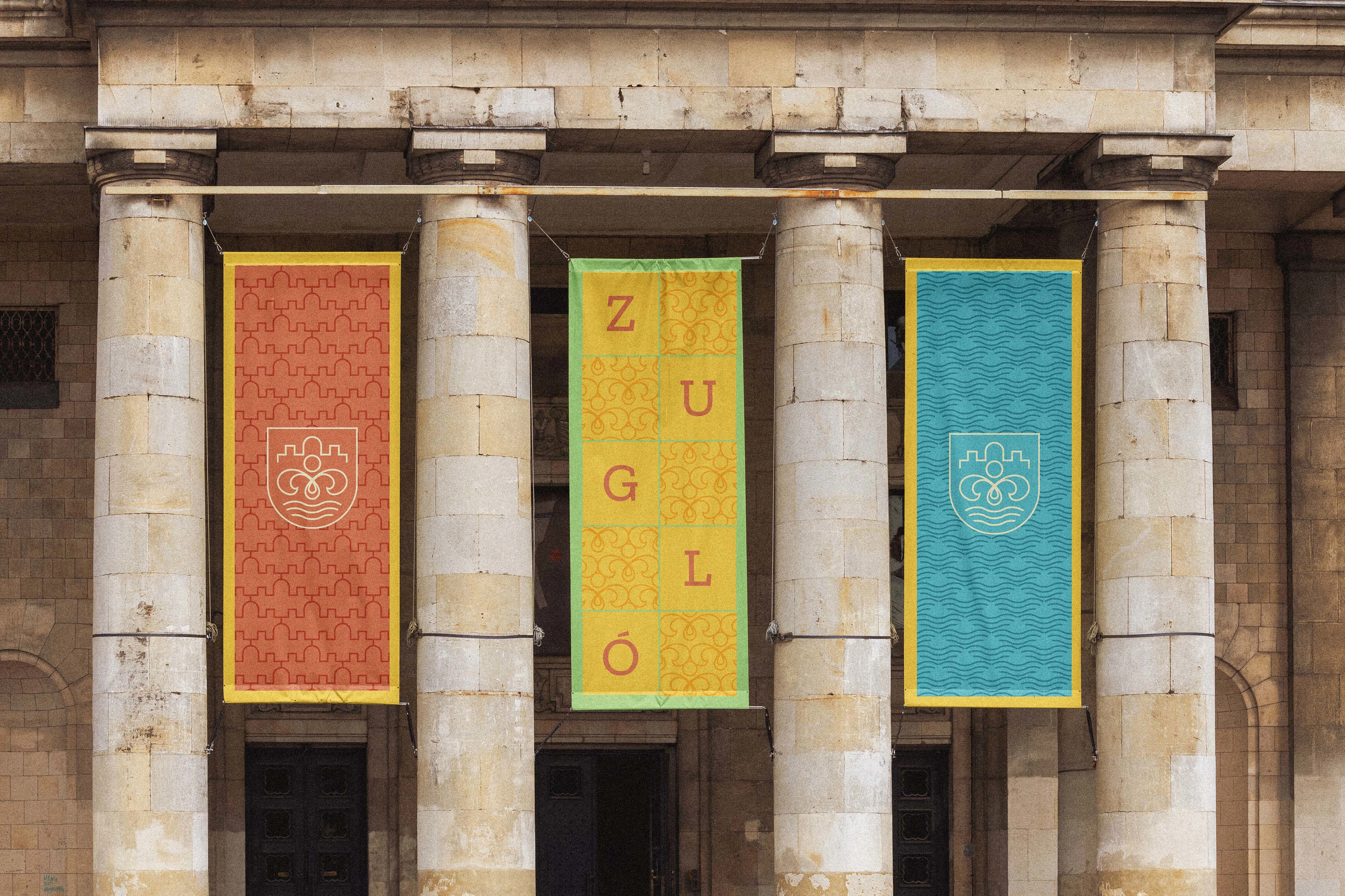
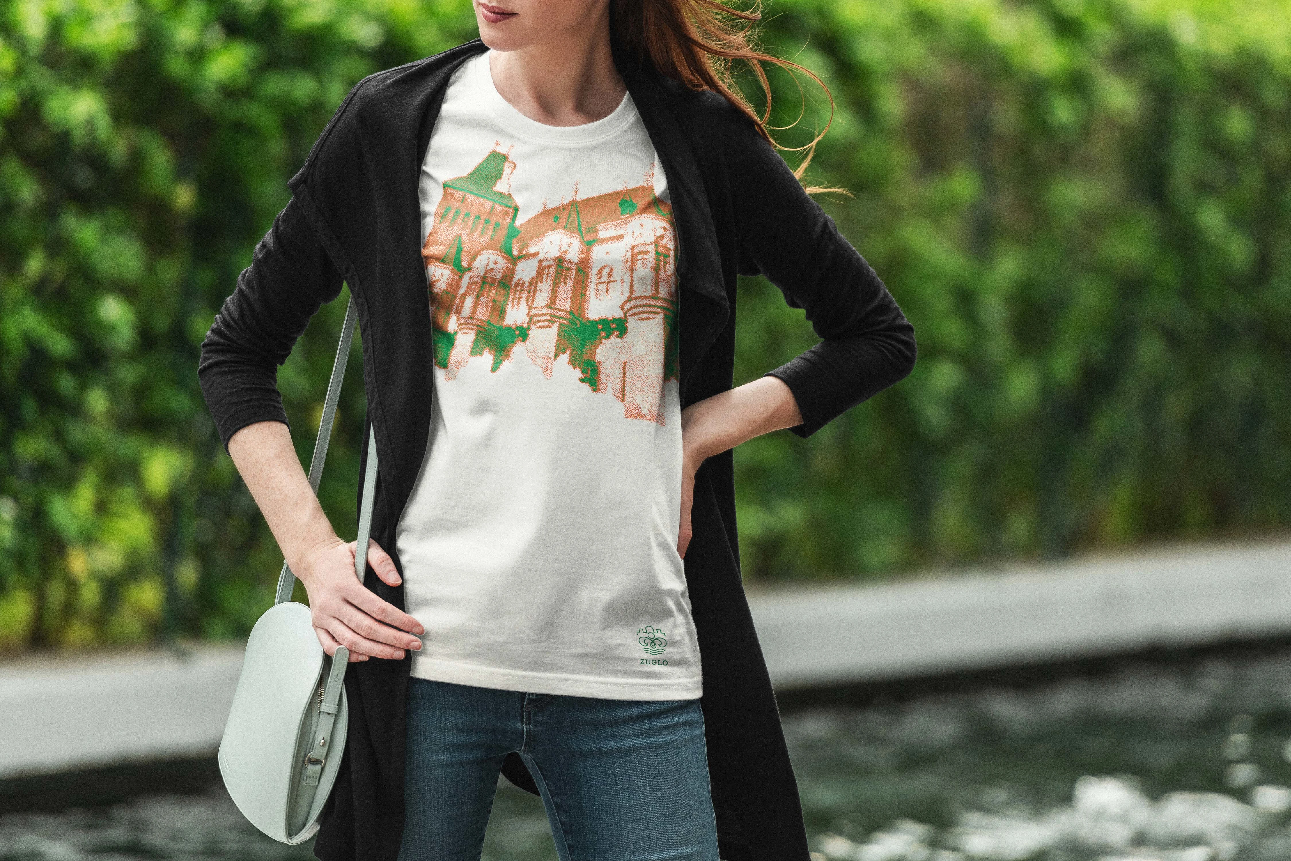
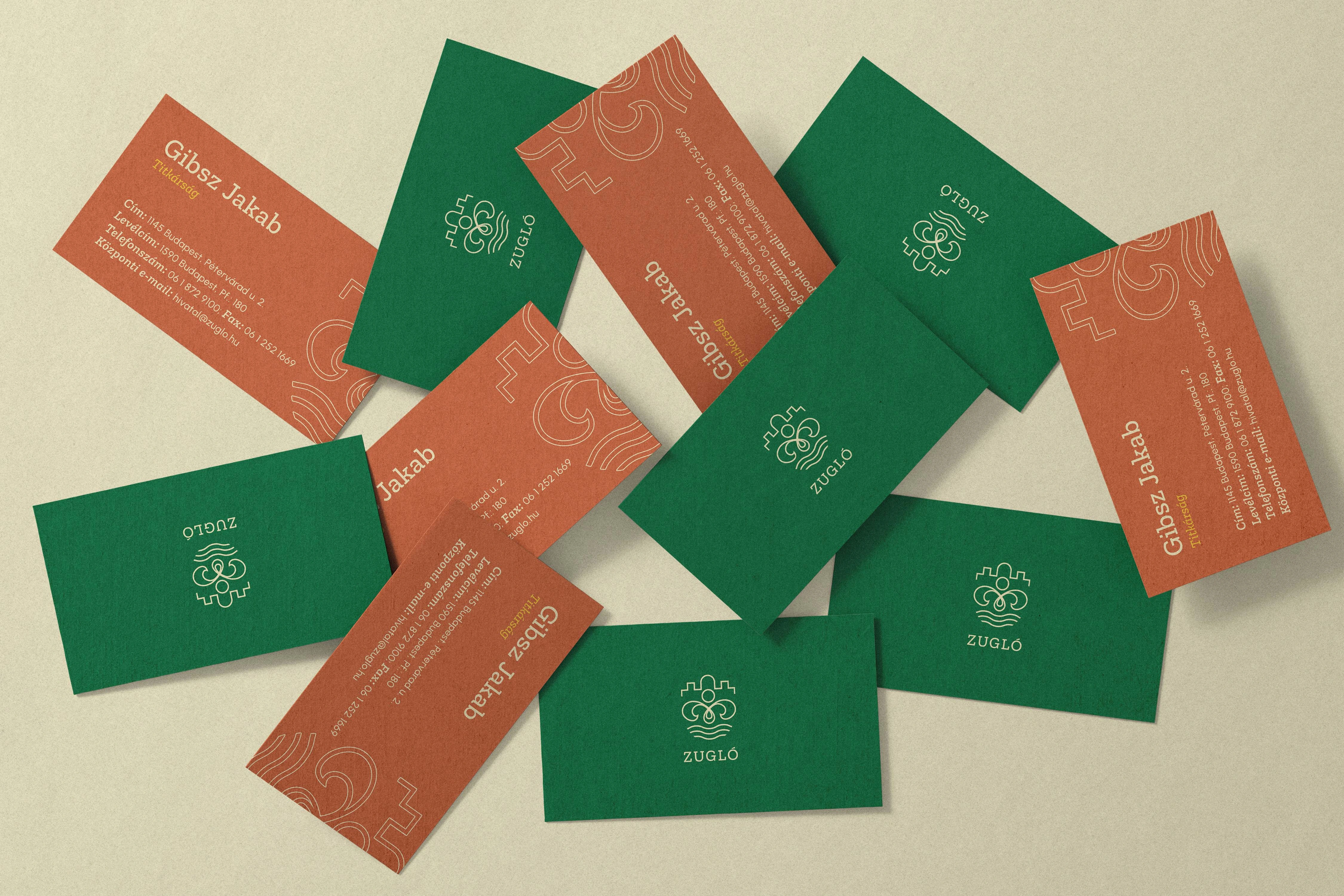
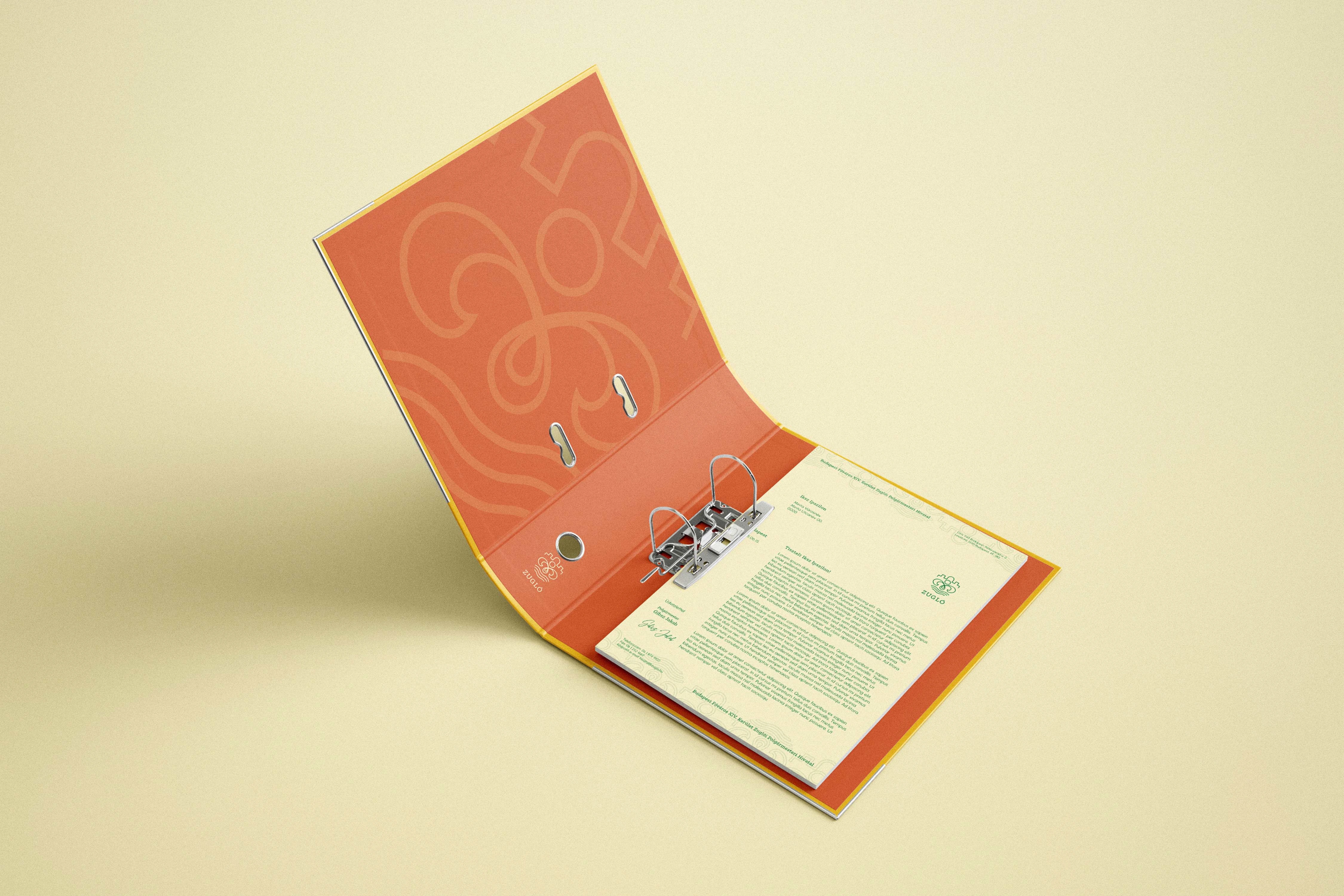
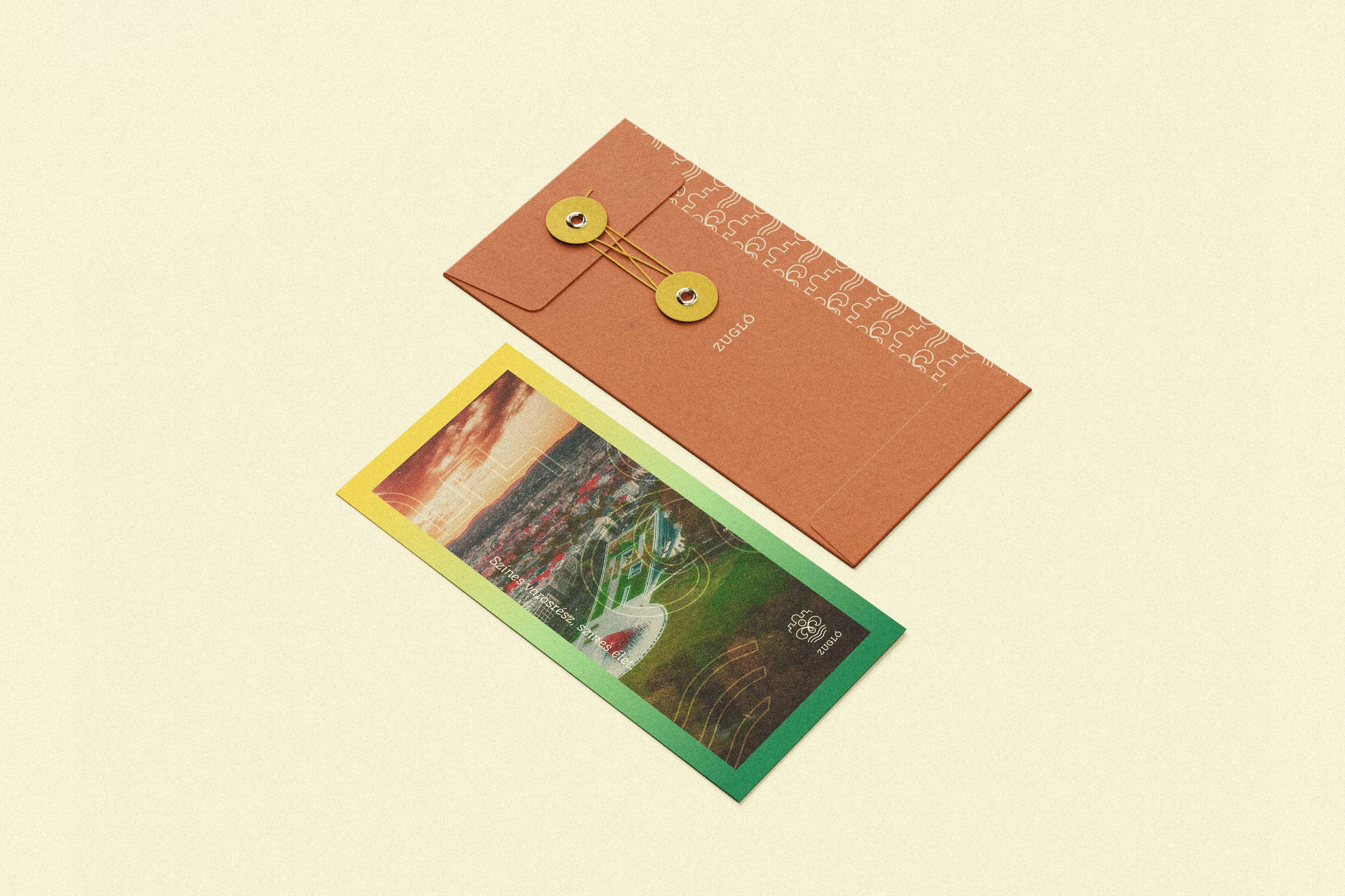
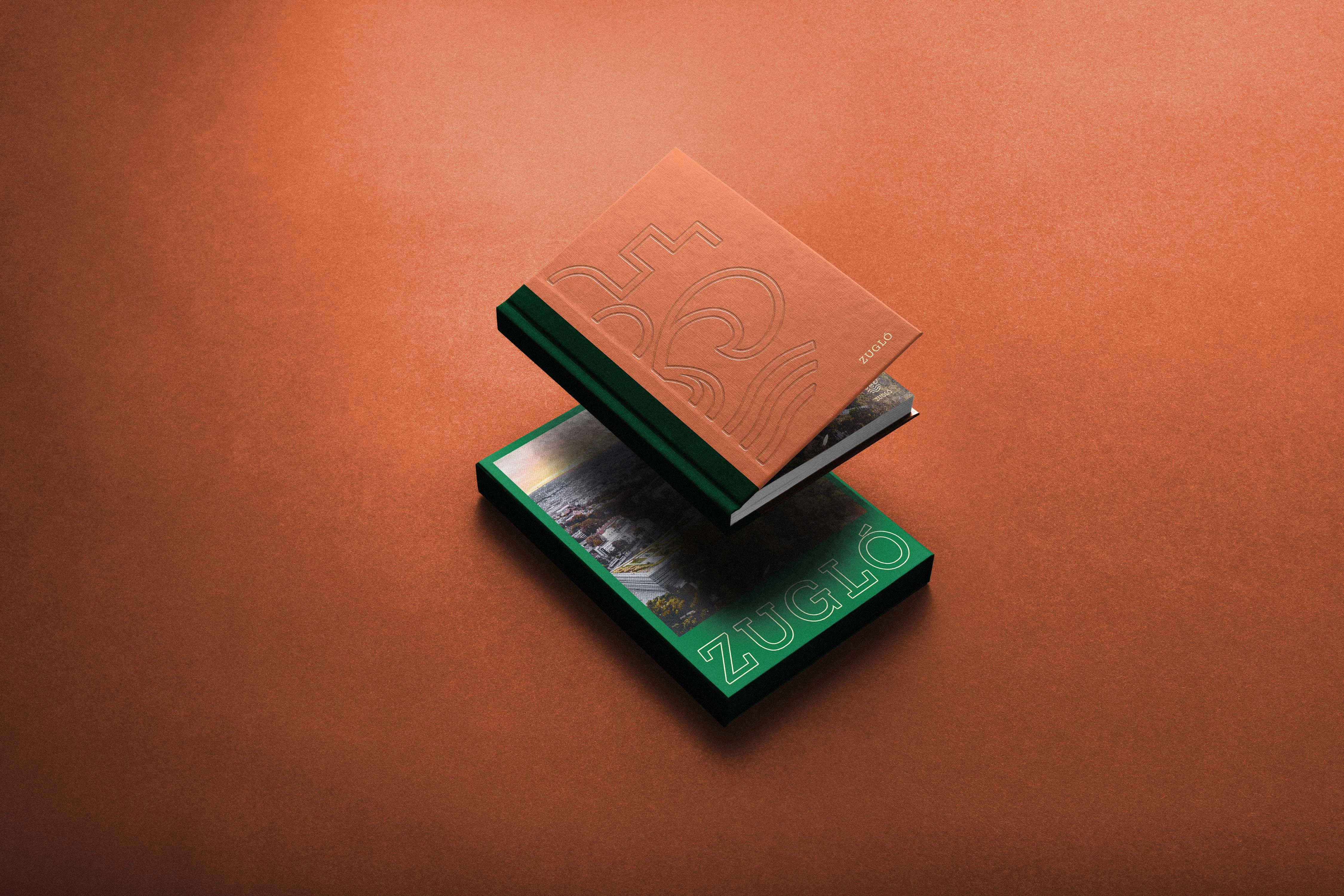
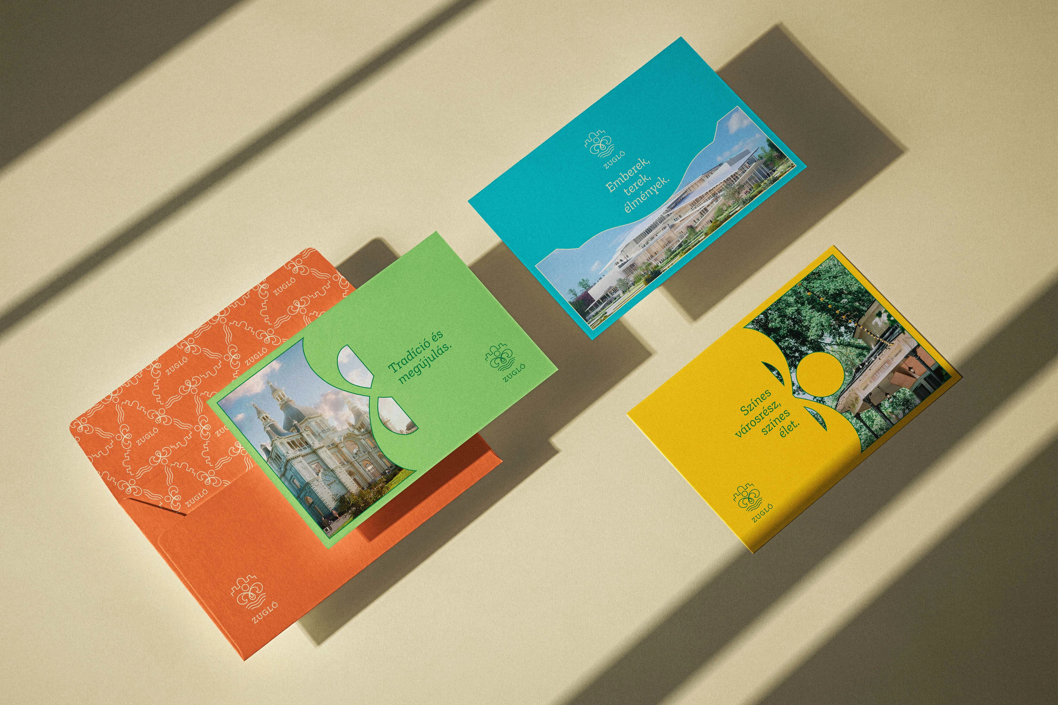
The aesthetic choices further reinforce Zugló's balanced, approachable urban character. The color palette mirrors the district's visual and emotional landscape: a deep, elegant green and an airy light cream serve as the foundation, anchoring the brand in stability and a closeness to nature. These are enriched by a warm brick shade reflecting patinated historical facades, a vivid yellow injecting vibrant, playful energy, and complementary pastel green and aqua blue notes that celebrate the local spa culture and parks. The typography pairs Zilla Slab, a modern slab serif that provides emotional depth and a uniquely structured playfulness for titles, with Urbanist, a contemporary geometric grotesque that acts as a highly legible, friendly workhorse for everyday communication.
Ultimately, this identity system presents Zugló as a district defined by perfect equilibrium: between tradition and modernity, nature and the city, emotional warmth and functional clarity. The comprehensive visual foundation successfully communicates a green, safe, and community-driven environment, positioning Zugló not merely as a part of Budapest, but as a distinct, inspiring destination that connects the people who live there with those who visit.



Like this project
Posted Jul 7, 2026
A cohesive brand identity for Zugló, Budapest's "green heart," balancing architectural heritage and nature into a modern, approachable visual system.