Brand Identity & Logo Design | MÁV Symphony Orchestra

Tamás Kurucz


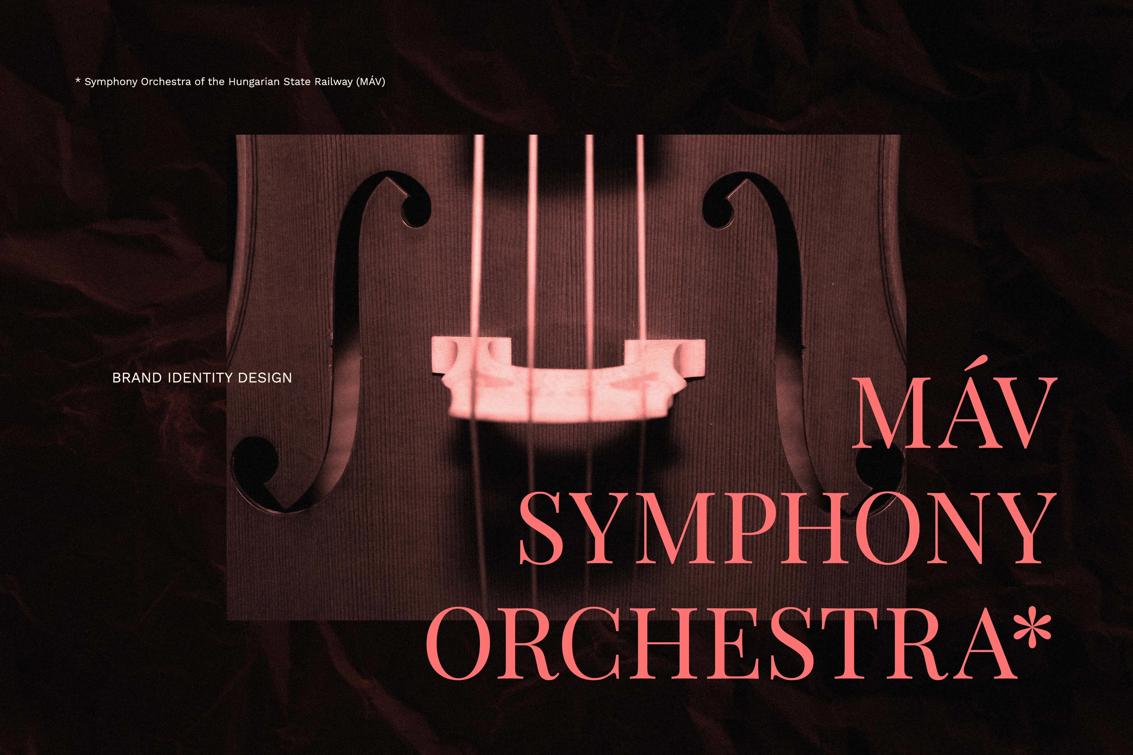
MÁV Symphony Orchestra
Symphony Orchestra Brand Identity & Logo Design
Case study of a symphony orchestra brand identity and logo design concept for the MÁV Symphony Orchestra, combining tradition, inclusivity and cultural prestige with a modern visual system for print and digital use.
CLIENT: MÁV Symphony Orchestra
YEAR: 2025
INDUSTRY: Classical Music; Cultural Institution
AWARDS & RECOGNITION: Exhibited, 23rd Golden Drawing Pin Award and Exhibition - 2026, Hungary
Project Overview
Designing the brand identity concept for the MÁV Symphony Orchestra—one of Hungary's most prestigious ensembles, active since 1945—required capturing the profound duality of a modern classical institution. With a repertoire spanning from Baroque masterpieces to contemporary works, and a deeply rooted commitment to social responsibility, inclusivity, and sustainability, the orchestra needed a visual system that reflects its forward-looking values. The resulting identity is built entirely around the core concept of "the harmony of opposites." This guiding principle perfectly bridges deep-rooted musical traditions with an open, modern, and engaging attitude, positioning music as a universal language that unites diverse communities across generations.
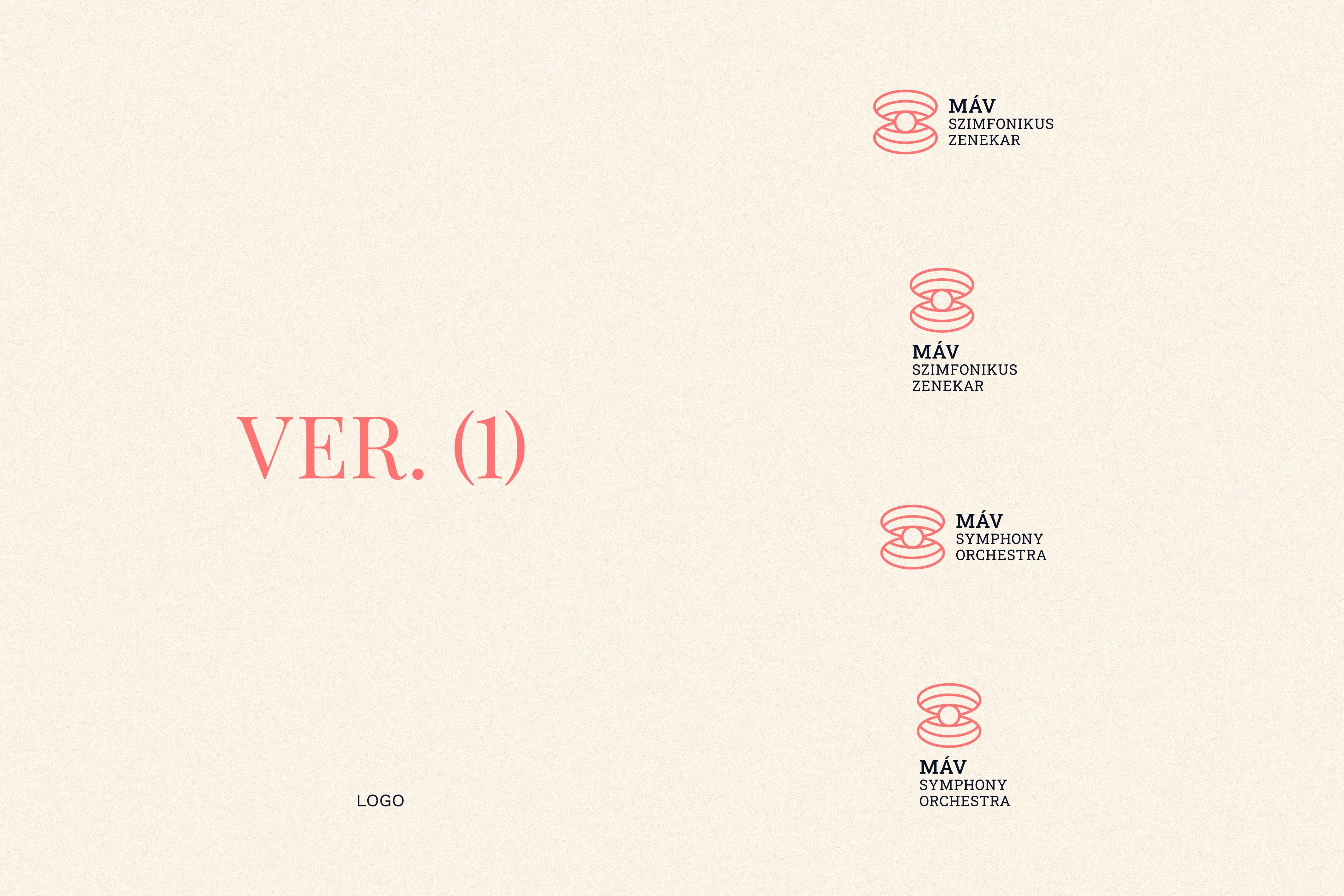
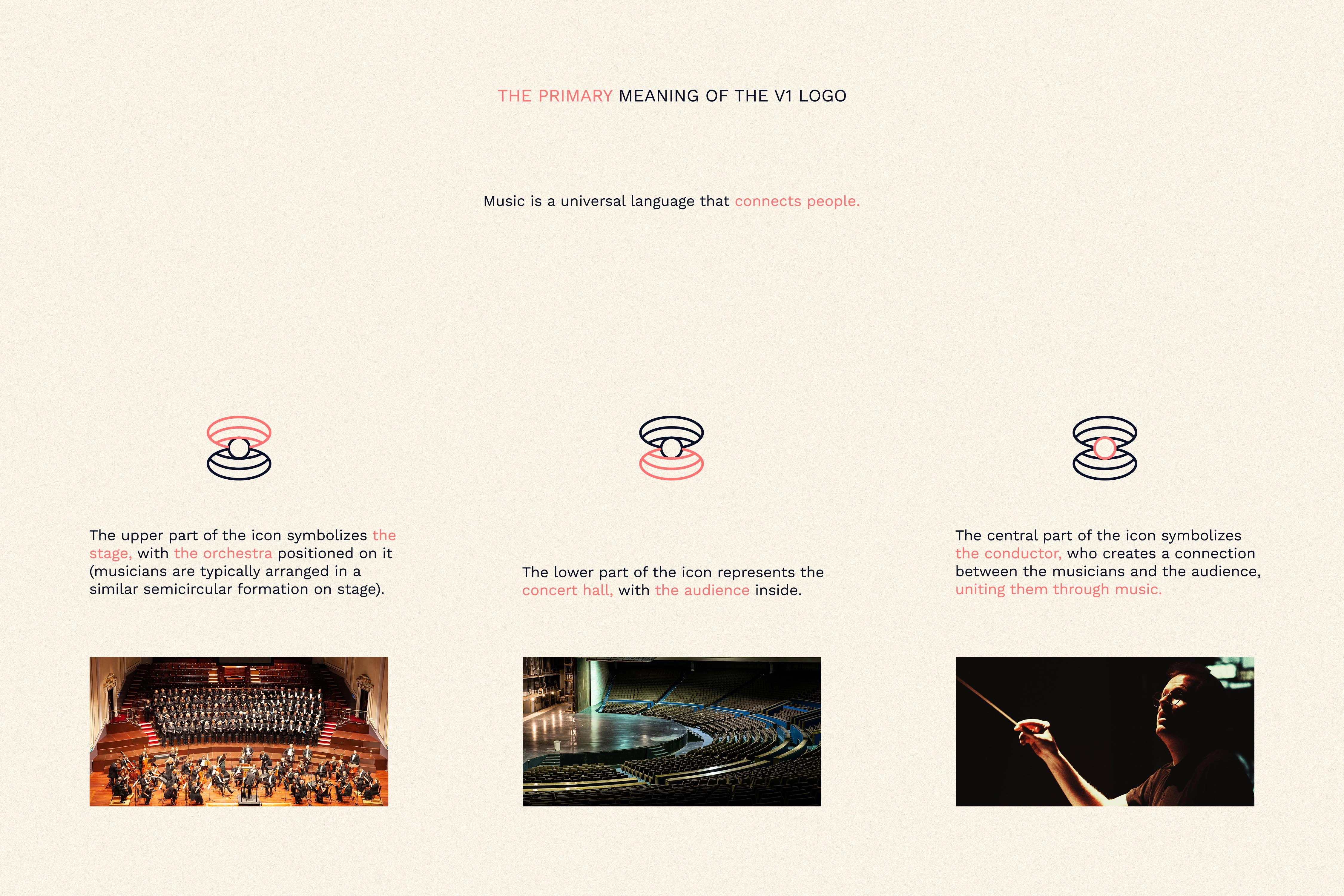
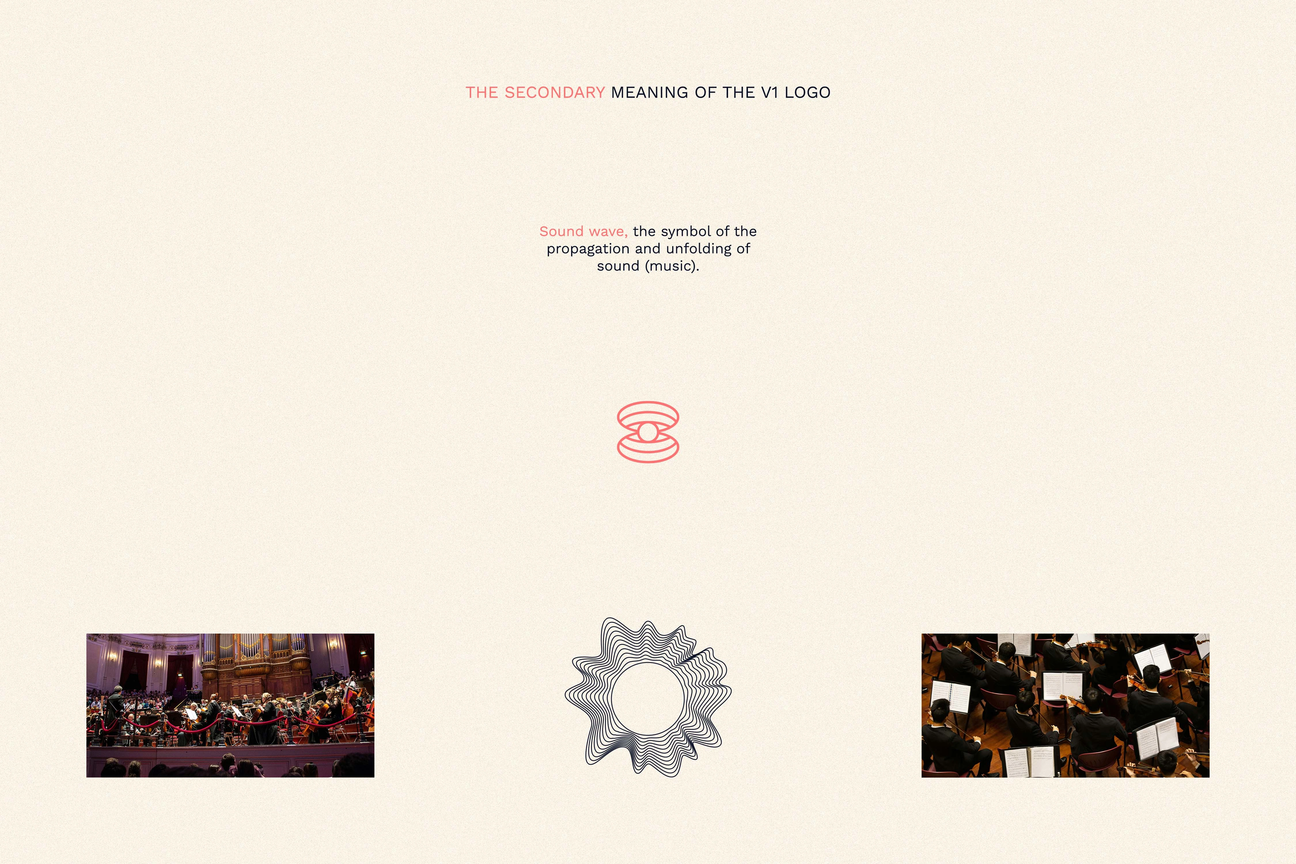
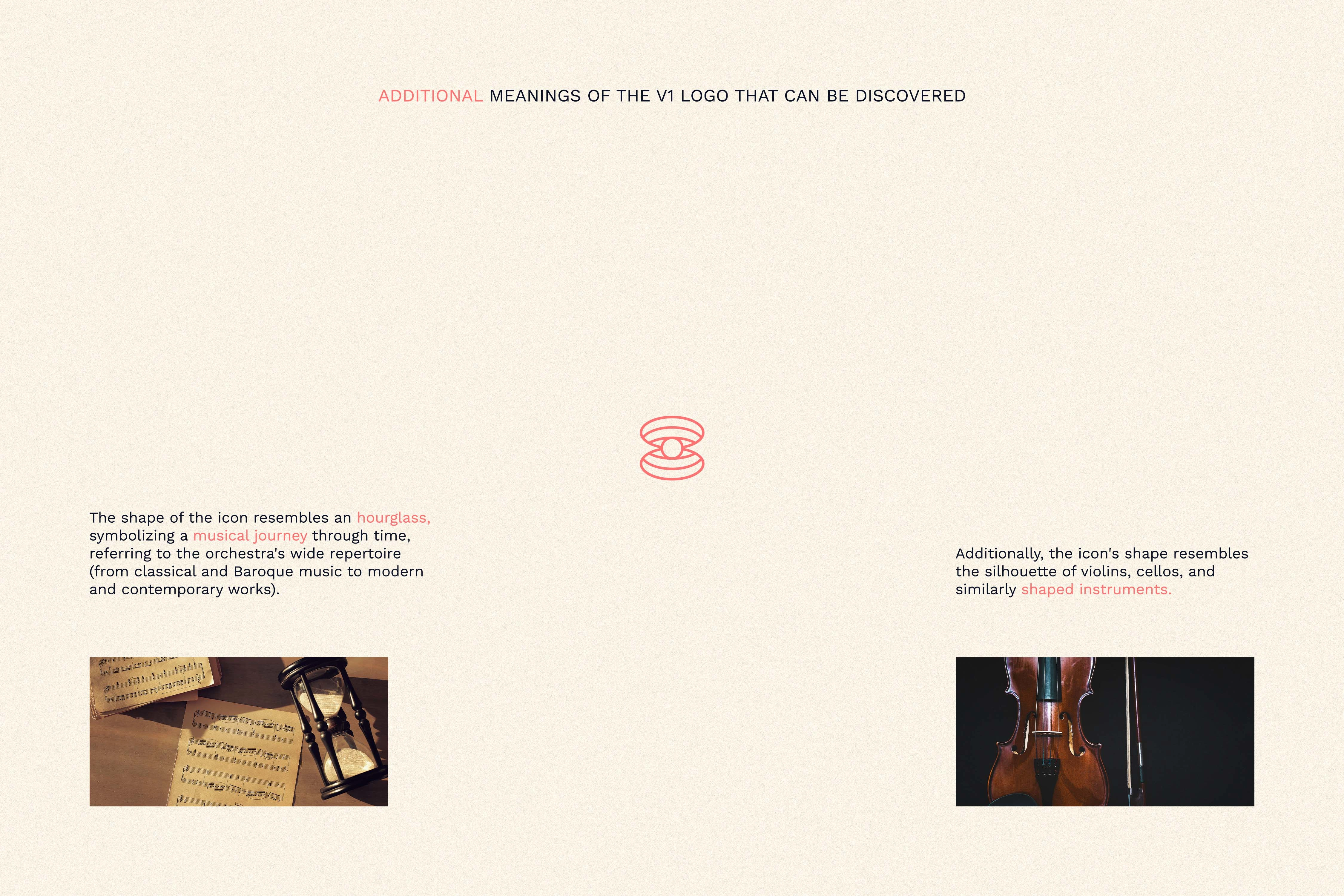
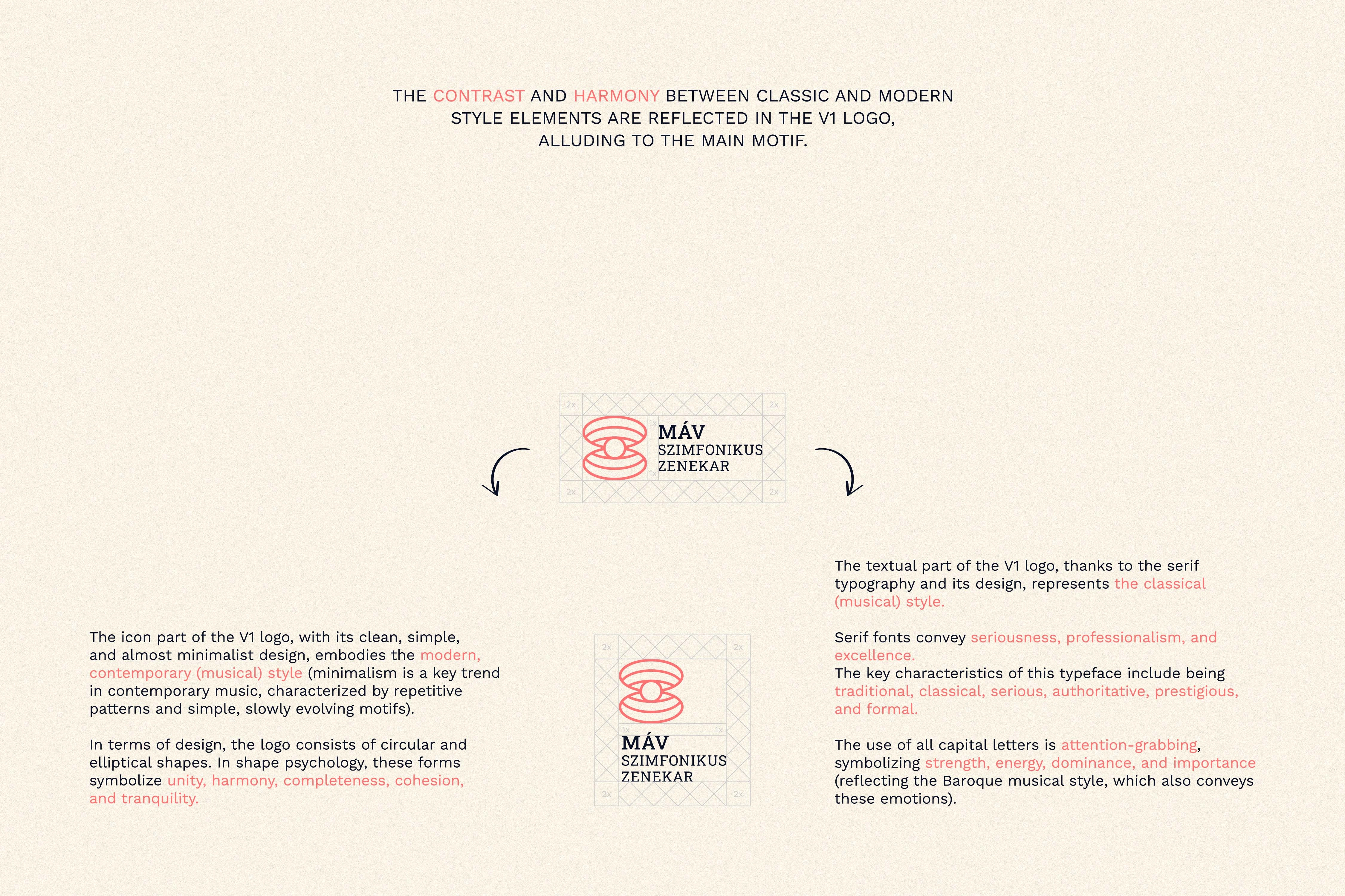
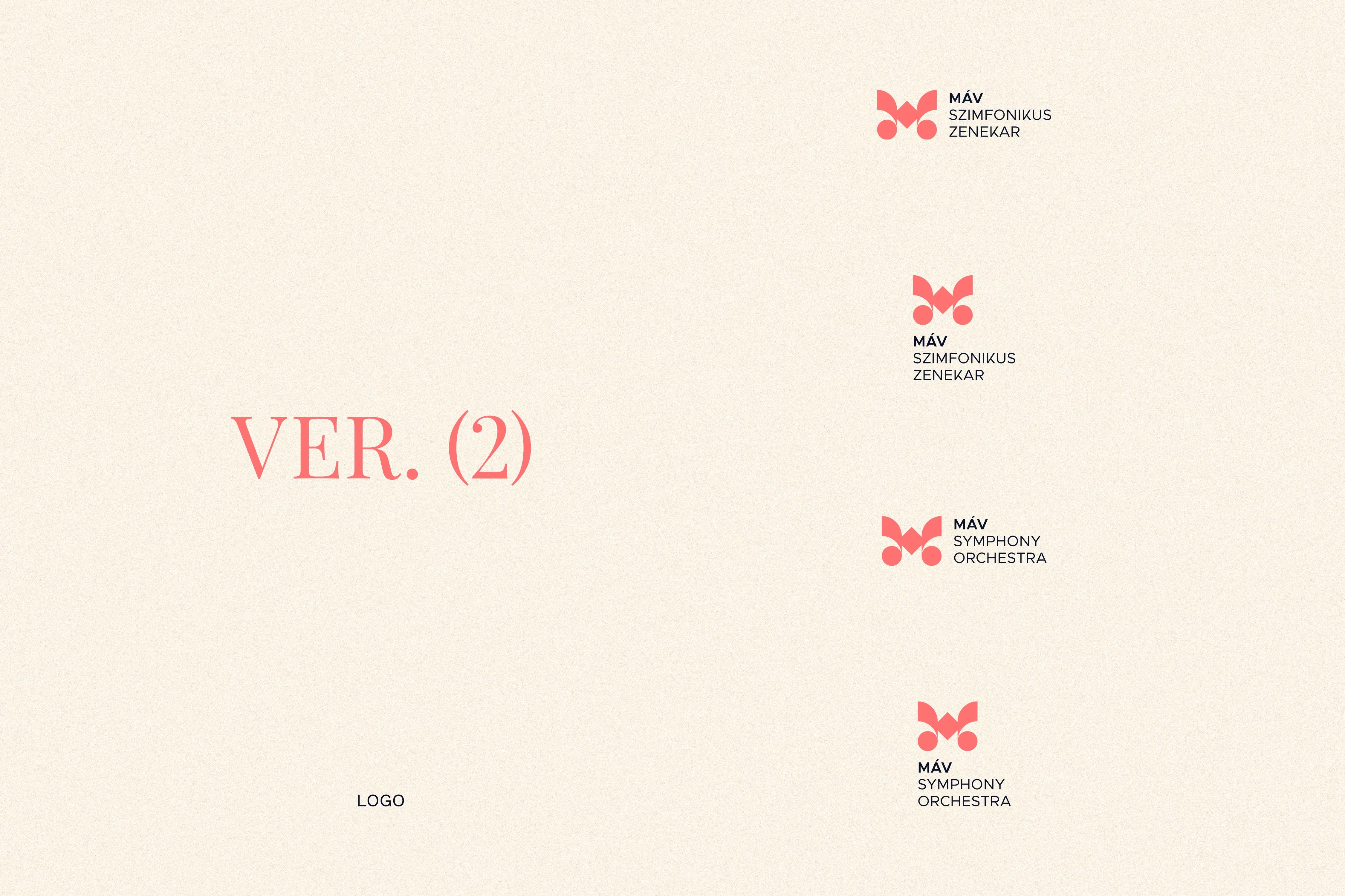
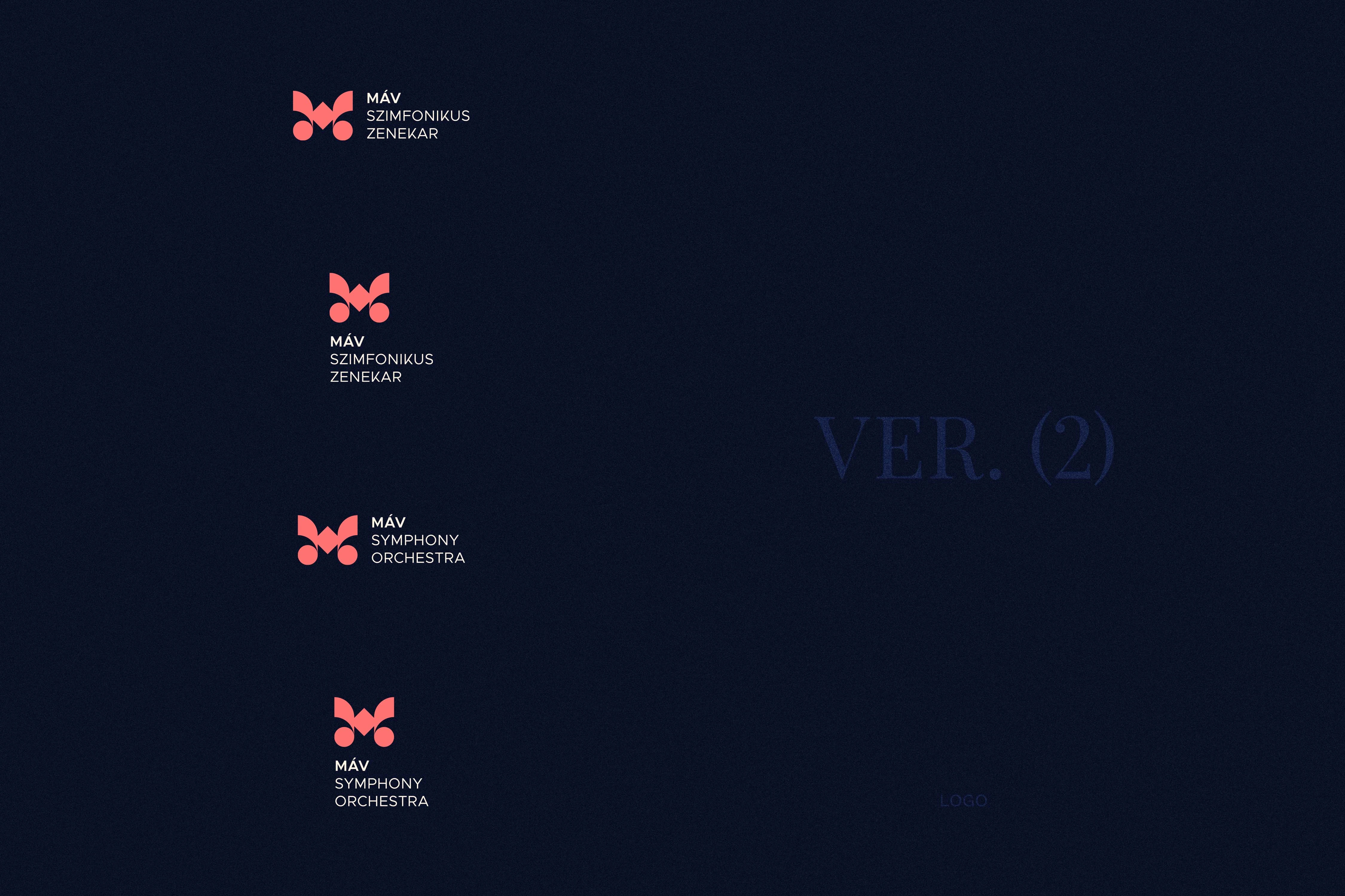
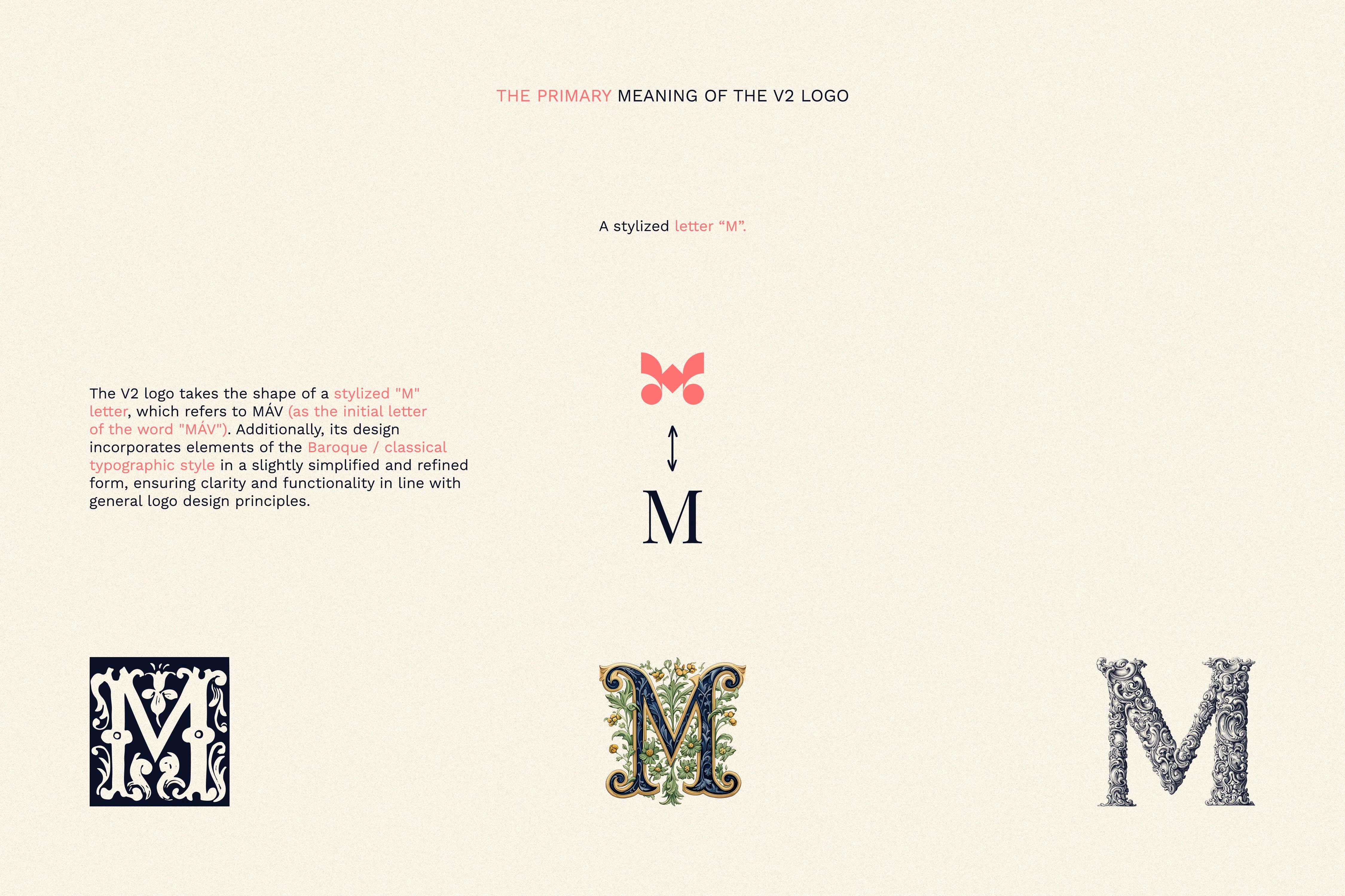
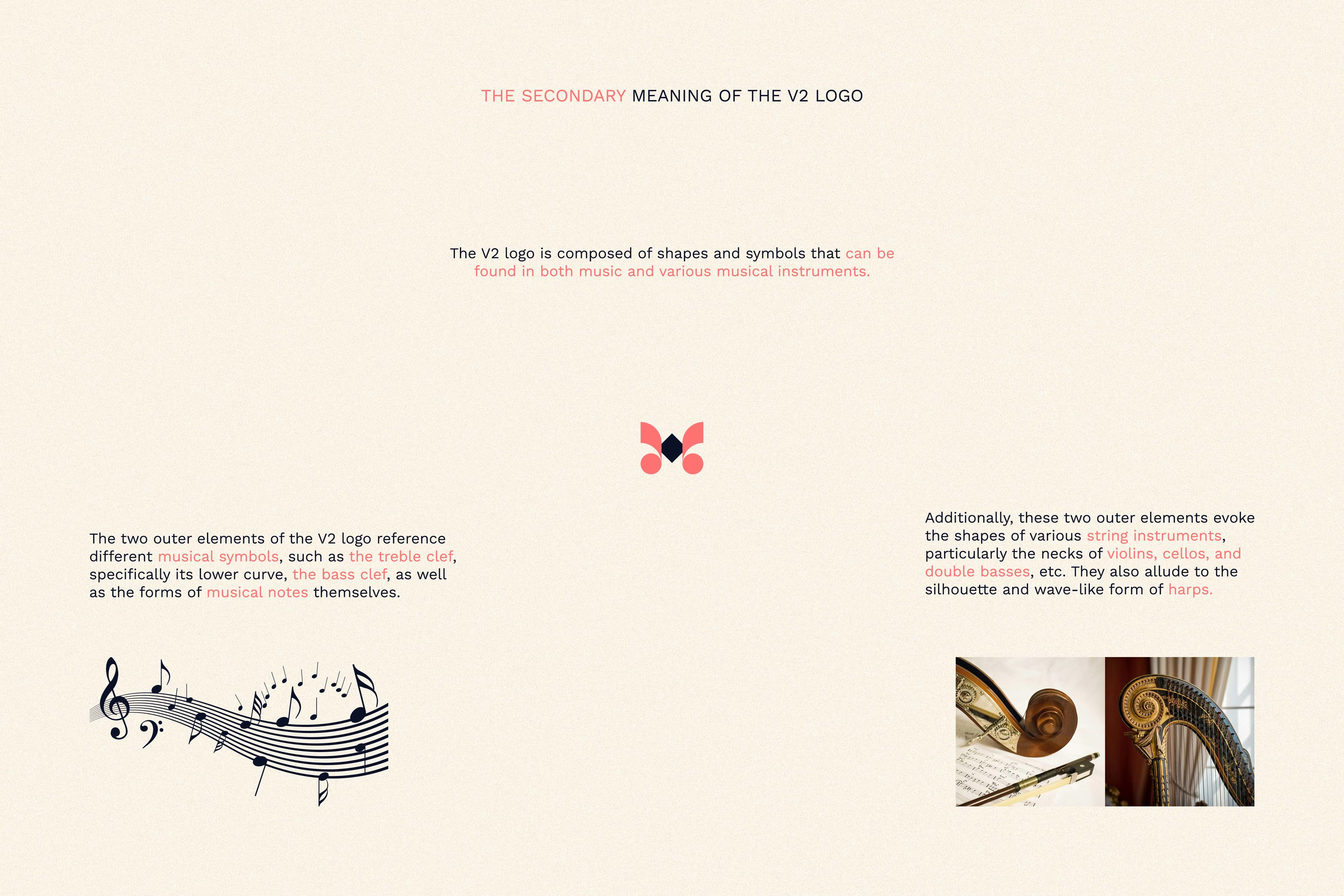
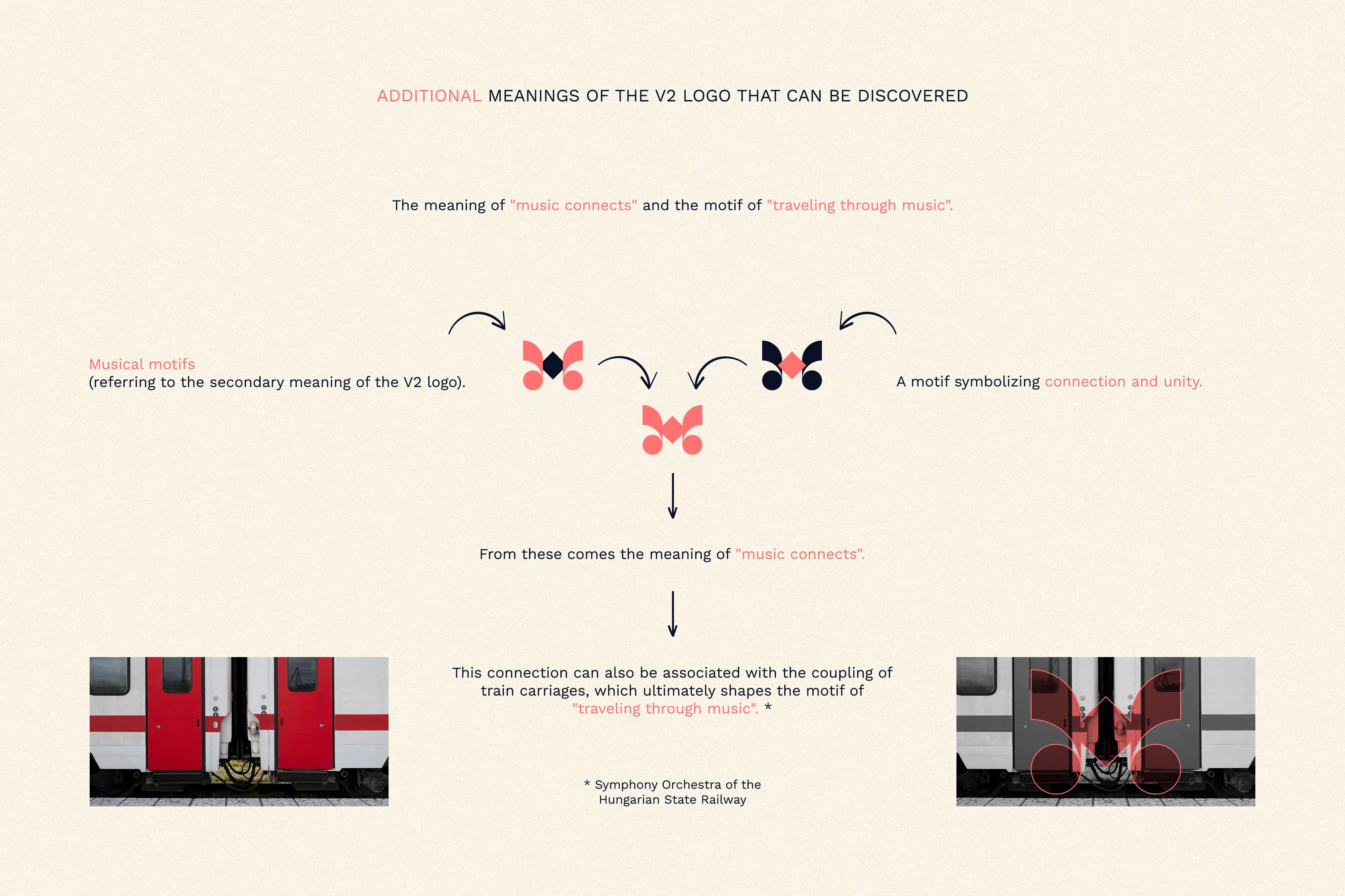
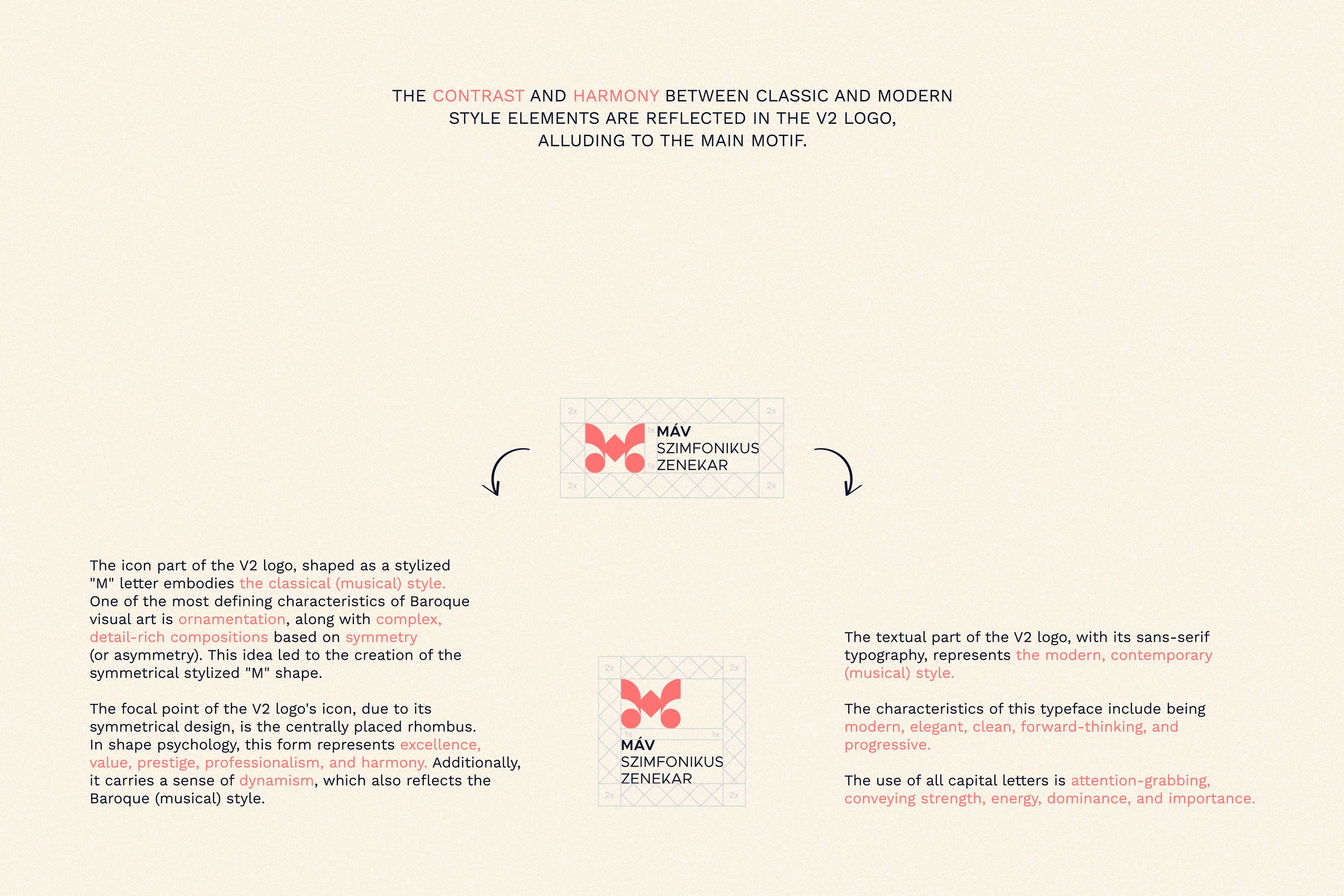
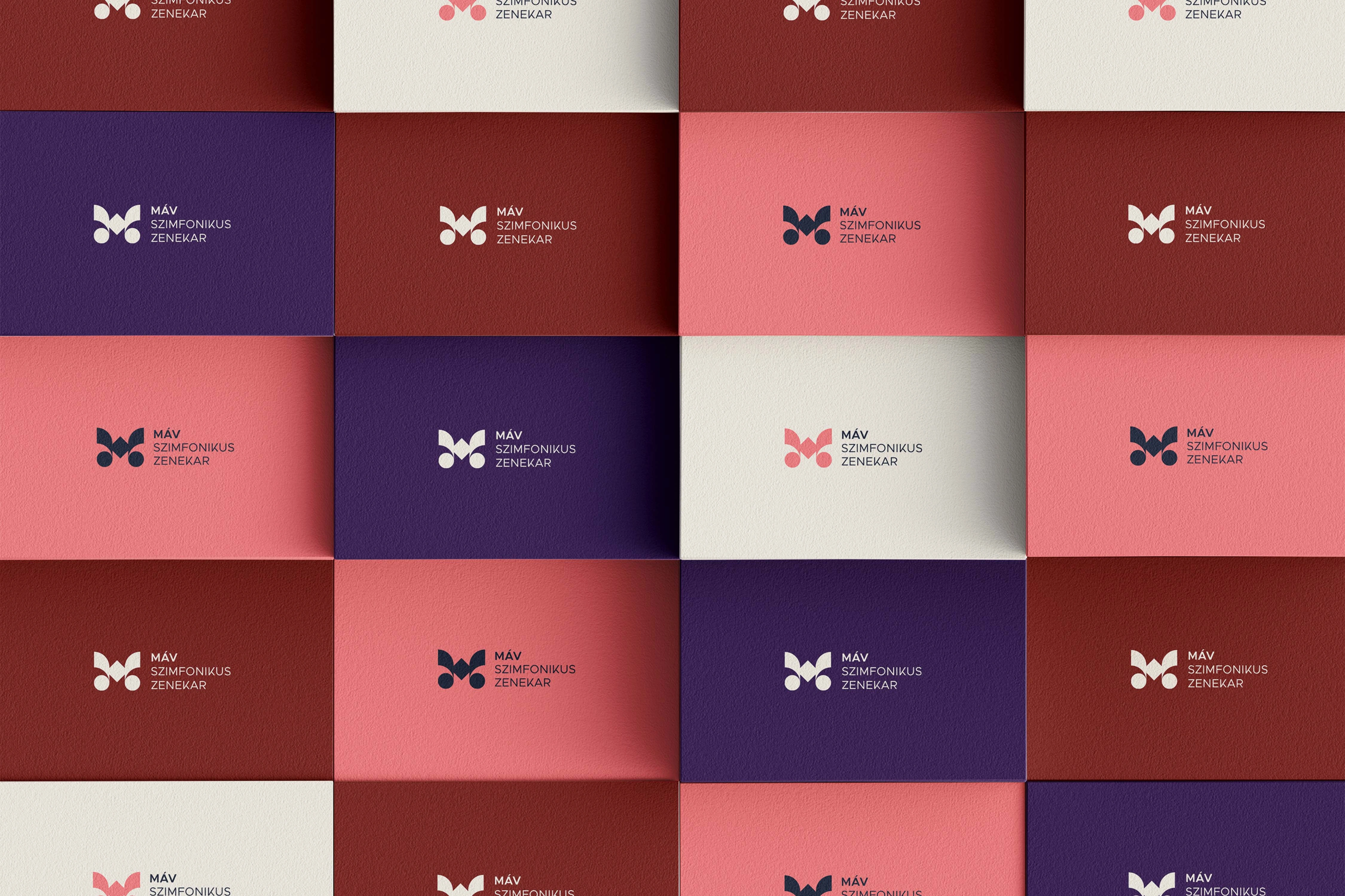
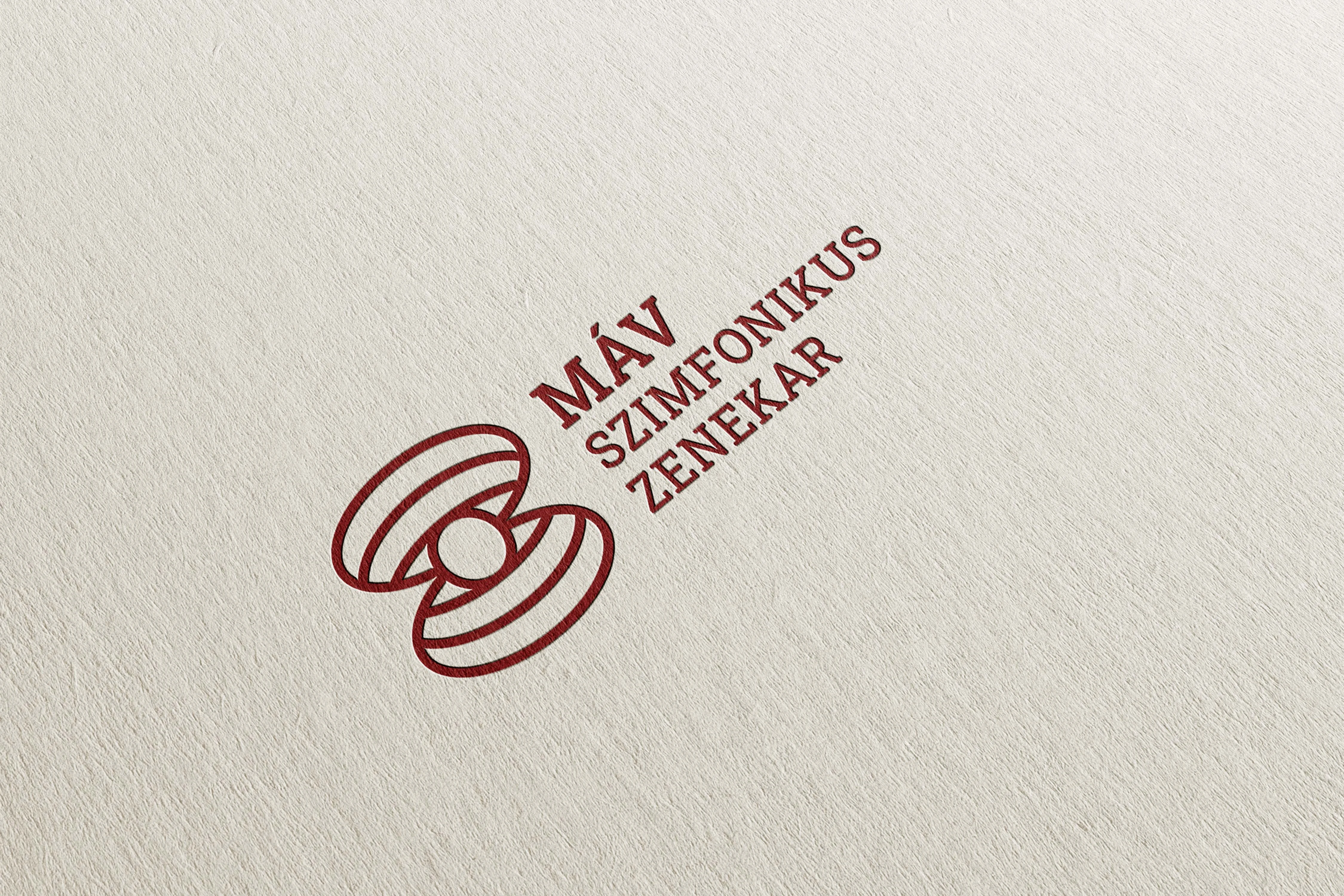
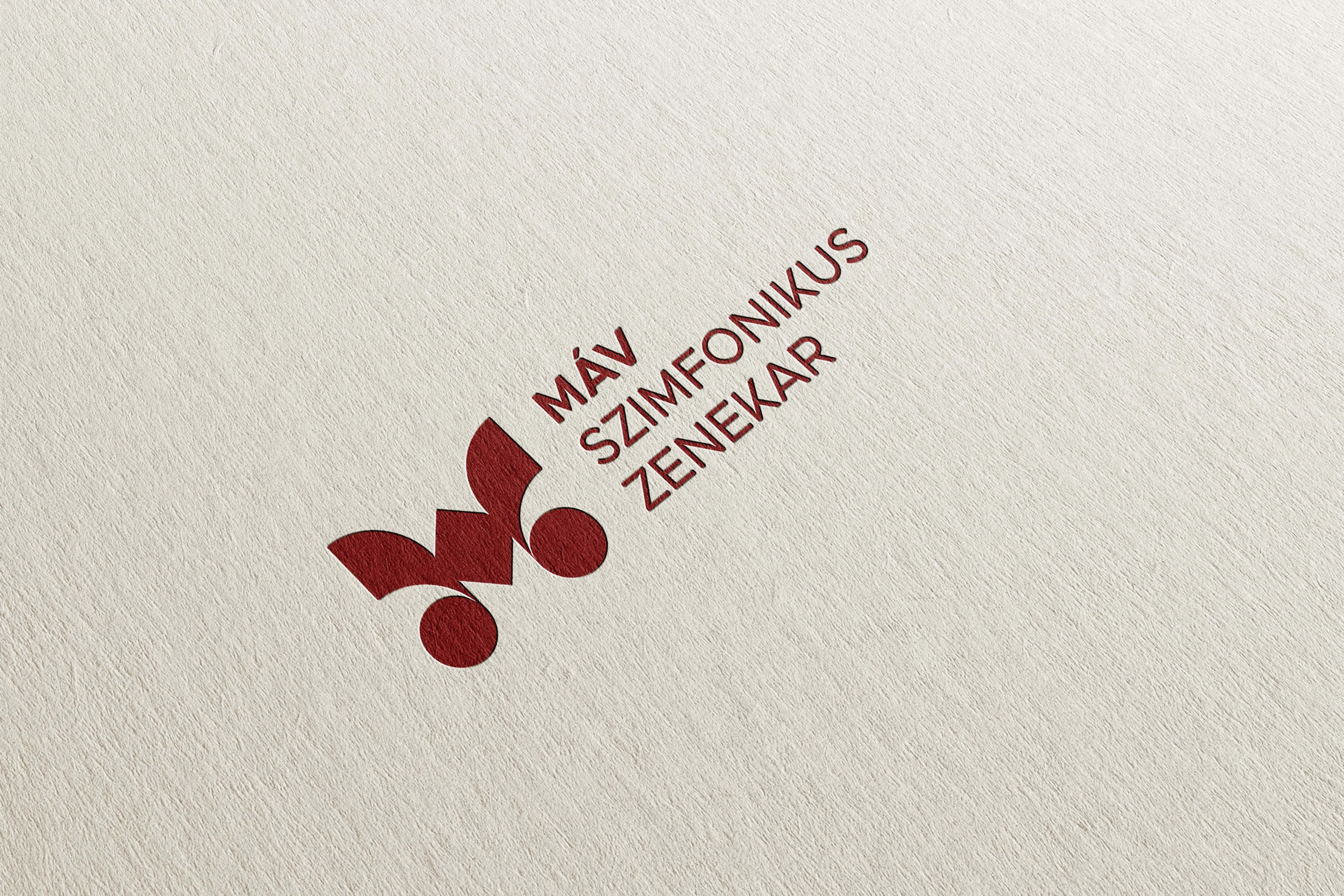
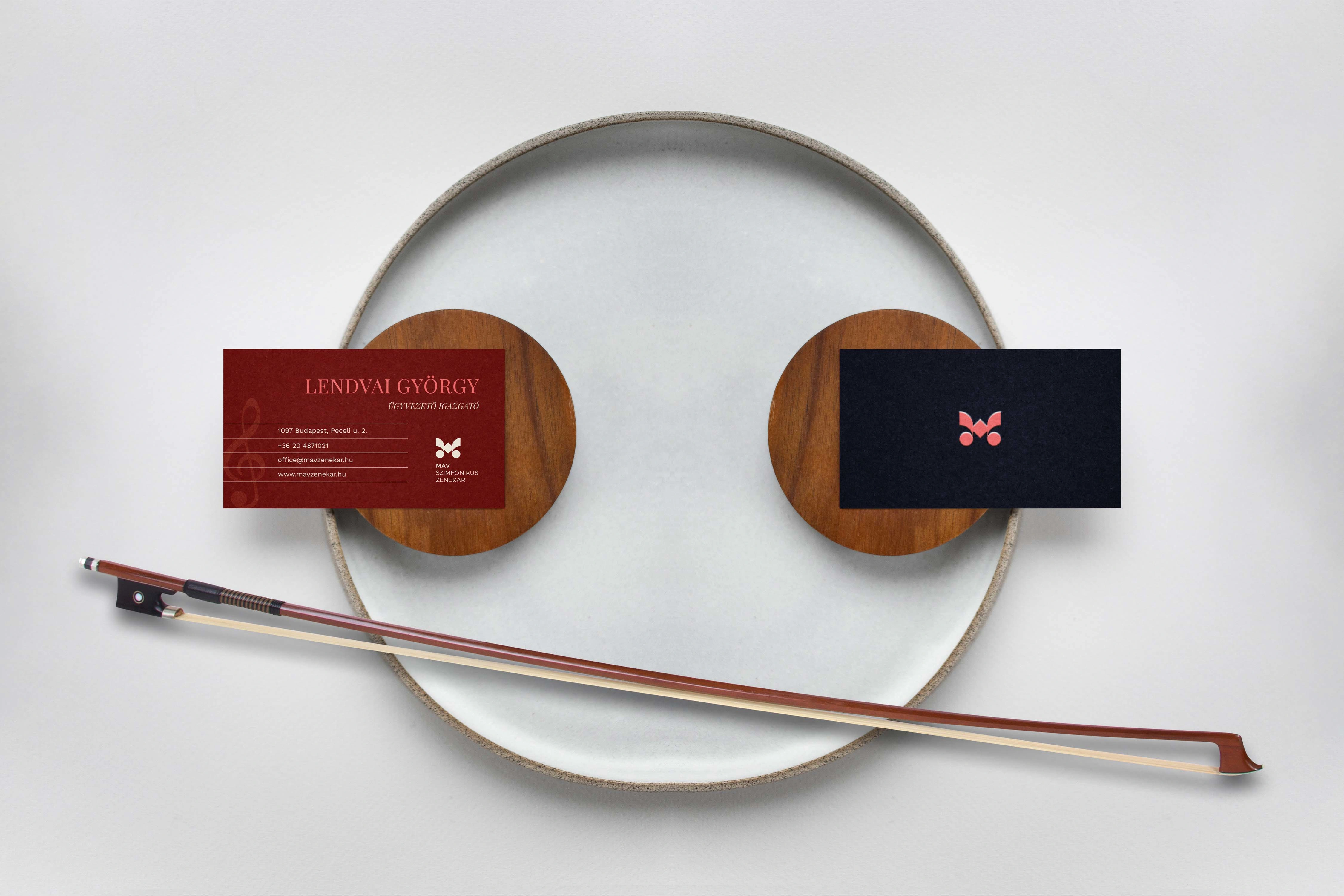
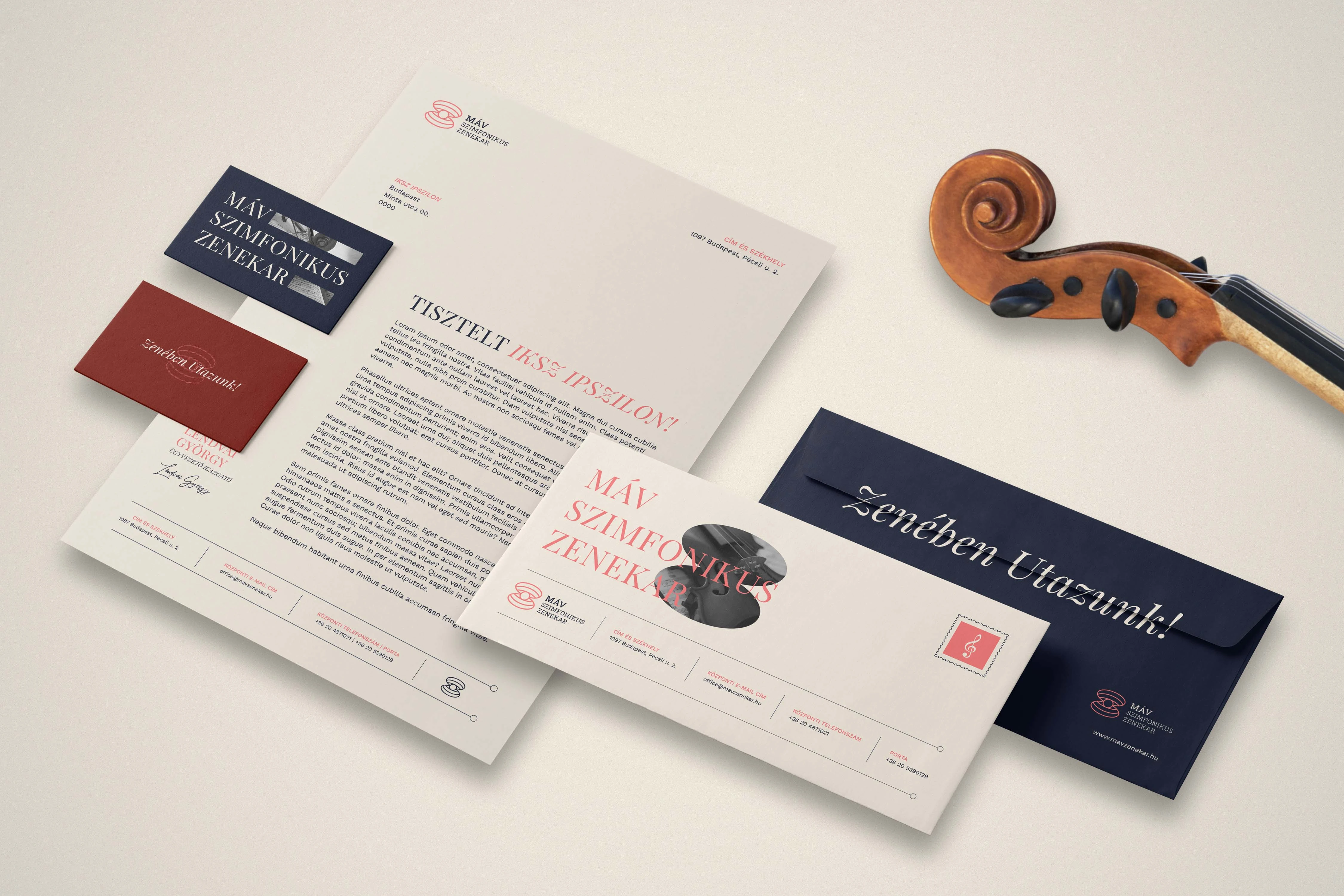
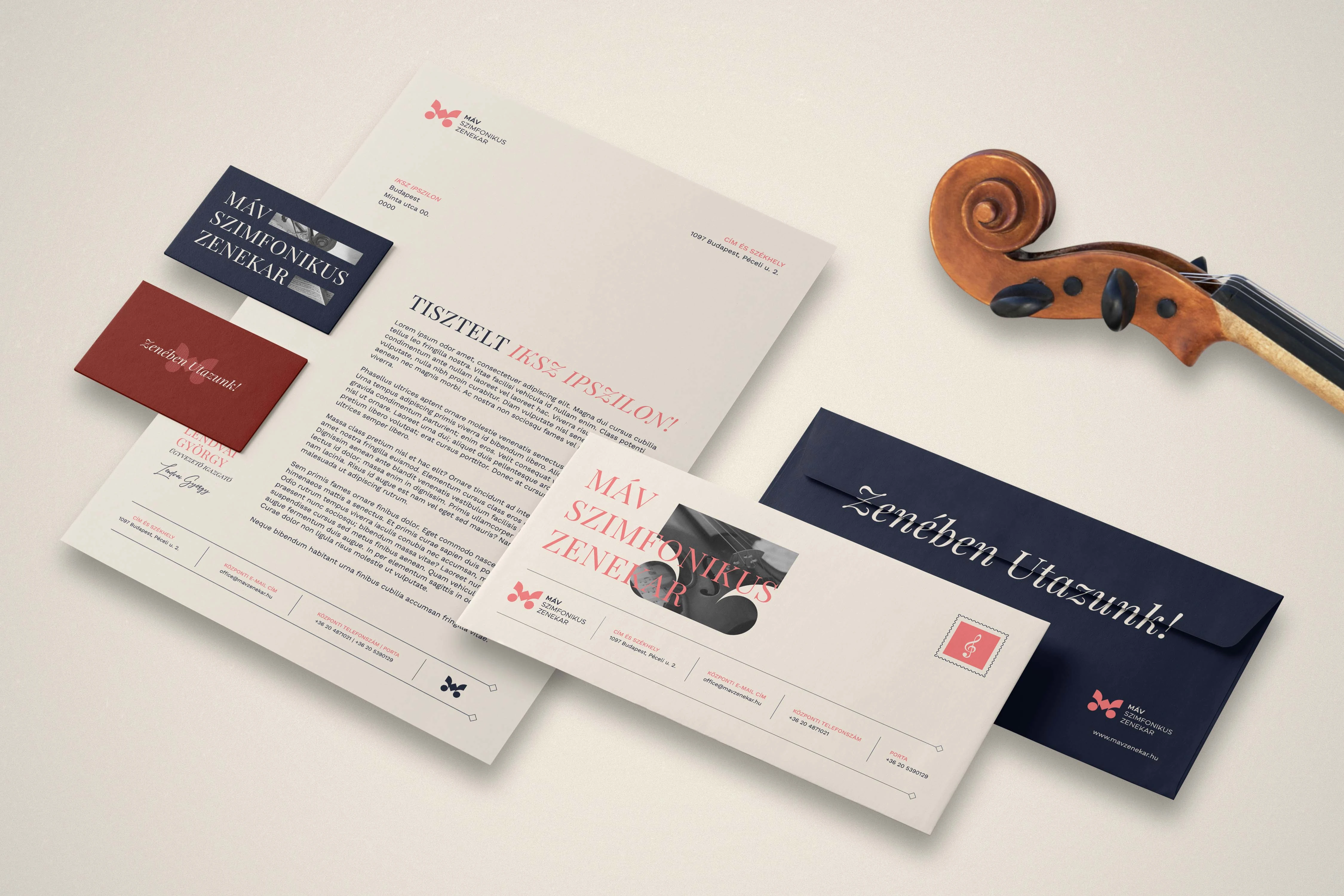
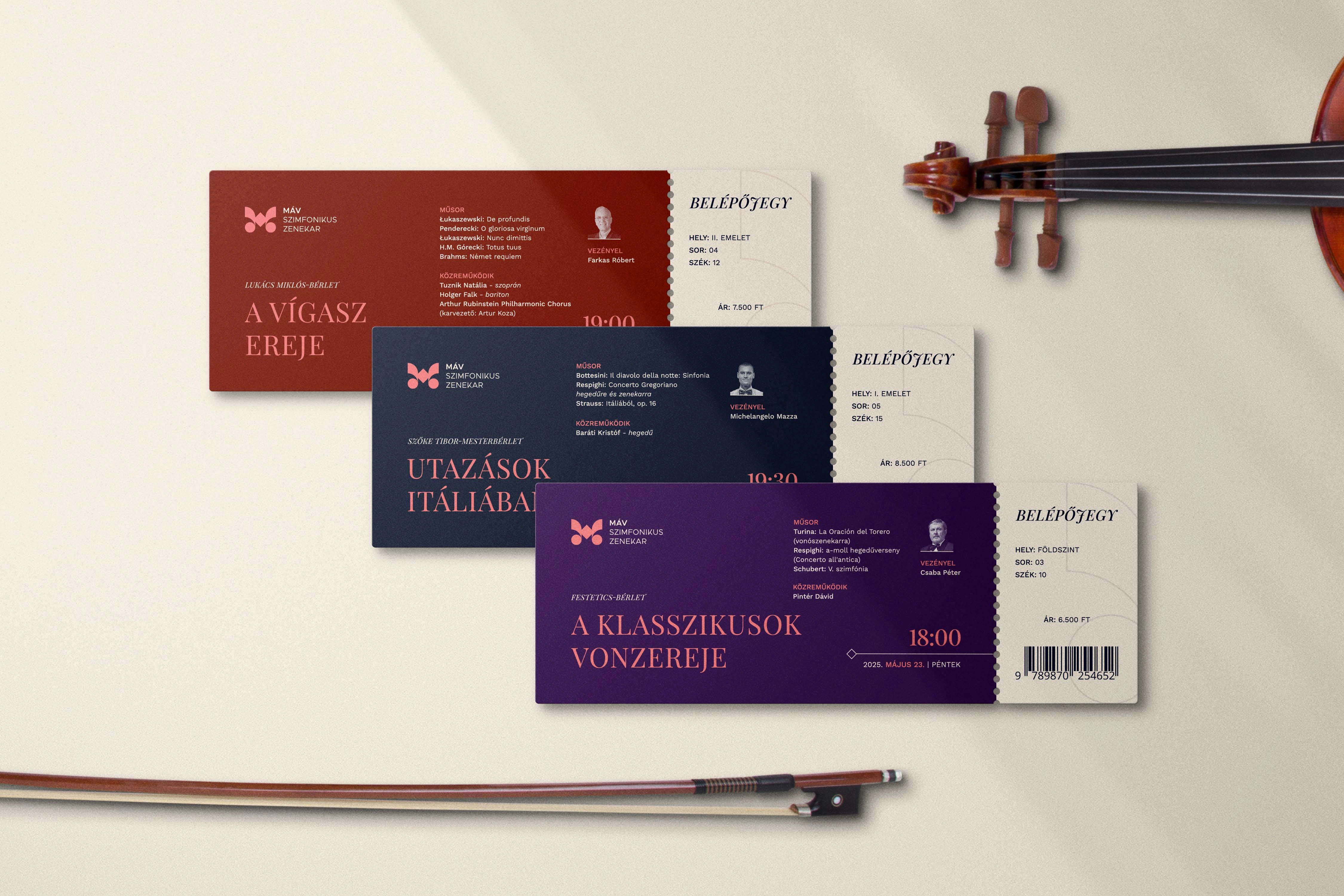
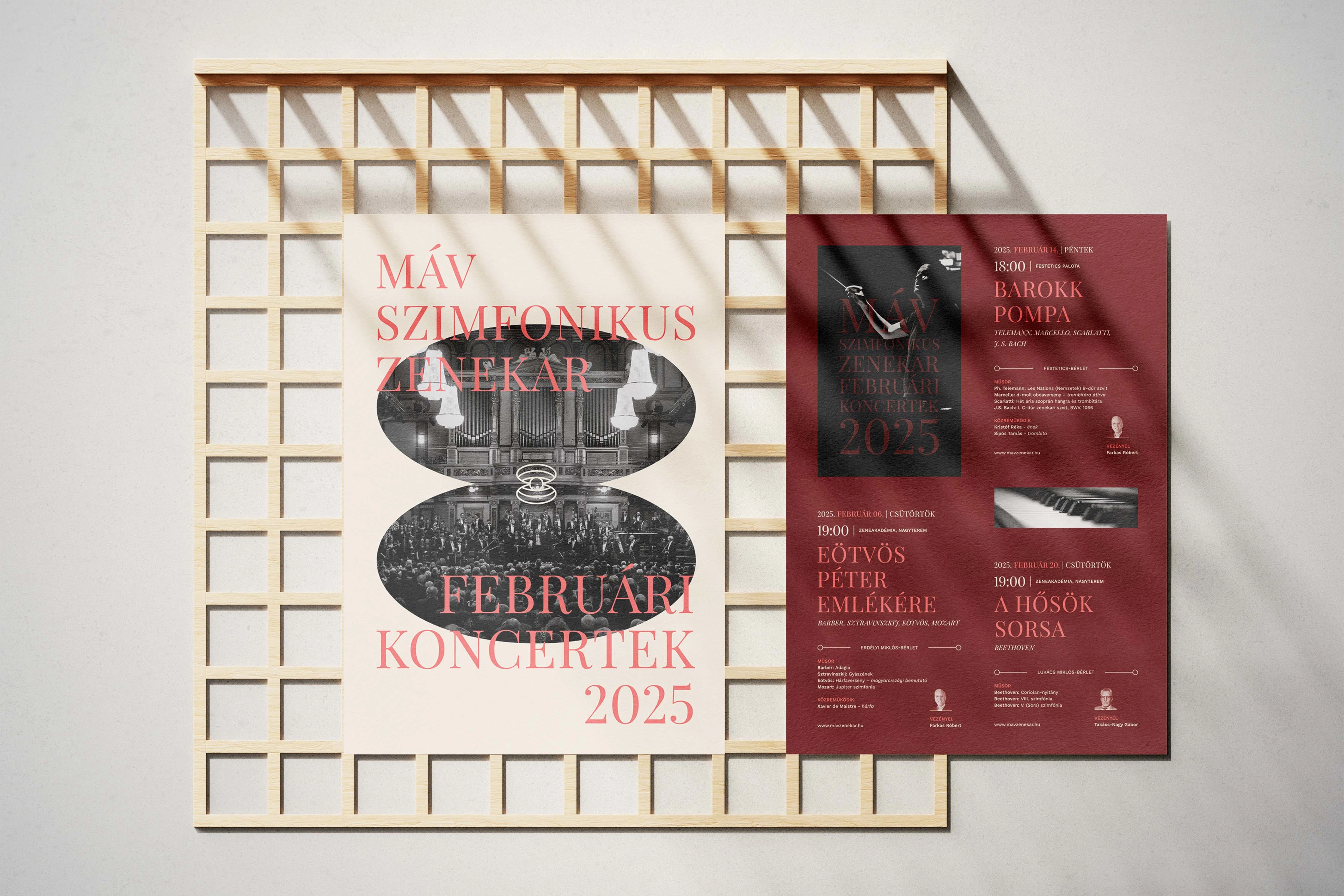
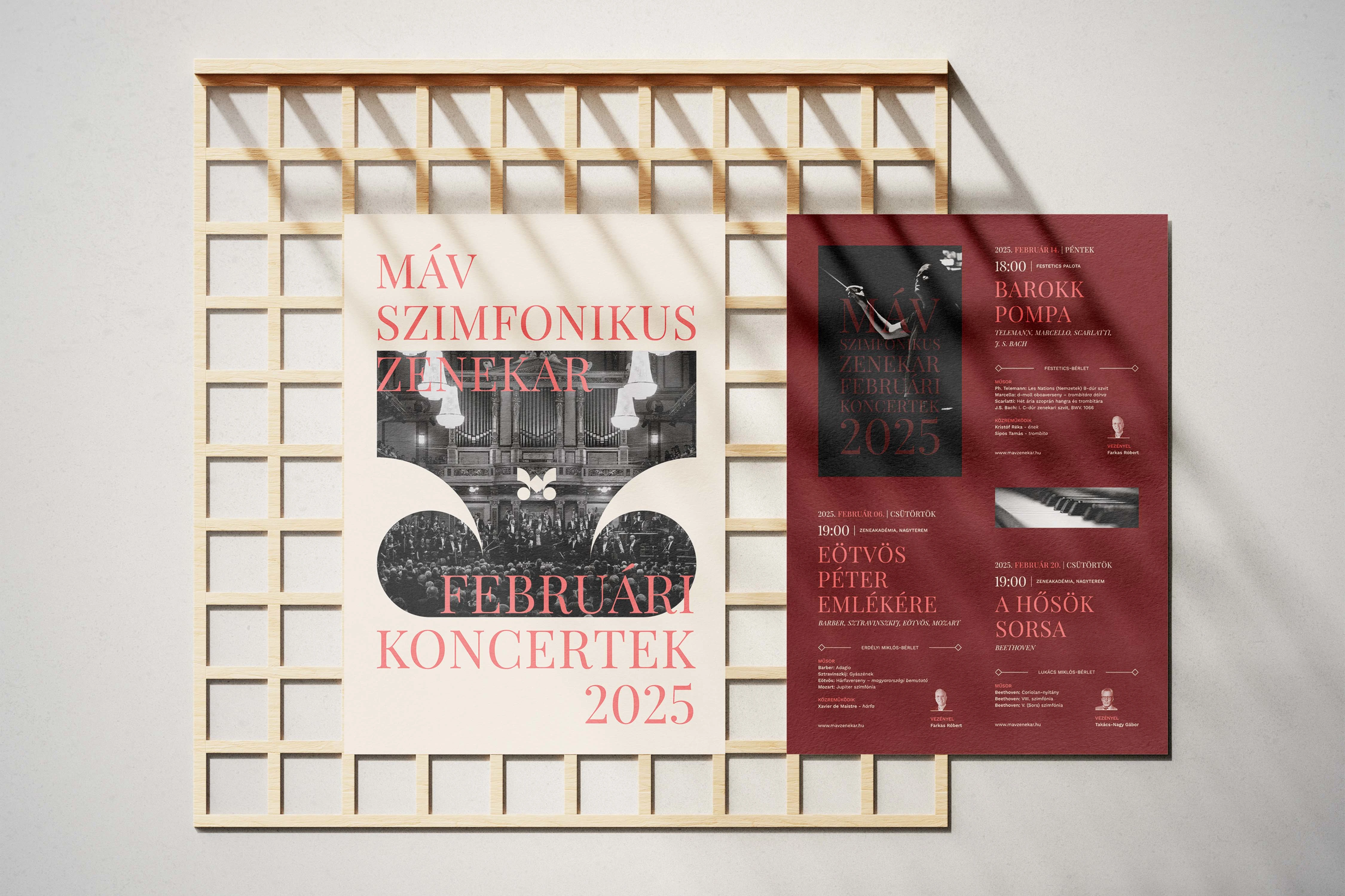
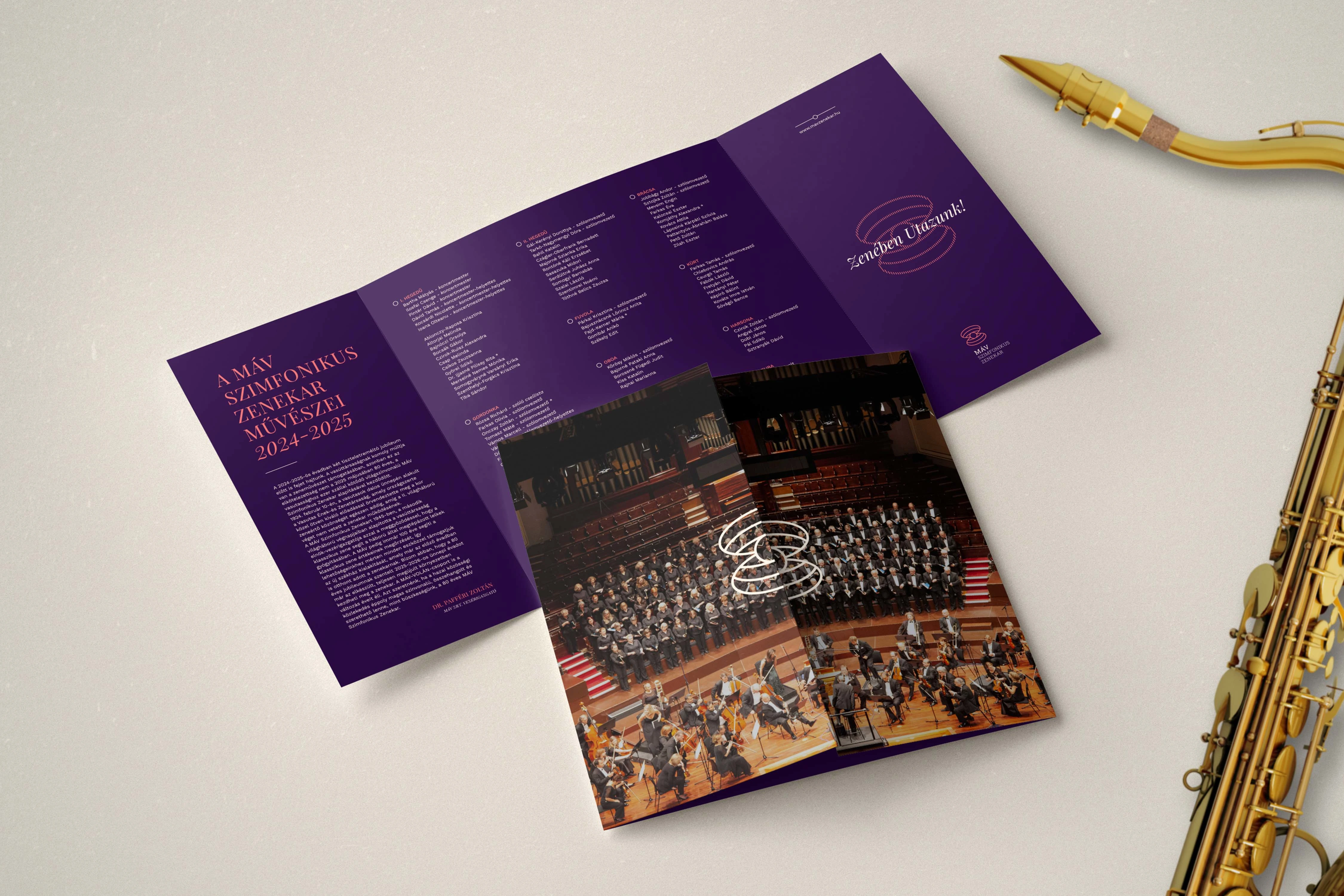
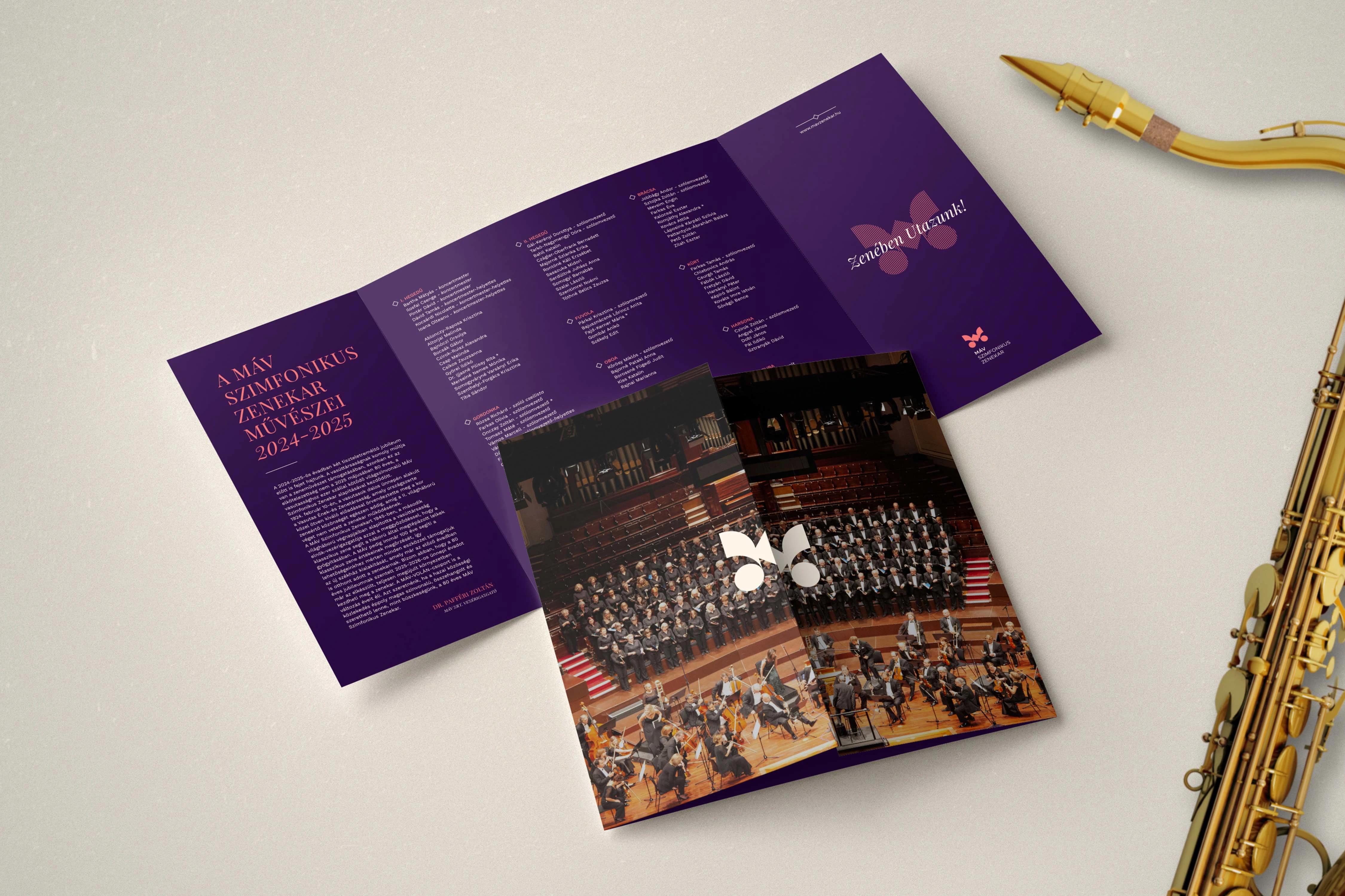
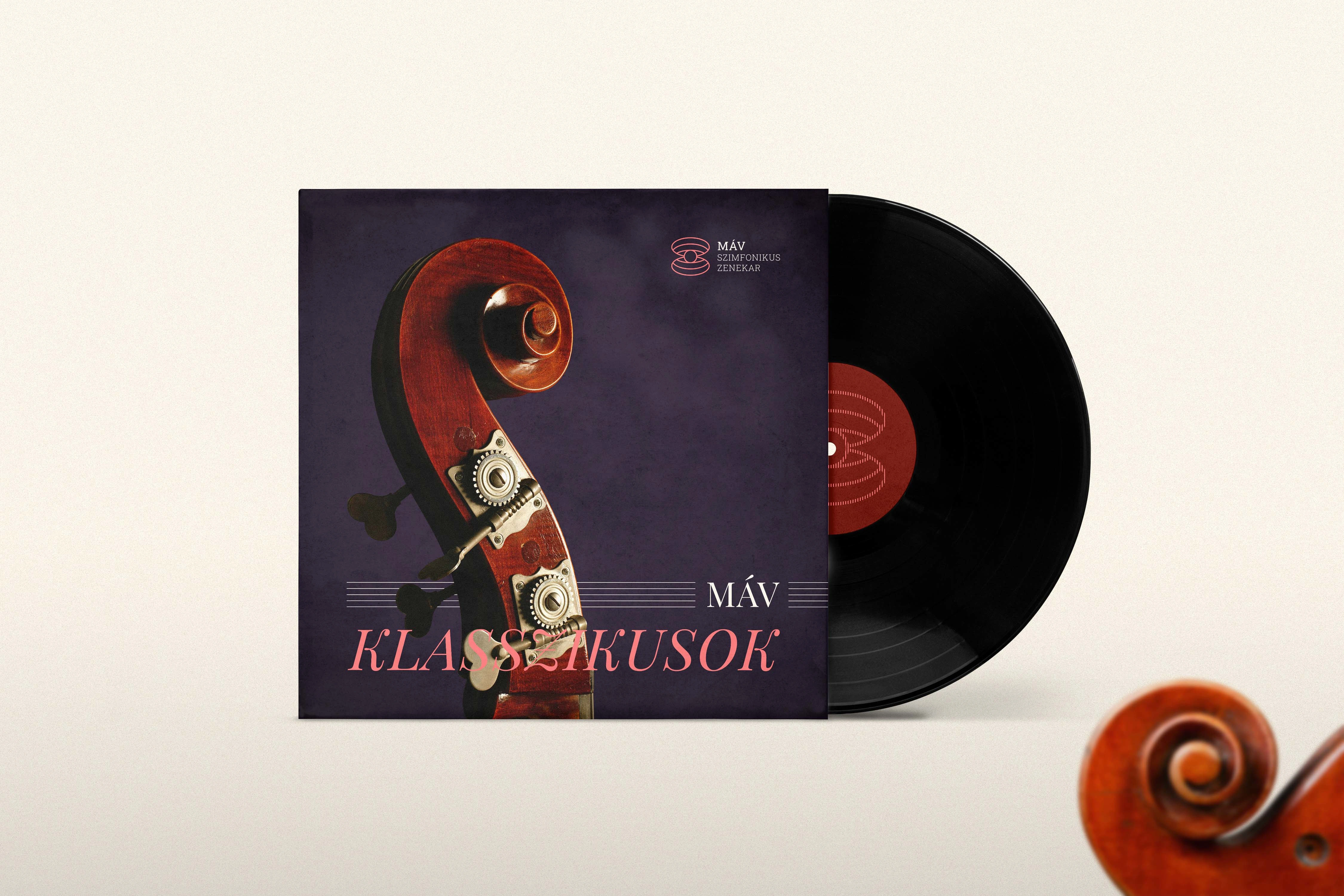
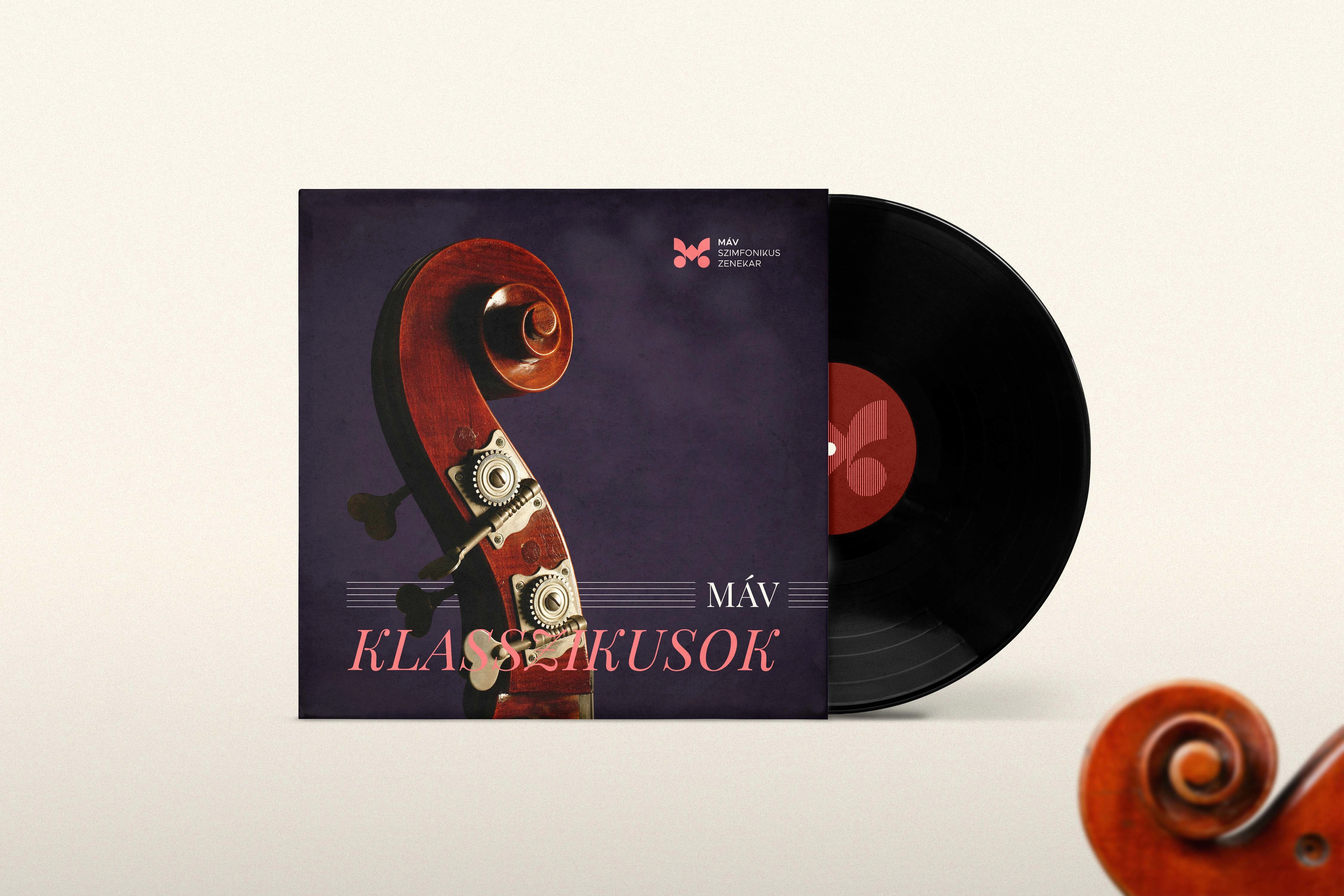
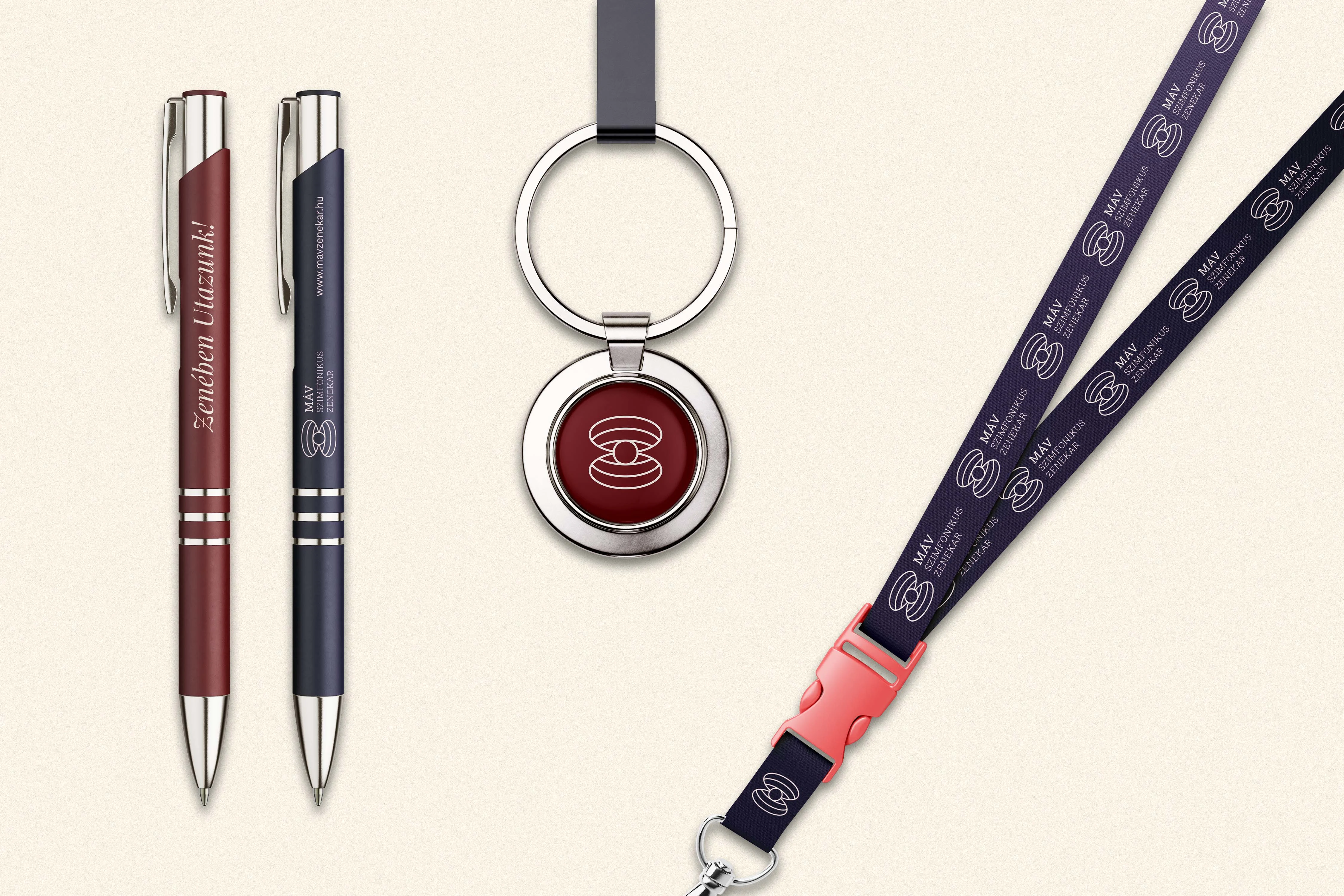
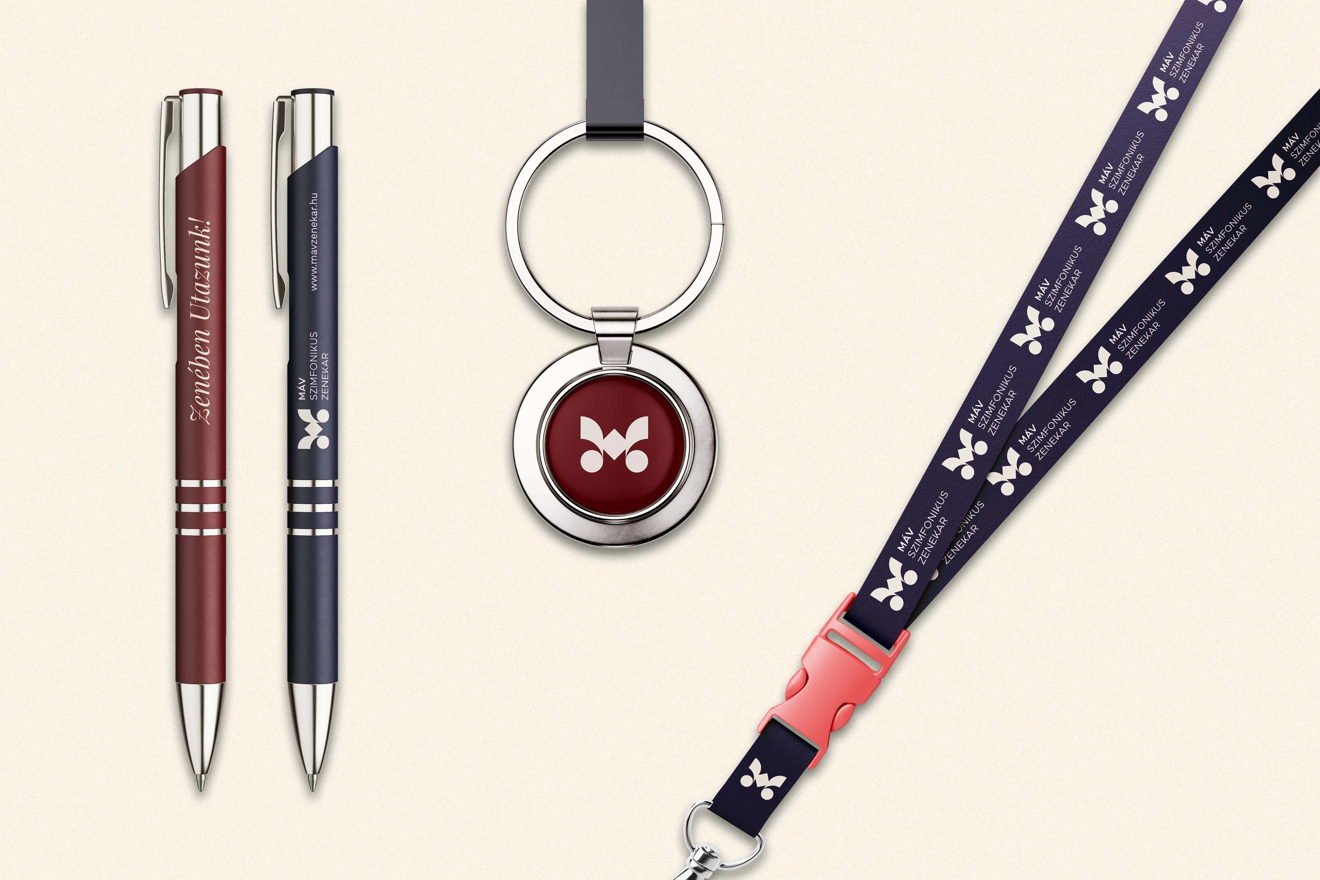
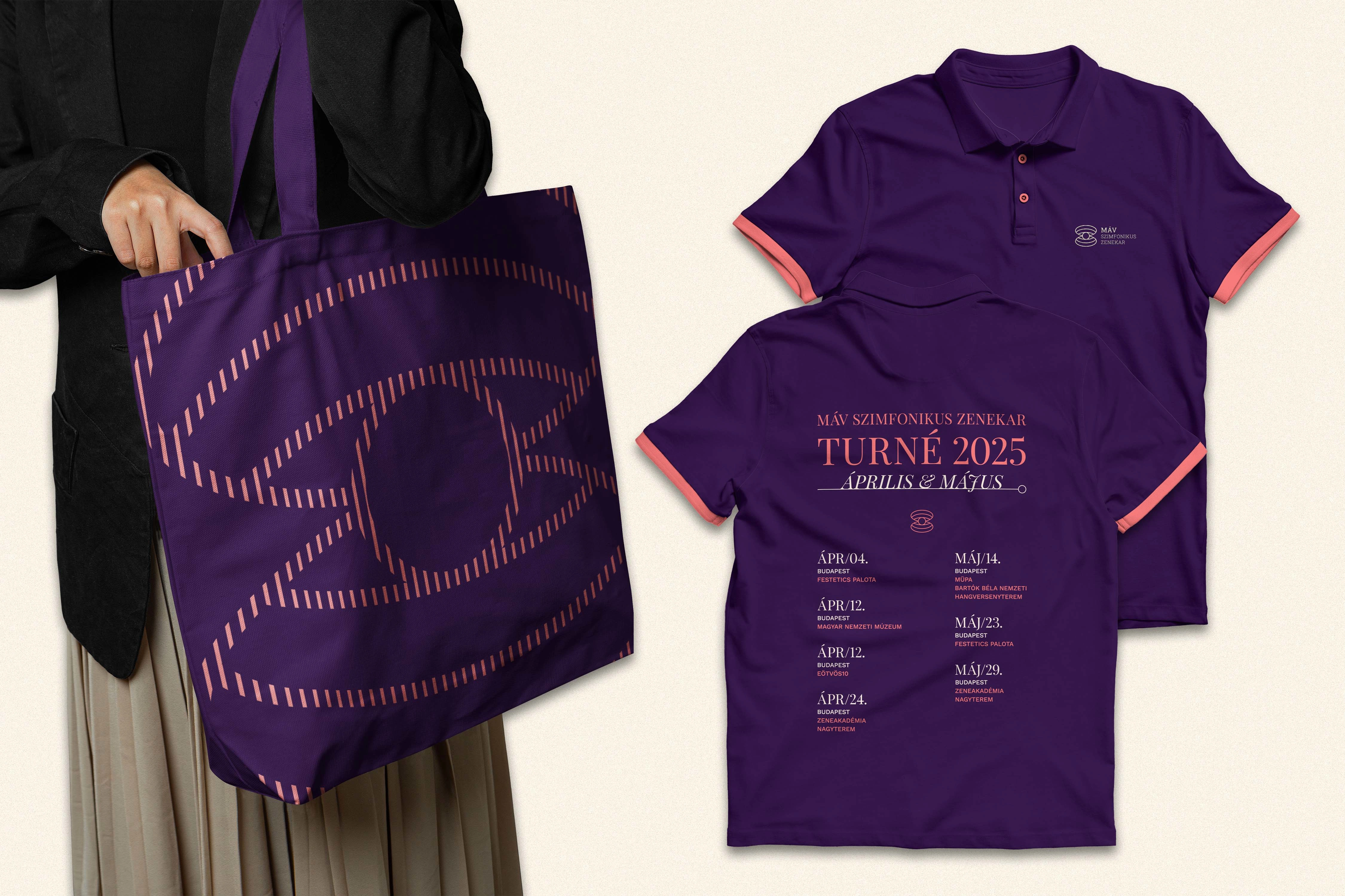
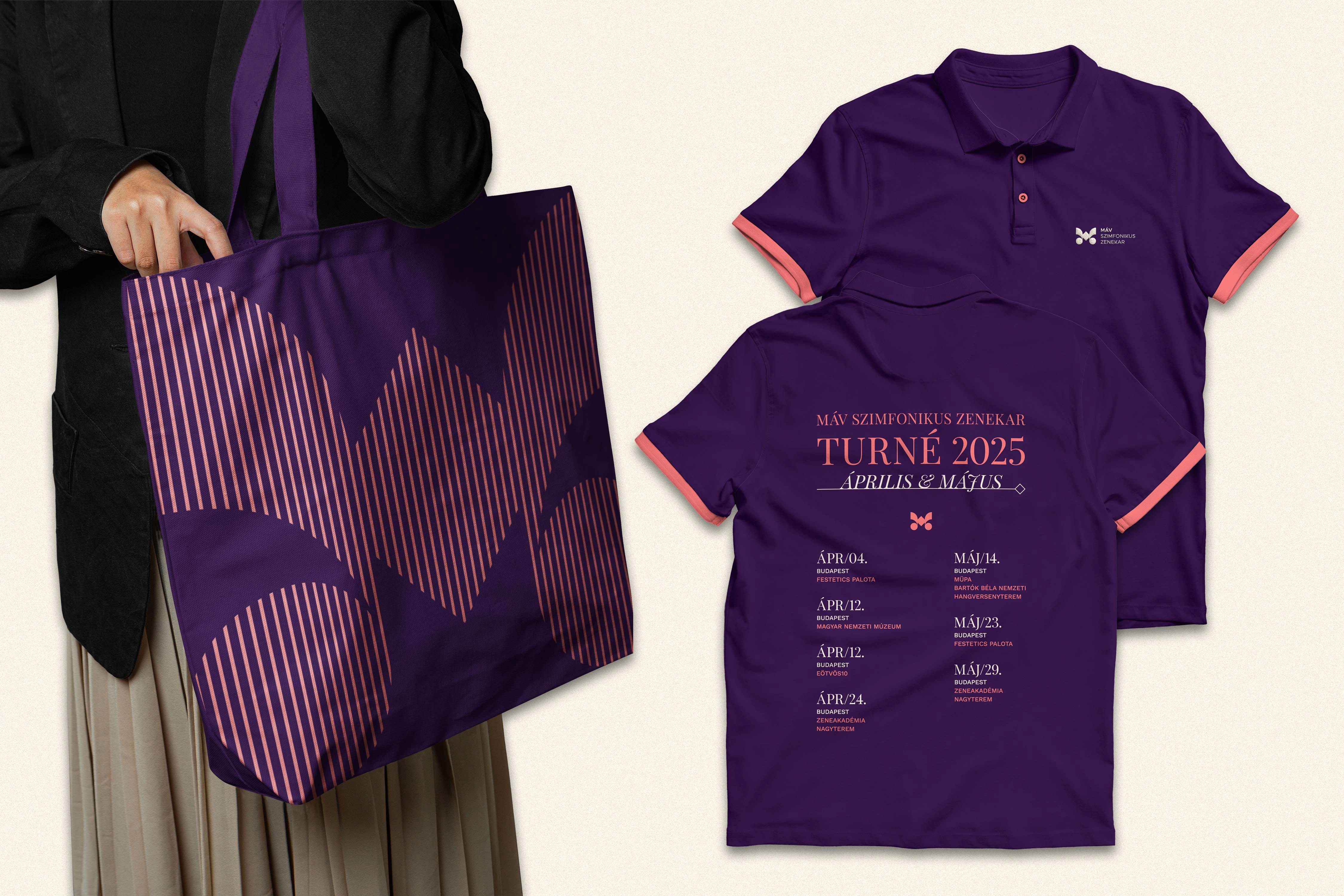
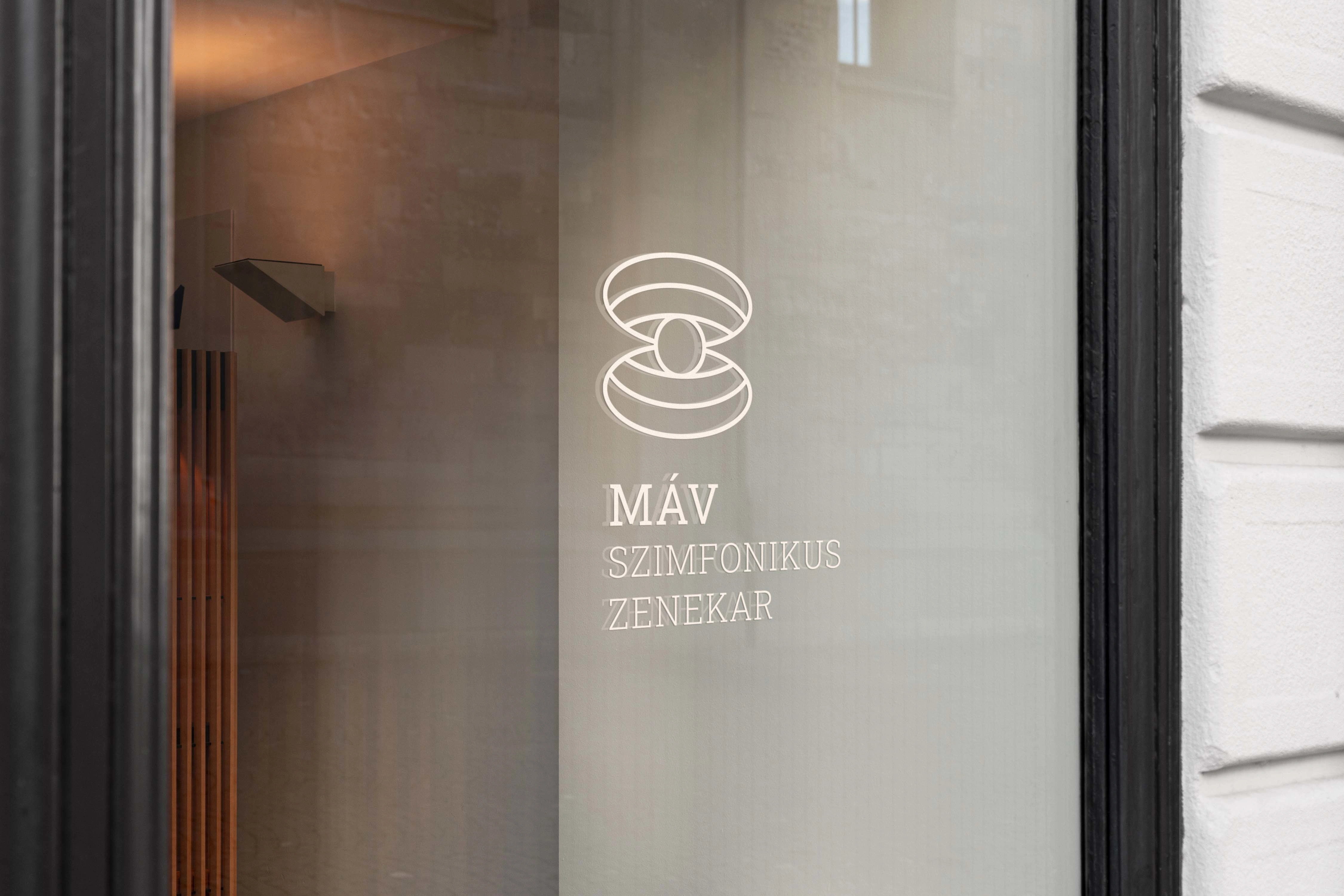
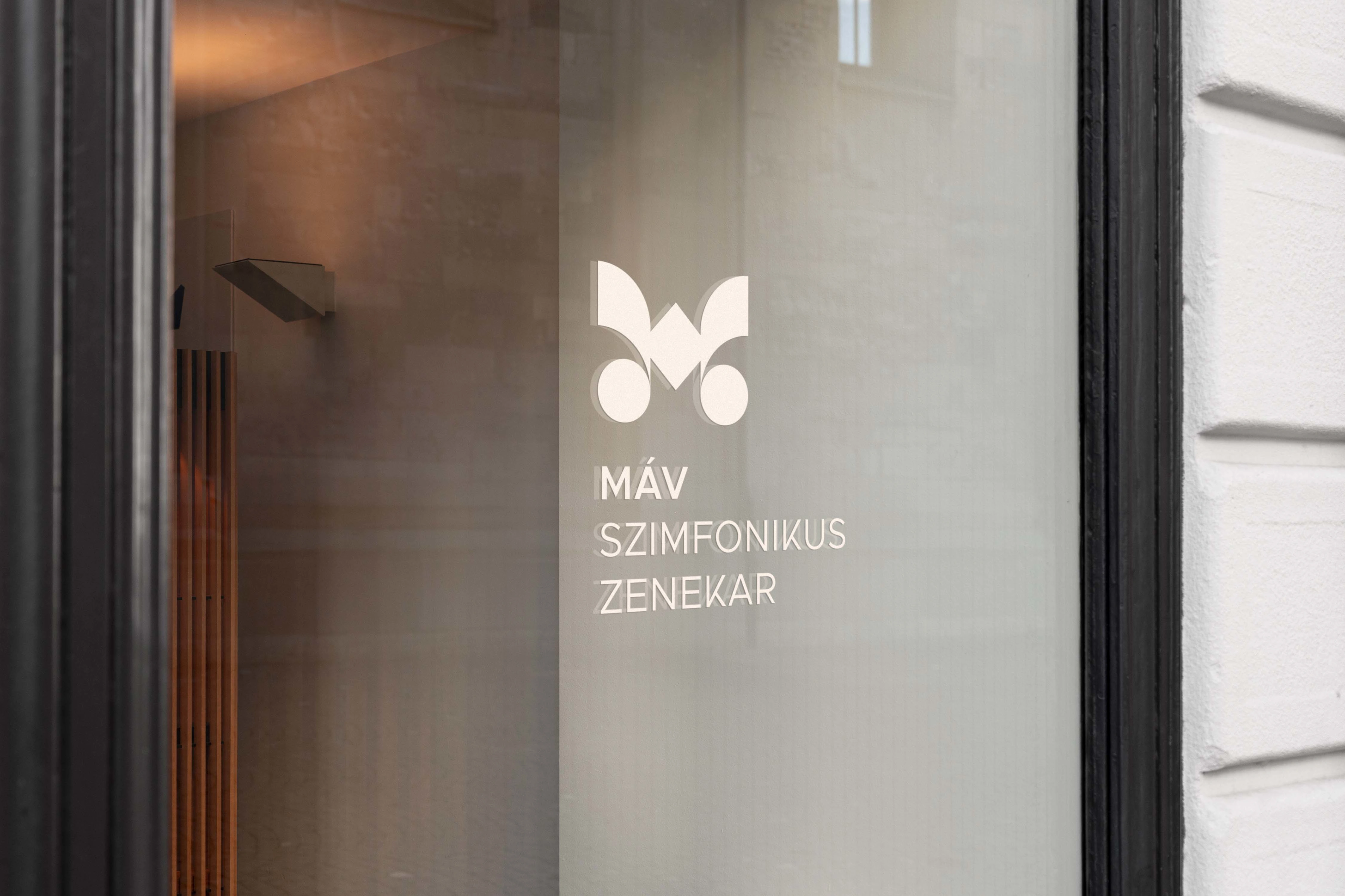
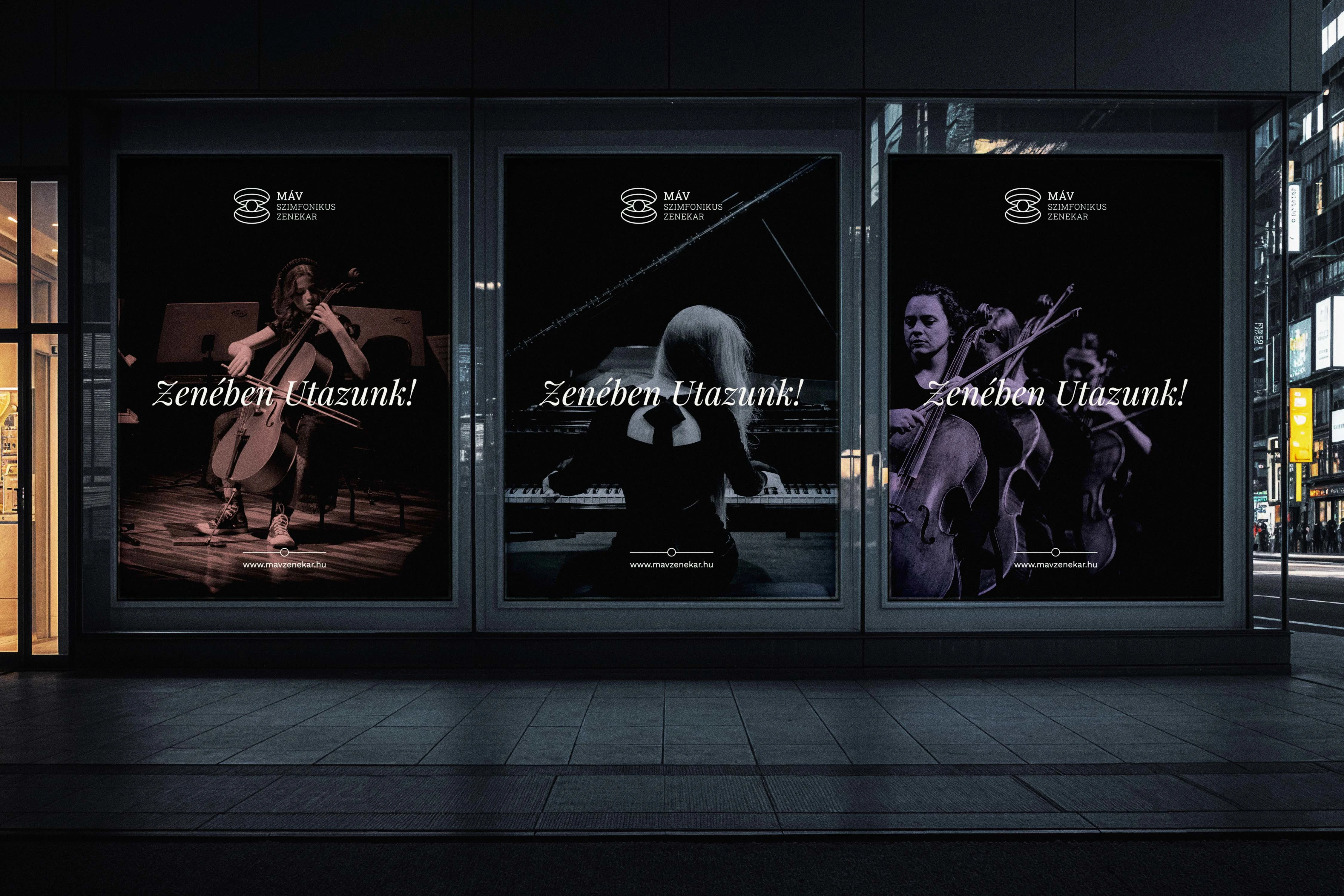
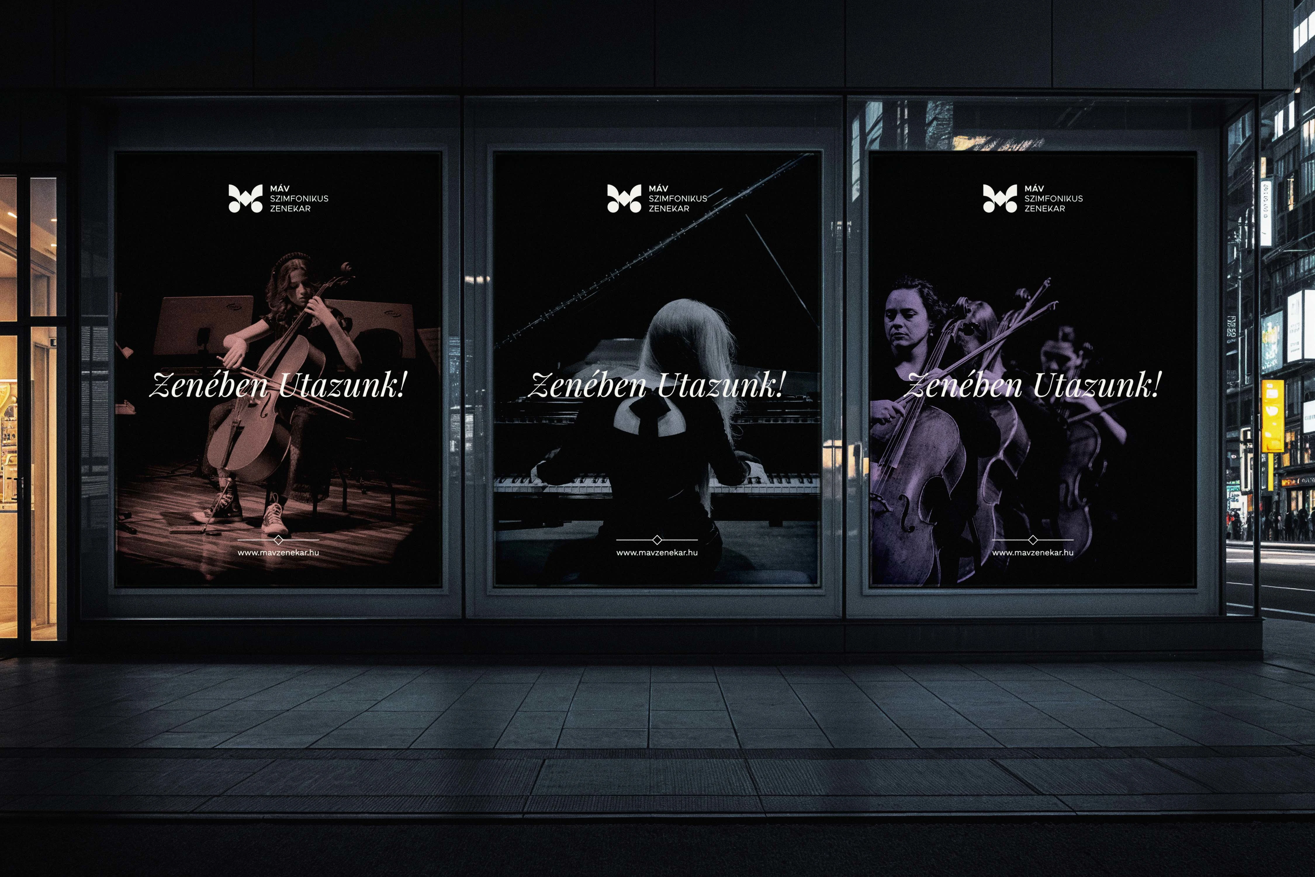
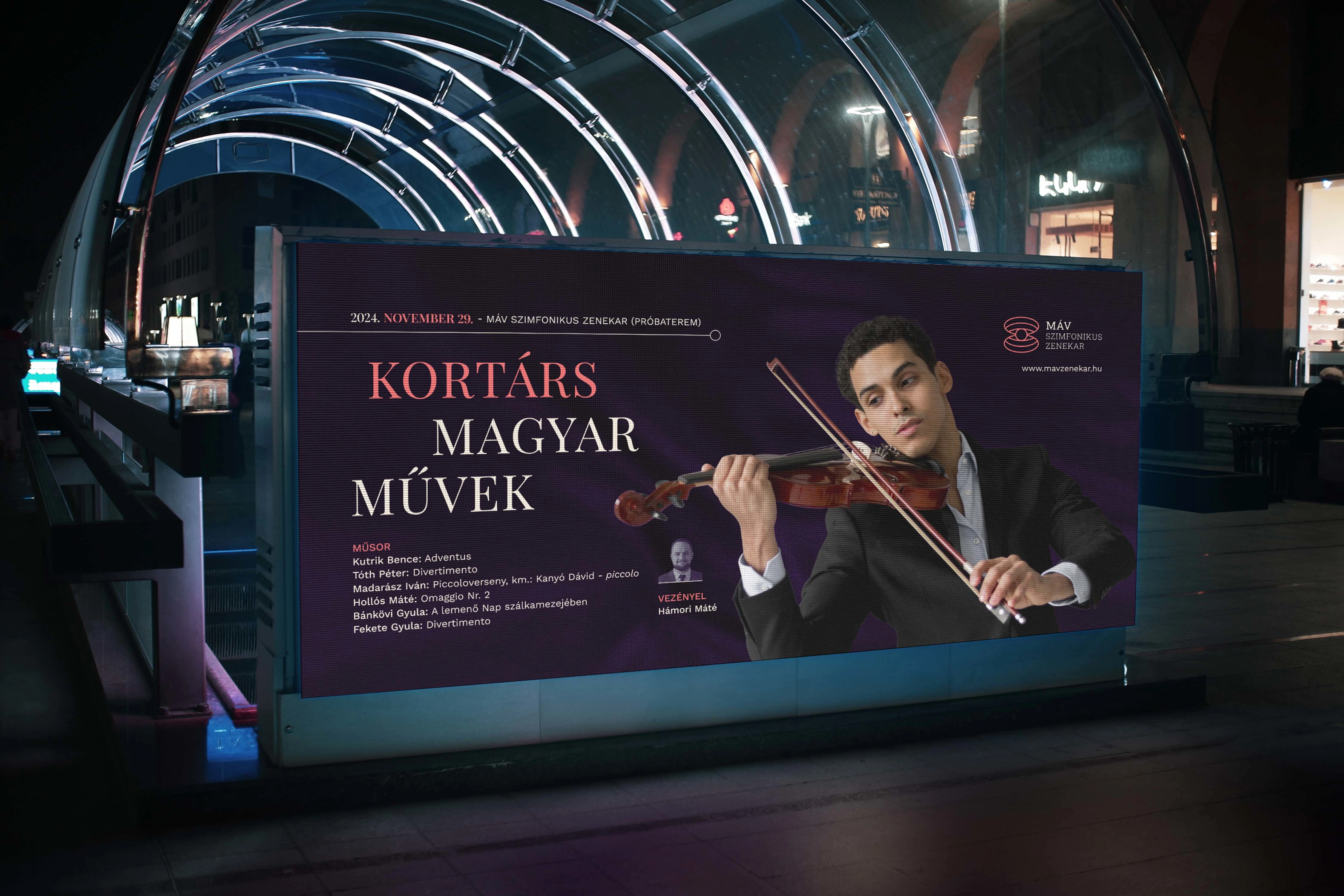
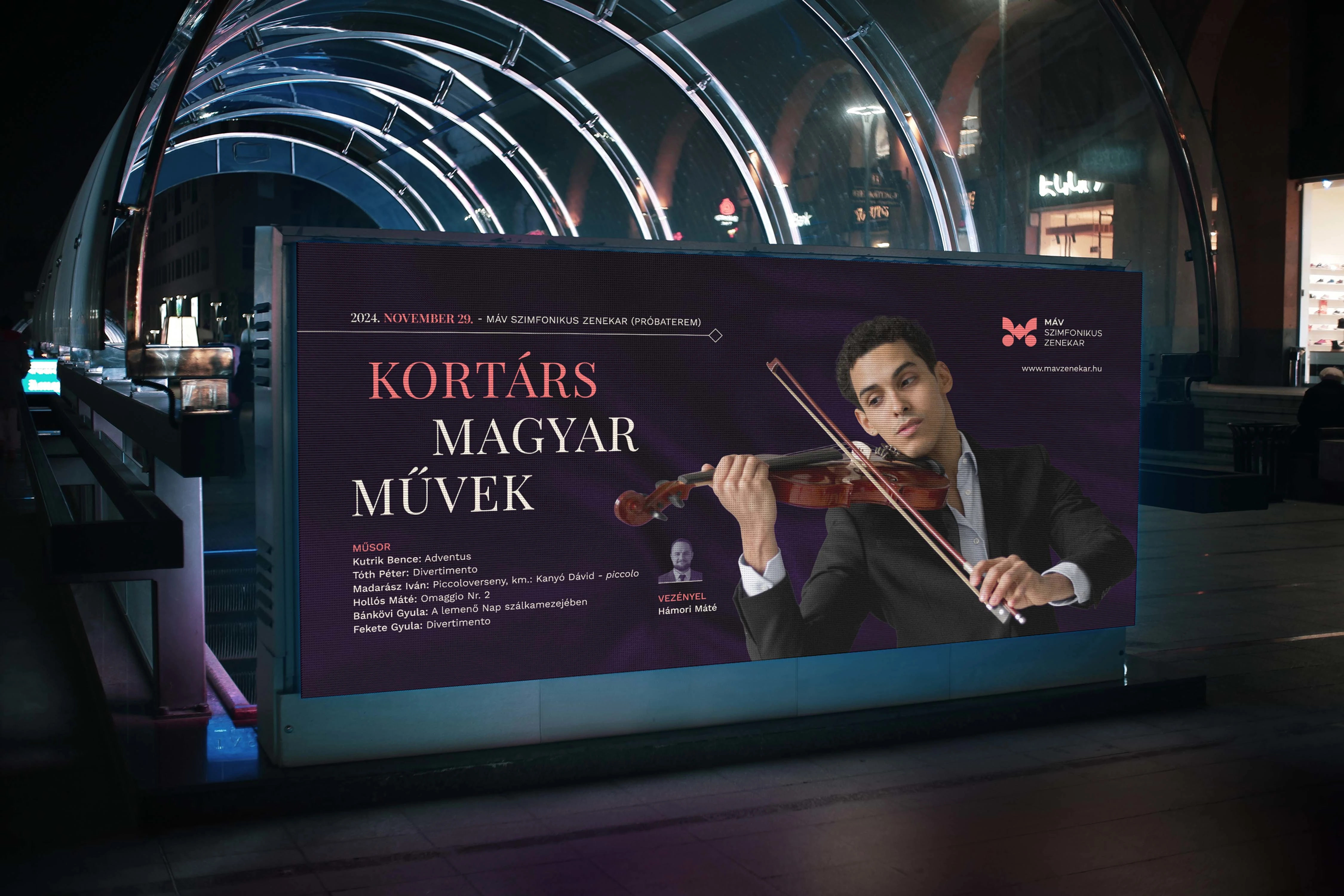
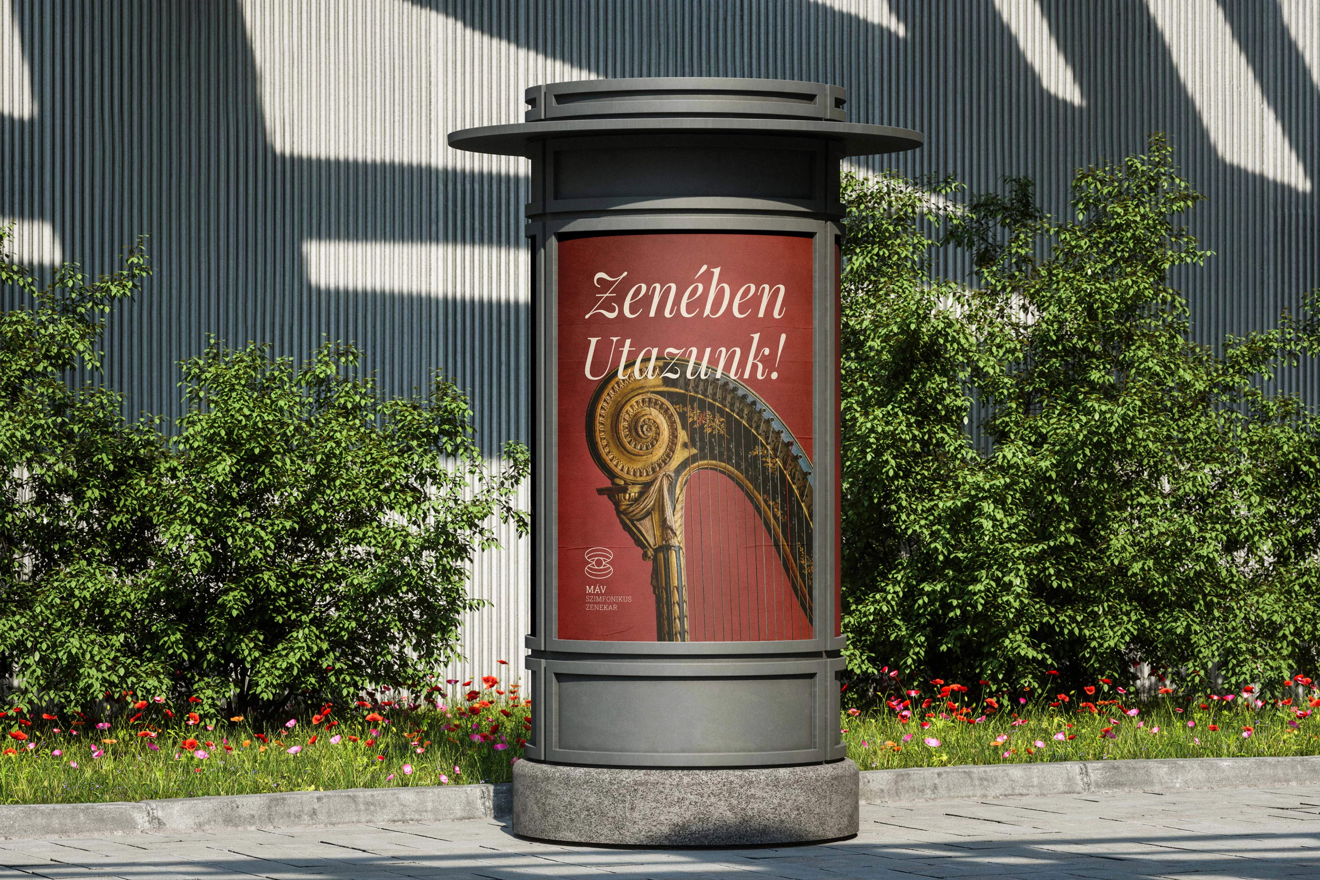
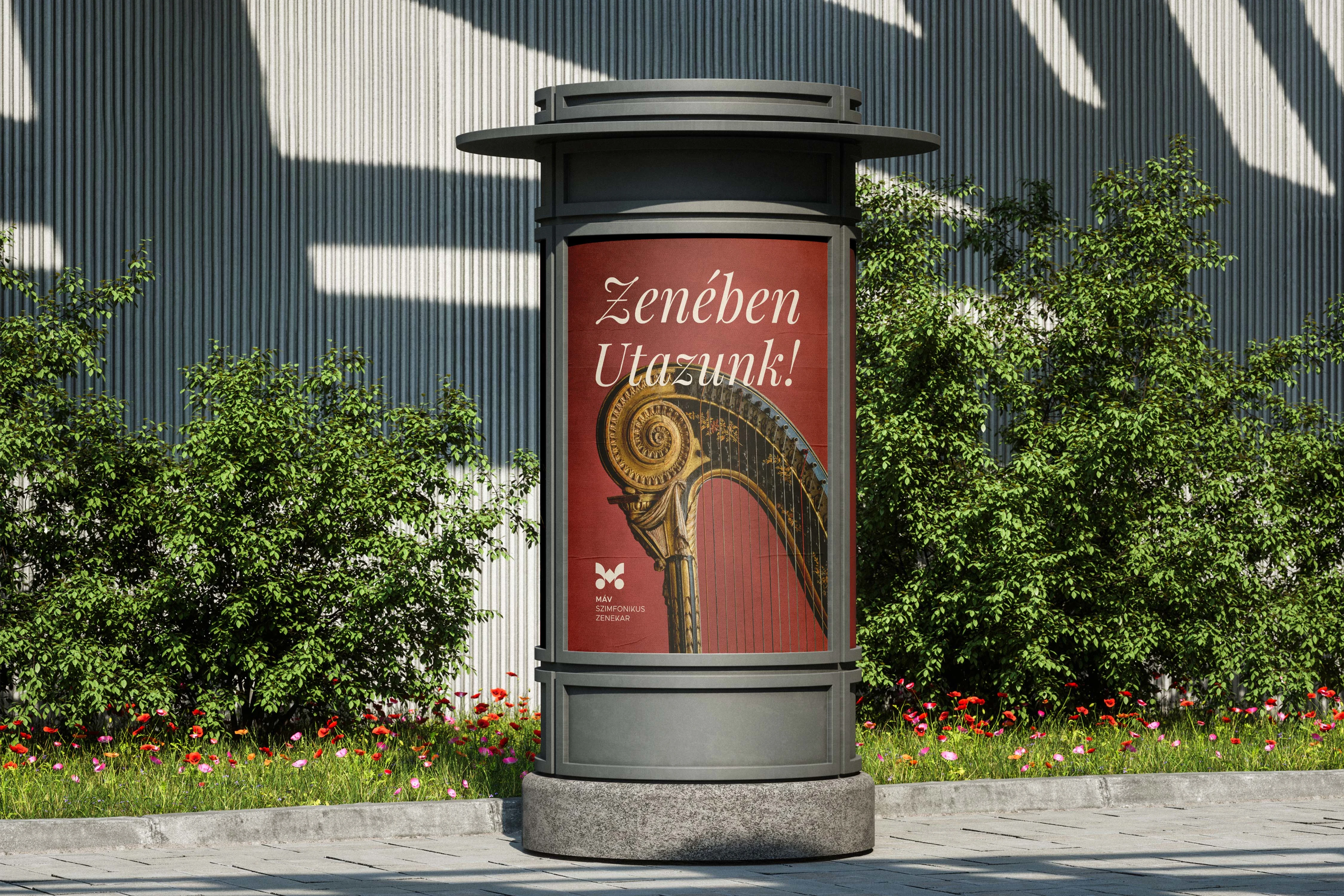
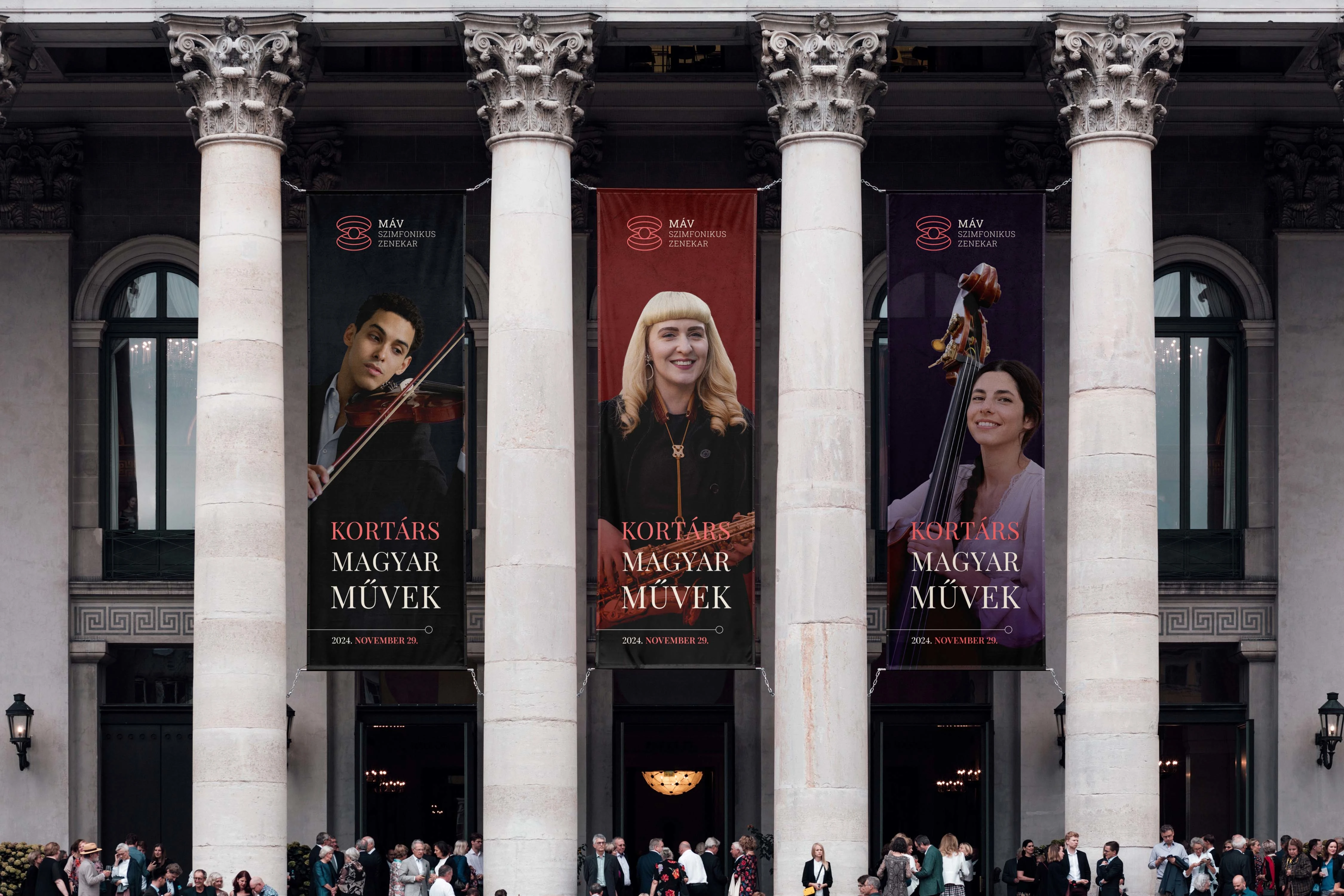
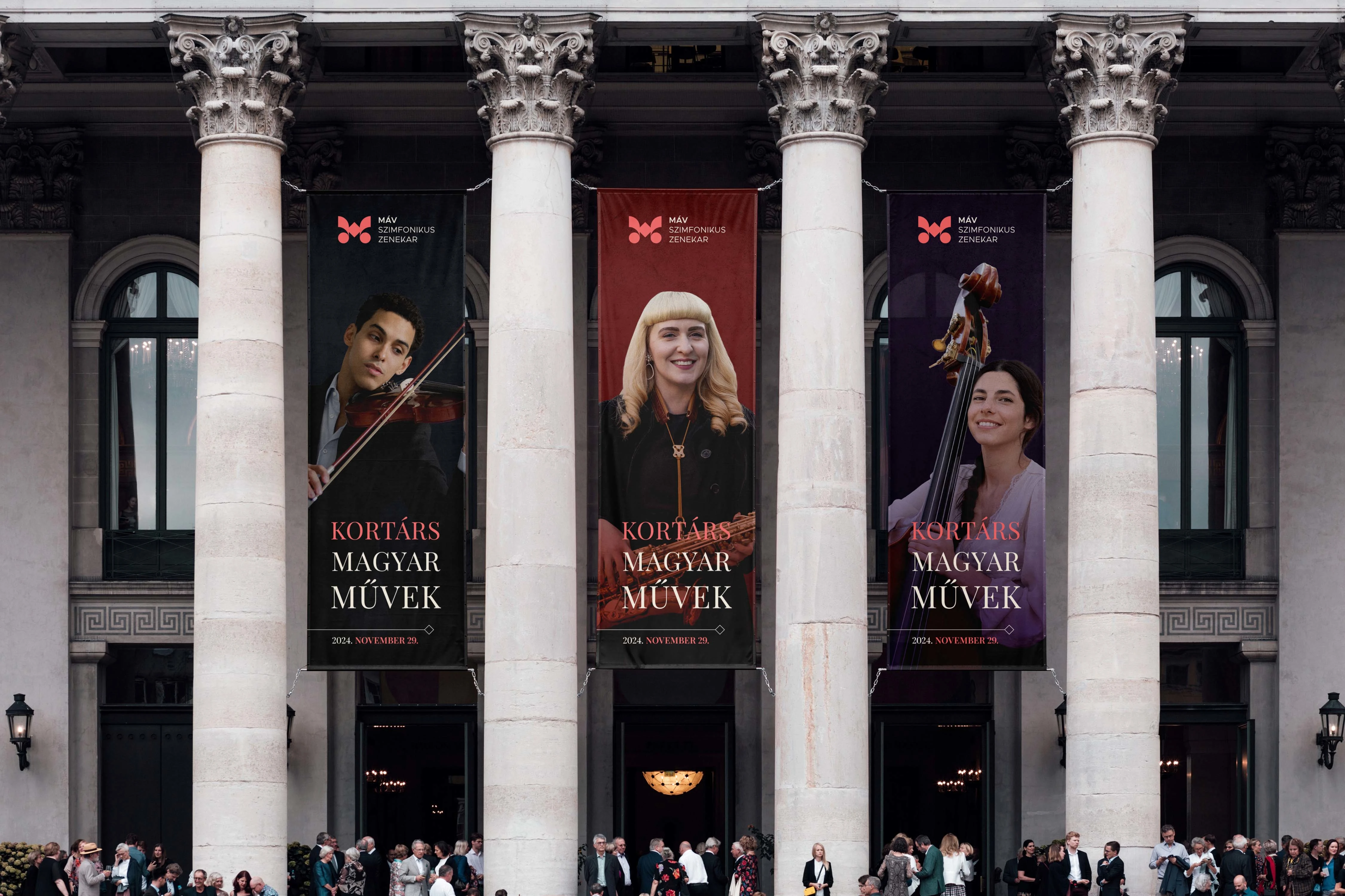
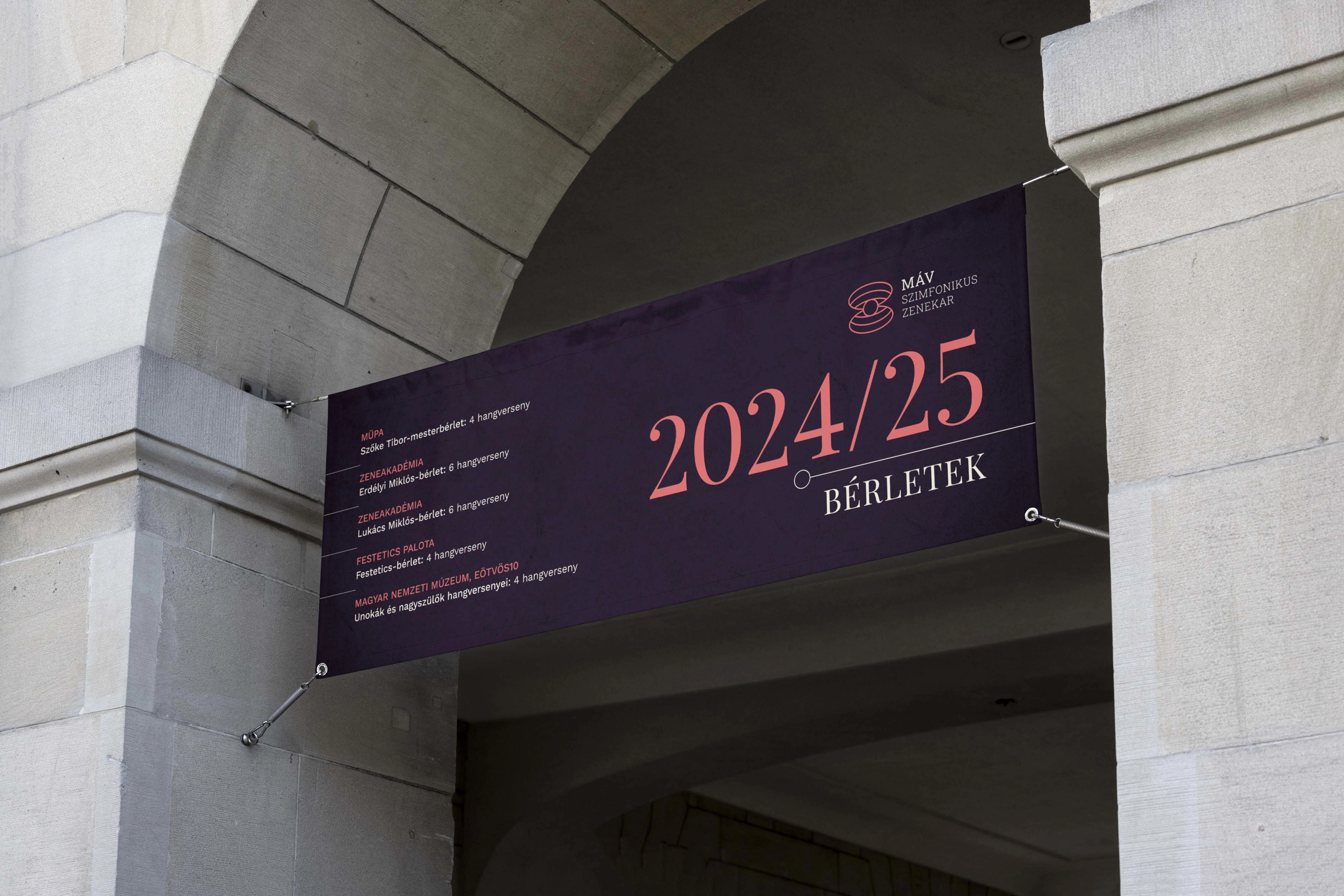
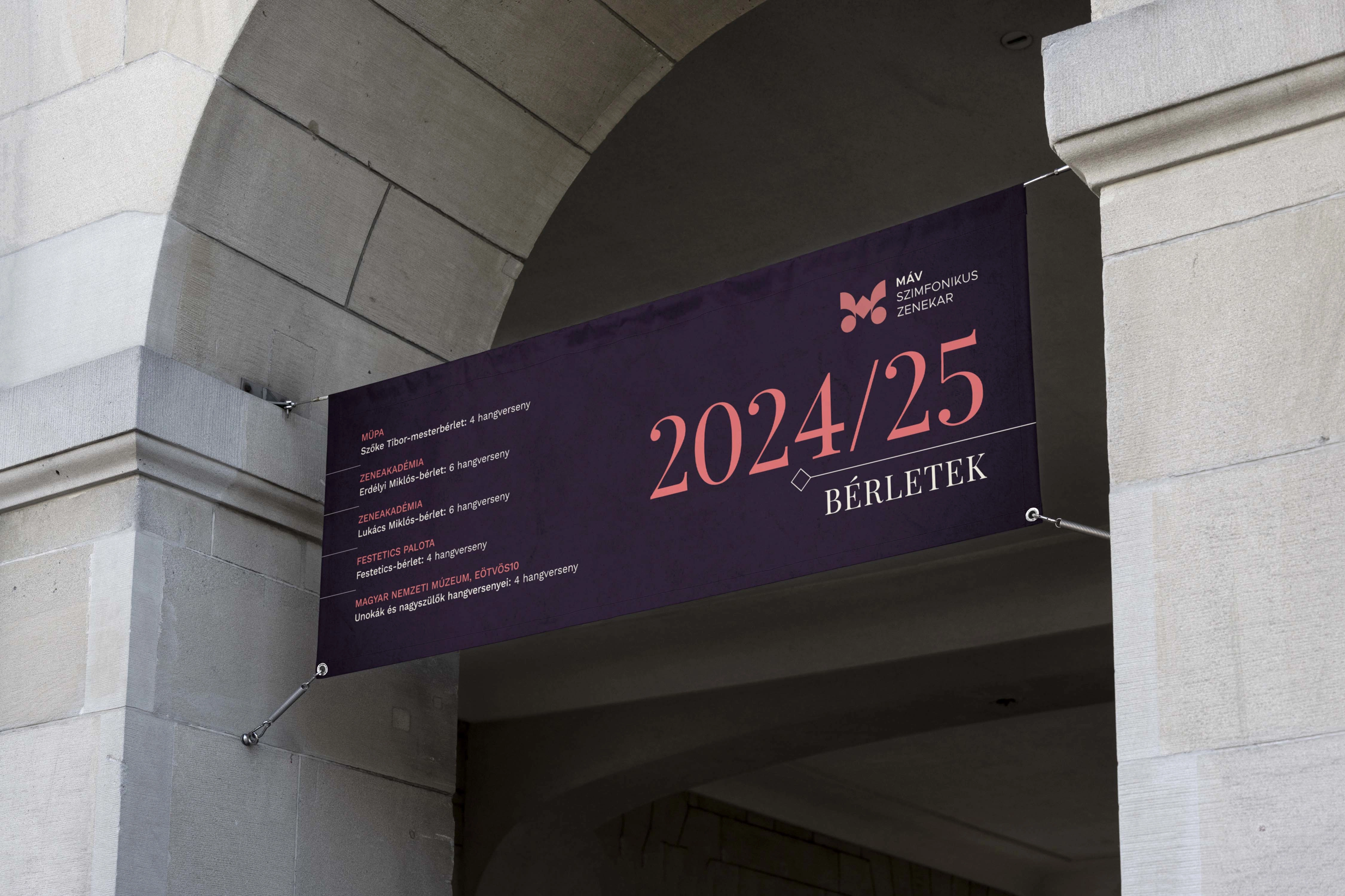
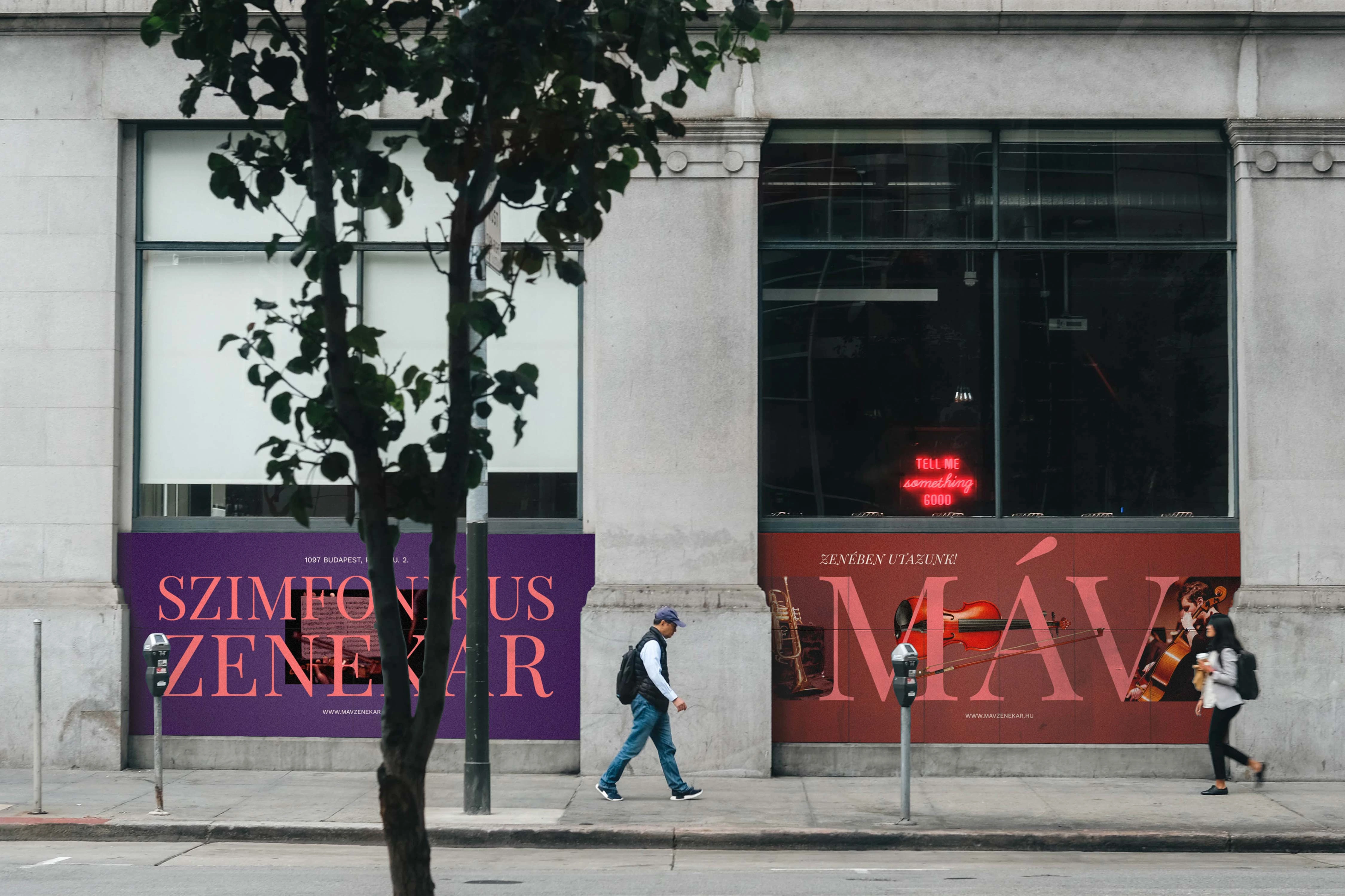
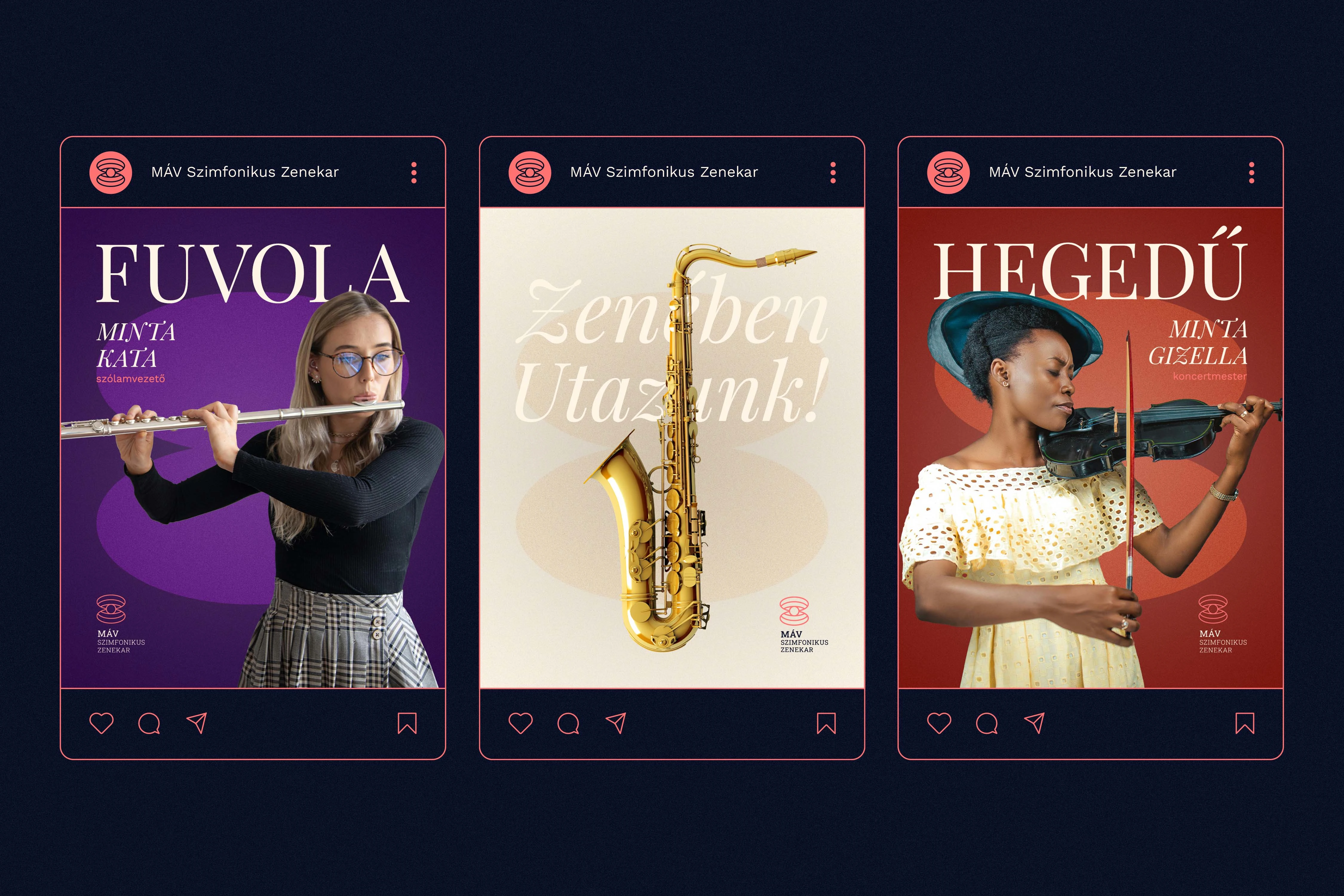
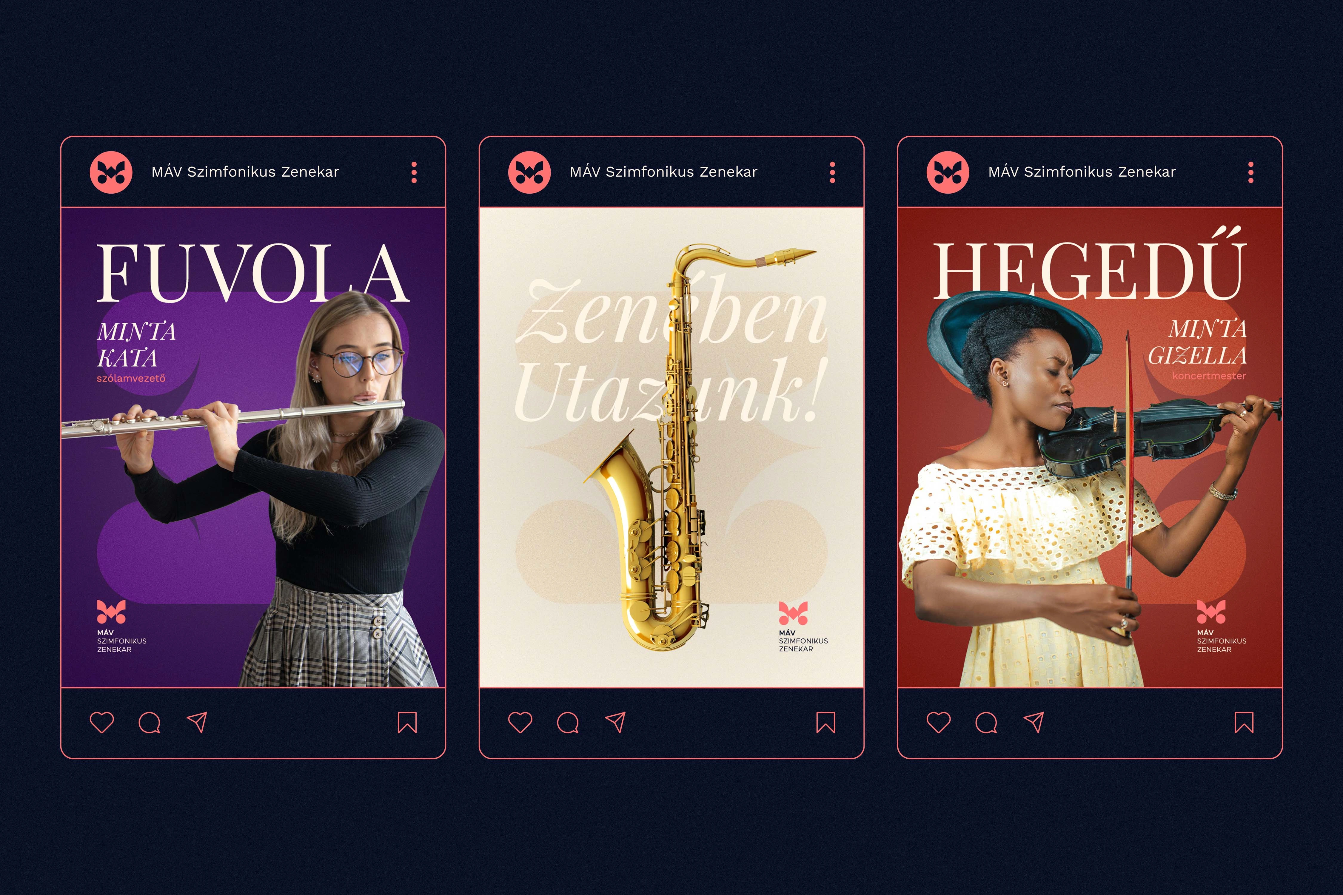
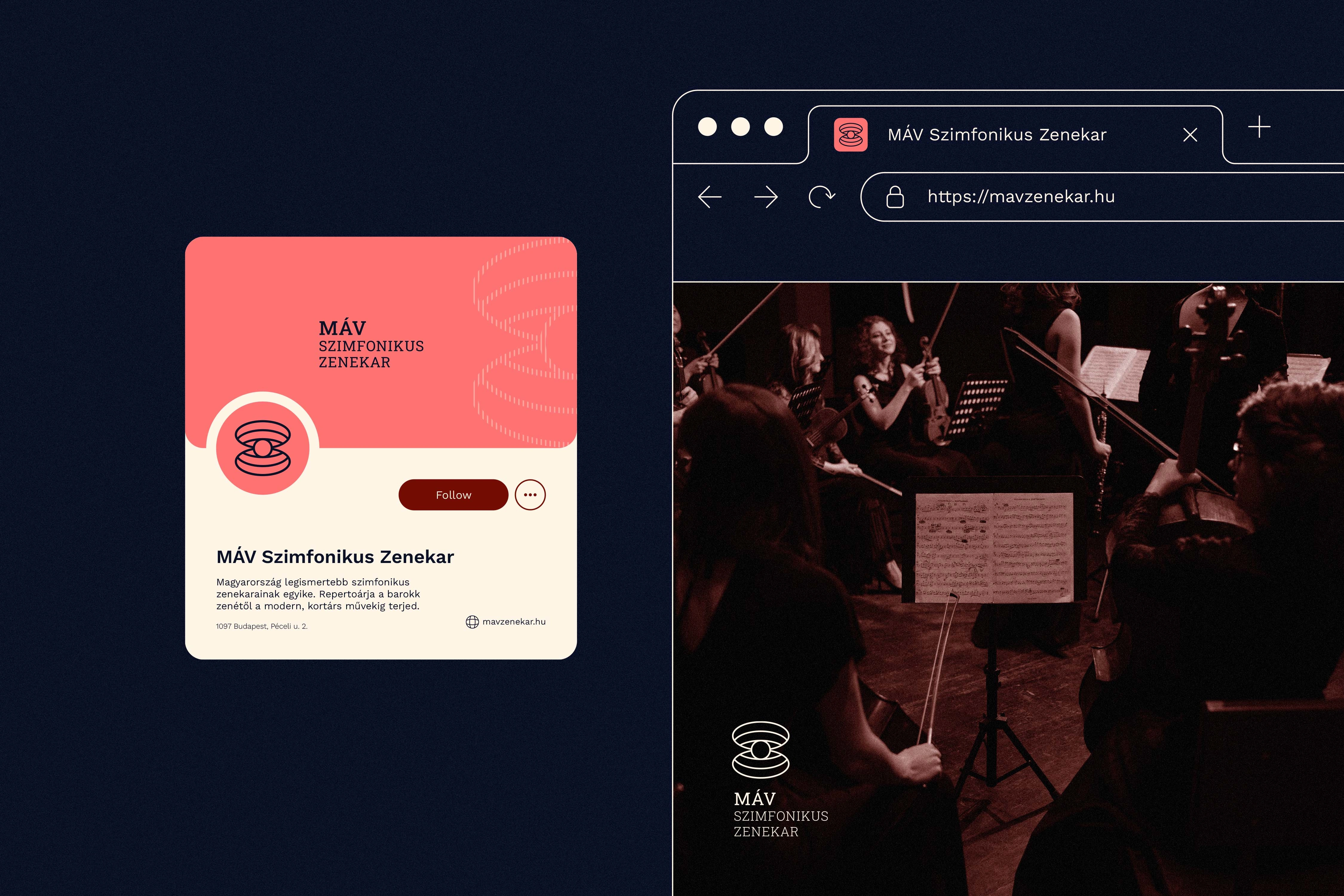
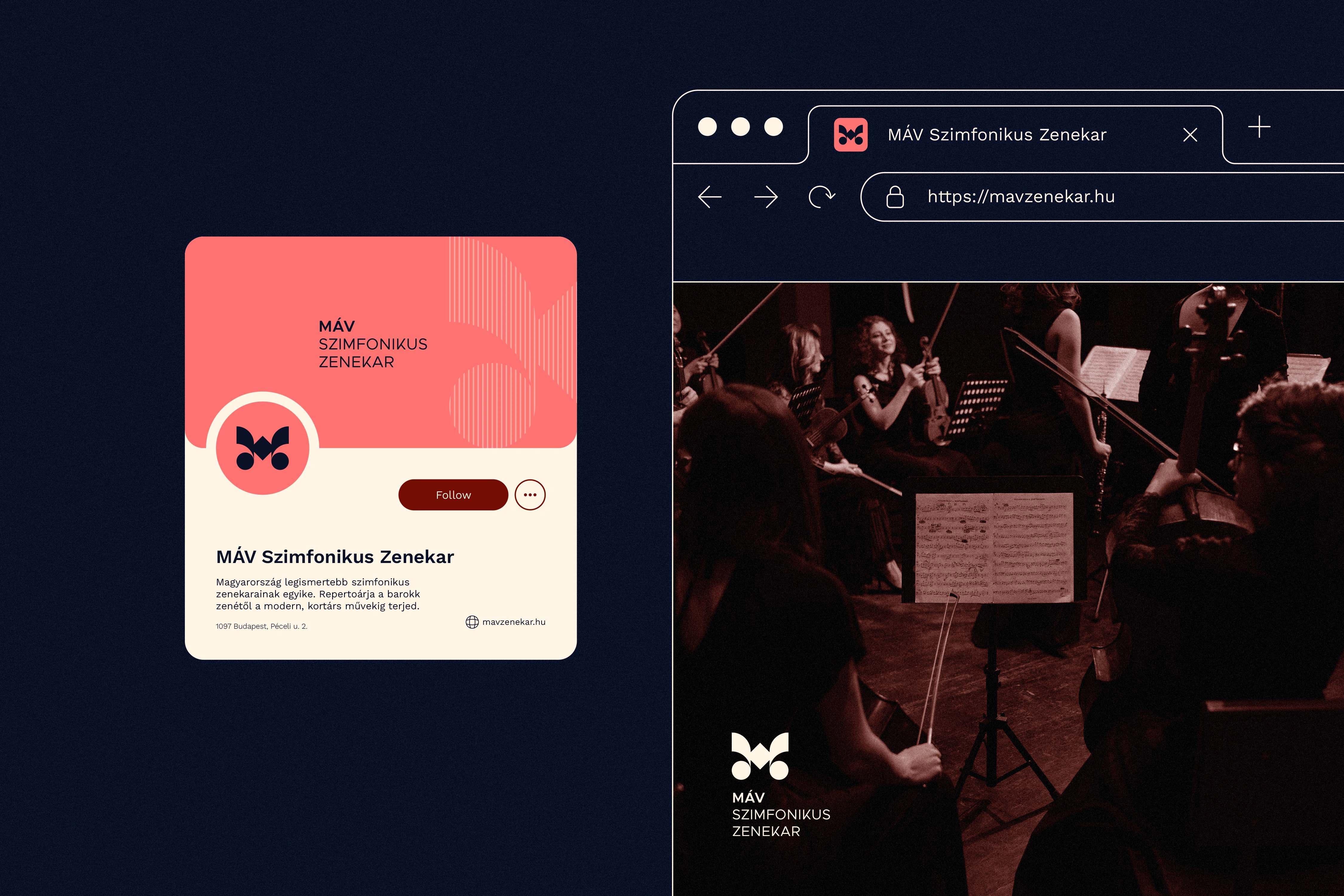
To express this rich narrative, the design system offers two distinct yet conceptually unified logo directions. The first direction utilizes elegant circular and elliptical elements to form a symbolic composition: an upper arc representing the stage, a lower arc for the audience, and a central shape embodying the conductor who connects them. This minimalist mark subtly evokes sound waves, the curves of string instruments, and an hourglass denoting a musical journey through time. The second direction centers on a stylized "M," seamlessly weaving together shapes inspired by treble and bass clefs, musical notes, and harp contours. Its symmetrical structure suggests unity and excellence, while subtly nodding to the orchestra's railway heritage and the beautiful idea of "traveling through music."
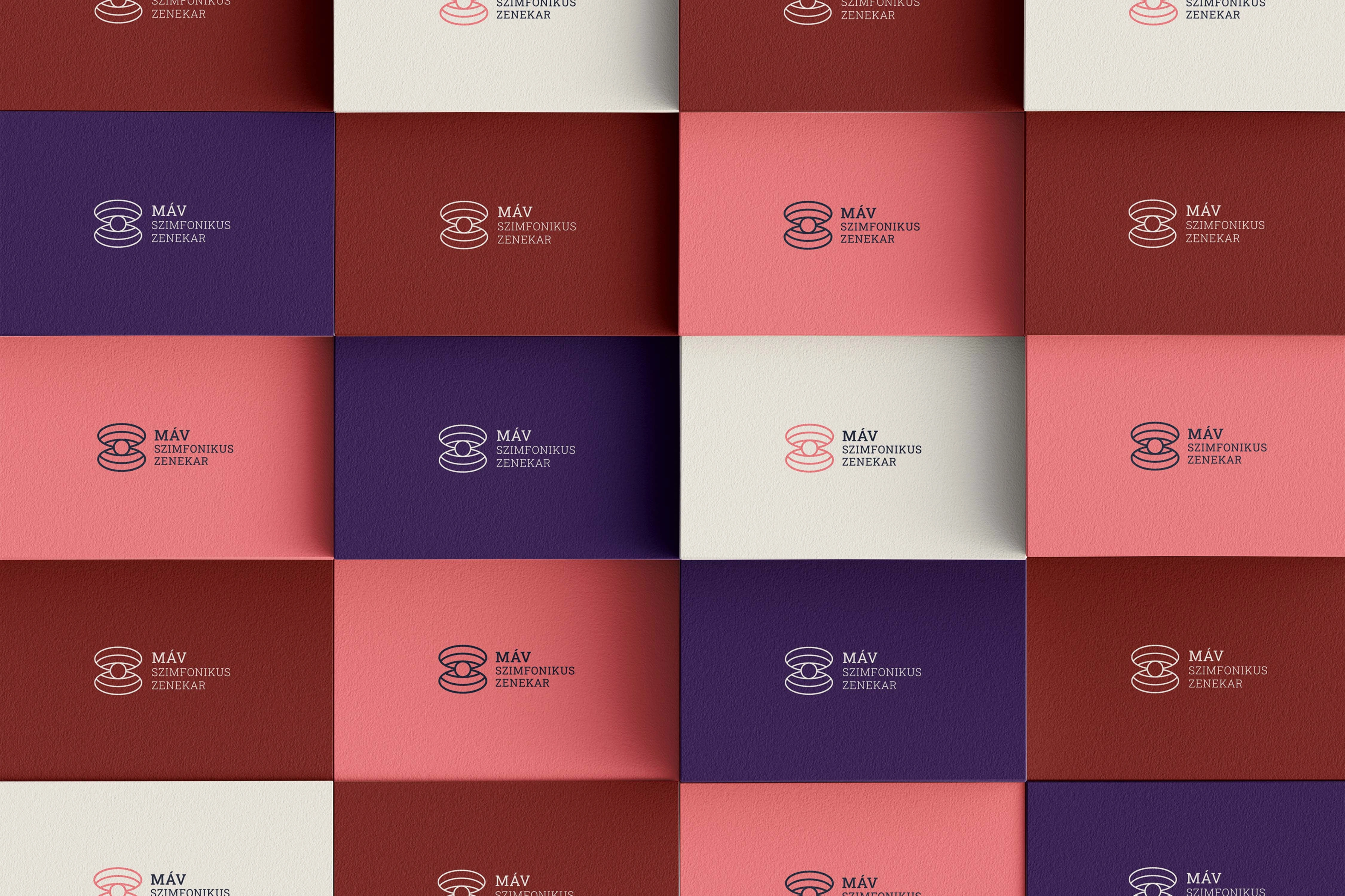
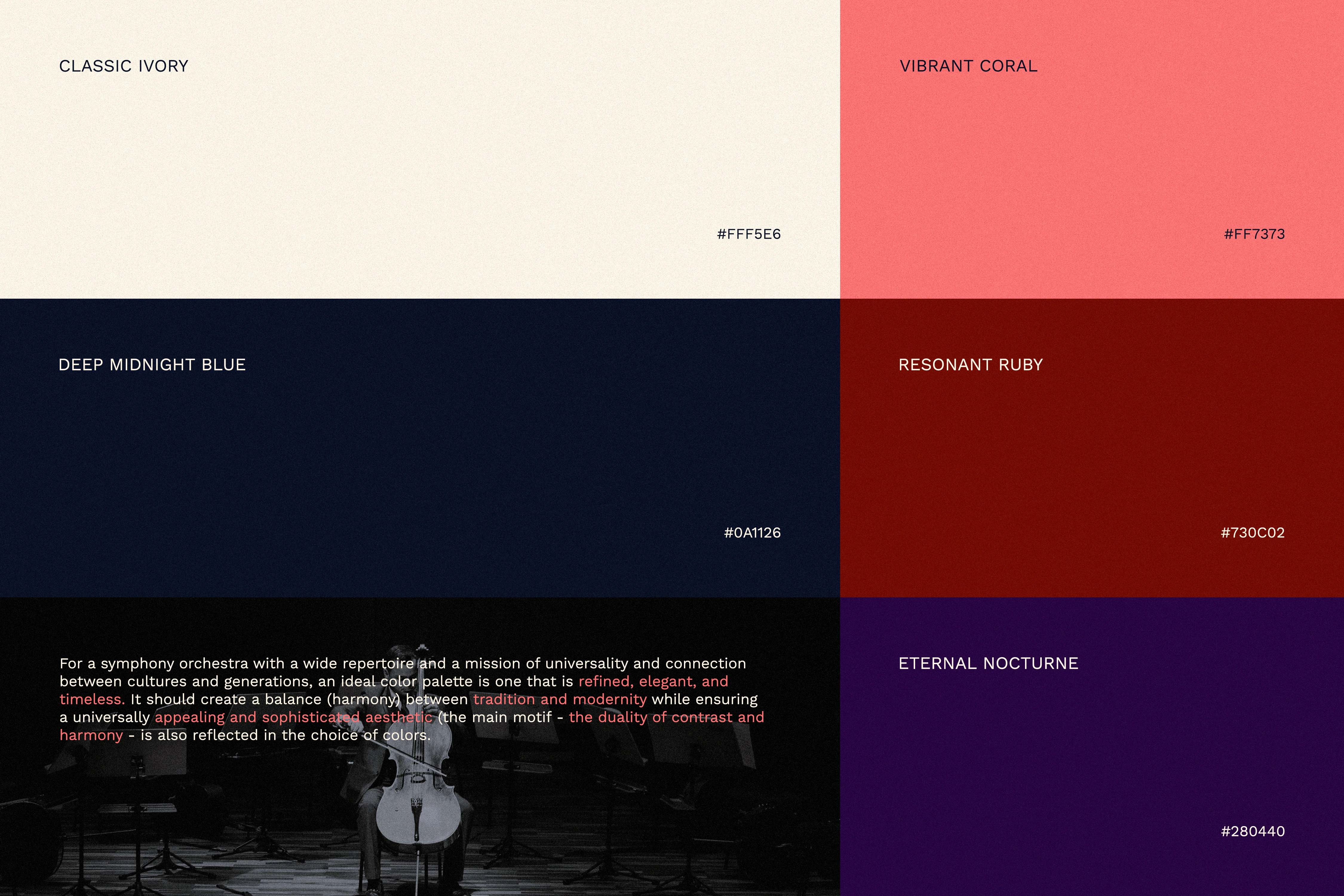
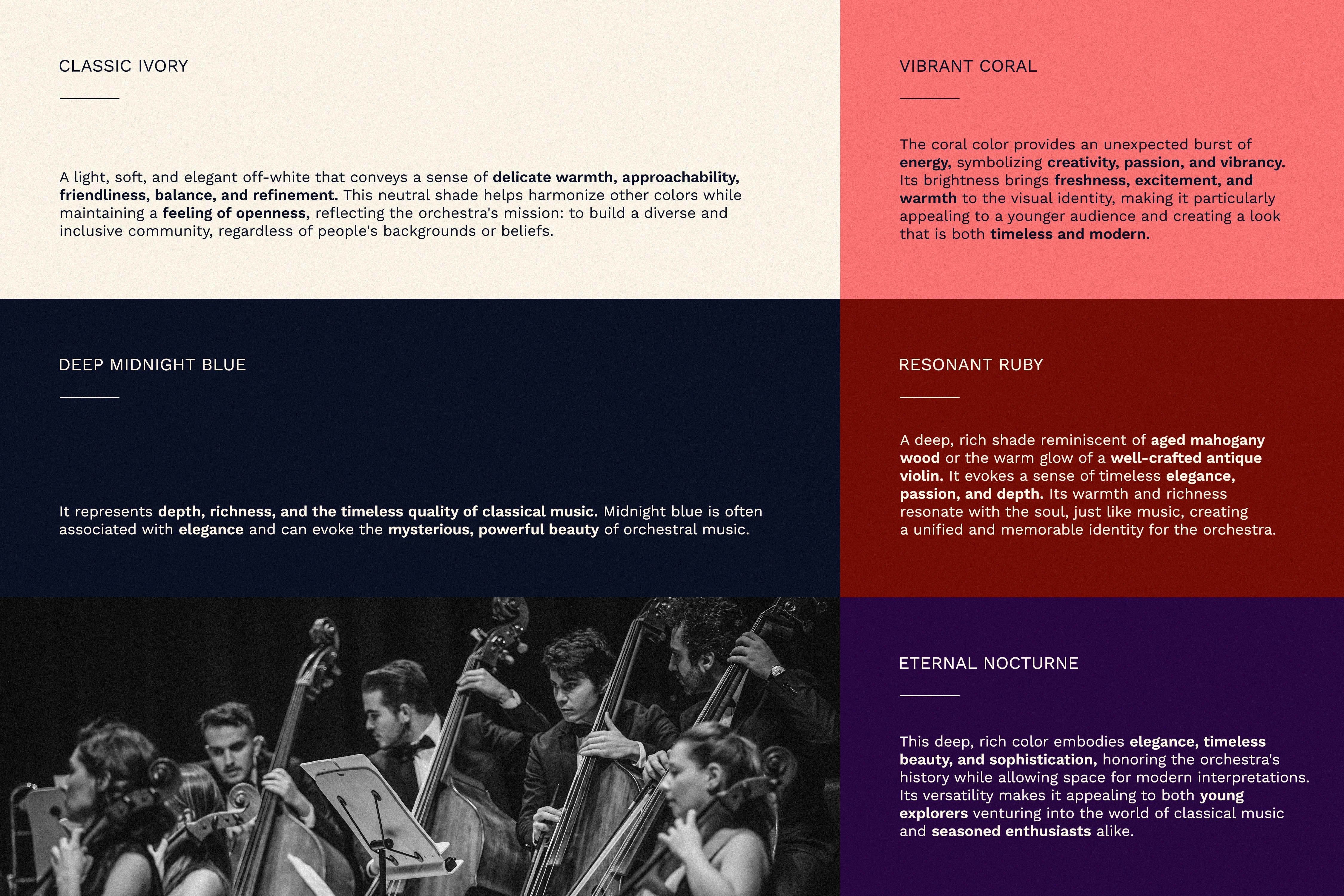
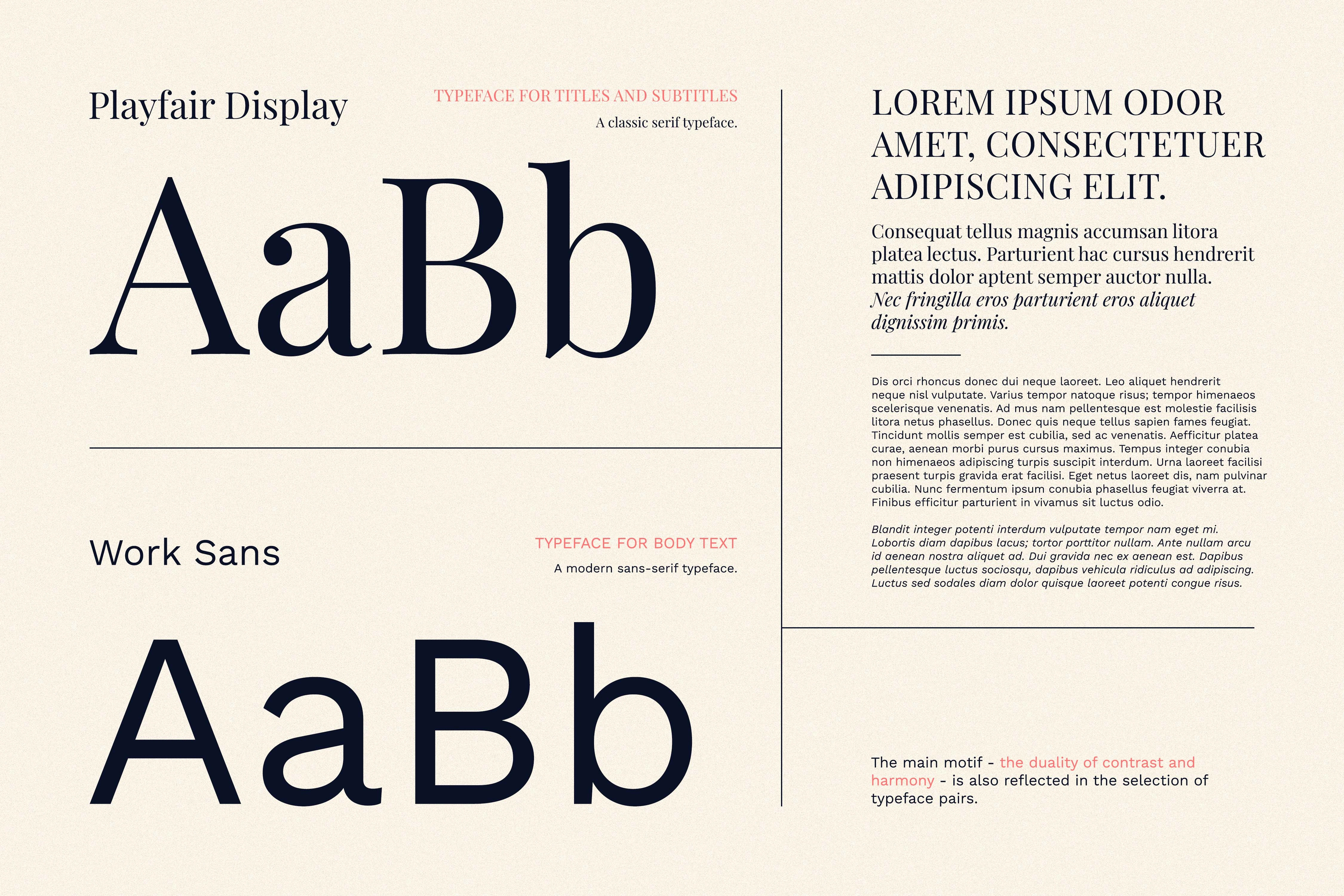
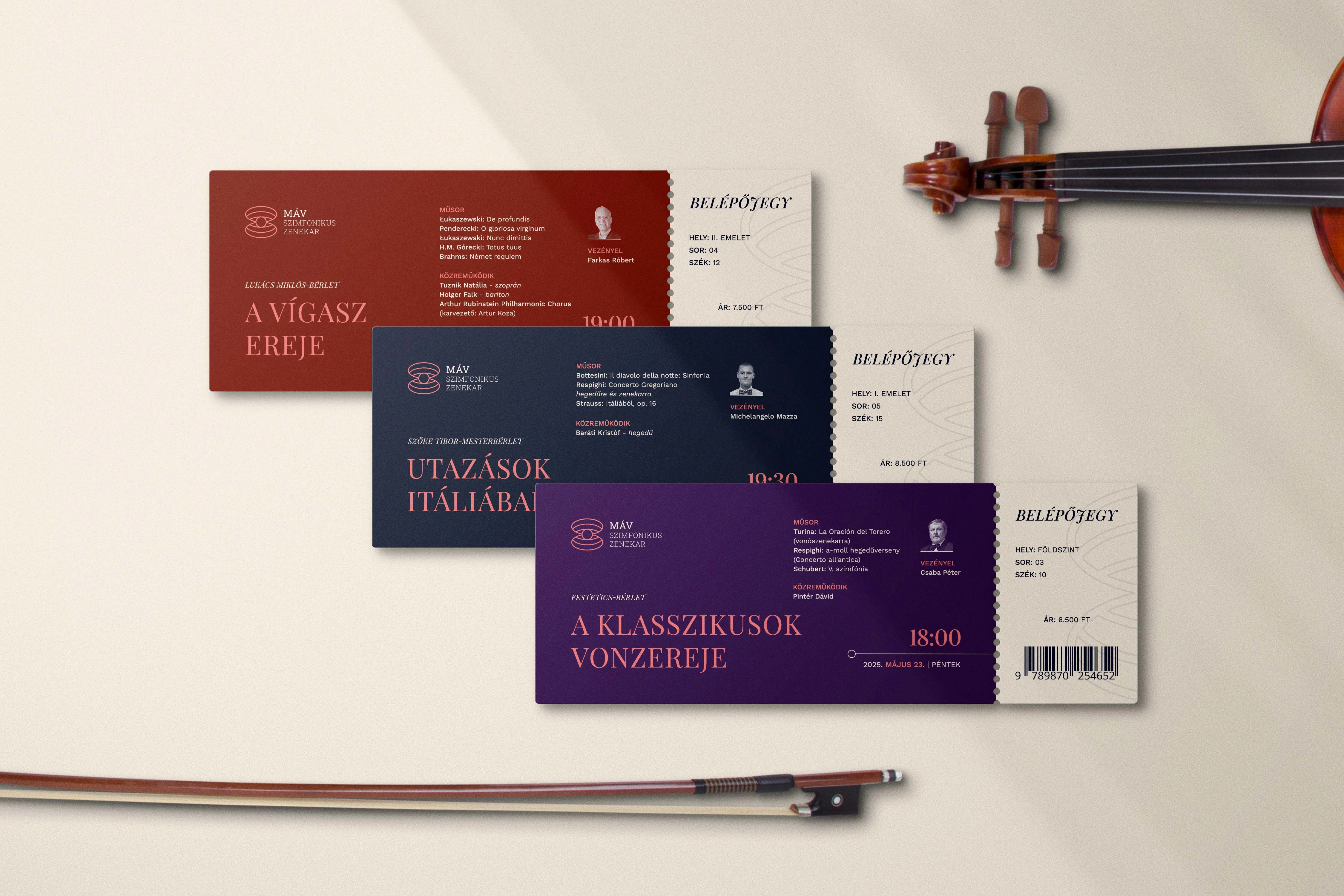
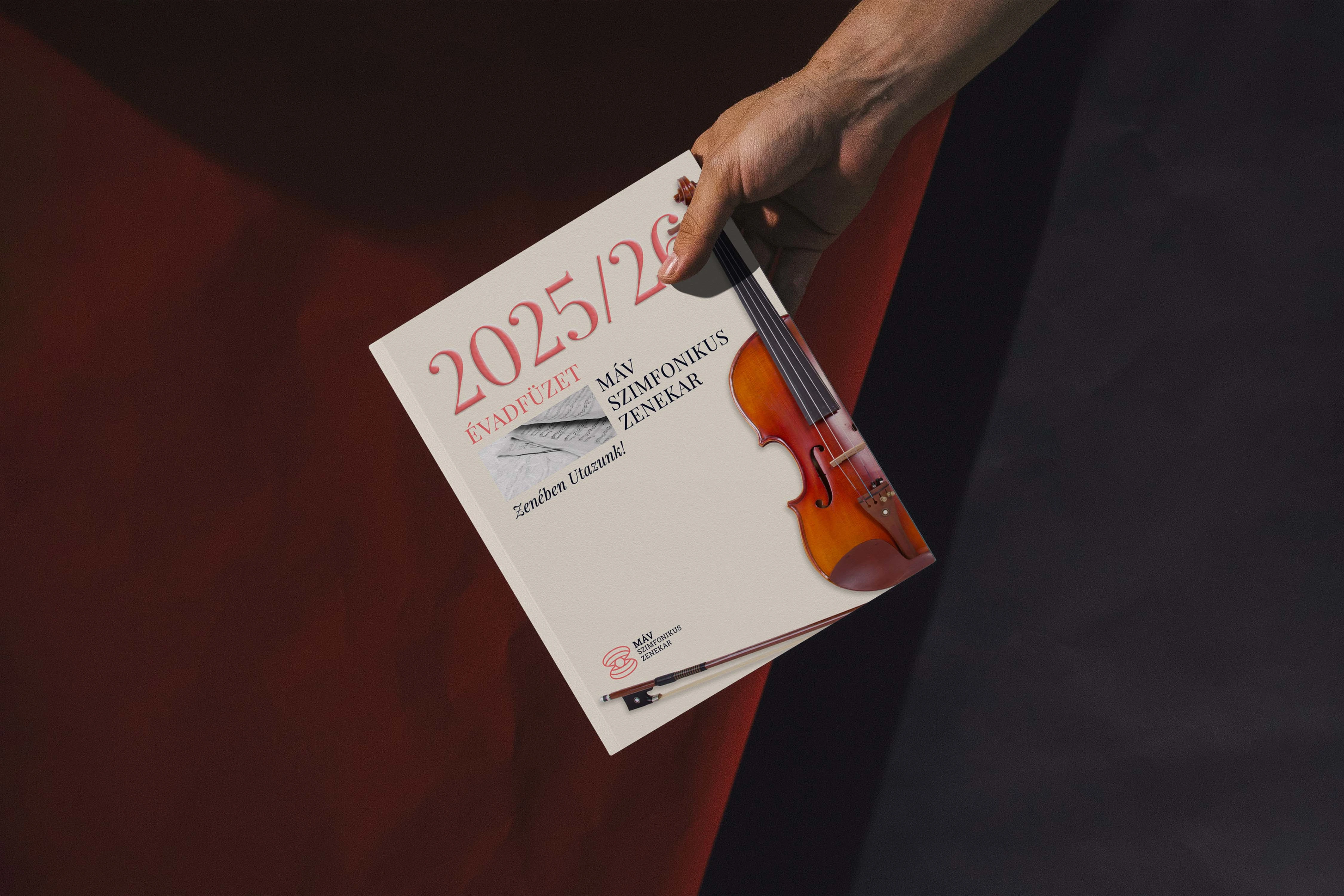
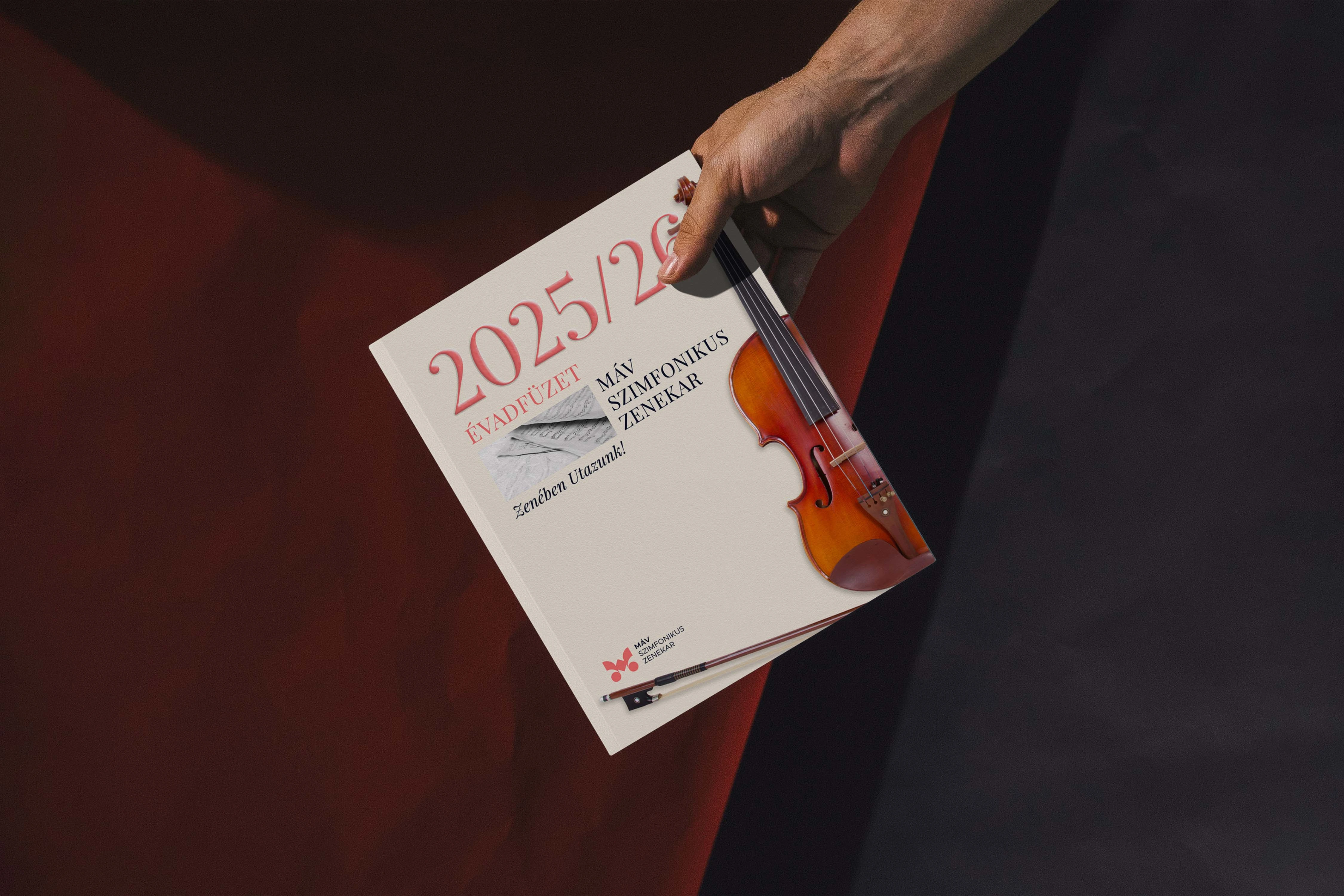
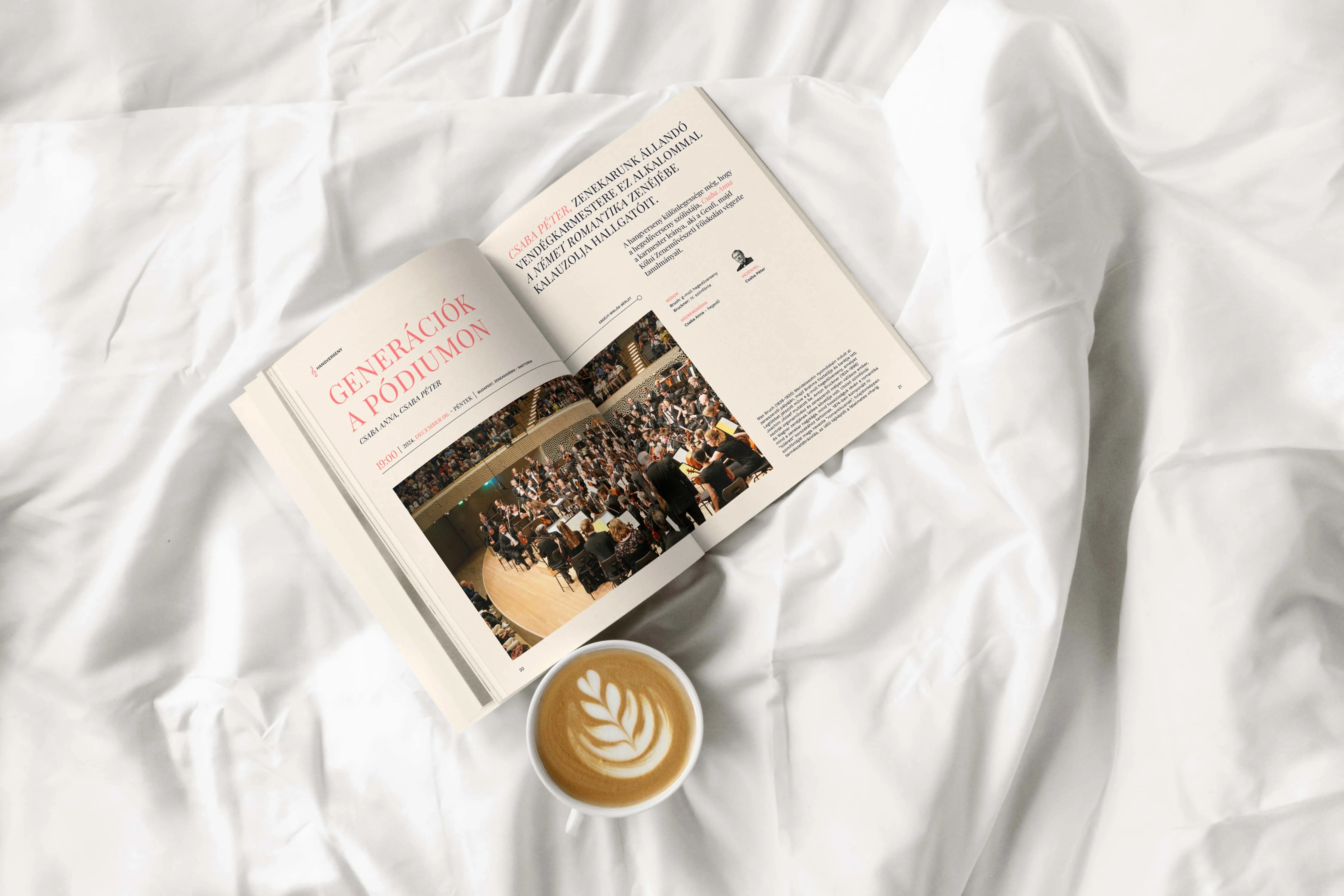
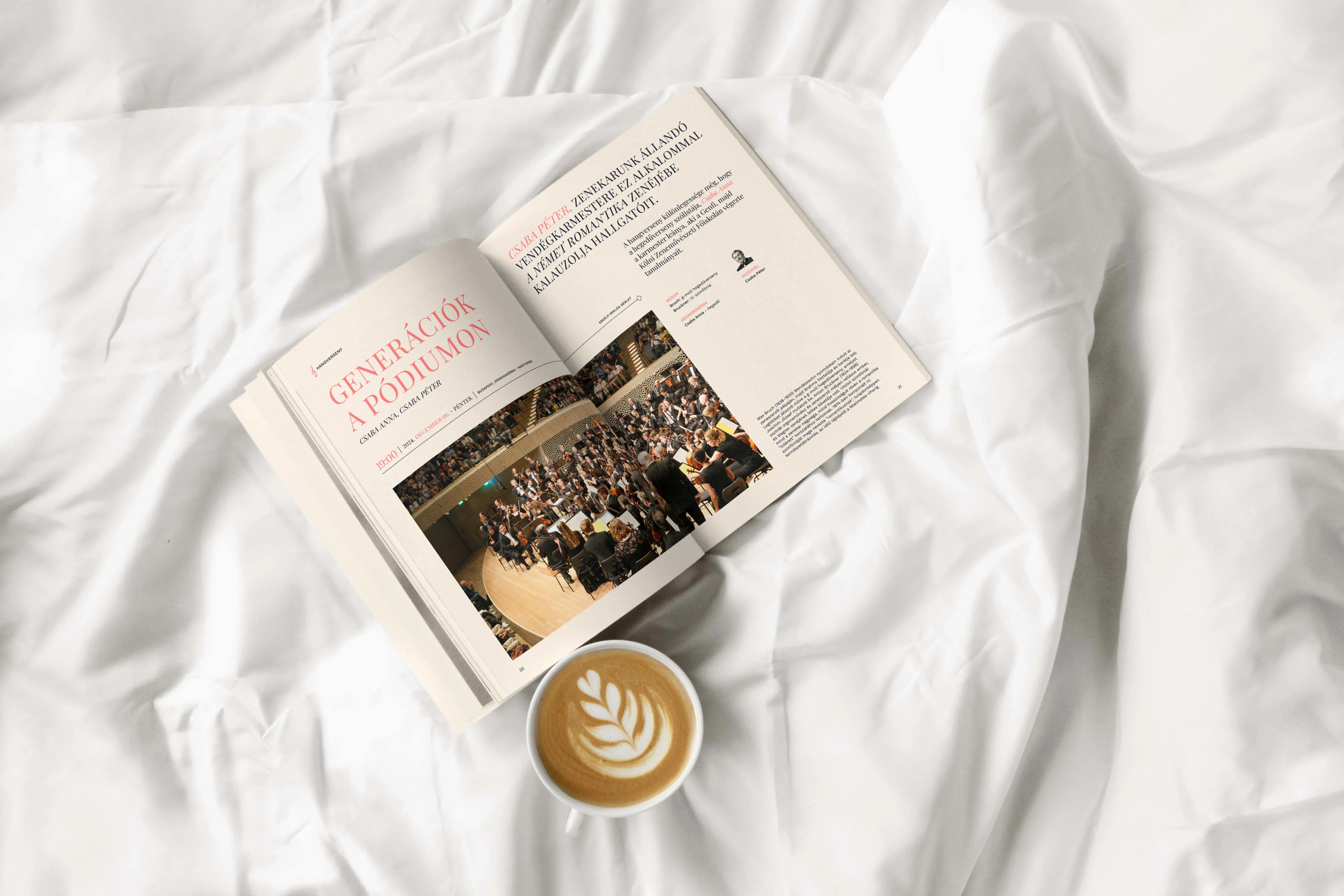
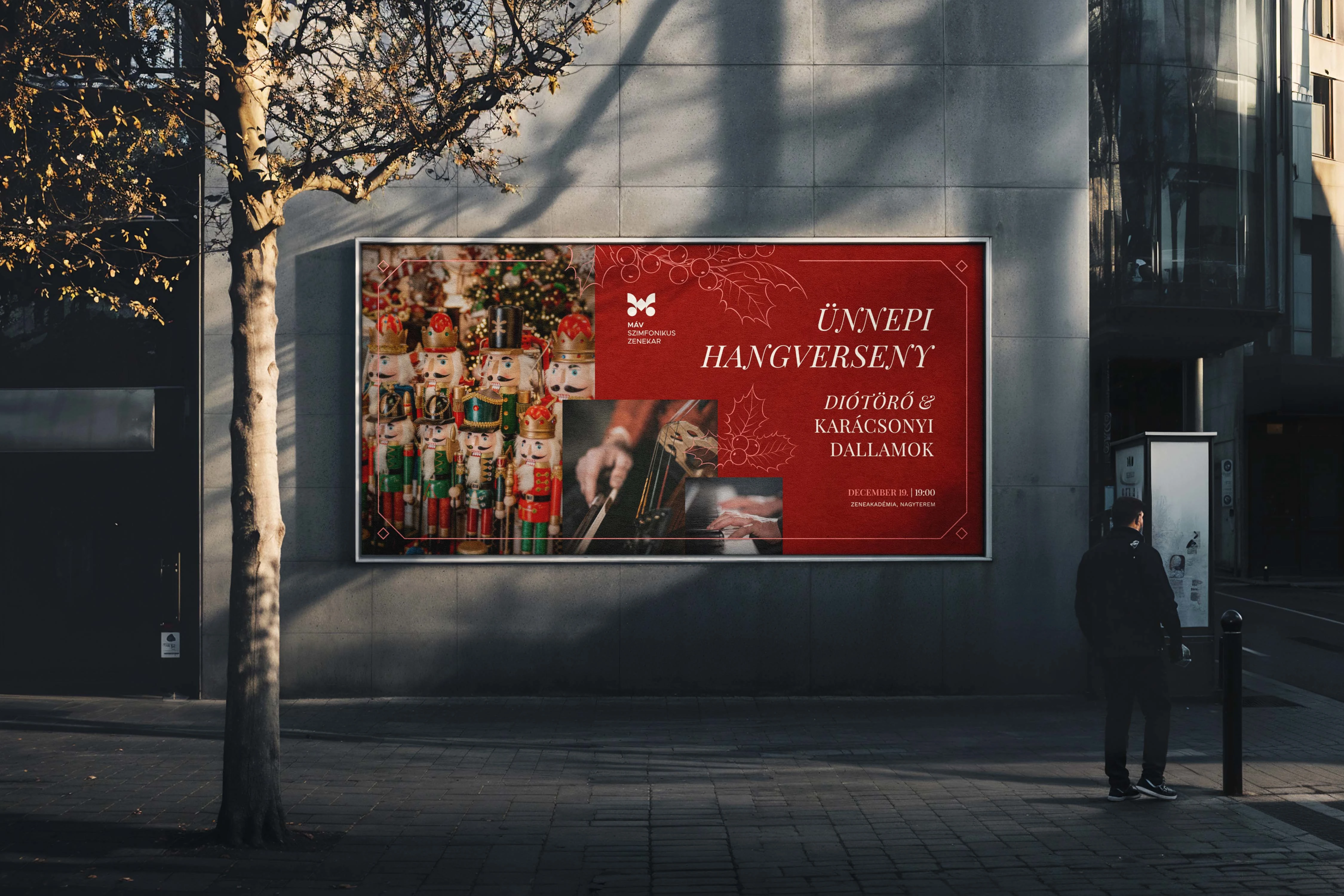
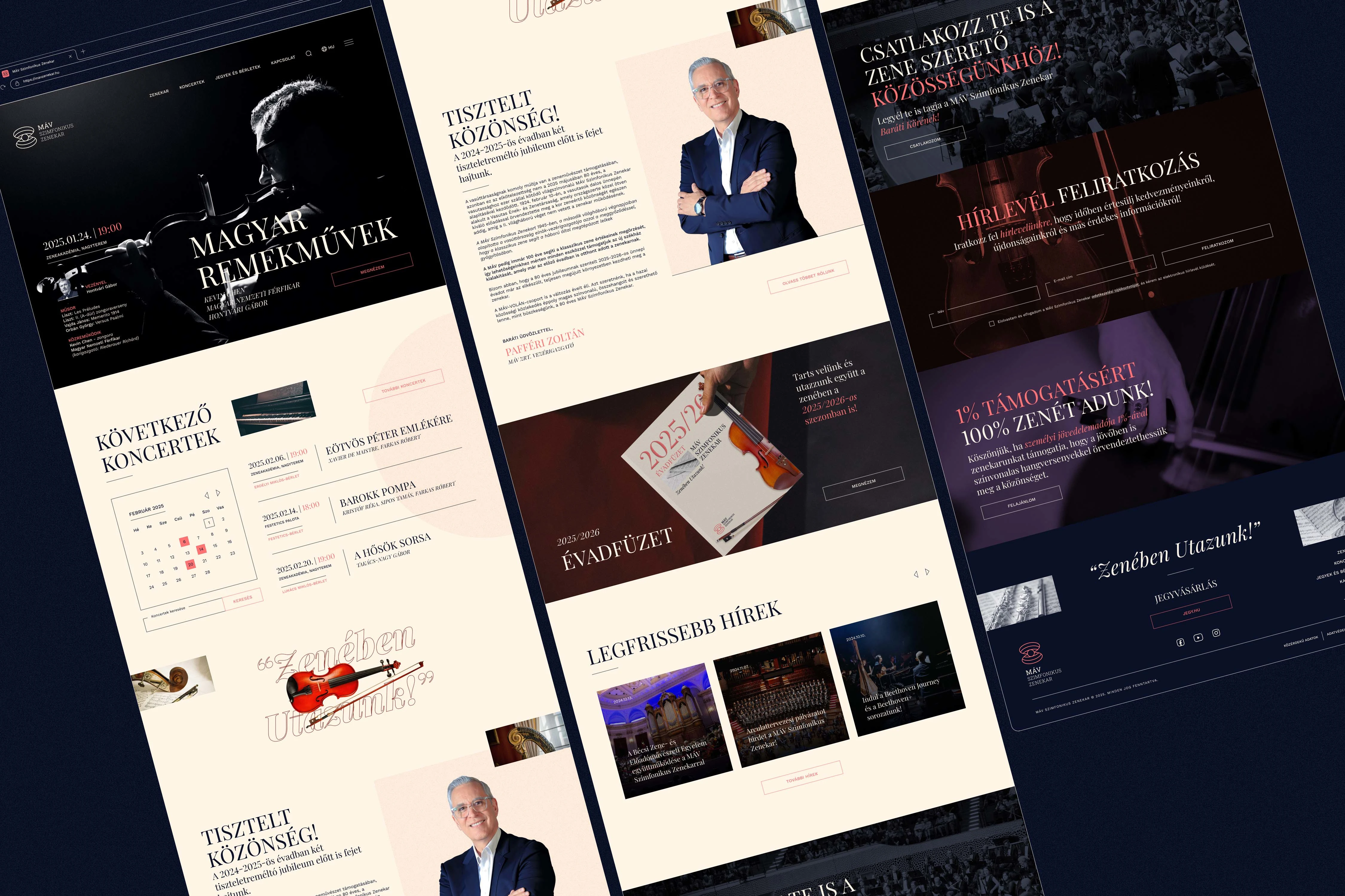
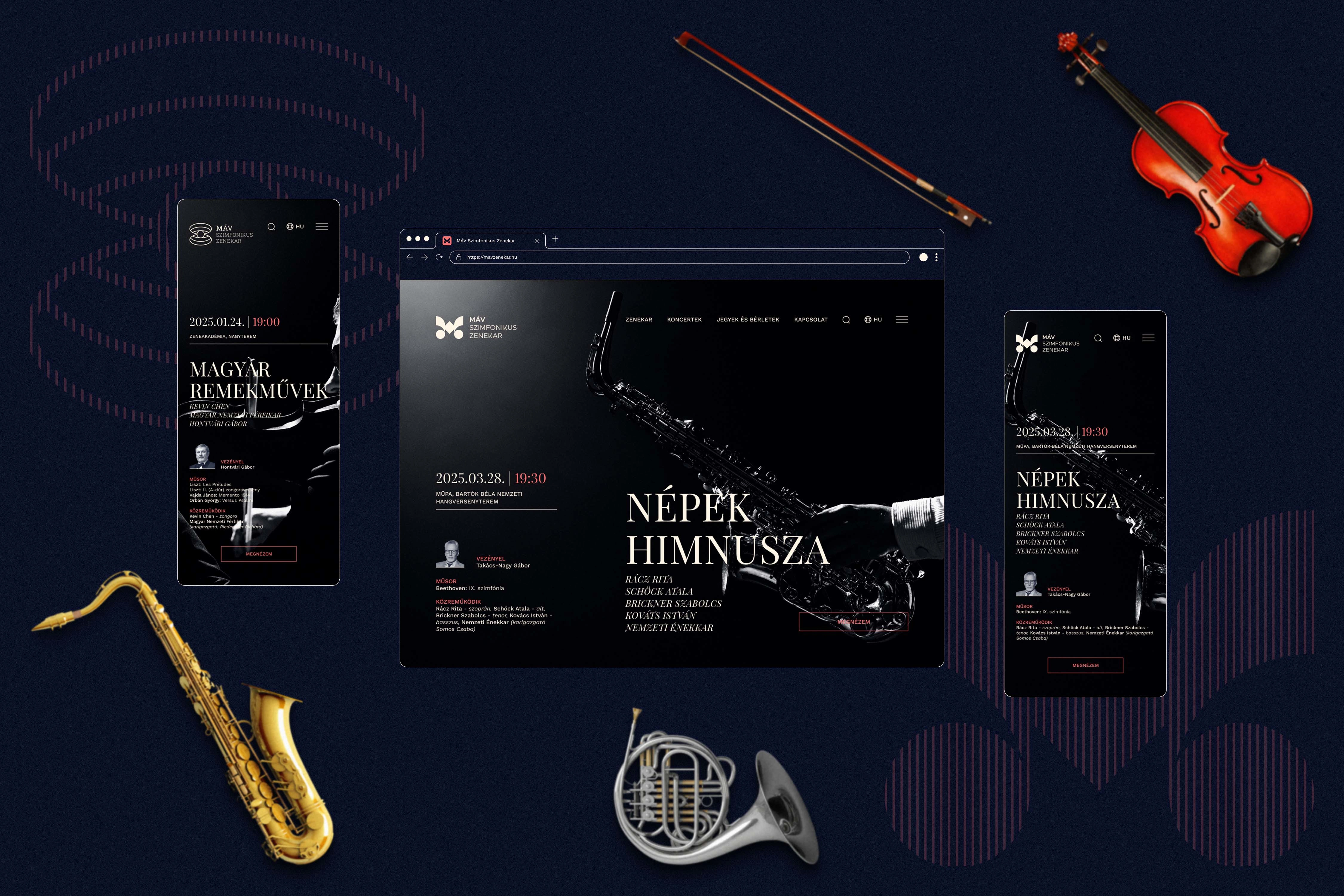
The aesthetic framework further reinforces this delicate balance of contrast and harmony. The color palette pairs a warm, approachable Classic Ivory with a Deep Midnight Blue, evoking the richness of timeless classical music. These foundational tones are deepened by a symphonic Eternal Nocturne and beautifully contrasted with a Vibrant Coral for modern energy, alongside a Resonant Ruby that recalls the polished warmth of wooden instruments. This interplay of eras is masterfully mirrored in the typography, which pairs the historic, artistic prestige of the serif Playfair Display with the clean, highly functional, and contemporary rhythm of the sans-serif Work Sans.
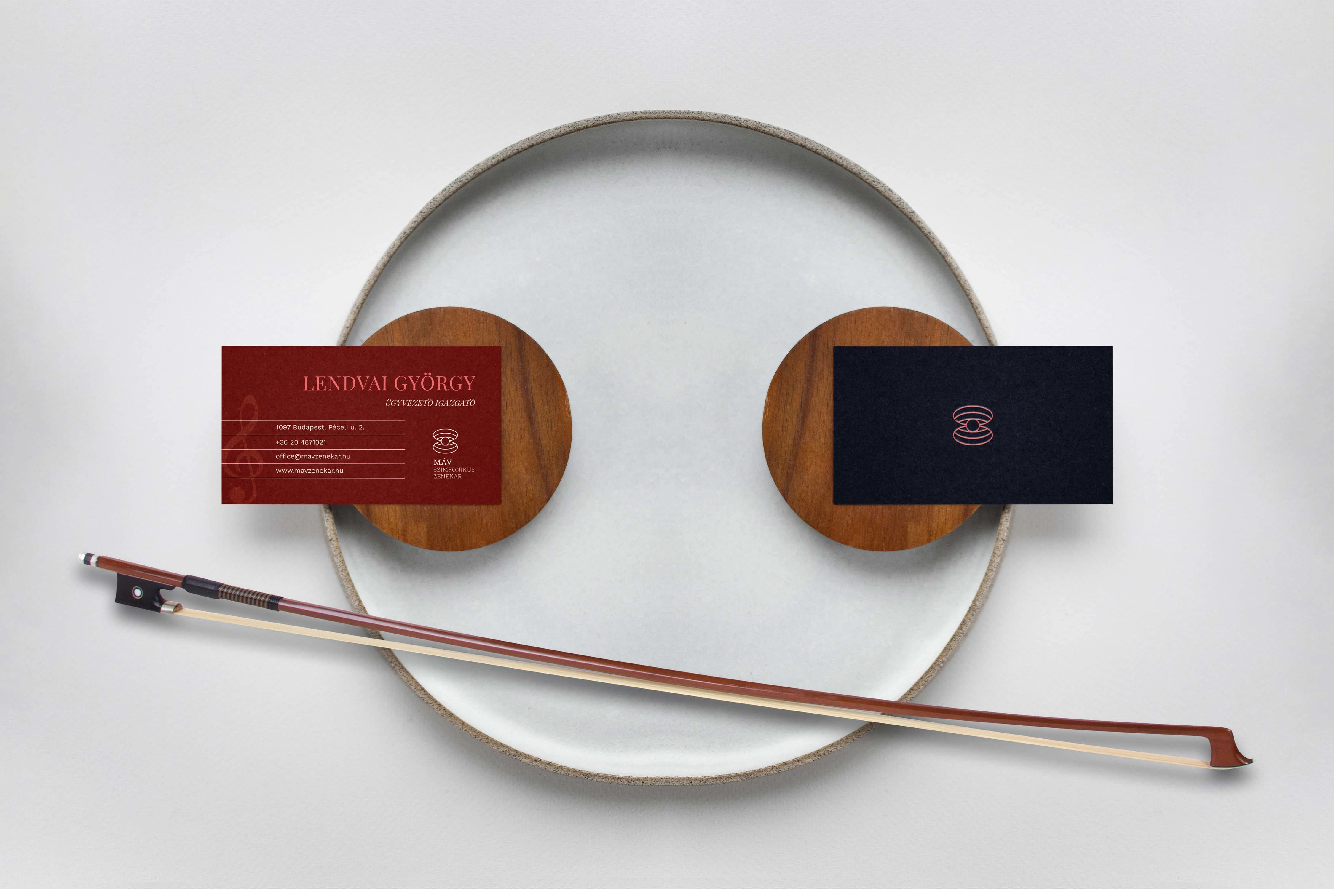
Ultimately, this comprehensive identity concept successfully presents the MÁV Symphony Orchestra as an institution shaped by a proud history yet driven by an inclusive, future-ready vision. By translating the "harmony of opposites" into a coherent, highly adaptable visual language, the system honors the orchestra's prestigious cultural legacy. It provides a sophisticated foundation that functions flawlessly across concert materials, educational programs, and digital platforms, reinforcing the ensemble's evolving role in Hungary's vibrant musical landscape and beyond.



Like this project
Posted Jul 7, 2026
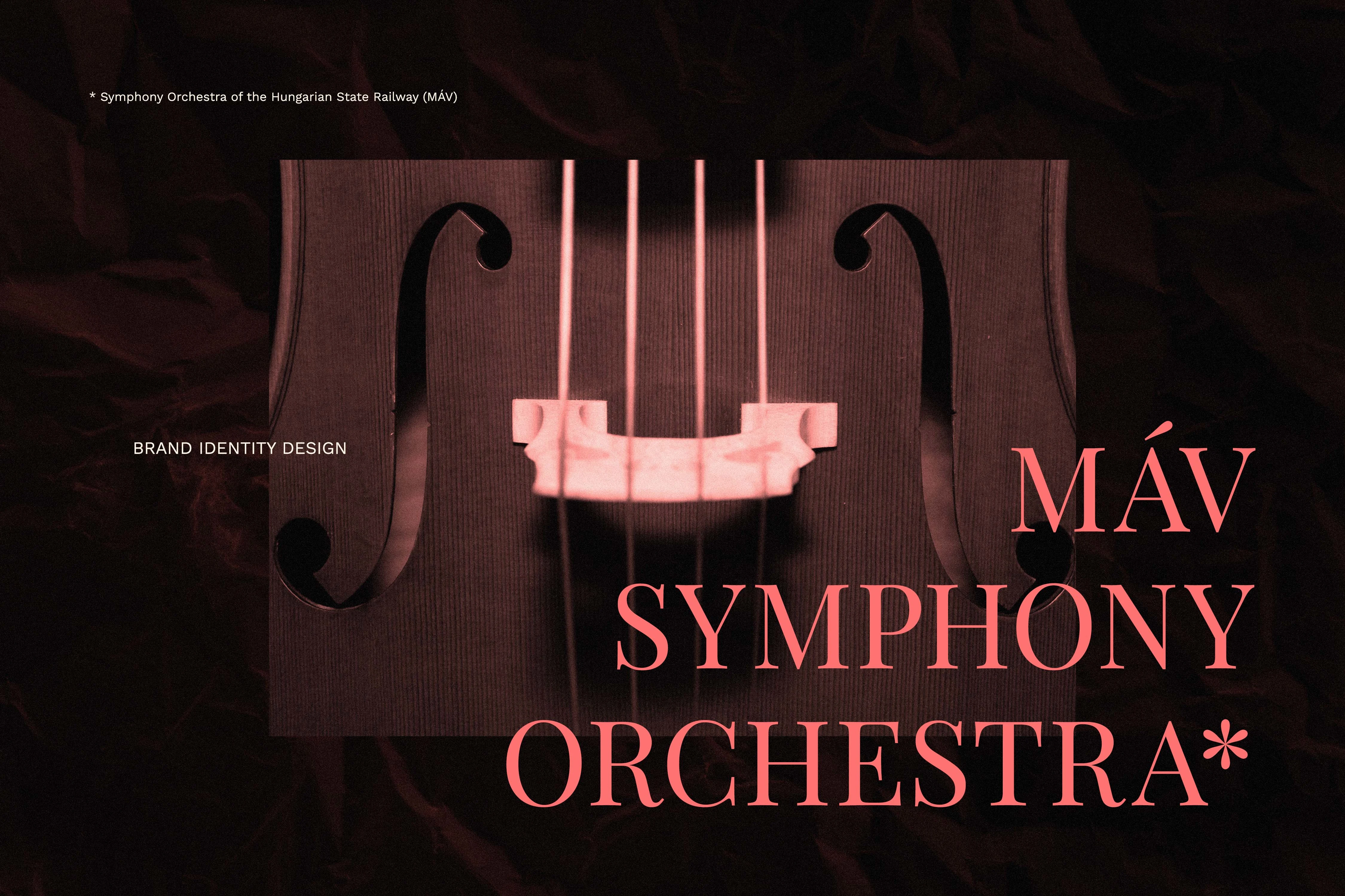
Brand identity concept for the MÁV Symphony Orchestra, bridging deep-rooted musical heritage with a modern, inclusive visual language.