Civil Engineering Brand Identity & Logo Design | Dozer-Ép

Tamás Kurucz


Dozer-Ép
Civil Engineering Brand Identity & Logo Design
Case study of a civil engineering brand identity and logo design for Dozer-Ép, a Hungarian construction company specializing in large-scale industrial projects, communicating professionalism, innovation and reliability.
CLIENT: Dozer-Ép
YEAR: 2025
INDUSTRY: Civil Engineering; Construction
AWARDS & RECOGNITION: Exhibited, 23rd Golden Drawing Pin Award and Exhibition - 2026, Hungary | Shortlisted, RGB Kreatív Design Award (Pro) - 2025, Hungary
Project Overview
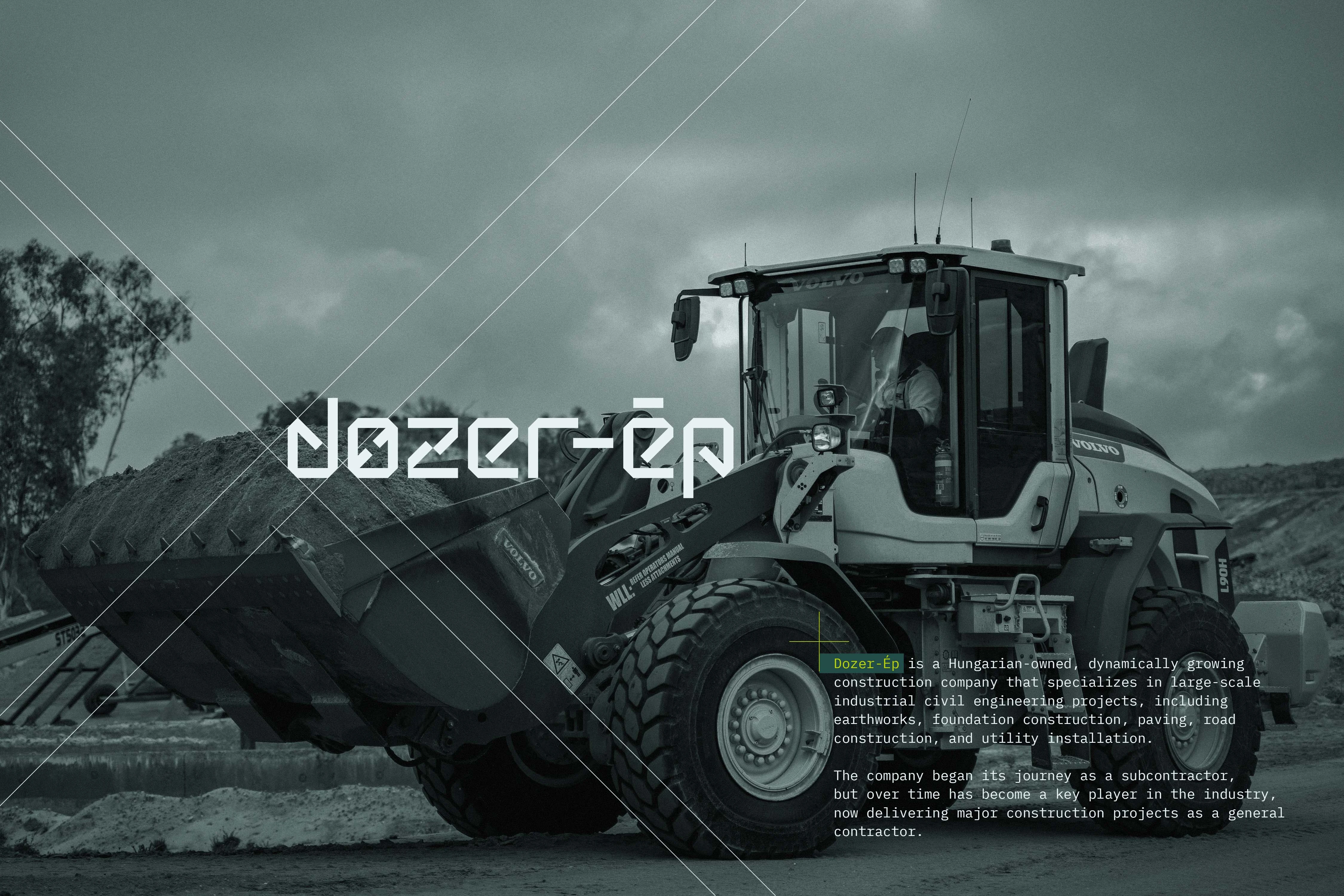
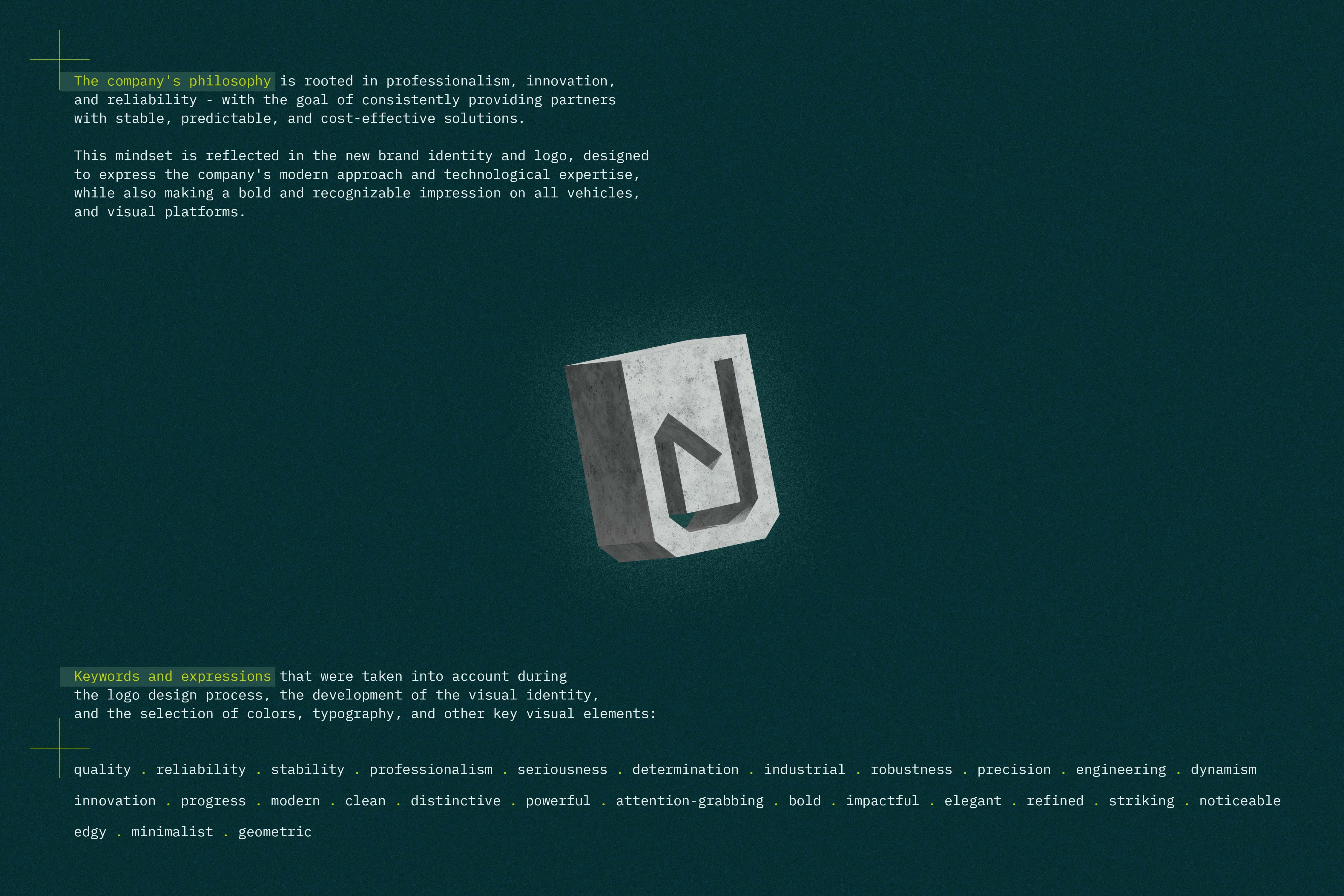
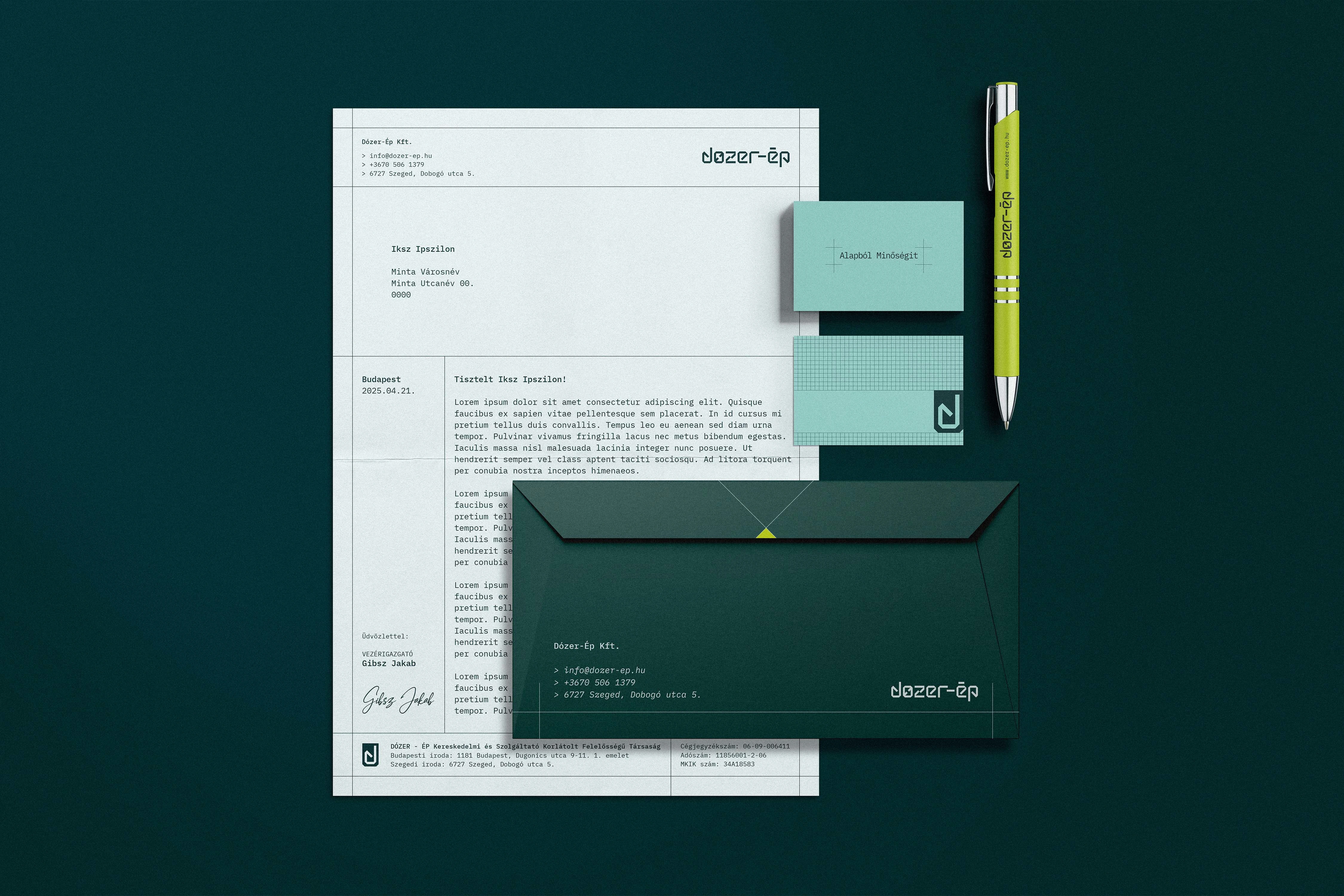
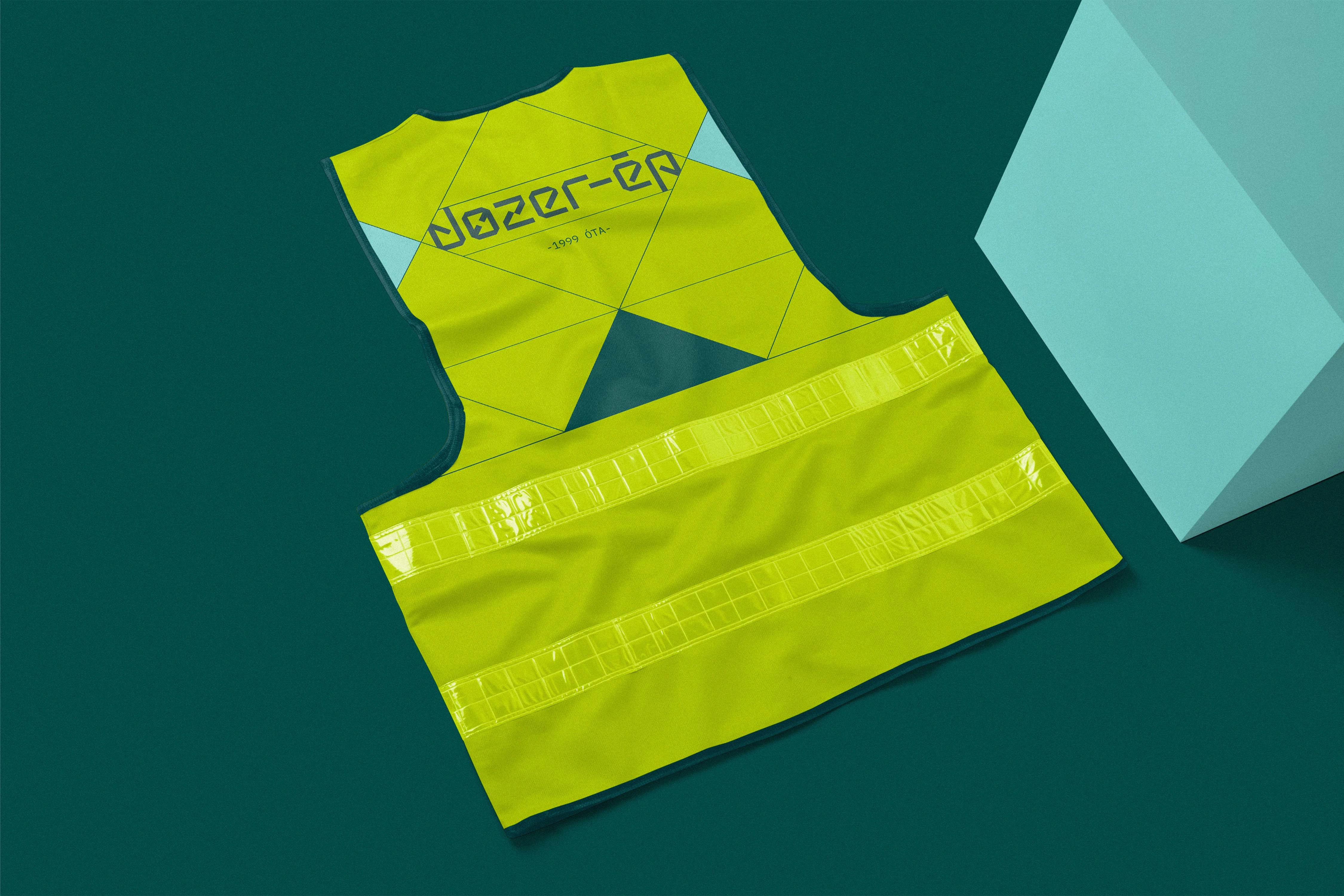
Designing the brand identity for Dozer-Ép required translating the profile of a dynamically growing Hungarian civil engineering company into a bold, robust, and modern visual system. Transitioning from a subcontractor to a regional general contractor specializing in large-scale industrial projects—such as earthworks, foundation construction, and road building—the company needed an identity that authentically reflects its capabilities. Backed by a modern fleet of advanced machinery and a highly skilled engineering team, the brand's core values of professionalism, innovation, and reliability formed the foundation of the design. The conceptual goal was to step away from decorative storytelling and instead create a straightforward, highly functional visual language that commands respect on complex construction sites and in corporate environments alike.
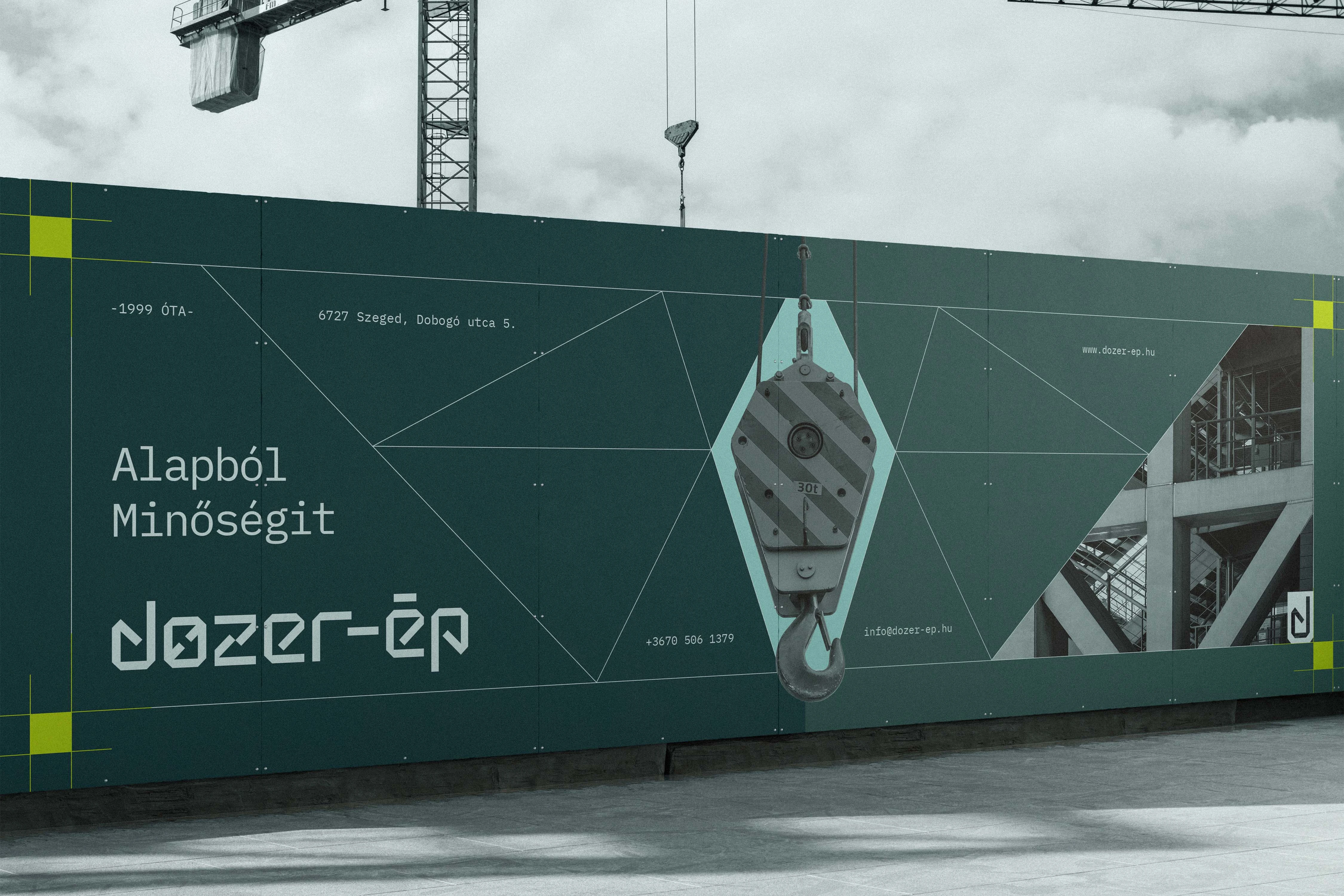
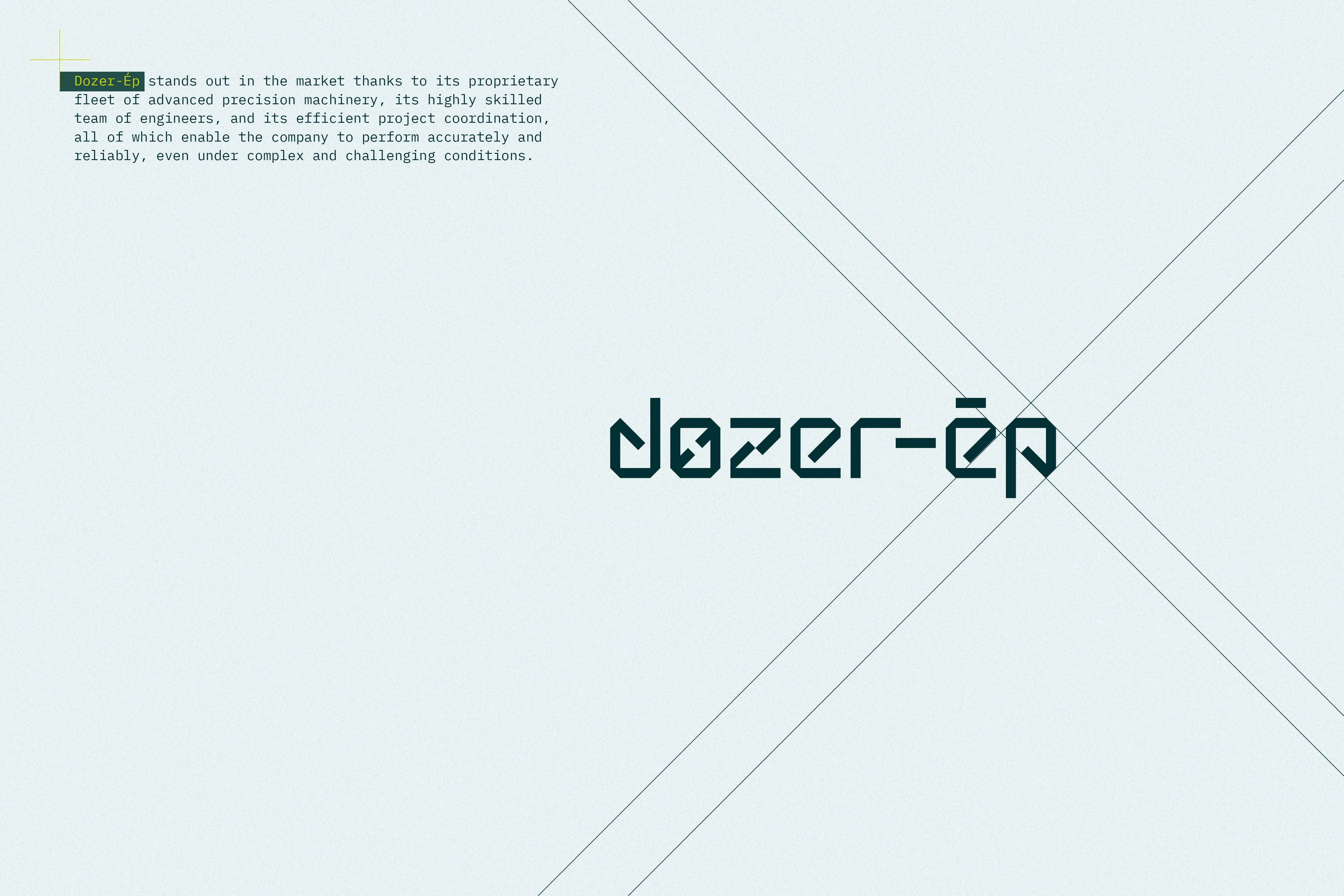
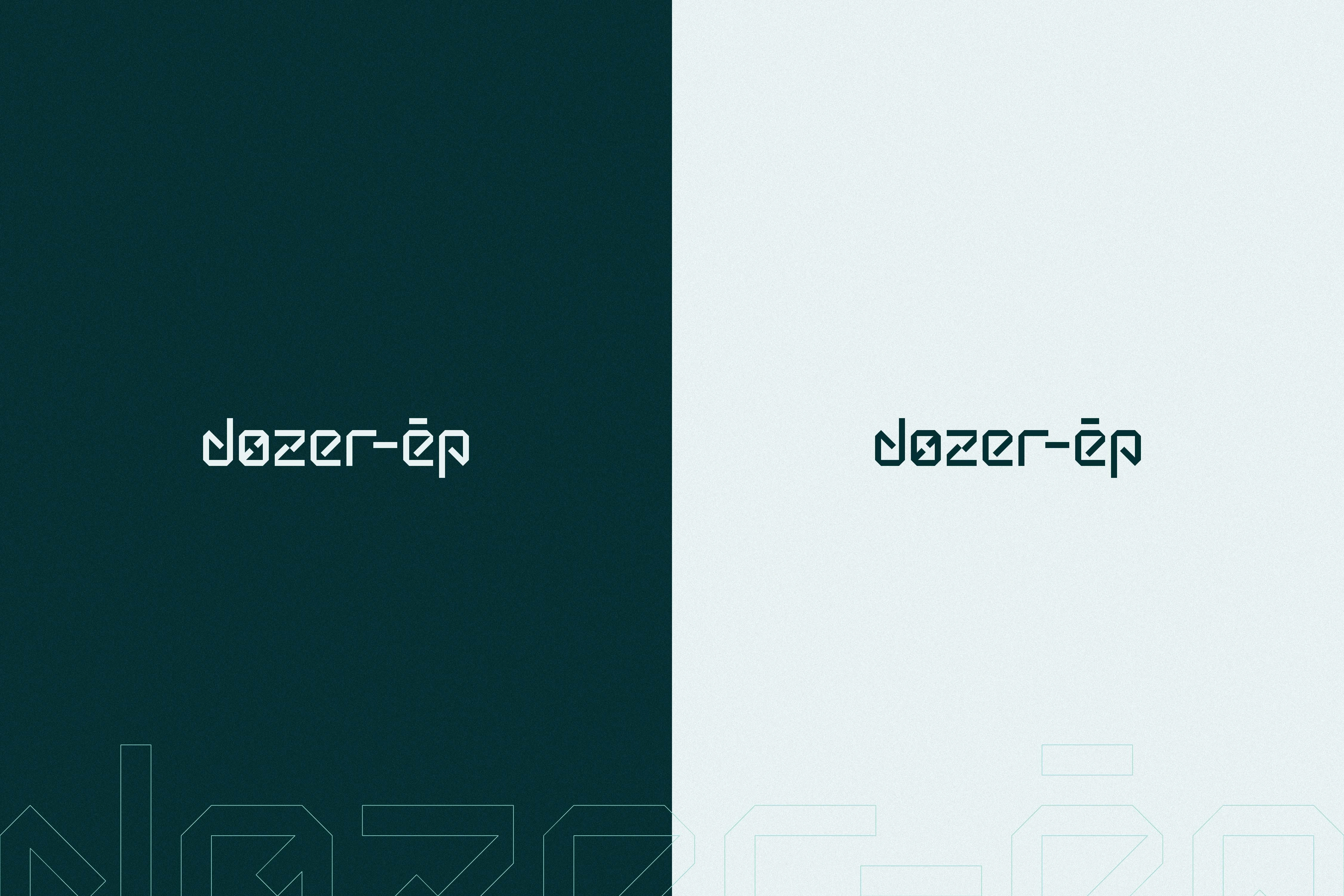
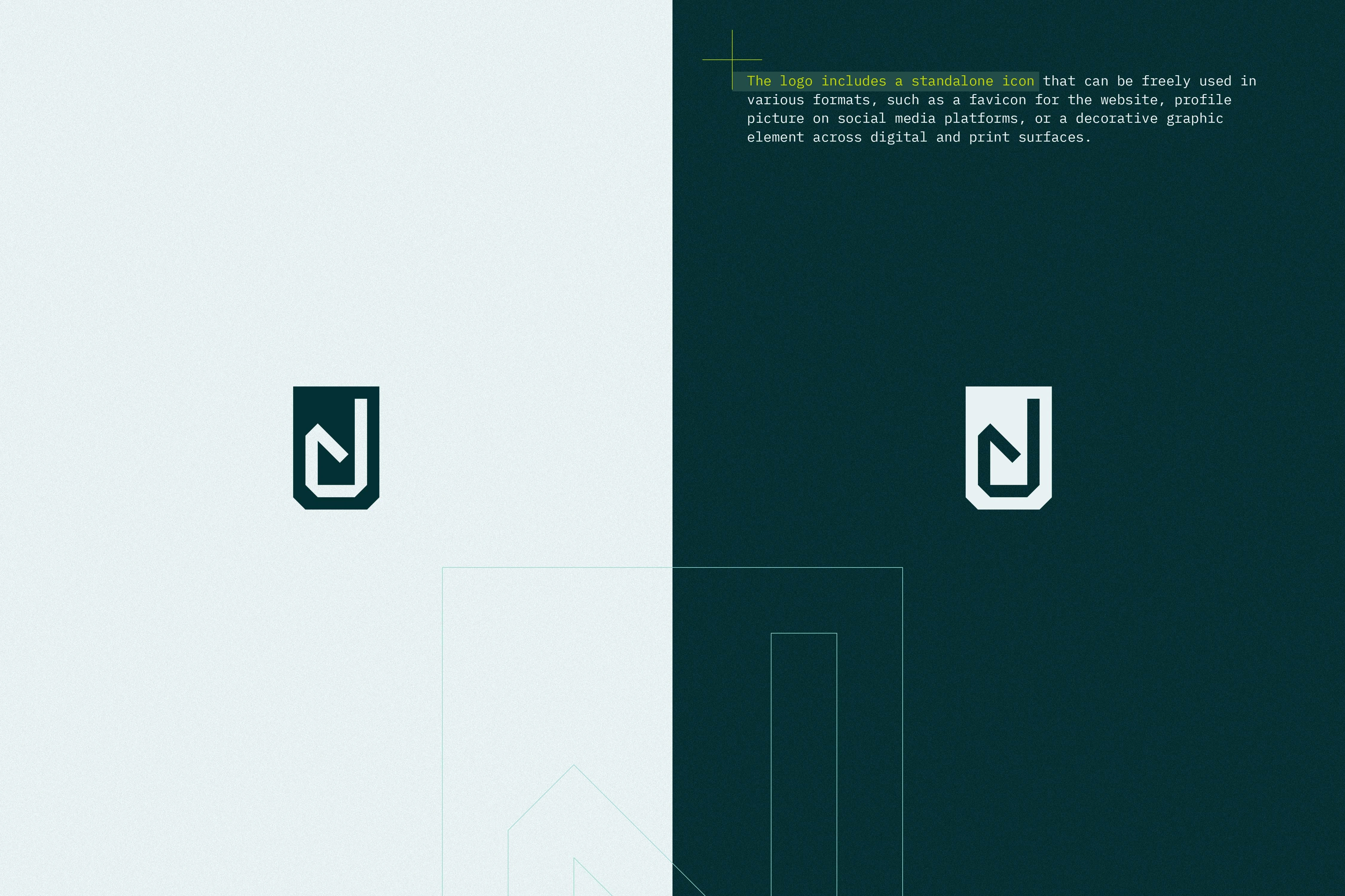
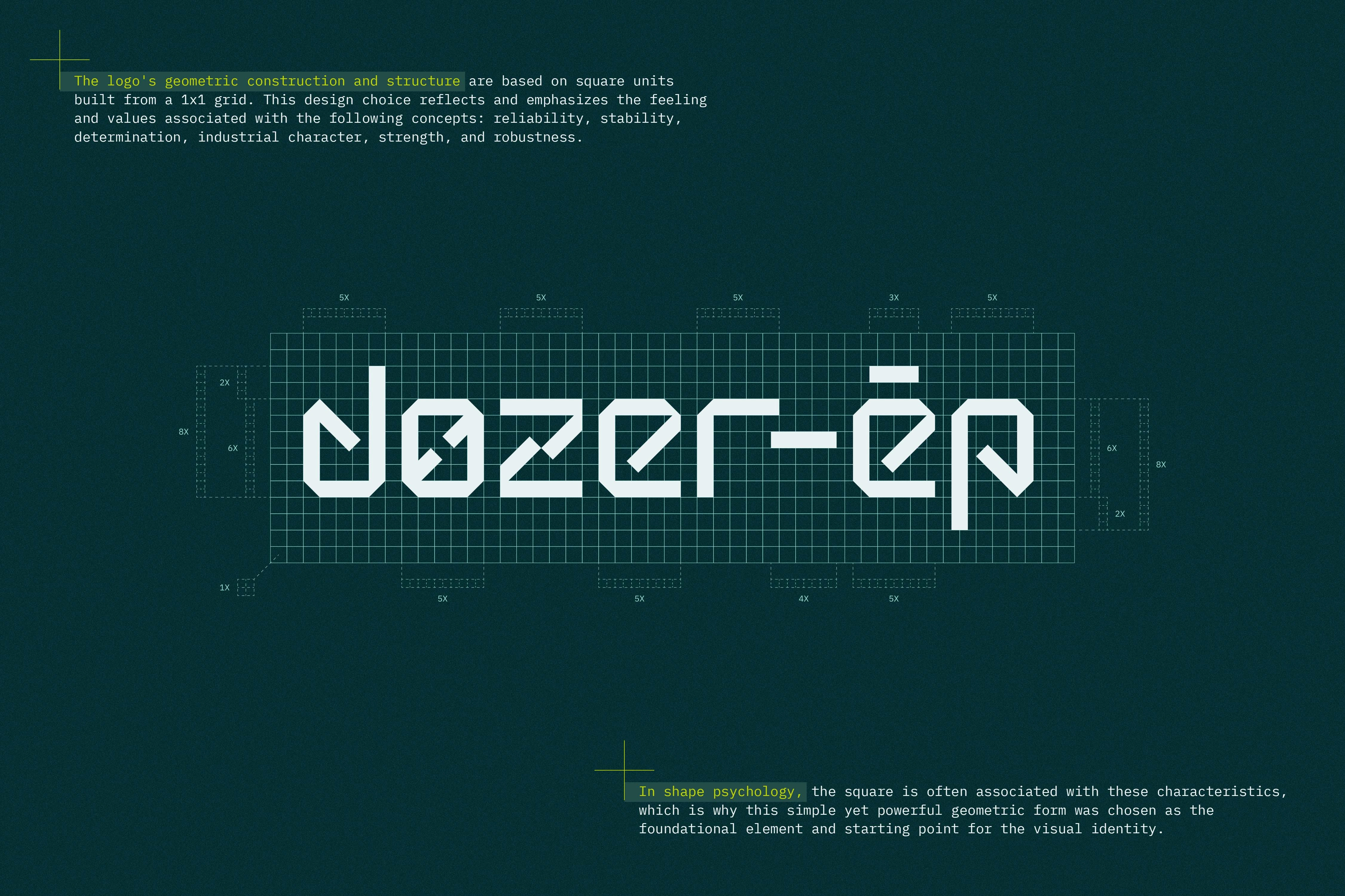
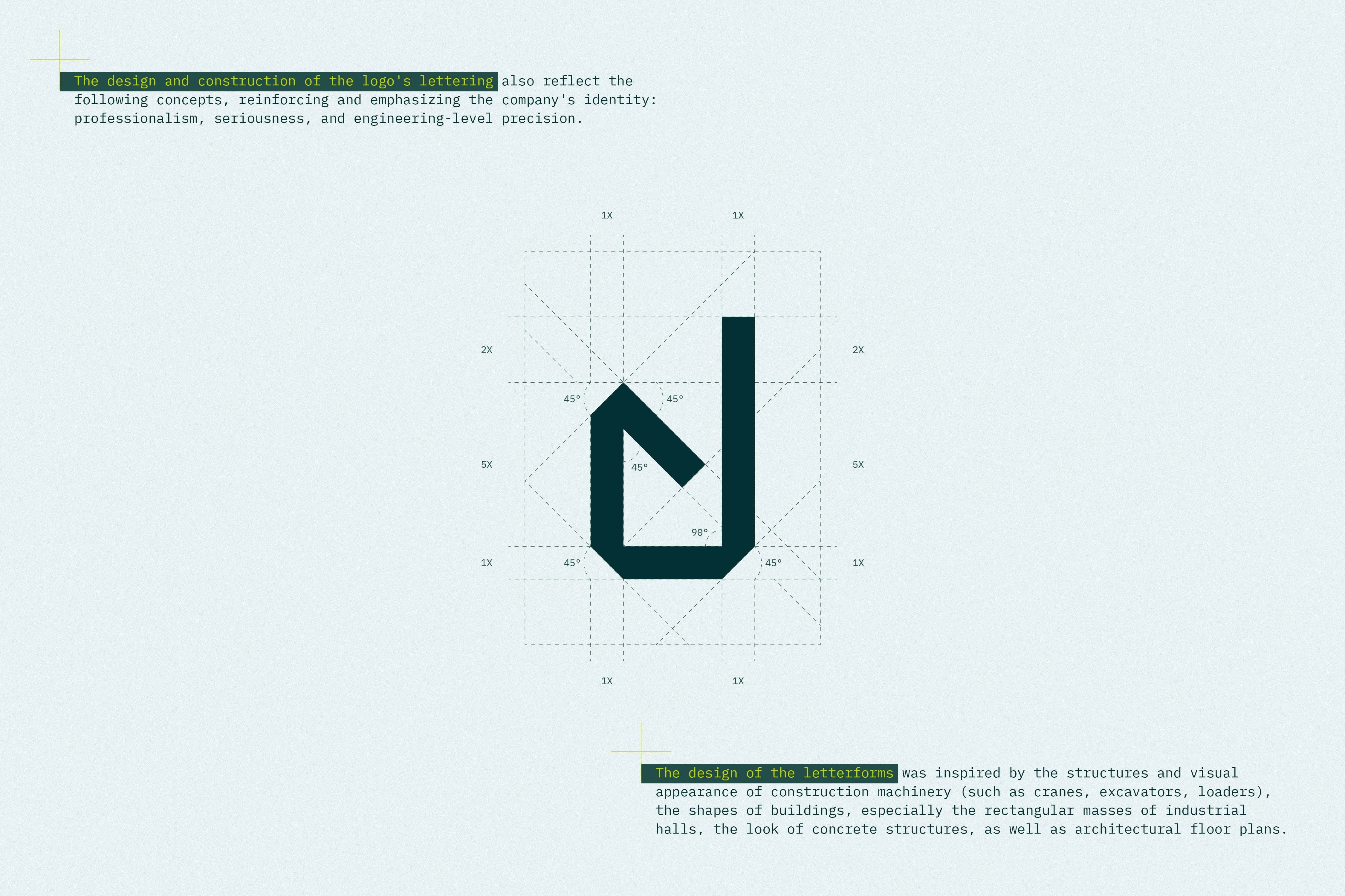
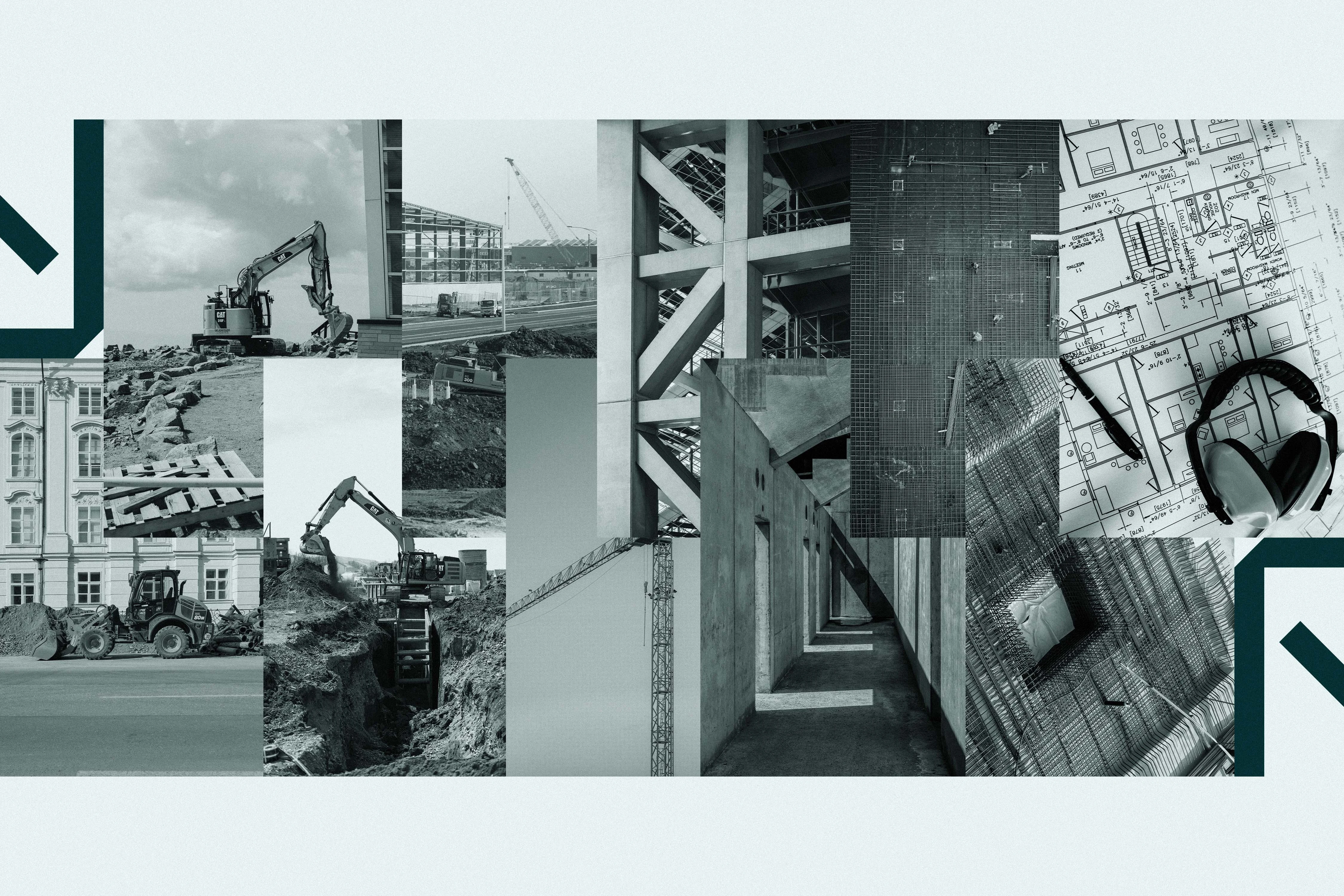
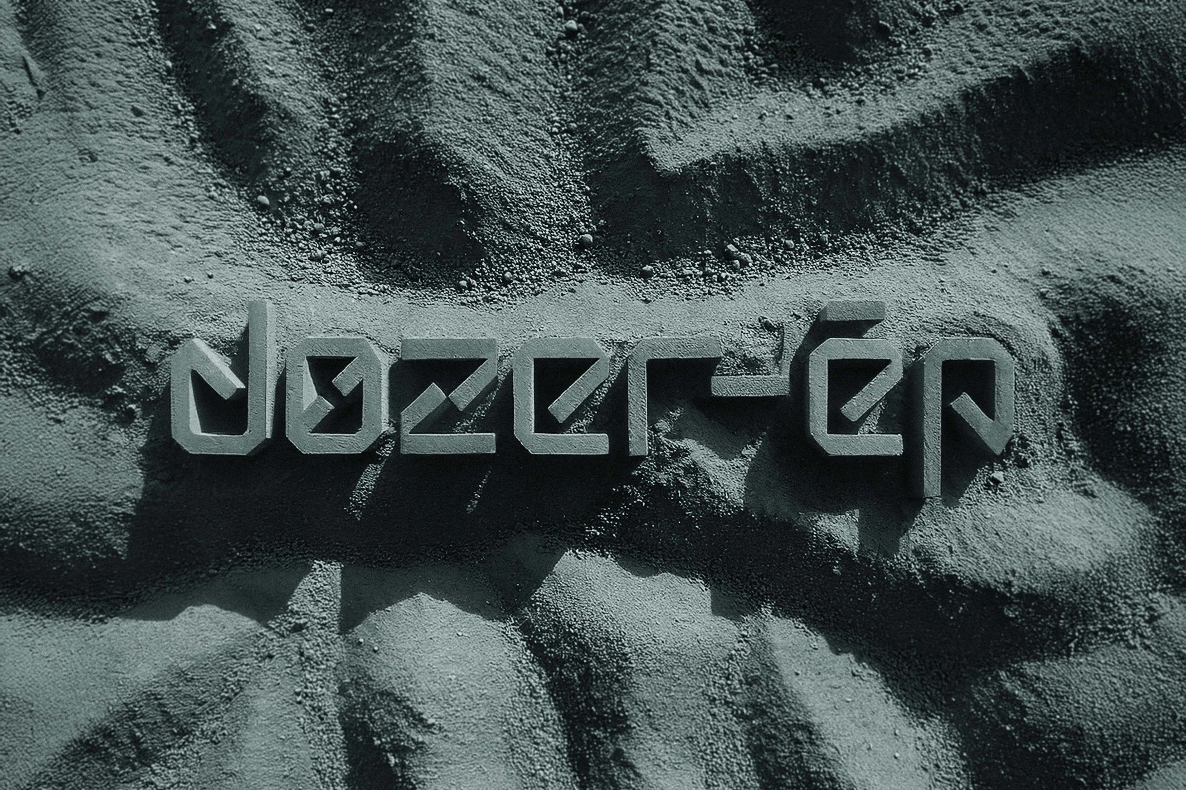
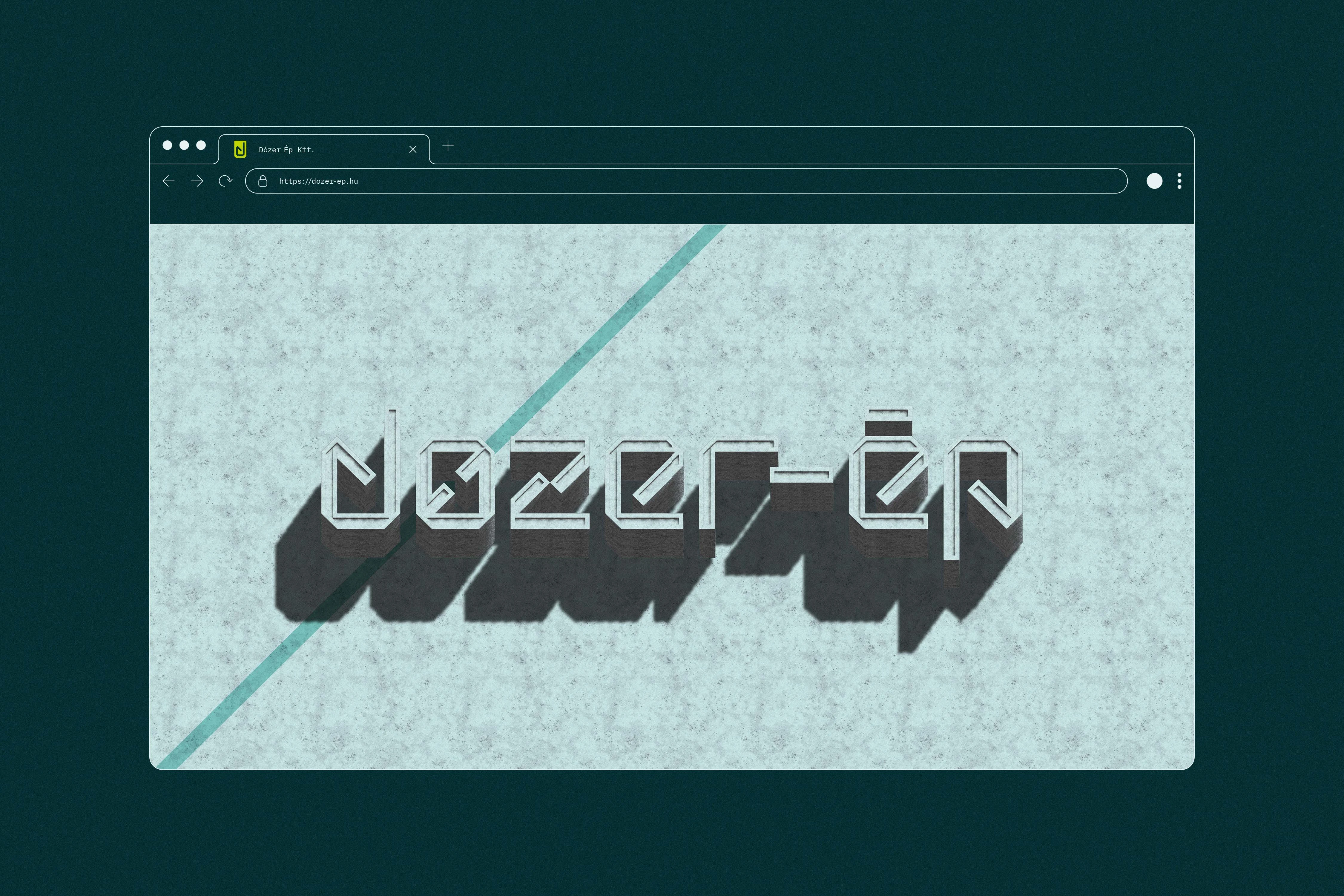
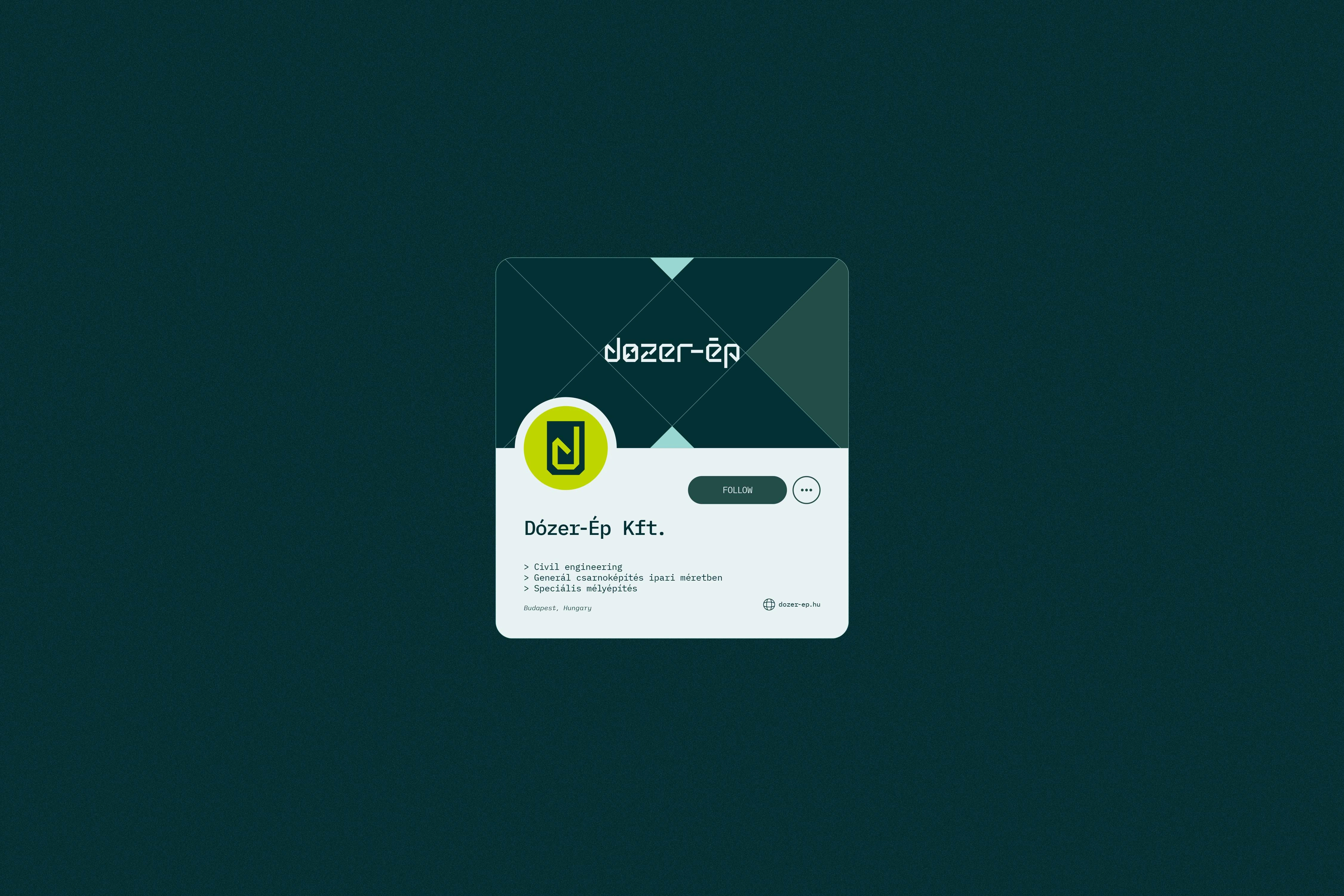
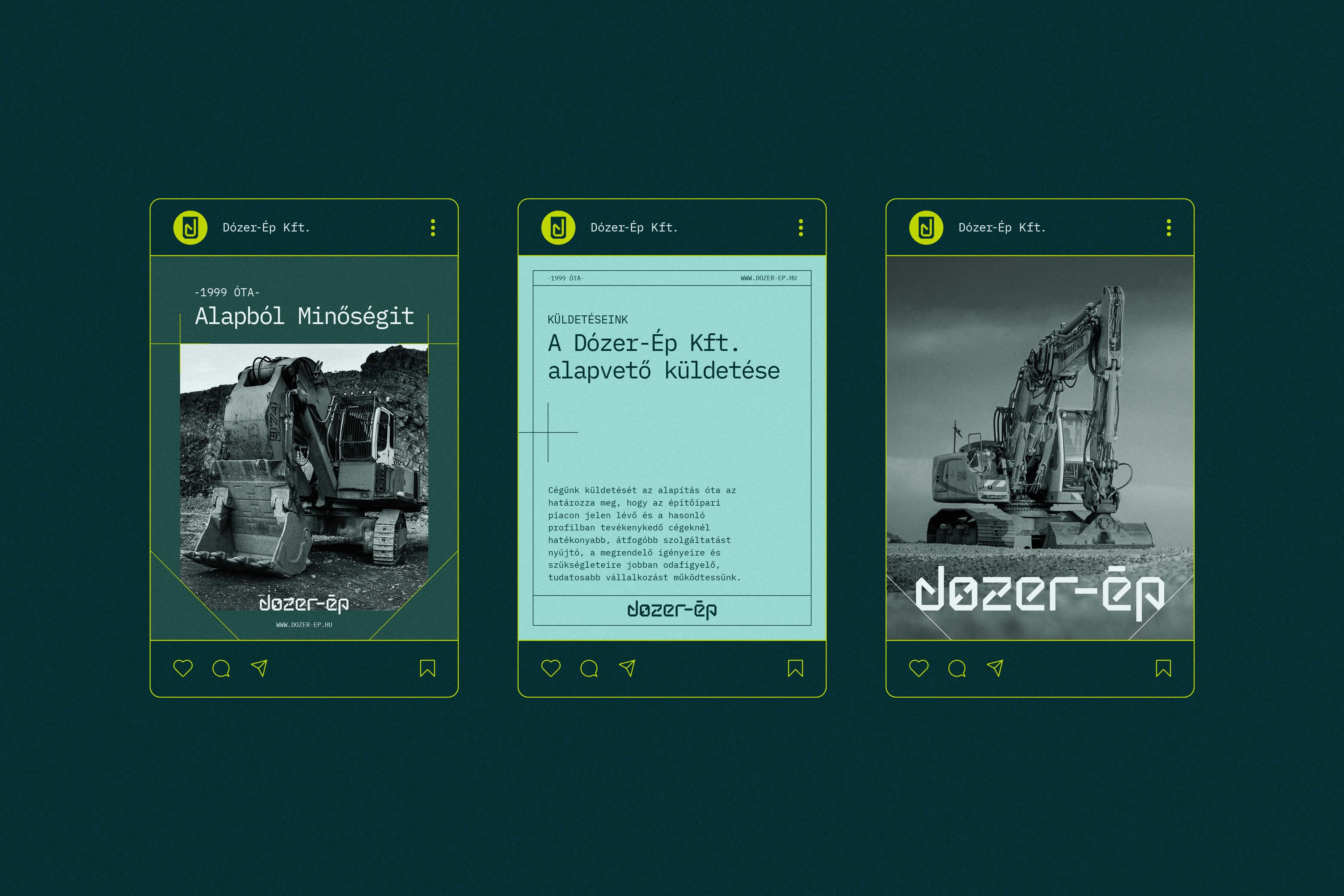
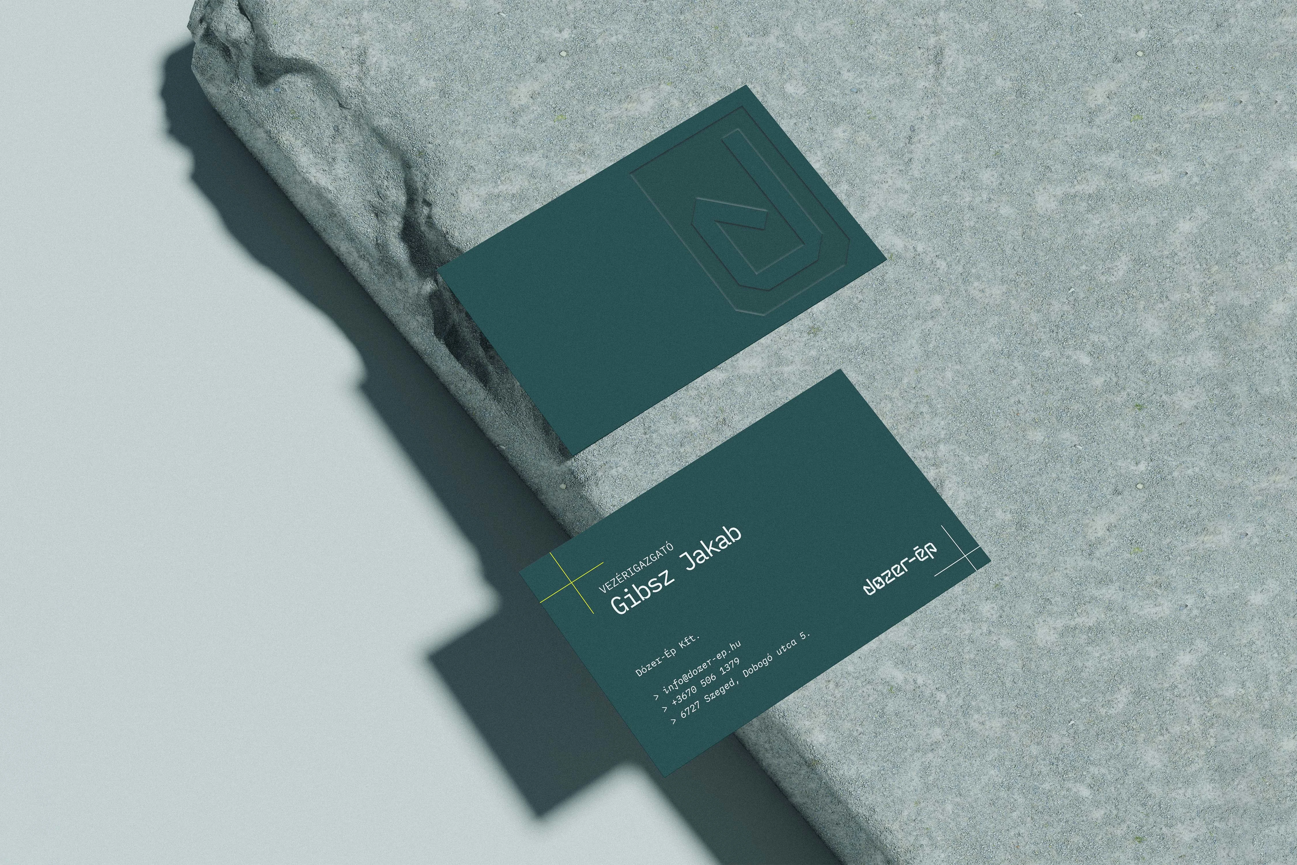
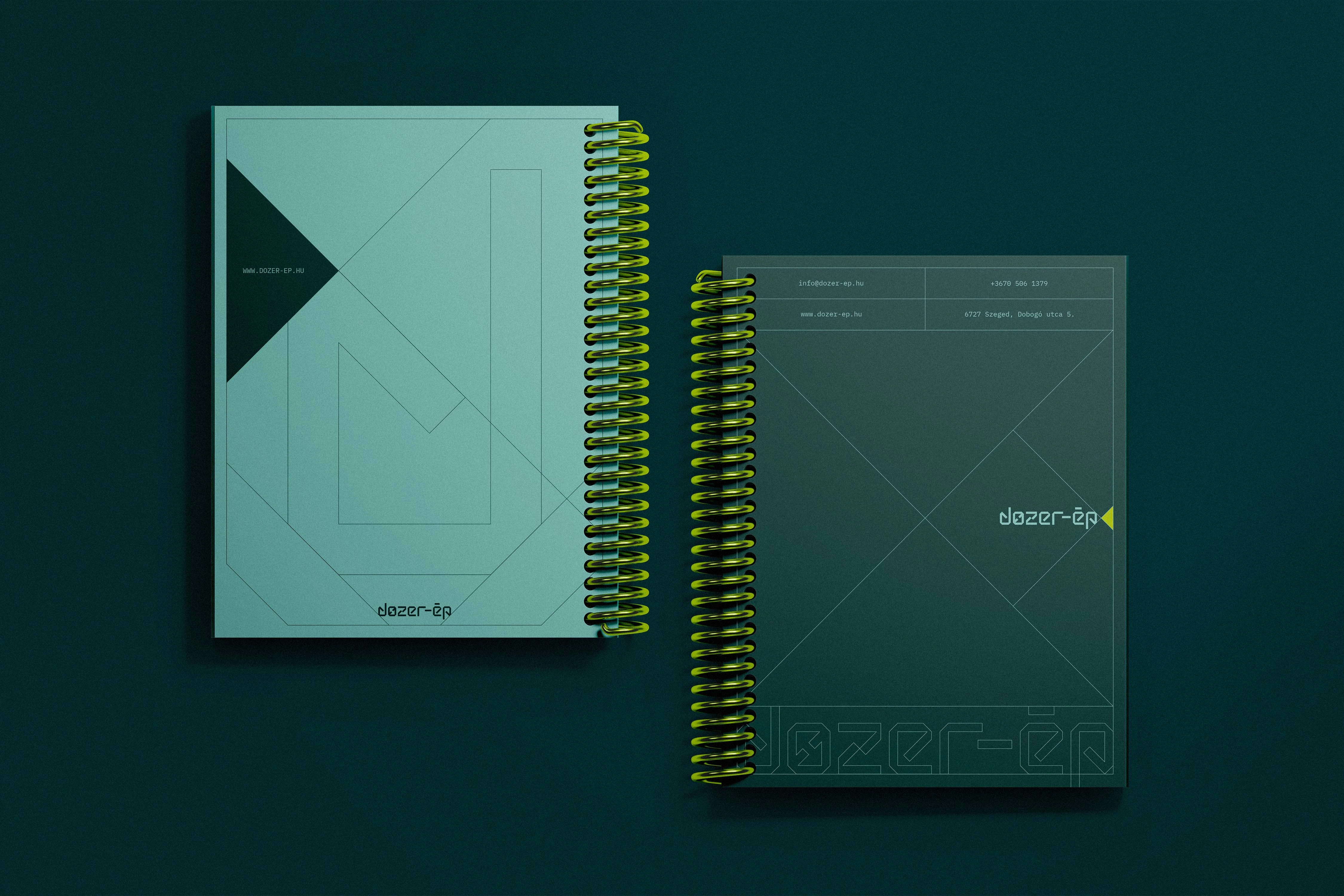
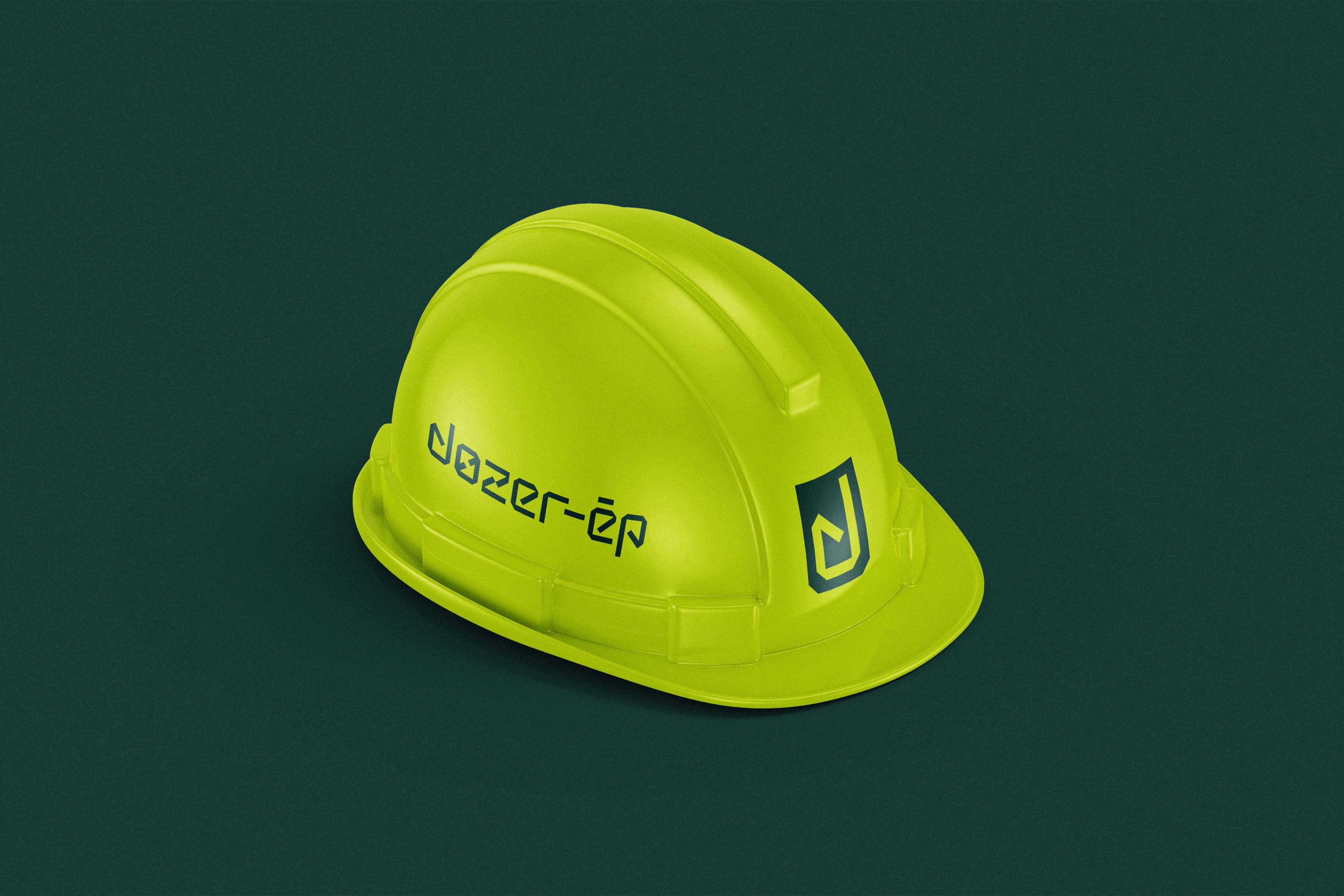
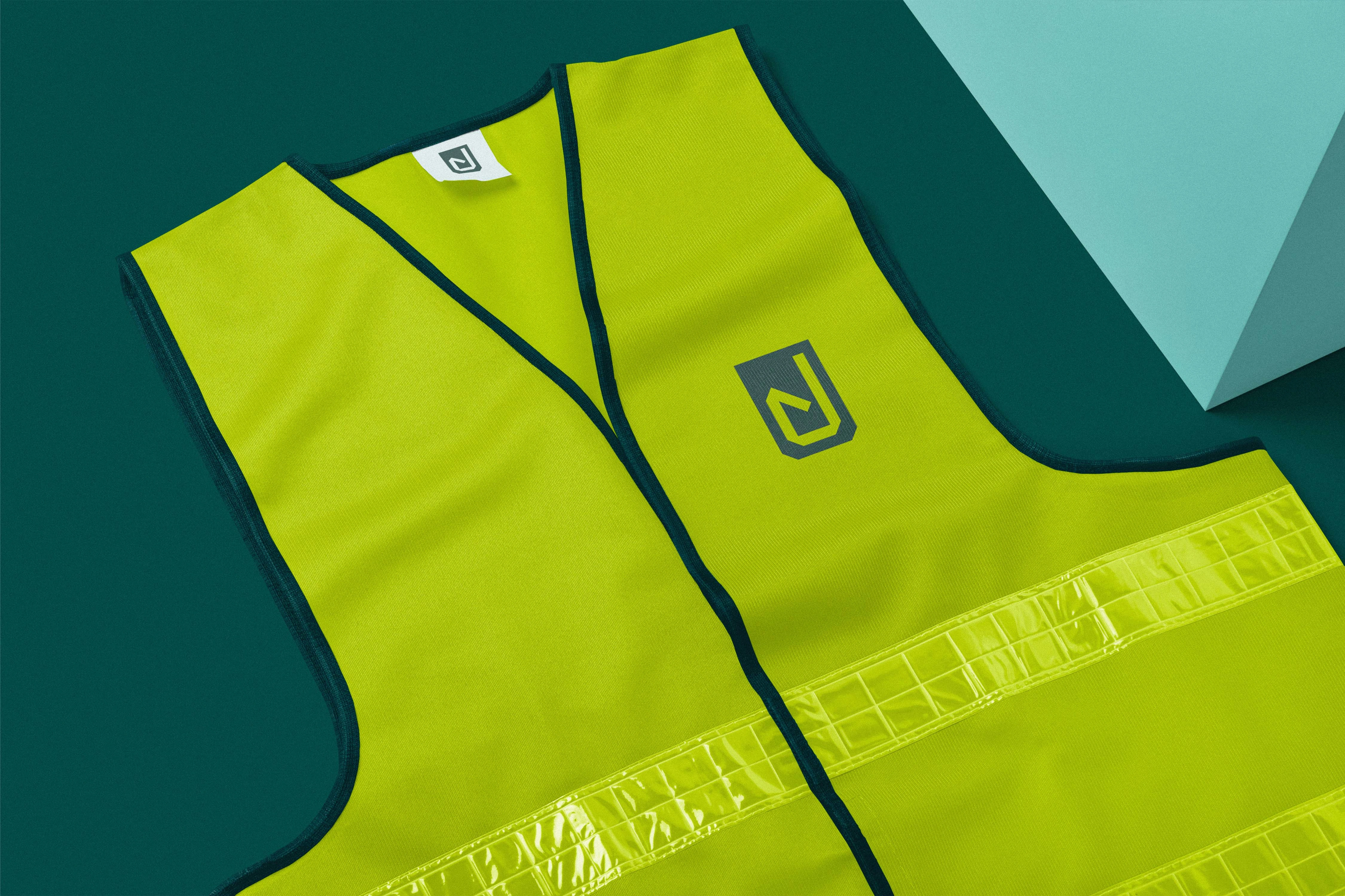
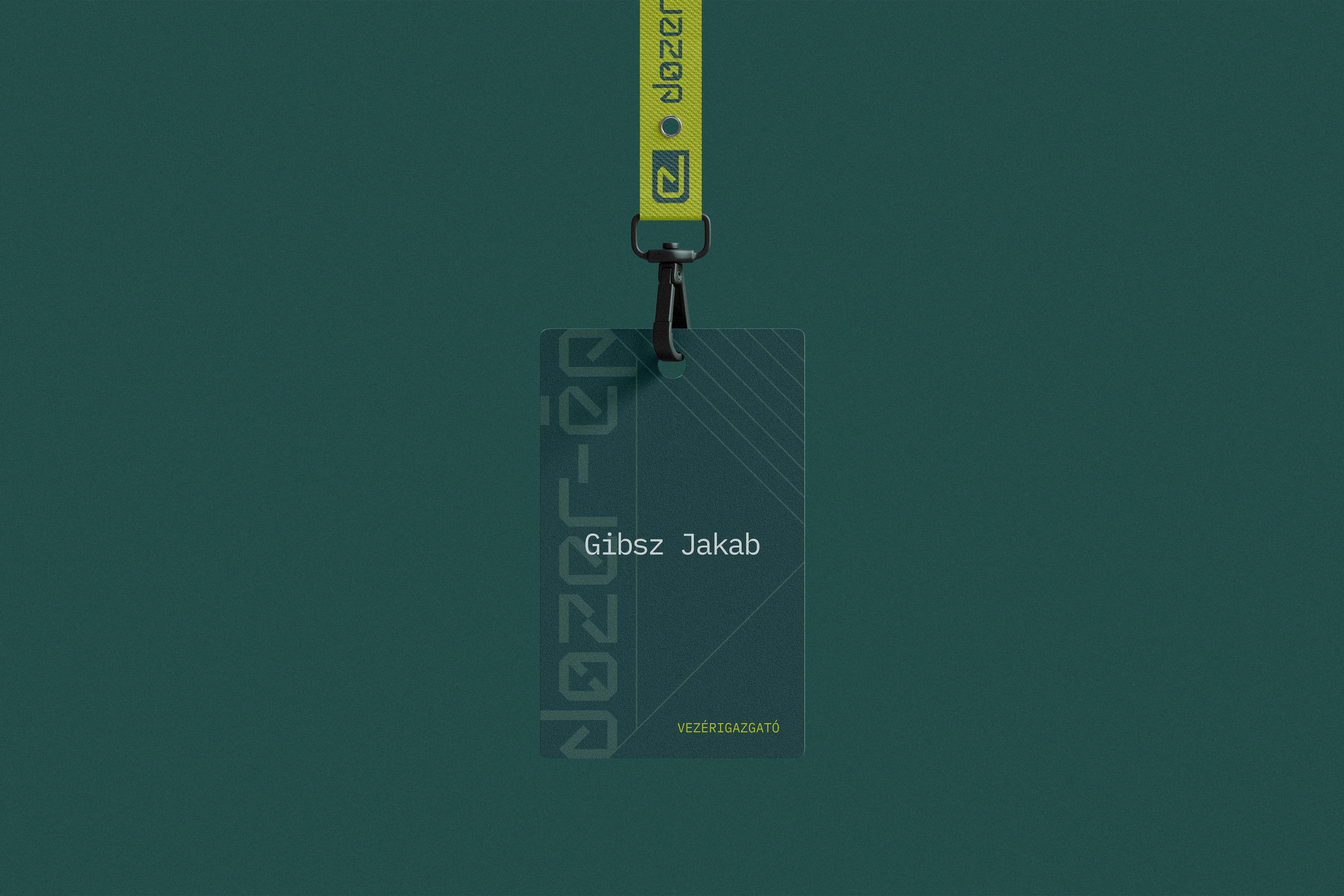
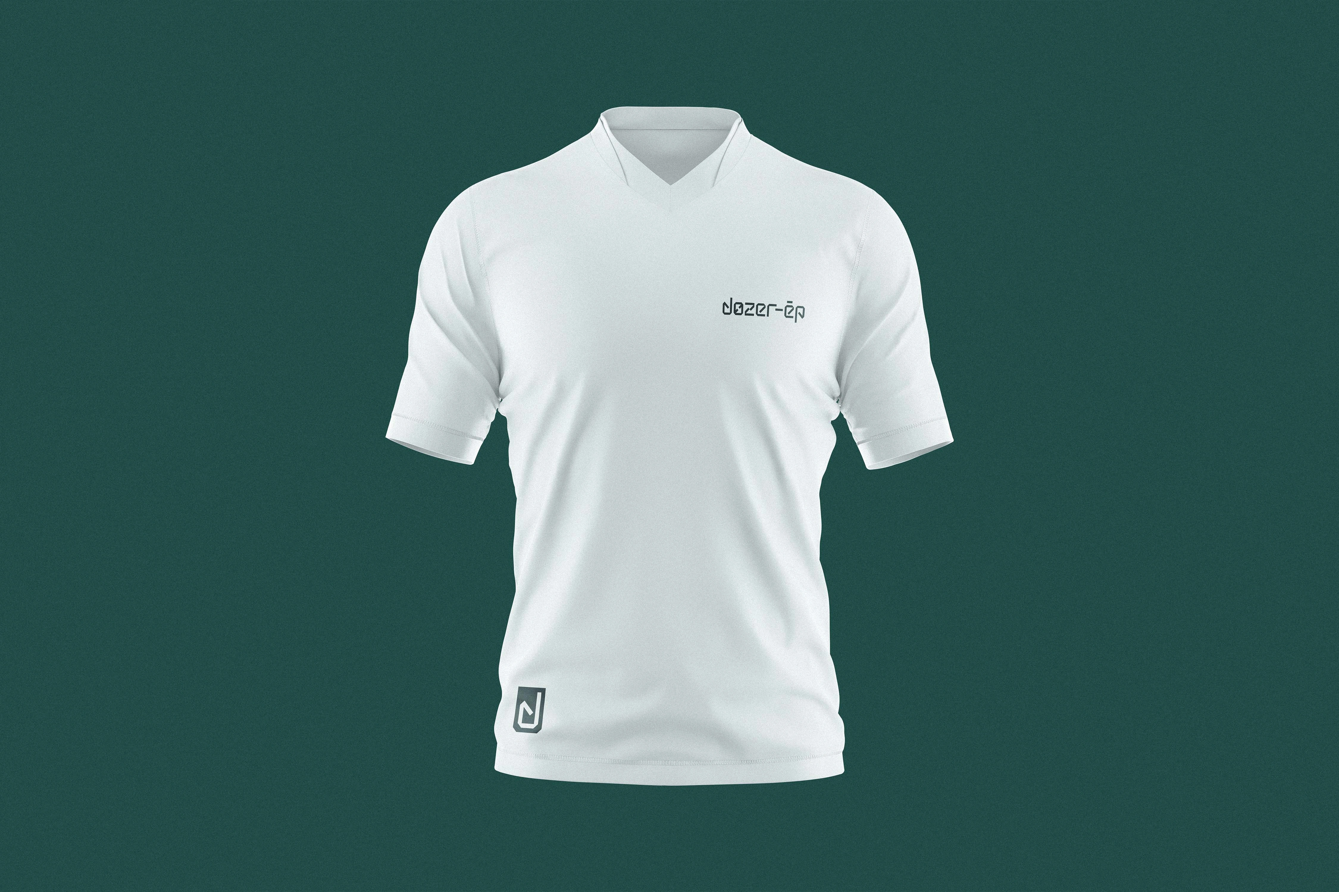
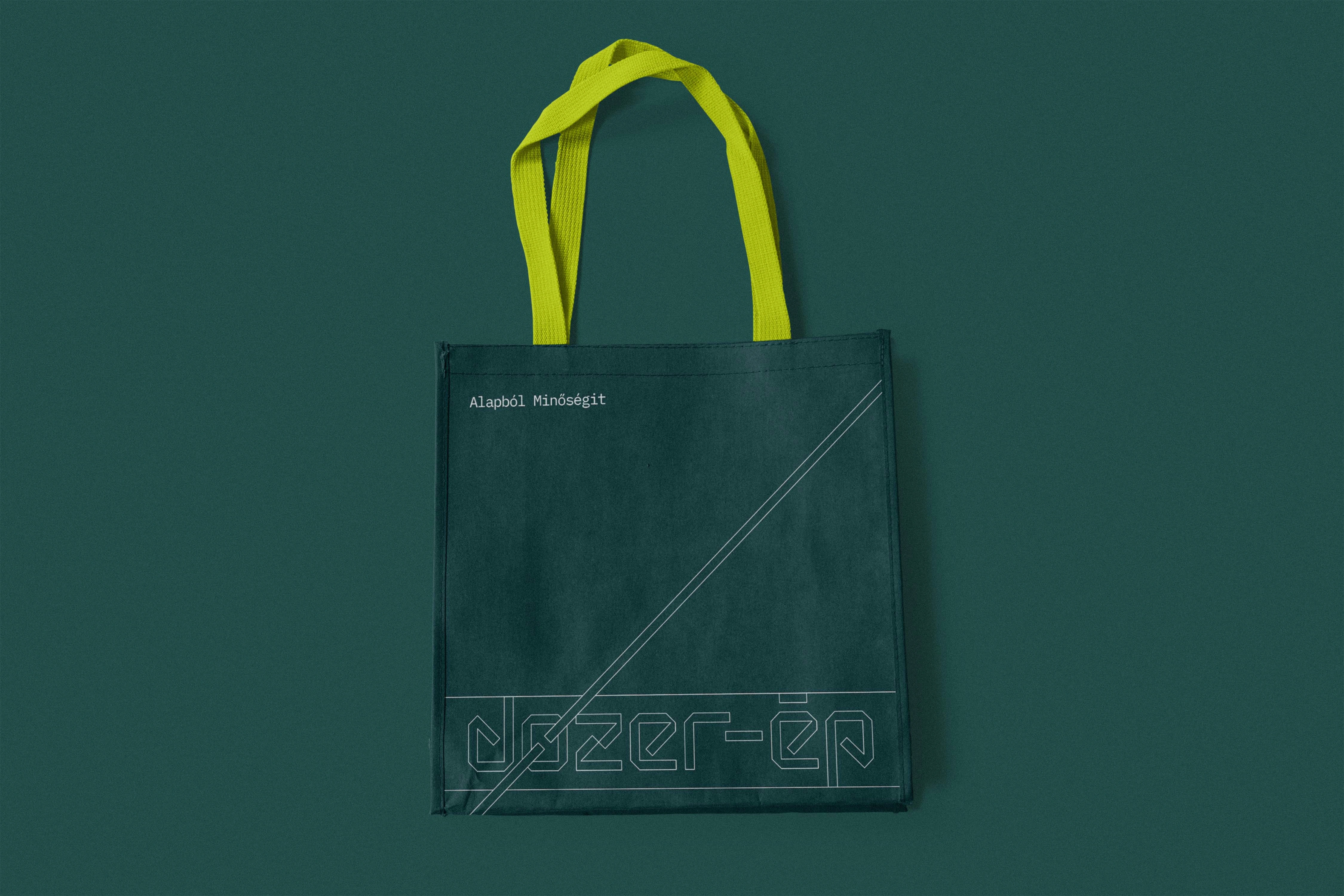
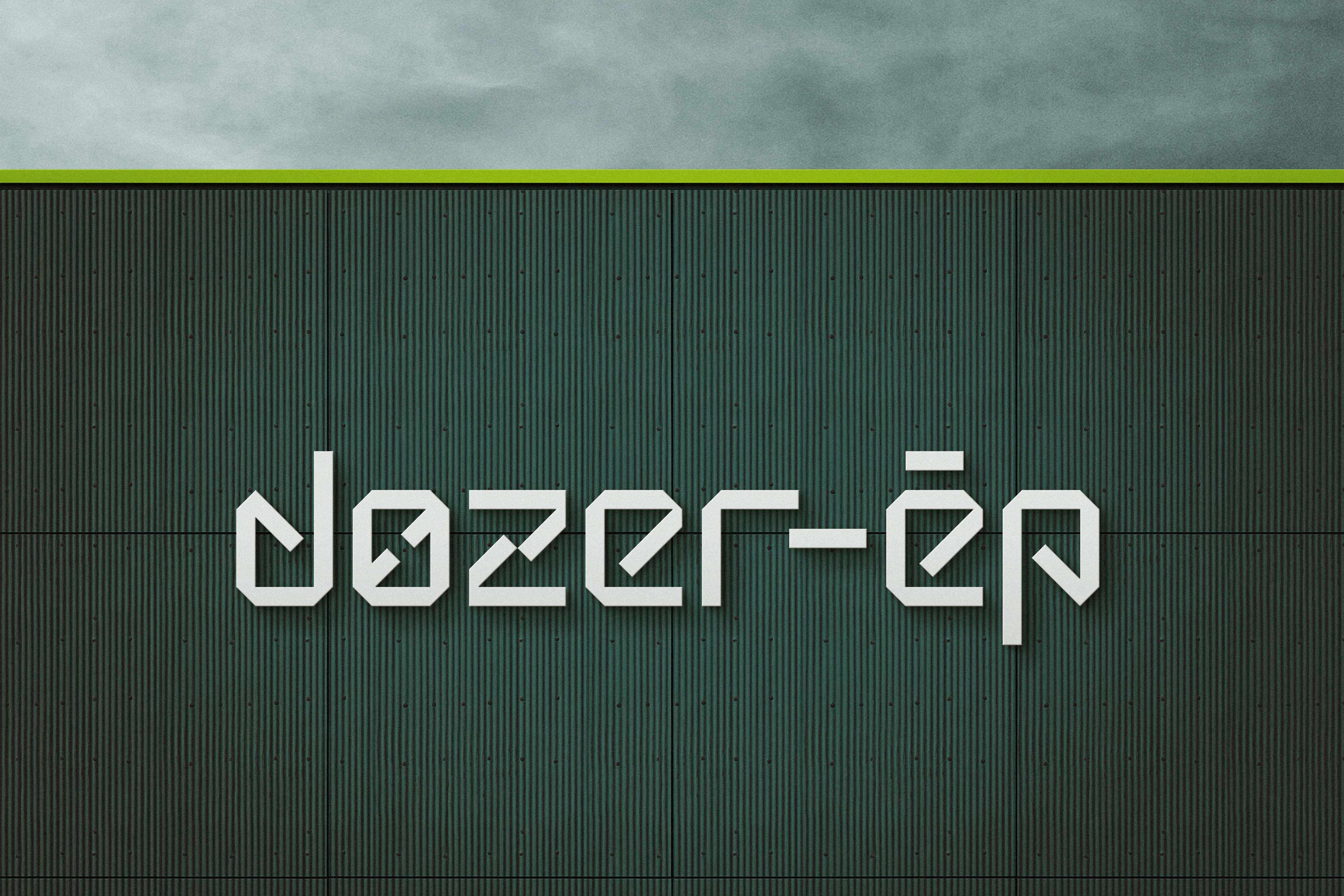
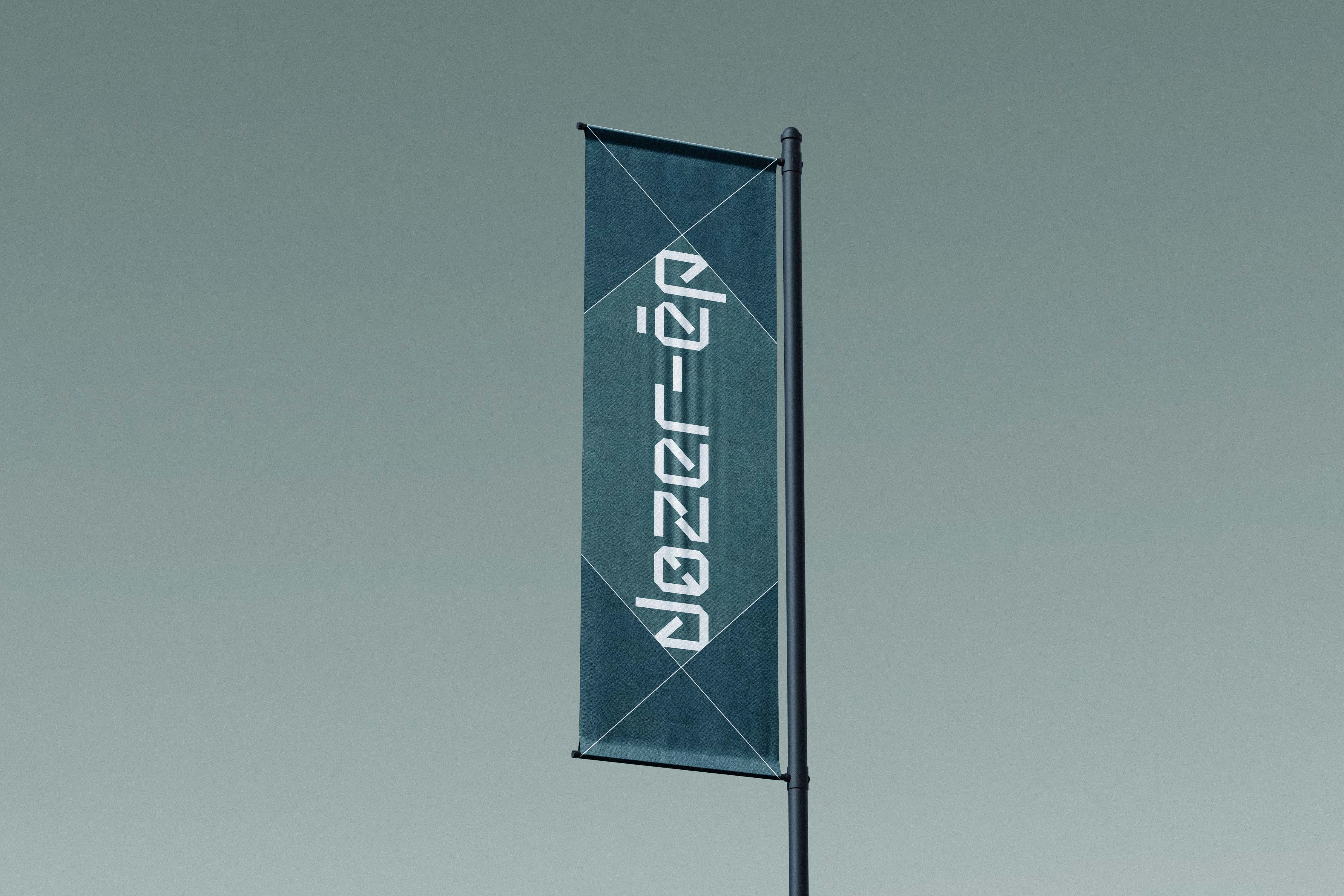
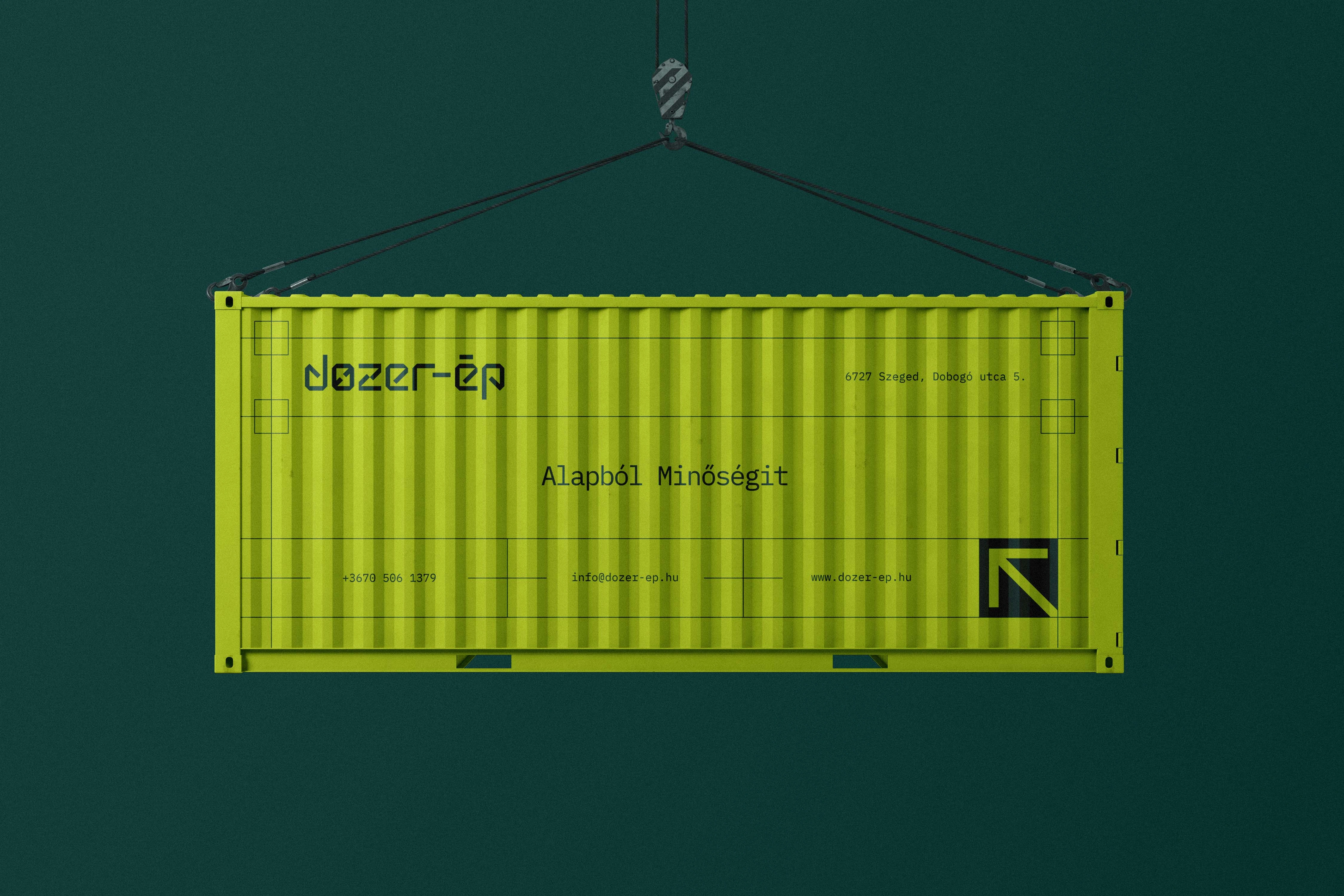
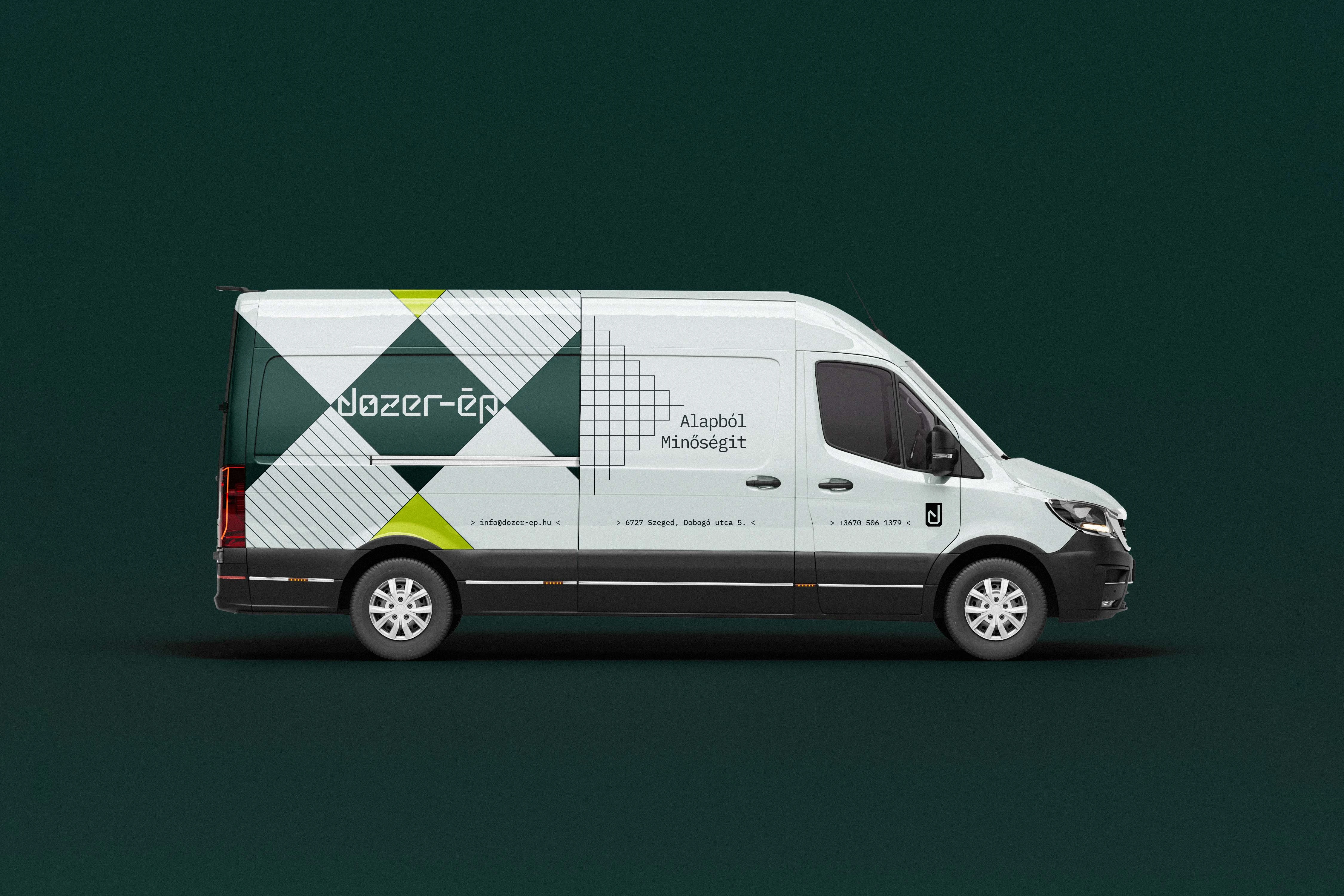
At the core of this identity is a precise, modular logo built on a strict 1×1 square grid. This geometric foundation, inherently associated with structural strength, stability, and engineering logic, perfectly mirrors Dozer-Ép's industrial profile. The custom letterforms of the wordmark draw direct inspiration from the heavy silhouettes of construction machinery—such as cranes, excavators, and loaders—as well as reinforced concrete structures and building plans. This grid-based construction results in a balanced, serious mark that scales flawlessly from large-scale signage on heavy site vehicles to a standalone icon designed for digital and social media applications.
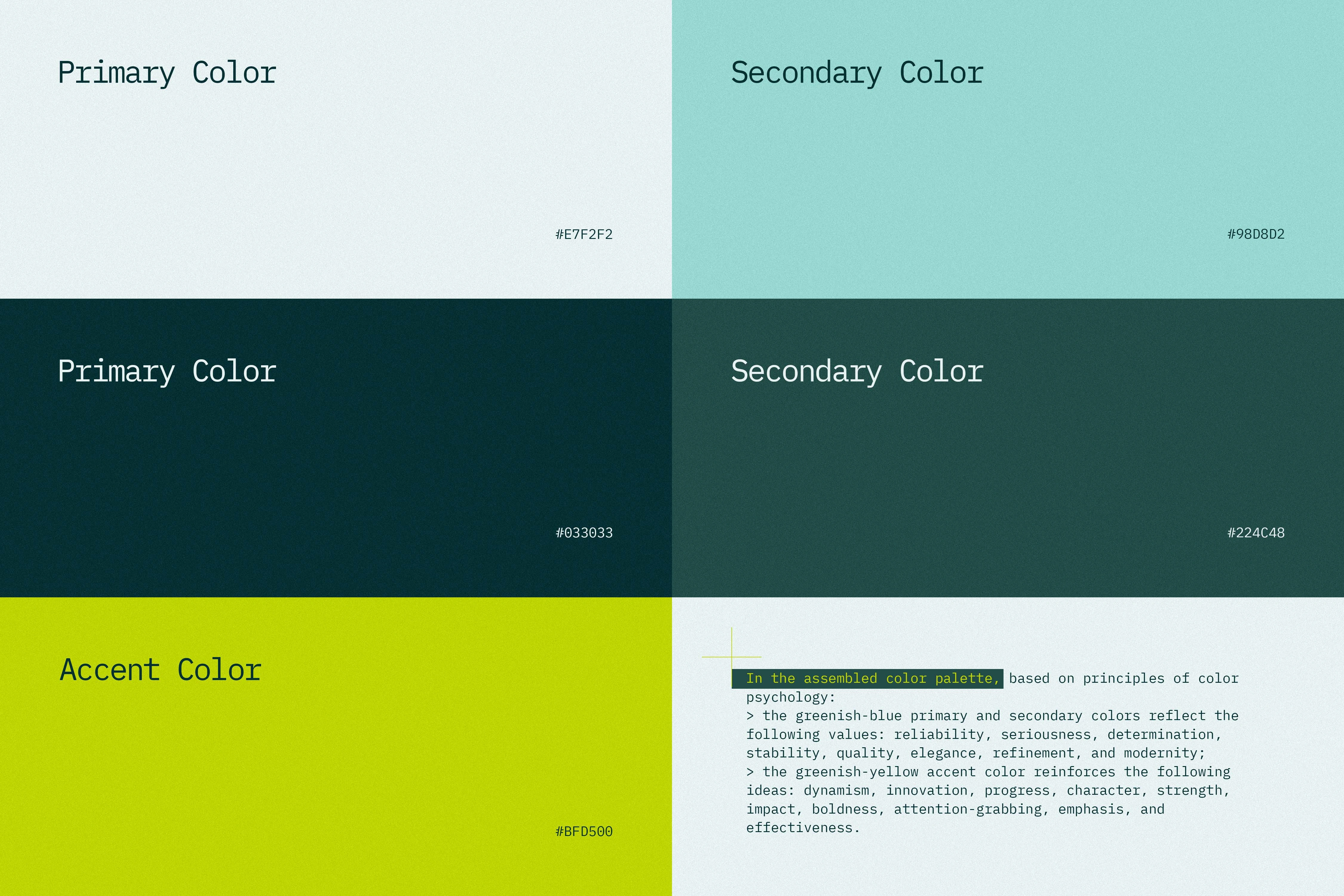
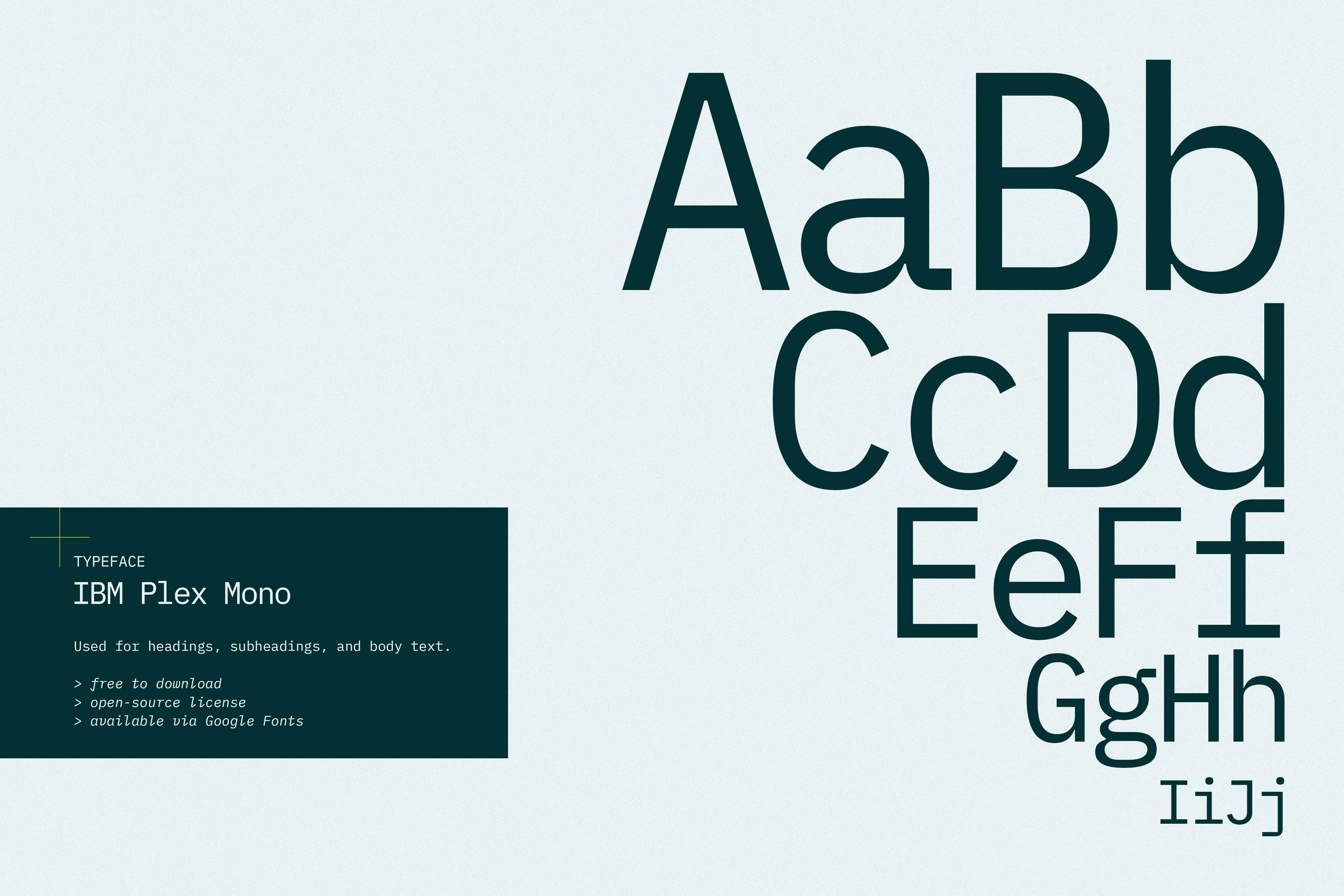
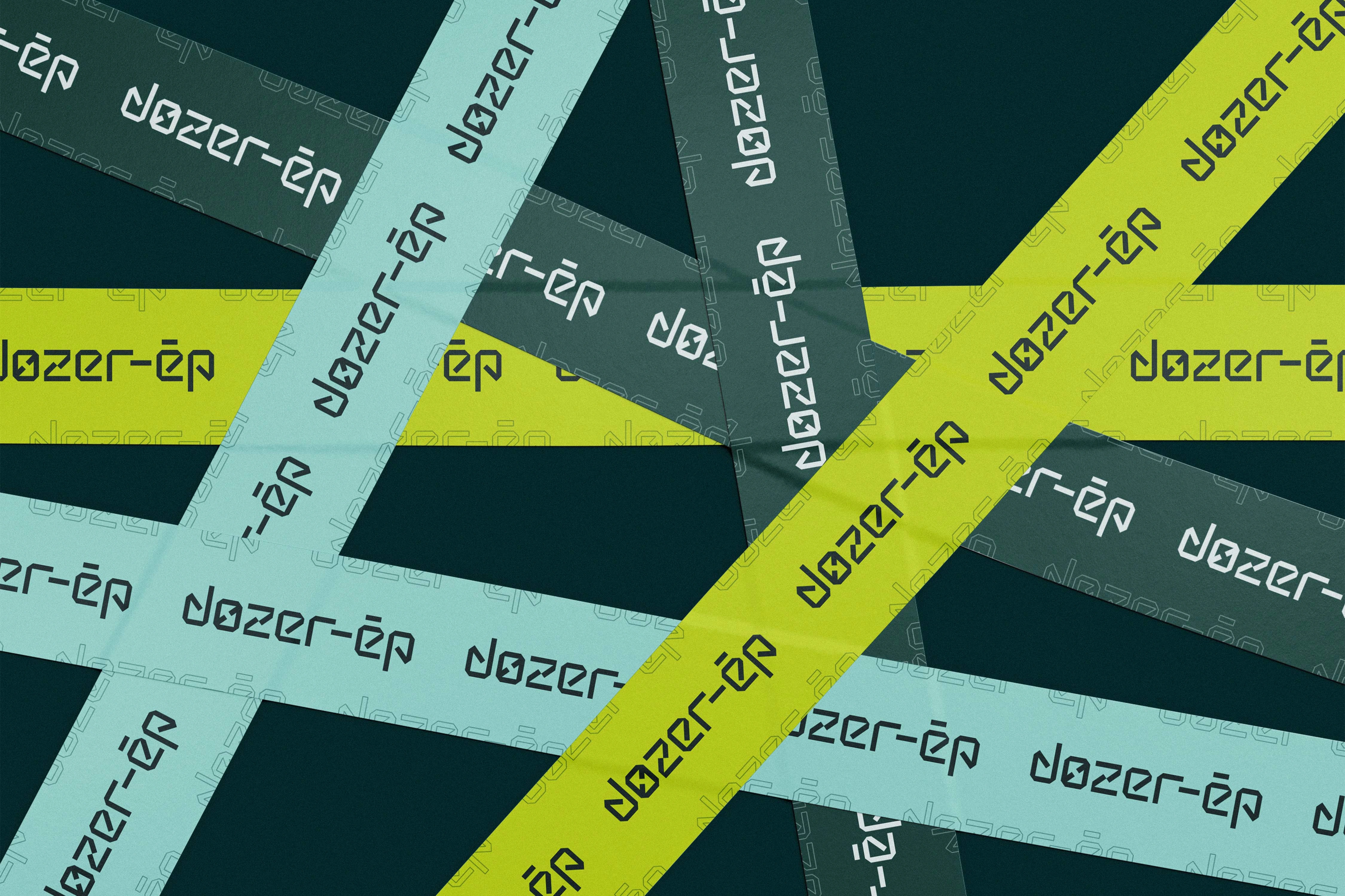
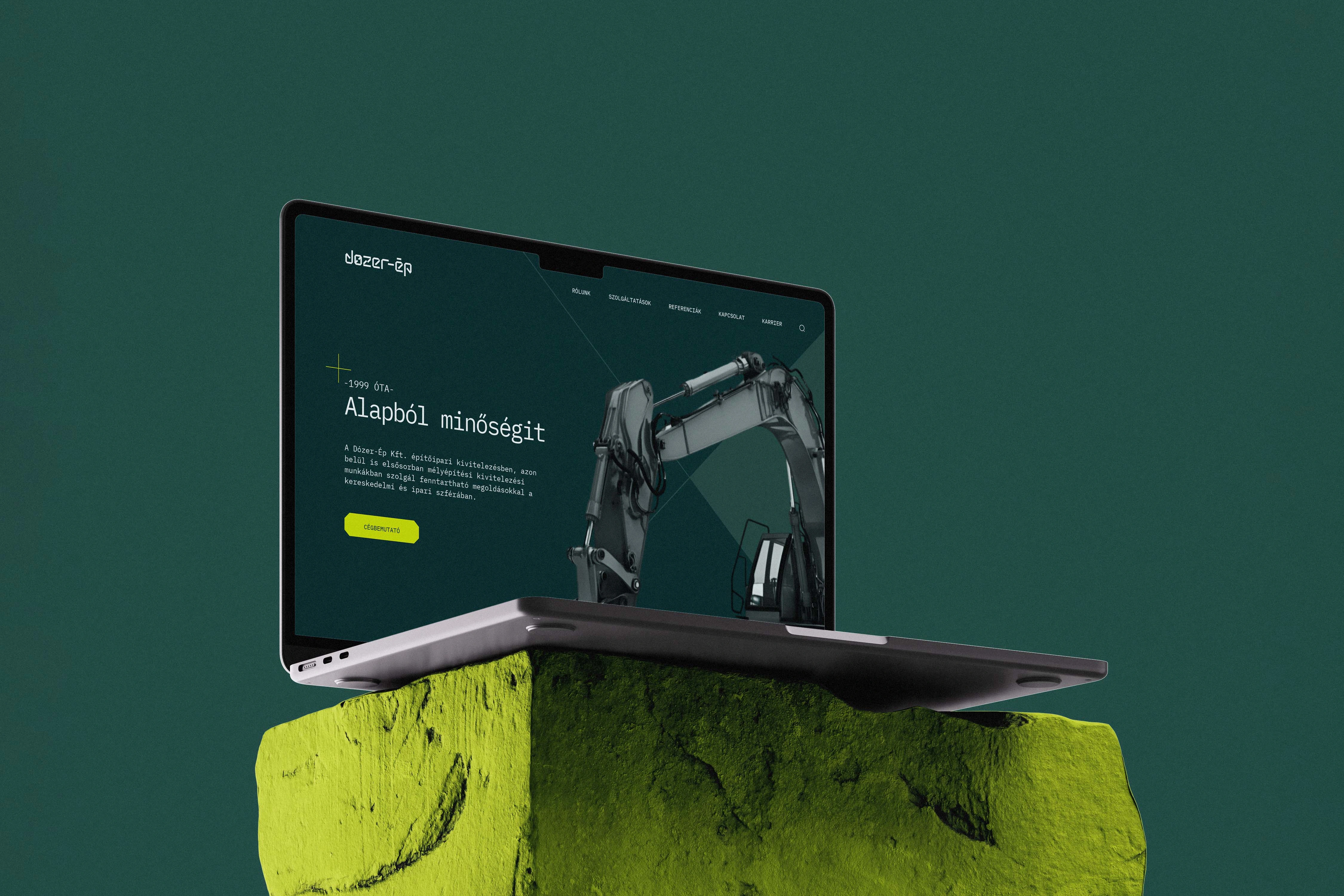
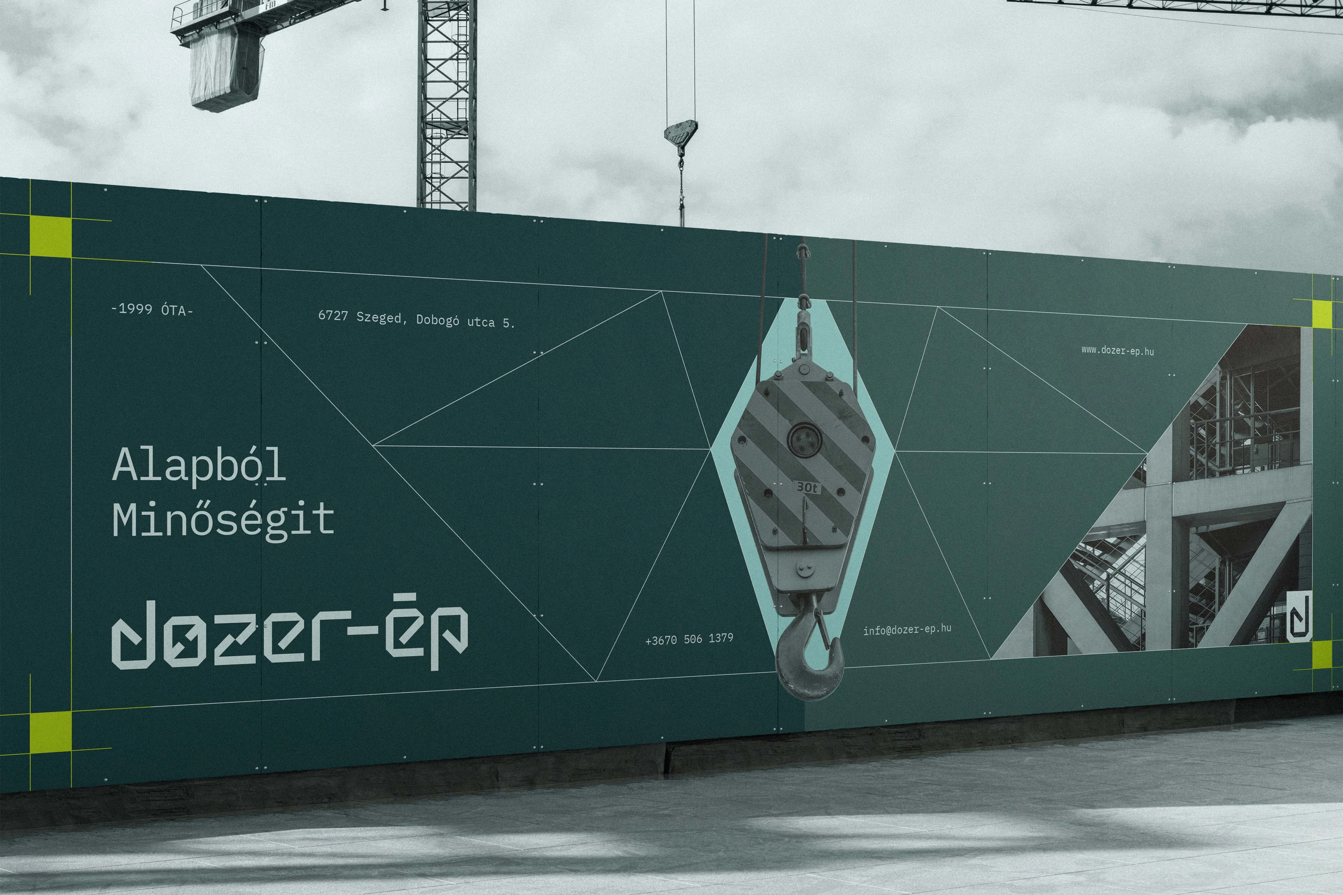
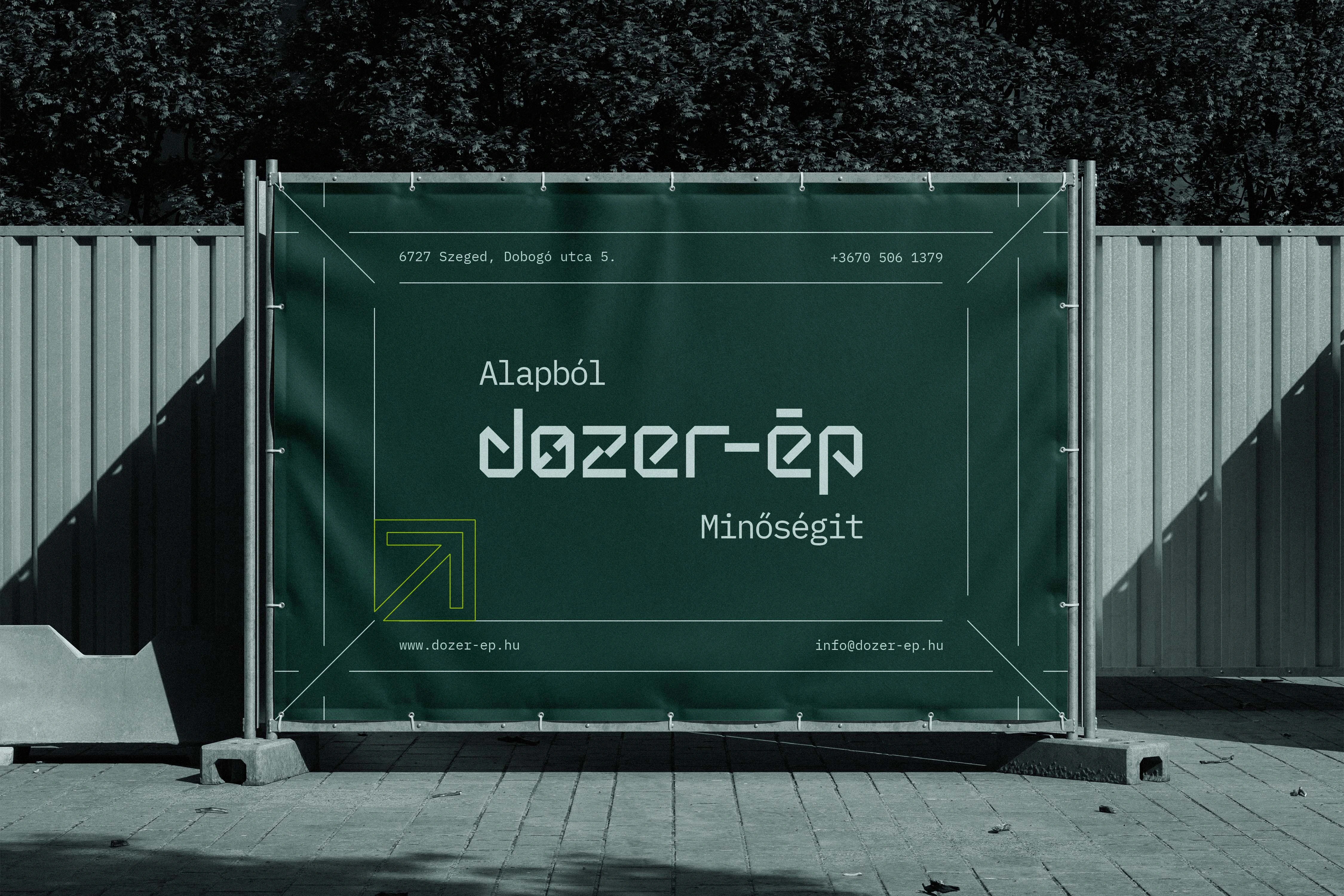
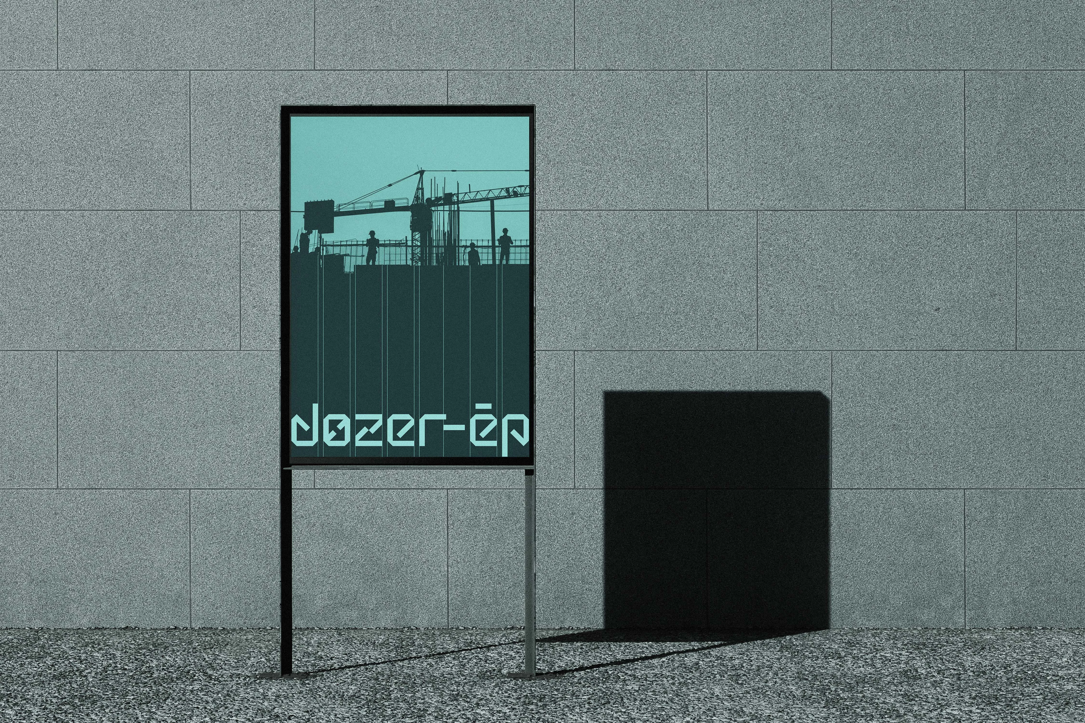
The aesthetic choices further emphasize the company's dependable yet forward-looking character. The primary color palette features a refined light greenish-blue paired with a deep, technical dark green-blue, conveying quality, elegance, and unshakeable stability. This cool, industrial foundation is pierced by a vibrant greenish-yellow accent that injects a controlled sense of energy, boldness, and high visual impact to highlight key elements. Complementing this color system is the exclusive use of IBM Plex Mono. This contemporary monospaced typeface was selected for its unmistakable technological character; its fixed-width rhythm subtly evokes measurement grids, technical documentation, and engineering drawings, creating a unified, minimal, and highly functional typographic voice.
Ultimately, this comprehensive identity system presents Dozer-Ép as a precise, engineering-focused partner equipped for the future. By combining a machinery-inspired, grid-based logo with a technical color palette and monospaced typography, the visual language communicates industrial robustness and professional seriousness. The result is a highly adaptable, scalable, and impactful brand foundation that supports Dozer-Ép's continued growth and ensures a commanding presence across all touchpoints, from heavy machinery to digital interfaces.


Like this project
Posted Jul 7, 2026
A geometric, highly functional brand identity for a growing civil engineering firm, balancing industrial robustness with precision and bold, modern aesthetics.
Likes
0
Views
2
Timeline
Jan 1, 2025 - Dec 31, 2025