Office Supplies Brand Identity & Logo Design | Viviani

Tamás Kurucz


Viviani
Office Supplies Brand Identity & Logo Design
Case study of an office supplies brand identity and logo design for Viviani, a Hungarian wholesale company in office and hygiene products, reflecting quality, reliability and simplicity for the B2B market.
CLIENT: Viviani
YEAR: 2025
INDUSTRY: B2B Wholesale; Office Supplies
AWARDS & RECOGNITION: Exhibited, 23rd Golden Drawing Pin Award and Exhibition - 2026, Hungary
Project Overview
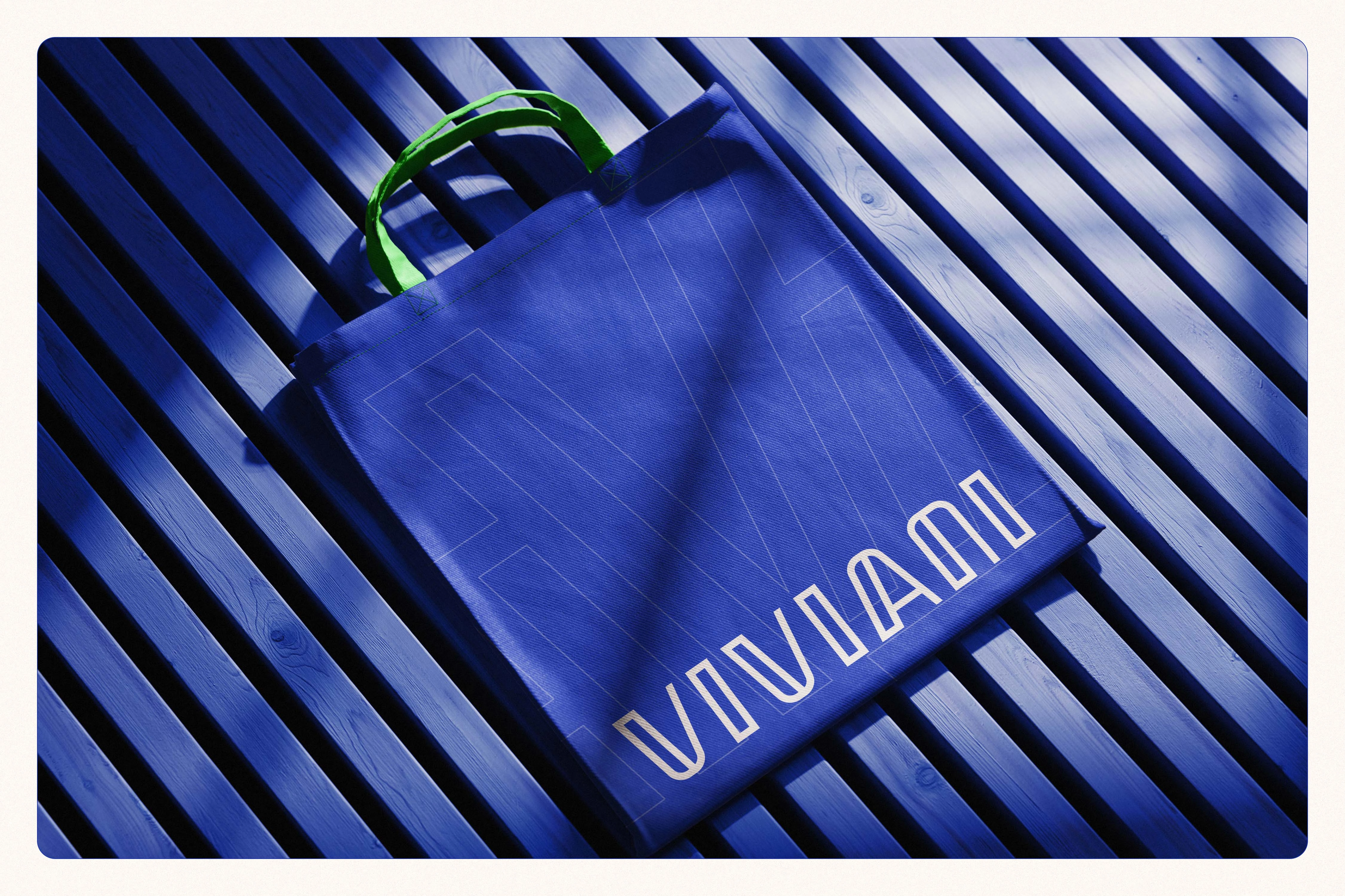
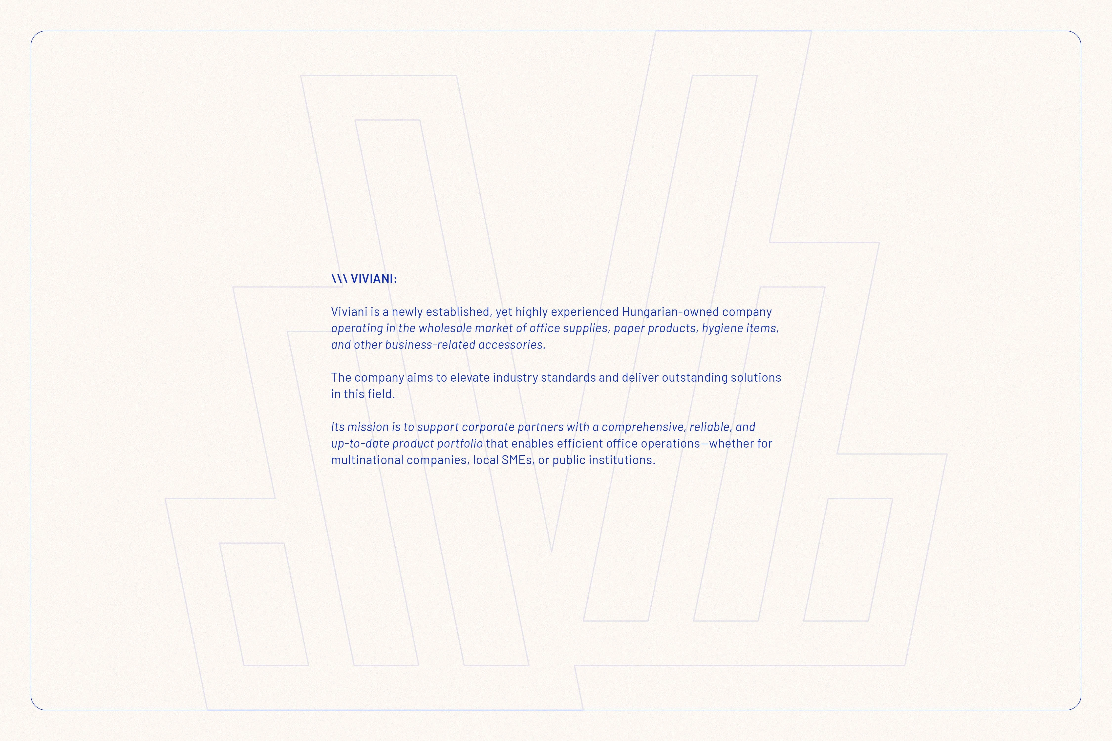
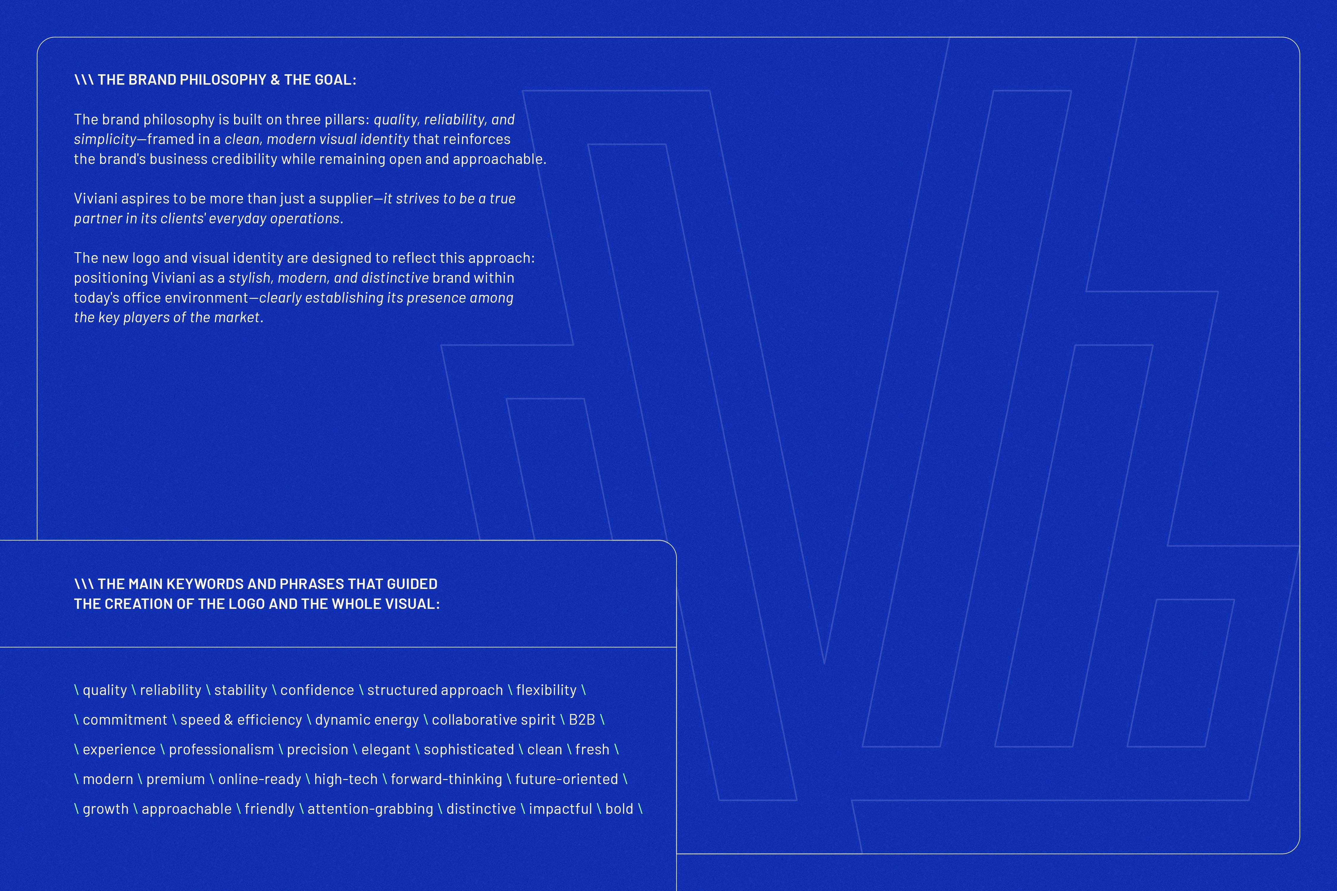
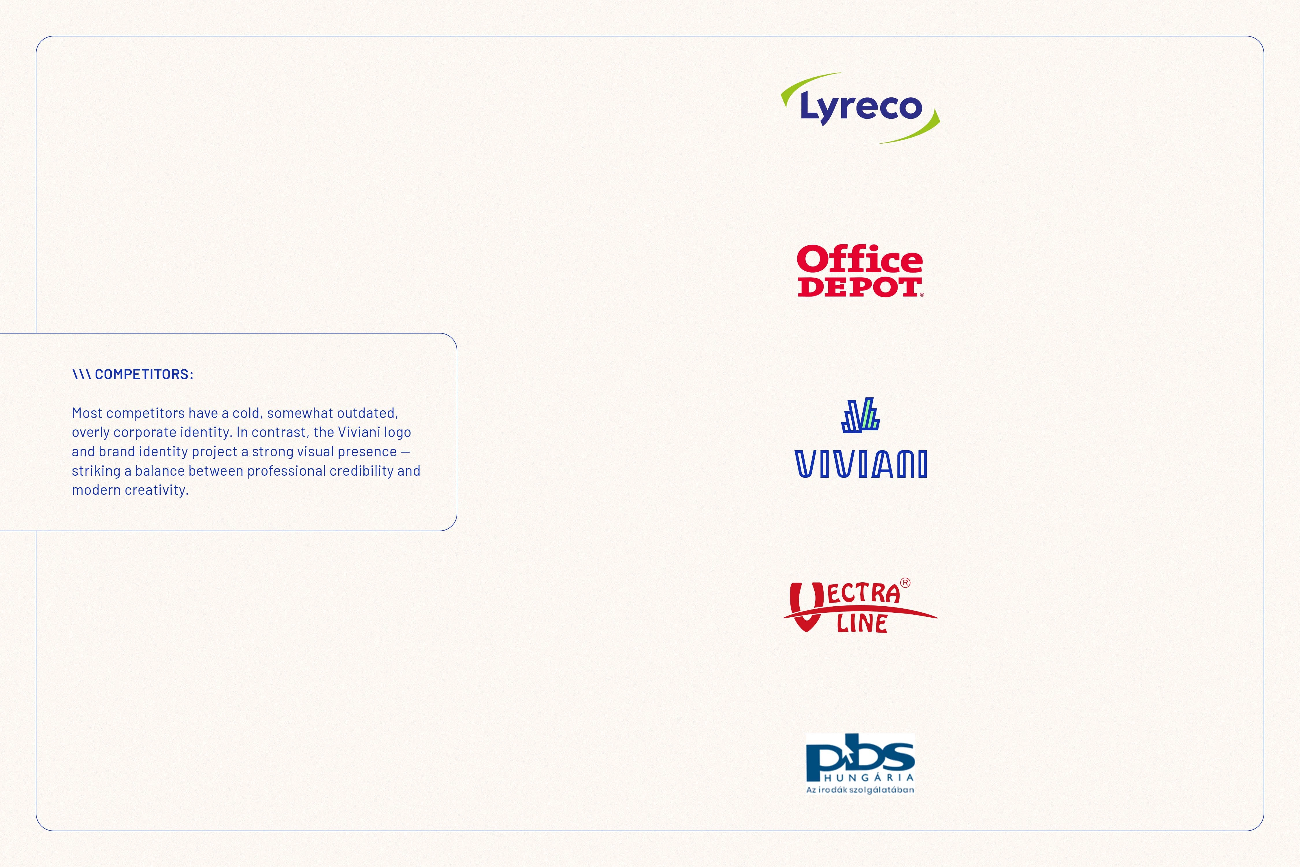
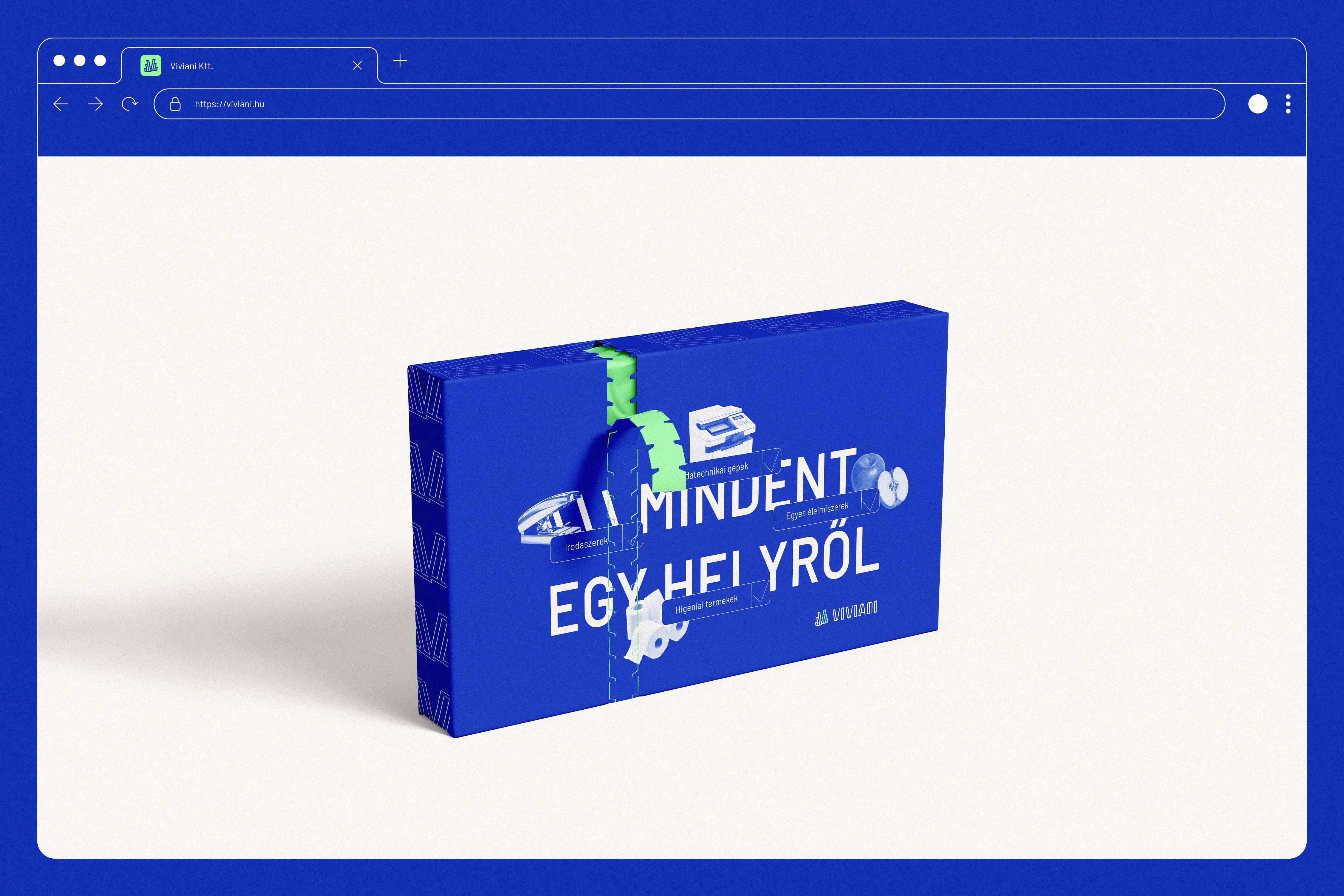
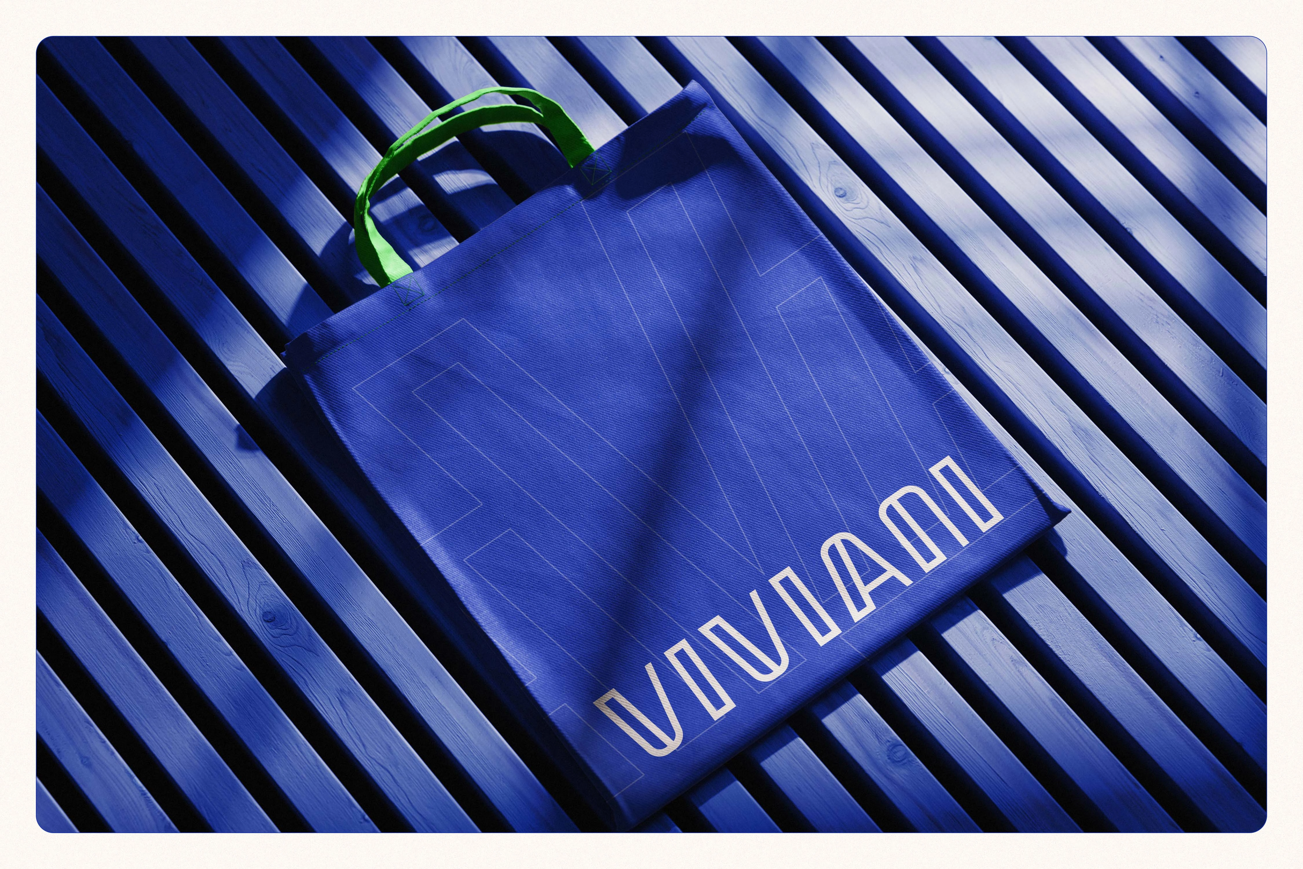
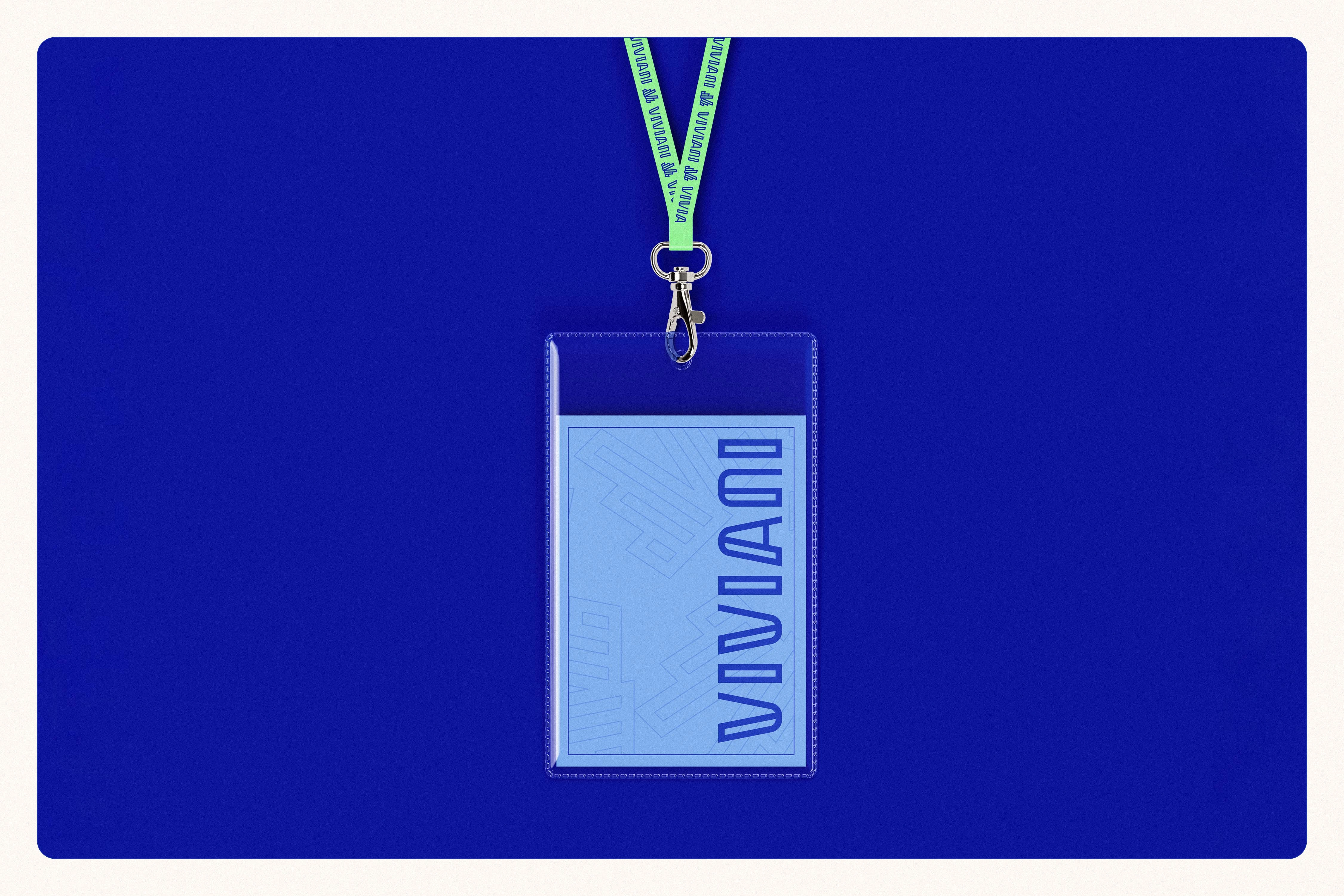
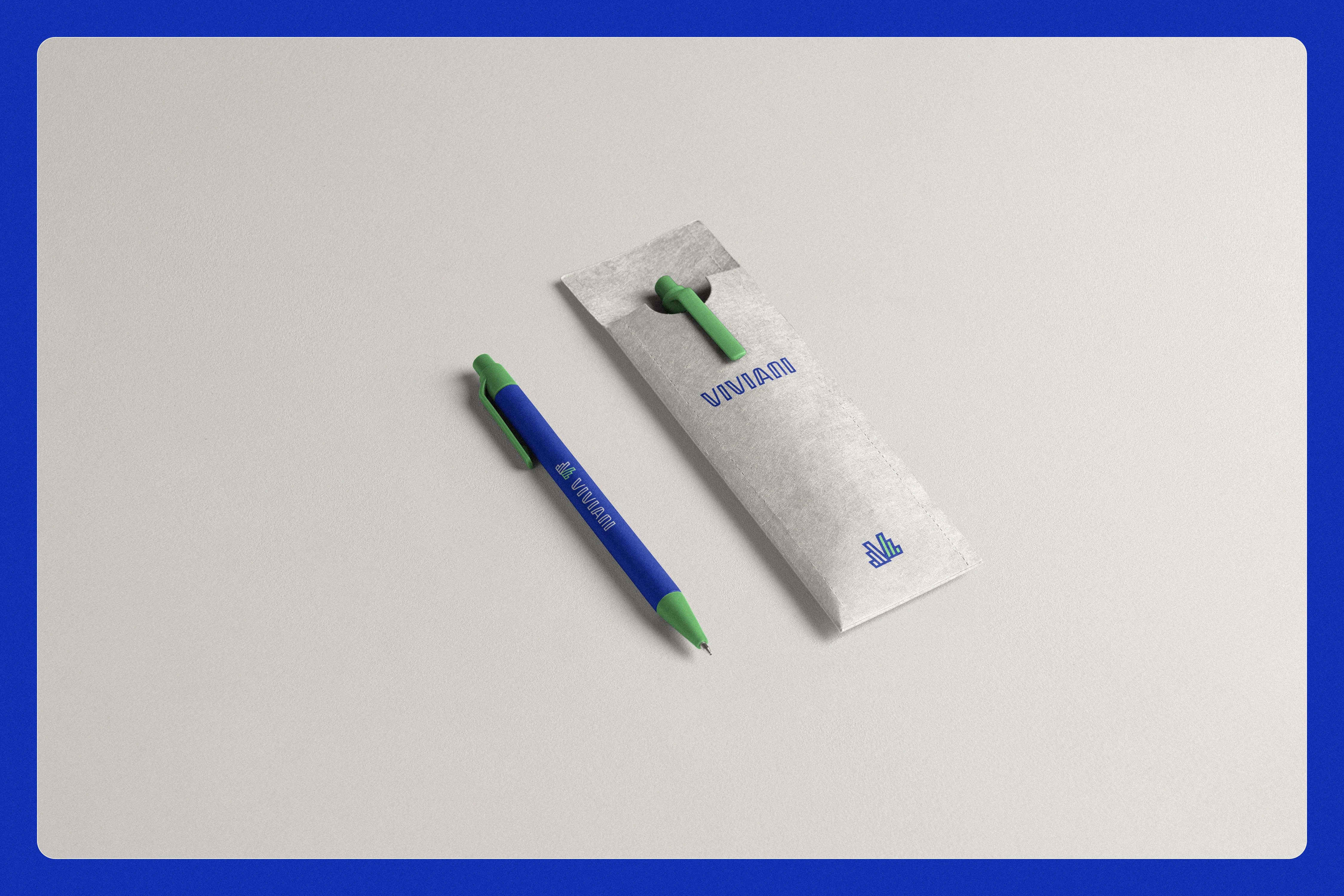
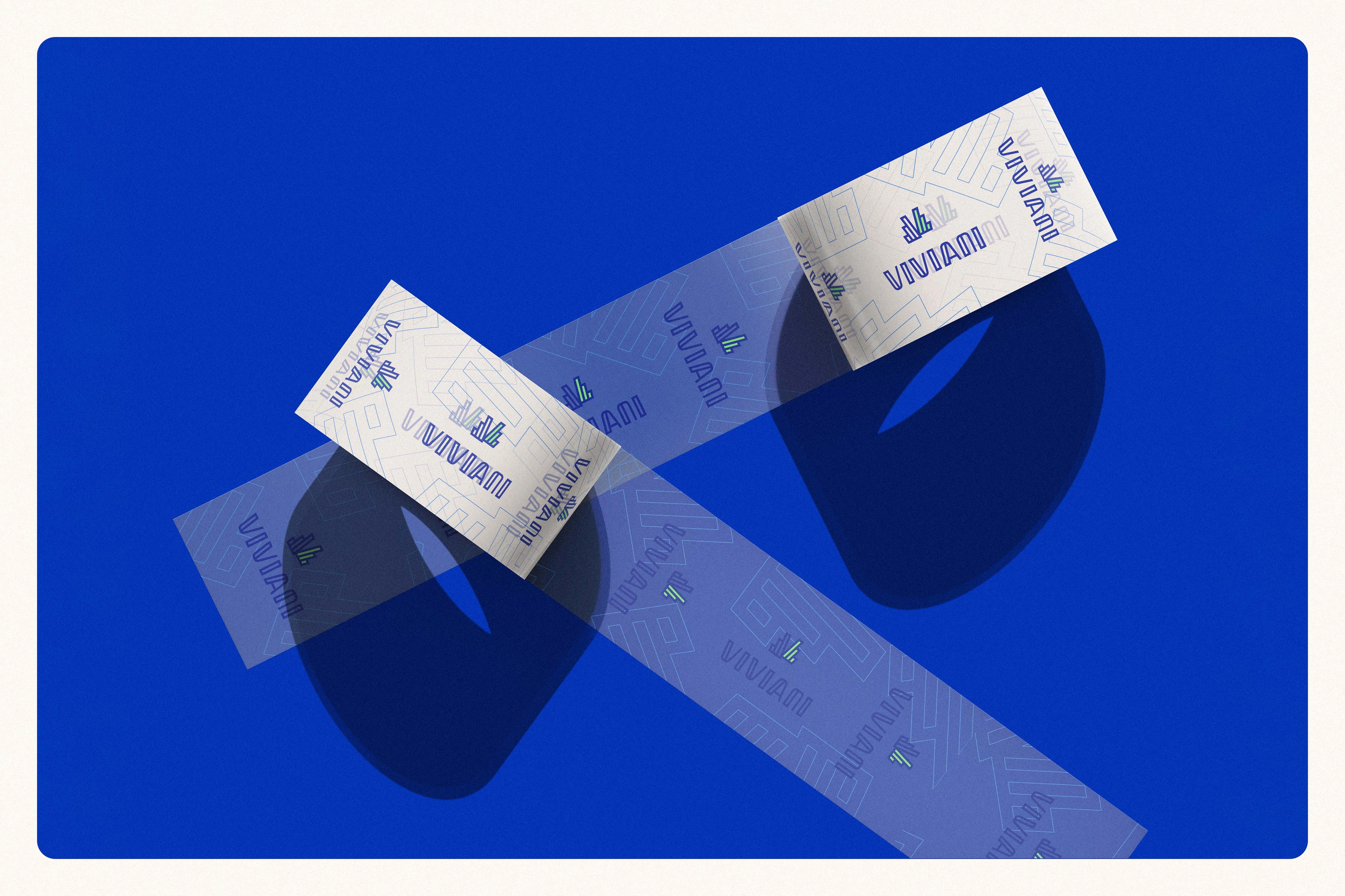
Designing the brand identity for Viviani—a newly established yet highly experienced Hungarian wholesale company specializing in office and hygiene supplies—required building a visual system firmly grounded in quality, reliability, and simplicity. The mission was to position the brand as a dependable, everyday partner for a diverse B2B market, spanning multinational corporations, domestic SMEs, and public institutions. To stand out in a sector often dominated by outdated or cold, overly corporate visuals, the core concept aimed to balance technical clarity with a human, approachable attitude. The resulting identity is clean, modern, and systematized, ensuring Viviani is perceived as a dynamic and flexible partner dedicated to keeping office operations running smoothly and efficiently.
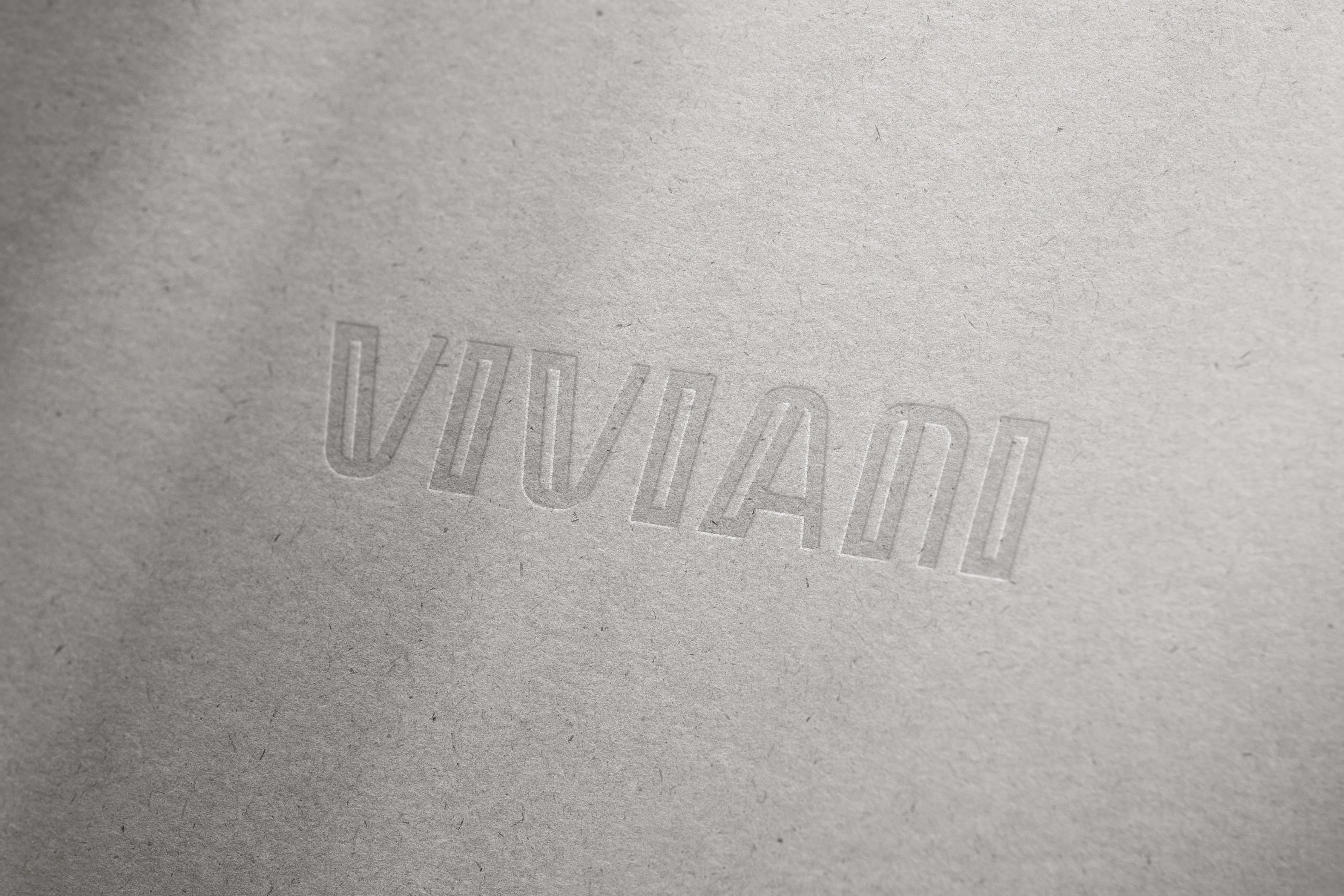
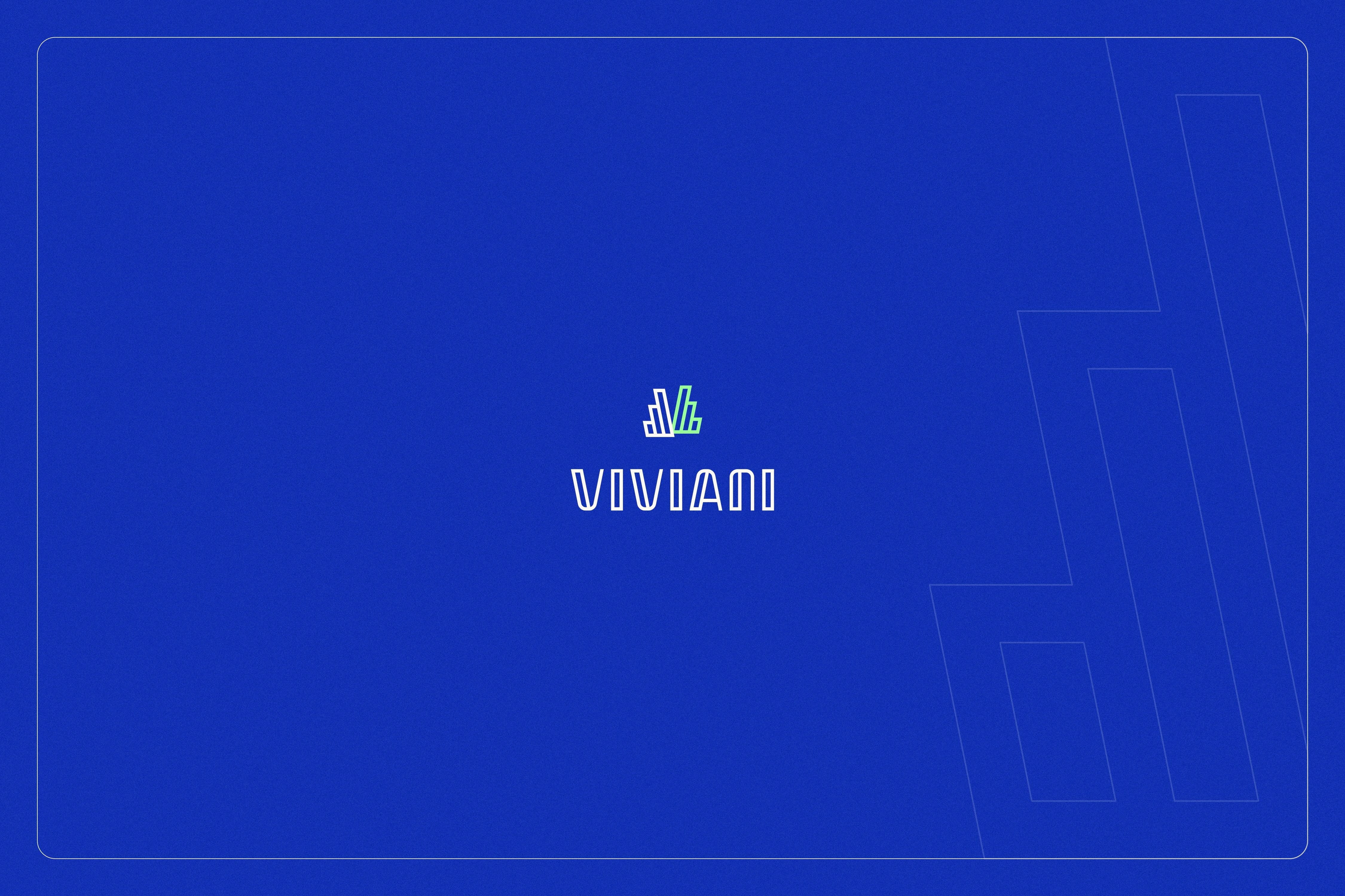
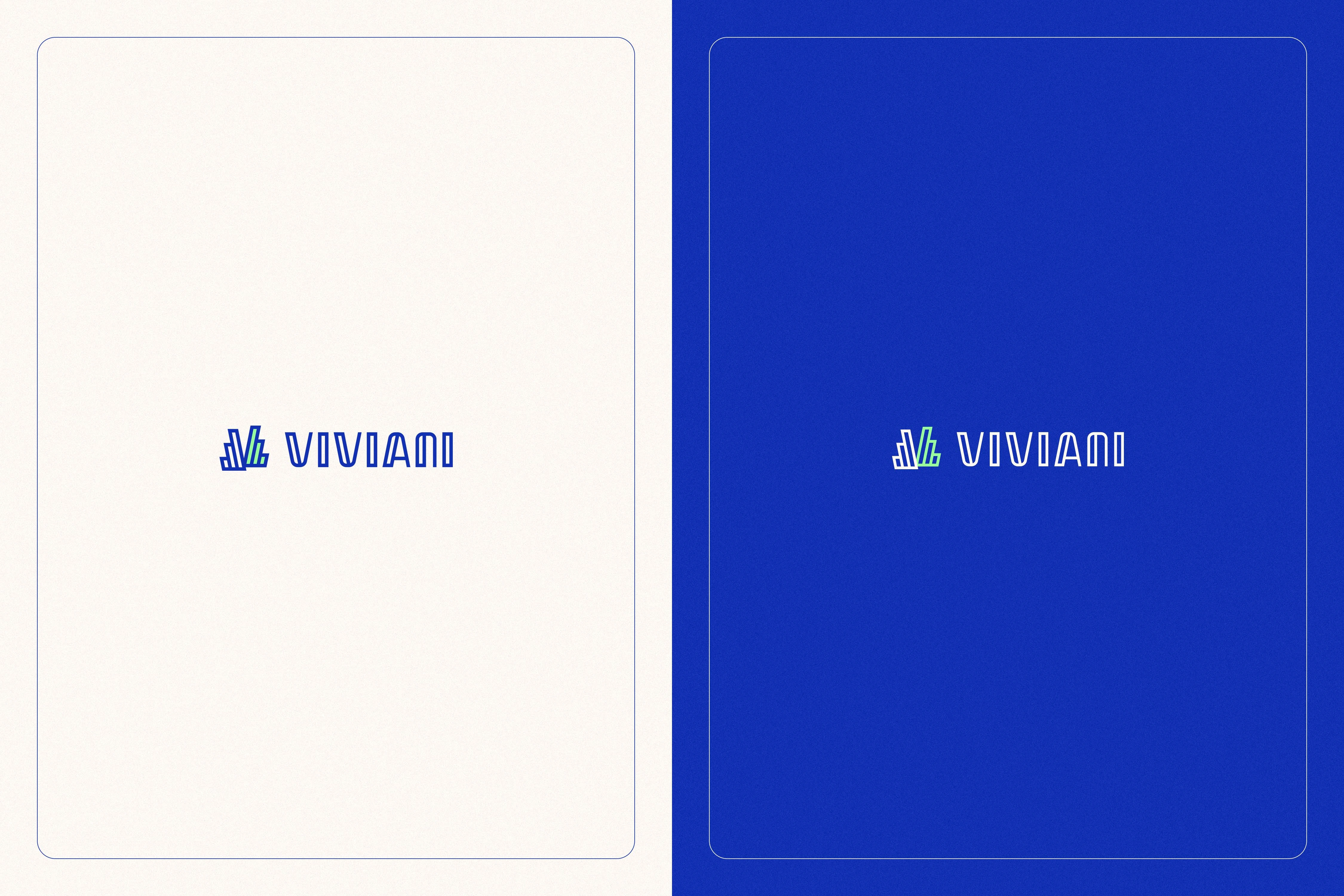
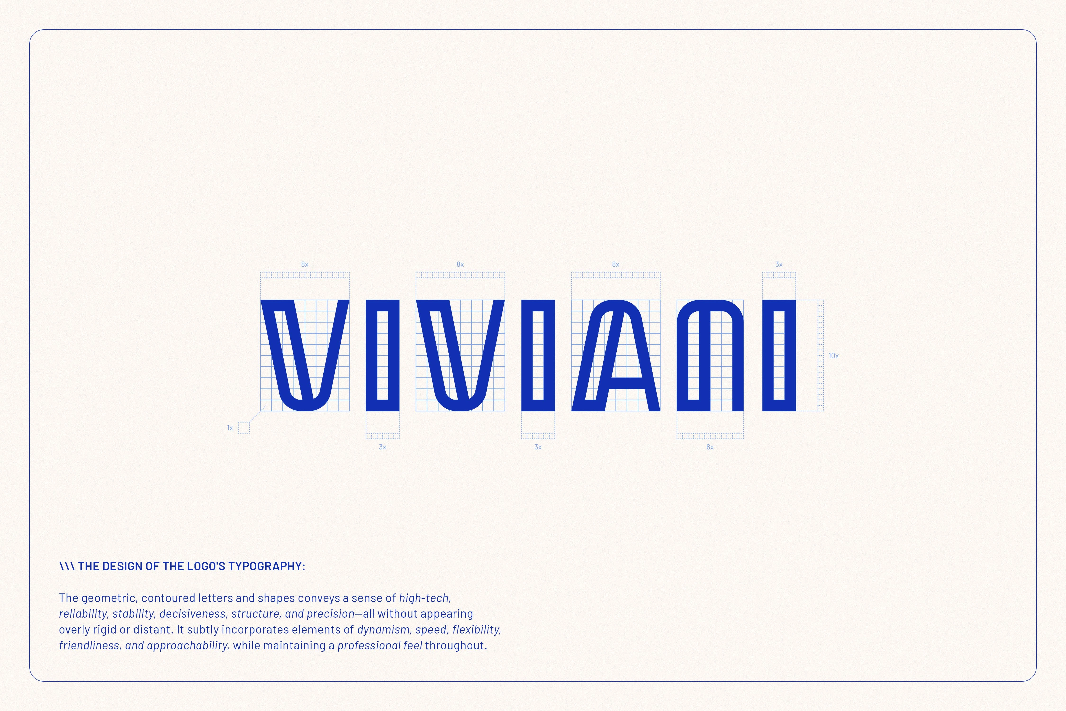
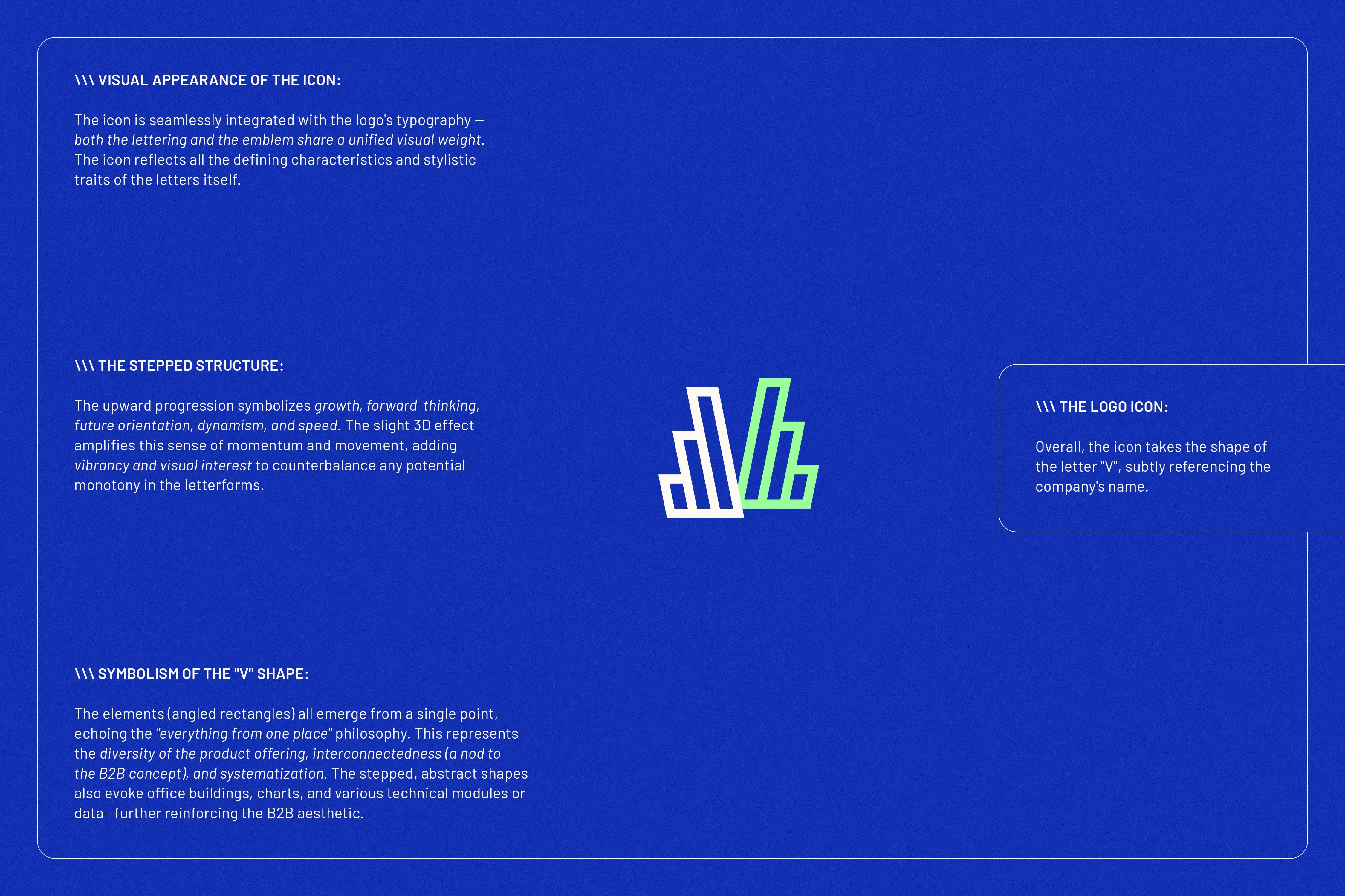
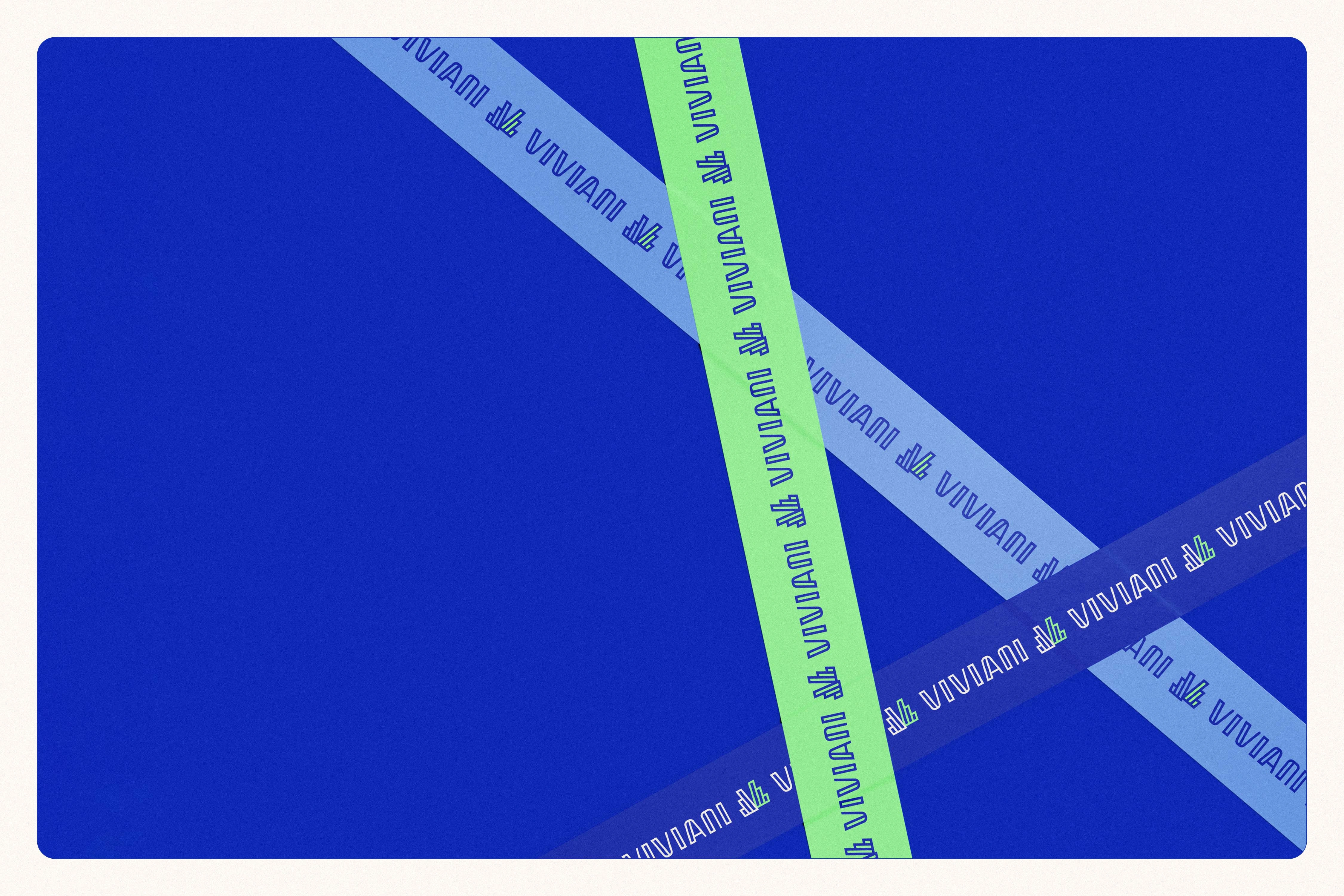
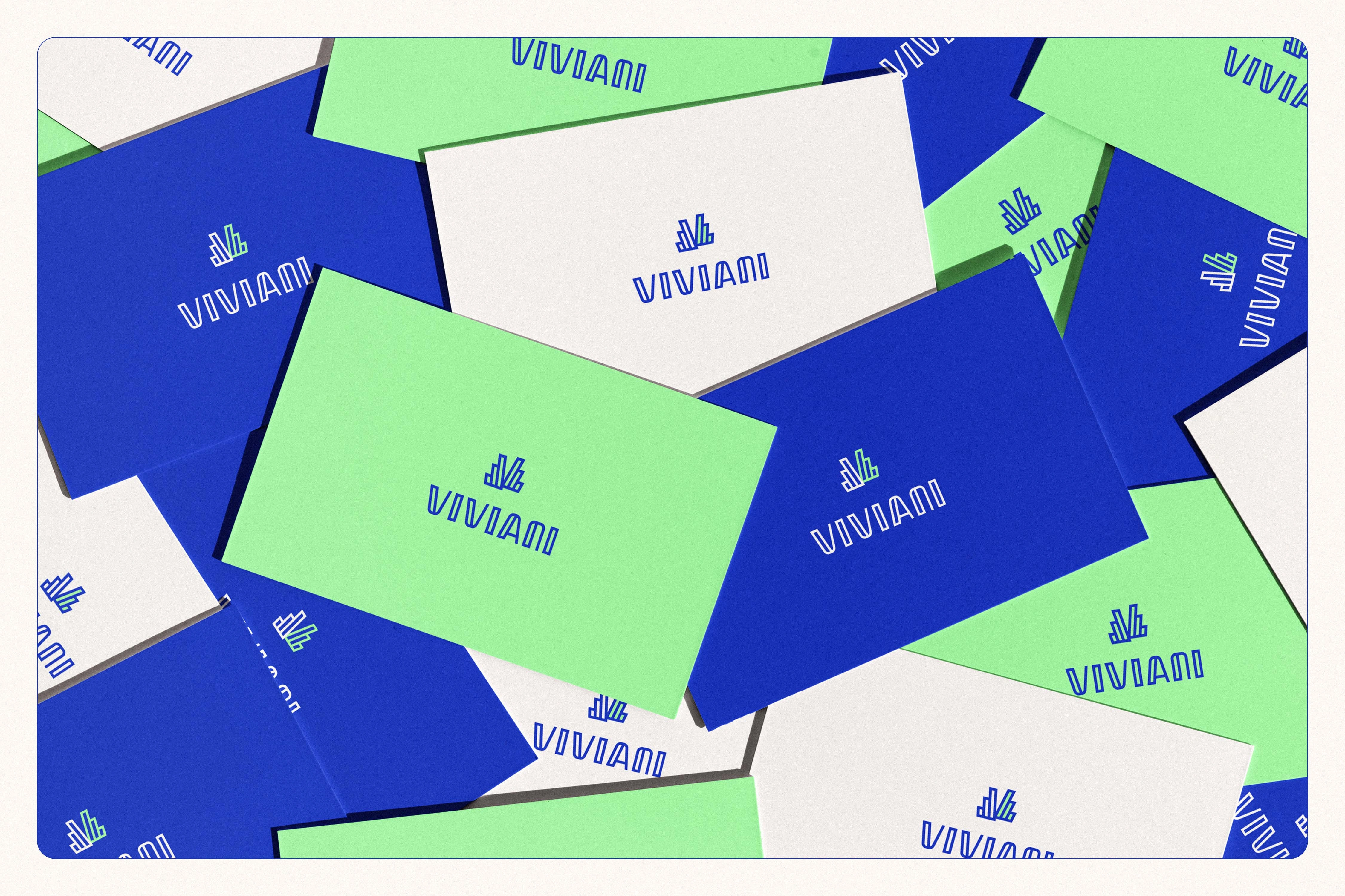
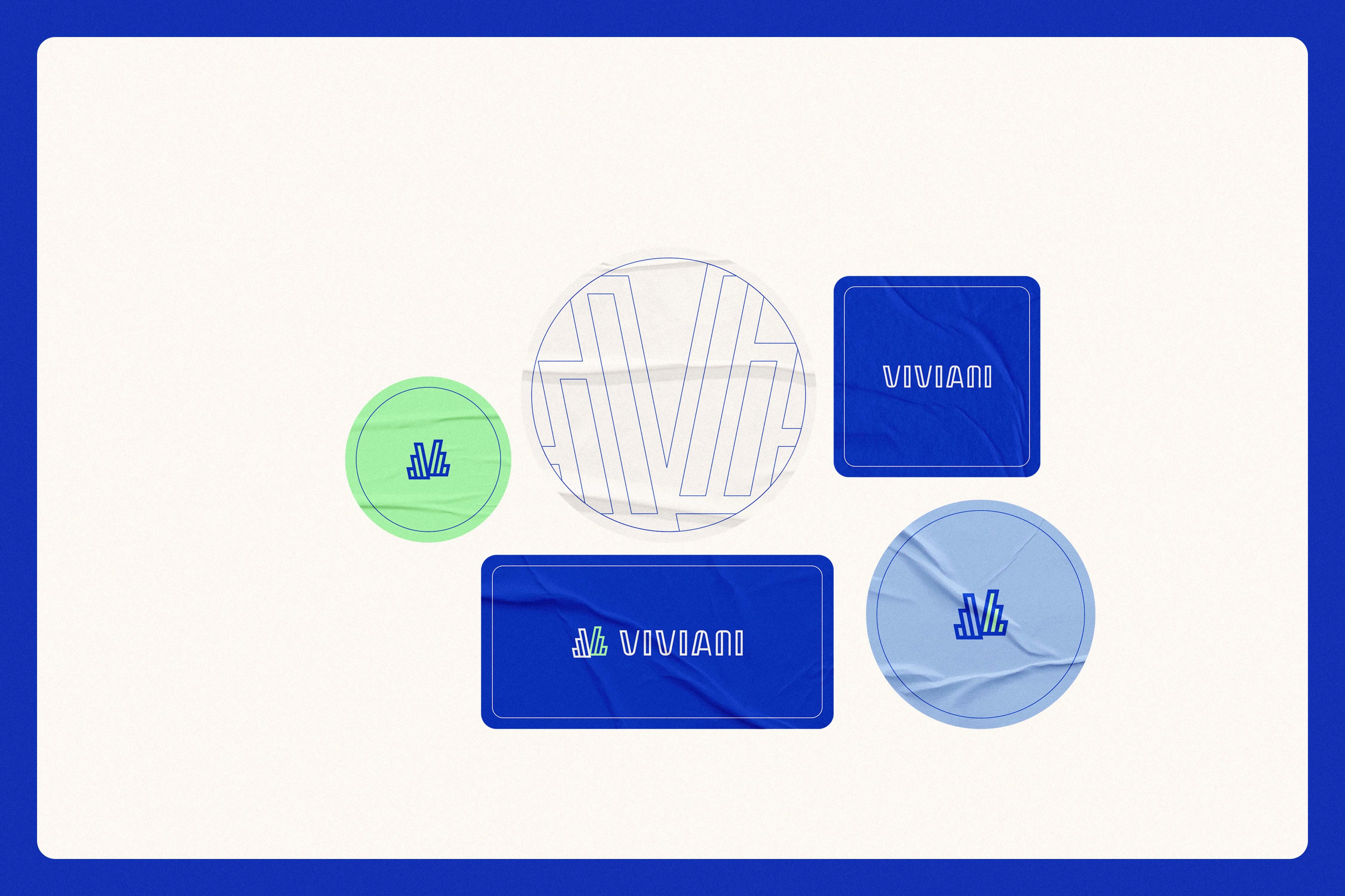
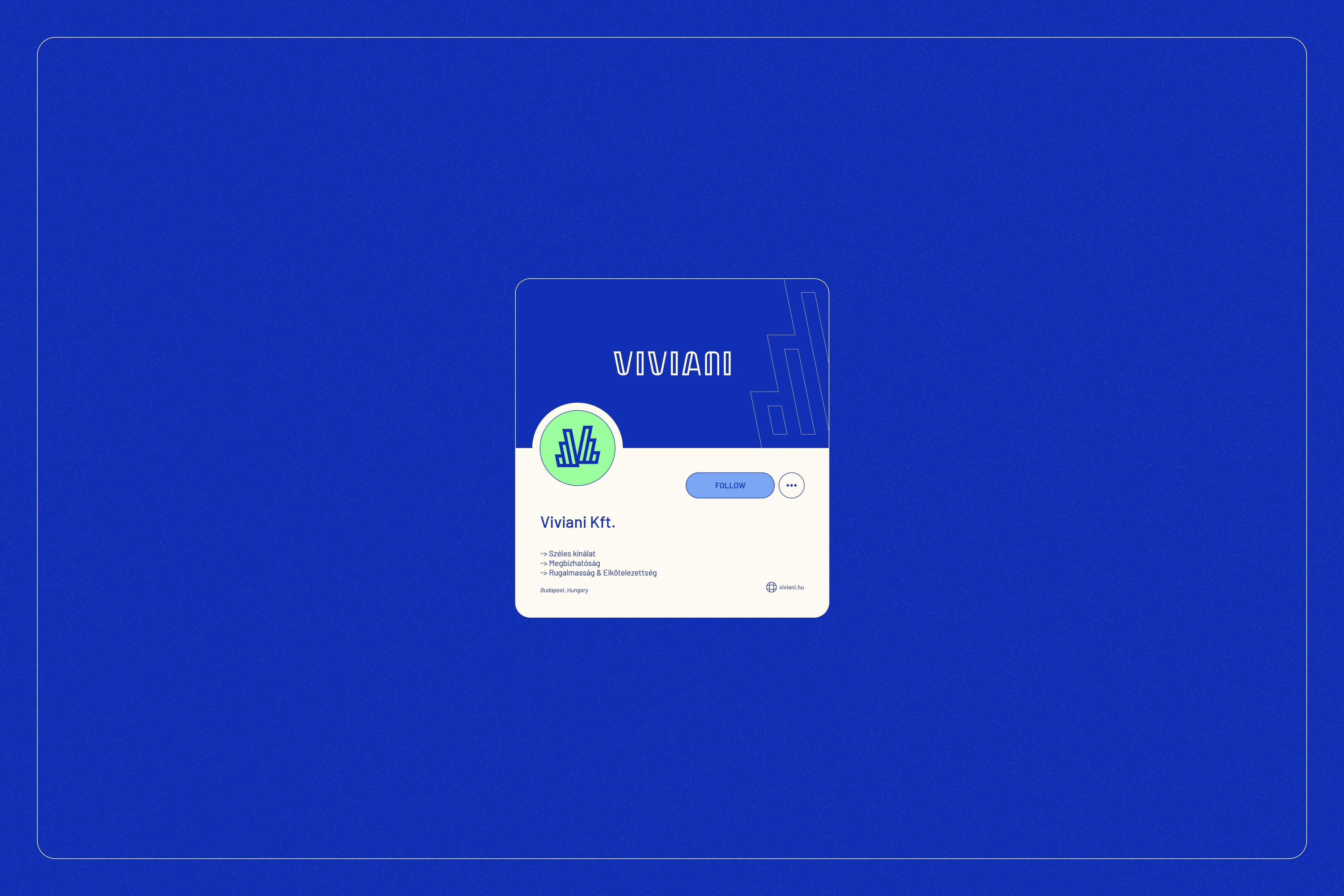
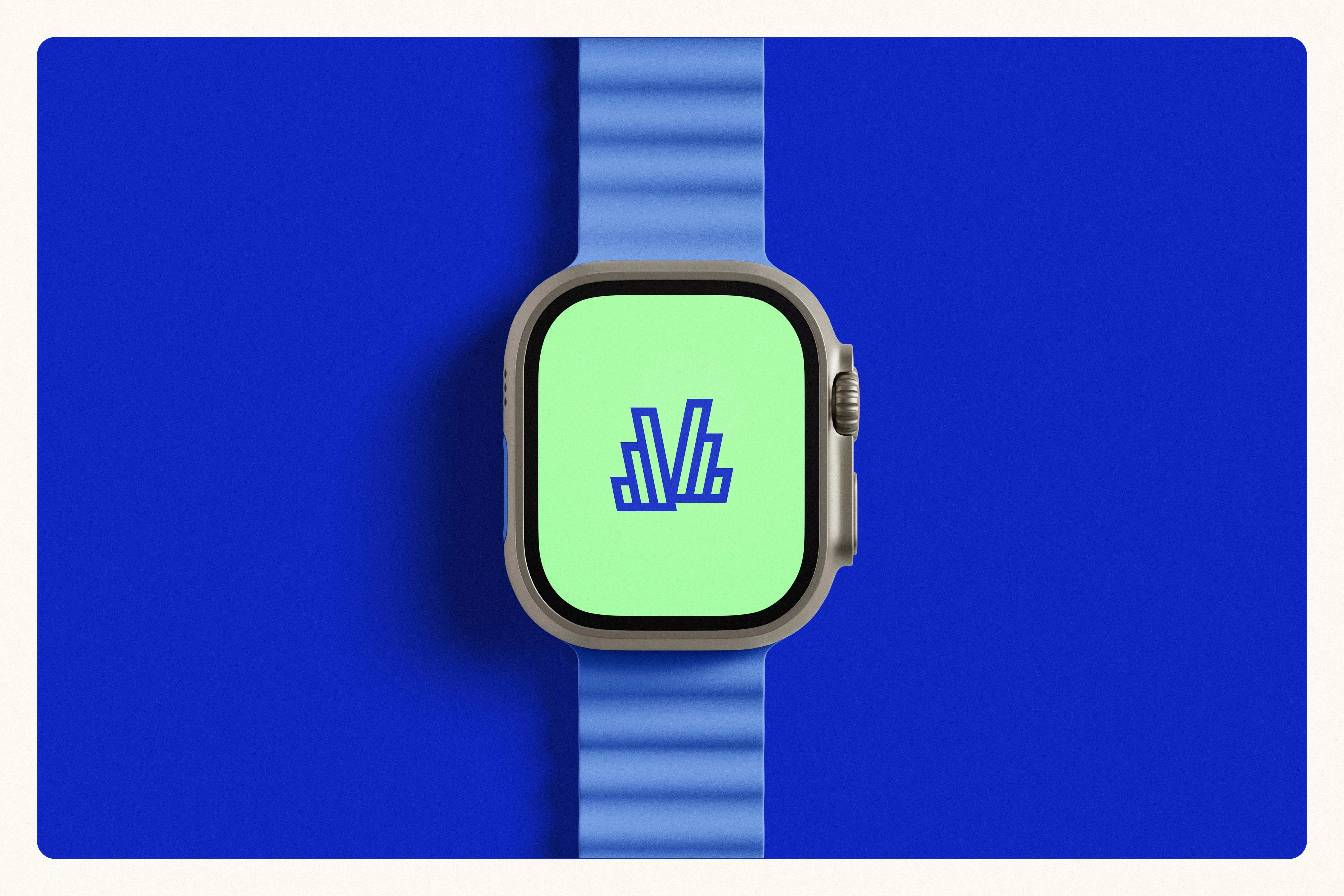
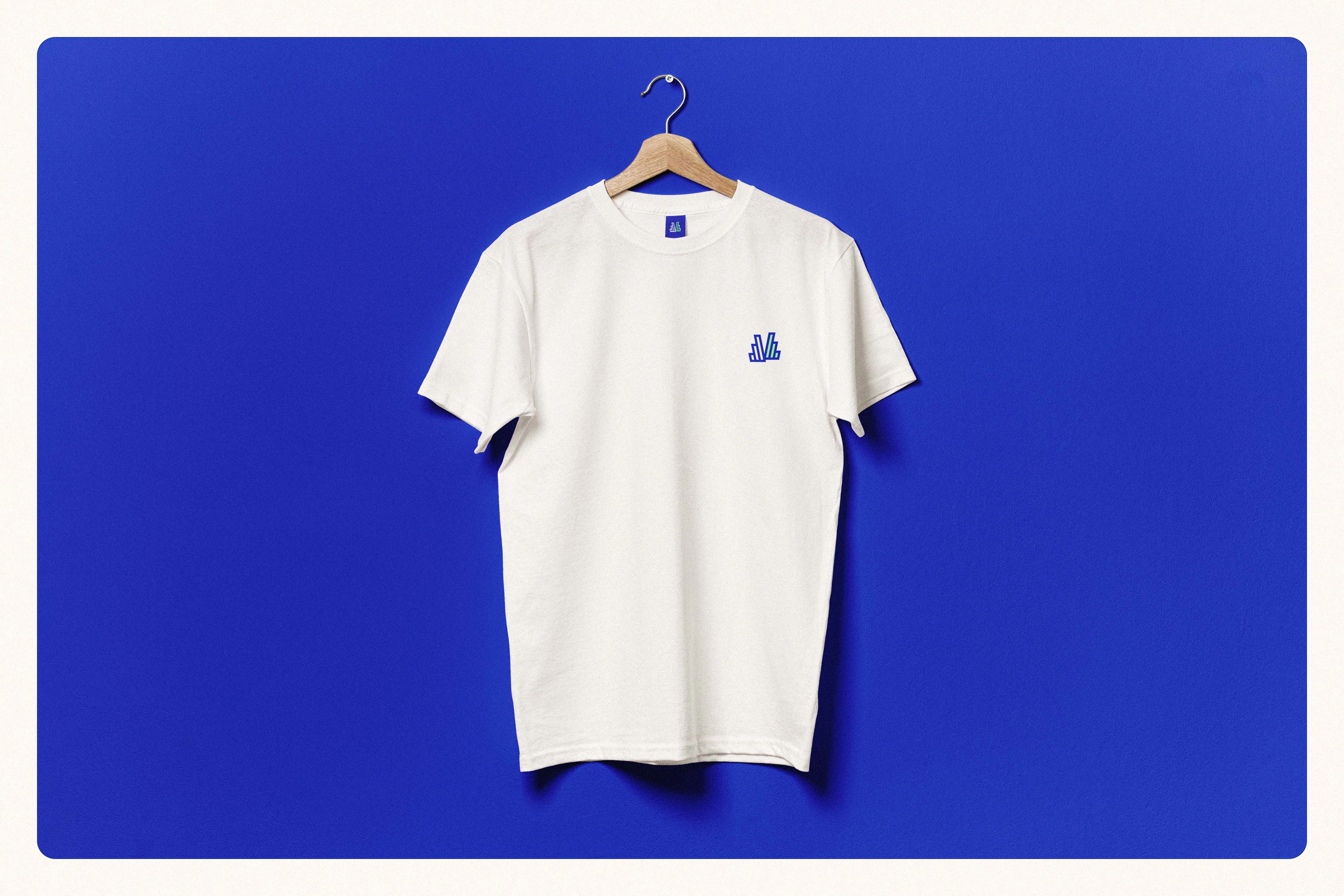
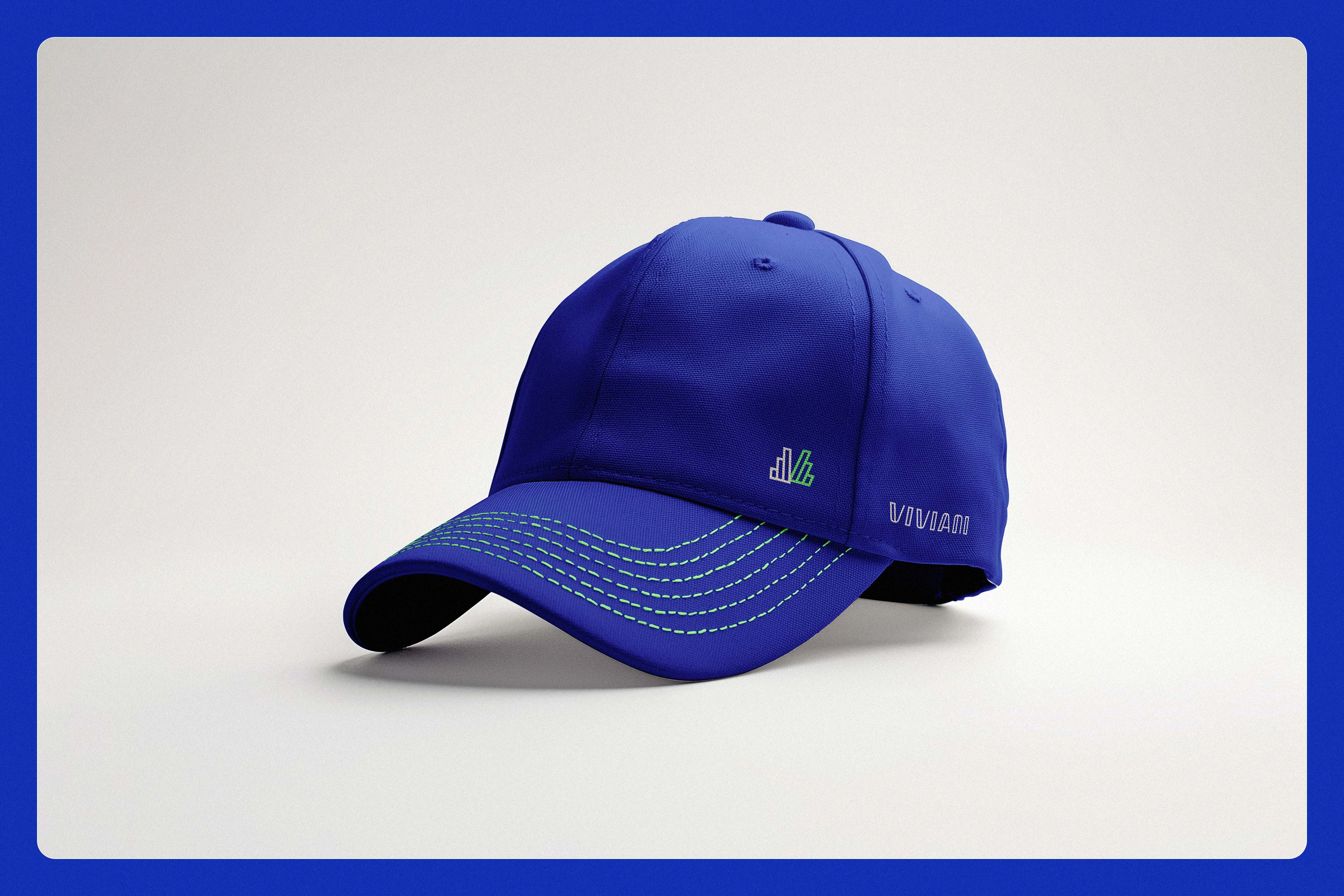
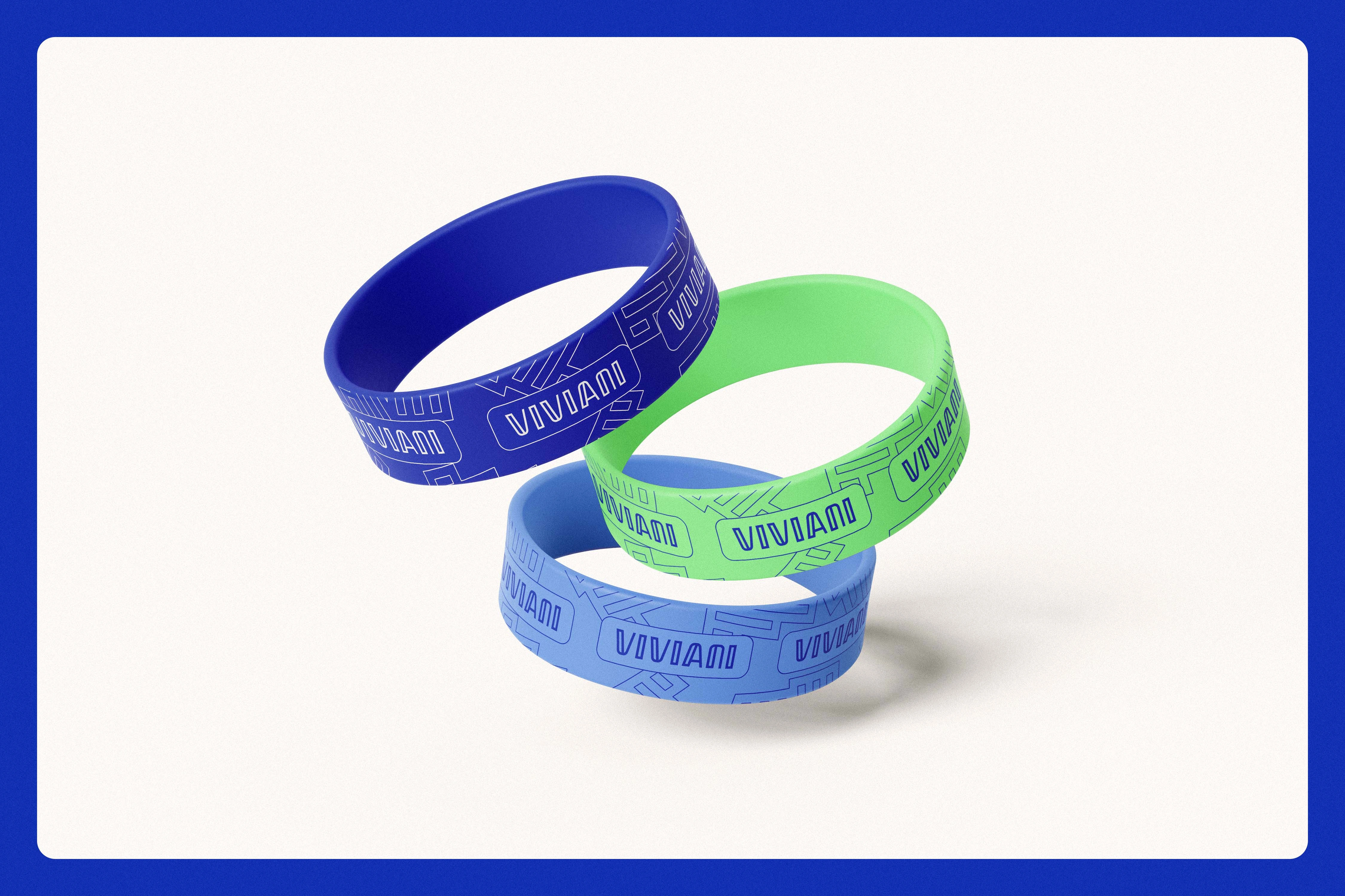
At the center of this identity is a logo based on geometric, contoured letterforms that convey structural stability and contemporary technical precision without feeling stiff. This wordmark is paired with a highly integrated icon that shares the exact proportions and visual language, creating a unified mark adaptable for everything from digital favicons to social media avatars. The icon features an abstract, stepped "V" structure that visually expresses upward growth, innovation, and forward momentum. Furthermore, its layered forms subtly hint at diverse product ranges, data structures, digital modules, and office buildings, perfectly encapsulating the brand's system-oriented mindset.
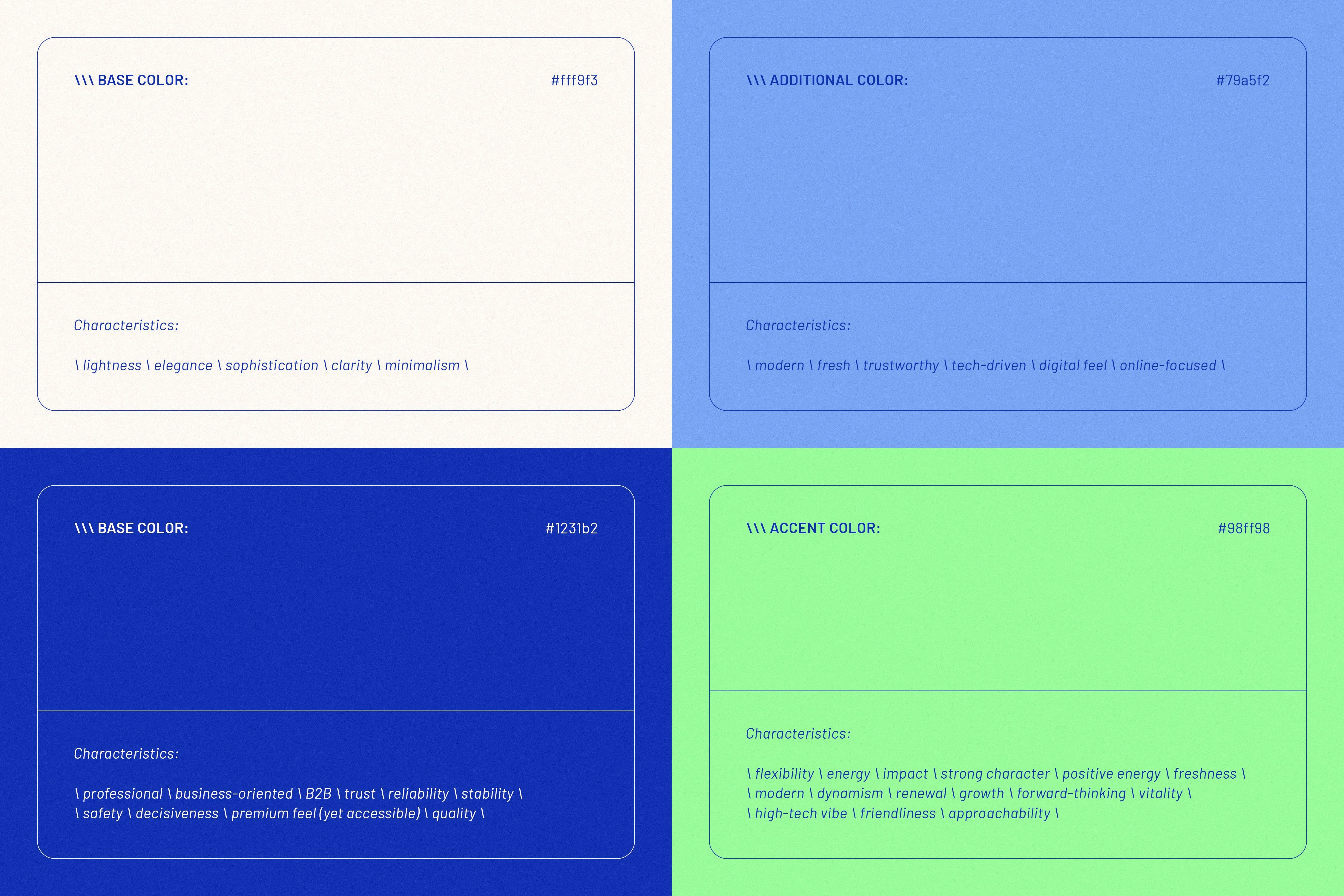
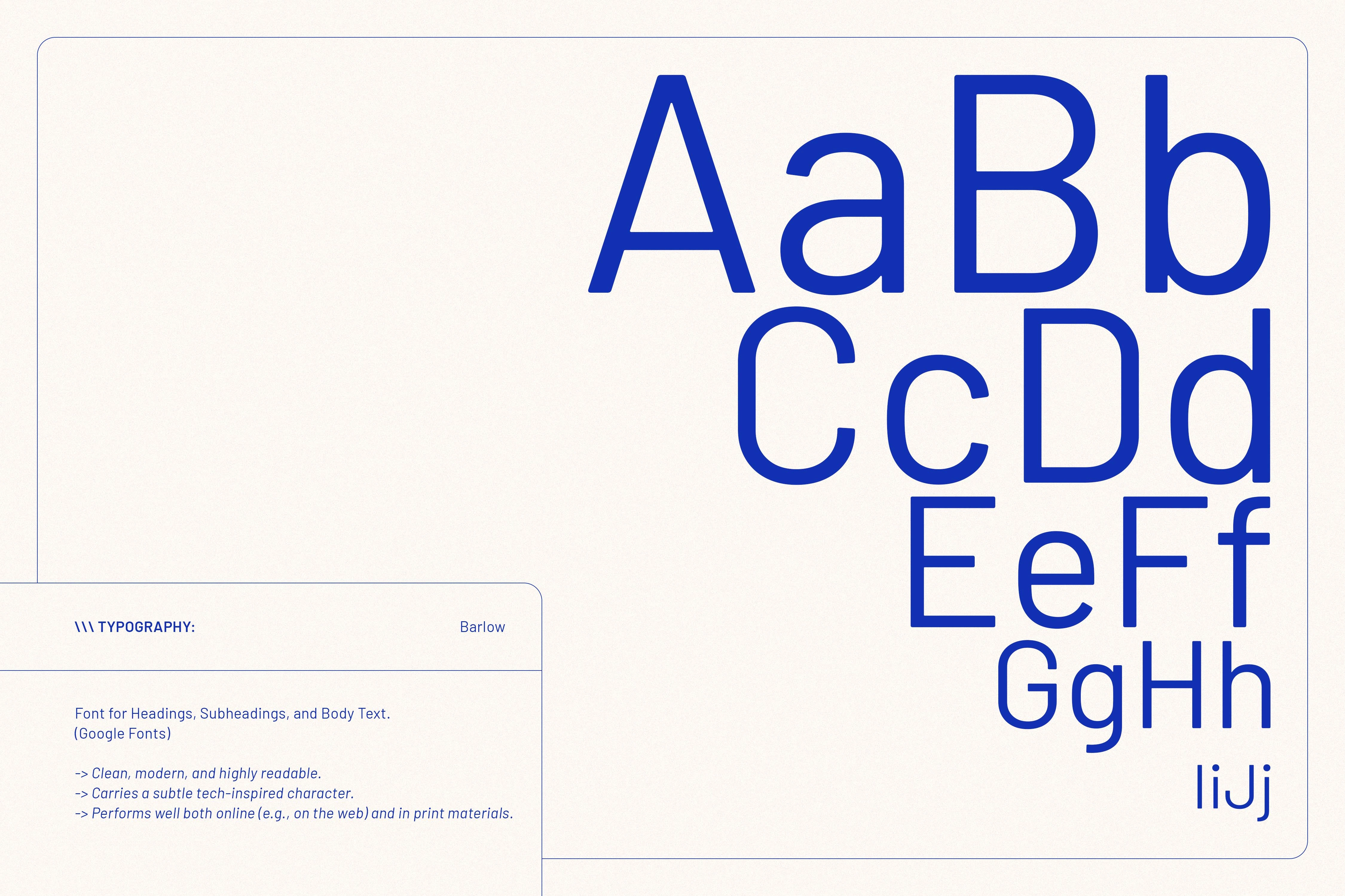
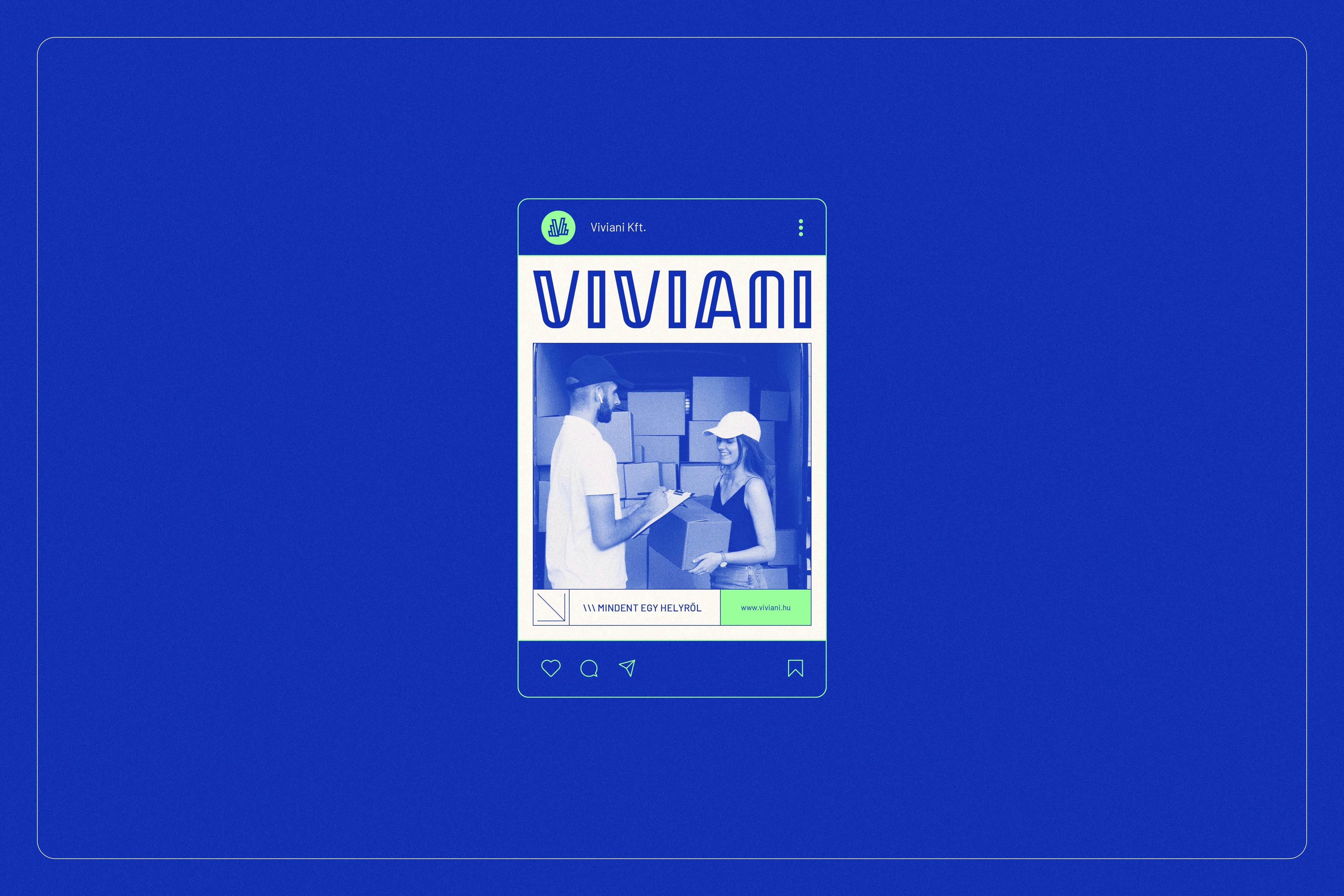
The aesthetic choices reinforce this harmonious blend of professionalism and modern energy. The color palette is anchored by an elegant, minimal light base tone, contrasted with a deep, confident blue that establishes strong B2B trust, stability, and accessible premium quality. An additional lighter blue introduces a tech-driven, online-focused feel, while a vivid green accent injects a burst of flexibility, freshness, and friendly high-tech energy into the system. This palette is perfectly complemented by the exclusive use of Barlow, a clean and highly readable sans-serif typeface. Its subtly tech-inspired character aligns seamlessly with Viviani’s forward-looking positioning, ensuring a clear hierarchy and a stable visual rhythm across all print and digital communications.
Ultimately, this comprehensive identity system successfully presents Viviani as a trustworthy, modern, and partner-focused brand. By combining a geometric "V" structure with a finely tuned color palette and functional typography, the visual language avoids the distant feel of traditional corporate design. Instead, it provides a strong, memorable, and future-ready foundation that elevates service quality and redefines reliability in the wholesale office supply market.

Like this project
Posted Jul 7, 2026
A clean, modern brand identity for Viviani, a B2B wholesale firm, balancing technical precision with a reliable, human-centered visual system.