Built with MagicPath
SwiftDrop Mobile-First Landing Page Design

Abel James

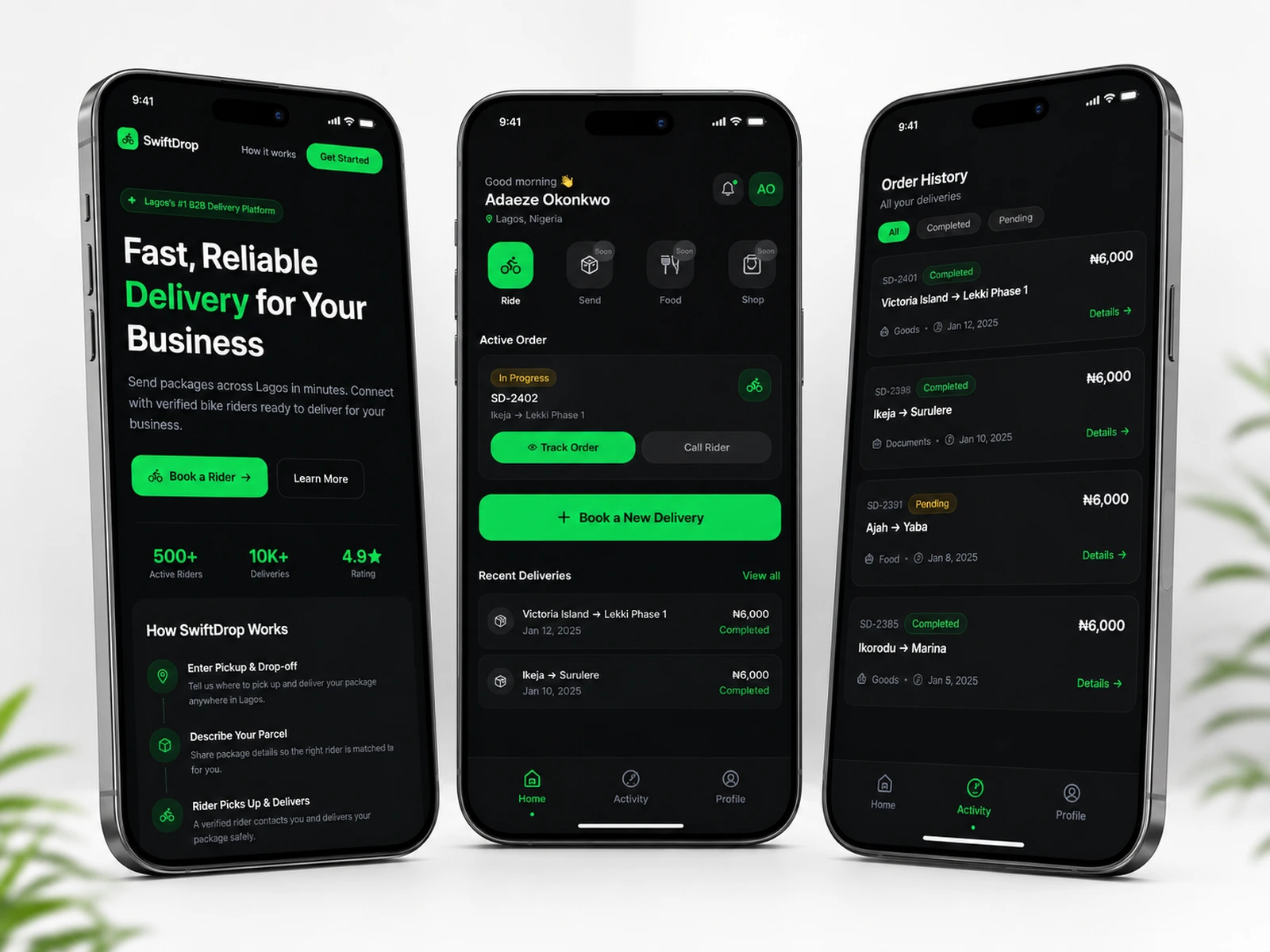
SwiftDrop — Mobile-First Delivery Platform
Project Type: Mobile-First Landing Page & Product Experience
Industry: Logistics & Delivery
Platform: MagicPath
🚚 Project Overview
SwiftDrop is a mobile-first delivery platform designed to help businesses across Lagos send packages quickly and connect with verified bike riders.
The goal of the project was to create a digital experience that feels fast, trustworthy, and extremely easy to use, especially for small business owners who often arrange deliveries directly from their phones.
I designed the landing page around a clear journey from understanding the service → building trust → booking a rider, while keeping the interface lightweight and easy to scan.
The final experience combines bold messaging, strong trust signals, a simple booking flow, and mobile-first interaction patterns to make local delivery feel more reliable and straightforward.
🧩 My Role
My contribution focused on the overall product and interface direction, including:
Structuring the landing page and user journey.
Designing the mobile-first interface and visual hierarchy.
Creating the booking and delivery flow.
Designing responsive layouts for different screen sizes.
Developing the visual identity and colour system.
Refining calls to action and trust-building elements.
Creating interaction patterns for a faster, more intuitive experience.
Maintaining consistency across typography, spacing, buttons, and content blocks.
The focus throughout the project was to make SwiftDrop feel like a credible logistics product, not just another delivery landing page.
🎯 The Problem — Making Delivery Feel More Reliable
Many small businesses rely heavily on local delivery but often deal with problems such as:
Delayed riders.
Unclear pricing.
Poor communication.
Uncertainty about rider reliability.
Complicated booking processes.
The design needed to address these concerns quickly.
Instead of asking visitors to navigate through several screens before understanding the service, SwiftDrop presents the core value proposition immediately and introduces trust-building information early in the journey.
This helps users understand both what the platform does and why they can trust it within the first few moments of visiting the page.
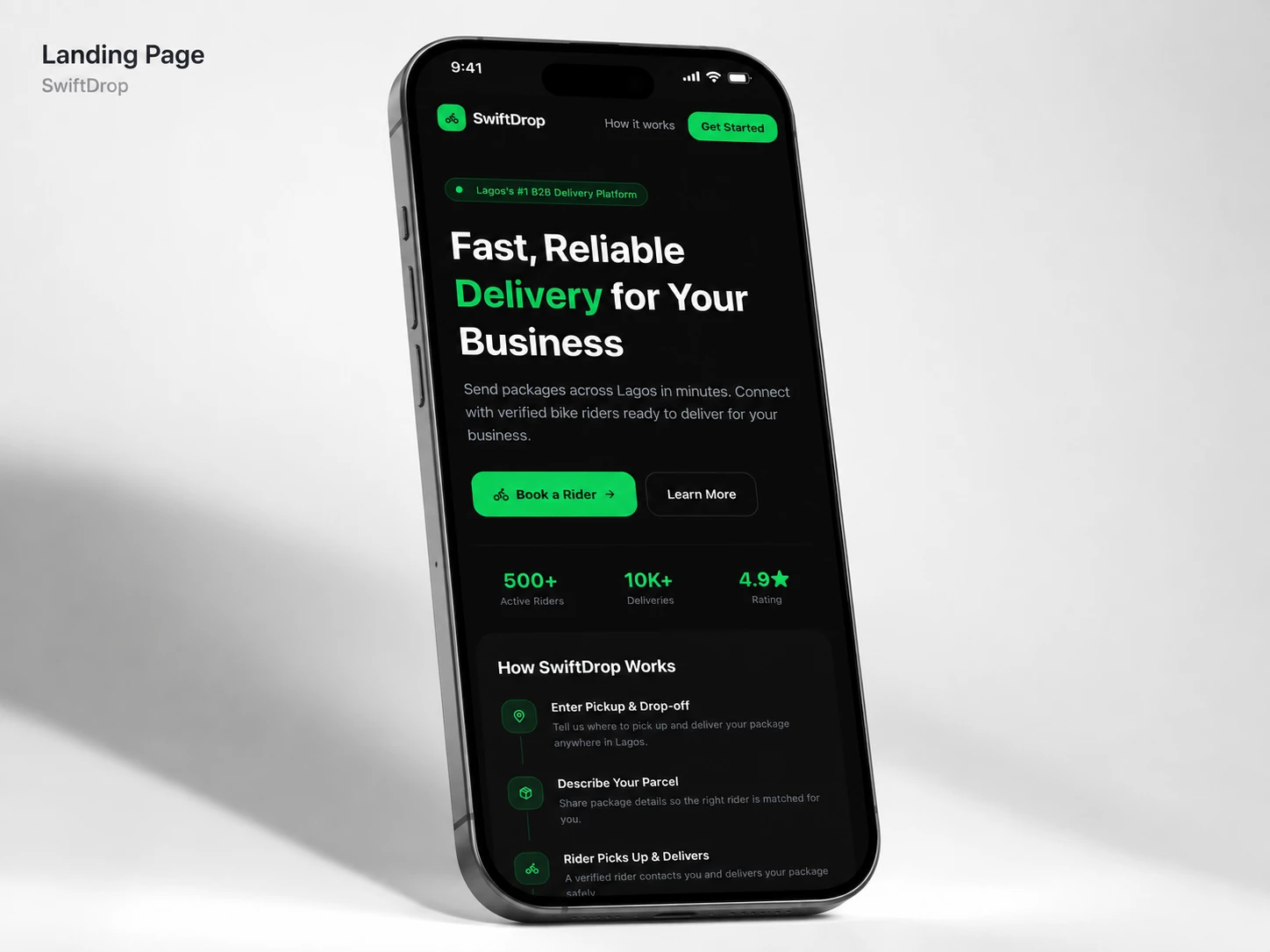
🏠 Hero Experience — Fast Understanding, Fast Action
The hero section was designed to communicate SwiftDrop’s value immediately.
A bold headline explains the service in simple terms, while a clear primary call to action gives visitors an obvious next step.
Rather than filling the first screen with unnecessary information, the design keeps the opening experience focused on speed, reliability, and action.
This creates a stronger first impression and helps visitors understand the service before they begin the booking process.
🛡️ Trust & Credibility
Trust is especially important in local delivery, where customers are handing valuable packages to riders they may never have met before.
To address this, the interface introduces credibility indicators such as:
Verified riders.
Delivery statistics.
Customer ratings.
Completed delivery figures.
Clear explanations of how the service works.
These signals are positioned early in the experience so confidence begins building before the visitor reaches the booking stage.
The goal was to reduce uncertainty and make the platform feel reliable, structured, and professional.
🧭 Booking Flow — Three Simple Steps
The booking process was intentionally reduced to a simple sequence:
1. Enter pickup and drop-off locations.
Users begin by telling SwiftDrop where the package is coming from and where it needs to go.
2. Describe the parcel.
Basic package information gives the platform enough context to prepare the delivery.
3. Get matched with a verified rider.
The final step connects the customer with an appropriate rider.
By reducing the process to a few clear actions, the experience avoids unnecessary friction and gives users a better sense of progress.
The result is a booking flow that feels predictable, fast, and easy to understand.
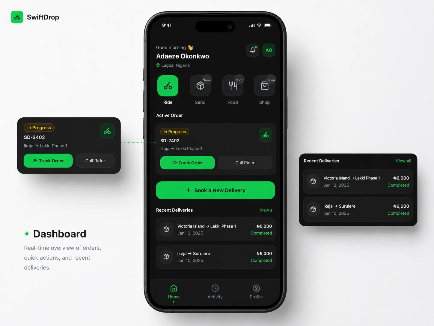
📱 Mobile-First Experience
SwiftDrop was designed primarily for people using their phones while running a business, managing orders, or moving between locations.
That meant the mobile experience could not simply be a smaller version of the desktop page.
The interface uses:
Large tap targets.
Short, readable content blocks.
Strong spacing between actions.
High-contrast buttons.
Single-column layouts.
Clear content hierarchy.
Minimal navigation complexity.
These decisions make the page easier to scan and operate quickly, even when the user is multitasking.
The result is an experience built around the reality of how local business owners are likely to use the platform.
⚡ Speed & Interaction Design
The interface was designed to feel quick and responsive.
Interaction patterns were kept simple so users receive clear feedback without unnecessary animation or visual noise.
Buttons, cards, booking steps, and navigation elements use consistent states to make actions easier to understand.
The goal was to make the product feel fast before a delivery has even been booked.
🎨 Visual Direction
The visual system was designed around speed, confidence, and modern urban logistics.
Bright Green — #00D563
#00D563Used as the primary accent colour to communicate movement, successful delivery, and action.
Near Black — #080808
#080808Creates a bold visual foundation and allows the green accent to stand out strongly.
Dark Surface — #111111
#111111Used for cards and supporting areas to create hierarchy without breaking the dark visual identity.
White — #FFFFFF
#FFFFFFProvides strong contrast for headlines, buttons, and important information.
Muted Grey — #9CA0AA
#9CA0AAKeeps supporting content readable without competing with primary messages.
The high-contrast system helps the interface feel modern, energetic, and technology-led while maintaining good readability on mobile.
📰 Typography & Content Hierarchy
Typography was kept bold and direct to reflect the speed of the service.
Large headlines communicate key messages quickly, while shorter supporting text prevents the page from becoming difficult to scan.
Important information such as delivery steps, statistics, and calls to action receives stronger visual emphasis.
This hierarchy allows visitors to understand the page even when they are moving quickly through the content.
📐 Responsive Design
Although SwiftDrop was created mobile-first, the interface was also designed to scale cleanly to larger screens.
Spacing, content widths, typography, cards, and navigation adapt across breakpoints while preserving the same hierarchy and brand personality.
The responsive system ensures the experience remains clear whether someone is booking a rider from a phone, tablet, or desktop computer.
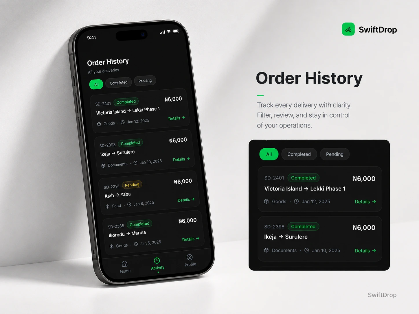
⚙️ Design & Build Approach
The project was created in MagicPath, with a focus on keeping the interface lightweight and easy to maintain.
Key considerations included:
Mobile-first responsive layouts.
Reusable interface patterns.
Clear booking and CTA hierarchy.
Consistent component spacing.
Accessible colour contrast.
Lightweight interactions.
Optimized imagery and assets.
Structured content for easy scanning.
The implementation was intentionally straightforward so the product could remain focused on its primary job: helping users arrange deliveries quickly.
🌱 Outcome
The finished concept creates a focused delivery experience that communicates SwiftDrop’s value almost immediately.
Visitors can understand the service, see why it is trustworthy, learn how the process works, and move toward booking a rider without navigating through unnecessary screens.
The final result is a platform experience that feels fast, reliable, modern, and designed specifically around mobile users and small businesses.
Like this project
Posted Jul 20, 2026
Designed SwiftDrop, a mobile-first delivery platform with clear booking flows, trust-focused UI, bold visuals, and a fast conversion-focused experience.
Likes
0
Views
11
Timeline
Apr 8, 2026 - Jul 15, 2026