Built with MagicPath
ARC — Think, Plan, Track: Editorial Productivity Experience

Abel James

ARC — Think. Plan. Track.
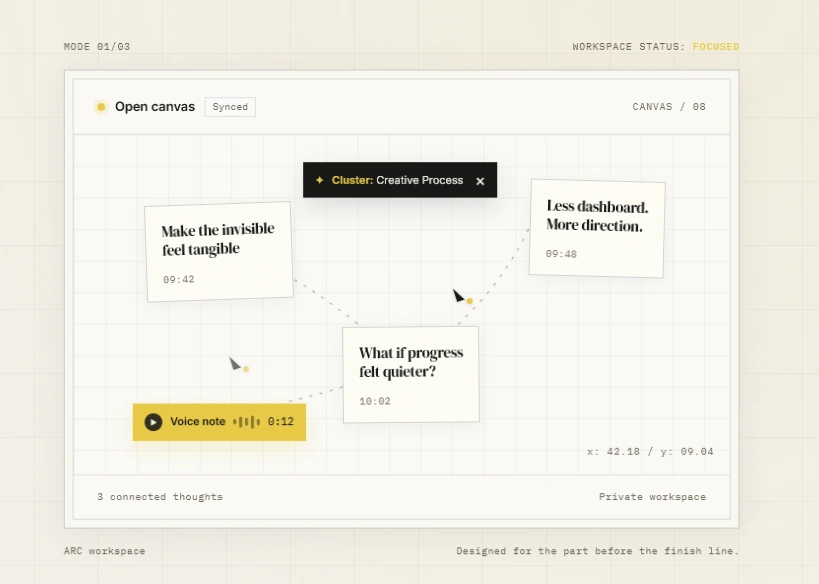
Canvas detail: connected notes, voice capture, spatial relationships, and focused status cues make idea organization feel tangible.
Why I built it
ARC began as an exploration of a calmer way to capture ideas and turn them into visible progress. I wanted to move away from crowded productivity dashboards and design a workspace that feels focused, tactile, and easy to understand at a glance.
Design direction
The visual system combines editorial serif typography with a precise grid, warm off-white surfaces, charcoal text, and a focused yellow accent. The result balances personality with clarity while giving the product a memorable identity.
The hero experience
The opening screen introduces the core journey—Think, Plan, Track—through a clear hierarchy and restrained calls to action. A live product preview lets visitors understand the experience before reading a long explanation.
The thinking canvas
The connected-note canvas shows how scattered thoughts can become a meaningful cluster. Lightweight cards, spatial relationships, voice notes, and subtle status details make the workflow feel active without becoming visually noisy.
Outcome
ARC became a responsive product concept that communicates its value quickly: less dashboard, more direction. The final experience pairs strong art direction with an intuitive system for turning ideas into clear, measurable progress.
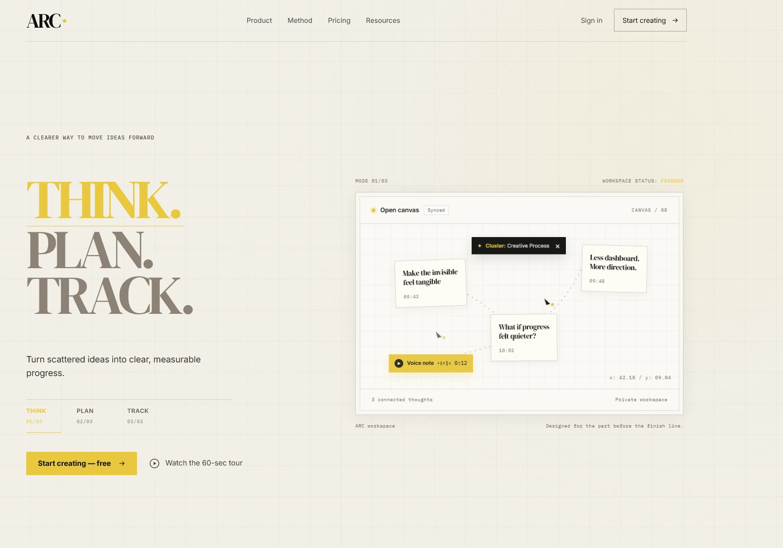
Hero concept: a clear Think–Plan–Track journey paired with a live workspace preview and restrained calls to action.
Like this project
Posted Jul 20, 2026
A responsive productivity landing page turning scattered ideas into clear action with editorial typography, focused interaction, and a visual thinking canvas.
Likes
1
Views
9
Timeline
Jul 18, 2026 - Jul 18, 2026