Product Page Development for Self Care for Dudes

Abel James
1 collaborator


Self-Care for Dudes – Shopify Website Build & Optimization
Project Type: Shopify Theme Implementation & SEO Optimization
Website: www.selfcarefordudes.com
🪞 Project Overview
Self-Care for Dudes is a men’s grooming brand focused on natural, eco-friendly self-care products. The goal was to design and implement a Shopify store that felt clean, confident, and easy to navigate — while highlighting the brand’s fun, masculine identity.
I handled the Shopify theme setup, customization, and product presentation, making sure each section was optimized for both conversion and storytelling.
🧩 My Role
Implemented a custom Shopify theme from provided design assets.
Structured the site for clarity and flow, ensuring quick load speeds and smooth navigation.
Created responsive layouts that work seamlessly across desktop and mobile.
Optimized product pages for SEO, imagery, and conversion using Shopify’s built-in tools.
Styled product cards and buttons to match the brand’s bold, straightforward tone.
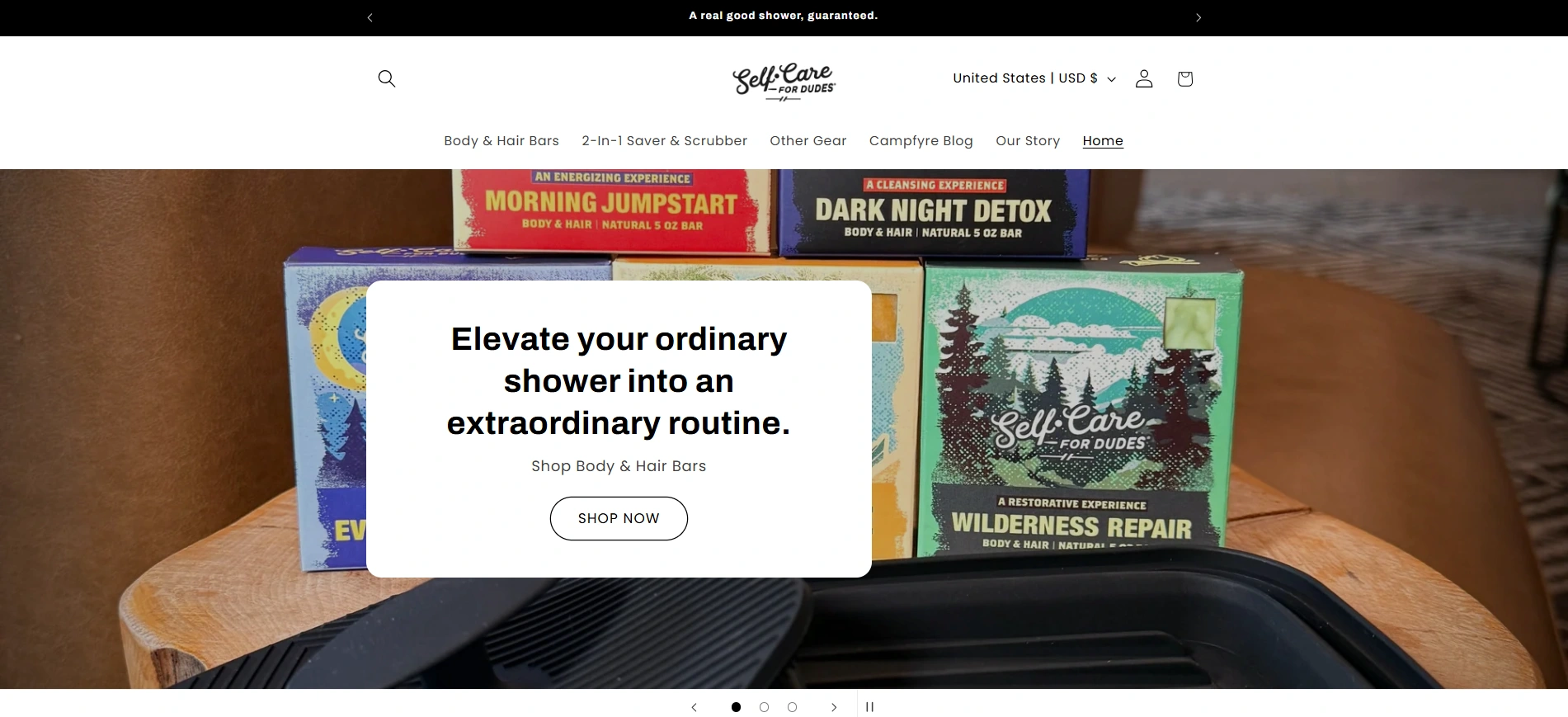
🖥️ Homepage
The homepage immediately introduces the brand promise:
“Elevate your ordinary shower into an extraordinary routine.”
I designed this section to grab attention instantly, while using warm colors and brand imagery to communicate confidence and cleanliness.
A minimal navigation bar and clear CTA buttons (“Shop Now”) make it effortless for visitors to start exploring.
🧴 Product Collection — Easy Comparison & Discovery
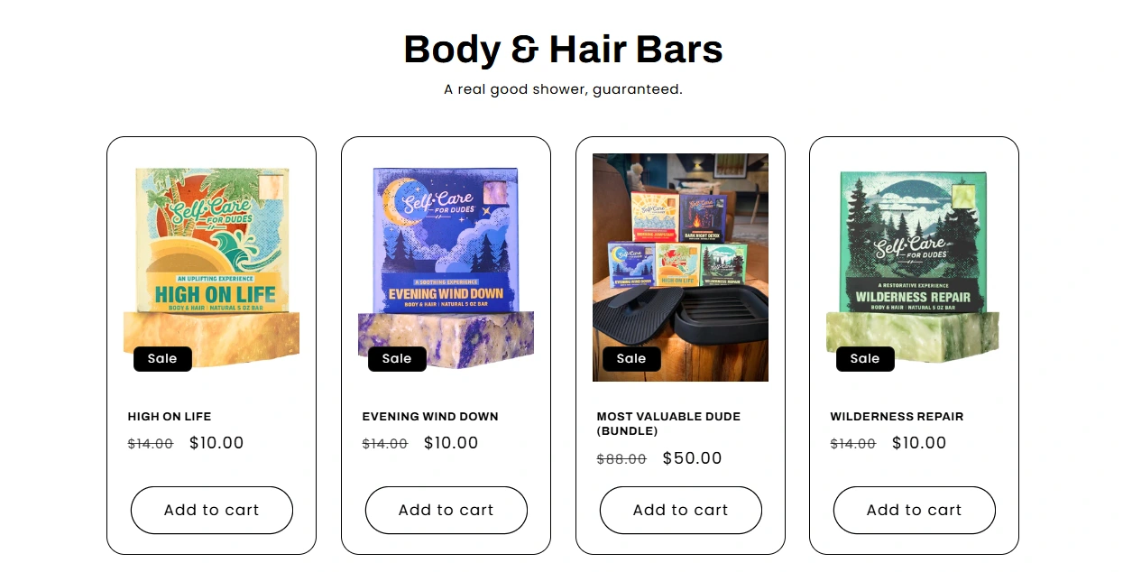
The collection experience was designed to help customers understand and compare products quickly.
Each product card uses a consistent structure with:
Clear product photography
Readable product names
Visible pricing
Straightforward calls to action
Promotional information where relevant
This makes it easier for customers to scan the range without opening every individual product page.
The supporting brand copy adds personality to the experience while keeping the interface focused on discovery and purchase.
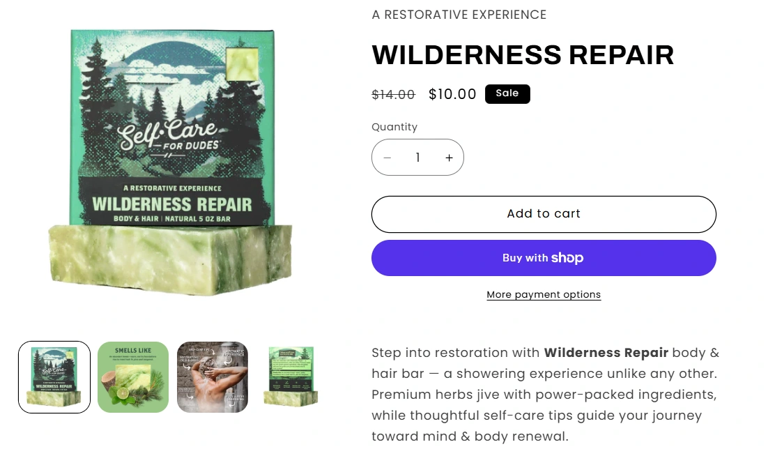
🌲 Product Page — “Wilderness Repair”
The individual product page needed to communicate the product’s personality while keeping the purchase decision simple.
The layout gives the product photography room to stand out, while pricing, product information, and purchase actions remain easy to locate.
Whitespace and clear typography help separate important information from supporting details, preventing the page from feeling crowded.
A familiar Shop Pay purchase option provides a clear and recognizable checkout path, helping reduce unnecessary friction for returning Shopify customers.
The result is a product page that feels focused, easy to scan, and consistent with the brand’s natural aesthetic.
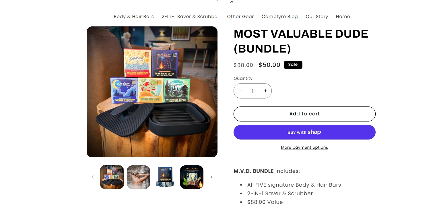
🎁 Bundle Experience — “Most Valuable Dude”
The bundle page had a slightly different challenge: communicate more value without overwhelming the customer with more information.
To solve this, the layout clearly presents the included products, pricing, and supporting details in a structured format.
Strong imagery establishes the bundle visually, while a concise list of included items helps customers understand exactly what they are getting.
The design keeps the buying decision straightforward while still making the bundle feel like a more complete and valuable offering.
🛒 Purchase Experience
The purchase journey was designed to keep the number of decisions and distractions to a minimum.
Product information is prioritized according to what customers need before purchasing, with clear pricing, consistent buttons, and familiar Shopify checkout patterns.
The interface avoids unnecessary complexity so visitors can move naturally from browsing to selection and checkout.
This creates a more direct path from product discovery → evaluation → purchase.
📱 Responsive Experience
Because a large portion of e-commerce browsing happens on mobile, the storefront was designed to remain easy to navigate across smaller screens.
Product grids, imagery, navigation, buttons, and content spacing were adapted across breakpoints to preserve clarity and usability.
Particular attention was given to keeping purchase actions visible and making product information easy to scan without excessive scrolling.
The result is a consistent shopping experience across desktop and mobile.
⚙️ Technical Highlights
The Shopify implementation focused on flexibility, performance, and maintainability.
Key technical considerations included:
Shopify 2.0 theme configuration.
Flexible and reusable content sections.
Custom metafields for product information and benefits.
Responsive image delivery and optimized assets.
SEO-friendly page structure and metadata.
Responsive layouts across major breakpoints.
Consistent product and collection templates.
Shopify-native checkout and payment integrations.
The implementation was kept lightweight so the store could remain easy to manage while still supporting a polished customer experience.
🎨 Visual Direction
The visual direction balances natural grooming, masculinity, and a playful sense of personality.
Warm earthy tones, strong product photography, and straightforward typography give the storefront a more approachable character than a typical clinical grooming brand.
The interface intentionally avoids excessive decoration, allowing the products and brand voice to carry most of the personality.
This creates a visual system that feels clean, relaxed, confident, and easy to shop.
🌱 Outcome
The finished storefront brings the brand, product catalogue, and purchase experience into a clearer and more consistent Shopify journey.
The updated structure makes products easier to explore, improves the hierarchy of important buying information, and creates a more direct route from discovery to checkout.
The result is an e-commerce experience that feels clear, distinctive, responsive, and aligned with the Self-Care for Dudes brand.
Like this project
Posted Aug 28, 2025
Built and optimized Self-Care for Dudes’ Shopify store with responsive product pages, clearer shopping flows, strong branding, and conversion-focused UX.
Likes
1
Views
8
Timeline
Aug 19, 2025 - Aug 31, 2025
Collaborators