Built with Framer
KaganTech Personal Brand Website

Abel James

KaganTech — Personal Brand & Tech Portfolio Website
Project Type: One-Page Website Design & Development
Website: https://kagantech.framer.website
🚀 Project Overview
KaganTech is a technology-focused personal brand centered on digital culture, innovation, and emerging technology.
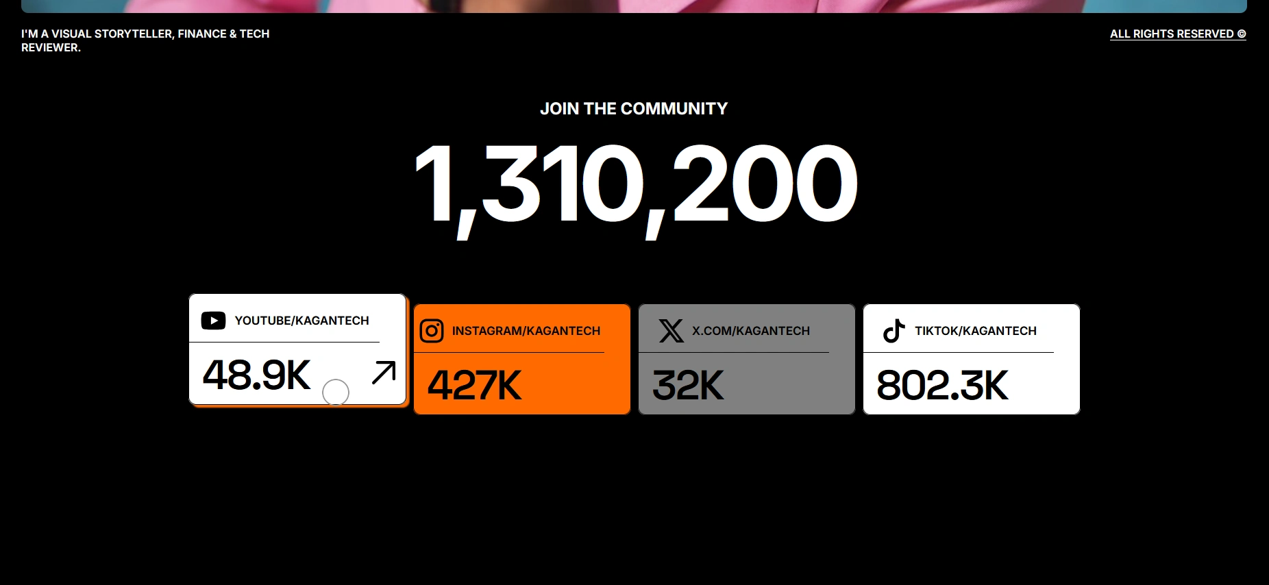
The goal of the project was to create a modern, high-impact personal website that could introduce the brand quickly, communicate credibility, and give potential collaborators a clear understanding of Kagan’s work and positioning.
I designed and developed the website in Framer, with a focus on content hierarchy, responsive layouts, motion, and a simple one-page structure that keeps the experience direct and easy to navigate.
The final site gives KaganTech a more focused digital home — combining personal branding, selected work, credibility, and contact pathways into one cohesive experience.
🧩 My Role
I handled the project from structure through implementation, including:
Planning the one-page information architecture and content flow.
Designing the visual direction and page hierarchy.
Building the website in Framer.
Creating responsive layouts for desktop, tablet, and mobile.
Developing hover states, transitions, and subtle motion effects.
Structuring calls to action and contact points for easier outreach.
Optimizing spacing, typography, and visual consistency throughout the site.
Preparing assets for fast and reliable delivery across devices.
🏠 Hero & First Impression
The opening section needed to answer three questions immediately:
Who is Kagan? What does he do? Why should a visitor keep exploring?
To achieve this, the hero uses a strong visual hierarchy with clear personal branding, focused messaging, and an immediate call to action.
Rather than overloading the first screen with information, the layout gives the core message enough space to stand out while encouraging visitors to continue through the rest of the page.
The result is a first impression that feels confident, focused, and contemporary.
🧭 One-Page Content Flow
Because the website was designed as a single-page experience, the order of the content was especially important.
The structure guides visitors naturally through:
Brand introduction
Personal background
Skills and areas of expertise
Selected work and credibility
Collaboration opportunities
Final contact call to action
Each section was intentionally kept concise so visitors can understand the brand quickly without having to move through multiple pages.
Smooth anchor navigation and clear visual transitions help maintain context throughout the journey.
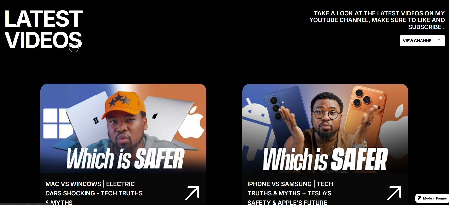
👤 Personal Brand & Credibility
The website needed to feel like more than a basic creator profile.
The design uses typography, imagery, selected work, and supporting content to establish Kagan as a recognizable personal brand within the technology space.
The layout gives individual achievements and areas of expertise room to breathe, while maintaining a consistent visual language across the entire experience.
This helps potential collaborators understand both the person behind the brand and the value he brings.
💼 Work & Value Proposition
Selected work and areas of expertise are presented in a way that remains easy to scan while still giving visitors enough context to understand Kagan’s capabilities.
Rather than treating the work section as a simple gallery, the surrounding messaging helps connect each piece of work back to his broader positioning.
This makes the portfolio section function as both proof of experience and support for the overall personal brand.
✨ Motion & Interaction
Motion was intentionally kept subtle.
Hover states, entrance transitions, and scroll-based interactions add polish and responsiveness without making the experience feel overly animated.
The goal was to use movement to support hierarchy and guide attention, rather than compete with the content.
This gives the website a more dynamic feel while maintaining the clean, minimal design direction.
📱 Responsive Experience
The layout was designed to remain clear and visually consistent across desktop, tablet, and mobile.
Typography, spacing, navigation, and content blocks were adapted across breakpoints to preserve readability and hierarchy on smaller screens.
Particular attention was given to keeping the one-page experience easy to scan on mobile, where long scrolling experiences can quickly become tiring.
The result is a responsive site that keeps the same brand personality regardless of device.
🎨 Visual Direction
The visual direction was built around clarity, confidence, and modern technology culture.
A restrained color palette, generous whitespace, and modern typography keep the interface clean while allowing Kagan’s personality and content to remain the main focus.
The design avoids unnecessary decoration, instead relying on composition, scale, spacing, and subtle interaction to create visual interest.
The result is an identity that feels modern, credible, minimal, and flexible enough to grow with the brand.
🌱 Outcome
The finished website gives KaganTech a clearer and more professional personal-brand presence.
The one-page structure makes it easy for visitors to understand who Kagan is, explore his expertise, see relevant work, and find a direct path to collaboration.
The final experience is focused, responsive, and intentionally simple, providing a stronger foundation for future content, partnerships, and brand growth.
Like this project
Posted Nov 22, 2025
Designed and developed a responsive Framer website for KaganTech, combining personal branding, selected work, subtle motion, and a clear collaboration flow.
Likes
0
Views
13