Built with Framer
AG1 Health & Nutrition Website Collaboration

Abel James


AG1 Health and Nutrition Website Collaboration
Project Type: Collaborative Website Design & Development
Website: https://drinkag1.com/en-eu
Project Overview
AG1 is a global health and wellness brand built around a daily nutritional supplement designed to support energy, immunity, digestion, and overall wellbeing.
The goal of this project was to help create a digital experience that communicates trust, scientific credibility, and product clarity without making the website feel overly clinical or complex.
Working as part of the design and development team, I contributed to the UI layout, responsive structure, visual hierarchy, interaction design, and motion direction across key areas of the website.
The final direction combines clean health-focused branding, science-backed storytelling, and conversion-focused e-commerce design, creating a smoother journey from product education to purchase while keeping the experience approachable, premium, and easy to navigate.
My Role
Collaborated with the design and development team to refine UI layouts, visual hierarchy, and overall brand consistency.
Helped improve the homepage structure and content flow, making key product information easier to scan and understand.
Contributed to interaction design, animation timing, and scroll transitions to create a smoother and more polished browsing experience.
Supported responsive behavior and asset optimization across different screen sizes.
Helped maintain consistency across typography, spacing, imagery, color usage, and brand tone throughout the experience.
Homepage Experience
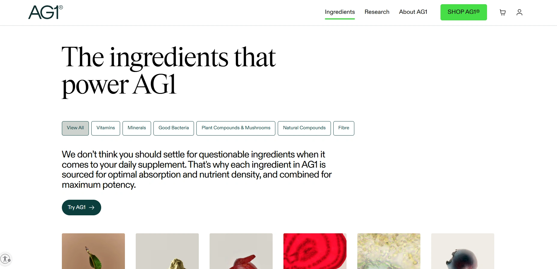
The homepage needed to communicate AG1’s value quickly while balancing product education, scientific credibility, and lifestyle appeal.
We structured the opening experience around a clear value proposition, supported by strong product imagery and a clean visual hierarchy that keeps the page easy to scan.
Key benefits such as Energy, Immunity, and Digestion are introduced early and supported with concise science-backed information, helping users understand the product without overwhelming them with technical content.
As users move through the page, subtle motion and scroll transitions help connect each section naturally — guiding them from what AG1 is, to how it works, and ultimately toward taking action.
The result is a homepage that feels informative, premium, and conversion-focused, while still remaining simple and approachable.
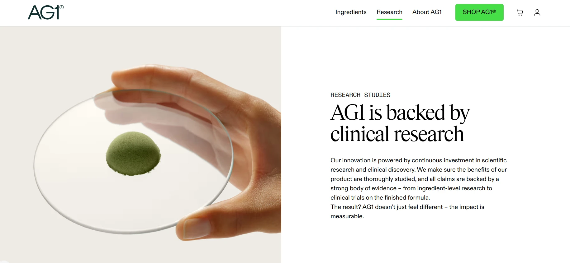
Science and Ingredients
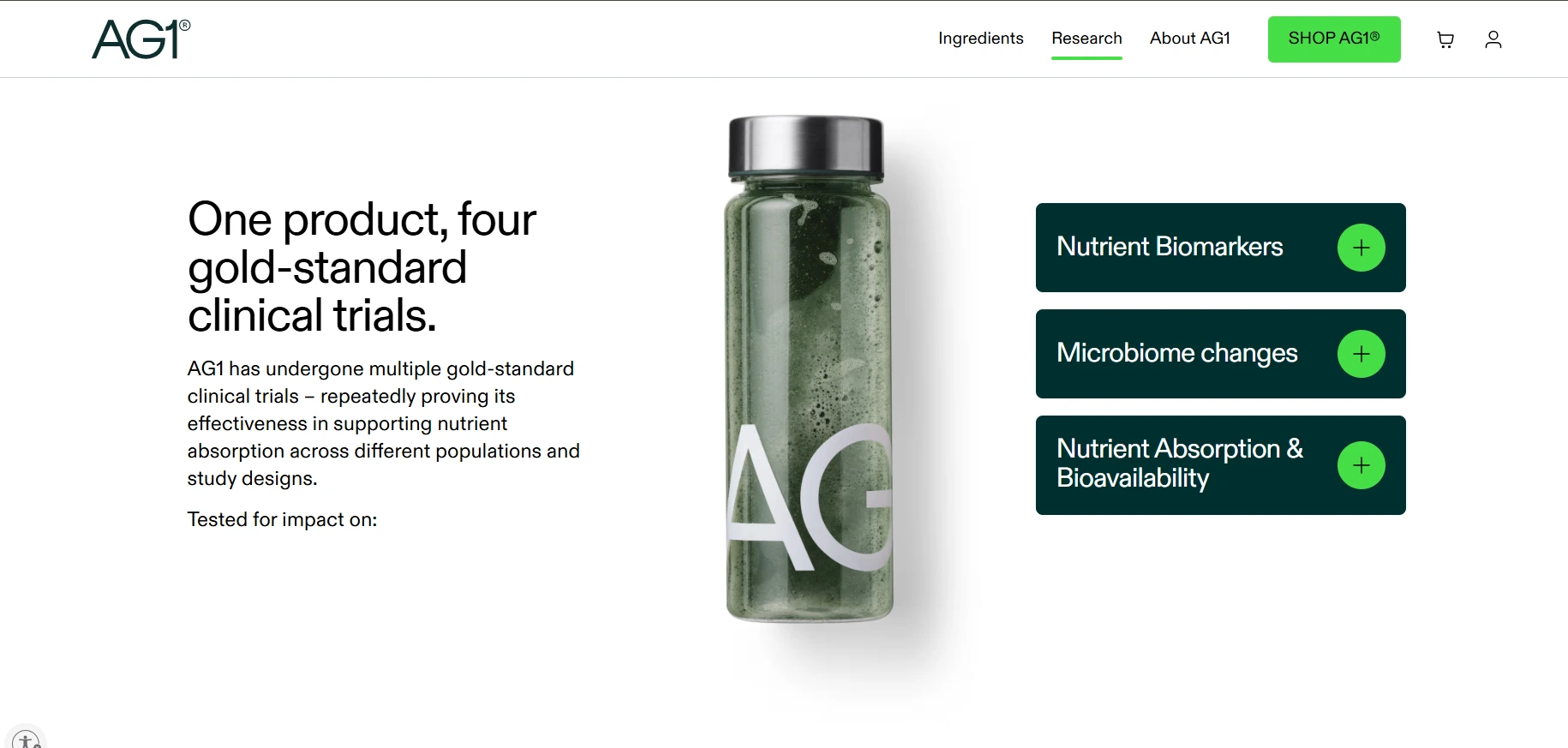
One of the key challenges was presenting AG1’s scientific and nutritional information without making the experience feel overwhelming or overly technical.
To solve this, the page uses a clear split-layout structure that separates ingredient categories from supporting research and detailed nutritional information, making the content easier to scan and understand.
Visual elements such as icons, infographics, and strong typography hierarchy help simplify complex information and highlight important product benefits.
Interactive elements are used selectively to reveal additional details only when needed, helping the page remain clean, informative, and easy to navigate.
The result is a more approachable educational experience that reinforces transparency, credibility, and user confidence in the product.
Lifestyle Integration
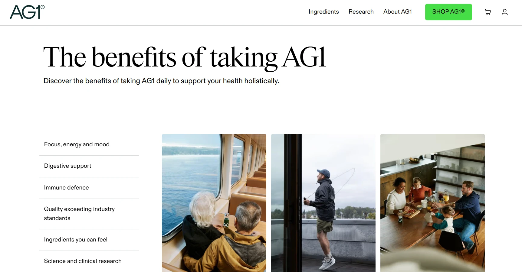
This section was designed to connect AG1’s scientific positioning with the way the product fits into everyday life.
Lifestyle photography places the product within familiar moments such as morning routines, workouts, and on-the-go activities, helping the experience feel more relatable and less clinical.
The softer visual direction also creates a natural contrast with the more research-focused sections of the website, giving the page a better balance between science, wellness, and lifestyle.
Smooth transitions between these moments help maintain a natural browsing rhythm and reinforce the idea of AG1 as a product that can easily become part of a daily routine.
Purchase Flow
The purchase experience was designed to make choosing and buying AG1 feel clear, simple, and reassuring.
Subscription options are presented with straightforward pricing and savings information, helping users compare choices without unnecessary complexity.
A sticky Add-to-Cart experience keeps the primary action easily accessible, while subtle interaction states provide clear feedback as users make selections.
Checkout and shipping information are also surfaced at the right moments to reduce uncertainty and build confidence before purchase.
The result is a focused, low-friction buying journey that guides users from product interest to checkout without distracting them from the decision-making process.

Technical Highlights
The project combined a modern front-end environment with a strong focus on performance, responsiveness, and interaction quality.
The website uses a React-based front end with a headless content setup, supported by motion tools such as Framer Motion and GSAP for smooth transitions and interactive moments.
My contribution focused on areas such as responsive implementation, layout refinement, animation timing, interaction polish, and asset optimization across key pages.
Performance was also considered throughout the experience, with optimized image delivery, lightweight interactions, and responsive behavior designed to maintain clarity and usability across different screen sizes.
Visual Direction
The visual direction balances scientific credibility with a calm, lifestyle-focused aesthetic.
A restrained palette of clean whites, muted greens, and natural imagery helps the experience feel fresh and premium without becoming overly clinical.
Typography is used to create a clear hierarchy between educational content, product messaging, and calls to action, while product photography and lifestyle imagery add warmth and relatability.
Together, these elements create a visual system that communicates trust, simplicity, wellness, and modern science in a consistent way across the website.
Outcome
The final experience brings together science, product education, lifestyle storytelling, and e-commerce within a more cohesive and approachable digital journey.
The redesigned structure makes complex information easier to understand, strengthens visual consistency across key sections, and creates a clearer path from product discovery to purchase.
Rather than overwhelming visitors with information, the experience uses hierarchy, interaction, and content flow to build confidence progressively throughout the journey.
The result is a website that feels credible, premium, accessible, and conversion-focused, while remaining aligned with AG1’s wider health and wellness positioning.
Like this project
Posted Nov 11, 2025
Collaborated on AG1’s digital experience, refining responsive layouts, visual hierarchy, motion, and conversion-focused interactions for a global wellness brand