Built with MagicPath
KORA Fintech Design for African Freelancers

Abel James

KORA — Finance Without Borders
KORA is a responsive fintech landing page and visual design system created for African freelancers and independent professionals. The experience presents international payments, invoicing, and cash-flow planning through a calm, trustworthy, and human-centred interface.
The challenge
African freelancers often work with clients around the world but still face unnecessary friction when receiving payments, managing invoices, and understanding their finances. I designed KORA to show how these tasks could exist within one simple and reassuring financial workspace.
The goal was to make finance feel clear and approachable while creating a brand that reflects the ambition and global reach of African independent professionals.
01 — Desktop hero experience
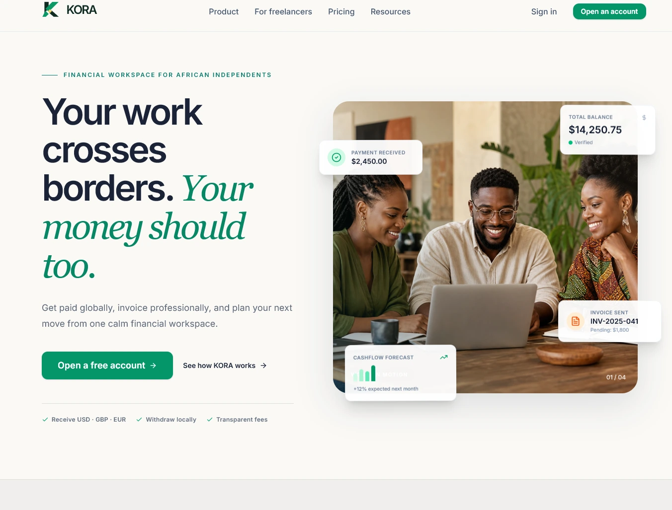
The desktop hero introduces KORA with the statement, “Your work crosses borders. Your money should too.”
The layout balances a bold message with an authentic image of African professionals. Floating payment, balance, invoice, and cash-flow cards help visitors understand the product before navigating deeper into the website.
The primary “Open a free account” CTA keeps the next step obvious, while the secondary link gives visitors room to explore the product first. Supporting details about currencies, withdrawals, and transparent fees address common concerns early in the experience.
02 — Mobile experience
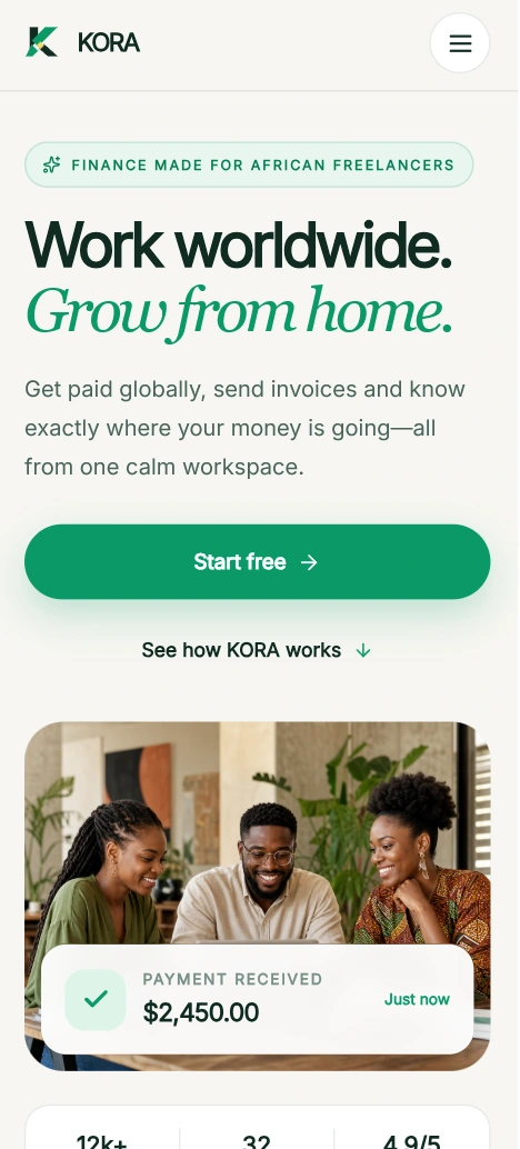
The mobile version was redesigned specifically for smaller screens rather than simply shrinking the desktop layout.
Content follows a clear vertical flow: brand message, supporting copy, primary action, product explanation, lifestyle image, and payment confirmation. Large buttons and comfortable spacing make the interface easy to use with one hand.
The headline was adapted to “Work worldwide. Grow from home.” This keeps the message concise while connecting global opportunity with local independence.
03 — Brand identity
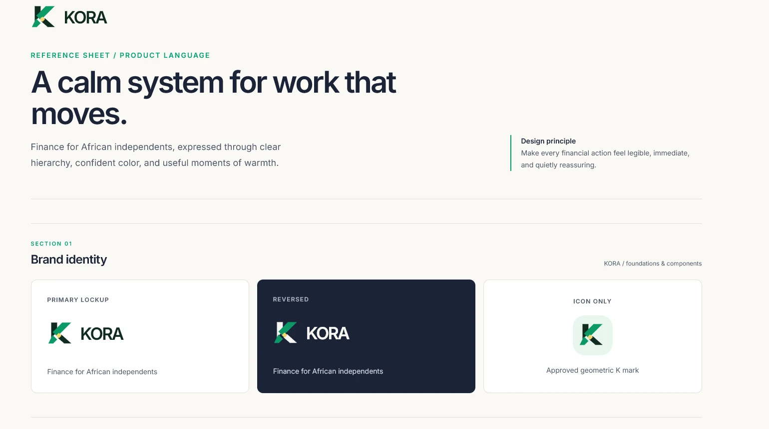
The KORA identity is built around a geometric letter K that represents movement, connection, and crossing borders.
The identity system includes a primary logo, reversed version, and standalone icon. This allows the brand to remain consistent across light backgrounds, dark interfaces, mobile applications, and smaller digital touchpoints.
The visual direction follows one central principle: every financial action should feel legible, immediate, and quietly reassuring.
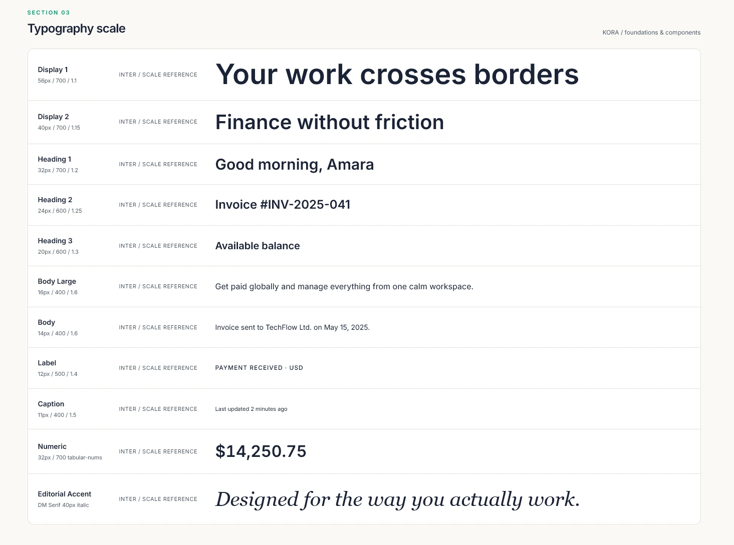
04 — Typography system
Inter is used for interface text, navigation, labels, financial values, and body content because of its clarity and strong readability at different sizes.
DM Serif Display is used as an editorial accent in major campaign statements. Its softer, expressive character adds warmth and personality to the otherwise structured financial interface.
A defined scale for display text, headings, body copy, labels, captions, and numbers keeps the experience consistent across the marketing website and product dashboard.
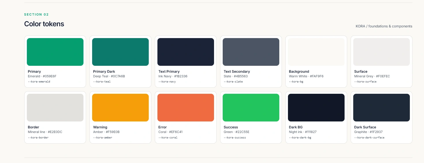
05 — Colour and visual language
Deep green communicates trust, stability, and financial confidence. Emerald green represents growth, successful payments, and important actions. Warm ivory creates a welcoming background, while dark navy provides contrast and improves readability.
Small yellow and coral accents are used for notifications, invoice states, and important moments. This prevents the interface from feeling overly corporate while ensuring each colour has a clear purpose.
06 — Motion and interaction
Subtle animations bring the experience to life. The hero content enters in stages, financial widgets float gently around the image, and payment information appears with smooth transitions.
These interactions make the product feel active and responsive without distracting users from important financial information.
Outcome
The final result is a complete fintech marketing experience supported by a consistent brand and typography system. KORA communicates its value clearly, adapts smoothly across desktop and mobile, and presents finance as something calm, empowering, and built around the realities of African freelancers.
Like this project
Posted Jul 20, 2026
Designed KORA, a fintech landing page for African freelancers, emphasizing clear, calm financial management.
Likes
1
Views
25
Timeline
Jul 16, 2026 - Jul 18, 2026
Clients
KORA