Built with MagicPath
Design and Development of ÒNÀ Travel Platform

Abel James

ÒNÀ — Curated African Travel Experiences
Project Type: Travel Platform UI/UX Design & Development
Industry: Travel & Tourism
Platform: MagicPath
🌍 Project Overview
ÒNÀ is a premium travel platform concept designed to help people discover authentic, curated experiences across Africa.
Rather than focusing only on accommodation or transportation, the platform centers the journey around the experience itself — from cultural tours and local food to nature, adventure, wellness, and premium escapes.
The goal was to create a digital experience that feels distinctly African, visually premium, and simple to explore, while giving travellers a clear path from inspiration to discovery and booking.
I worked across the interface design, experience structure, visual direction, responsive layout, and interaction flow, creating a platform that balances cultural personality with the usability expected from a modern travel product.
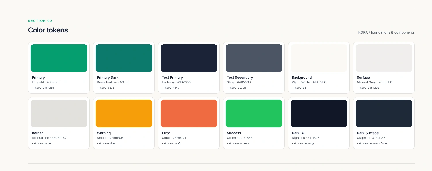
Colour system
🧩 My Role
My contribution covered the core design and experience direction of the platform, including:
Defining the overall page structure and user journey.
Designing the interface and visual hierarchy.
Creating the travel discovery and search experience.
Structuring destination and experience content.
Developing the visual identity and colour system.
Designing responsive layouts across different screen sizes.
Refining interaction patterns and calls to action.
Maintaining consistency across typography, spacing, imagery, and components.
The focus throughout the project was to make ÒNÀ feel like a credible travel product rather than a generic travel landing page.
🎯 The Opportunity — Designing Beyond Accommodation
A lot of travel platforms introduce destinations through hotels, flights, and logistics first.
For ÒNÀ, I wanted to reverse that approach.
The experience begins with the question:
What do you want to experience?
This allowed the platform to focus more strongly on the reasons people travel — food, culture, community, adventure, relaxation, and memorable local experiences.
The design therefore prioritizes destination storytelling, curated activities, imagery, and discovery, while still giving users access to practical search and booking tools.
This creates a more emotional entry point into the travel journey.
🔎 Search & Discovery Experience
The hero section immediately introduces the platform’s purpose while giving visitors a practical way to begin exploring.
A focused search interface allows users to specify key information such as:
Destination
Travel date
Number of guests
The search controls are integrated directly into the opening experience so users can move from inspiration to action without navigating through unnecessary pages.
The surrounding imagery and messaging maintain the aspirational feel of the platform while the search interface keeps the experience functional.
The result is a hero that works as both brand introduction and product entry point.
🧭 Experience Strategy — From Inspiration to Booking
The wider interface was structured around a simple journey:
Discover → Explore → Evaluate → Book
Destination imagery and curated experience cards help users browse naturally before making a decision.
Information is progressively introduced so the interface does not overwhelm visitors with details too early.
Clear headings, structured content blocks, and consistent calls to action make it easier to understand where to go next at every stage.
This allows ÒNÀ to feel editorial and inspiring while maintaining the clarity of a modern digital product.
🎨 Colour System — Warmth, Nature & Premium Travel
The colour palette was designed to reflect both the natural environment and the warmth associated with African travel.
Deep Forest Green —
#0B3B32
Used as the primary brand colour to communicate trust, nature, depth, and premium hospitality.Burnt Orange —
#B4551B
Introduces warmth and energy while reinforcing the sense of culture and adventure.Soft Gold —
#D99332
Used selectively for highlights and details, adding warmth without making the interface feel overly decorative.Warm Ivory —
#F7F4EE
Creates a softer alternative to pure white and helps the interface feel calm and welcoming.Dark Green —
#183F37
Supports readability while maintaining consistency with the broader brand palette.Together, these colours create a system that feels natural, warm, sophisticated, and distinctly different from the typical blue-heavy visual language of travel platforms.
📰 Typography & Editorial Direction
Typography plays an important role in giving ÒNÀ its premium personality.
Large editorial headlines create a sense of aspiration and discovery, while cleaner supporting typography keeps practical travel information easy to read.
This contrast allows the experience to feel closer to a premium travel publication while retaining the usability of a digital product.
Generous spacing and controlled text widths prevent the interface from becoming visually heavy, especially in areas where imagery and content appear together.
⚙️ Design & Build Approach
The project was created using MagicPath, with a focus on building a clear, reusable interface system.
Key considerations included:
Consistent spacing and visual hierarchy.
Reusable content and destination patterns.
Responsive layouts.
Optimized imagery.
Clear calls to action.
Structured search and discovery interfaces.
Accessible typography and contrast.
Lightweight interactions.
The system was designed to support future growth, allowing additional destinations, experiences, and travel categories to be introduced without disrupting the overall design language.
🌱 Outcome — A More Distinctive Way to Explore Africa
The final concept creates a travel experience that feels premium, culturally grounded, and easy to navigate.
ÒNÀ brings destination storytelling, curated experiences, search, and discovery into a single cohesive interface.
The structure gives travellers a clearer way to move from inspiration to exploration while allowing the visual design to communicate the warmth and character of African travel.
The result is a platform that feels less like a generic booking marketplace and more like a curated gateway to experiencing Africa.
Like this project
Posted Jul 20, 2026
Designed ÒNÀ, a premium African travel platform combining curated experiences, destination discovery, editorial storytelling, and intuitive trip planning.
Likes
0
Views
15