Brand Design - Núcleo Girassol 🌻
About the Brand
Núcleo Girassol is a multidisciplinary clinic, focused on caring for people on the autism spectrum.
It offers its patients care from a multidisciplinary and technical team, quality and diversified services, humanized and affectionate care with therapies adapted to each case and person.
It aims to become a reference in services in the following areas: Speech Therapy, Psychology, Nutrition, Music Therapy, Psychopedagogy, Art Therapy and ABA Therapies.
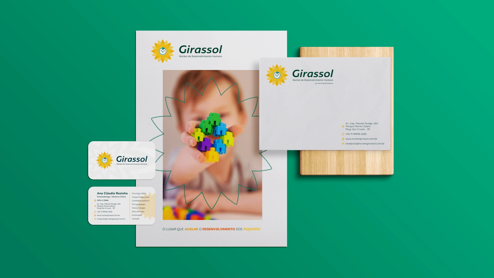
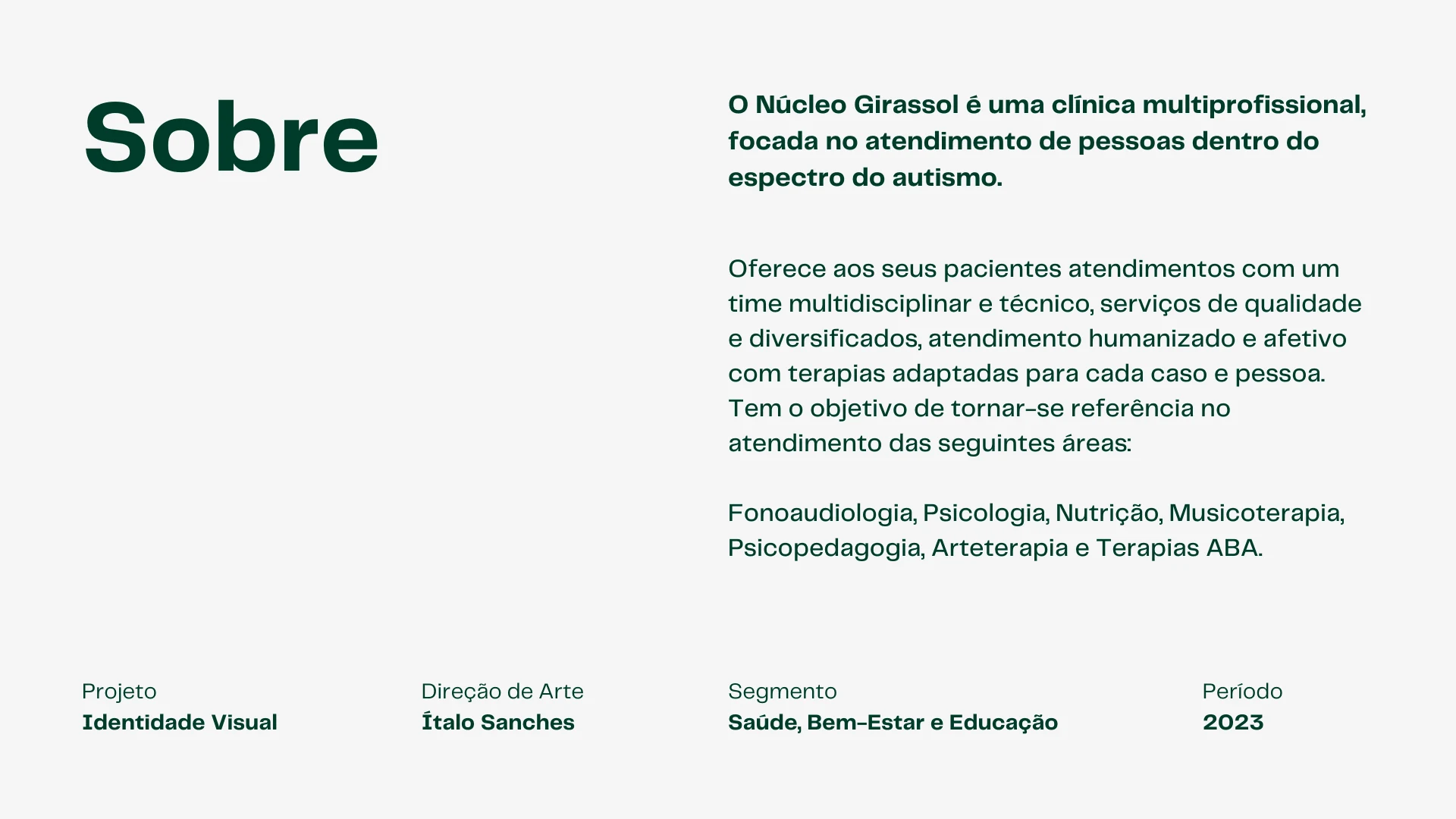
About the Brand.
Brand Purpose & Persona
Purpose: Serve people on the autism spectrum in a humanized way, with quality and based on science. Develop healthy, affectionate relationships and bring excellent results to the clinic's patients.
Persona: Reliable, Creative, Fun, Efficient, Elegant and Serious.
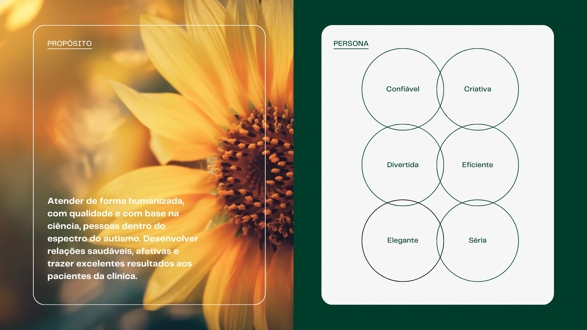
Brand Purpose and Persona.
Color Palette & Font System
The main color palette was taken directly from the sunflower, subtly representing the vivacity, strength and beauty of this flower that adapts daily and remains "facing the Sun".
The secondary palette was designed as a way to represent the different disciplines that the clinic offers its patients and the best that each one brings to the lives of little ones.
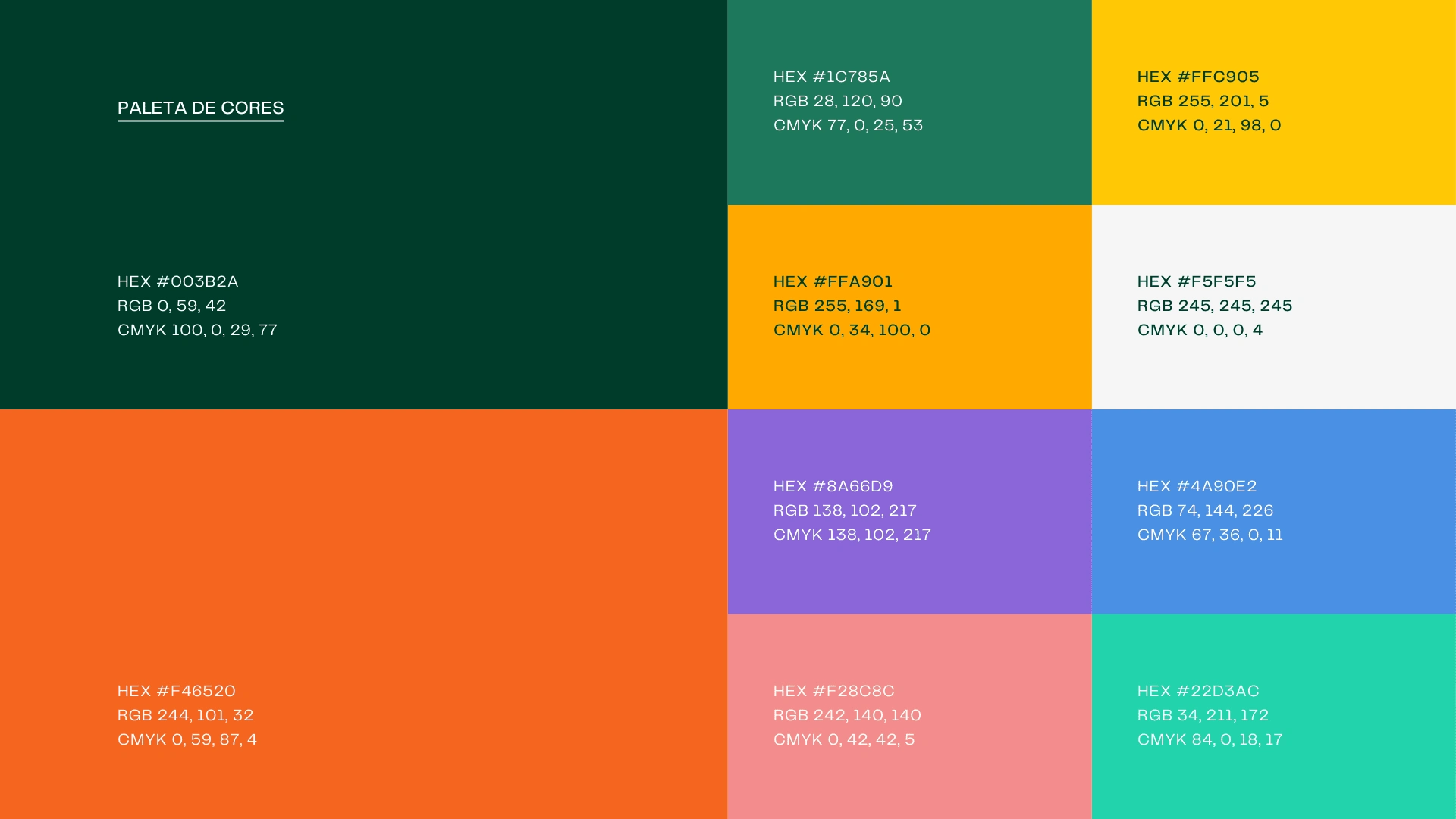
The main and secondary color palette.
When composing typographic studies, a very important point was taken into consideration: the fact that typography is the voice of a brand, and it is extremely important to make a safe choice of it and that thus translate the desired personality and essence. Based on this principle and the study of archetypes (with foundations in Carl Jung's theories and studies by Margaret Mark and Carol S. Pearson - in the book The Hero and the Outlaw), it was defined that the brand has as its typographic archetypes the combination of Wise and Helpful.
The Wise seeks the ultimate truth that will free him, living fully is his goal. Through knowledge of processes and information flows, he wants to control, measure, evaluate and validate. It is the specialist archetype, methodical and detailed. Identifies with brands/products that encourage creativity, intellectual skills and everything more that makes you think and reason (the truth will set you free).
The Helpful person is an altruist, driven by compassion, generosity and the desire to help others. He fears instability and difficulty, not so much for its own sake, but for its impact on people who are less fortunate or less resistant to shocks. The Helpful archetype is perceived in practically any activity related to the provision of services, health care and well-being or food.
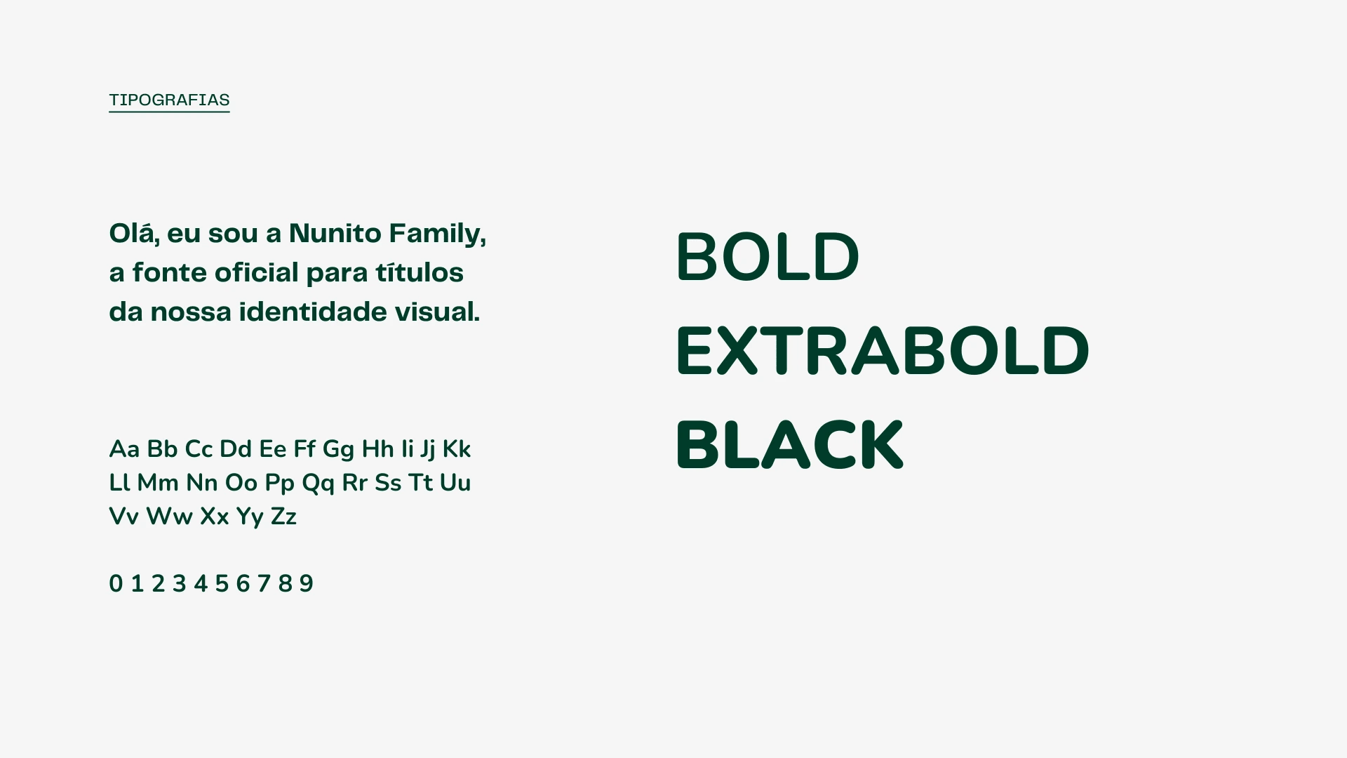
Hello, I'm Nunito Family, the official font for titles in our visual identity.
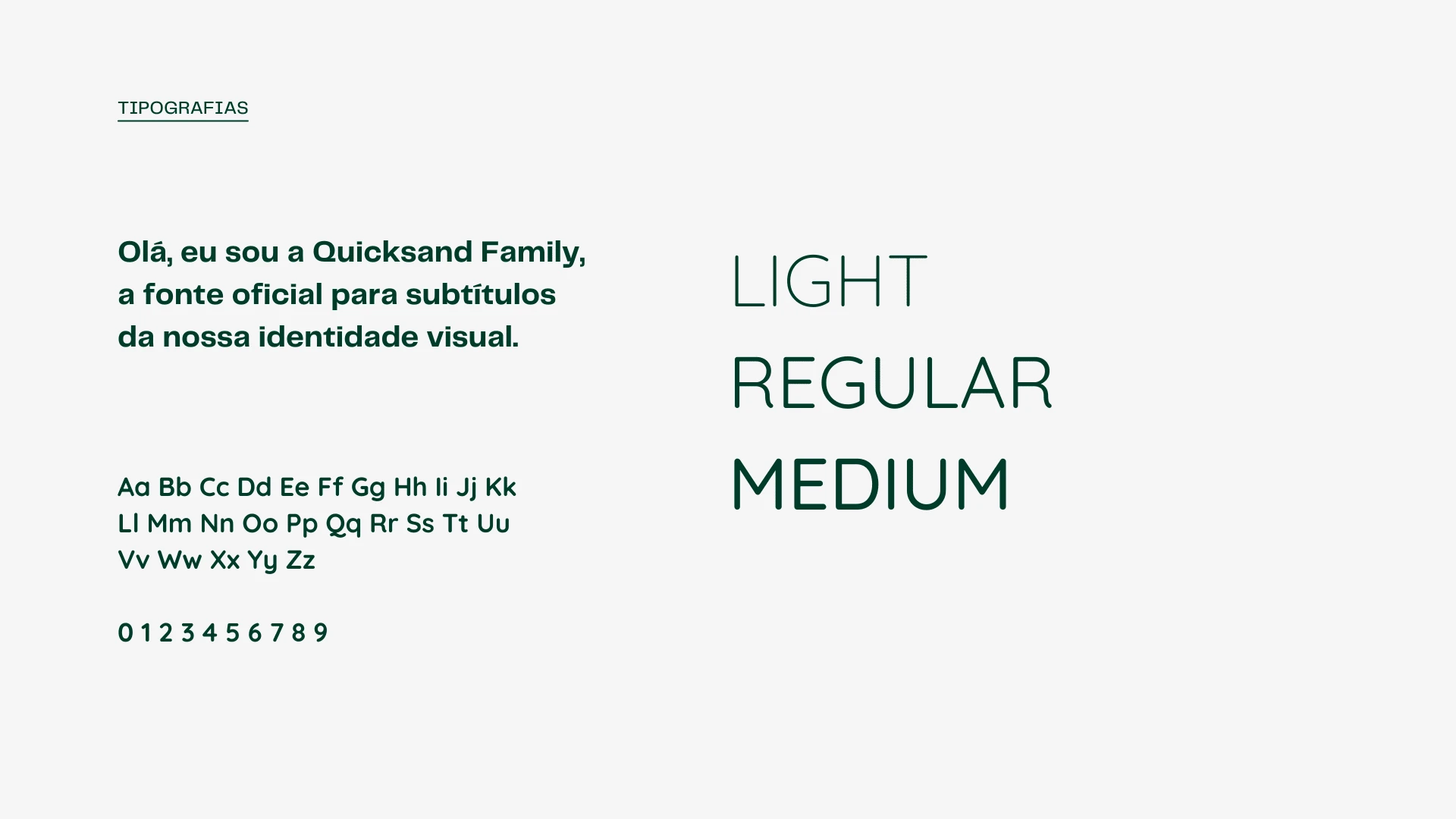
Hi, I'm Quicksand Family, the official font for subtitles in our visual identity.
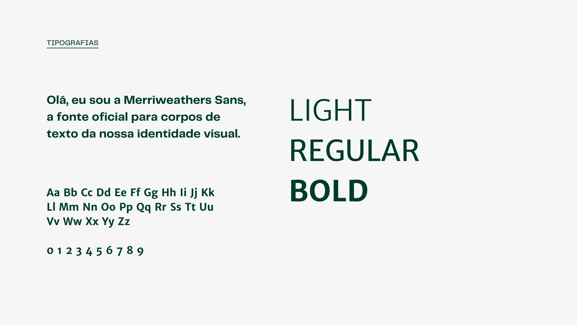
Hi, I'm Merriweather Sans, the official font for bodies of text in our visual identity.
Brand Concept
Sunflower Flower (Main Inspiration)
People with ASD (Target Audience of the Clinic)
Affection and Welcoming Communication (Main Values of the Clinic)
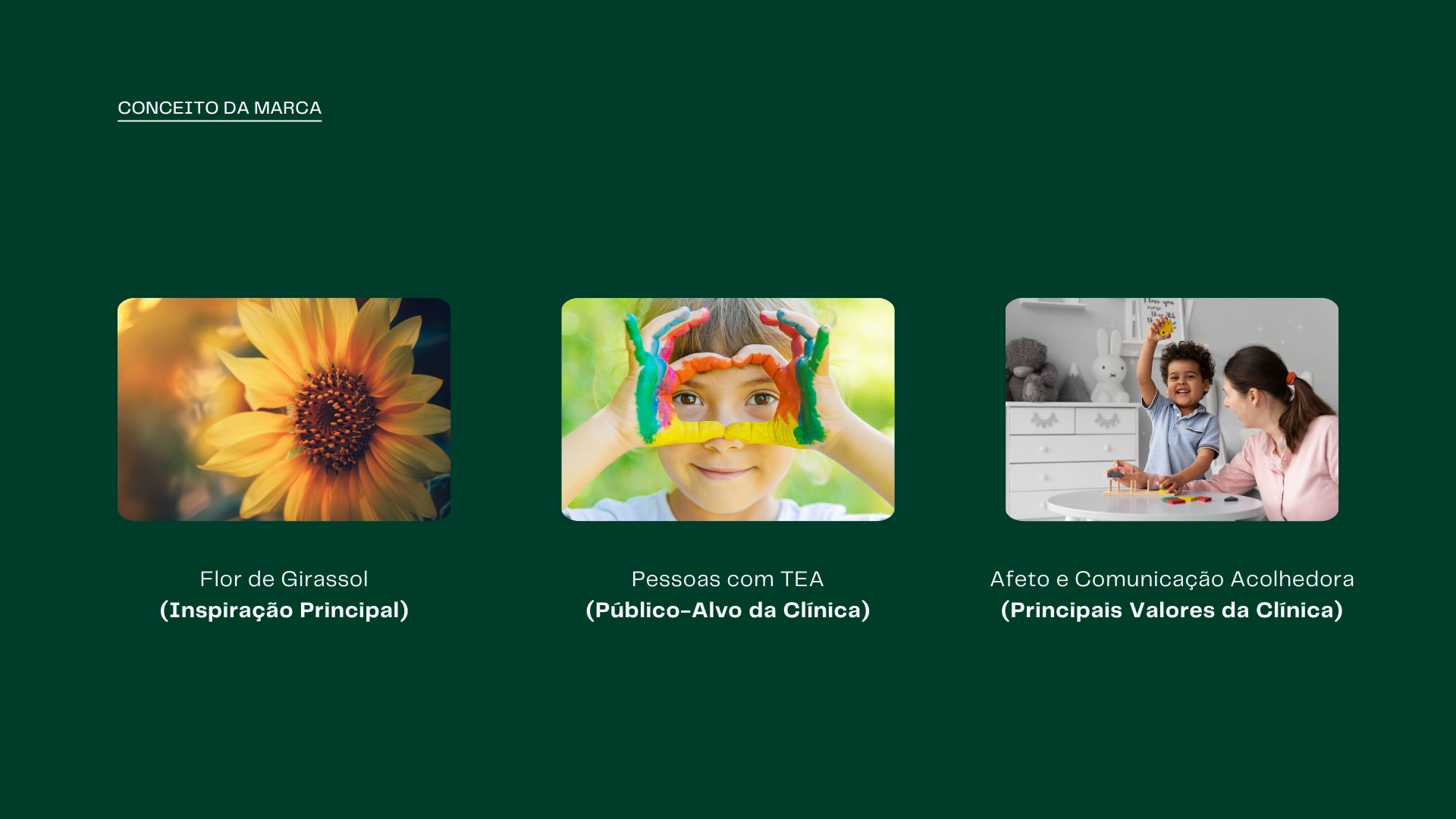
Brand Concept Examples.
The symbol conveys the clinic's new name and symbol (the sunflower) in a playful and fun way, including a light representation of a smiling child's face.
The edges of the sunflower leaves have been gently rounded for user-friendly reading. The overlapping of the leaves and the transparency also help with the lightness of the new graphic symbol.
In a careful and affectionate way, we generate a connection with those who observe, making it possible to identify from the first contact with the symbol that this is work with children.
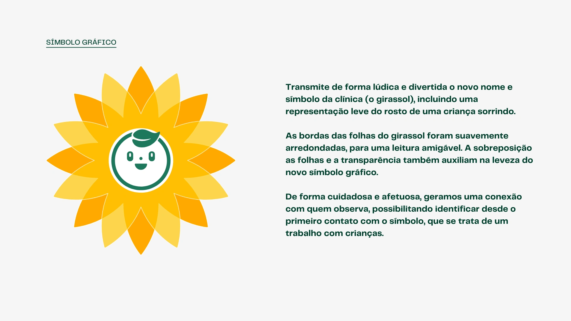
The Graphic Symbol.
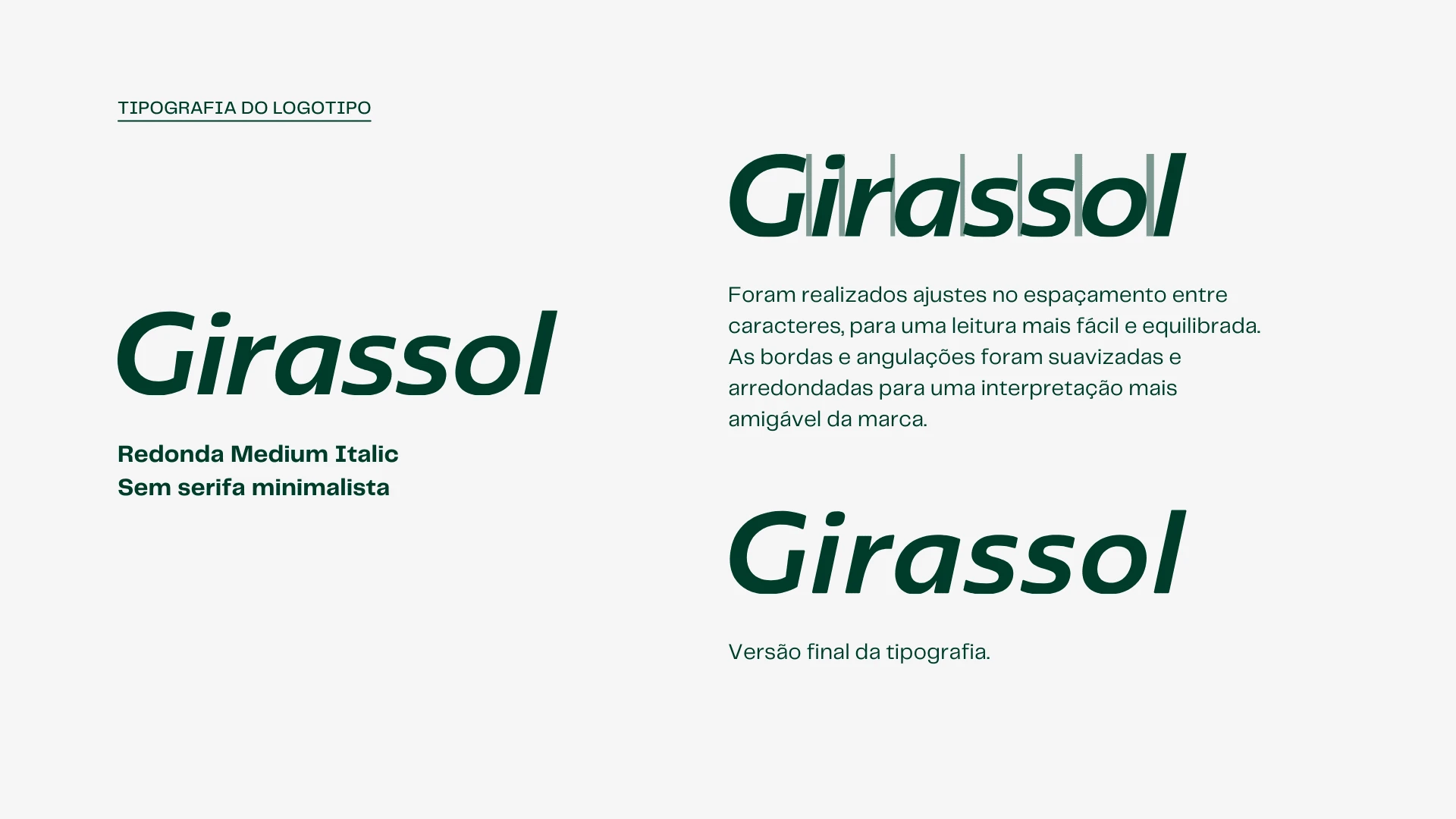
Logo Typography.
Logo Typography: Adjustments were made to the spacing between characters, for easier and more balanced reading. The edges and angulations have been softened and rounded for a friendlier interpretation of the brand.
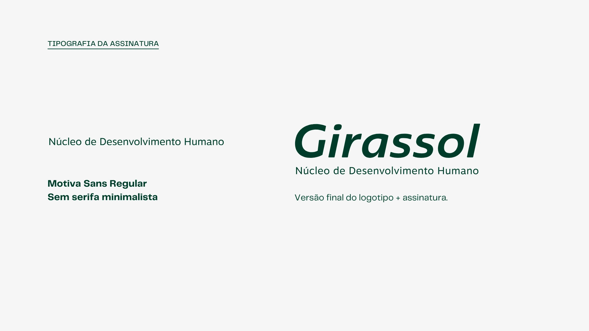
Logo Signature.
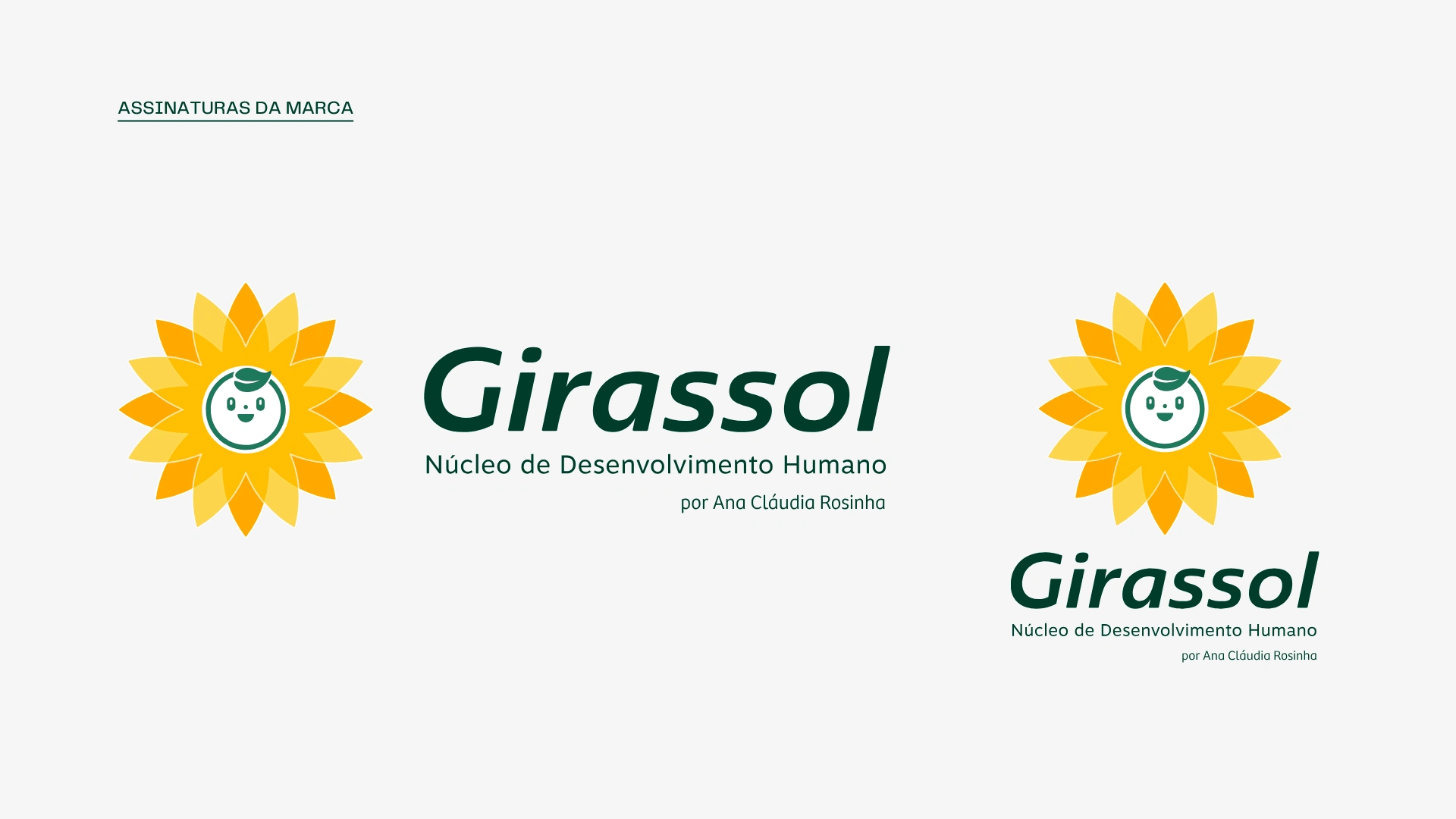
Brand Signatures.
Graphic Elements
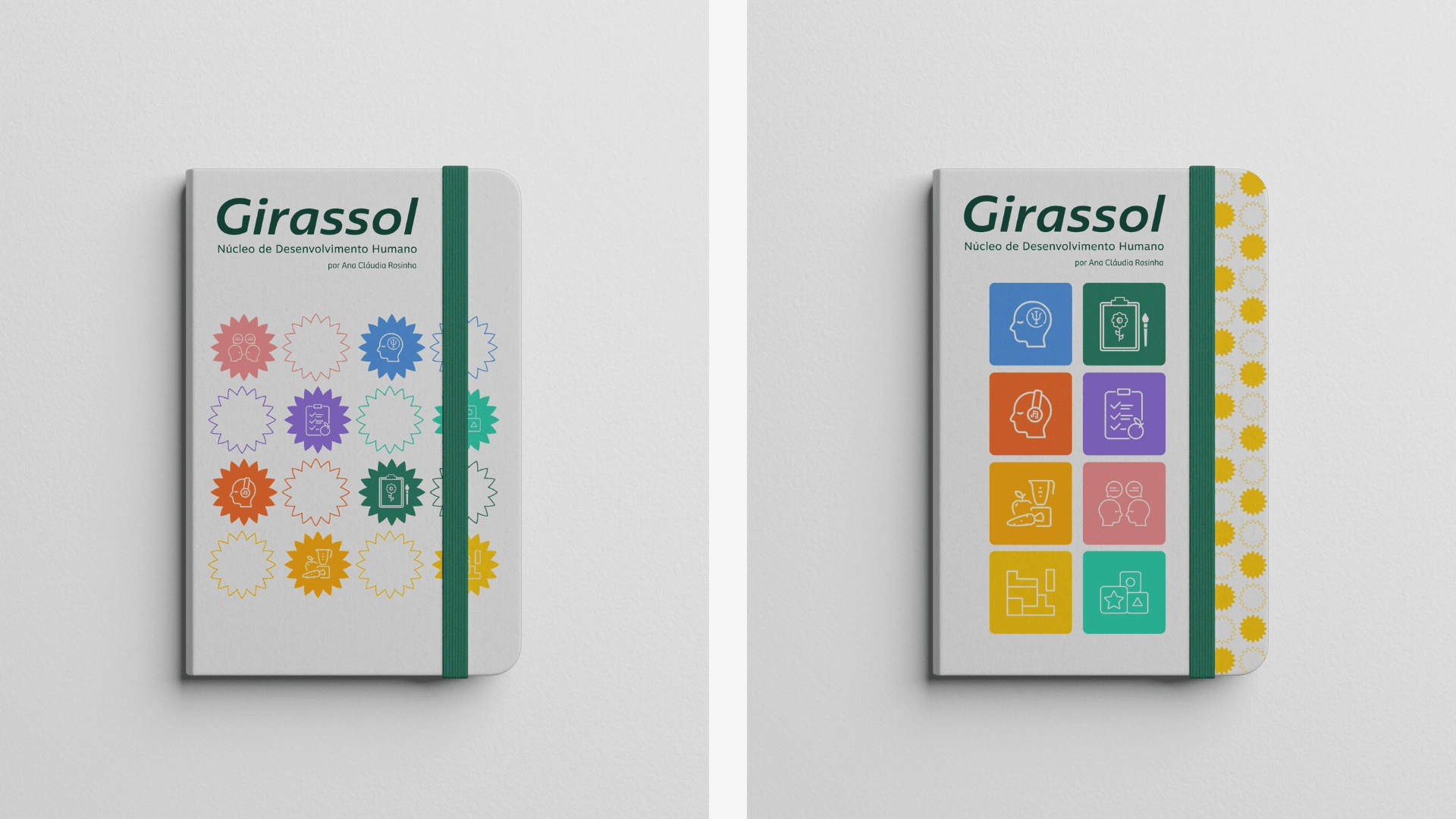
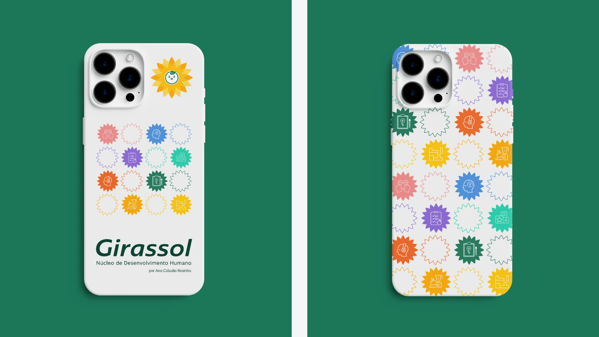
The brand's graphic elements, the icons, were developed and personalized for each specialty of the clinic. This is a way to generate recognition among the public and best segment the types of services at the clinic, by colors and exclusive iconography.
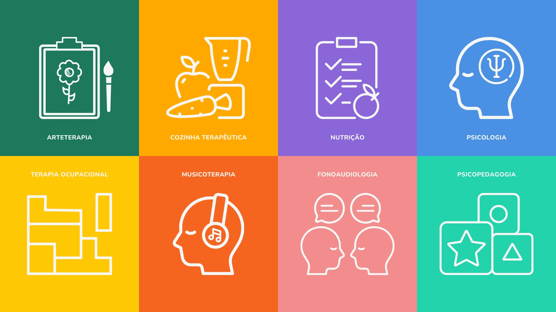
Customized and Exclusive Icons by Specialty.
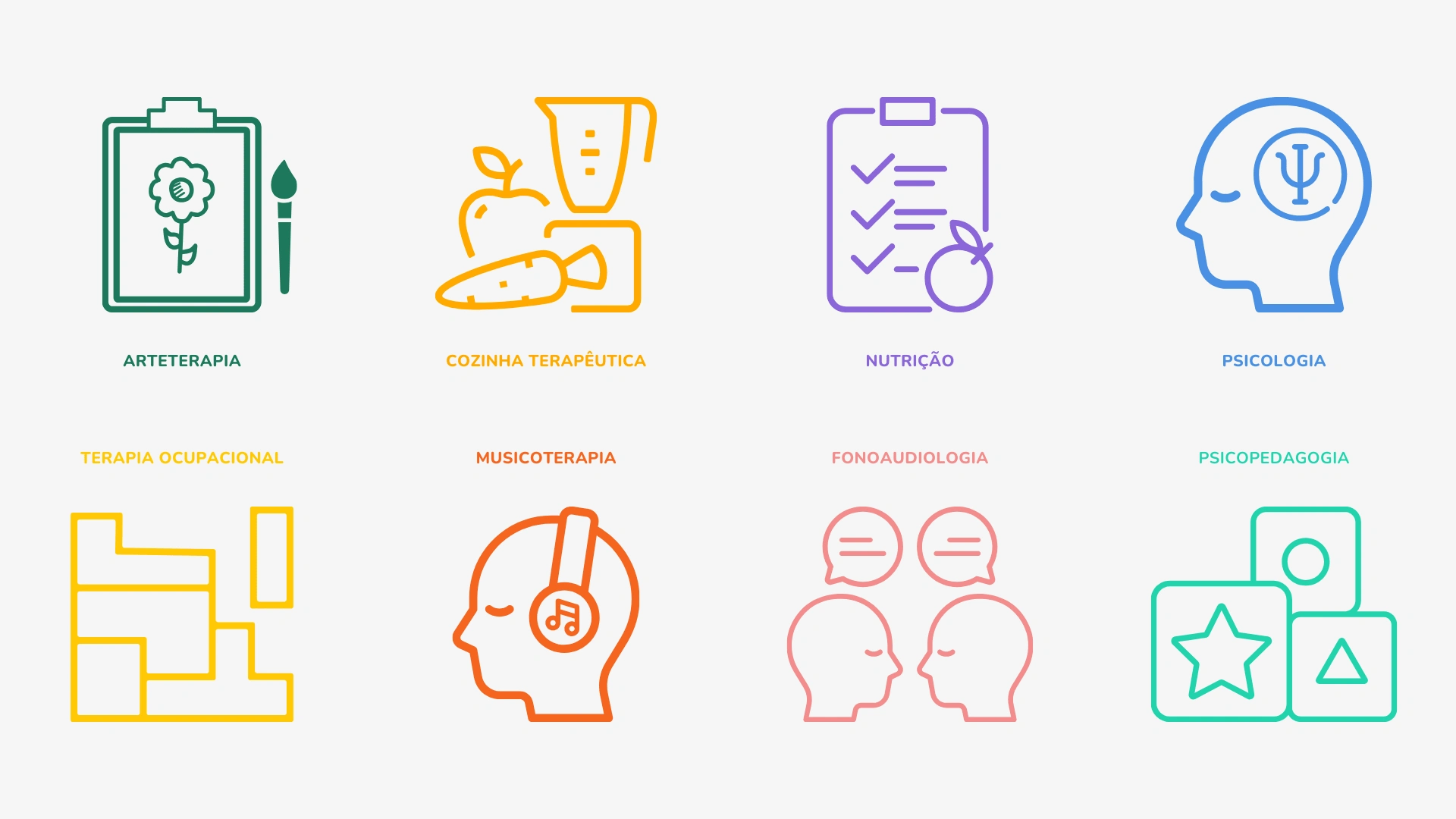
Customized and Exclusive Icons by Specialty.
Brand Launch
Strategic posts were developed to warm up social media, thus generating curiosity and interest among the clinic's target audience.
The new brand was revealed little by little with each new post and with easter-eggs throughout the pre-launch days.
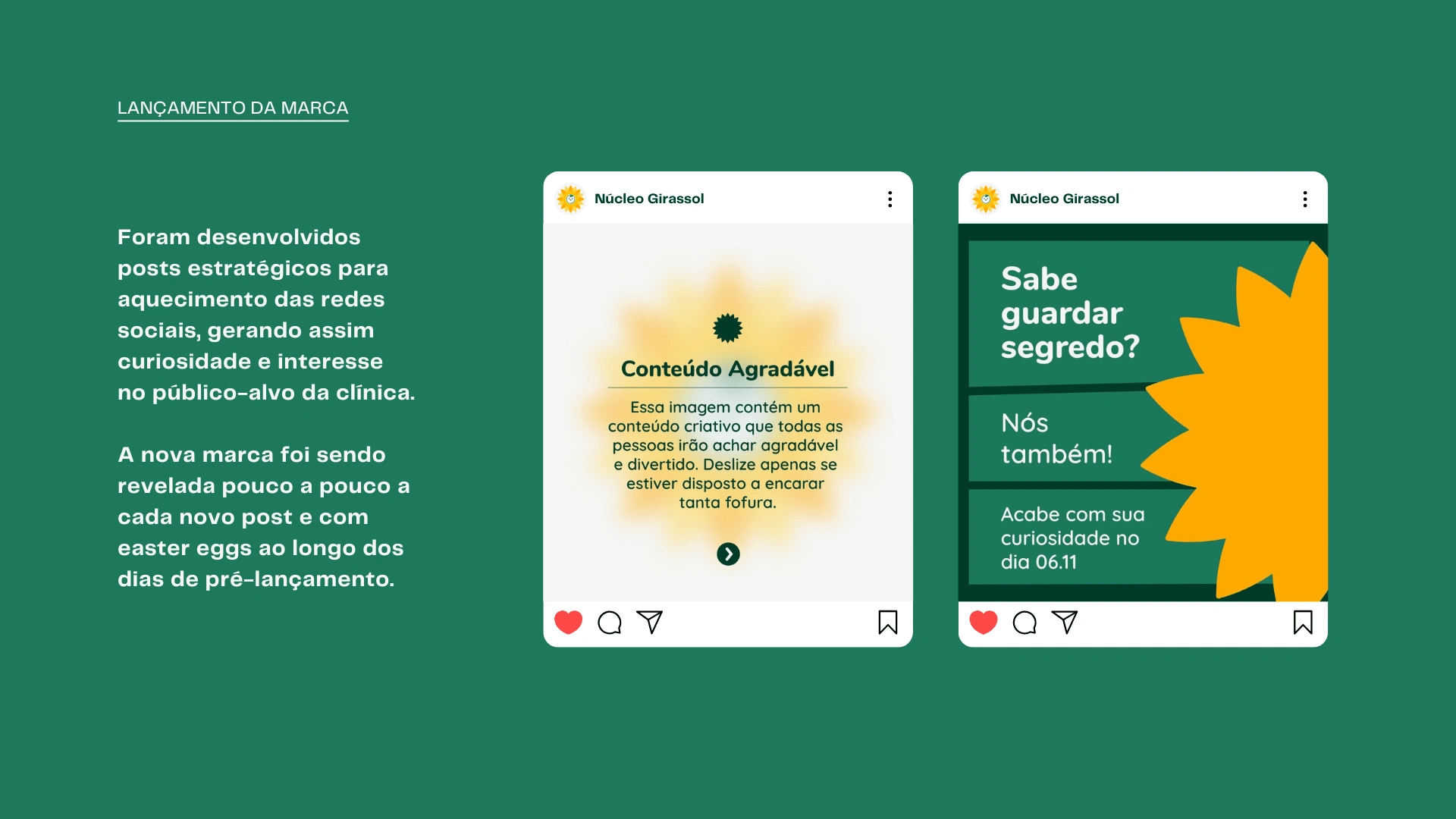
Brand Launch - Mysterious Post.
We used a lighter and more fun approach in the new brand launch posts. The focus was to keep the public interested and curious about the news we prepared for the clinic's new visual identity.
Brand Launch - Too Tasty Meme.
We use elements and references from childhood that subconsciously inhabit our daily lives, whether in the form of memes or even nostalgia related to programs from other decades.
Example: Opening of Teletubbies and Powerpuff Girls.
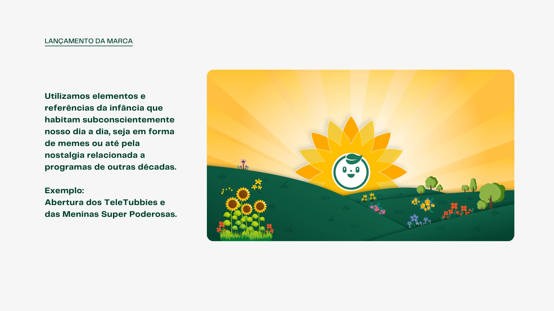
Brand Launch - Opening of Teletubbies.
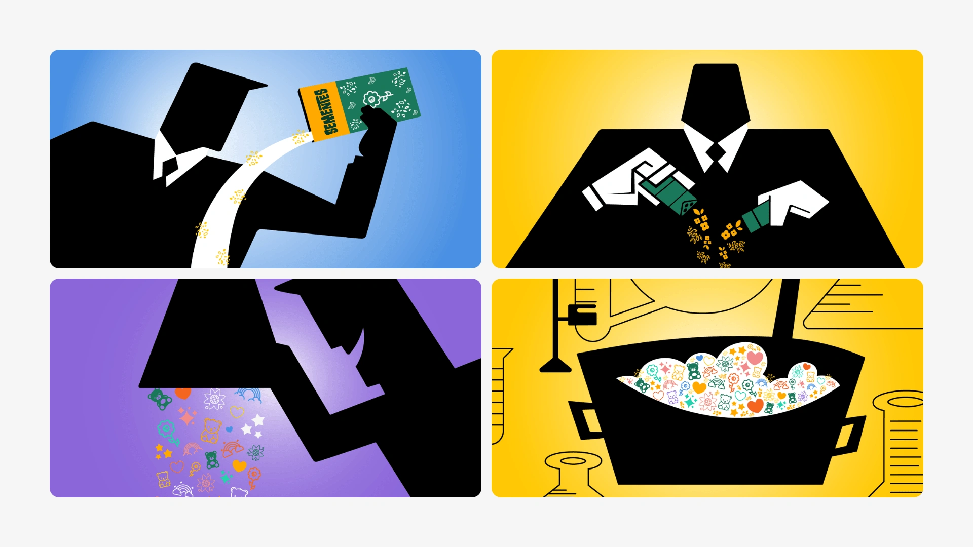
Brand Launch - Powerpuff Girls Opening - 4 Frames.
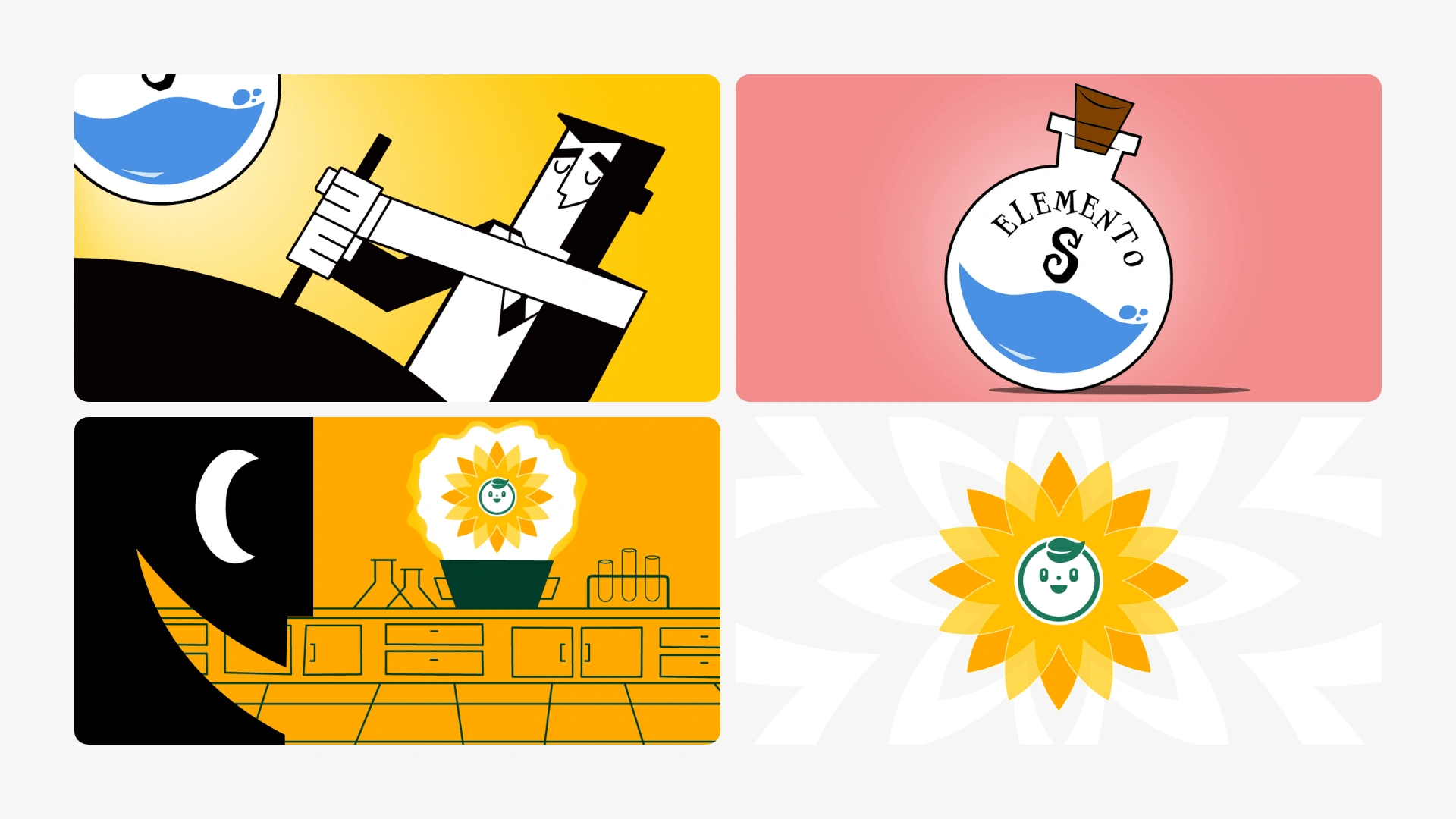
Brand Launch - Powerpuff Girls Opening - 4 Frames.
Brand Launch - Powerpuff Girls Opening - Final Version.
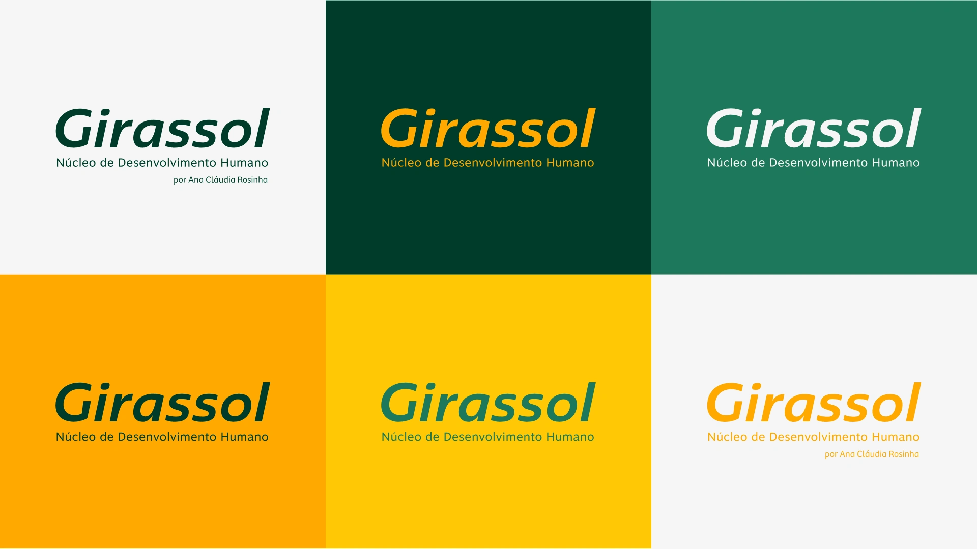
Brand Applications on Color Palettes.
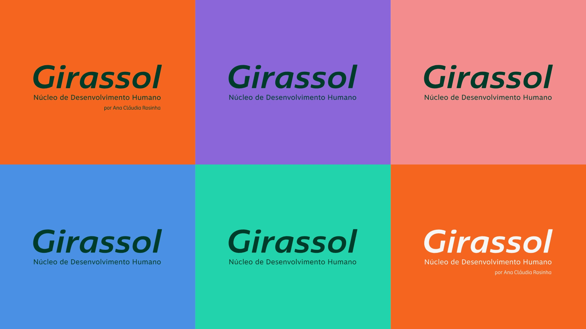
Brand Applications on Color Palettes.
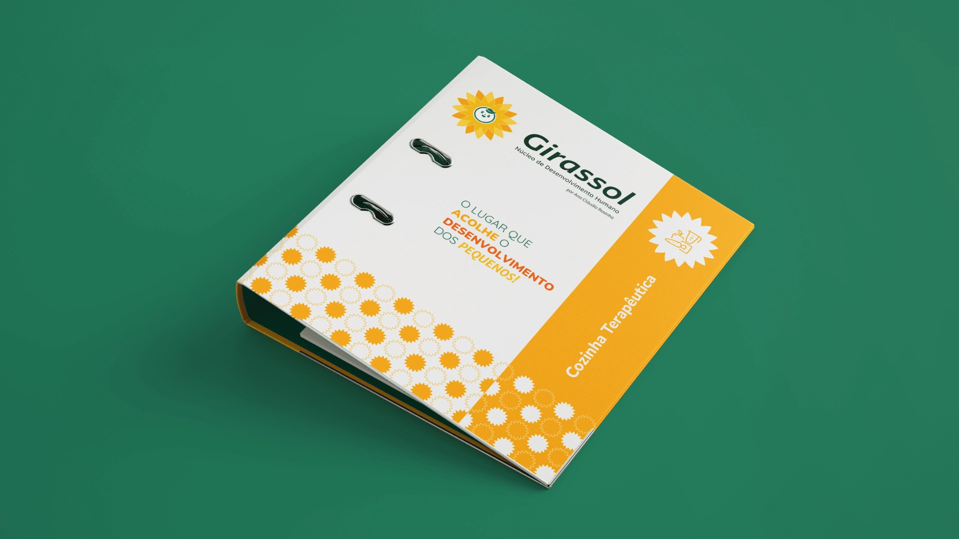
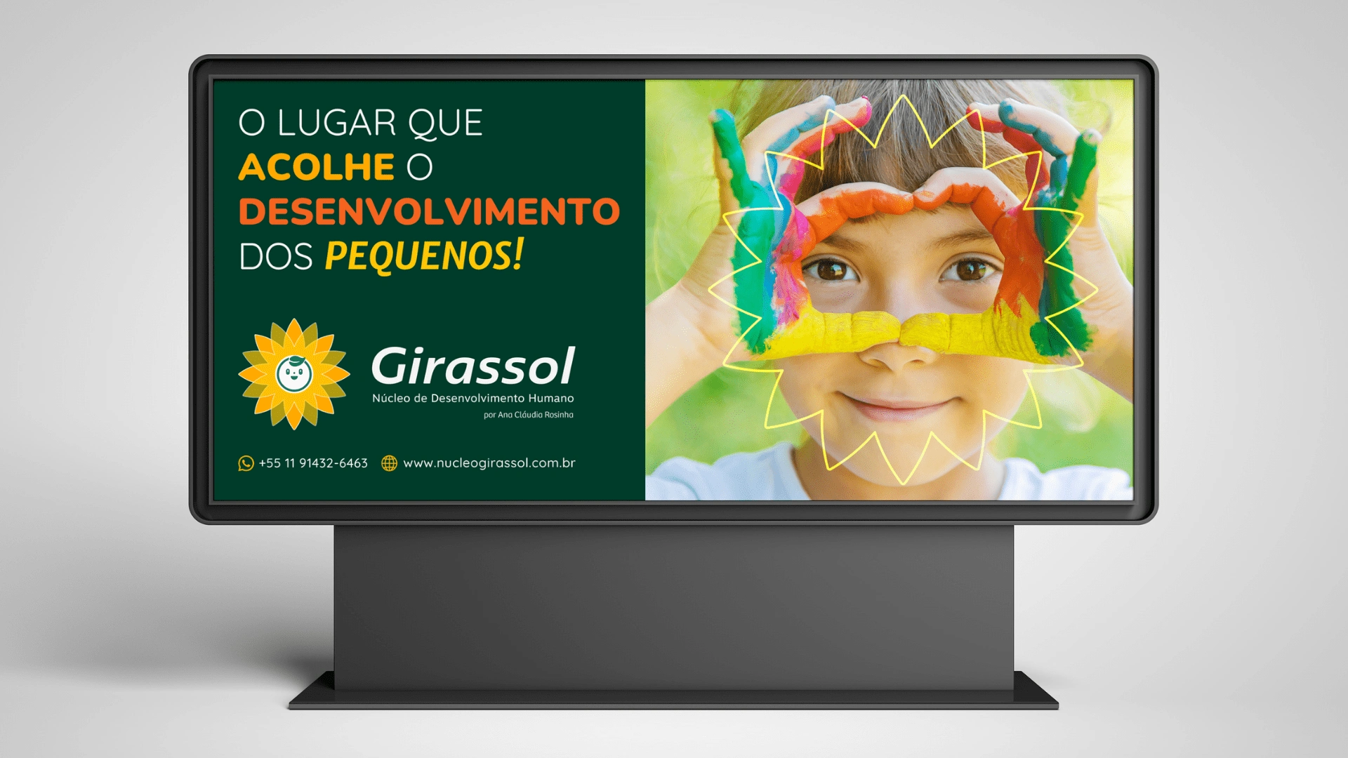
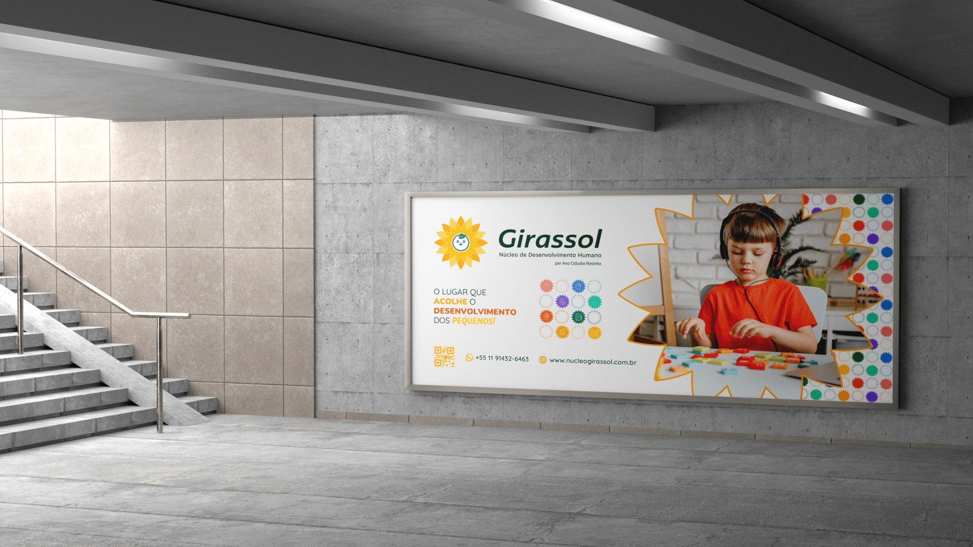
The place that welcomes the development of little ones!
Five years of innovating to improve your child's quality of life!
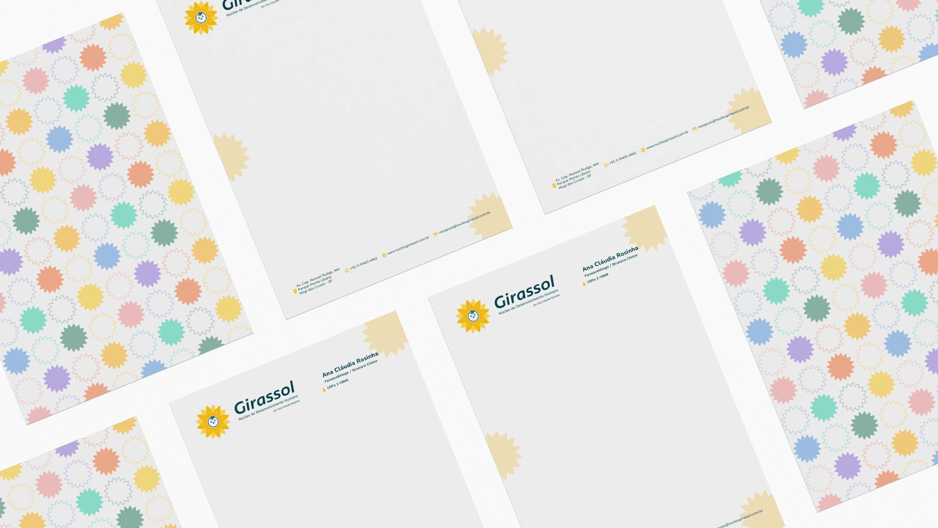
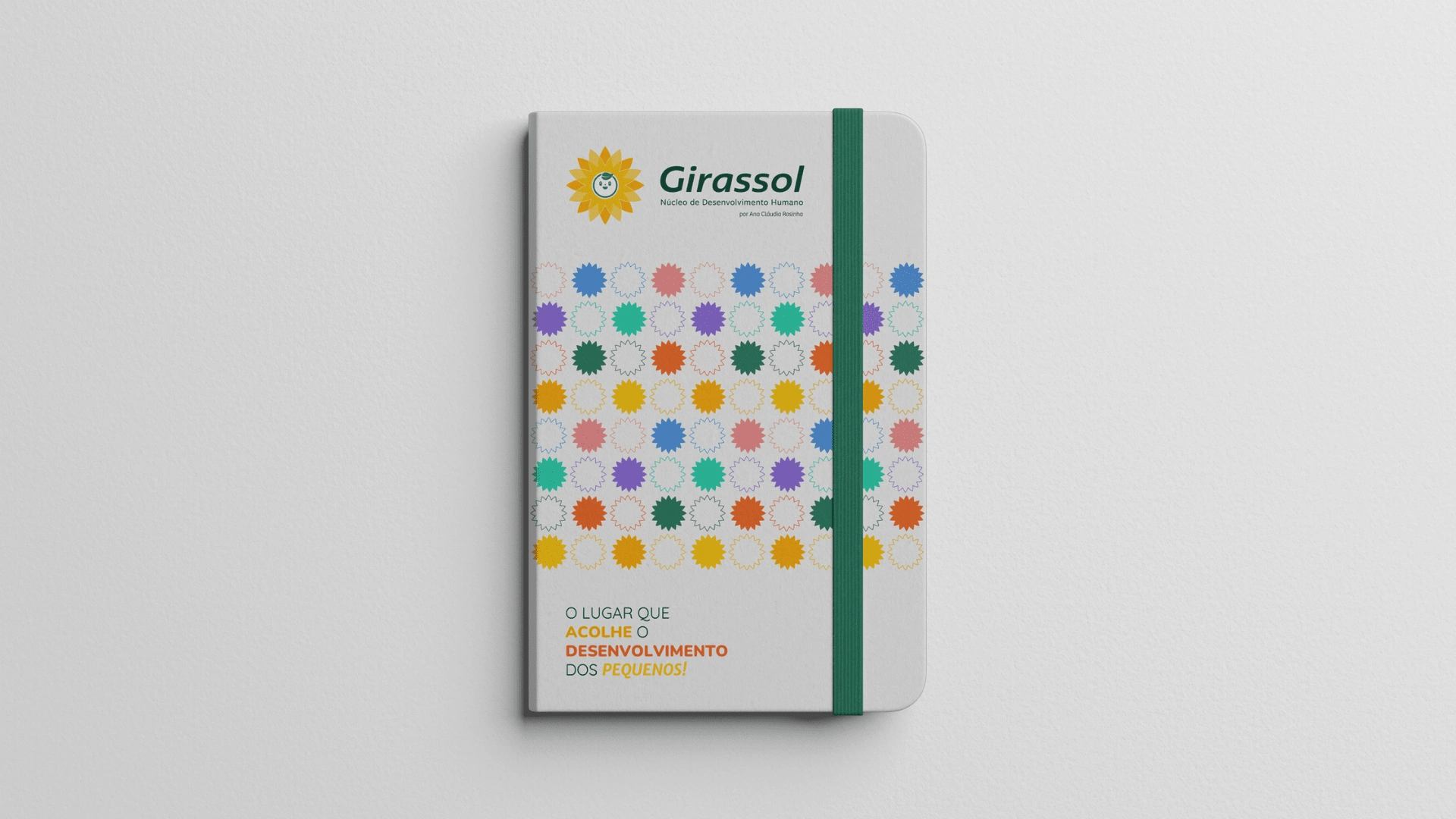
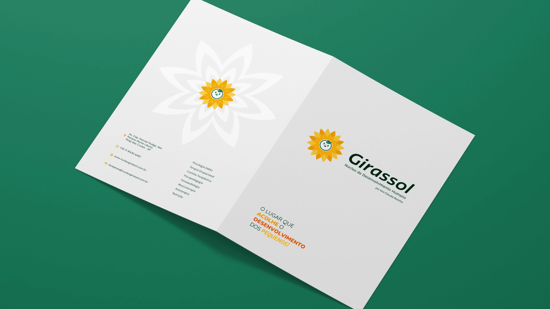
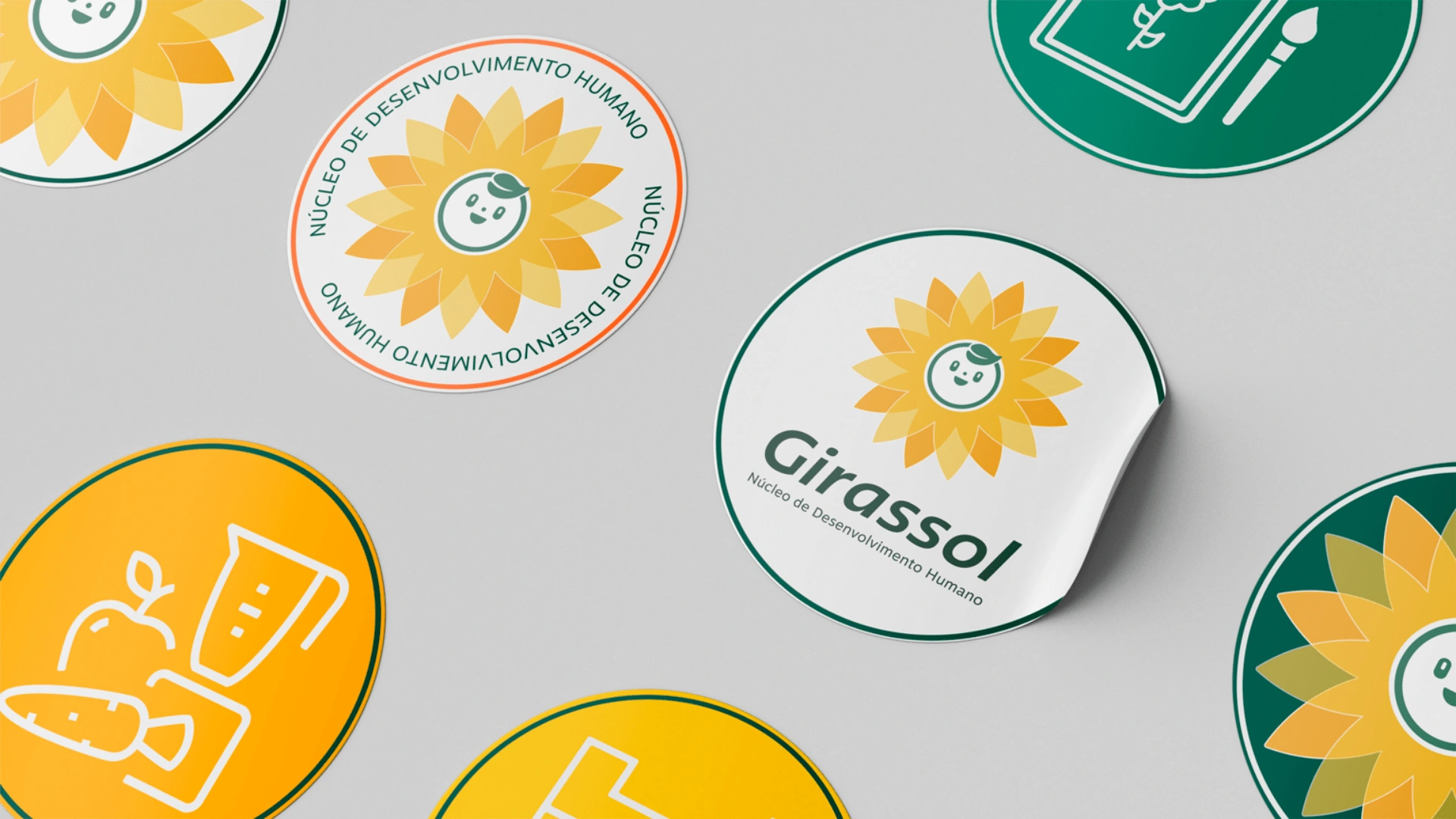
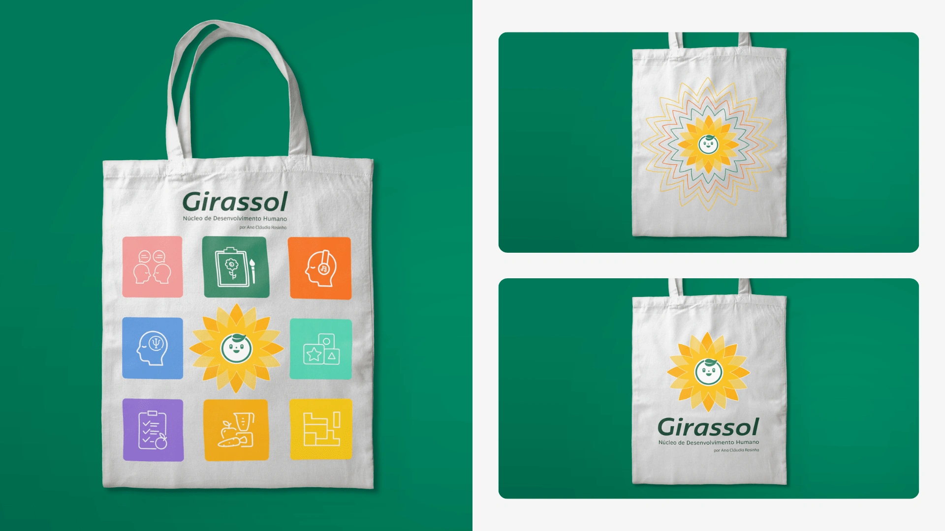
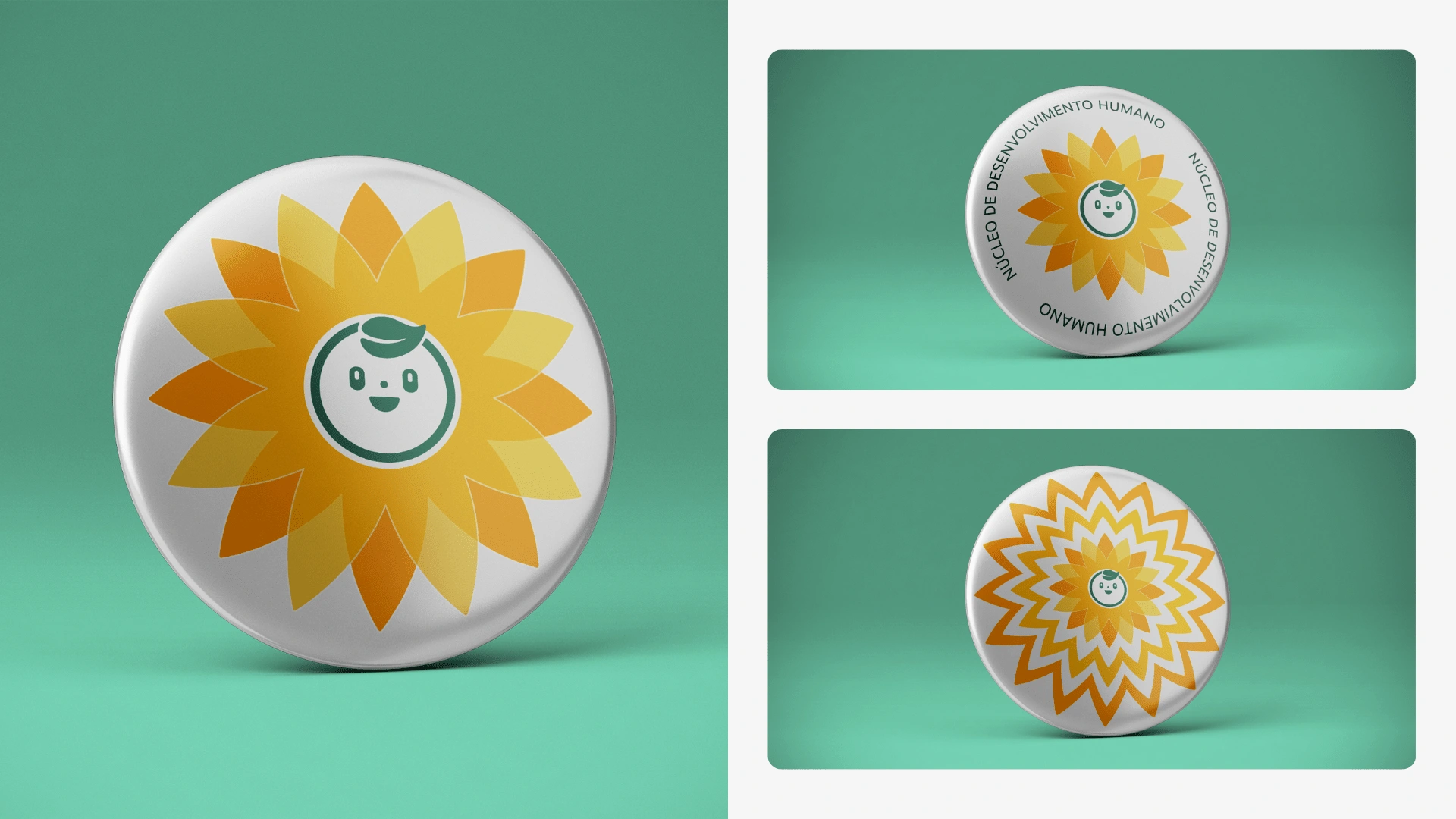
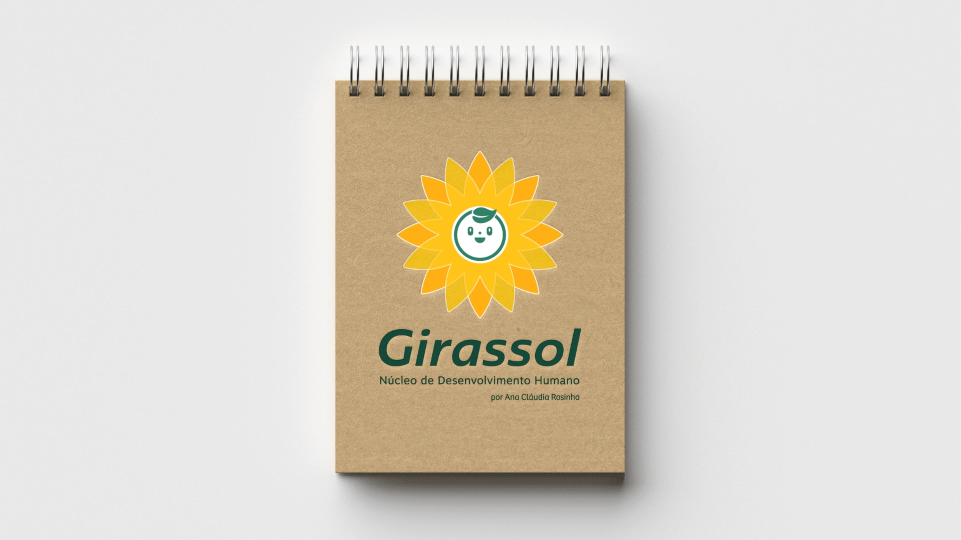
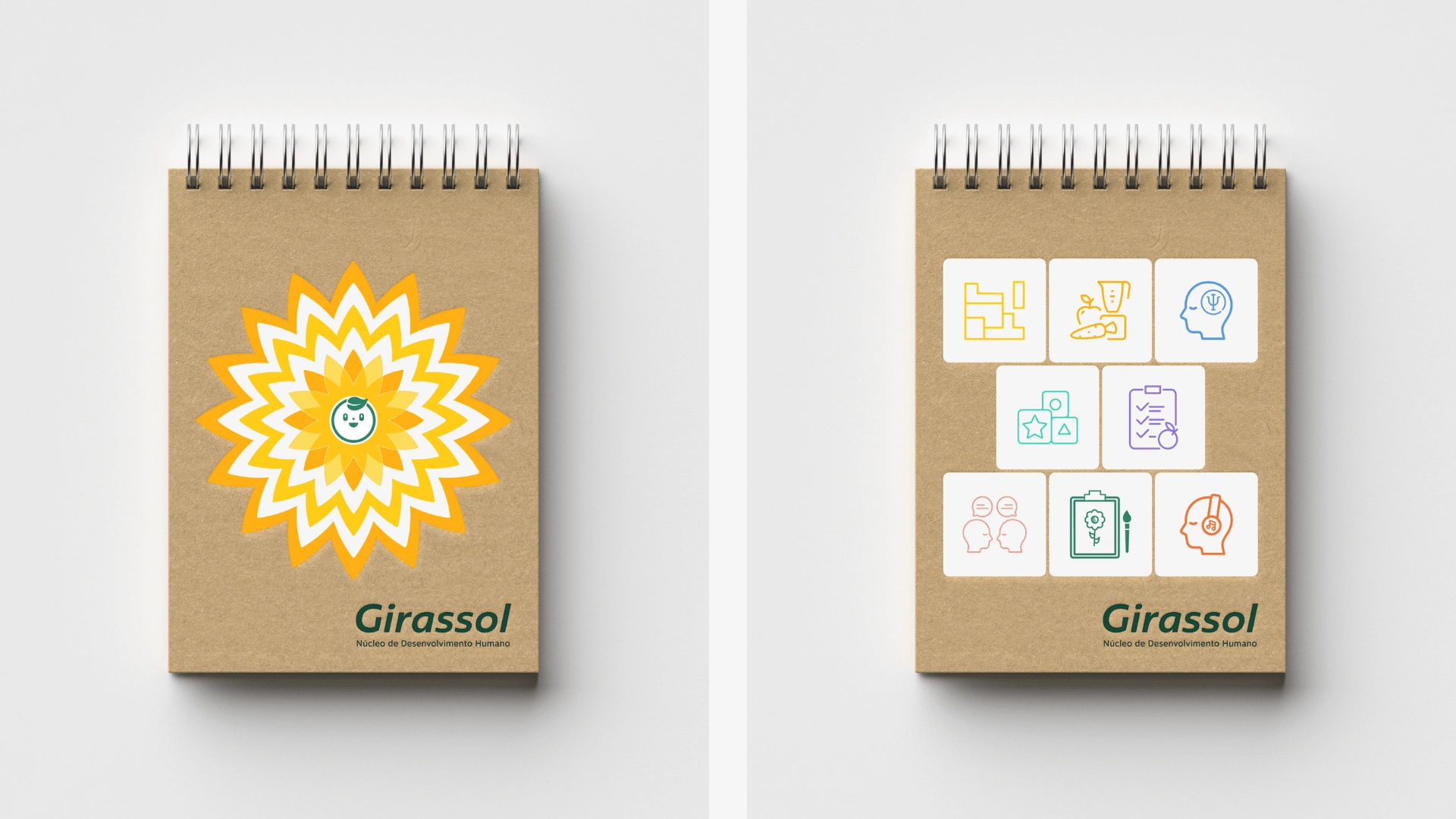
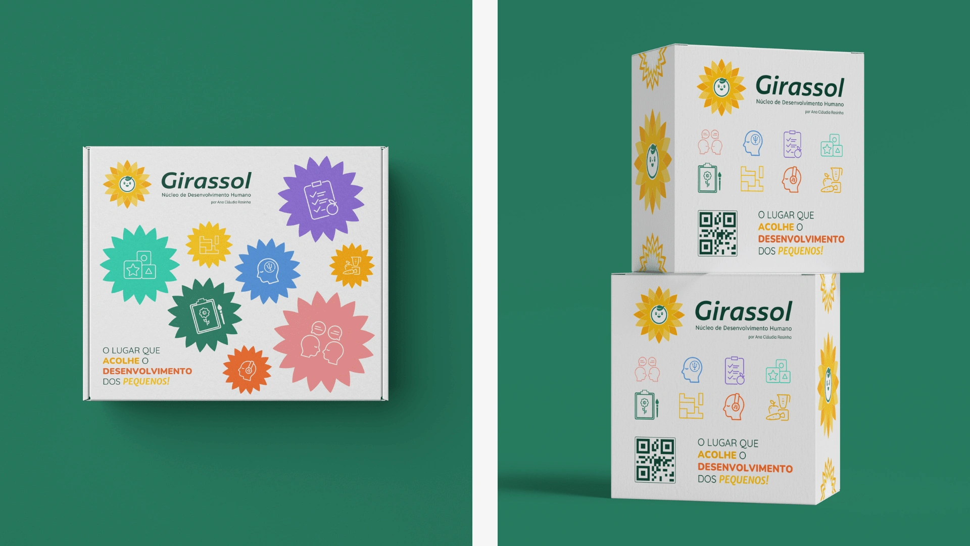
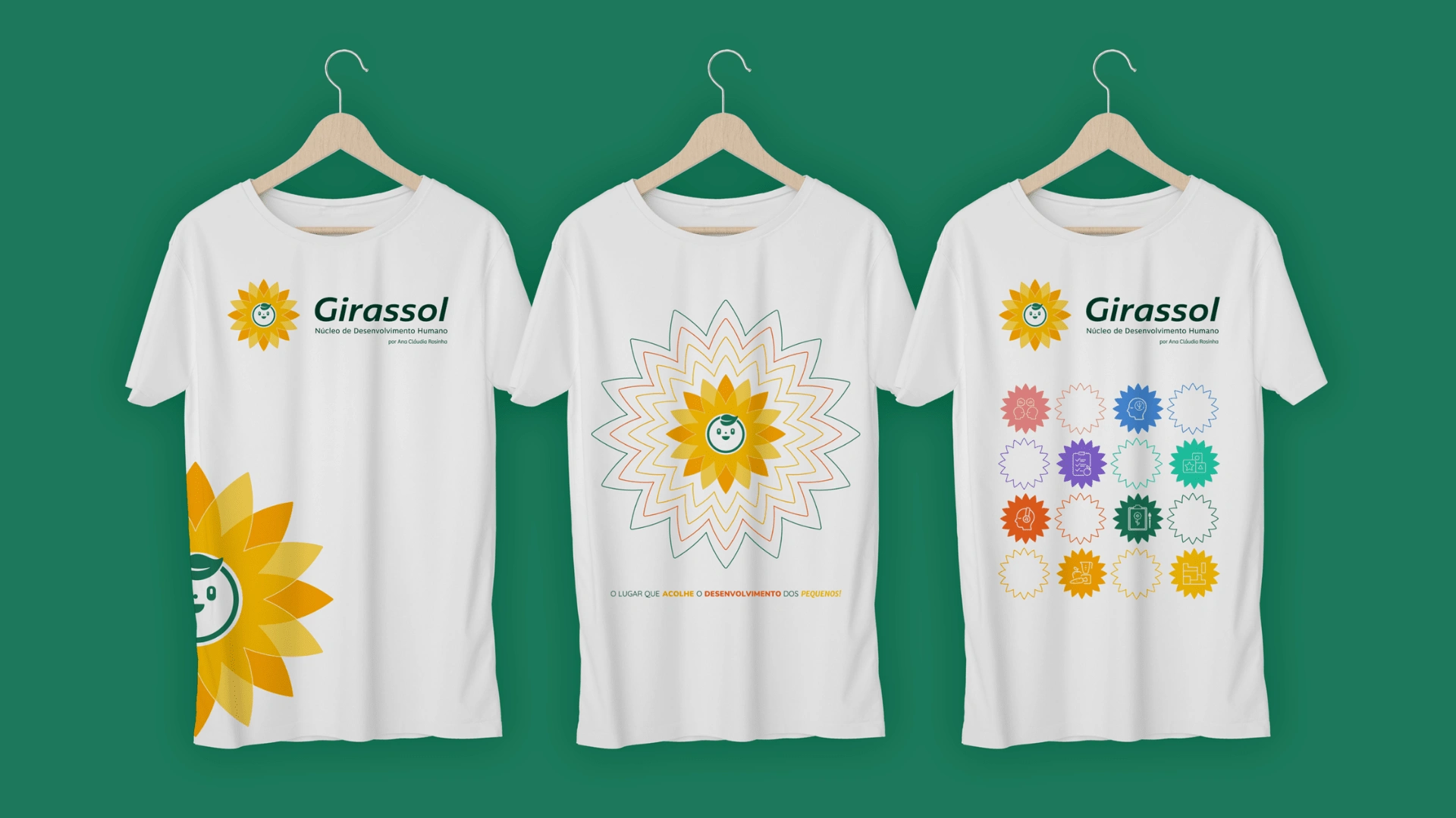
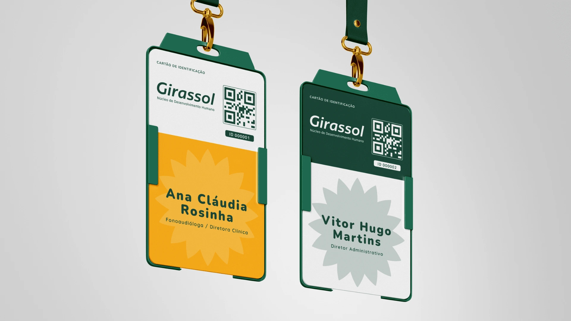
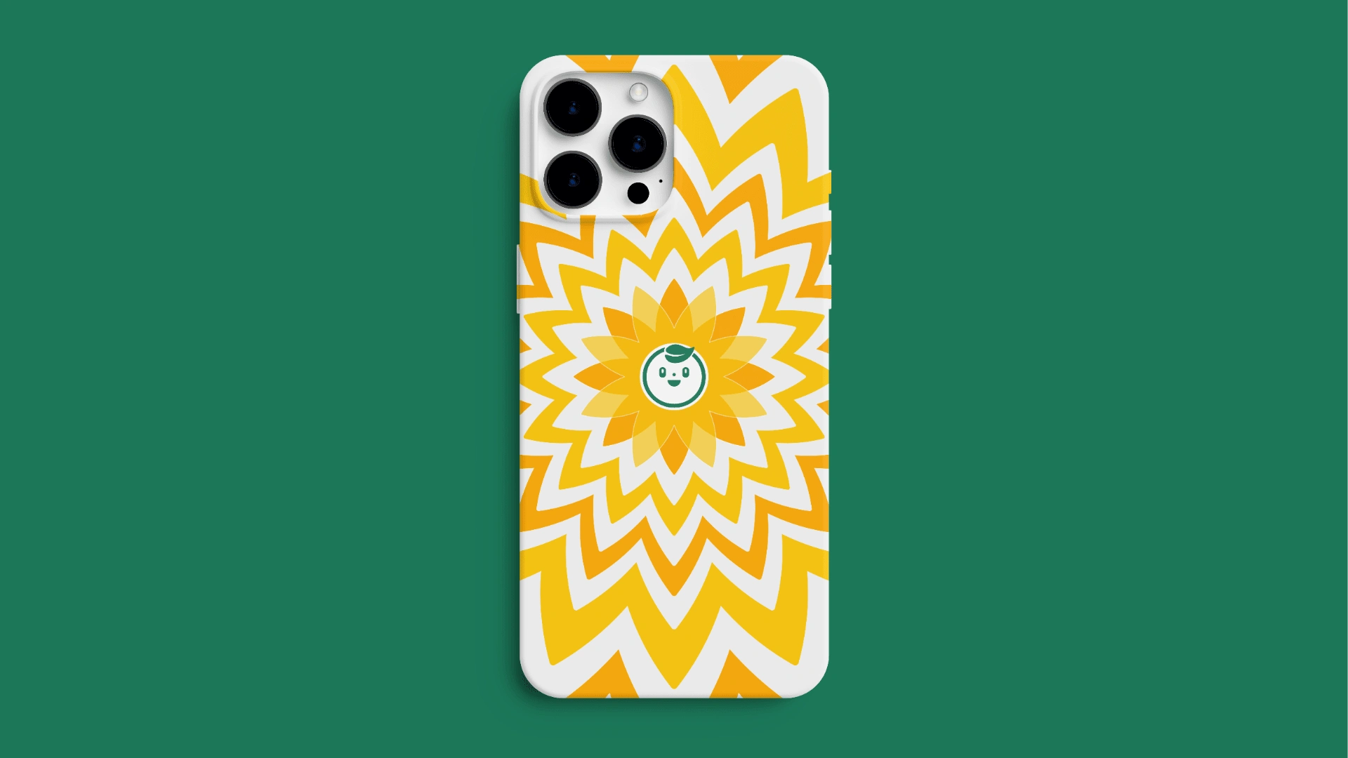
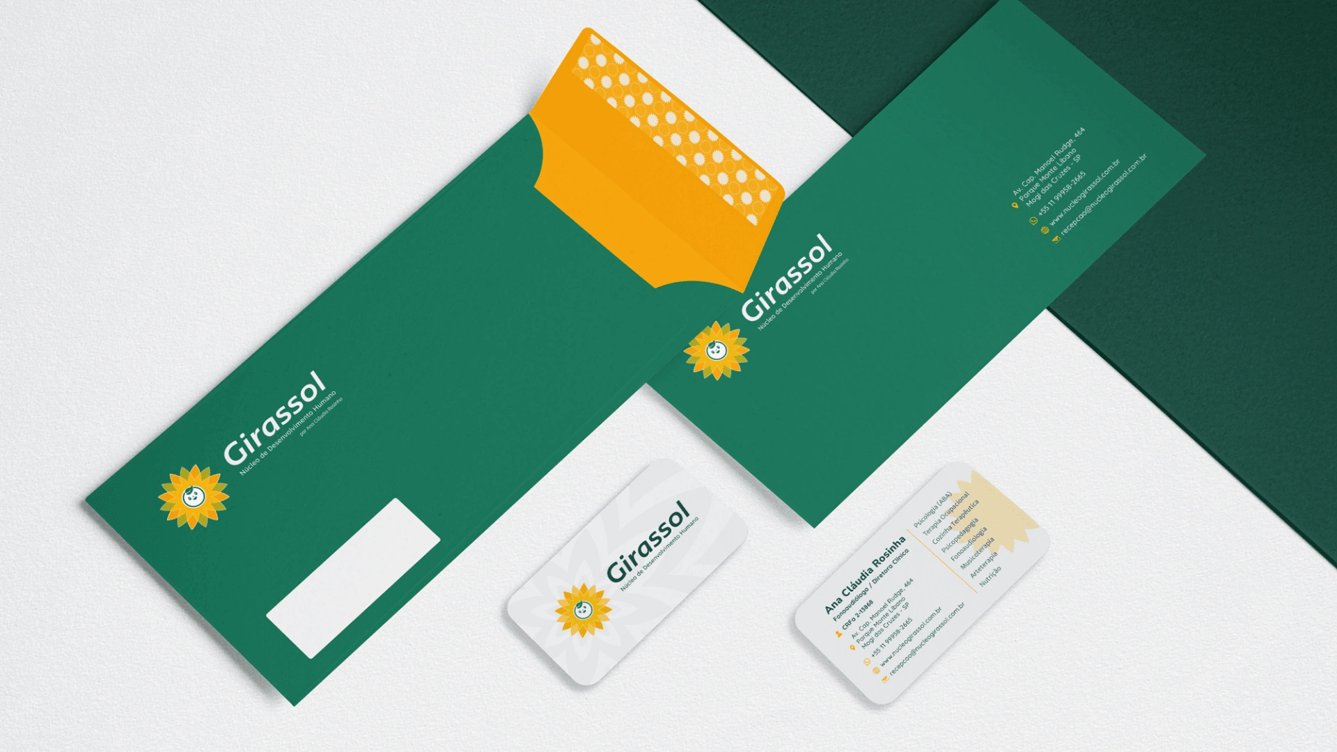
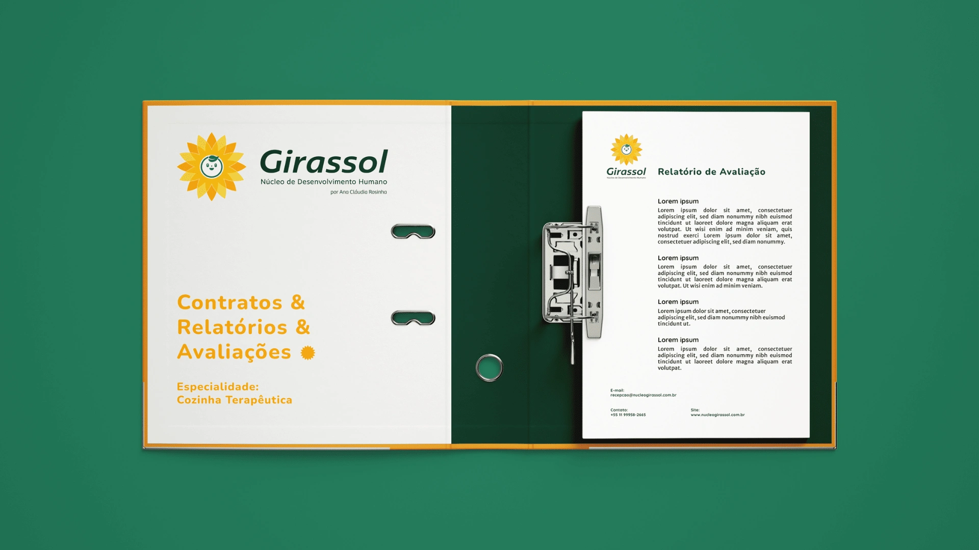
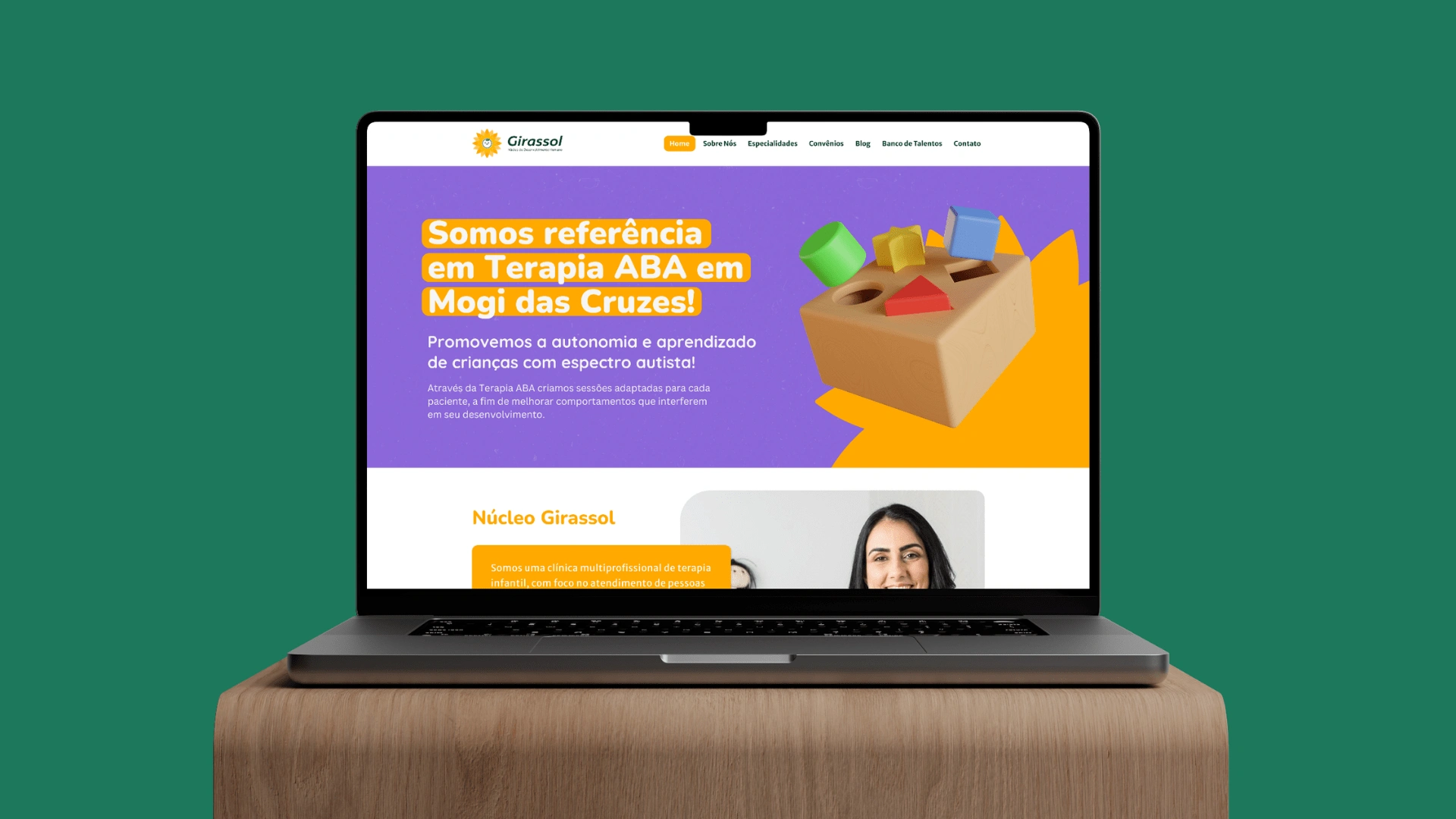
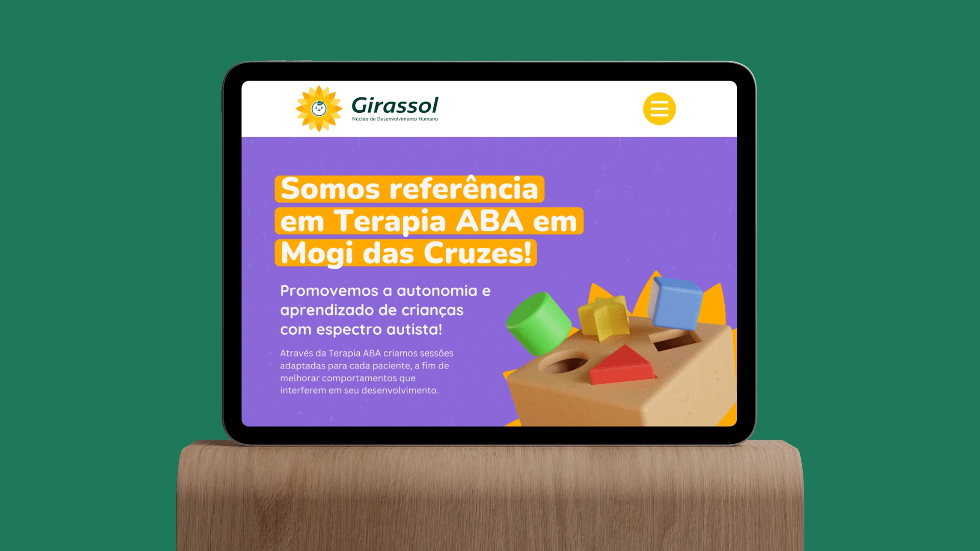
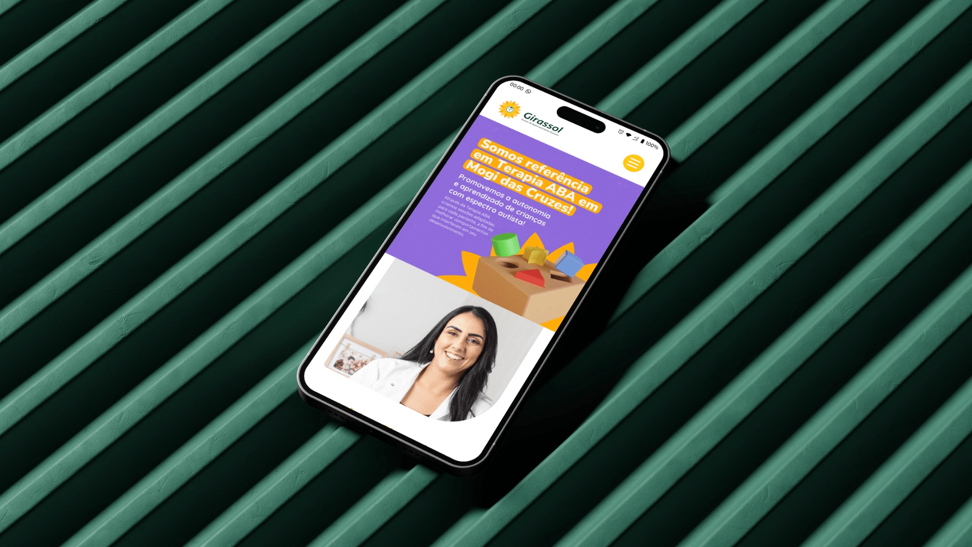
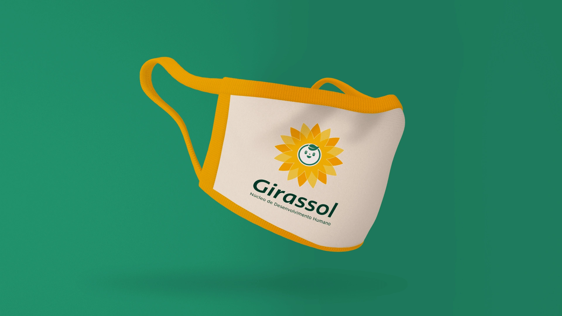
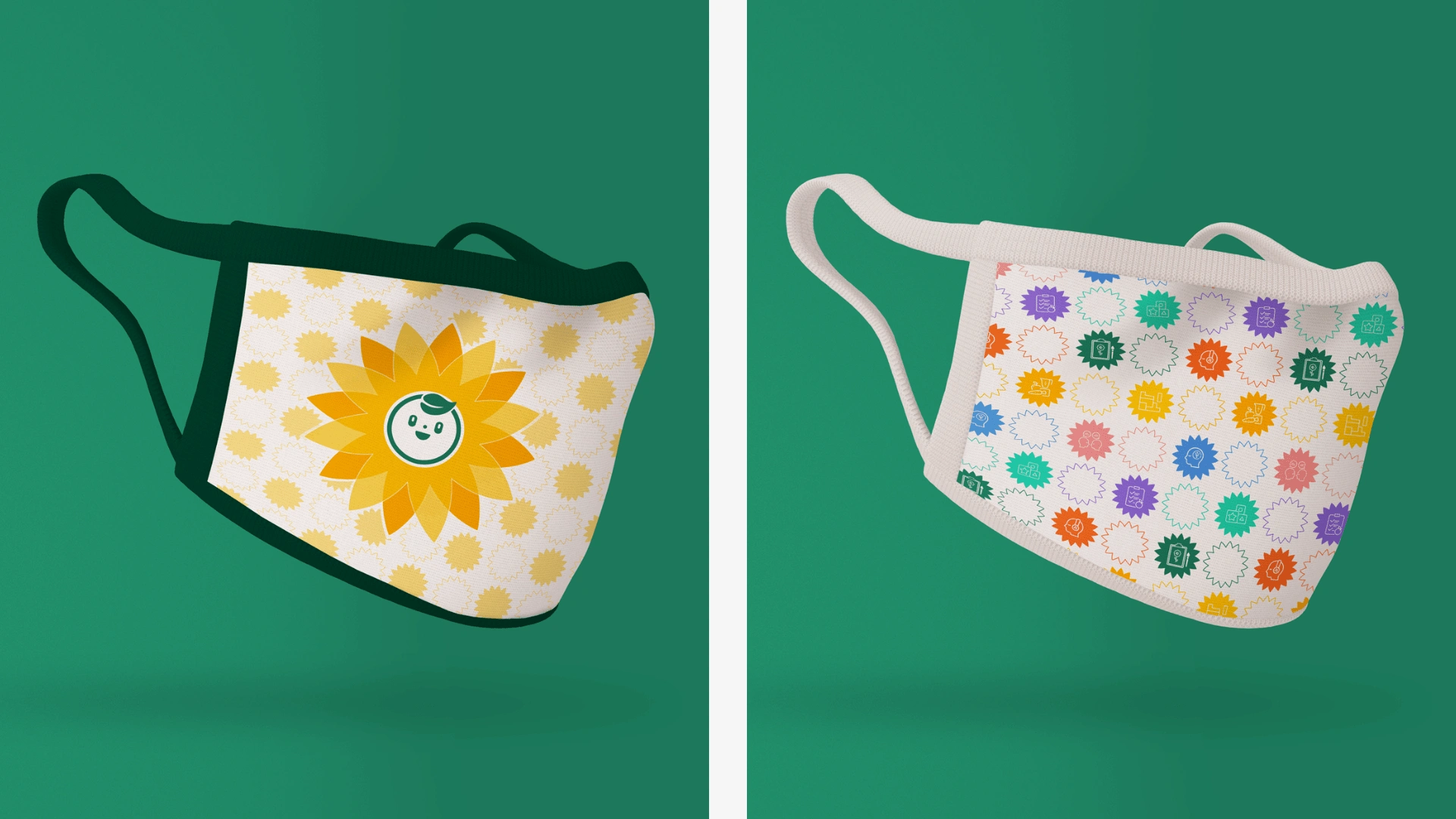
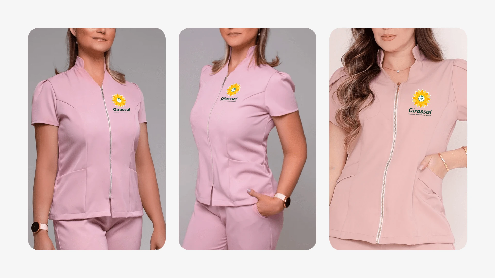
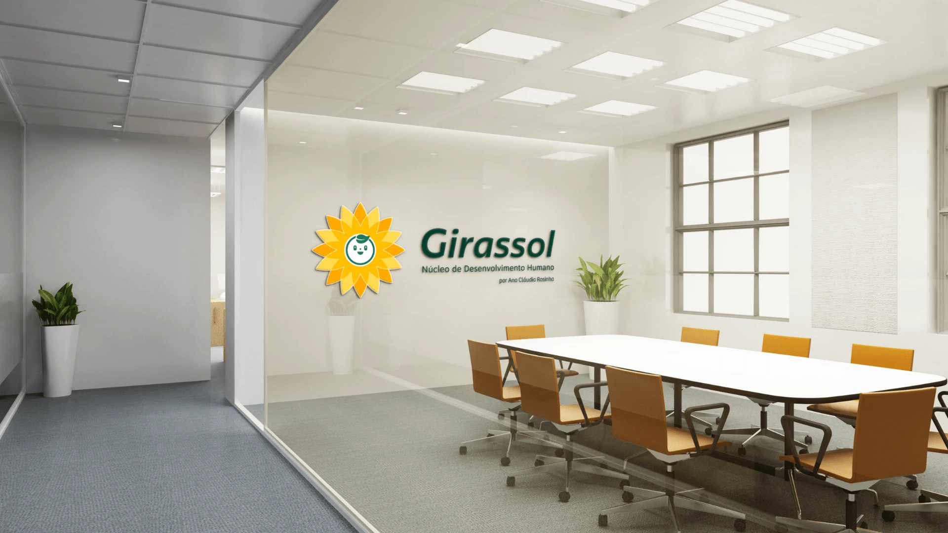
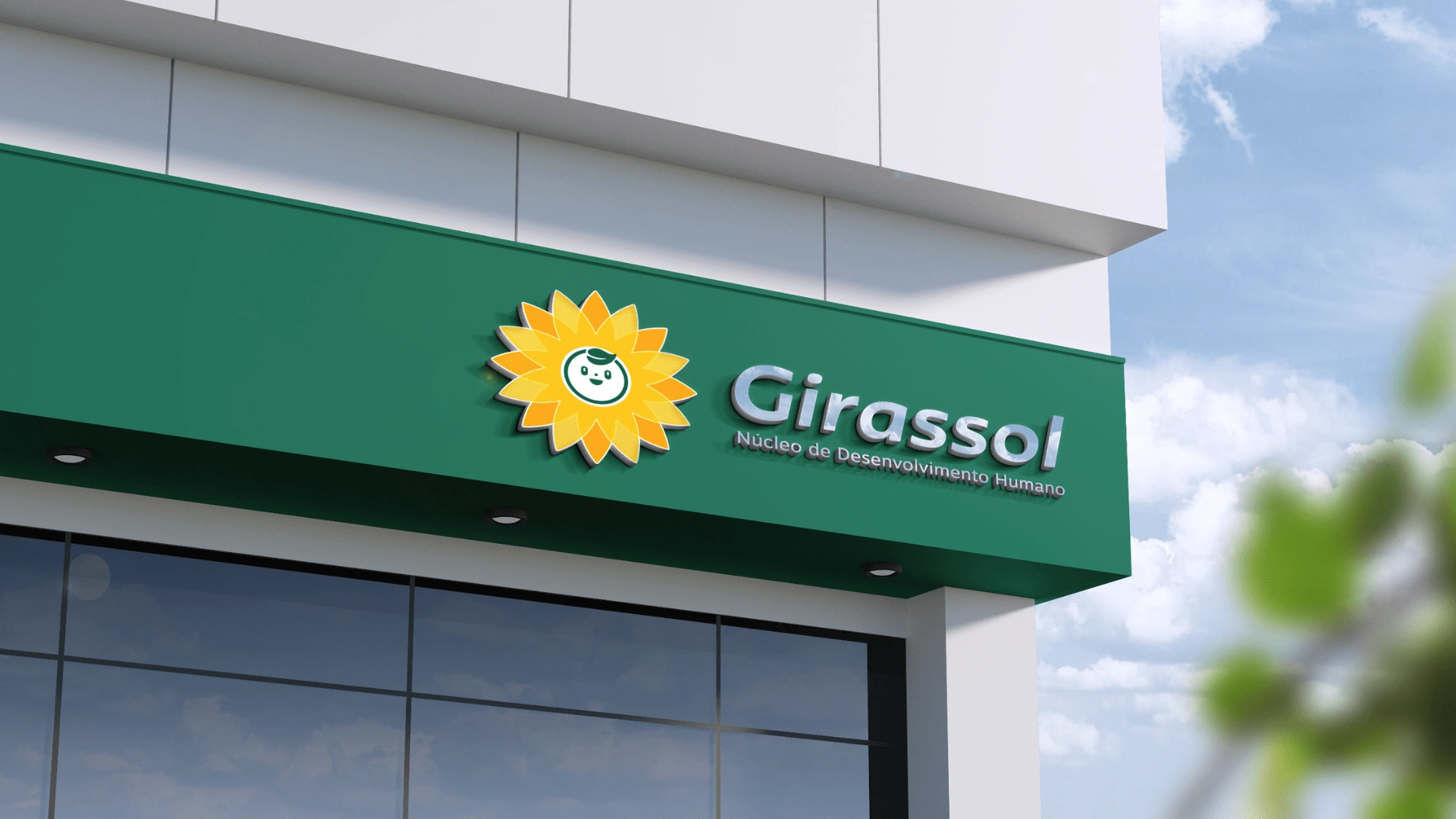
Brand Applications
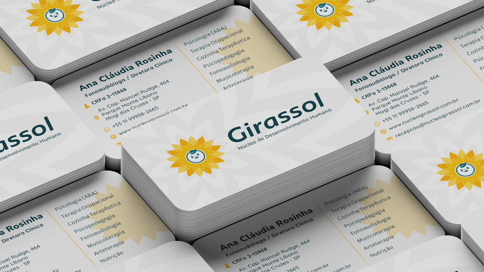
Thank You!
Like this project
Posted May 9, 2024
Visual identity developed for the Girassol Núcleo de Desenvolvimento Humano clinic with multidisciplinary care, focused on people within the autism spectrum...

