Brand Design - Plena Mente Psicologia 🧠
About the Brand
Plena Mente Psicologia is an office where every detail is carefully thought out, so that people feel welcomed in their pain and can express themselves with freedom, confidence and without judgment.
Patients can count on trained professionals for the most diverse types of care, such as: Individual Psychological Care, Couples, Groups, Lectures, Professional Guidance, Consulting for Athletes, Pregnancy, Childbirth and Puerperium Monitoring, Training, Personal Development and Quality of Life.
Mission: Take care of people, promote self-knowledge and quality of life.
Vision: Services with excellence and professionalism, seeking recognition as a reference practice in Psychology in Brazil.
Values: Ethics, Reception, Commitment, Respect and Creativity.
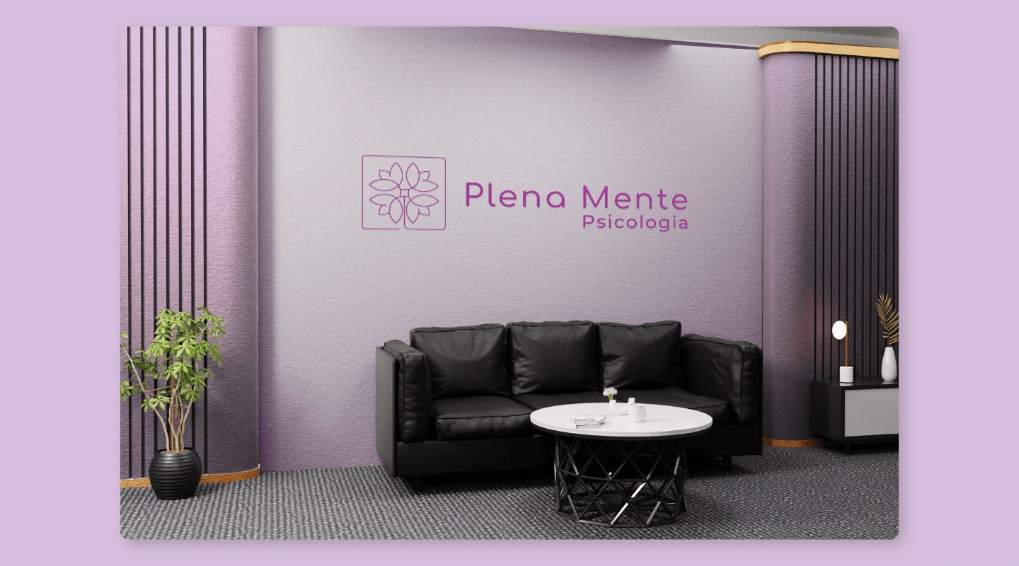
The Office Waiting Room.
The brand's main logo.
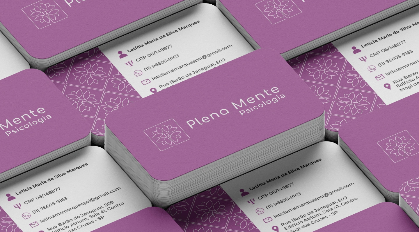
Personalized Business Card.
Brand Persona
Plena Mente Psicologia is: Attentive, Creative, Careful, Different, Efficient, Elegant, Ethical, Excellent, Modern, Sensitive and Serious.
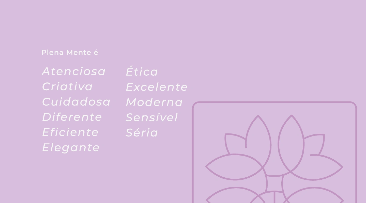
The Brand Persona.
Color Palette & Font System
Color Palette Study
In summary and taking as a starting point some words mentioned in the brand's Mission, Vision and Values, such as: Self-knowledge, Quality of Life, Ethics, Welcoming, Commitment and Creativity, several studies were carried out focusing on colors and their importance in the branding process. According to Color Psychology, there is a range of words that represent certain colors, most common in our daily lives, such as blue, red, yellow, green, orange, purple and even black.
For words related to the brand, the colors that were chosen and do justice to the Mission, Vision and Values are: White, Lilac, Purple and Blue. White is seen as the color of innocence, good, perfection and even the minimalist style in the area of Design. It conveys the feeling of peace, cleanliness and is present in countless tones and items in our daily lives. Lilac and Purple have similar meanings and symbolism, they are considered colors that represent faith, the divine, and are often also linked to beauty, care, the feminine, mystery and fantasy. Some studies point to stronger characteristics, such as robustness, sophistication, style and that generate a feeling of attraction, inspiring confidence and stability. The color Blue represents friendliness, harmony and often causes a distant and infinite effect depending on the tone used, bringing calm and peace. It is considered the color of fidelity, faith and also intellectual virtues in some countries.
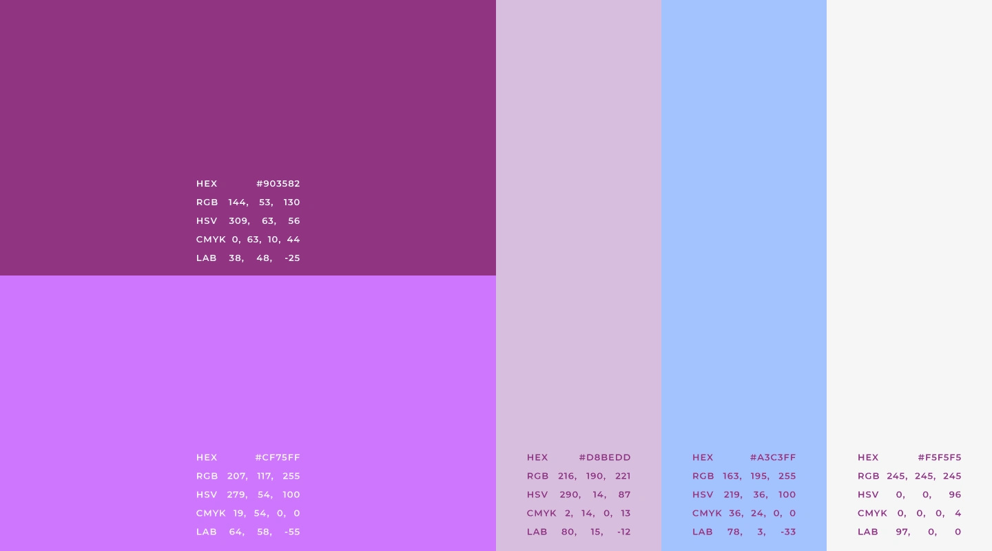
Main Color Palette.
Suggested Use and Proportion of the Institutional Color Palette
The proportion of use of institutional colors was initially based on the 60/30/10 rule, with possibilities for future adjustments. The color sequence can be changed, respecting the suggested proportions.
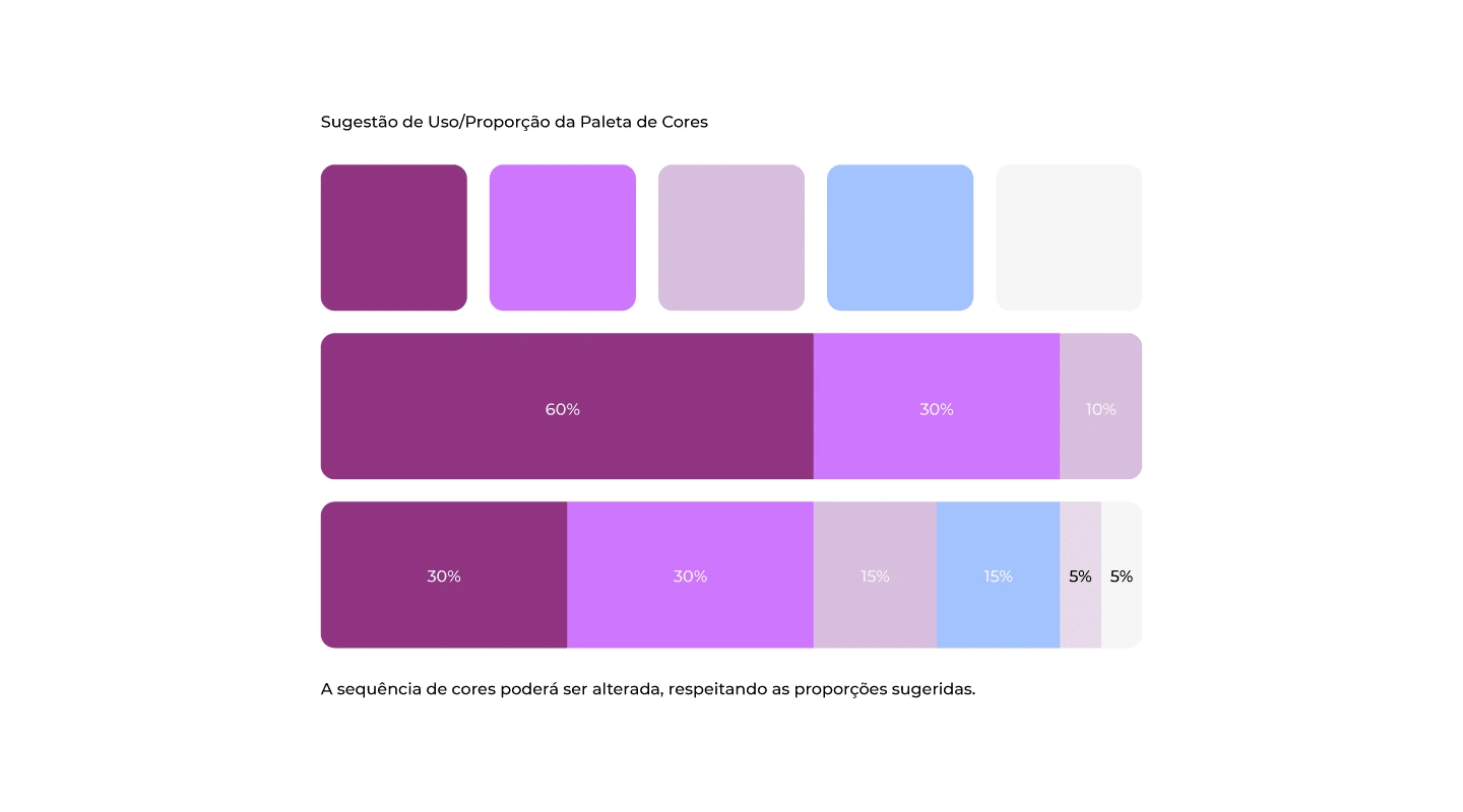
Proportion Color Palette.
Logo Typography
When composing typographic studies, a very important point was taken into consideration: the fact that typography is the voice of a brand, and it is extremely important to make a safe choice of it and that thus translate the desired personality and essence. Based on this principle and the study of archetypes (with foundations in Carl Jung's theories and studies by Margaret Mark and Carol S. Pearson - in the book The Hero and the Outlaw), it was defined that the brand has as its typographic archetype of the Helpful.
The Helpful person is an altruist, driven by compassion, generosity and the desire to help others. He fears instability and difficulty, not so much for himself, but for the impact on people who are less fortunate or less resistant to shocks. The Helpful archetype is perceived in practically any activity related to the provision of services, health care, well-being or food.
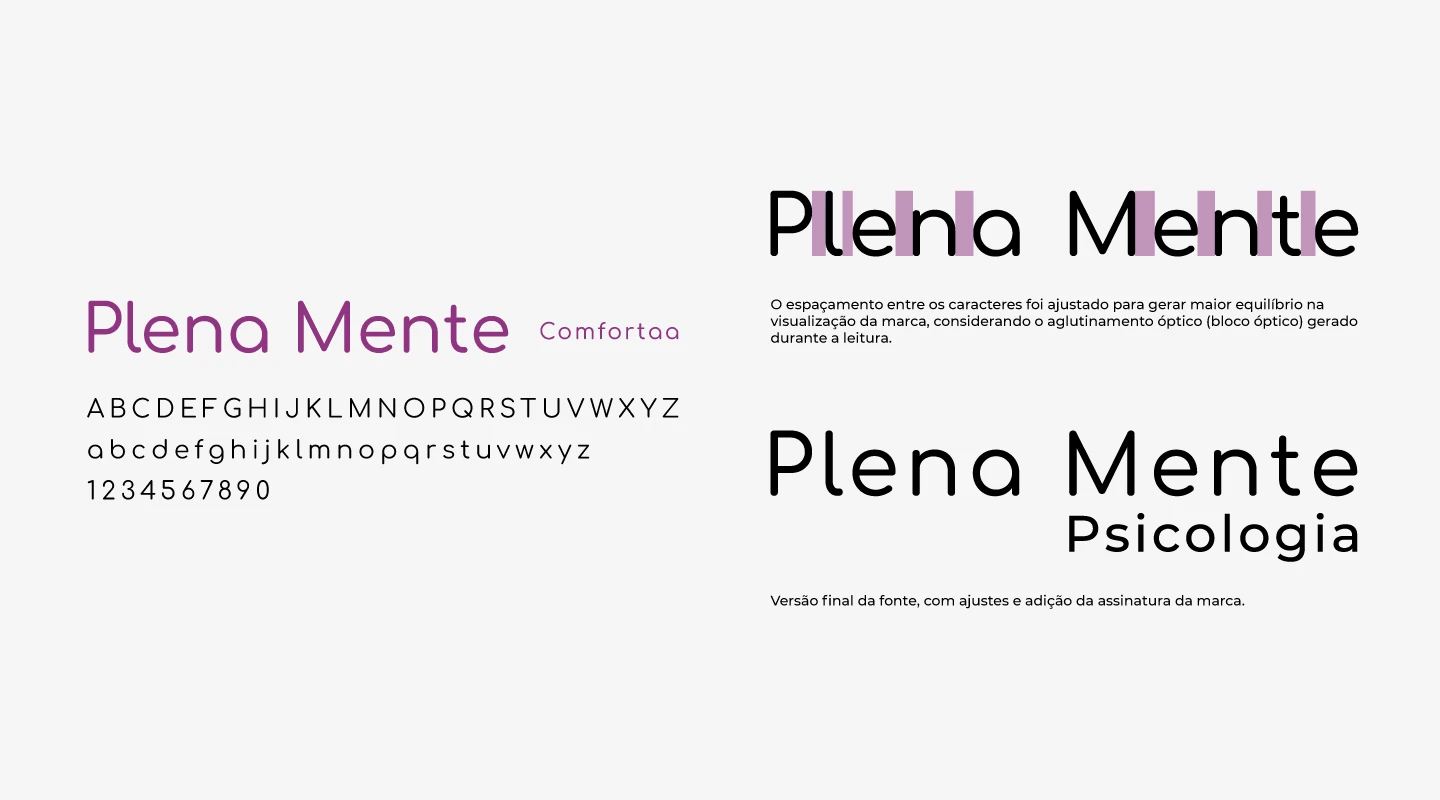
Final version of the font, with adjustments and addition of the brand's signature.
The spacing between the characters was adjusted to generate greater balance in the visualization of the brand, considering the optical agglutination (optical block) generated during reading.
After choosing the main typography, it is necessary to carry out the process known as Typographic Pairing. Different font styles can be combined to support the main typography, and also to balance reading, whether long or short texts or any other form of brand communication. Below are the selected typographic families that best match the brand’s main font:
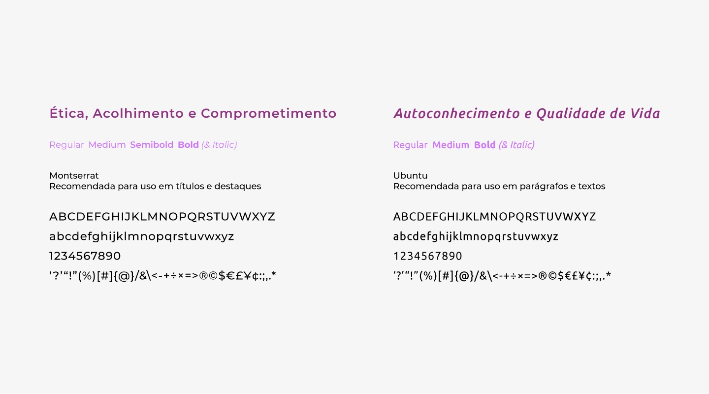
Recommended fonts for use in titles, highlights, paragraphs and texts.
Brand Concept
The initial inspiration for creating the symbol were the 4 members of the psychology office, Adriana, Amanda, Leticia and Renata.
The flowers that make up the symbol were based on tulips, which according to cultures around the world represent tranquility, peace, prosperity, forgiveness and several other meanings.
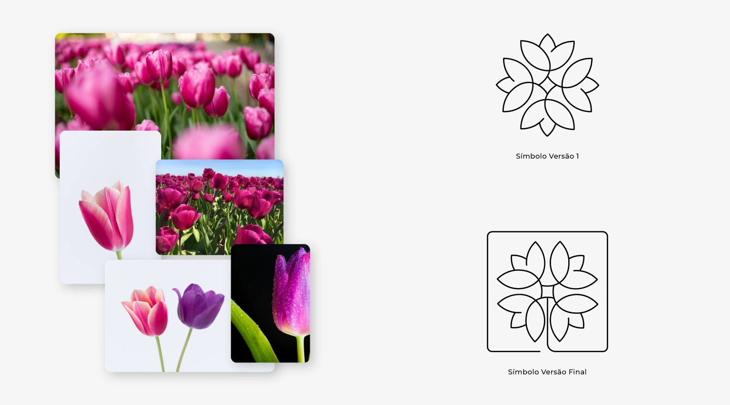
The graphic symbol in its initial and then final version.
Personalized Flower in minimalist style
In the center of the symbol, the shape of a diamond was included, which according to heraldry represents femininity. Furthermore, this geometric shape centralizes and represents the link between the members of the office.
The final version received a frame that originates from the center of the symbol, representing external elements that are often internalized, noticed from the moment we look “inside”.
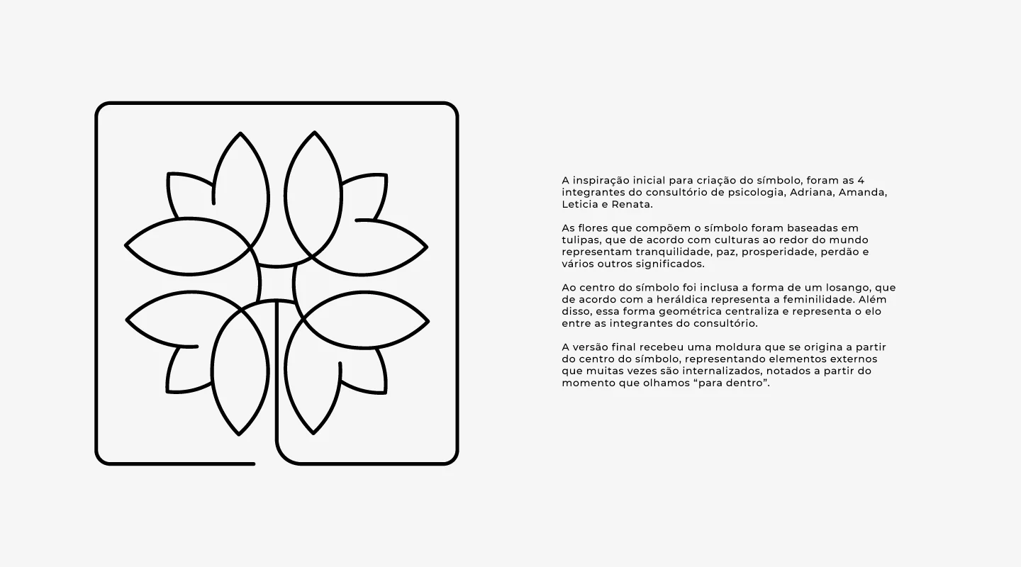
The final version of the graphic symbol.
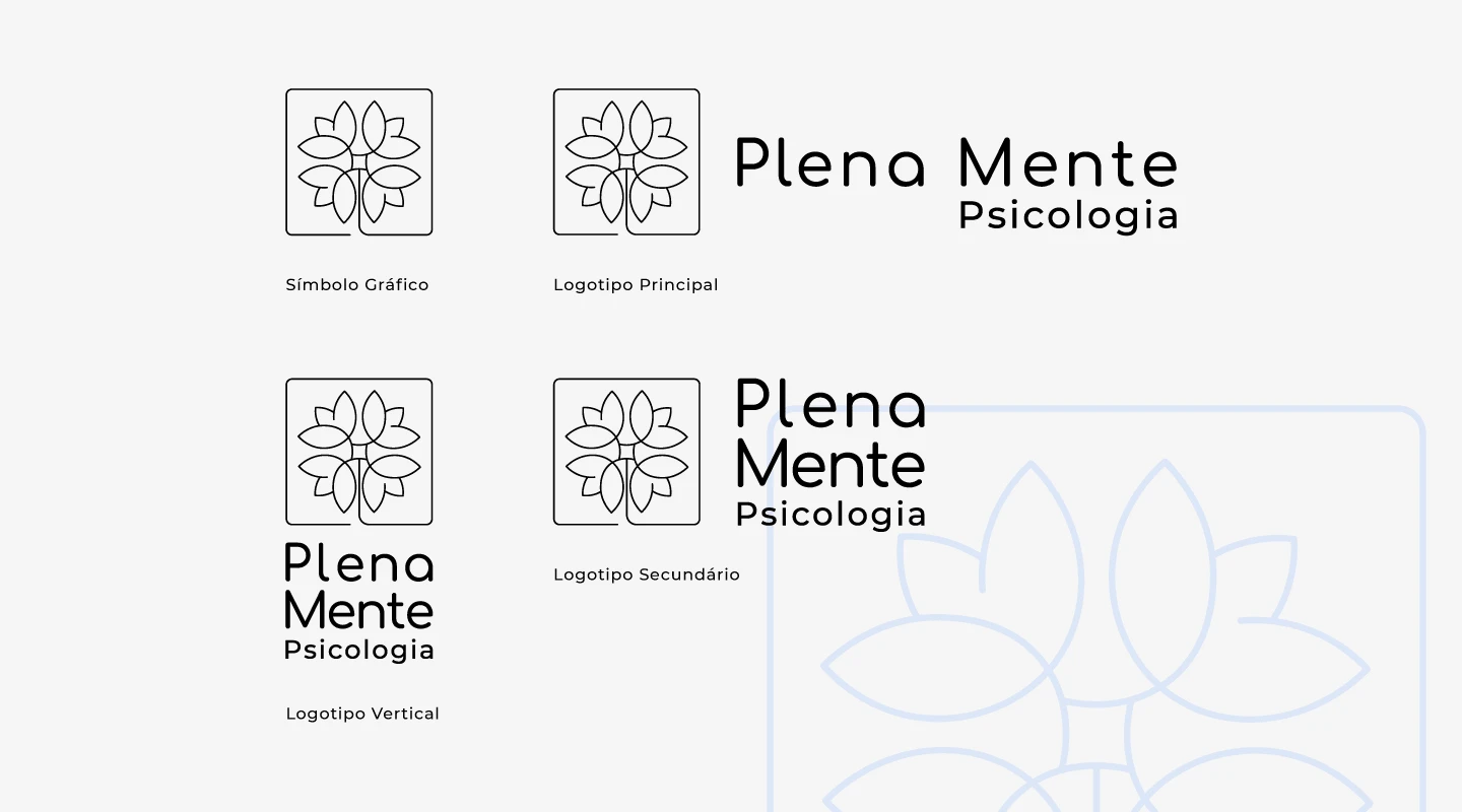
The brand and its possible uses. Graphic symbol, main, secondary and vertical logo.
Applications of the Main Brand in the Color Palette.
Applications of the Main Brand in the Color Palette.
Applications of the Secondary Brand in the Color Palette.
Applications of the Secondary Brand in the Color Palette.
Applications of the Seal Version Brand in the Color Palette.
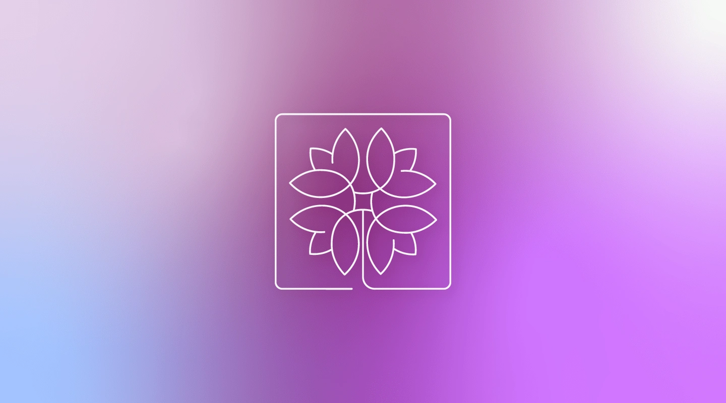
The Graphic Symbol.
Graphic Elements
The brand received a pattern with the graphic symbol, visually interconnected and forming a network of connections, support or even a collective interpretation in accordance with the fundamental values of the office. The fill size and colors can be changed, depending on usage needs.
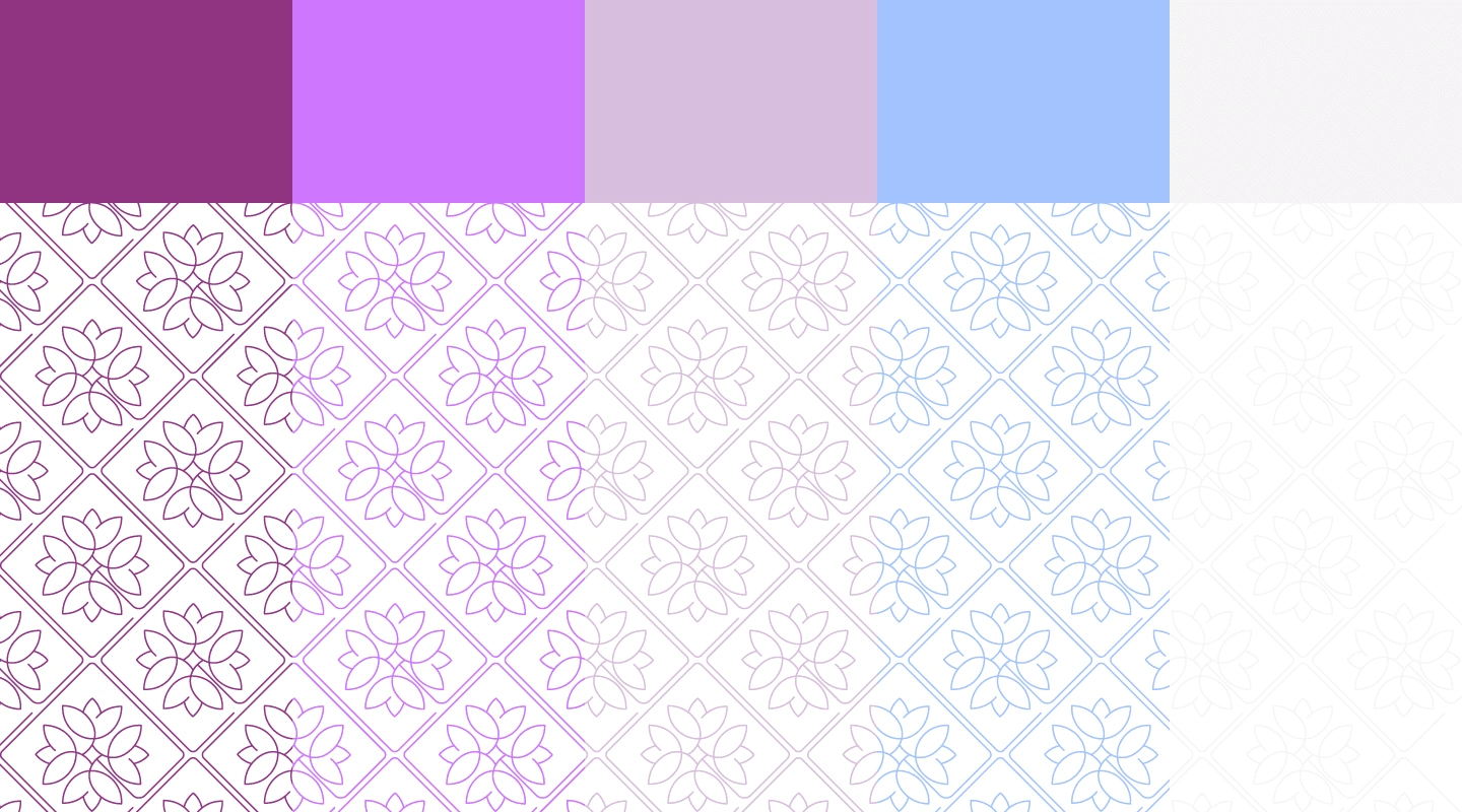
Graphic Symbol Pattern Composition.
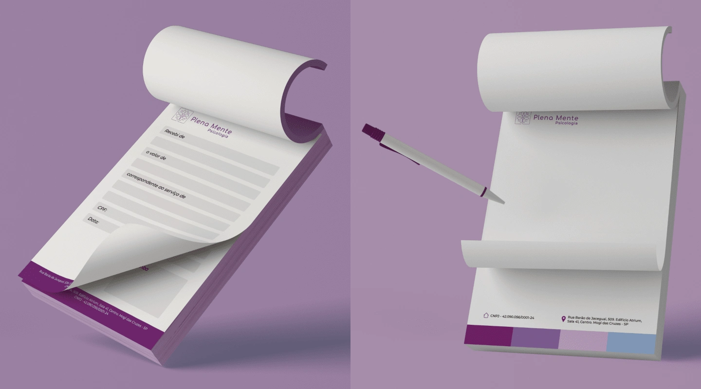
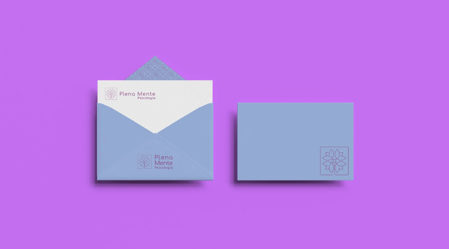
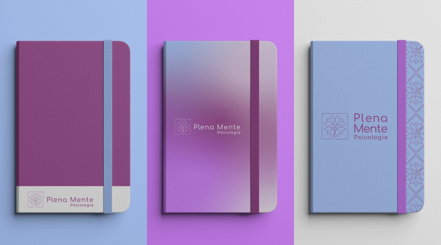
Brand Applications
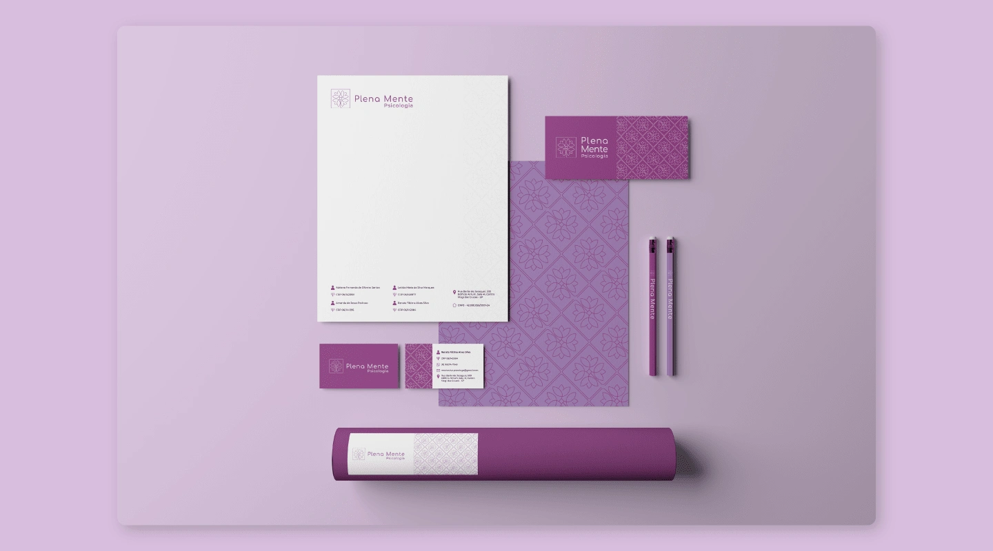
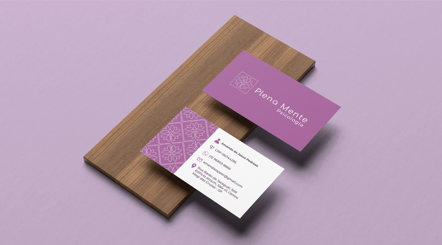
Thank You!
Like this project
Posted May 13, 2024
Plena Mente Psicologia is an office where every detail is carefully thought out, so that people feel welcomed in their pain and can express themselves...

