Brand Design - São Saúde 🏥
About the Brand
São Saúde is a specialty medical clinic, focused on providing B2B services (small and medium-sized companies).
Accessibility, effective solutions, ethics, safety and variety of services offered are the main differentials of the São Saúde clinic.
São Saúde - Unlimited Well-Being!

The brand's main logo.
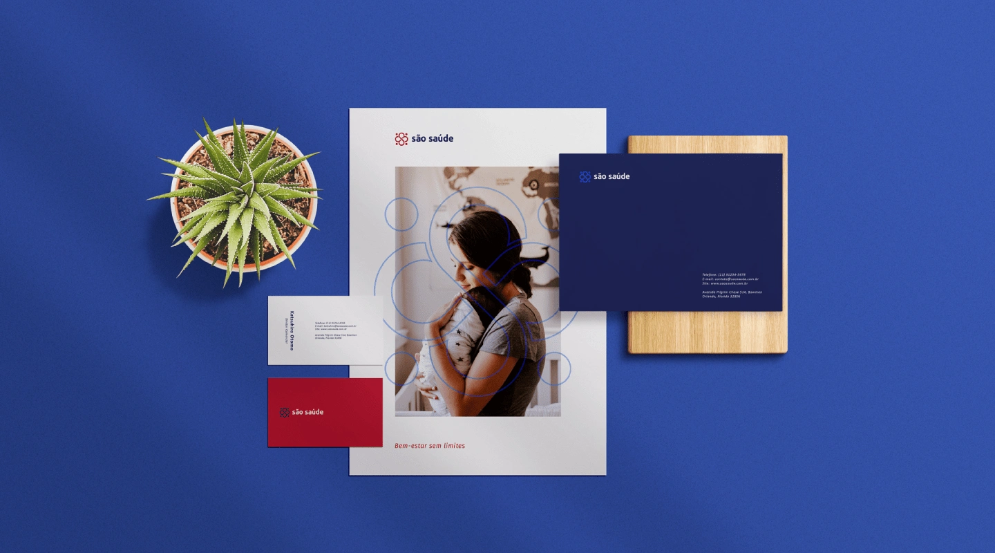
Some elements of the brand kit.
Brand Persona
São Saúde is: Attentive, Careful, Efficient, Ethical, Excellent, Modern, Helpful and Serious.
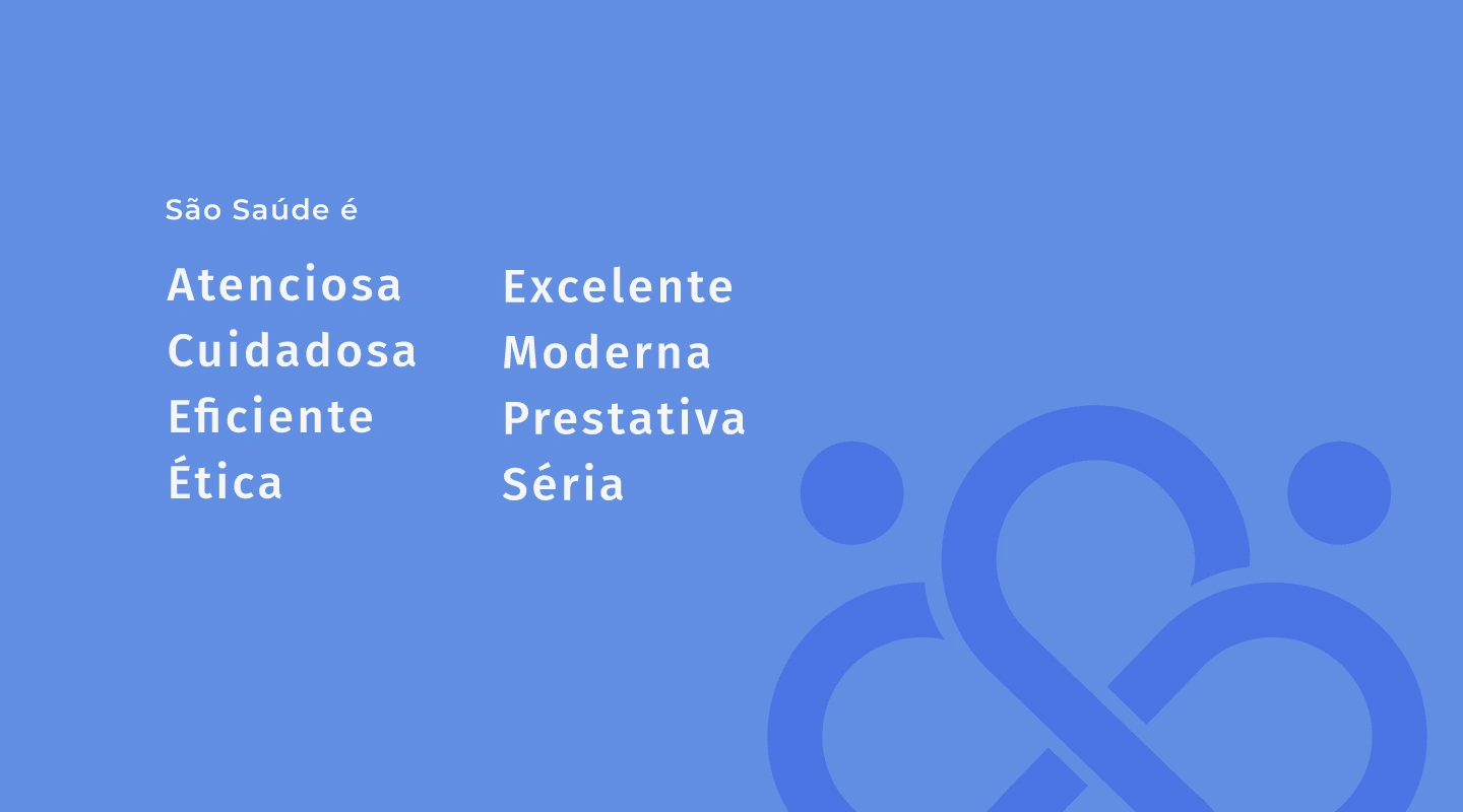
The Brand Persona.
Color Palette & Font System
Color Palette Study
In summary and taking as a starting point some words mentioned in the brand's Mission, Vision and Values, such as: Accessibility, Effective Solutions, Ethics, Safety and Service Variety, several studies were carried out focusing on colors and their importance in the branding process. According to Color Psychology, there is a range of words that represent certain colors, most common in our daily lives, such as blue, red, yellow, green, orange, purple and even black.
For words related to the brand, the colors that were chosen and do justice to the Mission, Vision and Values are: Deep Navy Blue, Vibrant Blue, Deep Red, Bright Orange and Golden Yellow.
Vibrant Blue signifies clarity, focus, and effectiveness, reflecting the clinic’s dedication to offering accessible and efficient healthcare solutions. This blue also promotes a feeling of tranquility and peace, enhancing patient comfort.
Deep Red represents strength, urgency, and care, which are vital in the medical field. This red communicates the clinic’s commitment to addressing health concerns promptly and with utmost dedication, ensuring patient well-being.
Bright Orange embodies energy, innovation, and enthusiasm, highlighting the clinic’s dynamic approach to healthcare services. It also suggests a welcoming and friendly atmosphere, making patients feel at ease.
Golden Yellow conveys optimism, warmth, and positivity, reflecting the clinic’s mission to promote well-being without limits. This color also suggests transparency and trustworthiness, enhancing the clinic’s reputation.
These chosen colors perfectly reflect the values and mission of the São Saúde clinic. Each color brings positive meanings that reinforce the identity of the clinic as a trustworthy, effective and welcoming healthcare provider. By using these colors, the brand visually communicates its ideals of accessibility, safety, and comprehensive care, creating a reassuring and professional experience for its clients.
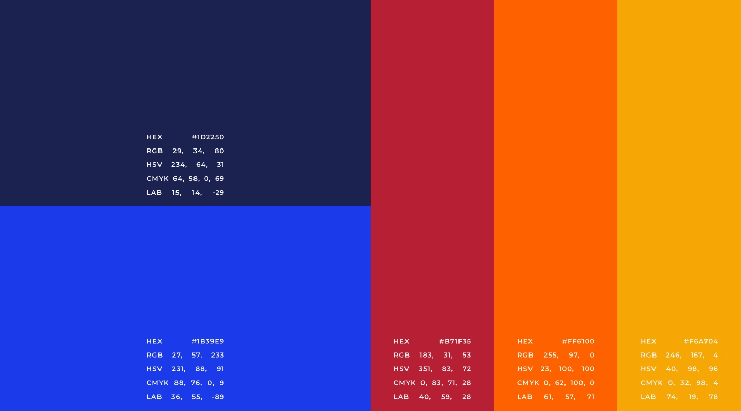
Main Color Palette.
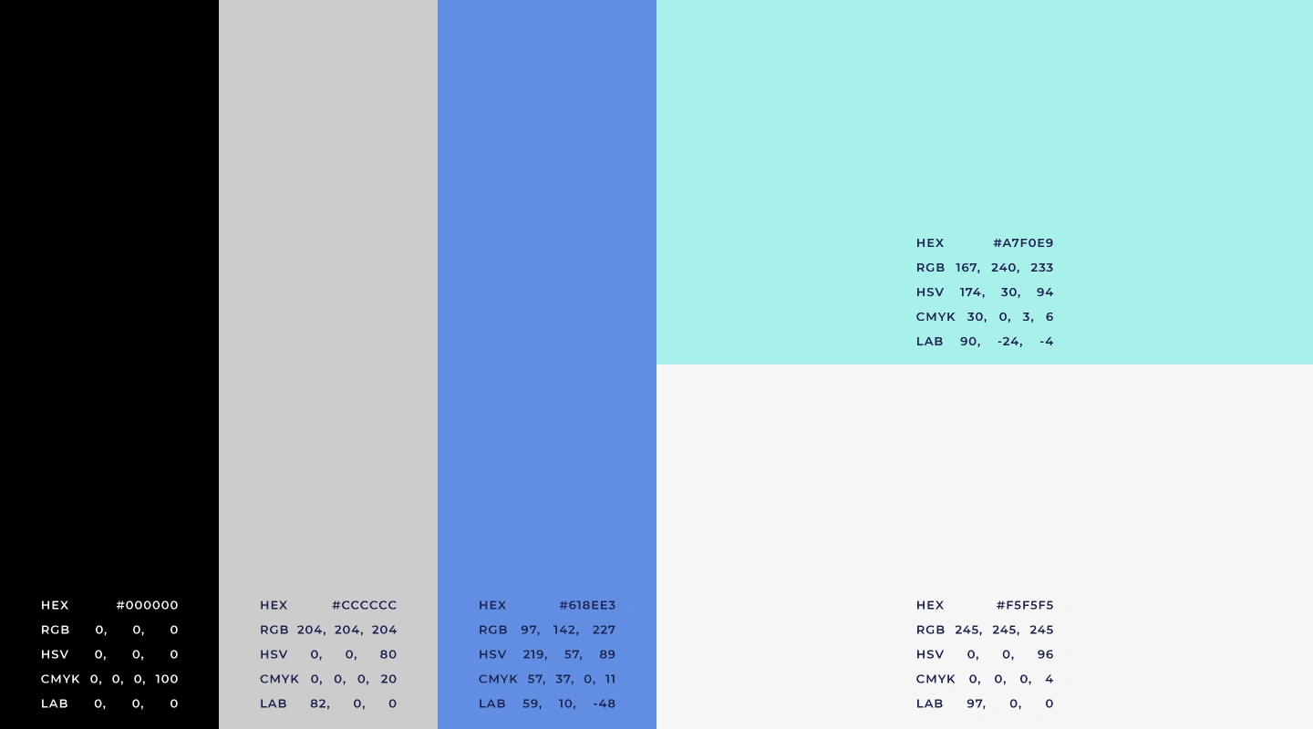
Secondary Color Palette.
Suggested Use and Proportion of the Institutional Color Palette
The proportion of use of institutional colors was initially based on the 60/30/10 rule, with possibilities for future adjustments. The color sequence can be changed, respecting the suggested proportions.
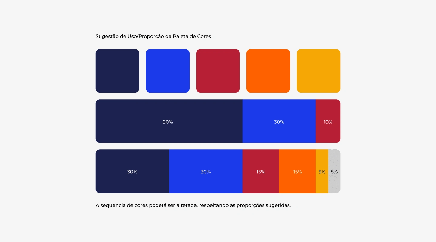
Proportion Color Palette.
Logo Typography
When composing typographic studies, a very important point was taken into consideration: the fact that typography is the voice of a brand, and it is extremely important to make a safe choice of it and that thus translate the desired personality and essence. Based on this principle and the study of archetypes (with foundations in Carl Jung's theories and studies by Margaret Mark and Carol S. Pearson - in the book The Hero and the Outlaw), it was defined that the brand has as its typographic archetypes the combination of the Wise and Helpful.
The Wise seeks the ultimate truth that will free him, living fully is his goal. Through knowledge of processes and information flows, he wants to control, measure, evaluate and validate. It is the specialist archetype, methodical and detailed. Identifies with brands/products that encourage creativity, intellectual skills and everything more that makes you think and reason (the truth will set you free).
The Helpful person is an altruist, driven by compassion, generosity and the desire to help others. He fears instability and difficulty, not so much for himself, but for the impact on people who are less fortunate or less resistant to shocks. The Helpful archetype is perceived in practically any activity related to the provision of services, health care, well-being or food.
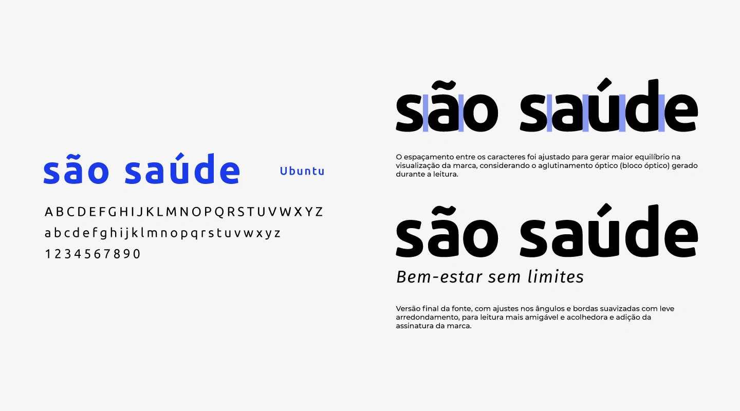
The final version of the font with adjustments for more friendly and welcoming reading.
The spacing between the characters was adjusted to generate greater balance in the visualization of the brand, considering the optical agglutination (optical block) generated during reading. The final version of the font, with adjustments to angles and smoothed edges with slight rounding, for more friendly and welcoming reading and addition of the brand's signature.
After choosing the main typography, it is necessary to carry out the process known as Typographic Pairing. Different font styles can be combined to support the main typography, and also to balance reading, whether long or short texts or any other form of brand communication. Below are the selected typographic families that best match the brand’s main font:
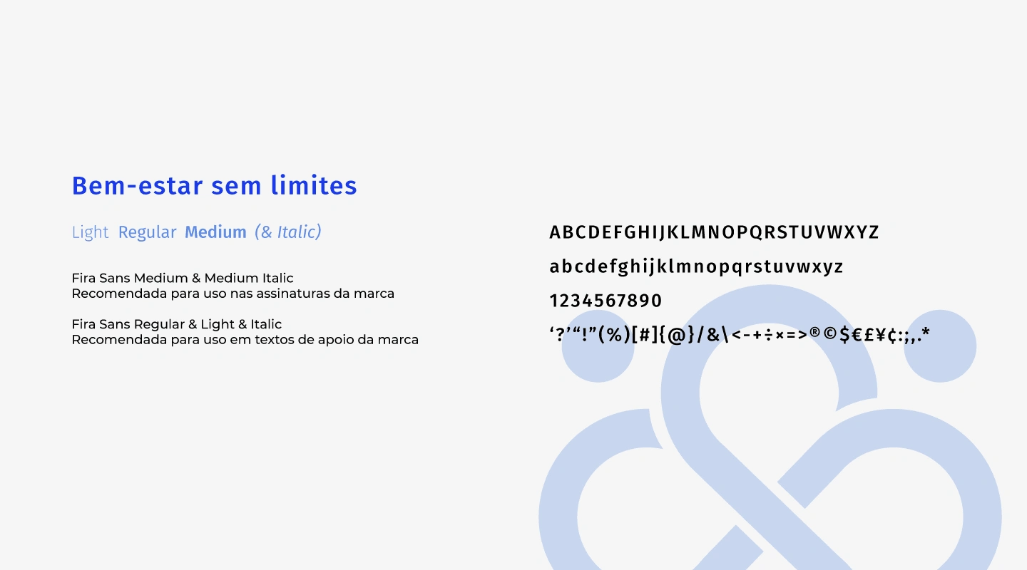
Recommended fonts for use in titles, highlights, paragraphs and texts.
Brand Concept
Letter S in minimalist style
The main idea for composing the graphic symbol was to follow the minimalist style, representing an stylized letter S + 4 points representing the symbol of infinity, longevity and the clinic's areas/teams.
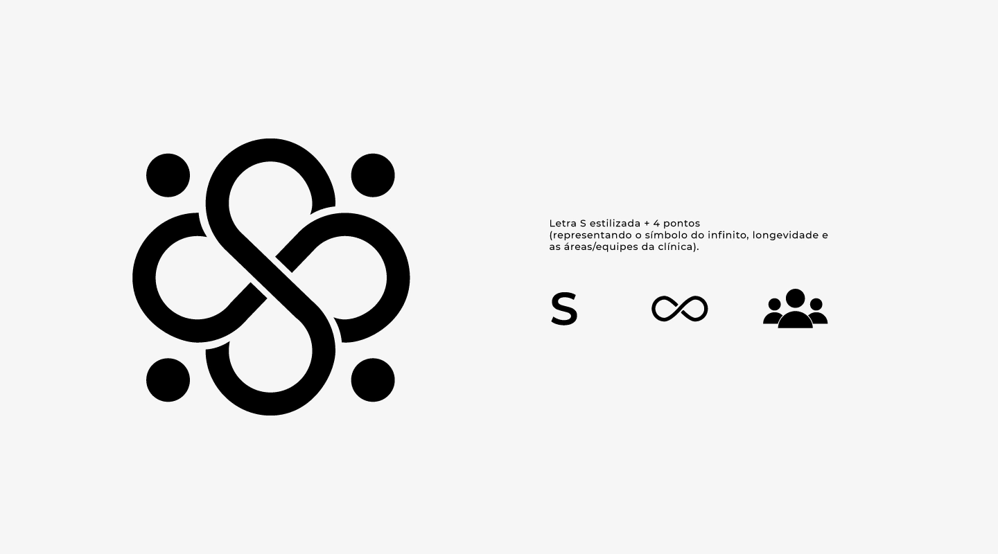
Graphic Symbol Development.
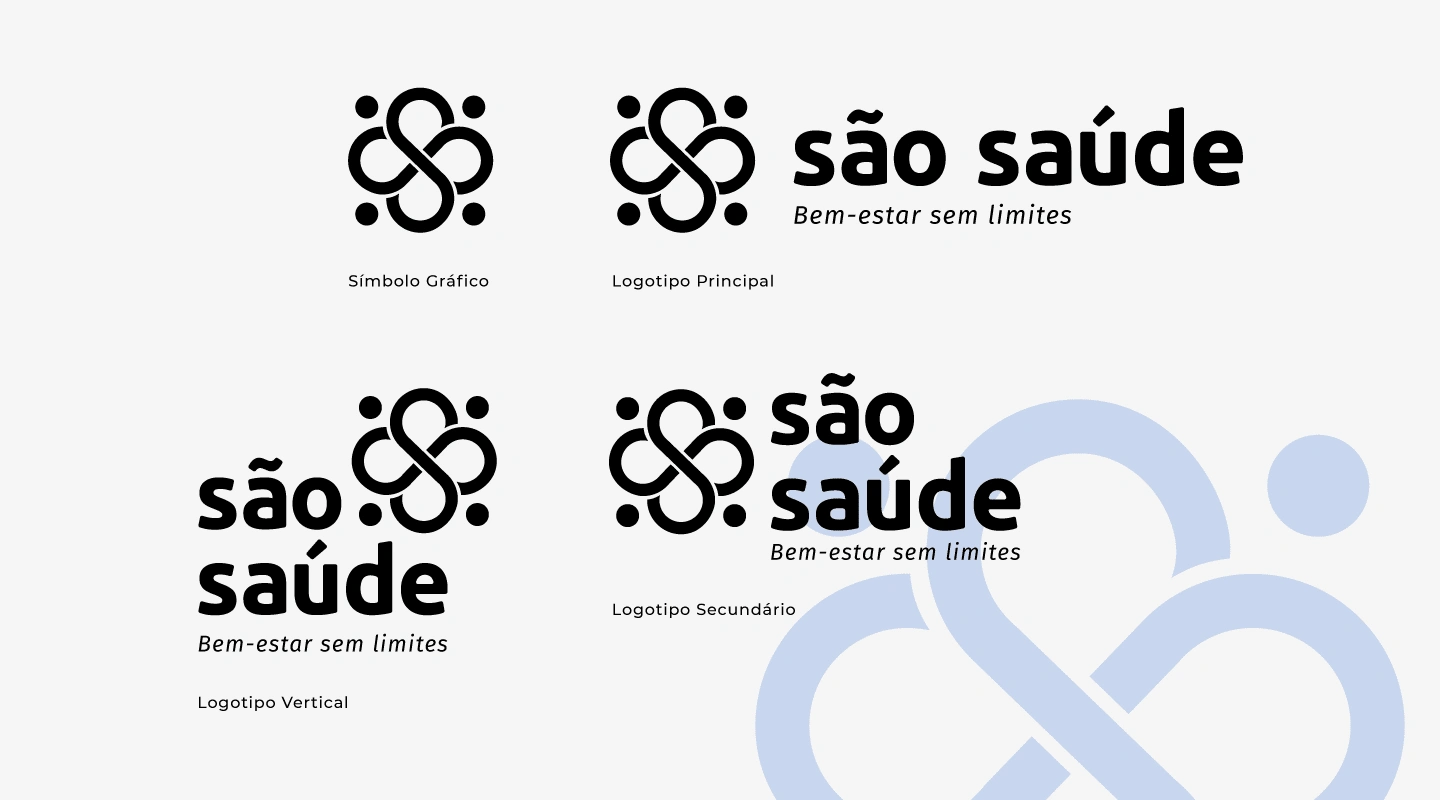
The brand and its possible uses. Graphic symbol, main, secondary and vertical logo.
Applications of the Main Brand in the Color Palette.
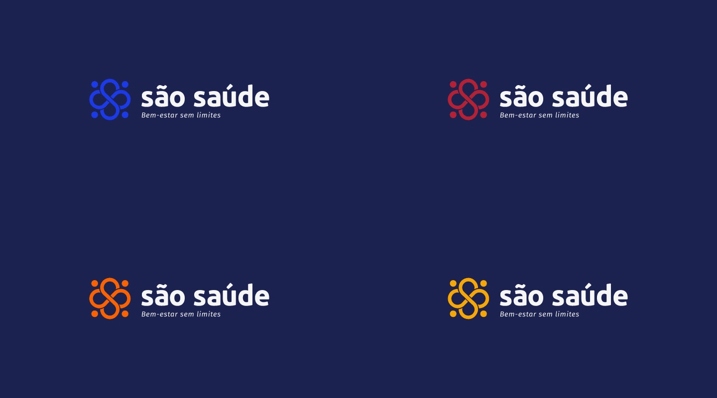
Applications of the Main Brand in the Color Palette.
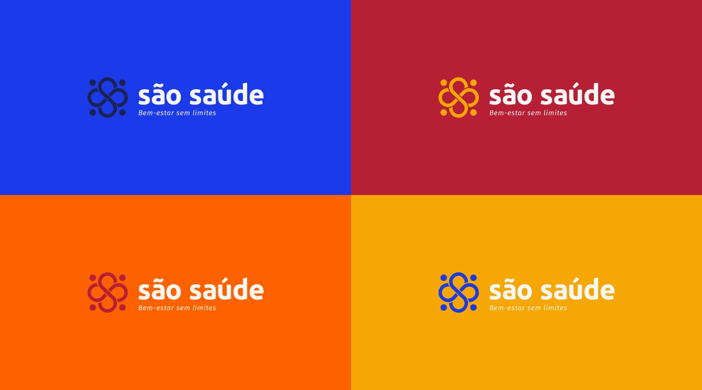
Applications of the Main Brand in the Color Palette.
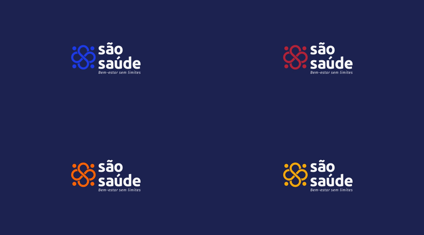
Applications of the Secondary Brand in the Color Palette.
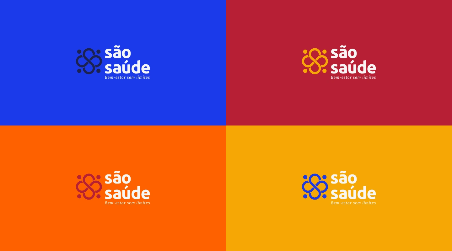
Applications of the Secondary Brand in the Color Palette.
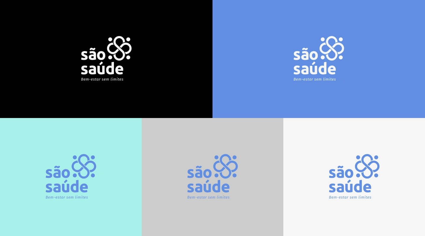
Applications of the Vertical Brand in the Secondary Color Palette.

The Graphic Symbol.
Graphic Elements
The brand received a pattern with the graphic symbol, visually interconnected and forming a network of connections, support or even a collective interpretation in accordance with the fundamental values of the clinic. The fill size and colors can be changed, depending on usage needs.
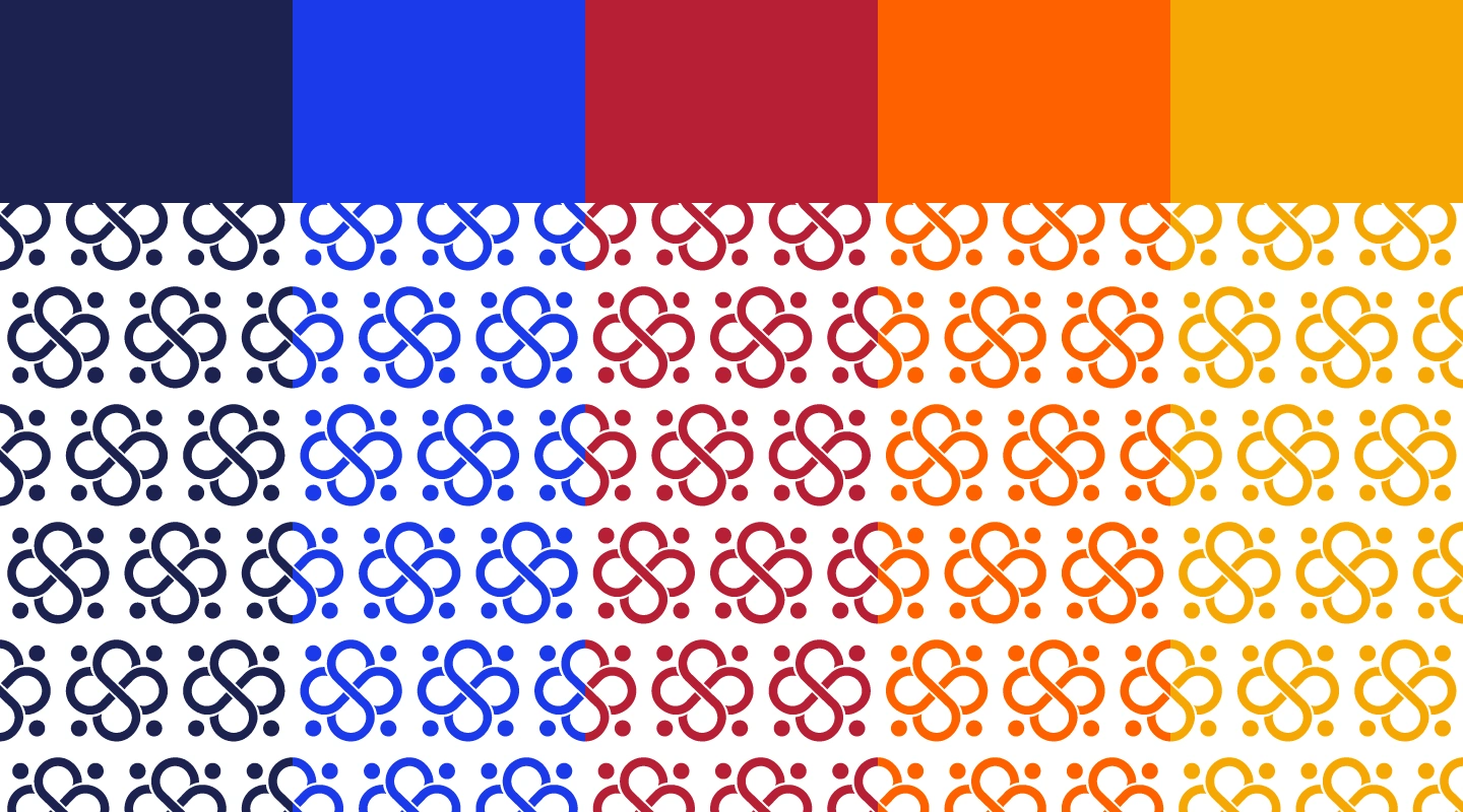
Graphic Symbol Pattern Composition.
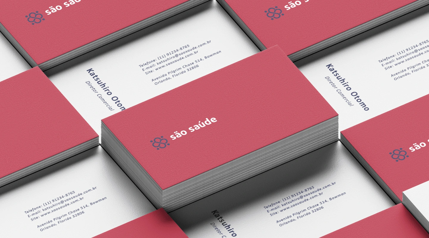
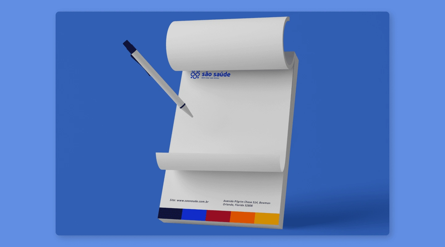
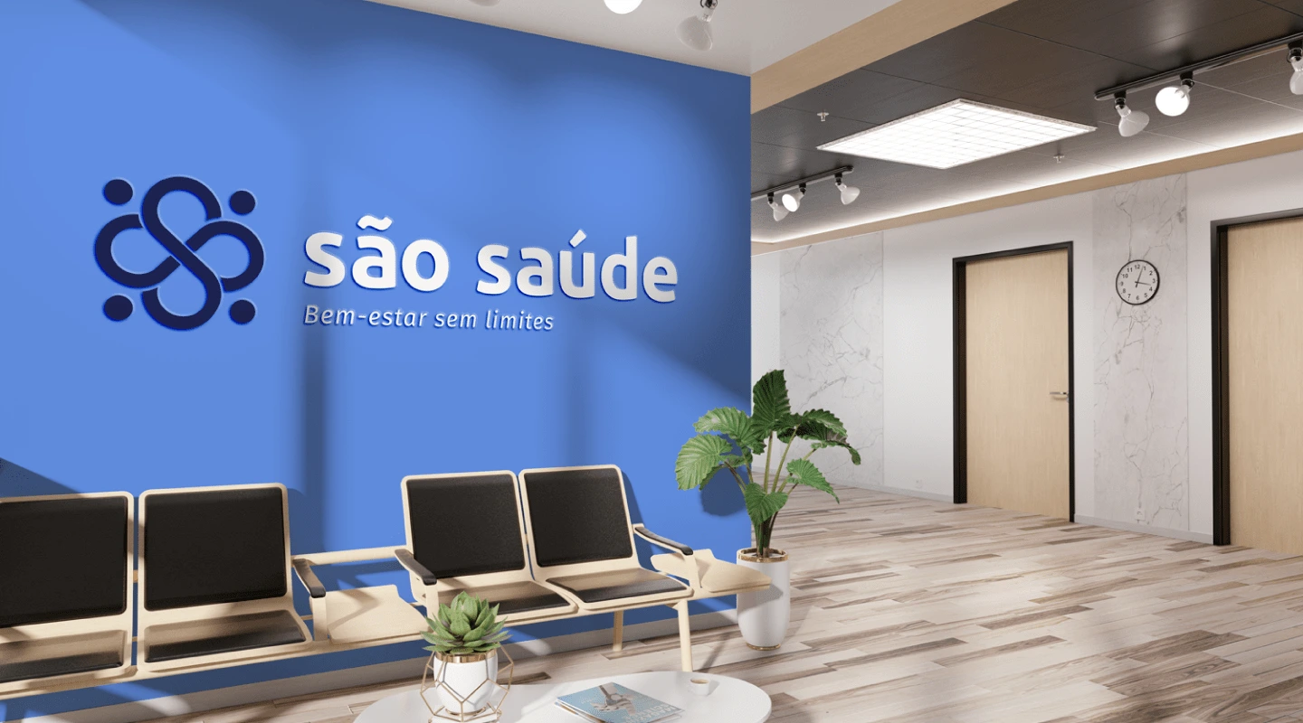
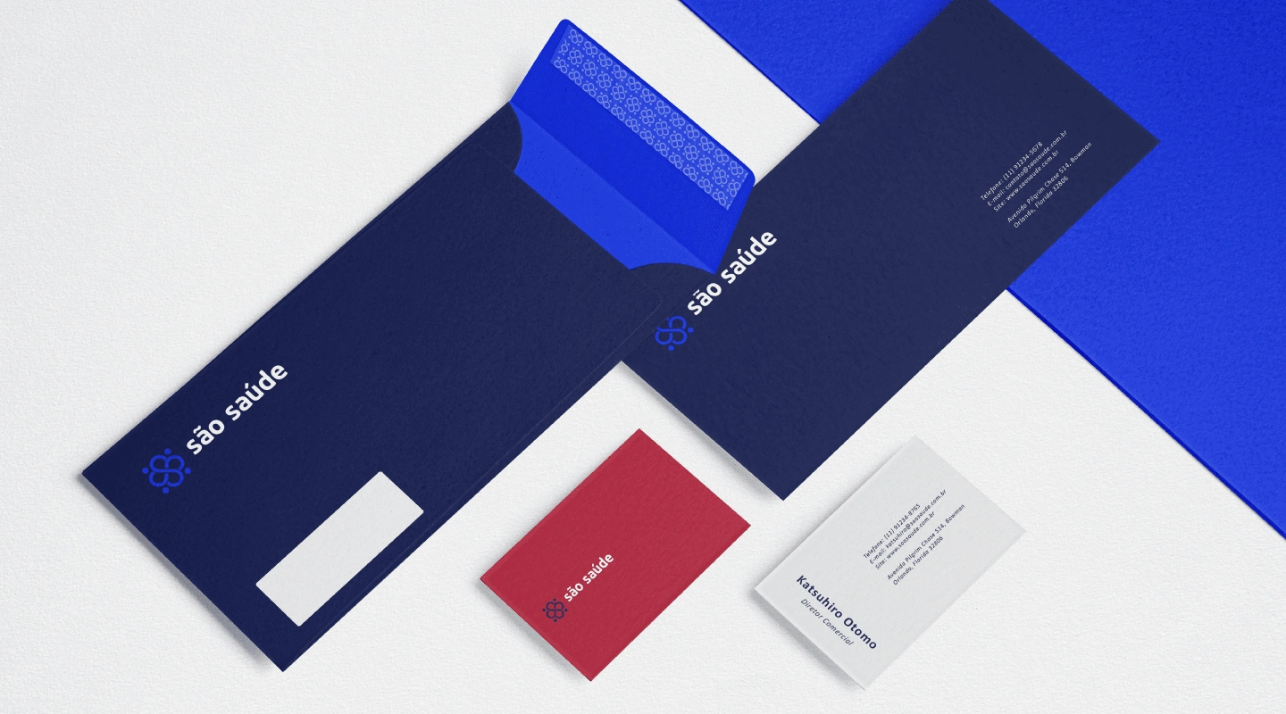
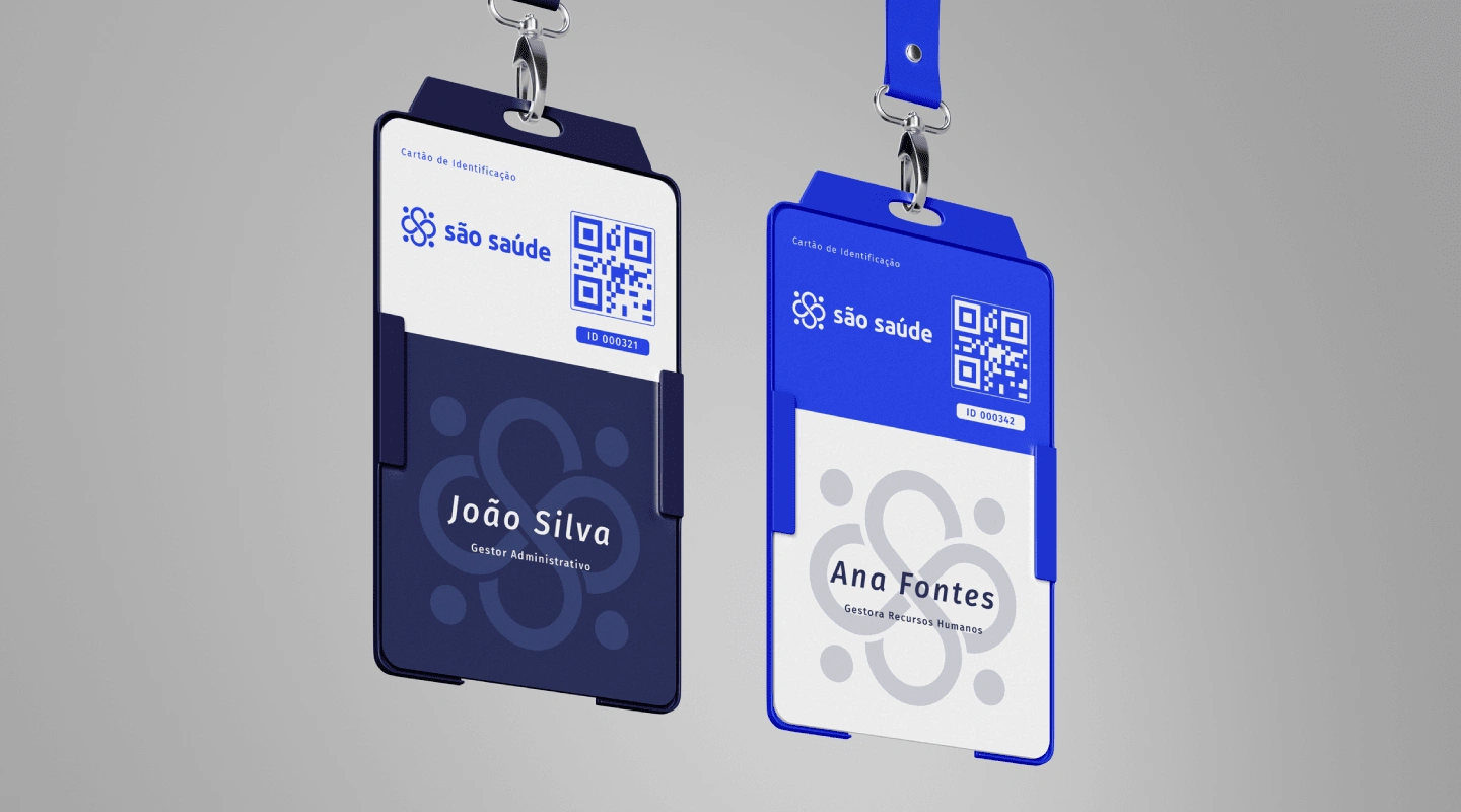
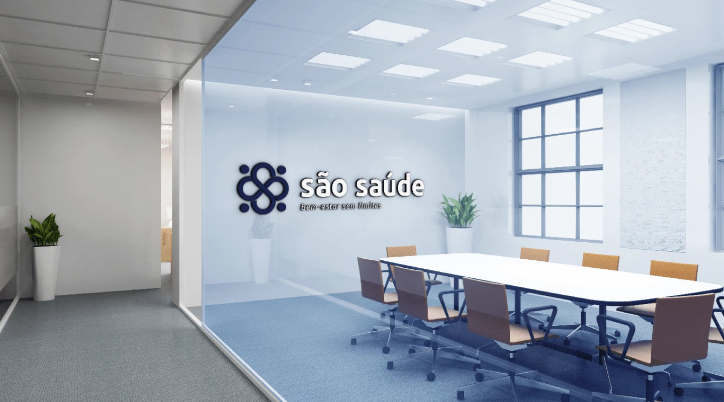
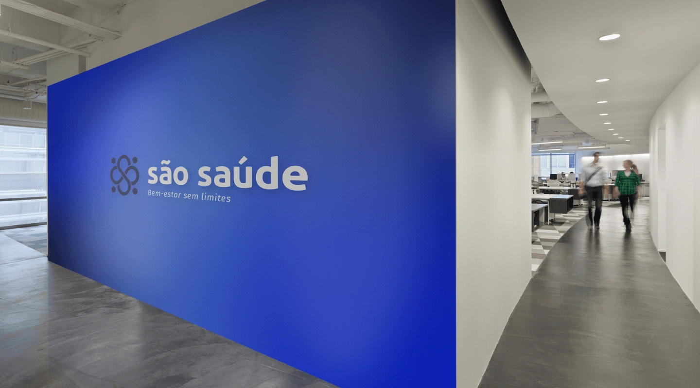
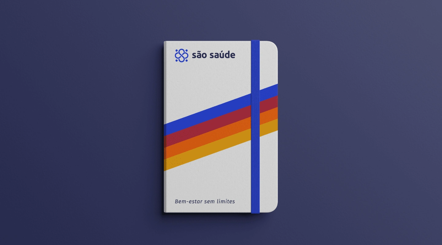
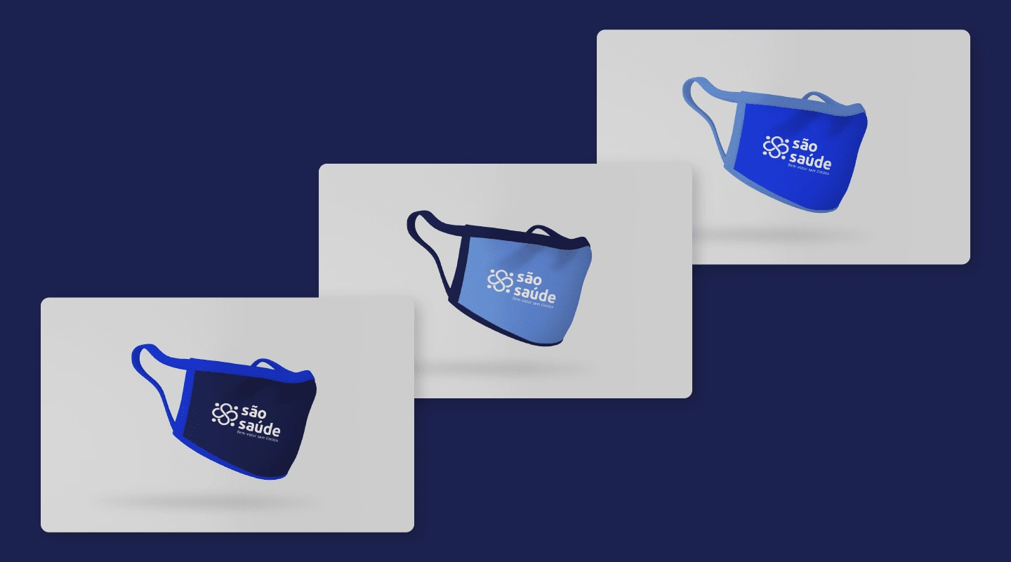
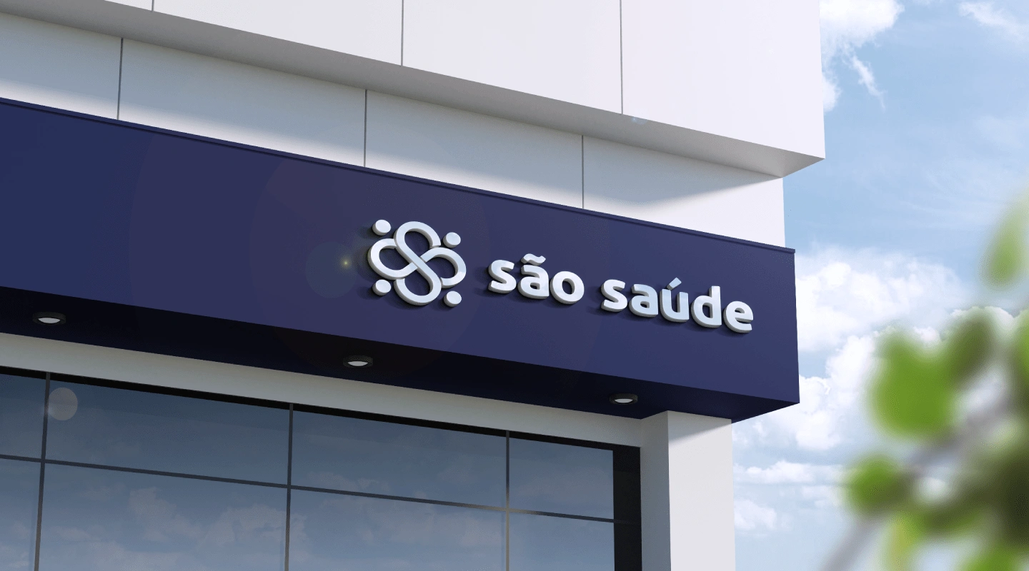
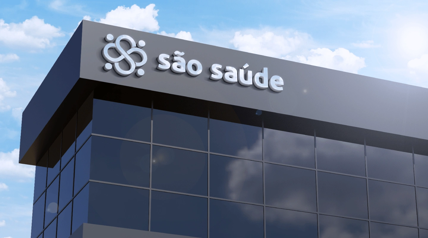
Brand Applications

Thank You!
Like this project
Posted May 25, 2024
São Saúde is a specialty medical clinic, focused on providing B2B services. Accessibility, effective solutions, ethics, safety and variety of treatments are...

