Brand Design - Débora Reis Beauty 💮
About the Brand
Débora Reis Beauty is a beauty salon whose proposal is to serve its customers in a unique way, with great professionals and a very welcoming space.
This space, where people feel free to be what they want, feel safe and confident to carry out the salon's aesthetic procedures. The name chosen for the brand is the same as the beauty salon owner. The origin of the name is from the Hebrew language, where "Debhoráh" means bee and has as symbologies representations of the soul, wisdom, resurrection, victory, qualities of hard work, effort and dedication.
Mission: To provide an excellent service experience and high quality procedures.
Vision: To be recognized as a reference in aesthetic treatments in the region.
Values: Commitment, Reception and Responsibility.

The brand's main logo.
Brand Persona
Débora Reis Beauty is: Modern, Elegant, Romantic, Excellent and Efficient.

The Brand Persona.
Color Palette & Font System
Color Palette Study
In summary and taking as a starting point some words mentioned in the brand's Mission, Vision and Values, such as: Excellence, Quality, Welcoming, Commitment and Responsibility, several studies were carried out focusing on colors and their importance in the branding process. According to Color Psychology, there is a range of words that represent certain colors, most common in our daily lives, such as blue, red, yellow, green, orange, purple and even black.
For words related to the brand, the colors that were chosen and do justice to the Mission, Vision and Values are: Black, Pink, Medium Pink, Light Pink and Ice White. White is seen as the color of innocence, good, perfection and even the minimalist style in the area of Design. It conveys the feeling of peace, cleanliness and is present in countless tones and items in our daily lives. Pink is considered the color of charm and kindness, it conveys affection and care for according to the tone used. It is considered the color of sentimentality and miracles in several world cultures, and is also linked to creativity for visual artists. Black is considered a conservative color, which conveys authority, elegance and is constantly associated with Design, Fashion and as a favorite among clothing options.

Main Color Palette.
The gradients developed aim to be applied to the brand's digital materials, posts and other elements that should provide this difference in institutional communication.
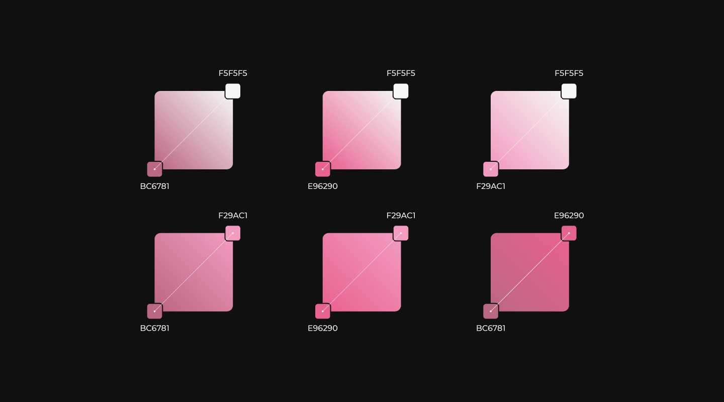
Color Palette Gradients.
Logo Typography
When composing typographic studies, a very important point was taken into consideration: the fact that typography is the voice of a brand, and it is extremely important to make a safe choice of it and that thus translate the desired personality and essence. Based on this principle and the study of archetypes (with foundations in Carl Jung's theories and studies by Margaret Mark and Carol S. Pearson - in the book The Hero and the Outlaw), it was defined that the brand has as its typographic archetypes the combination of the Lover and Helpful.
The Lover is strongly associated with several famous brands, mainly in the world of fashion and aesthetic beauty. It is characterized by the cult of beauty and the valorization of romance through the invocation of everything that manifests physical attraction and bodily admiration. The archetype of the Lover also evokes elegance, playfulness and romanticism in addition to various ephemeral pleasures.
The Helpful person is an altruist, driven by compassion, generosity and the desire to help others. He fears instability and difficulty, not so much for himself, but for the impact on people who are less fortunate or less resistant to shocks. The Helpful archetype is perceived in practically any activity related to the provision of services, health care, well-being or food.
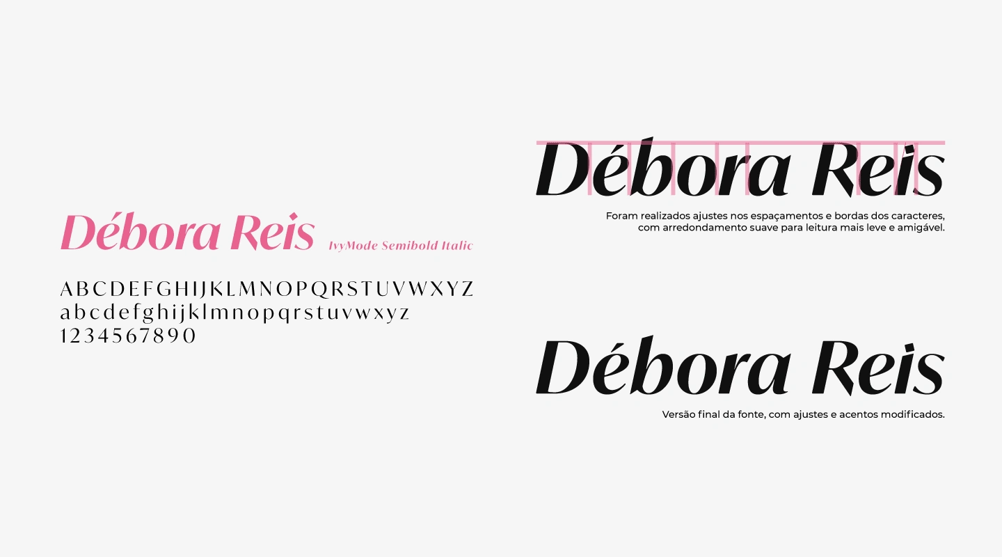
Final version of the font, with modified adjustments and accents.
Adjustments were made to the spacing and borders of characters, with light rounding for lighter and more friendly reading.
After choosing the main typography, it is necessary to carry out the process known as Typographic Pairing. Different font styles can be combined to support the main typography, and also to balance reading, whether long or short texts or any other form of brand communication. Below are the selected typographic families that best match the brand’s main font:

Recommended fonts for use in titles, highlights, paragraphs and texts.
Brand Concept
The main idea for composing the graphic symbol was to follow the minimalist style, representing an open flower seen from above. Using Illustrator's Pathfinder tool to cut the previous composition, it was possible to arrive at the minimalist symbol of an open flower.
After adjusting the thickness of the contours and discarding excess shapes, it was possible to better define the composition of the flower and its petals. The final version of the flower received adjustments to the external edges, becoming more rounded and to the internal part, color filling was applied.
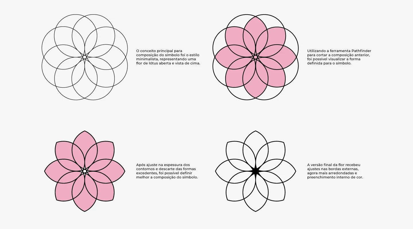
Graphic Symbol Development.
Personalized Lotus Flower in minimalist style
The lotus flower symbolizes, for many people around the world, elegance, beauty, perfection, purity and grace, and is often associated with feminine attributes. For science, the lotus flower still represents a mystery that scientists cannot explain: its characteristic of repelling microorganisms and dust particles.
The white lotus is generally related to the perfection of the spirit and mind, a state of total purity and immaculate nature, normally represented with 8 petals (same as the symbol developed). The pink lotus is considered the most important and special of all its variations, being related to divine characters, such as the Great Buddha. The lotus flower in its full and open form also represents the creation of the Universe.

Graphic Symbol Composition.
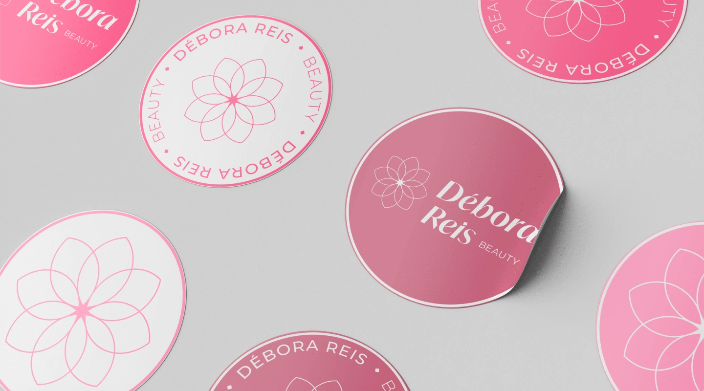
Brand Applications on Color Palettes Gradients.

Brand Applications on Color Palettes.
Brand Applications on Color Palettes.
Graphic Elements
The brand received some supporting graphic elements, such as patterns and textures related to the universe of beauty and the main values attributed since the beginning of the project.
The selected textures aim to be applied to the brand's digital materials, posts and other elements that should provide this difference in institutional communication. In the case of applications in printed materials, the colors must be chosen based on a reference card, provided by the service provider/printer responsible for producing the material.
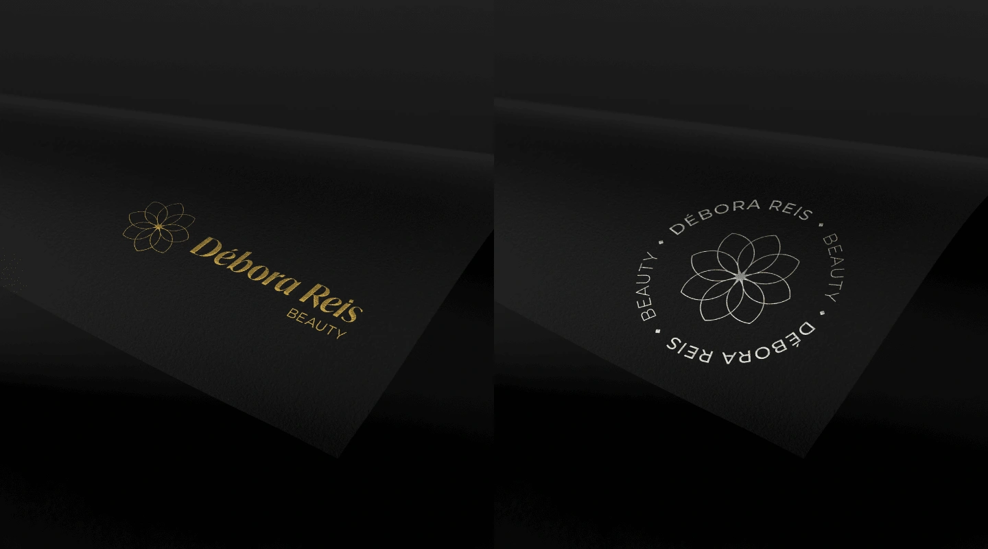
Special Textures: Rose Gold, Gold and White Gold.

Patterns and Special Textures of the Brand.
Brand Application with Rose Gold Texture.
Brand Application with Gold and White Gold Texture.
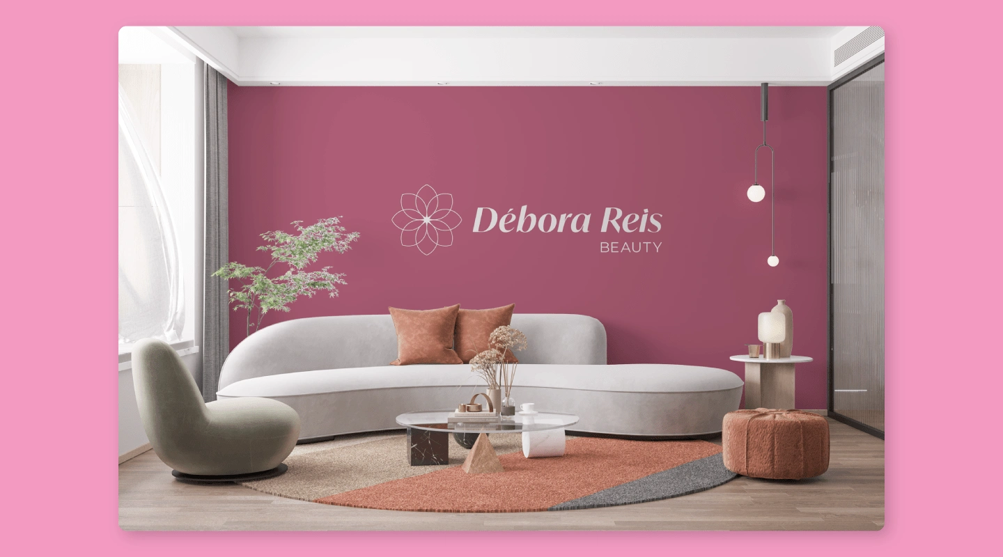
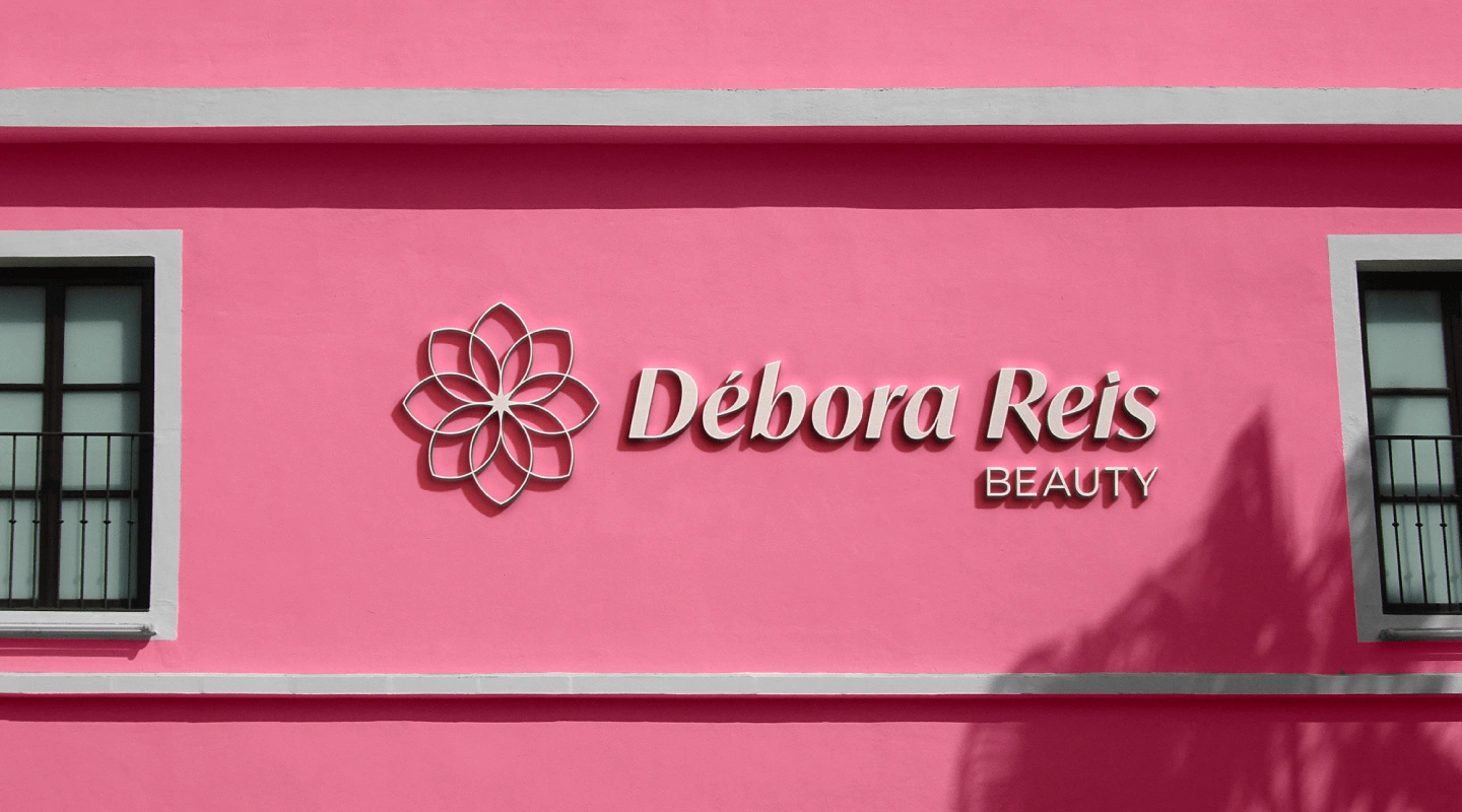
Brand Applications


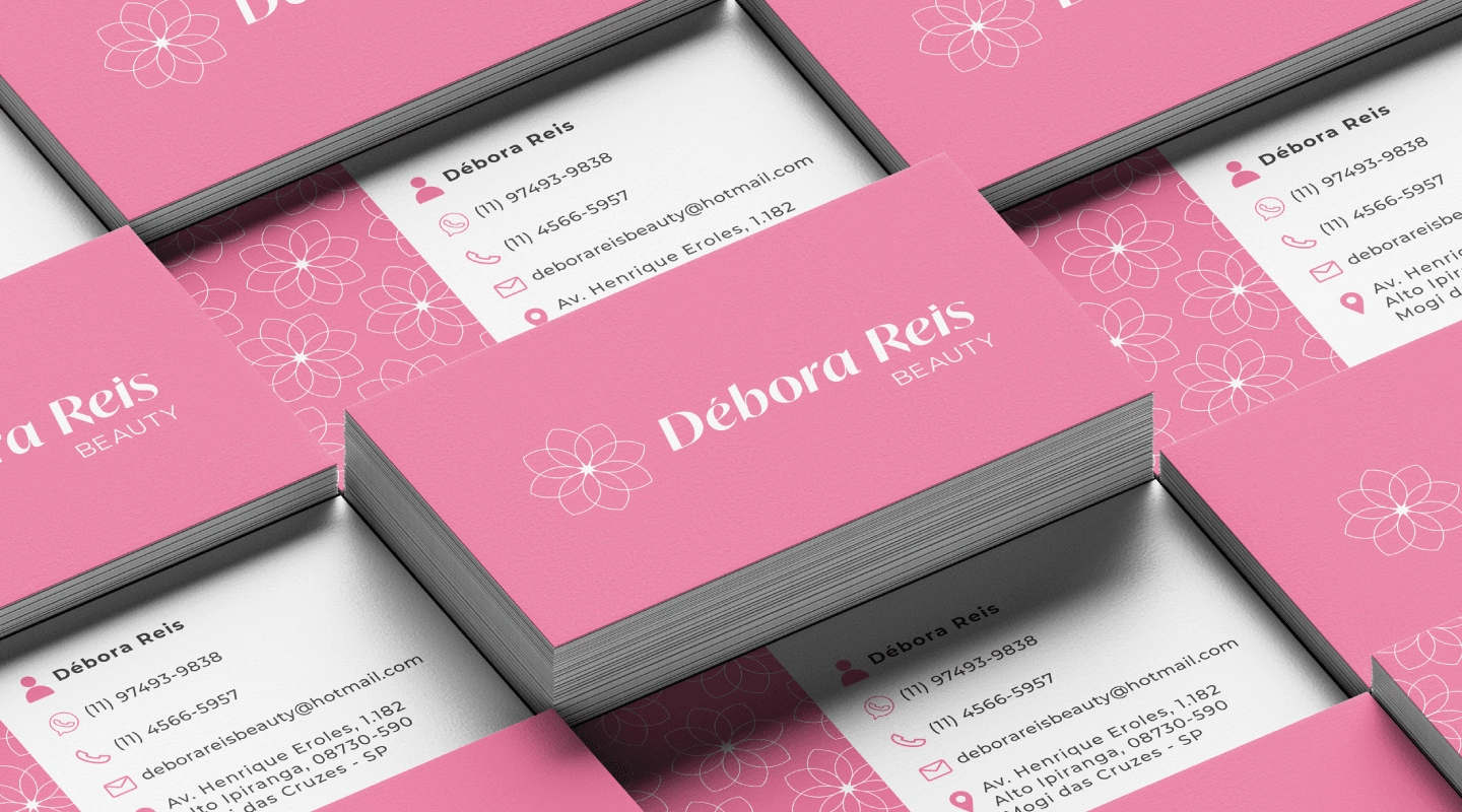


Thank You!
Like this project
Posted May 12, 2024
Débora Reis Beauty is a beauty salon whose proposal is to serve its customers in a unique way, with great professionals and a very welcoming space...


