Brand Design - Moranga Café 🍰
About the Brand
Moranga Café is an affective space in Aracaju - Sergipe/Brazil, with plant-based and vegetarian options with lots of flavor and love involved.
A space that is not just about cooking and barista techniques! We use our ideals, our love, our faith - not as a religion - but as a movement of life, what motivates us every day.
Sustainable food consumption and processes in perspectives that approach the territoriality of eating habits, local gastronomy from its ecosocial tendency.
Self-love, to the next and for the work, which leads us to build with our hands. We have dreams about a sustainable future for everyone!
The brand's main logo.
Brand Persona
Moranga Café is: Artistic, Caring, Affectionate, Creative, Fun and Outgoing.
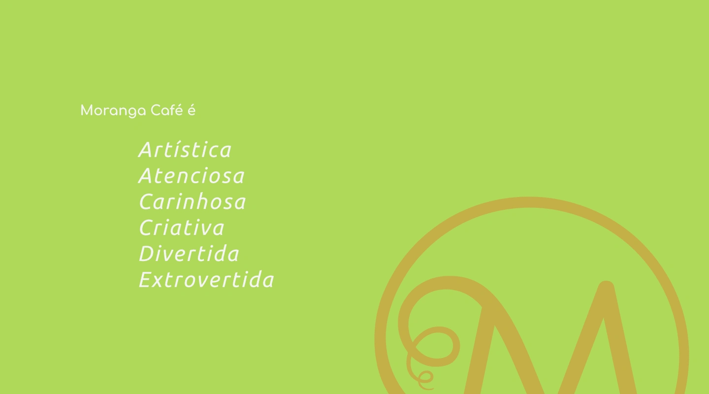
The Brand Persona.
Color Palette & Font System
Color Palette Study
In summary and taking as a starting point some words mentioned in the brand's Mission, Vision and Values, such as: Self-love, Sustainability, Community, Innovation and Passion, several studies were carried out focusing on colors and their importance in the branding process. According to Color Psychology, there is a range of words that represent certain colors, most common in our daily lives, such as blue, red, yellow, green, orange, purple and even black.
For words related to the brand, the colors that were chosen and do justice to the Mission, Vision and Values are: Light Green, Honey Yellow, Orange and Medium Orange.
Light Green conveys harmony, balance, and freshness, promoting a sense of well-being and aligning with the café's commitment to sustainable and plant-based options. This green also signifies renewal, echoing the concept of local gastronomy and respect for the environment.
The vibrant Honey Yellow embodies optimism, joy, and warmth, reflecting the welcoming and affectionate atmosphere of the café. This hue highlights the vitality and passion in the daily activities of the café, emphasizing hospitality and a lively spirit.
Orange represents energy, fun, and creativity, mirroring the café's enthusiastic and sociable environment. This orange promotes social interaction and innovation in the culinary offerings, resonating with the idea of a dynamic and affectionate space.
Medium Orange symbolizes passion, action, and enthusiasm, emphasizing the dedication and proactive approach of the café. This color reflects the brand's focus on sustainability and ecossocial eating habits, embodying self-love and empathy.
These chosen colors are vibrant and full of energy, perfectly reflecting the values and mission of the Moranga Café. Each color brings positive meanings that reinforce the identity of the café as a welcoming, sustainable and lively space. By using these colors, the brand visually communicates its ideals of love, joy, renewal and passion, creating an engaging and harmonious experience for its customers.
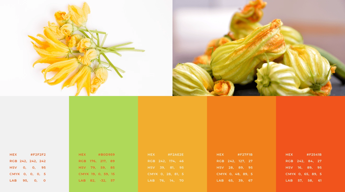
Main Color Palette.
The gradients developed aim to be applied to the brand's digital materials, posts and other elements that should provide this difference in institutional communication.
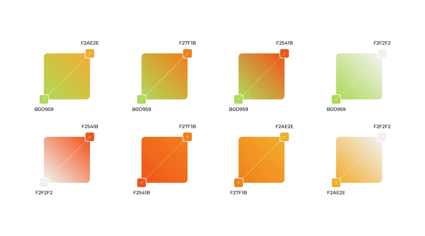
Color Palette Gradients.
Suggested Use and Proportion of the Institutional Color Palette
The proportion of use of institutional colors was initially based on the 60/30/10 rule, with possibilities for future adjustments. The color sequence can be changed, respecting the suggested proportions.
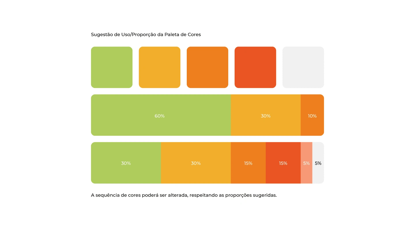
Proportion Color Palette.
Logo Typography
When composing typographic studies, a very important point was taken into consideration: the fact that typography is the voice of a brand, and it is extremely important to make a safe choice of it and that thus translate the desired personality and essence. Based on this principle and the study of archetypes (with foundations in Carl Jung's theories and studies by Margaret Mark and Carol S. Pearson - in the book The Hero and the Outlaw), it was defined that the brand has as its typographic archetype of the Helpful.
The Helpful person is an altruist, driven by compassion, generosity and the desire to help others. He fears instability and difficulty, not so much for himself, but for the impact on people who are less fortunate or less resistant to shocks. The Helpful archetype is perceived in practically any activity related to the provision of services, health care, well-being or food.
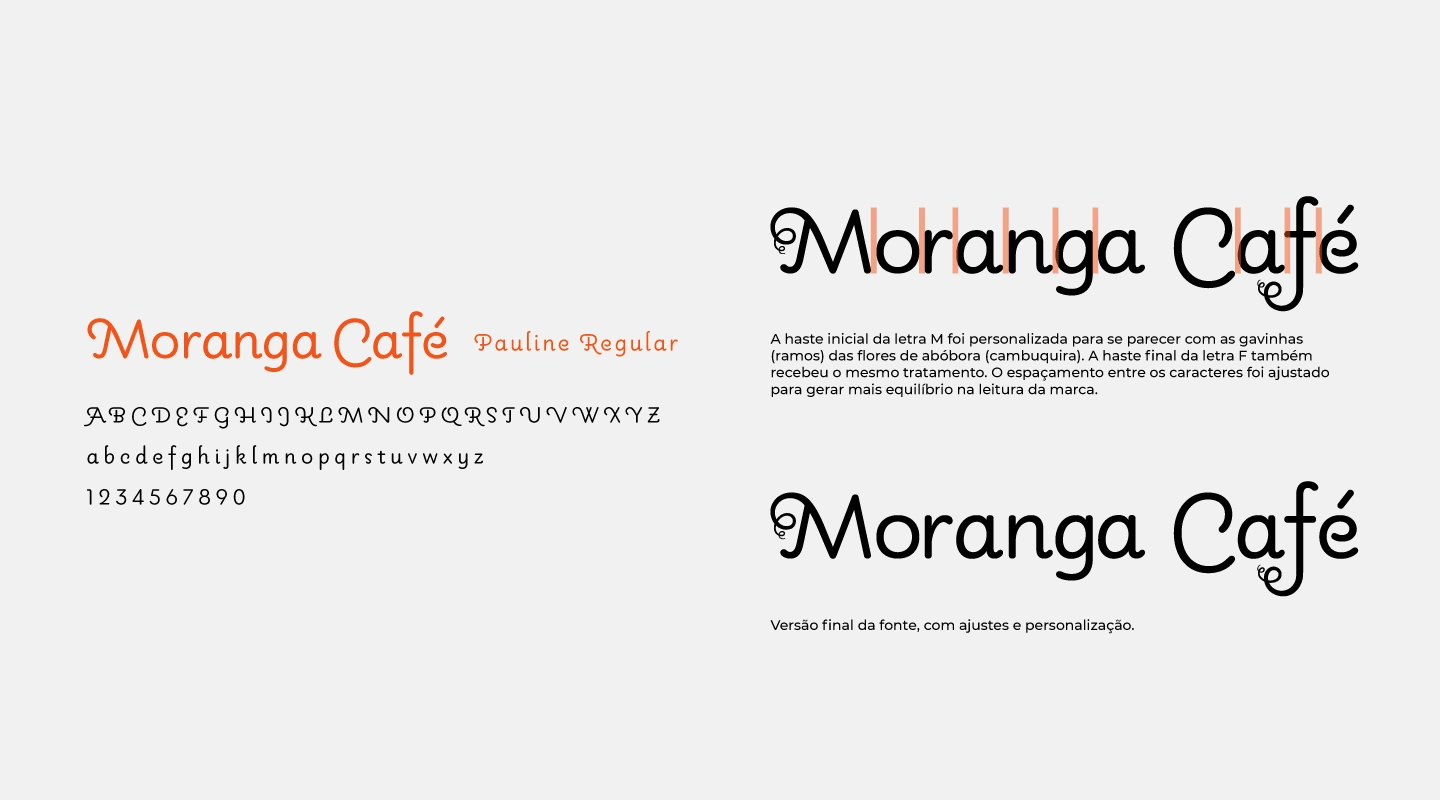
Final version of the font, with adjustments and customization.
The initial stem of the letter M was customized to resemble the tendrils (branches) of pumpkin flowers (cambuquira). The final stem of the letter F also received the same treatment. The spacing between characters was adjusted to create more balance when reading the brand.
After choosing the main typography, it is necessary to carry out the process known as Typographic Pairing. Different font styles can be combined to support the main typography, and also to balance reading, whether long or short texts or any other form of brand communication. Below are the selected typographic families that best match the brand’s main font:
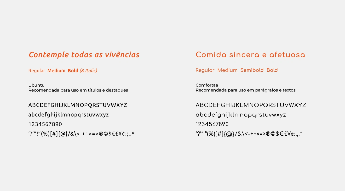
Recommended fonts for use in titles, highlights, paragraphs and texts.
Brand Concept
The letter M was chosen to compose the brand's graphic symbol. The main concept chosen was the minimalist style, as we will see below.
The initial stem of the letter M was customized to resemble the tendrils (branches) of pumpkin flowers (cambuquira), thus generating a subtle association between symbol, brand and the vegetable.
After cutting, adjusting the thickness and curvatures of the customized rod, it was possible to better define the composition of the symbol.
The final version of the symbol received an arch, also simulating the tendrils (branches) of pumpkin flowers. The idea was to convey the feeling of welcome and space for dialogue, these being some of the brand's values.
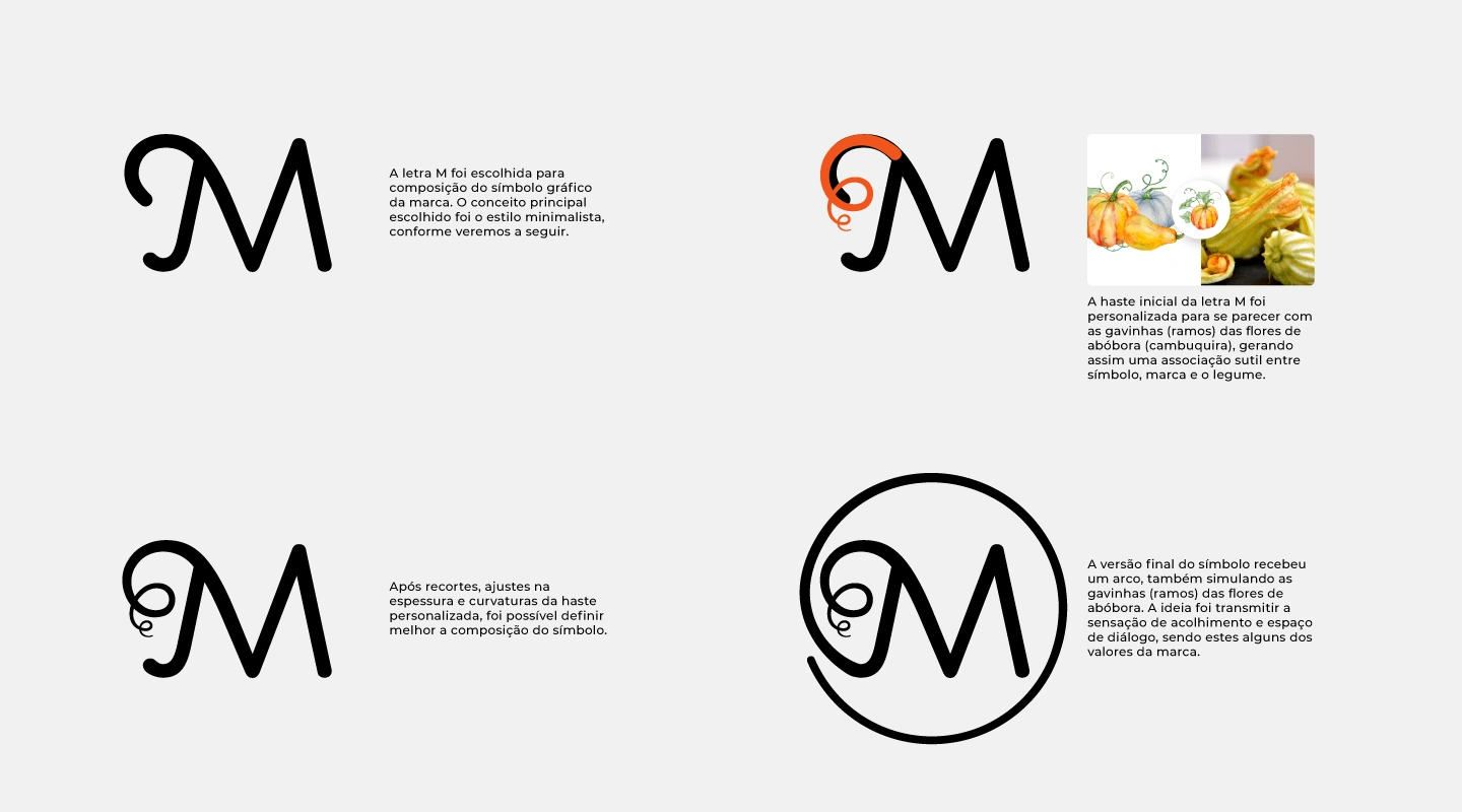
The graphic symbol in its initial and then final version.
Personalized Letter in minimalist style
The initial inspiration for the symbol's composition was the letter M customized for the logo, which simulates the tendrils (branches) of the pumpkin flower (known as cambuquira).
Due to the immense quantity of seeds, or pips, the symbolism of the pumpkin is related to fecundity and abundance.
The pumpkin is also considered a symbol of regeneration and a source of life. In the East, it is common to consume pumpkin seeds in spiritual renewal rituals during the spring equinox.
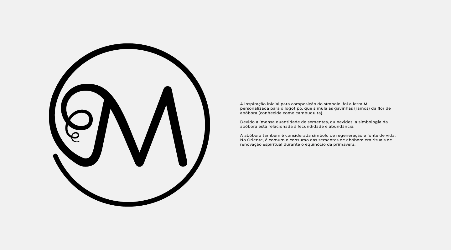
The final version of the graphic symbol.
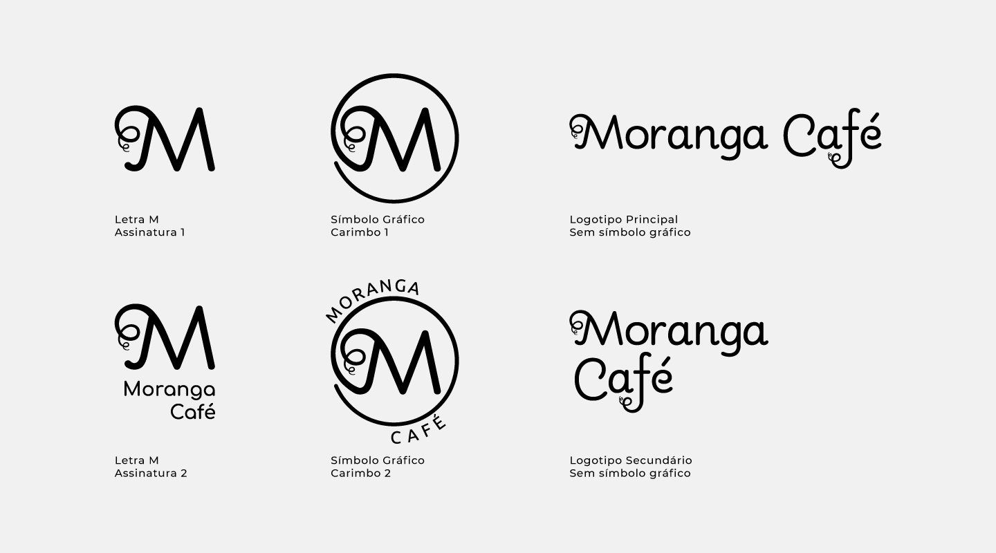
The brand and its possible uses. Graphic symbol, main, secondary and signature logo.
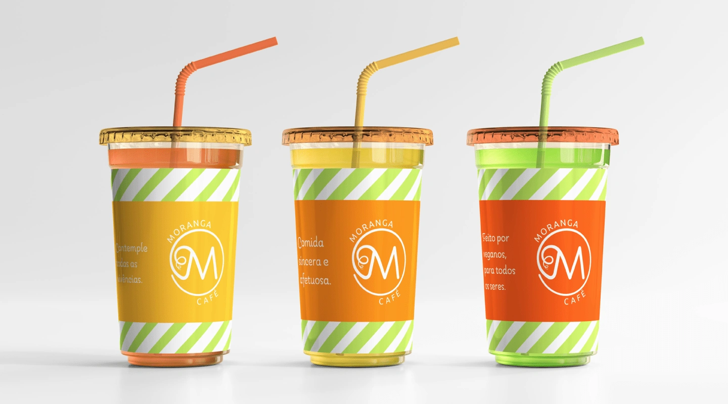
Contemplate All Experiences
Sincere and Affectionate Food
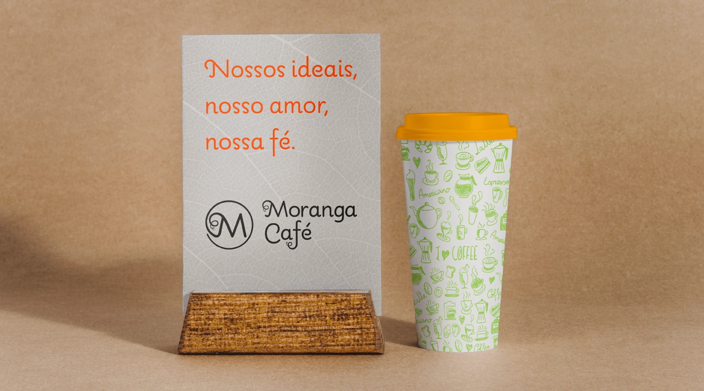
Our Ideals, Our Love, Our Faith
Made By Vegans, For All Beings
Free from Intolerance and Cruelty
Consider Veganism
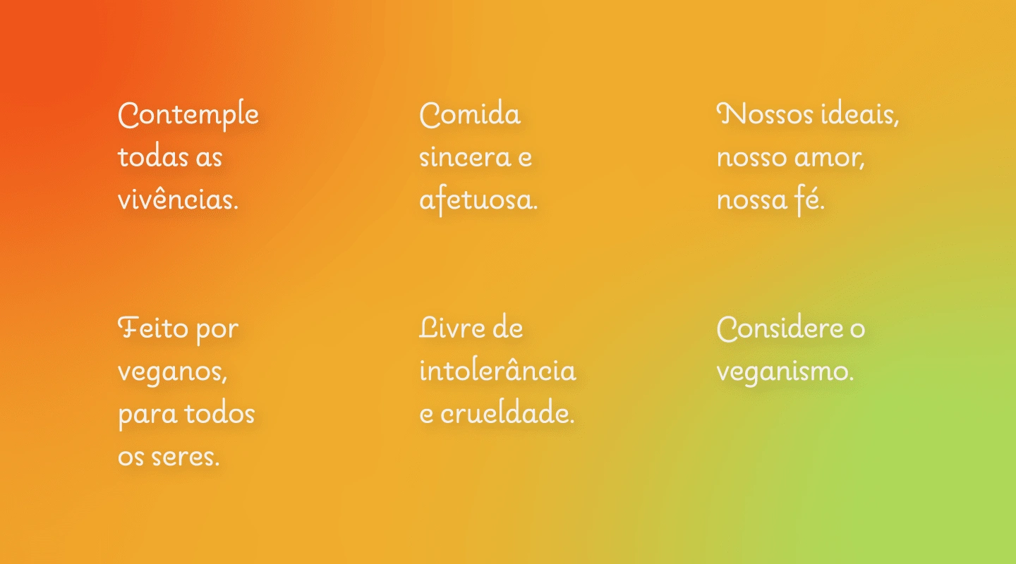
Phrases created by the owners of Moranga Café.
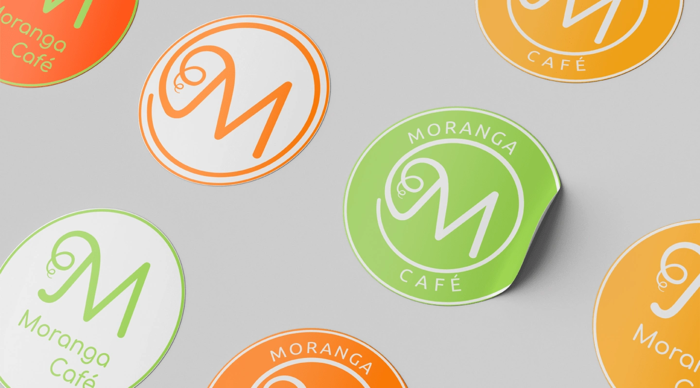
Applications of the Main Brand in the Color Palette.
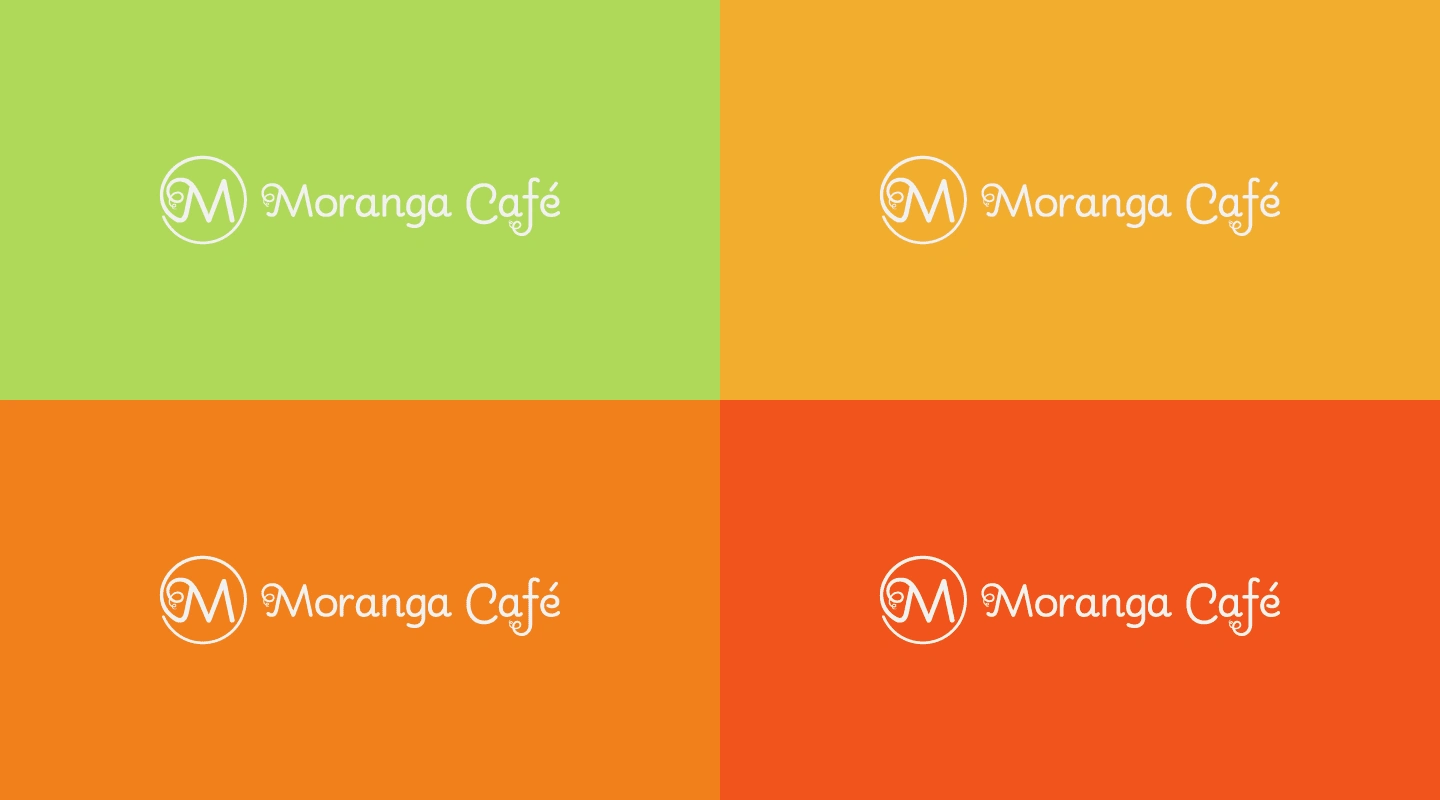
Applications of the Main Brand in the Color Palette.
Graphic Elements
The brand received some supporting graphic elements, such as patterns and textures related to sustainable materials and the main values attributed since the beginning of the project.
The selected textures aim to be applied to the brand's digital materials, posts and other elements that should provide this difference in institutional communication. In the case of applications on printed materials, the colors must be chosen based on a reference sheet, provided by the service provider/printer responsible for producing the material.
Special Textures and Materials: Kraft Paper, Recycled Paper and Seed Paper.
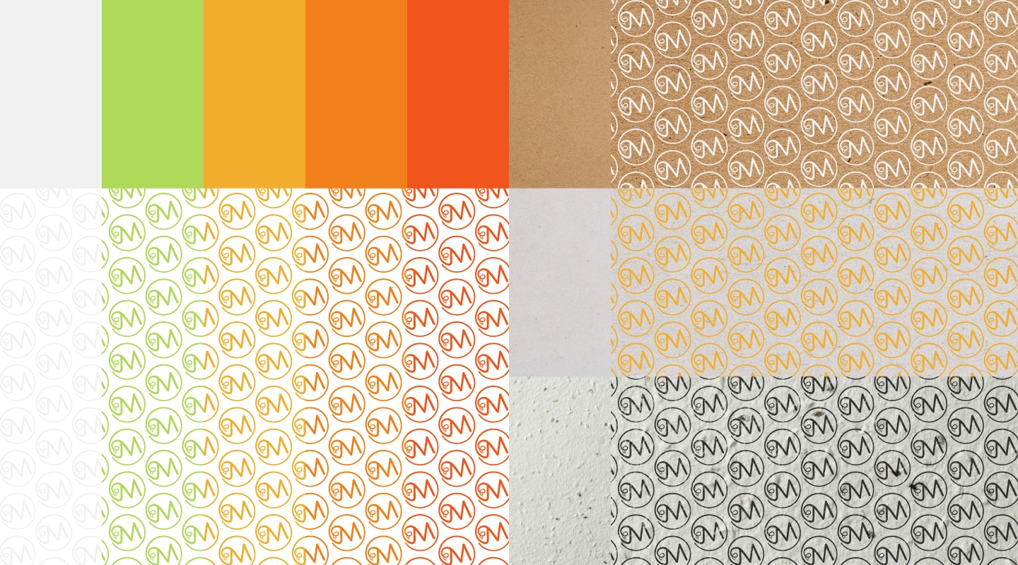
Patterns and Special Textures of the Brand.
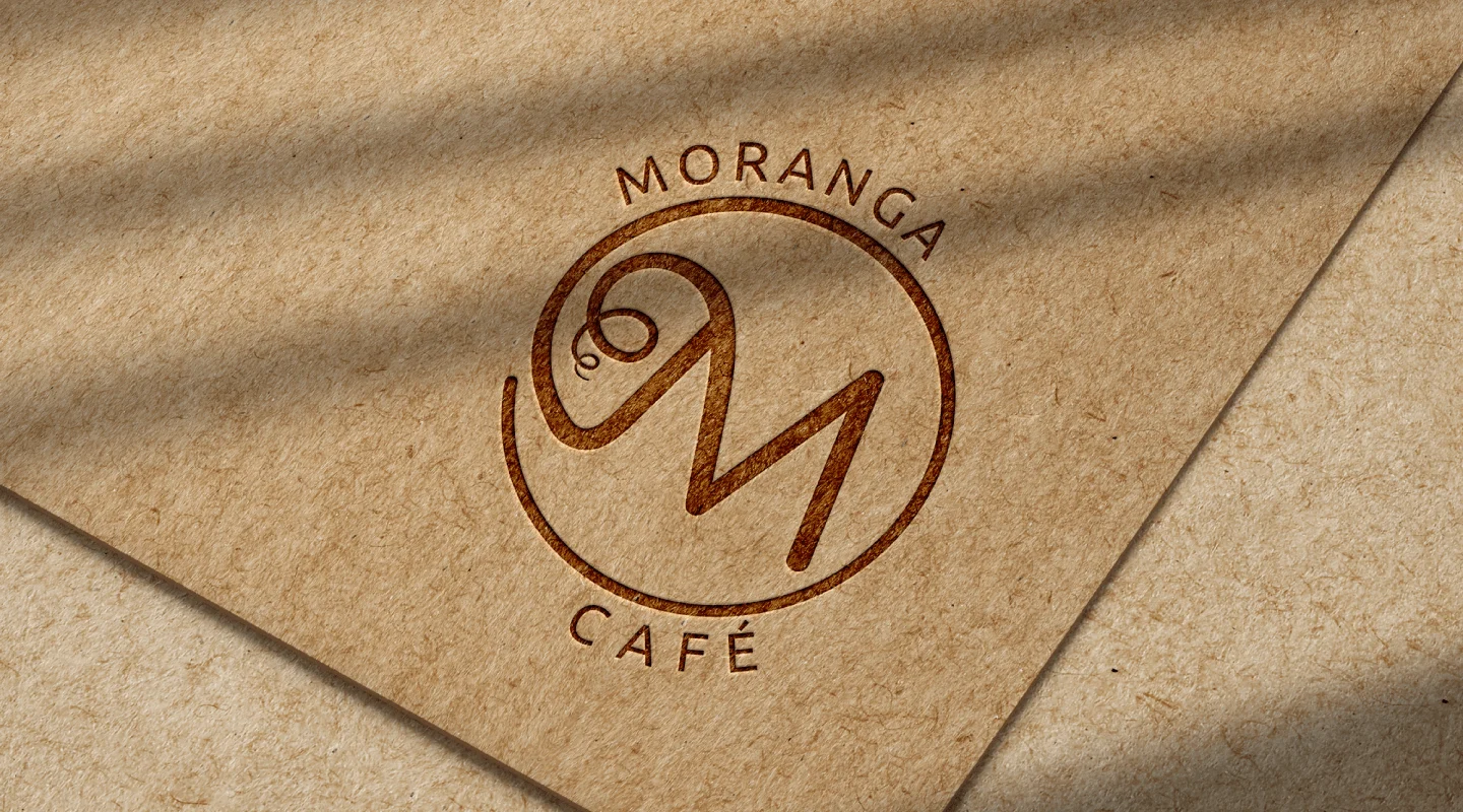
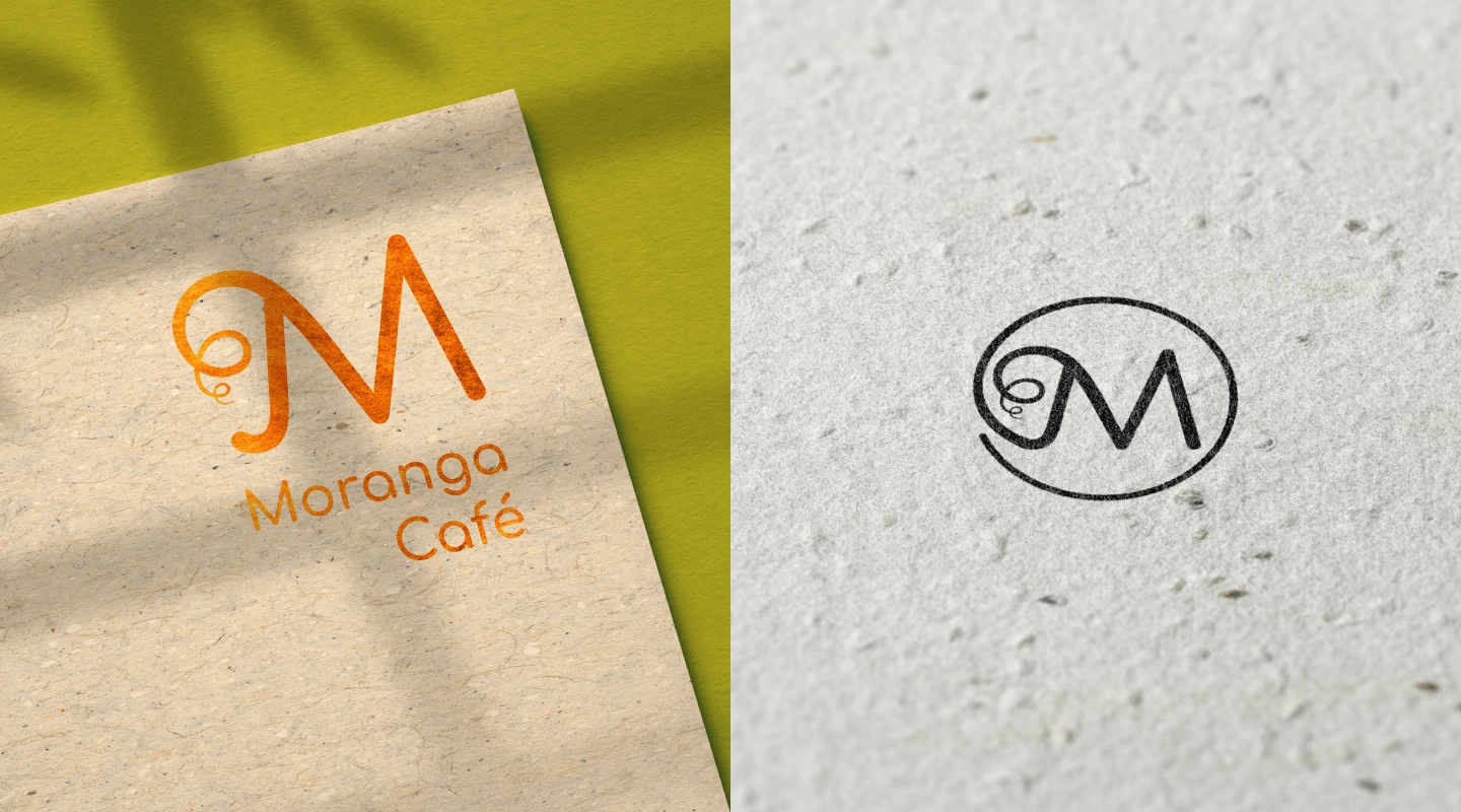
Brand Applications
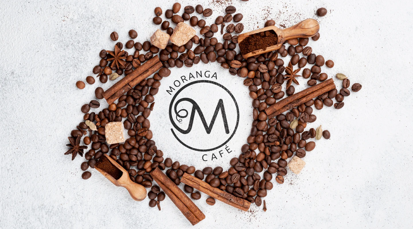
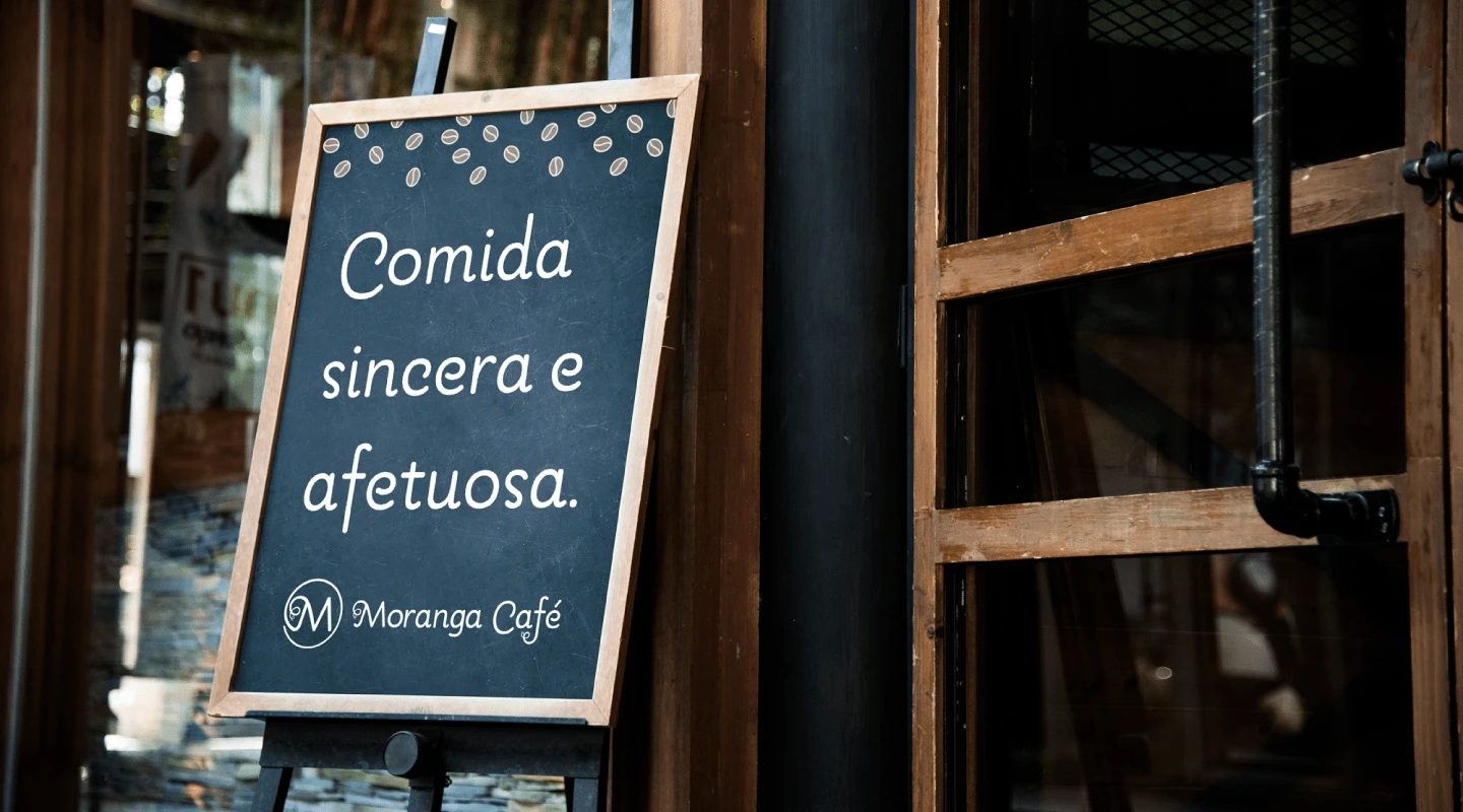
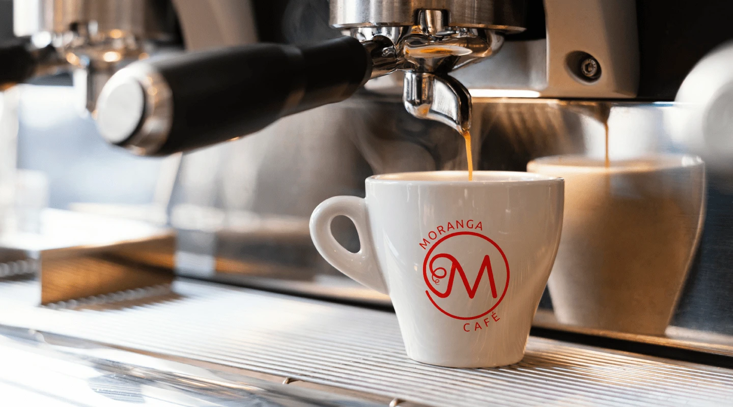
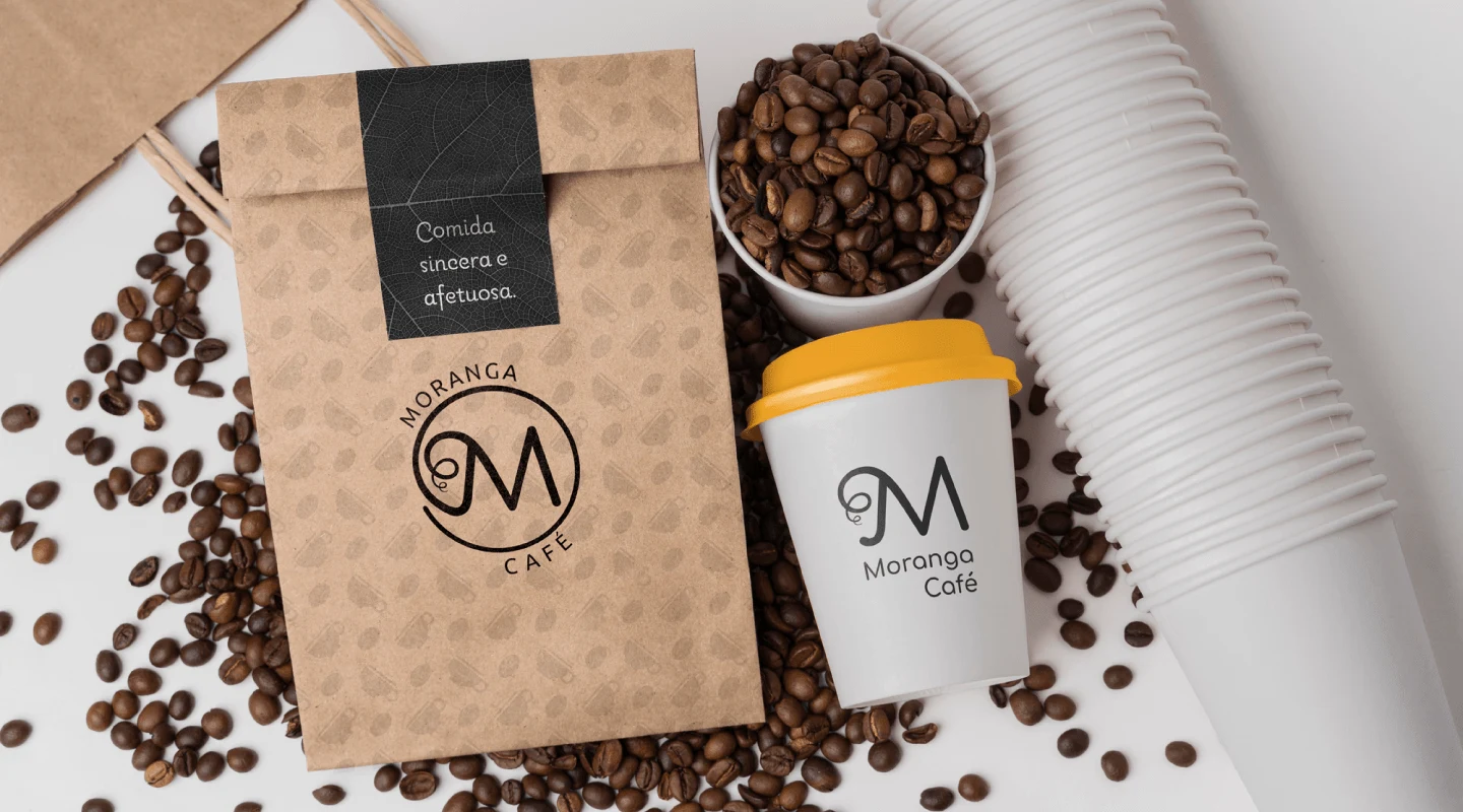
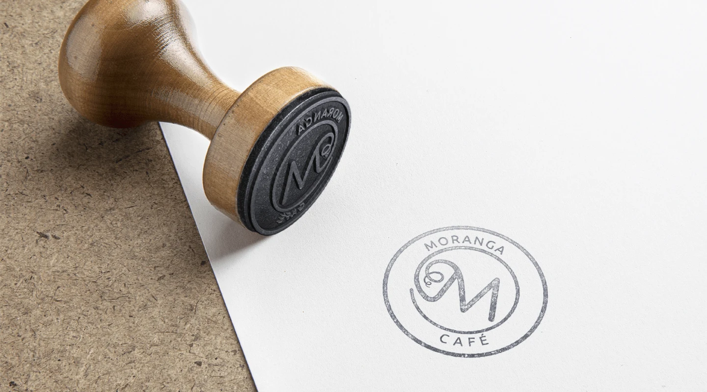
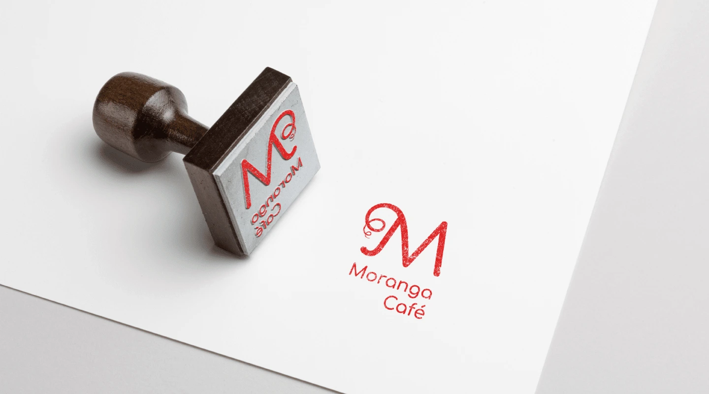
Thank You!
Like this project
Posted May 24, 2024
Moranga Café is an affective space in Aracaju/Brazil, with plant-based and vegetarian options with lots of flavor, love involved, ideals, dreams and faith...

