Brand Design - Poncianos’ Construções 🏡
About the Brand
Poncianos' Construções is a company specialized in the real estate sector of medium and high standard homes, operating for more than 9 years in the segment with quality, professionalism and transparency.
Its main differentials are: high quality constructions, extensive guarantees to buyers, transparency in negotiations and focus on providing pleasant environments for families who trust to acquire properties built by our professionals.
Mission: To make the quality of the construction of houses perceptible and provide pleasant environments to the homes of families who choose our properties.
Vision: To be an organized, ethical and recognized family business in the city of Mogi das Cruzes.
Values: Quality, transparency, ethics, good and fair nature.

The brand's main logo.

The brand's main logo with signature.

Some elements of the brand kit.
Brand Persona
Poncianos' Construções is: Creative, Different, Discreet, Fun, Efficient, Elegant, Excellent, Extroverted, Futuristic, Modern, Romantic, Serious and Simple.

The Brand Persona.
Color Palette & Font System
Color Palette Study
In summary and taking as a starting point, some words mentioned in the brand's Mission, Vision and Values, such as: Quality, Family, Ethics, Transparency, Trust and Professionalism, several researches were carried out focused on colors and their importance in the branding process . According to Color Psychology, there is a range of words that represent certain colors, most common in our daily lives, such as blue, red, yellow, green, orange, purple and even black.
For words related to the brand, the colors that do justice to the Mission, Vision and Values are: White, Black, Gray and Wine. White is seen as the color of innocence, good, perfection and even the minimalist style in the area of Design. It conveys the feeling of peace, cleanliness and is present in countless tones and items in our daily lives. Black is considered a conservative color, which conveys authority, elegance and is constantly associated with Design, Fashion and as a favorite among clothing options. The color Gray basically permeates the same values transmitted by Black, with the addition of characteristics such as modesty, balance and even being recognized as the color of theories. The Wine color has strong characteristics, such as robustness, sophistication, style and generates a feeling of attraction, inspiring confidence and stability in a natural way.

Main Color Palette.
Suggested Use and Proportion of the Institutional Color Palette
The proportion of use of institutional colors was initially based on the 60/30/10 rule, with possibilities for future adjustments. The color sequence can be changed, respecting the suggested proportions.
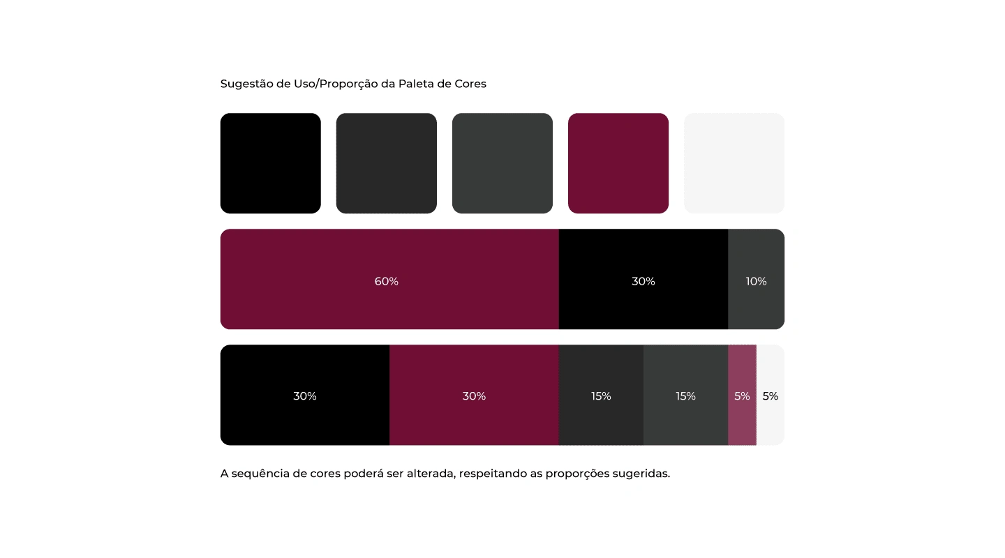
Proportion Color Palette.
Logo Typography
When composing typographic studies, a very important point was taken into consideration: the fact that typography is the voice of a brand, and it is extremely important to make a safe choice of it and that thus translate the desired personality and essence. Based on this principle and the study of archetypes (with foundations in Carl Jung's theories and studies by Margaret Mark and Carol S. Pearson - in the book The Hero and the Outlaw), it was defined that the brand has the Wise and Ruler styles as typographic archetypes.
The Wise seeks the supreme truth that will free him and living fully is his goal. Through knowledge of processes and information flows, he wants to control, measure, evaluate and validate. He is the specialist archetype, but methodical and detailed.
The Ruler is always in charge and in control. It is typical of him to be shown as an extremely responsible individual who handles many important responsibilities. This archetype wants leadership and power. It can be summarized in terms of responsibility, competence and sovereignty, being an archetype concerned with the well-being of society and the planet.
Brand Fun Fact
To compose the brand name, during the typographic testing phase, the use of the diacritical sign known as the Apostrophe was defined. This function indicates the deletion of letters in a word, such as pingo d’água for dripping water, Vozes d’África or Santa Bárbara D’Oeste.
This suppression is known in Portuguese as elision. Although incorrect, it is very common to use the minute sign (’) in place of the apostrophe, due to the fact that computer keyboards do not have the diacritical sign. The shortcut to correctly use the typographic apostrophe is Alt key + 0146 (Windows systems).
In the English language, its use is also necessary to indicate that a letter has been omitted in the word, this abbreviation being known in English as contracted form. It is generally used in informal writing and speaking, generating greater fluidity and naturalness. Another factor that determines the use of an apostrophe in the English language is the indication of possession of something, such as dad’s car, today’s newspaper, dog’s tail and thousands of other possible applications. For cases like these, this function is called genitive case, with origins based on Old English and archaic English.
In the case of the development of the name Poncianos’ Construções during typographic tests, the correct use of the apostrophe was to indicate ownership of something by a proper name. This choice reflects all members of the Ponciano family who are part of the company and in accordance with the aforementioned English language rules.

Final version of the font, with modified adjustments and accents.
The spacing between the characters was adjusted to generate greater balance in the visualization of the brand, considering the optical agglutination (optical block) generated during reading. The final version of the font, with the decision to “break” the optical block into a vertical reading, instead of a standard version read horizontally.
After choosing the main typography, it is necessary to carry out the process known as Typographic Pairing. Different font styles can be combined to support the main typography, and also to balance reading, whether long or short texts or any other form of brand communication. Below are the selected typographic families that best match the brand’s main font:
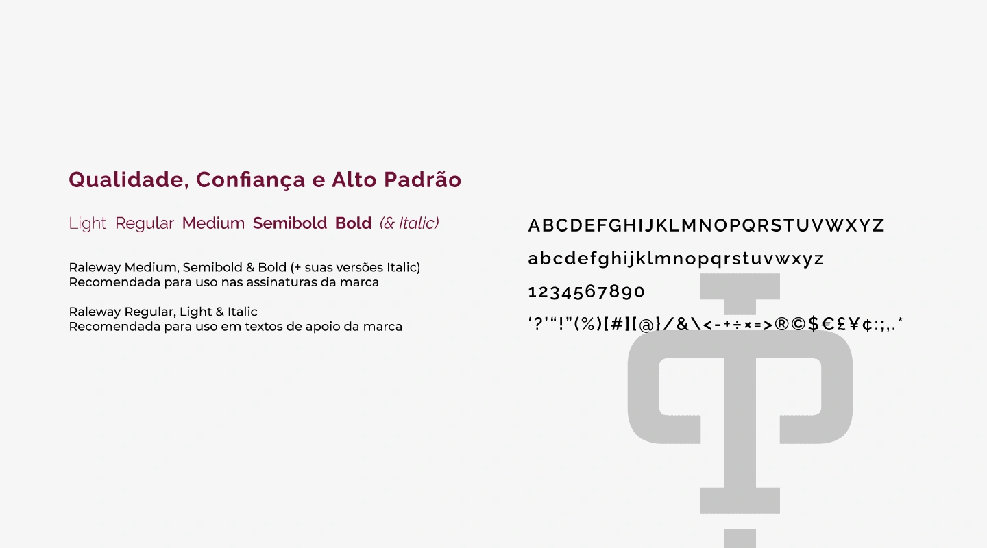
Recommended fonts for use in titles, highlights, paragraphs and texts.
Brand Concept
Vertical Key in minimalist style
The main idea for composing the graphic symbol was to follow the minimalist style, representing the letter P personalized and mirrored to simulate the key's support base. Using Illustrator's Pathfinder tool to cut the previous composition, it was possible to arrive at the minimalist symbol of an vertical key.

Graphic Symbol Development.
The symbol was developed for vertical use only. When horizontal, the personalization and mirroring characteristics are lost, even if the base is rotated in the correct direction in which it was created.
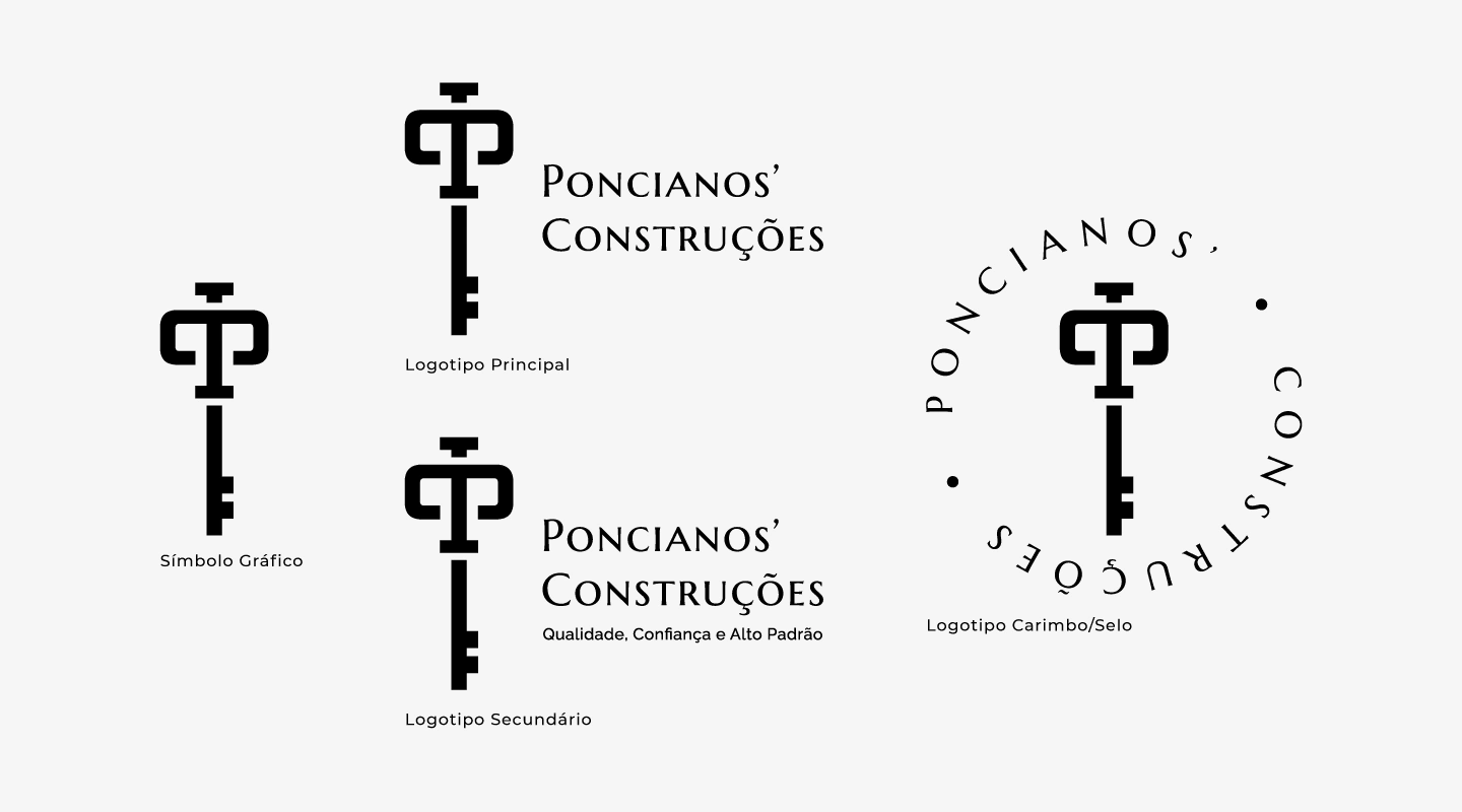
The brand and its possible uses. Graphic symbol, main, secondary and stamp/seal logo.

Applications of the Secondary Brand in the Color Palette.
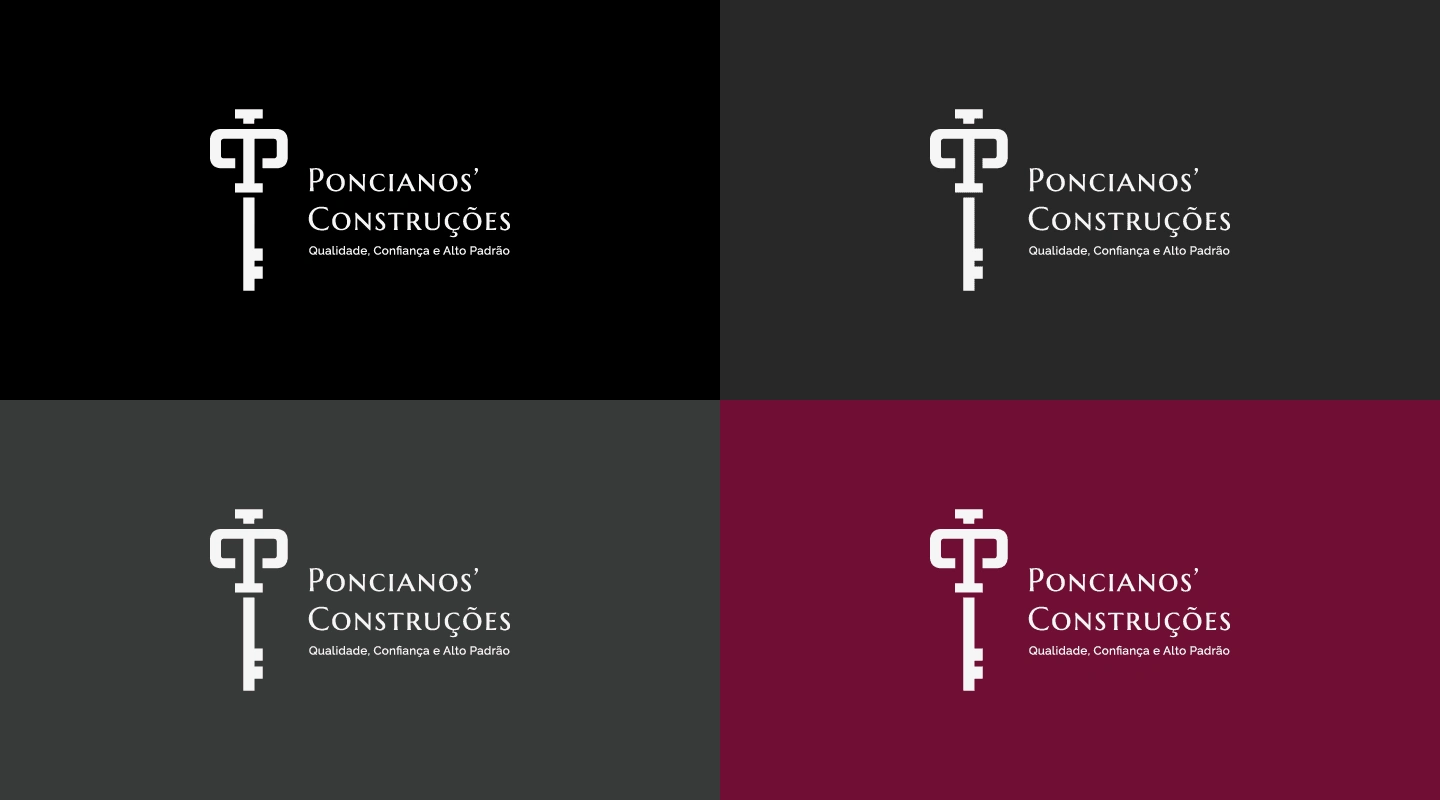
Applications of the Secondary Brand in the Color Palette.
Graphic Elements
The brand received some supporting graphic elements, such as patterns and textures related to noble materials and the main values attributed since the beginning of the project.
The selected textures aim to be applied to the brand's digital materials, posts and other elements that should provide this difference in institutional communication. In the case of applications on printed materials, the colors must be chosen based on a reference sheet, provided by the service provider/printer responsible for producing the material.
Special Textures: Gold, Silver and Bronze.

Patterns and Special Textures of the Brand.

Brand Application with Gold Texture.

Brand Application with Silver and Bronze Texture.
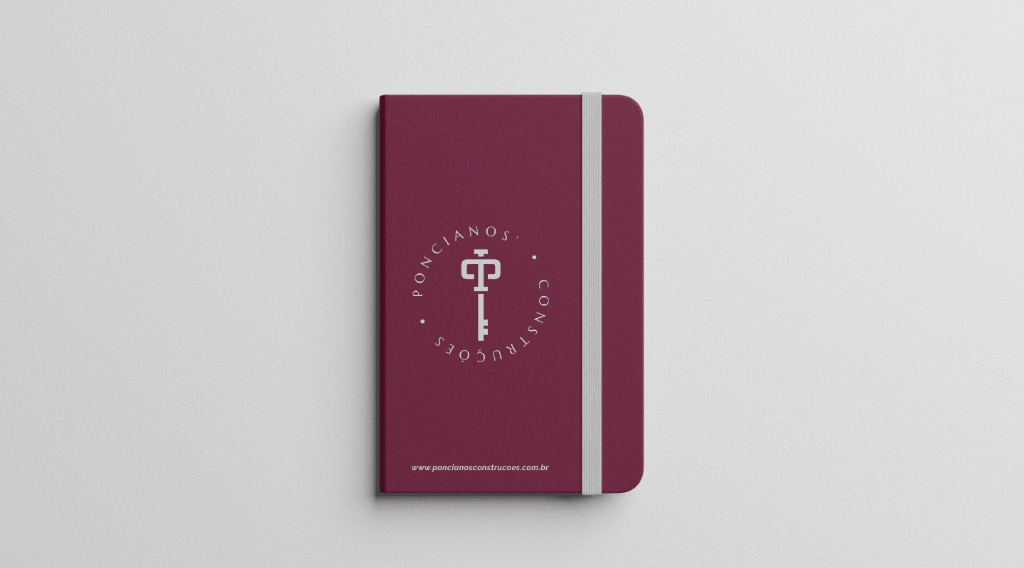
Brand Applications




Thank You!
Like this project
Posted May 24, 2024
Poncianos' Construções is a company specialized in the real estate sector of medium and high standard homes, with quality, professionalism and transparency...


