Digital Sport / Checkout & User Area Redesign
Julian Ibañez
Digital Sport / Checkout & User Area
With thousands of products and a leading presence in Argentina, Digital Sport is synonymous with sports and movement.
Digital Sport is the leading e-commerce platform for sports gear and fashion in Argentina, handling high sales volumes across the country. However, its checkout flow and design had remained unchanged for years, and early user feedback was signaling the need for an update. This project aimed to rethink the experience and align it with today’s expectations.
The real challenge was to create a solution that could be adopted quickly without causing major controversy. With hundreds of thousands of daily visits, even small changes could have an immediate impact on the platform. It was crucial to identify what could be improved — and how much — without overwhelming users. Another key challenge was meeting shareholder expectations, balancing the need for innovation with the natural fear of change that comes from working with a highly profitable, yet aging, system.

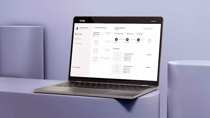
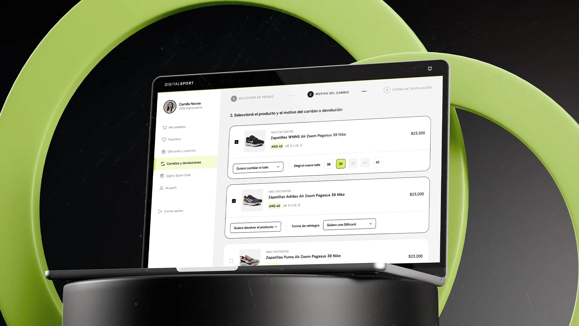
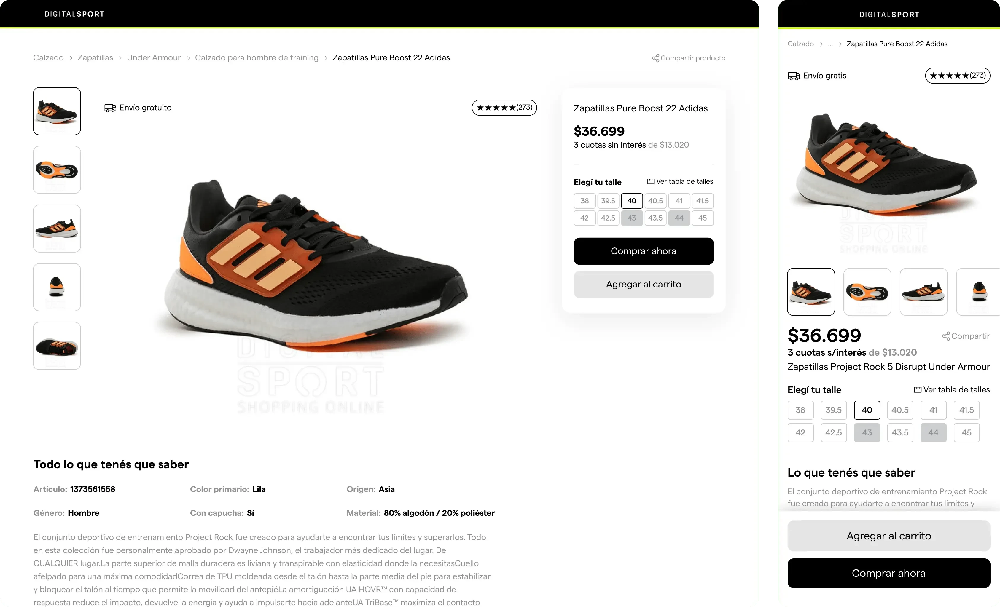
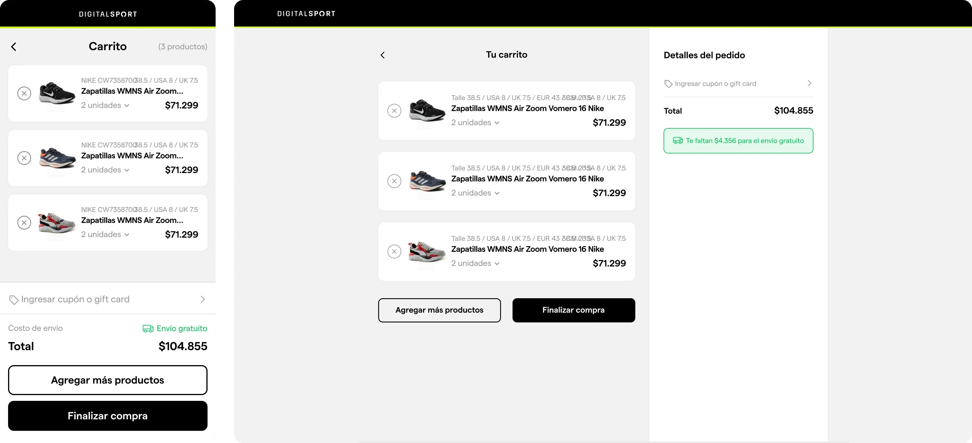
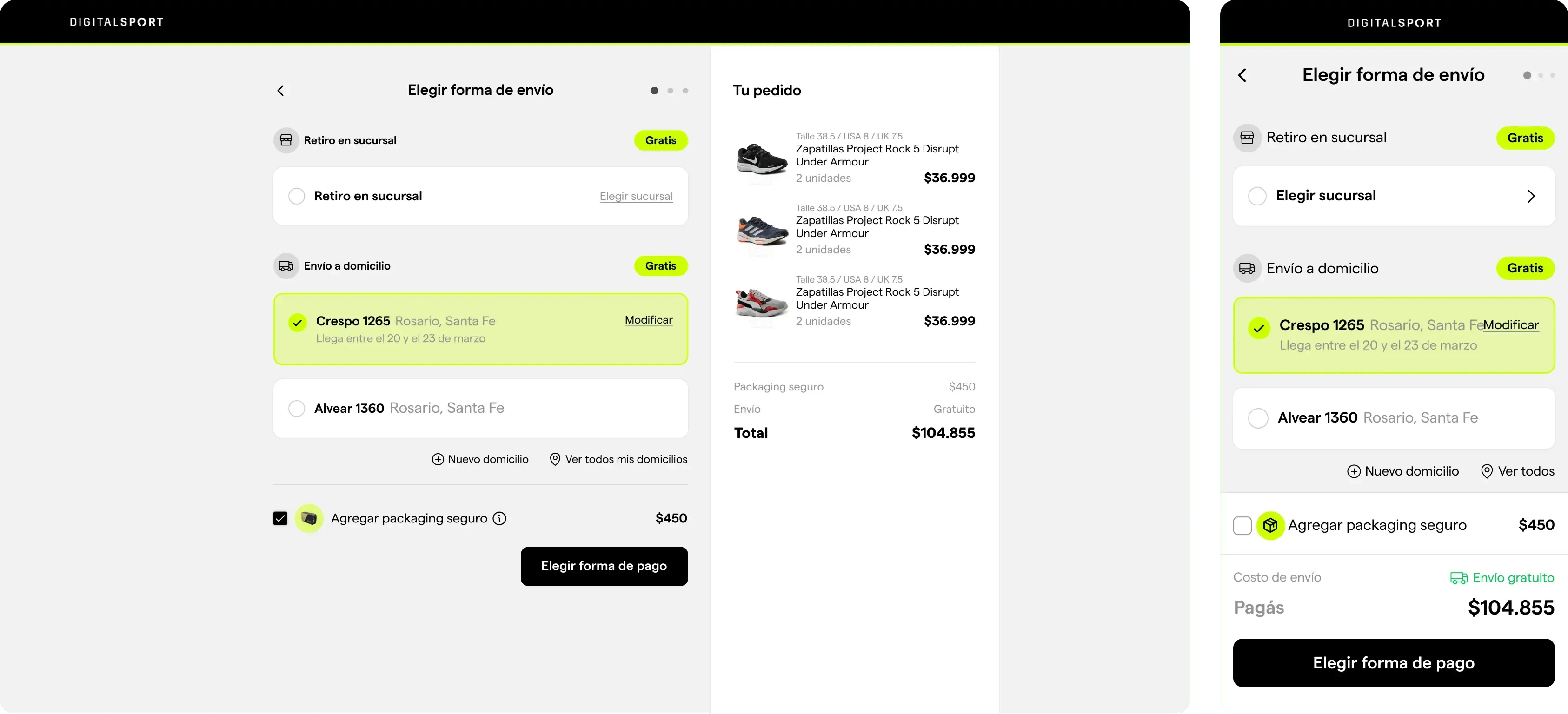
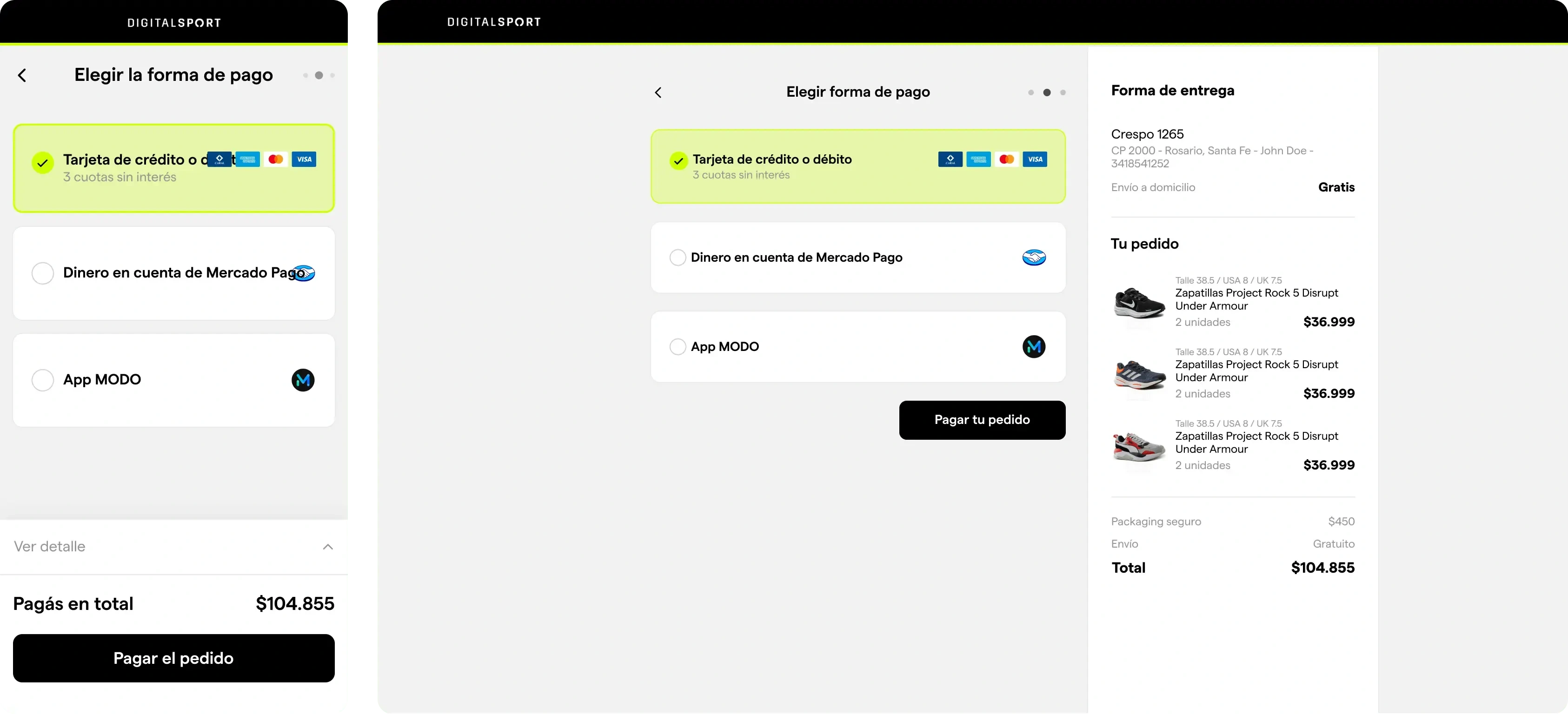
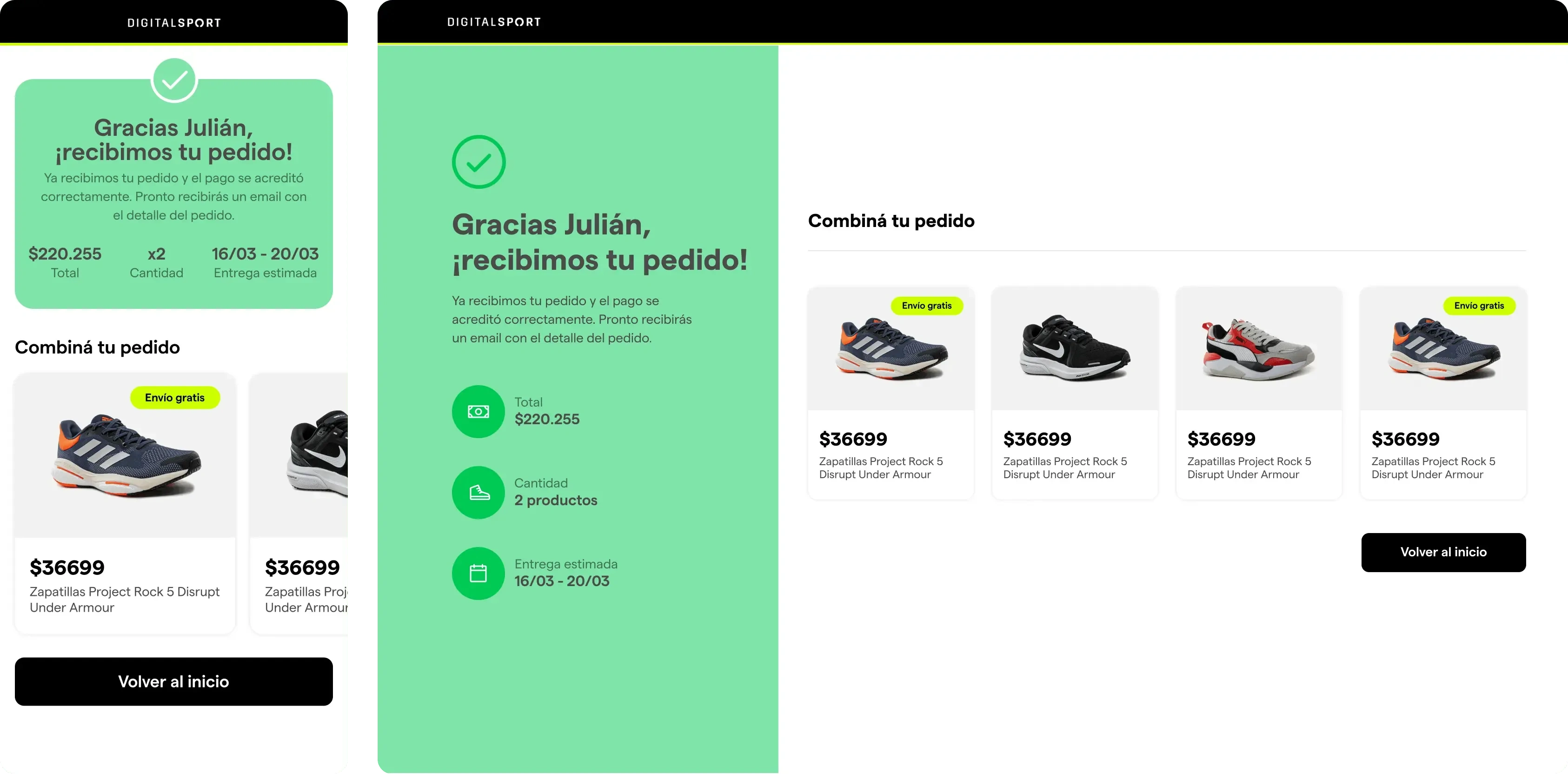
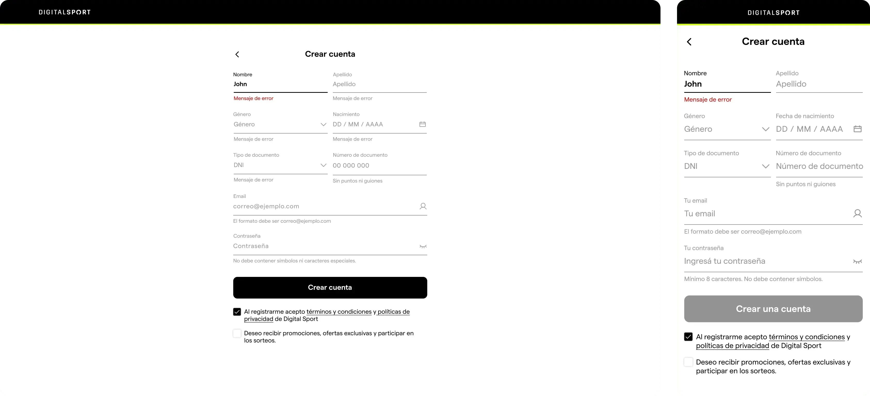
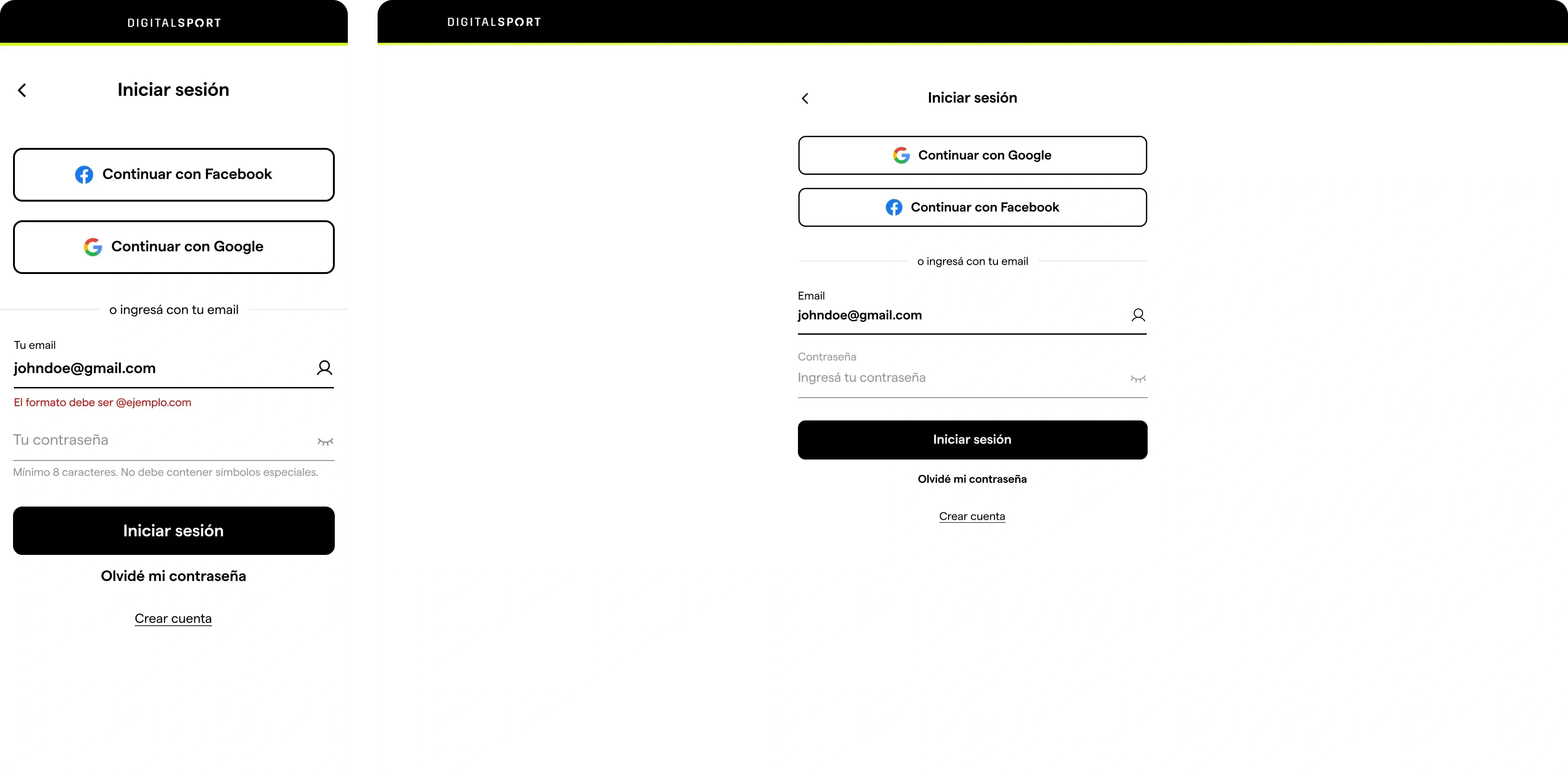
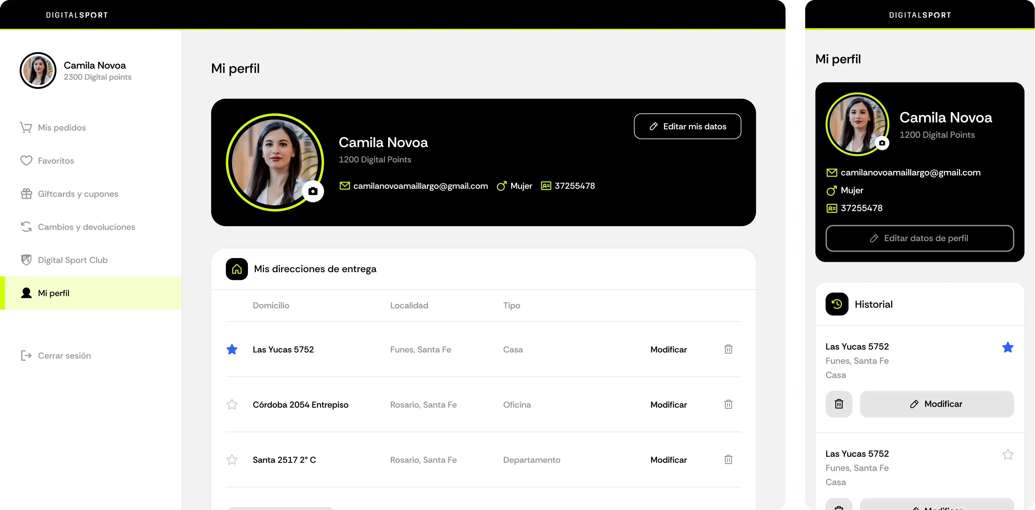
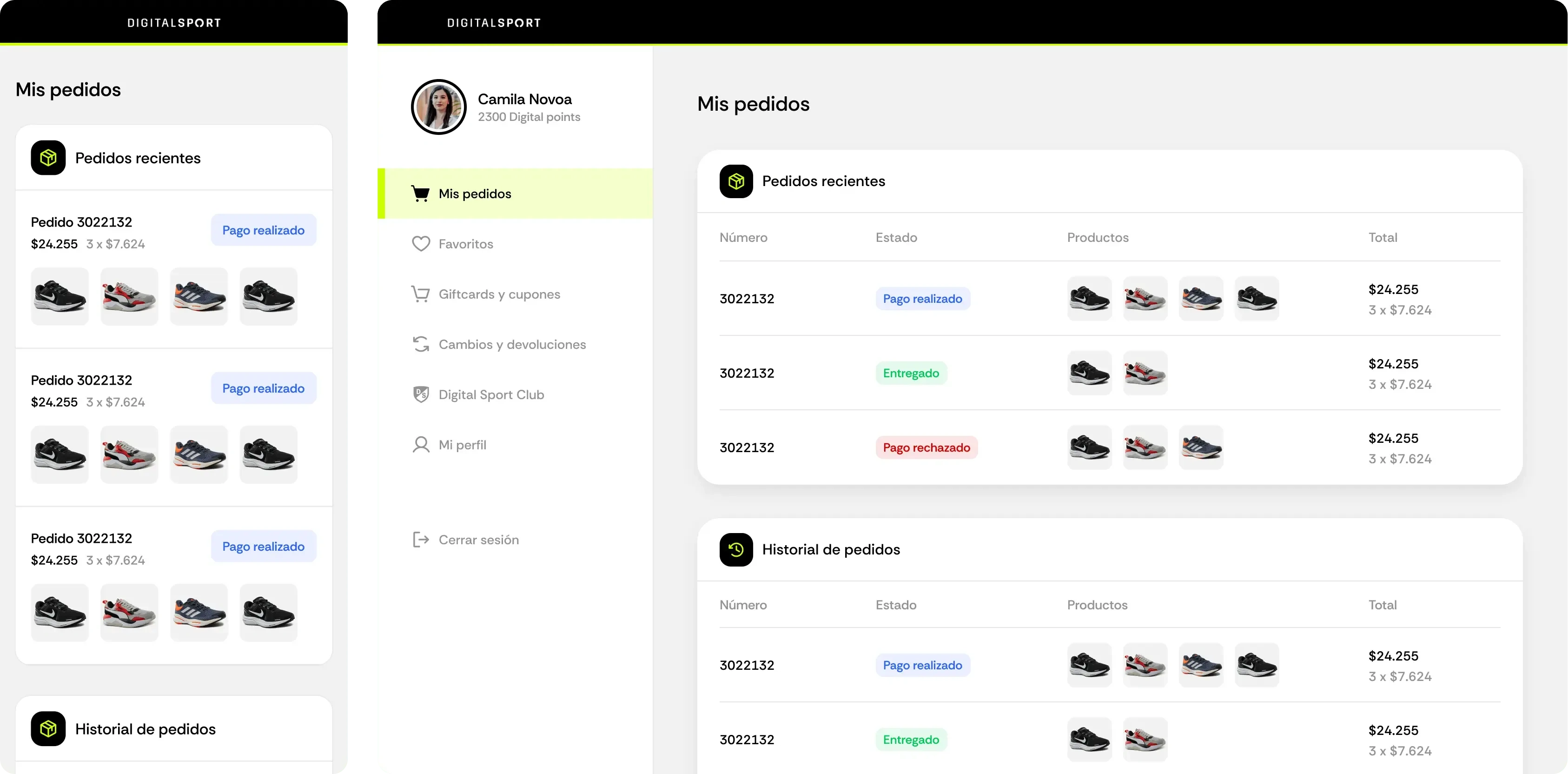
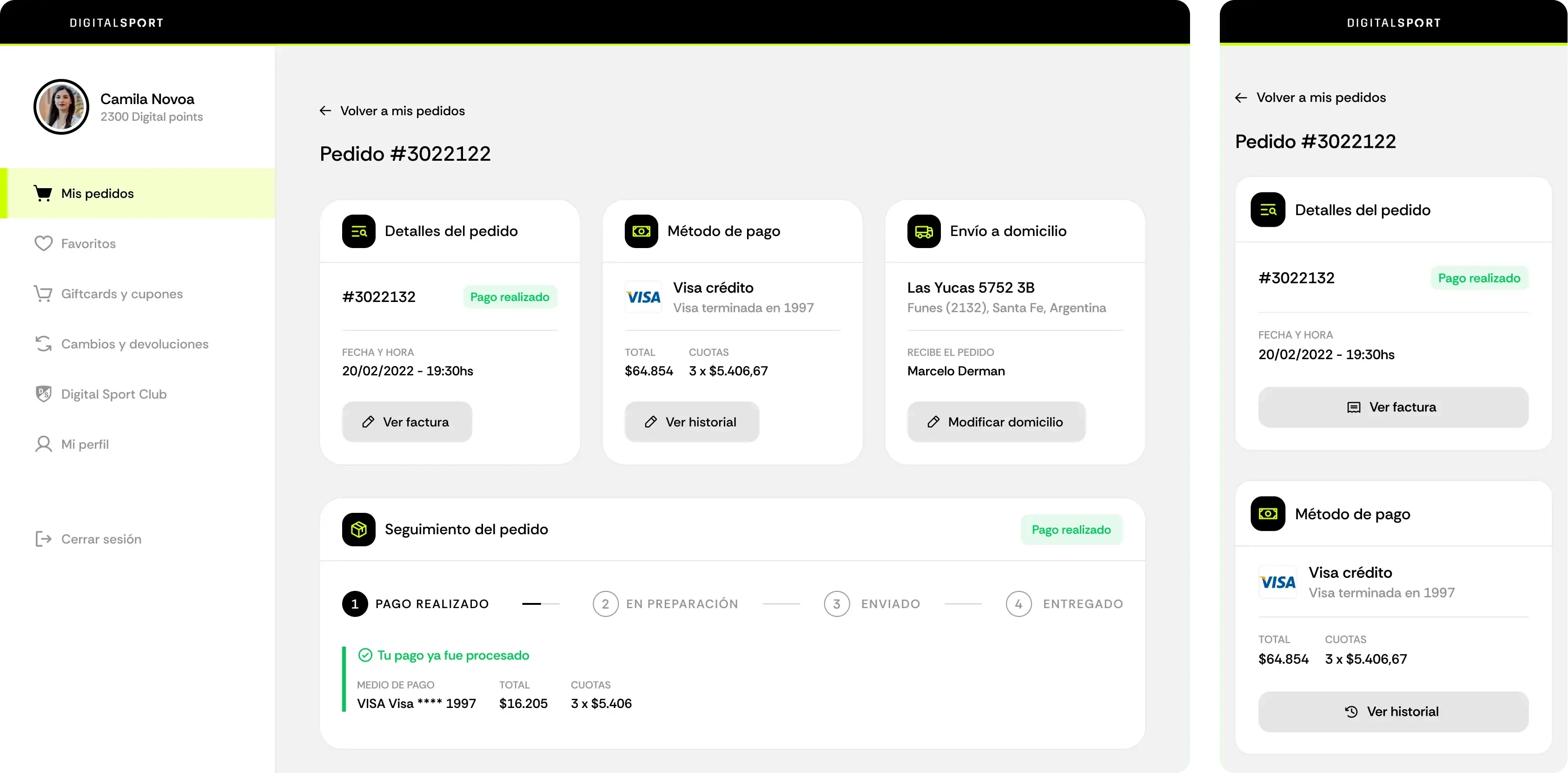
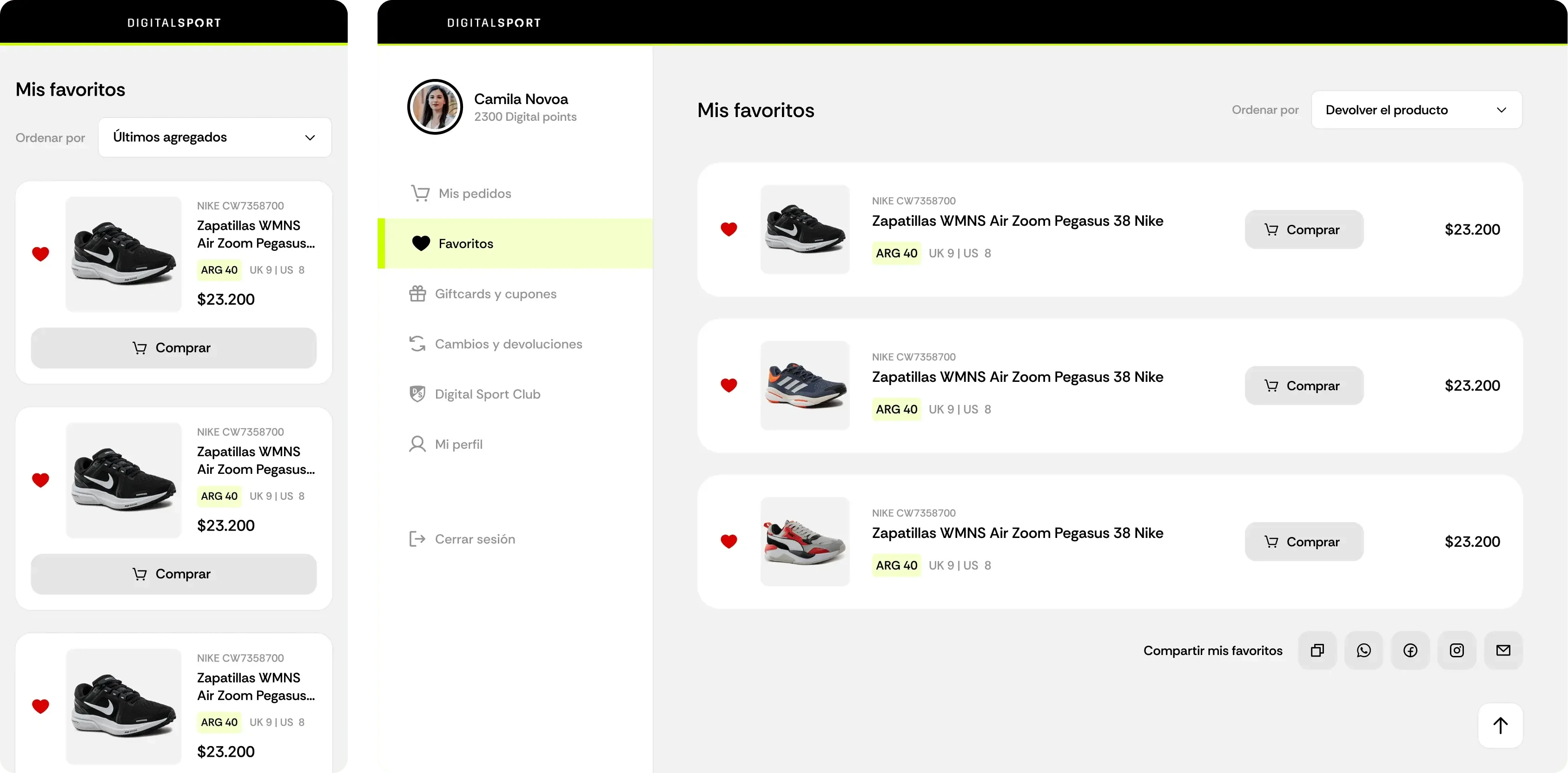
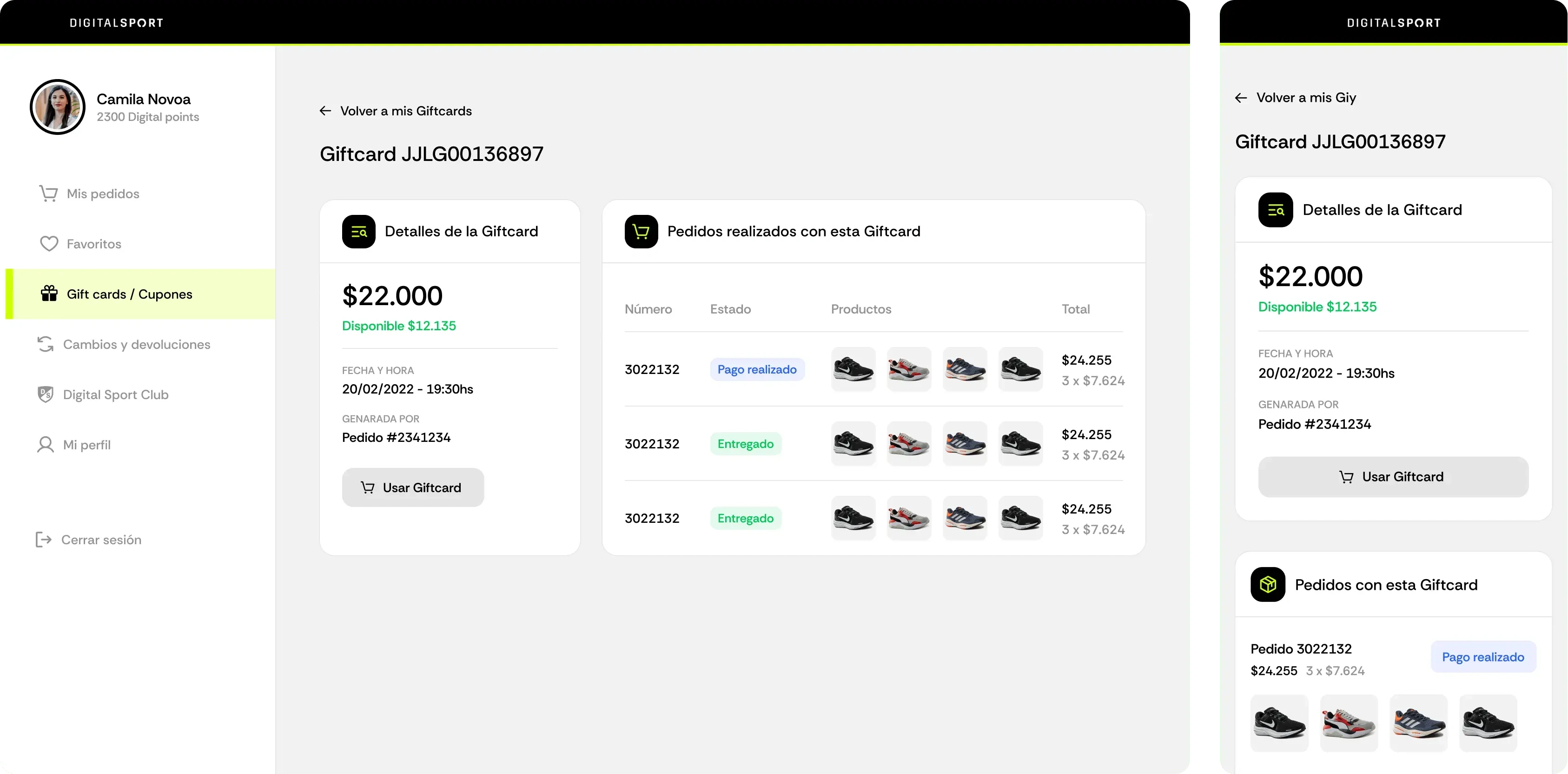
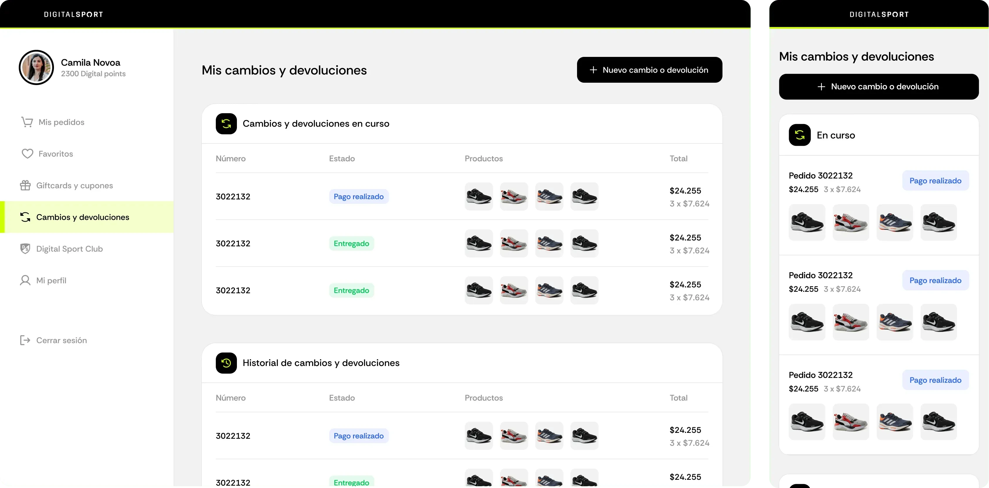
Through a combination of testing processes and research tools — including User Testing, Heuristic Evaluations, Google Analytics, and User Interviews — we identified the main pain points in both the checkout flow and customer area. Some key findings included unnecessary steps in the checkout, lack of clarity about its length, and overwhelming information presented at once. In the customer area, outdated aesthetics, overly technical information, and poor navigation were among the major issues.
After completing an information architecture and user flow creation phase, followed by medium-fidelity wireframes and a final high-fidelity prototype in Figma, we arrived at the redesign solution shown below.


Like this project
Posted Jun 5, 2025
Redesigned Digital Sport's checkout and user area for improved UX.