DoMe Live Visual Identity System Design

Sansi Branding


PROJECT OVERVIEW
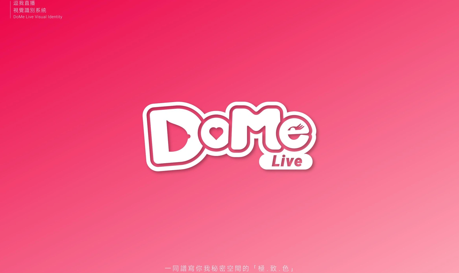
DoMe Live is a social live-streaming platform created for a young, highly expressive audience. The visual identity needed to feel immediate, friendly, and emotionally engaging while remaining consistent across digital interfaces, marketing materials, and bilingual communication.
The project transformed the platform's playful personality into a practical identity system, covering logo construction, color, typography, spacing, minimum size, and usage rules.
THE CHALLENGE
Live-streaming brands operate in fast-moving, visually crowded environments. DoMe Live needed an identity that could attract attention instantly without losing clarity at small digital sizes.
The system also had to support both Chinese and English content, accommodate energetic campaign visuals, and give internal teams clear rules for maintaining recognition across different touchpoints.
LOGO CONCEPT
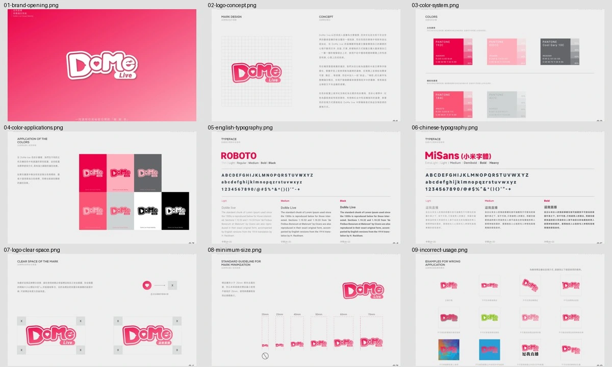
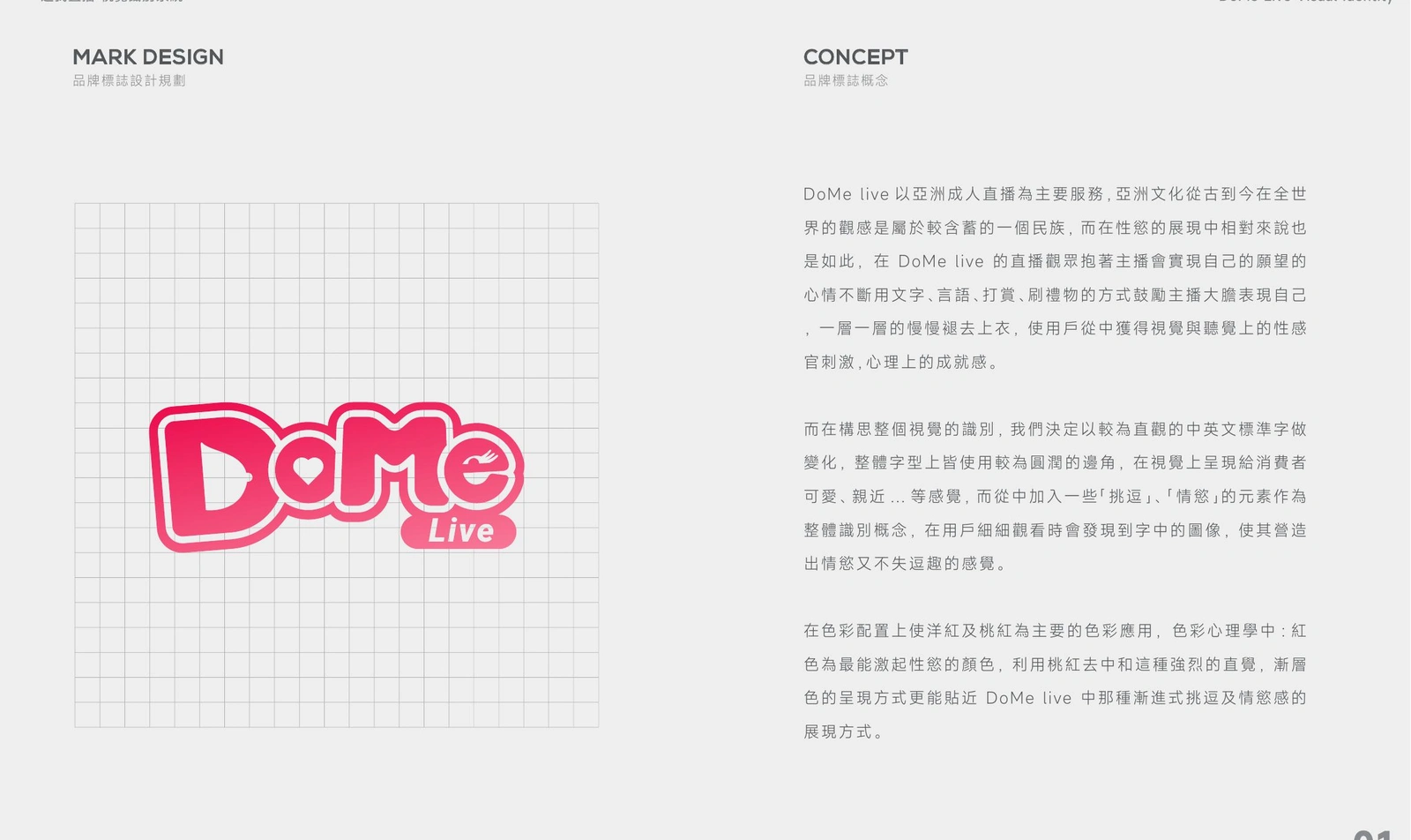
The custom wordmark uses rounded, irregular letterforms to communicate friendliness, spontaneity, and real-time interaction. Heart- and play-inspired details are integrated into the lettering, connecting emotional engagement with the experience of live content.
The compact construction gives the mark a sticker-like quality that feels natural in social interfaces while remaining distinctive as a standalone brand asset.
COLOR SYSTEM
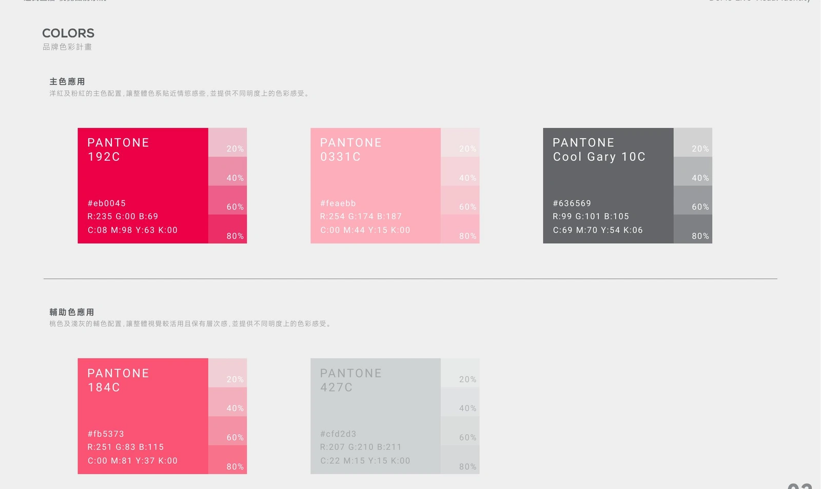
A high-energy pink anchors the identity and gives DoMe Live an immediately recognizable presence. Supporting pink, coral, and neutral gray tones expand the palette for hierarchy, contrast, and different communication needs.
Defined Pantone, CMYK, RGB, and HEX values ensure that the brand remains consistent across print and screen.
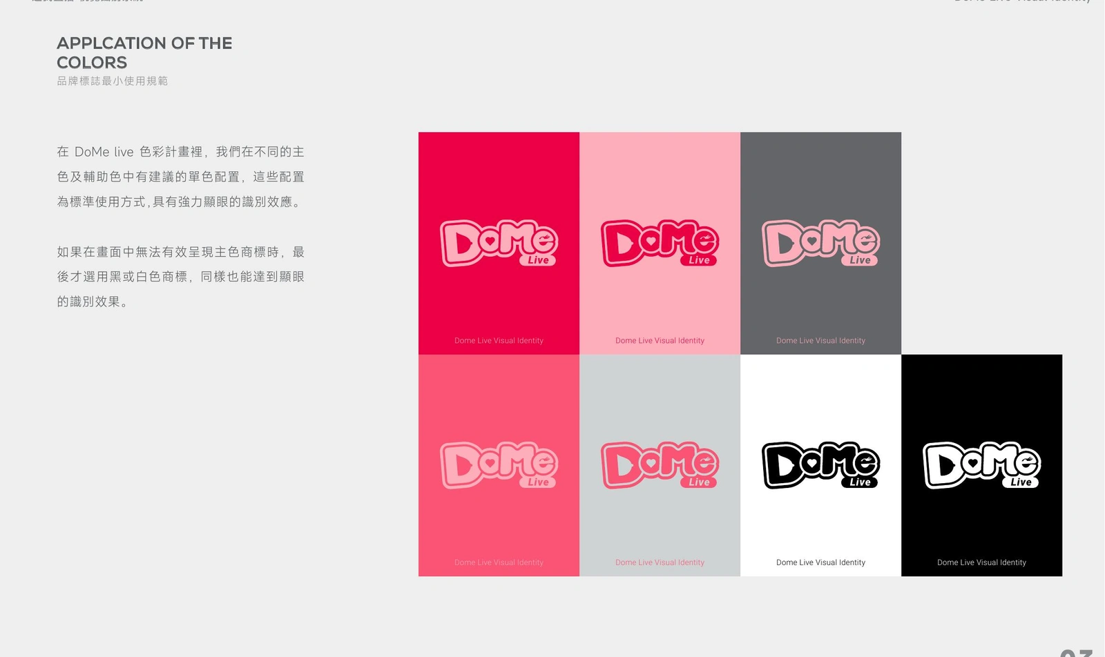
The logo was also tested across approved color combinations, including light, dark, monochrome, and reversed applications. This creates flexibility without weakening recognition.
BILINGUAL TYPOGRAPHY
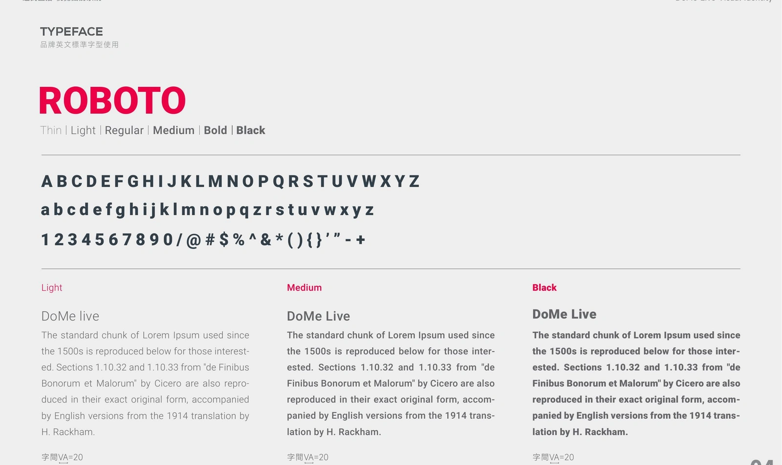
Roboto was selected for English communication because of its clarity, broad weight range, and strong performance in digital environments. The system defines how light, medium, and black weights can establish hierarchy across interface and campaign content.
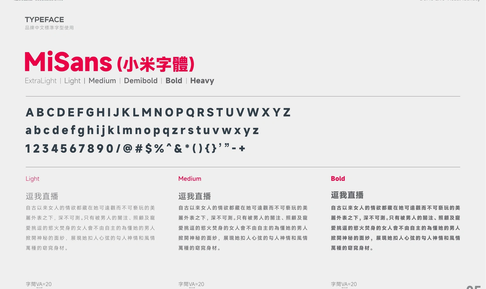
MiSans supports Chinese communication with a contemporary structure and a similarly flexible family of weights. Together, the two typefaces create a consistent bilingual voice without sacrificing readability.
LOGO USAGE GUIDELINES
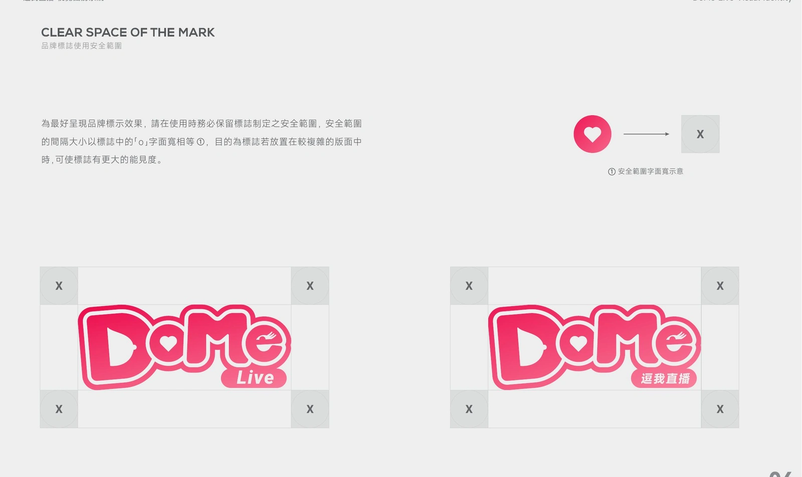
A defined clear-space rule protects the mark from surrounding text and graphics. The guideline also covers both the main DoMe Live signature and localized lockups, making the system easier to apply across regional content.
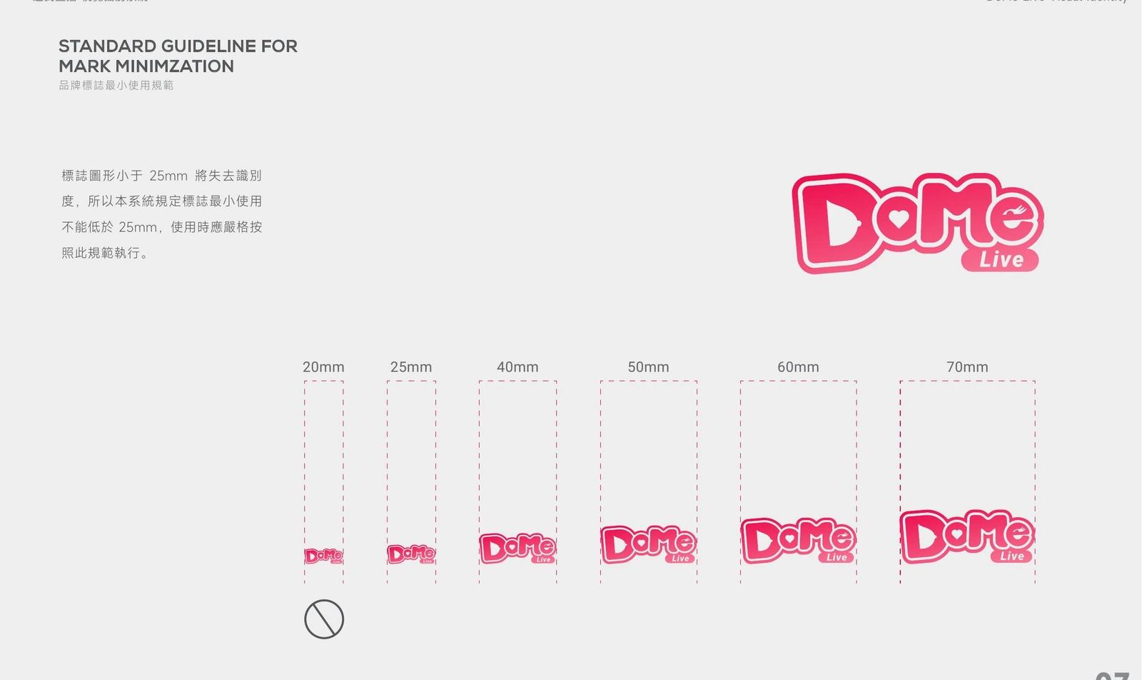
Minimum-size standards preserve legibility across compact digital placements and printed materials. These rules help teams select the appropriate version before small details become difficult to reproduce.
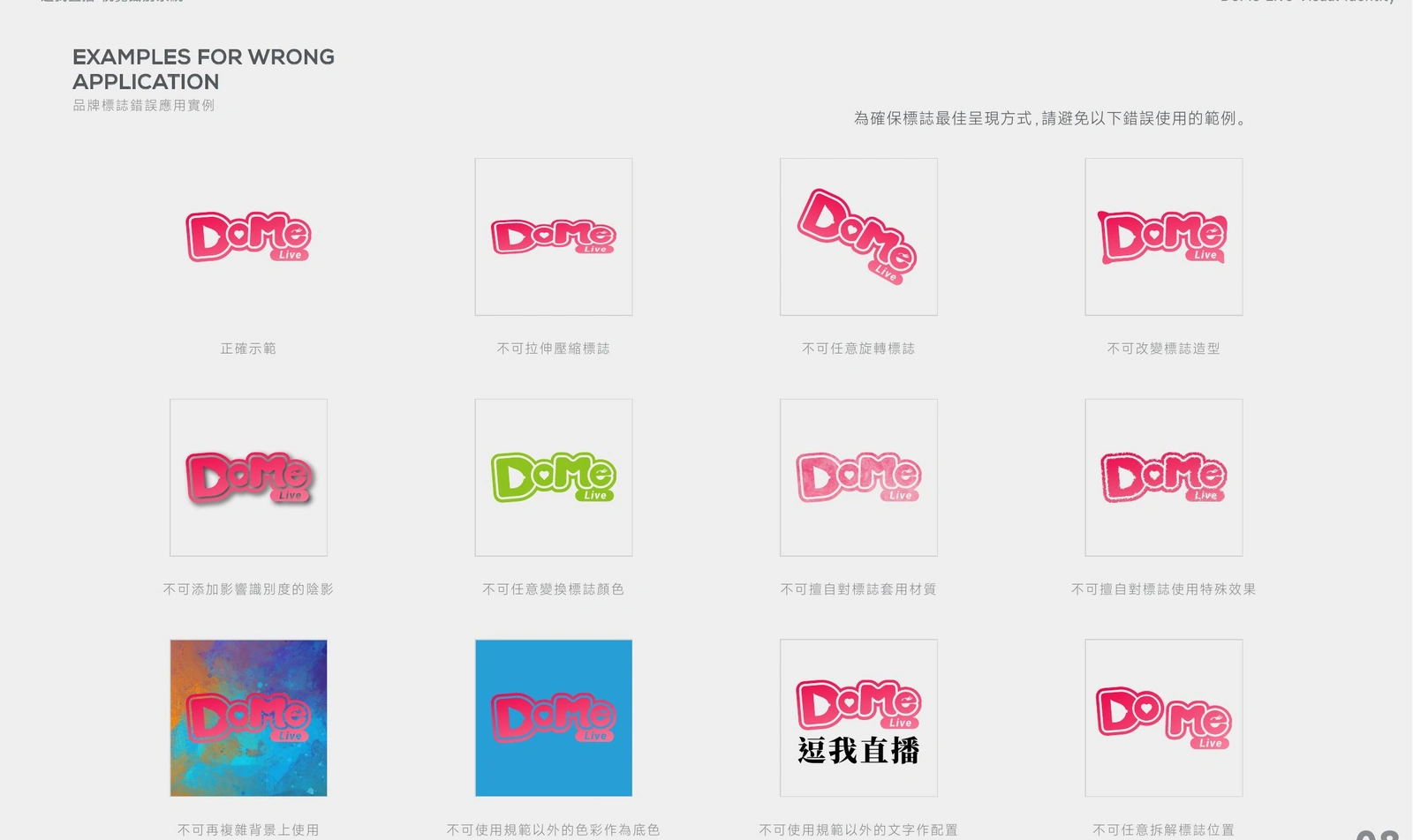
Incorrect-use examples clarify how to avoid distortion, unapproved colors, added effects, low-contrast backgrounds, and changes to the logo's composition. This final layer turns the identity into a practical day-to-day reference.
OUTCOME
The completed guideline gives DoMe Live a recognizable and scalable visual foundation. Its expressive wordmark and vivid palette capture the immediacy of live social interaction, while the structured rules make the identity easier to manage across teams, languages, and platforms.
Rather than stopping at logo creation, the project established a usable brand system designed for consistent real-world implementation.
ROLE
Visual Identity Design, Logo Development, Brand Guideline Design, Color System, Bilingual Typography System, Art Direction, and Brand Application Standards.
Recommended skills
Brand Designer
Graphic Designer
Logo Designer
Brand Guidelines
Recommended tools
Adobe Illustrator
Adobe PhotoShop
Like this project
Posted Aug 24, 2026
Created a vibrant visual identity system for DoMe Live, translating the energy of social live streaming into a clear, flexible, and bilingual brand guideline.