iSKIN Medical Aesthetics Social Media Visual System

Sansi Branding


iSKIN is a medical aesthetics and wellness brand communicating a wide range of services—from skincare and non-invasive treatments to nutrition, body management, and seasonal campaigns.
The objective was to create social media content that could remain recognizable as part of one brand while adapting to different audiences, topics, and campaign moods.
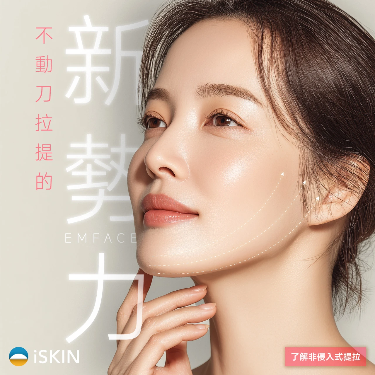
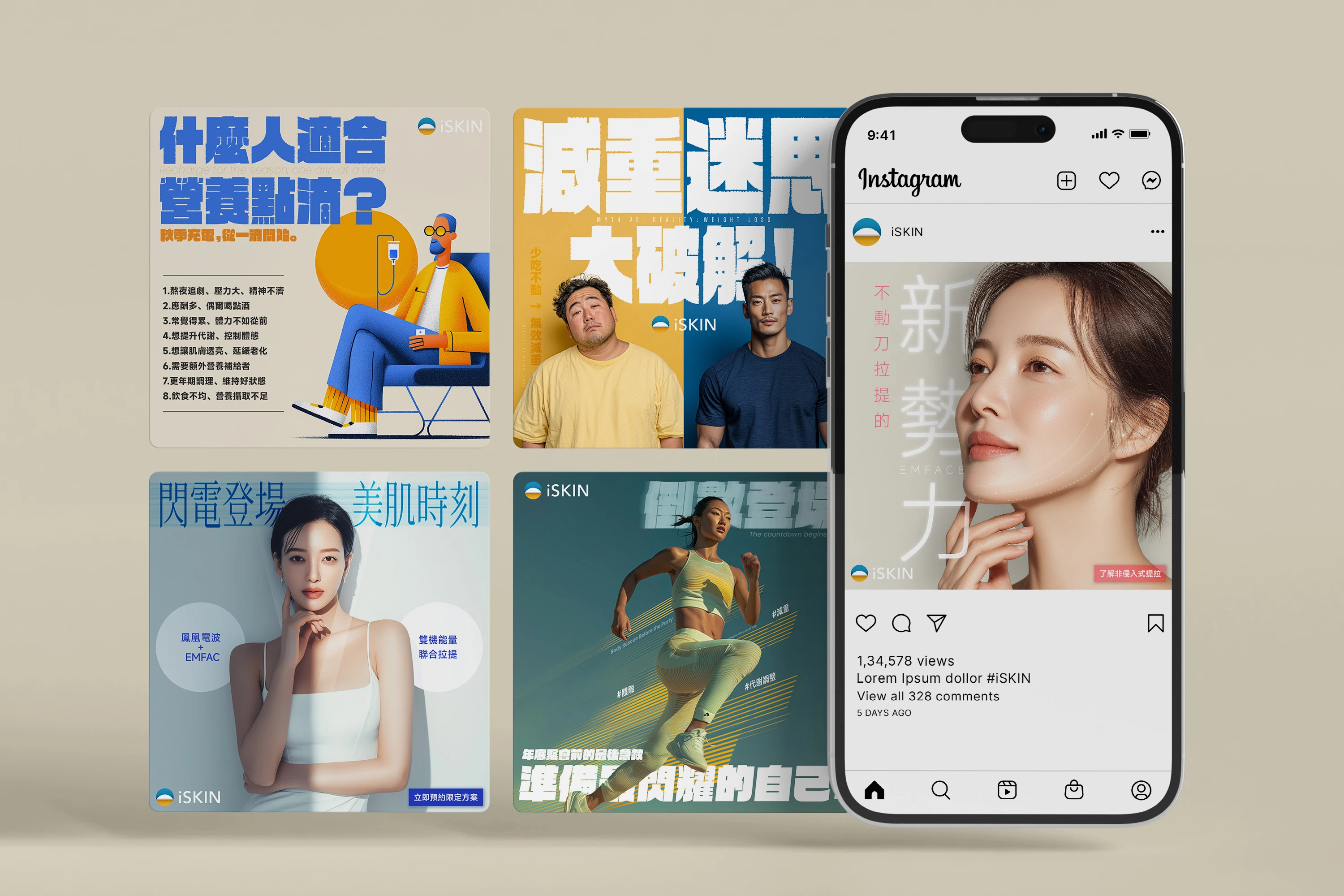
A portrait-led composition with directional facial lines communicates the concept of non-invasive lifting, while the oversized typography creates an editorial and premium impression.
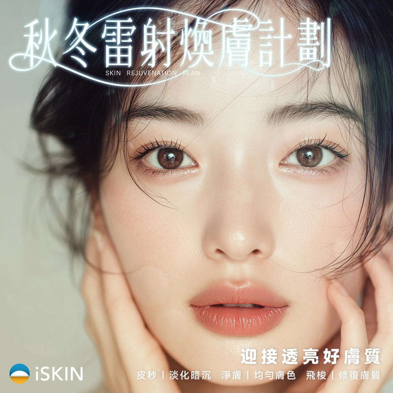
Treatment-focused visuals use refined portrait imagery, clear typography, and restrained calls to action to communicate professional services without losing warmth.
Medical aesthetics content needs to attract attention while communicating information clearly and responsibly.
The visual system had to support several communication goals: explaining treatments, presenting seasonal wellness topics, promoting limited campaigns, and encouraging audience engagement—all without making the brand feel visually repetitive.
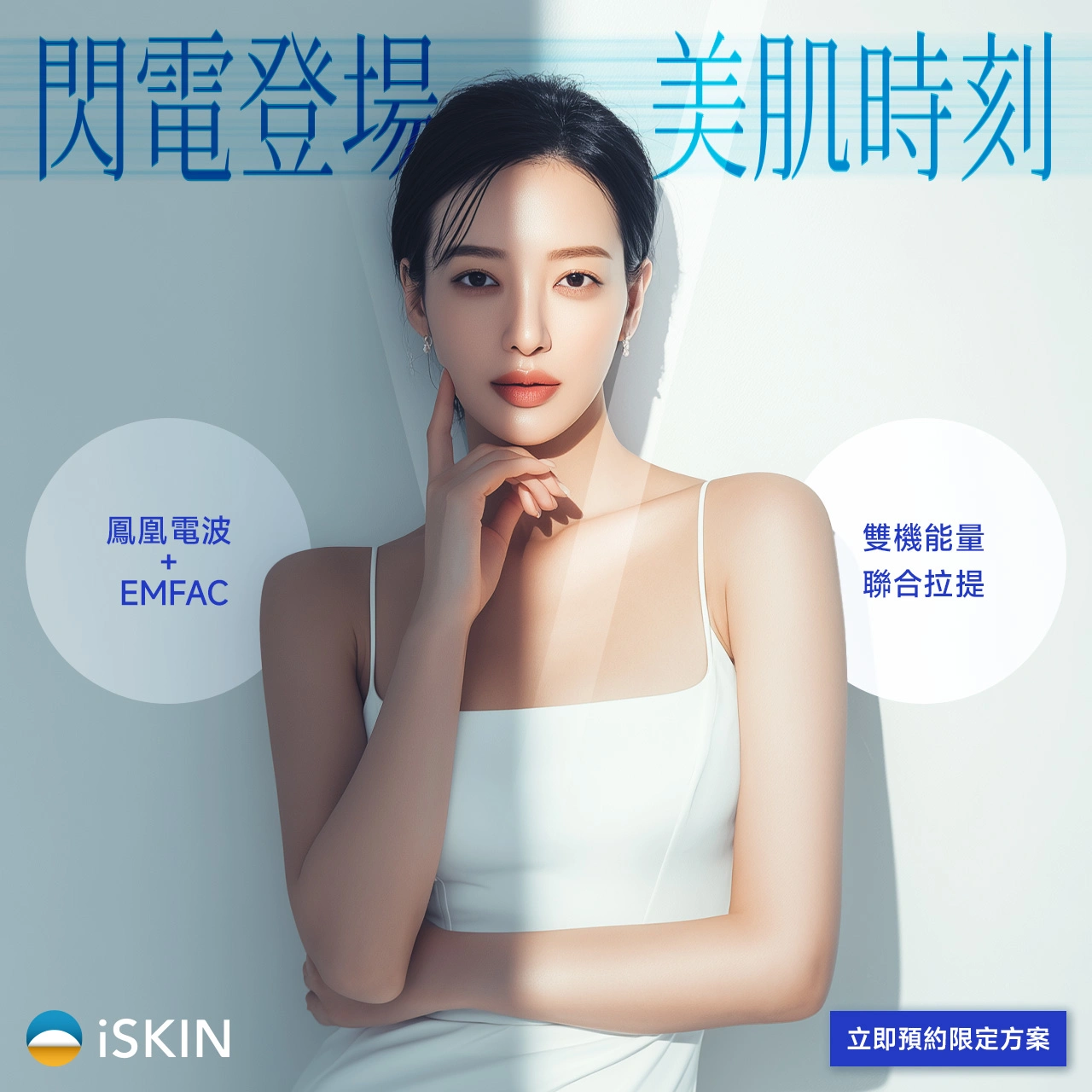
Cool blue tones, split lighting, and circular information modules create a more technology-driven visual direction for a combined treatment campaign.
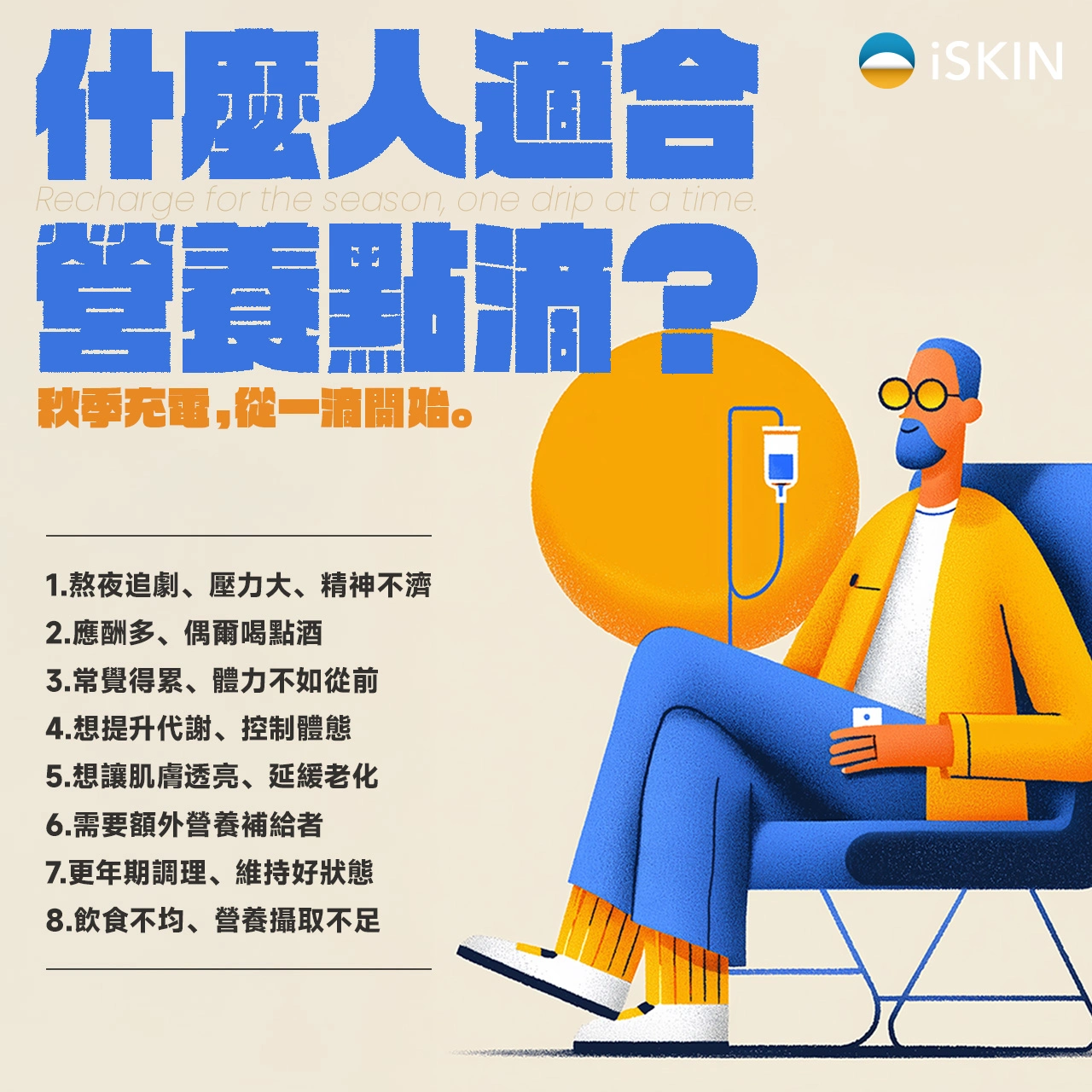
Different information structures were developed for treatment promotion and educational content. Portrait-led layouts create aspiration, while illustration-led posts make detailed wellness information feel more accessible.
For treatment and skincare content, I used close-up imagery, spacious compositions, and strong typographic contrast to establish a polished and trustworthy tone.
The hierarchy was designed to help audiences quickly identify the treatment category, key benefit, and next action, even when viewing the post on a small mobile screen.

An editorial orange palette, autumn leaves, and supplement imagery transform seasonal wellness concerns into a bold and attention-grabbing campaign visual.
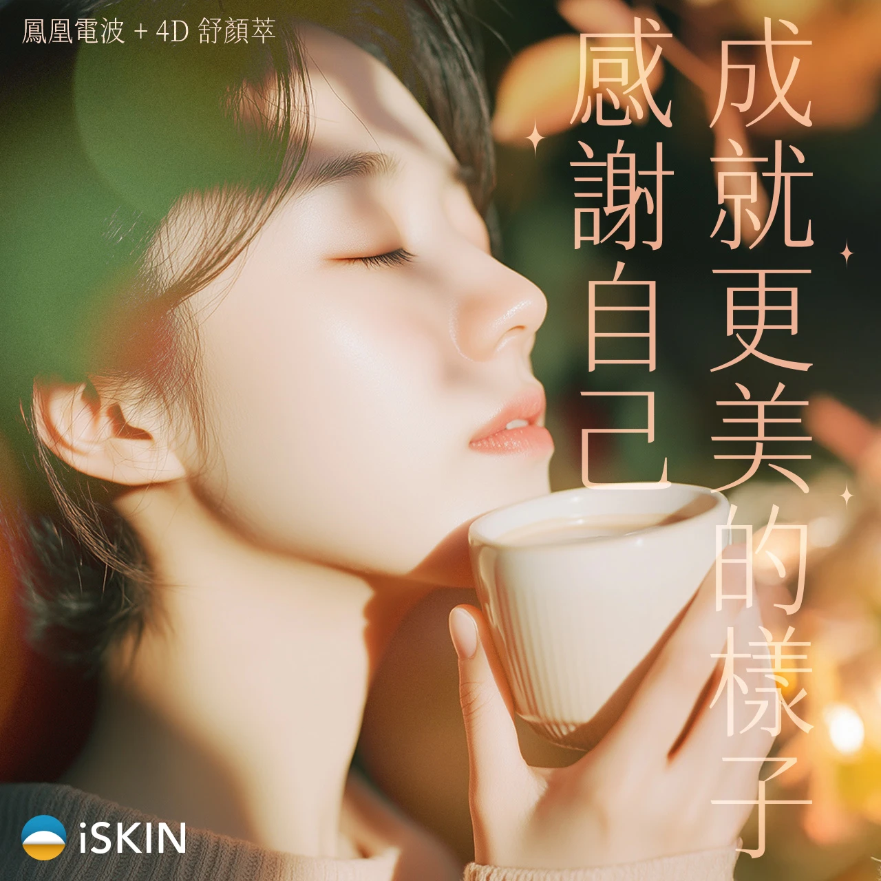
Warm lifestyle imagery and vertically arranged typography create a softer, more emotional seasonal message centered on gratitude and self-care.
Body-management content required a more energetic visual language. Strong contrast, bold typography, dynamic imagery, and clear conceptual structures were used to make educational topics feel immediate and engaging.

A split-screen “myth versus reality” structure uses contrasting colors and characters to turn an educational weight-management topic into an instantly understandable visual.
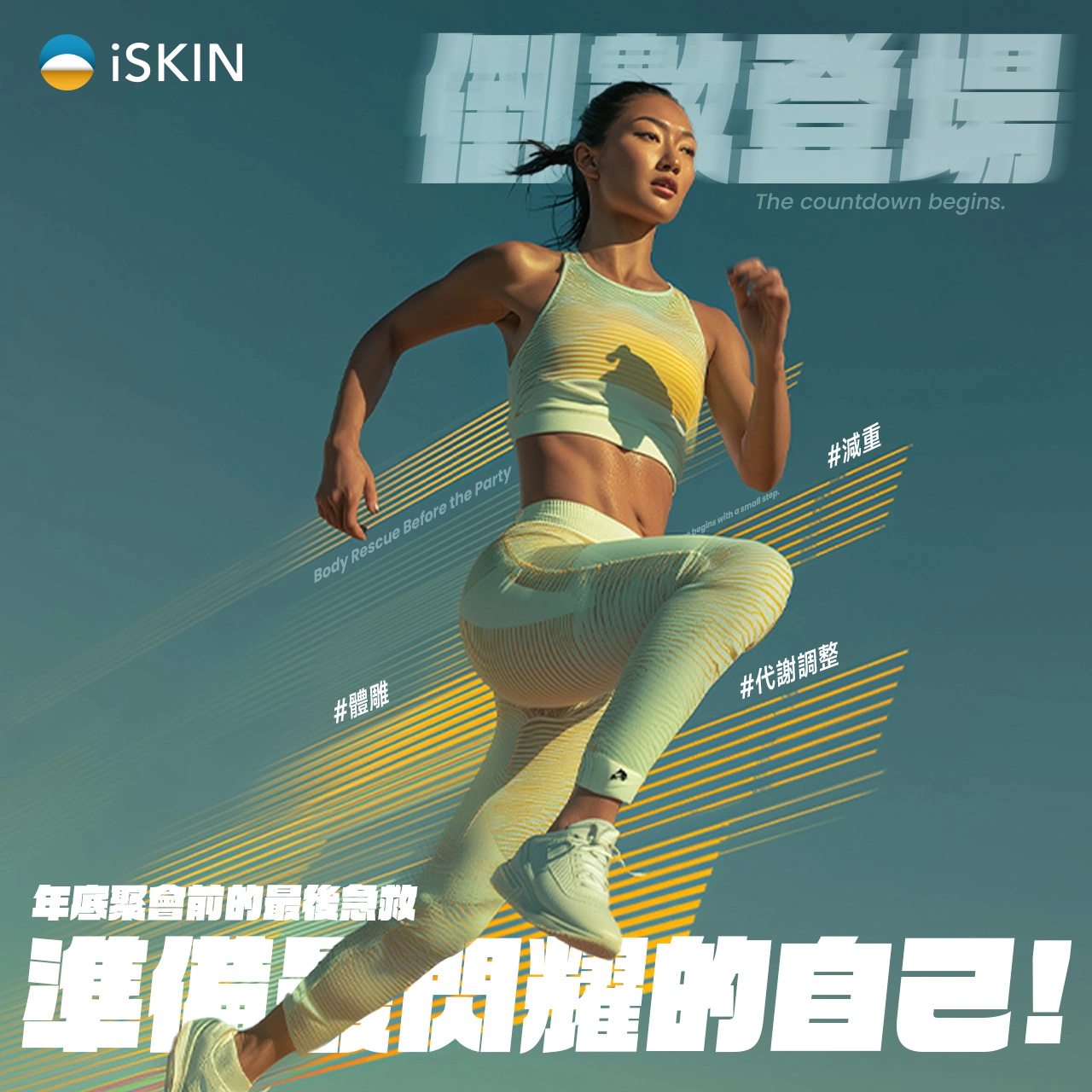
Athletic imagery, diagonal lines, and oversized typography create urgency and movement for a time-sensitive body-management campaign.
The anniversary campaign was designed as a connected three-part visual story. The illuminated door became the central campaign symbol, representing anticipation, discovery, and a new stage for the brand.
A consistent combination of cinematic lighting, pink accents, dark backgrounds, and dimensional objects connected the individual posts into one recognizable campaign sequence.

01 — Teaser: An illuminated doorway introduces a sense of mystery and anticipation.
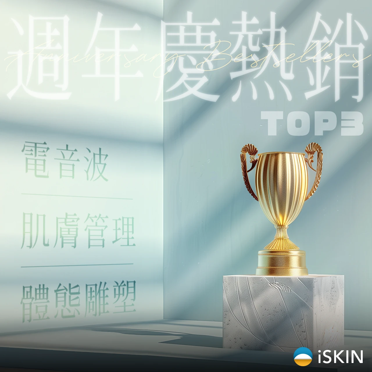
02 — Service Highlights: A trophy-centered composition presents the campaign’s featured categories.

03 — Campaign Launch: The doorway returns in a celebratory environment to reveal the continuation of the anniversary event.
My role included:
• Social media visual direction
• Campaign concept development
• Graphic and layout design
• Typography and information hierarchy
• Image selection and retouching
• Educational content visualization
• Promotional and seasonal adaptations
• Content planning and Chinese copy development

The final body of work demonstrates a flexible social media system capable of supporting different communication needs without restricting the brand to a single visual style.
Across treatment promotions, educational posts, wellness content, and seasonal campaigns, each visual was designed to be clear, engaging, and appropriate for the medical aesthetics audience while maintaining recognizable iSKIN brand elements.
Like this project
Posted Sep 14, 2026
A flexible social visual system for iSKIN, spanning medical aesthetics, wellness education, seasonal campaigns, and promotional content.