Corporate Identity System for True Architecture Group

Sansi Branding


PROJECT OVERVIEW
True Architecture Group needed a clear corporate identity system that could communicate precision, reliability, and professional integrity across every brand touchpoint.
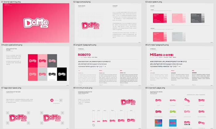
The project transformed the core identity into a practical set of standards covering logo construction, approved variations, clear space, minimum sizing, color usage, and bilingual typography. The result was designed to help internal teams and external partners apply the brand consistently across print and digital communication.
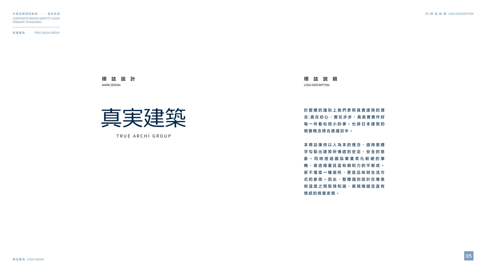
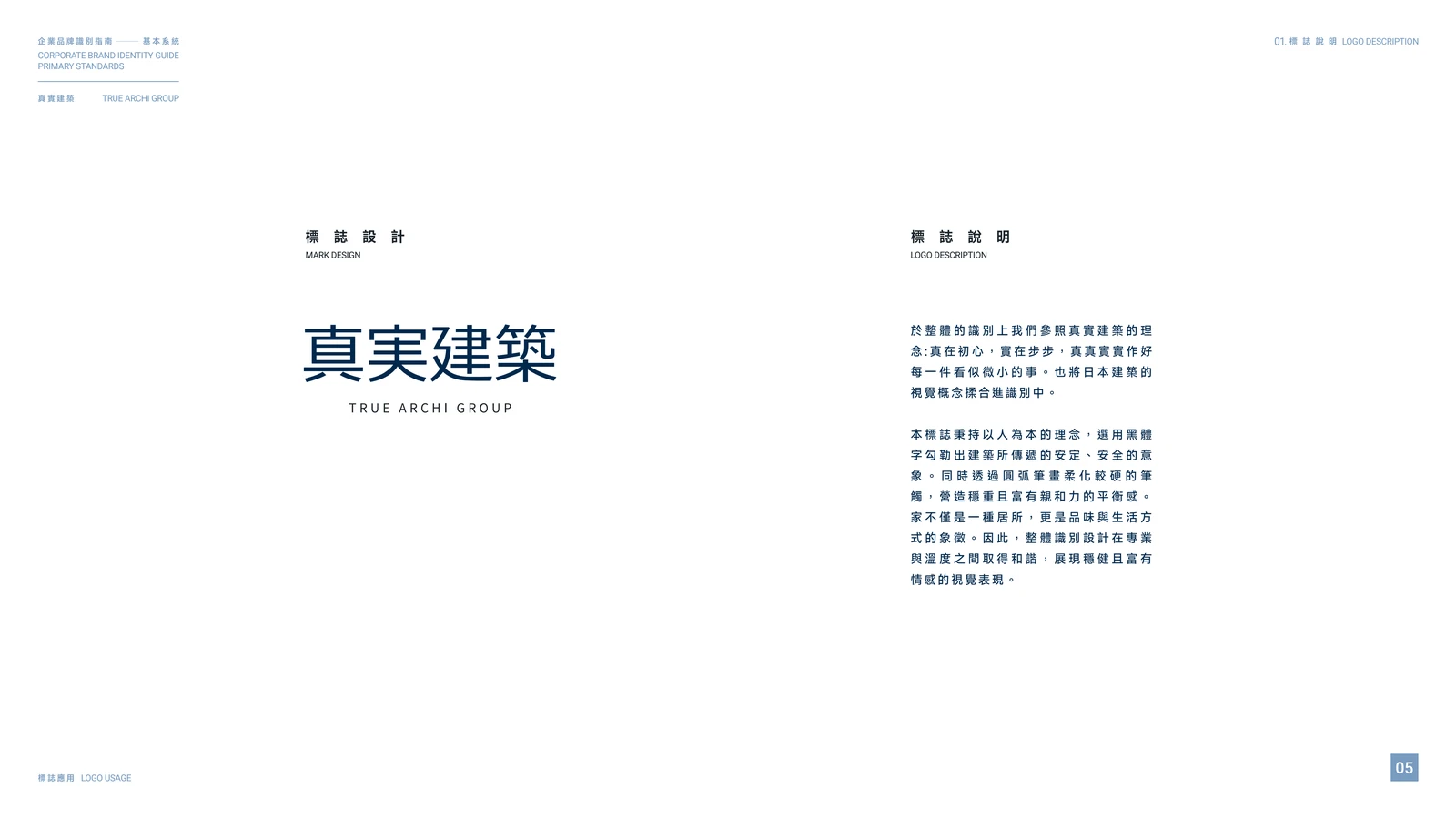
Logo concept and brand rationale
THE CHALLENGE
Architecture and construction brands need to feel stable and trustworthy without becoming generic or visually rigid. The challenge was to create a system that felt restrained and professional while remaining distinctive enough to build recognition.
The identity also needed to work in both Chinese and English, across horizontal and vertical formats, and at a wide range of sizes.
LOGO SYSTEM
The logo combines a structured Chinese wordmark with the English name TRUE ARCHI GROUP. Its geometry and spacing create a calm, architectural rhythm that reflects the brand's focus on accuracy, clarity, and attention to detail.
Horizontal and vertical configurations were developed so the identity could adapt to different layouts without losing hierarchy or recognition.
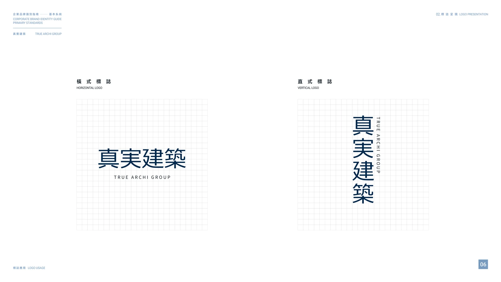
Horizontal and vertical logo configurations
Approved arrangement variations were then defined for different communication formats, giving the brand flexibility while protecting visual consistency.
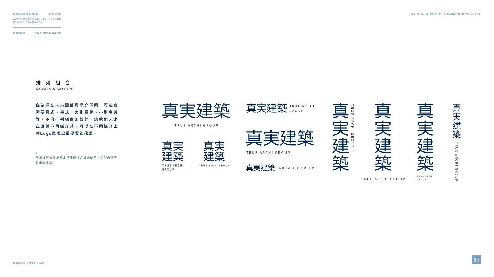
Approved logo arrangements and bilingual variations
USAGE GUIDELINES
A usable identity requires more than approved artwork. The guide establishes minimum-size requirements, clear-space rules, and examples of incorrect use to prevent distortion, unauthorized colors, visual effects, and inconsistent typography.
These rules make it easier for employees, suppliers, and future creative partners to reproduce the identity accurately.
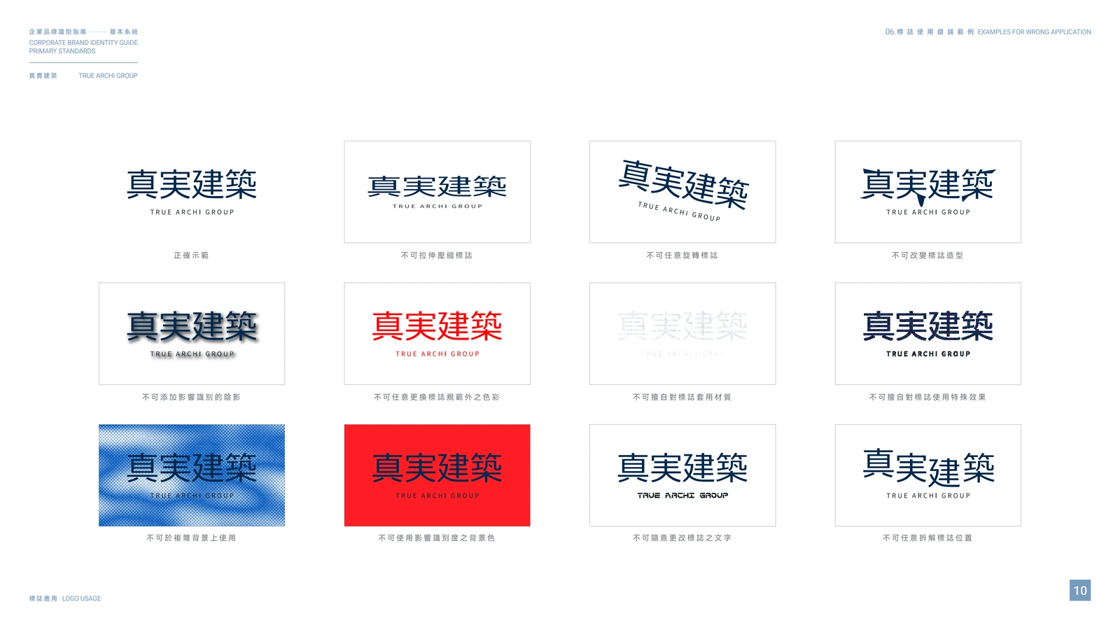
Incorrect-use examples for consistent brand reproduction
COLOR SYSTEM
The primary palette is anchored by a deep architectural navy and charcoal, supported by muted green, blue, and warm neutral tones. Together, the colors communicate stability and professionalism while giving the system enough flexibility for different brand applications.
Pantone, CMYK, RGB, and tonal values were documented to support consistent reproduction across print and digital environments.
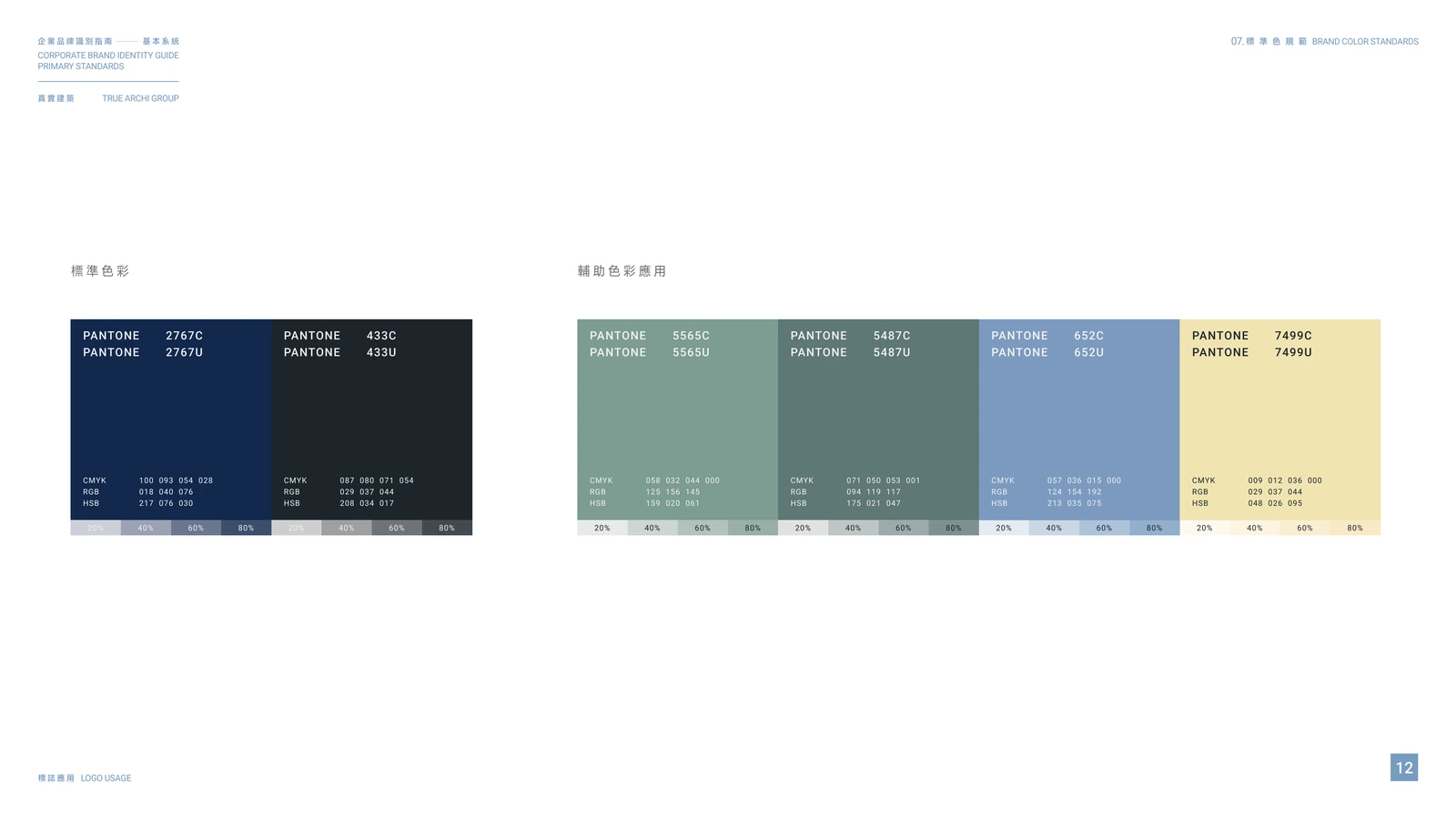
Primary and supporting brand colors with production specifications
The guide also demonstrates approved color combinations, ensuring that the logo remains legible and recognizable across light, dark, and colored backgrounds.
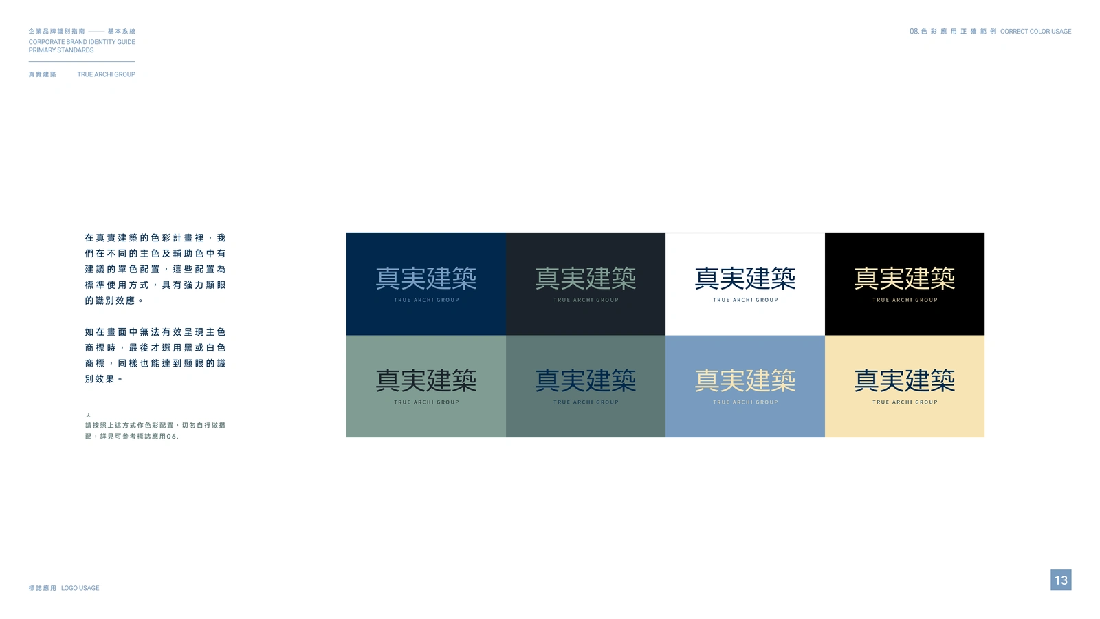
Approved color combinations and background usage
BILINGUAL TYPOGRAPHY
Because the brand communicates in both Chinese and English, the typography system was designed to maintain a consistent level of clarity and authority across languages.
MiSans provides a contemporary and highly legible Chinese type system, while Roboto supports English communication with a clean, functional character. Thin, regular, and bold weights create a practical hierarchy for headlines, supporting information, and body copy.
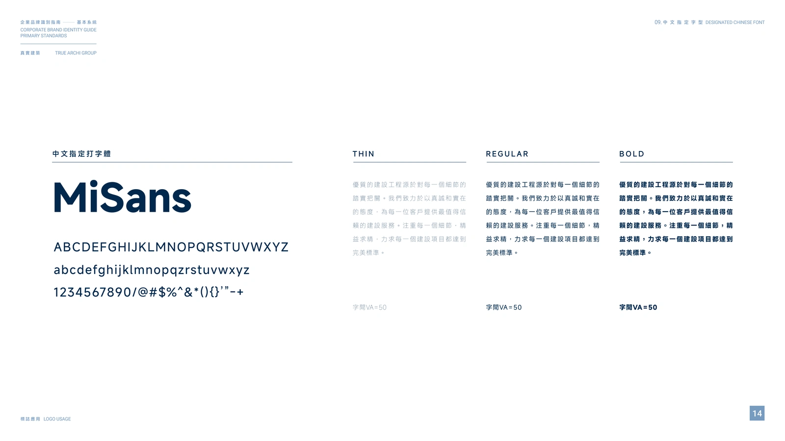
Chinese typography system using MiSans
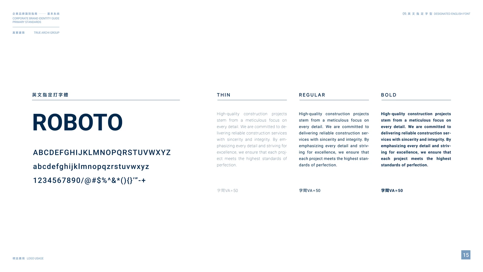
English typography system using Roboto
OUTCOME
The completed identity guide gives True Architecture Group a reliable foundation for consistent brand communication. It turns the logo into a complete working system - one that can be understood and applied by internal teams, vendors, and future creative collaborators.
The final result reflects the qualities at the heart of the company: sincerity, integrity, precision, and a meticulous approach to every detail.
ROLE
Brand Identity Design, Logo System Development, Corporate Identity Guidelines, Color System, Bilingual Typography, and Editorial Layout.
Recommended skills
Brand Designer
Brand Strategist
Graphic Designer
Recommended tools
Adobe Illustrator
Adobe InDesign
Adobe Photoshop
Like this project
Posted Aug 24, 2026
Developed a corporate identity guide for an architecture group, covering logo standards, color, bilingual typography, and consistent brand use.