Yichao — Seafood Brand Identity & Packaging Concept

Sansi Branding


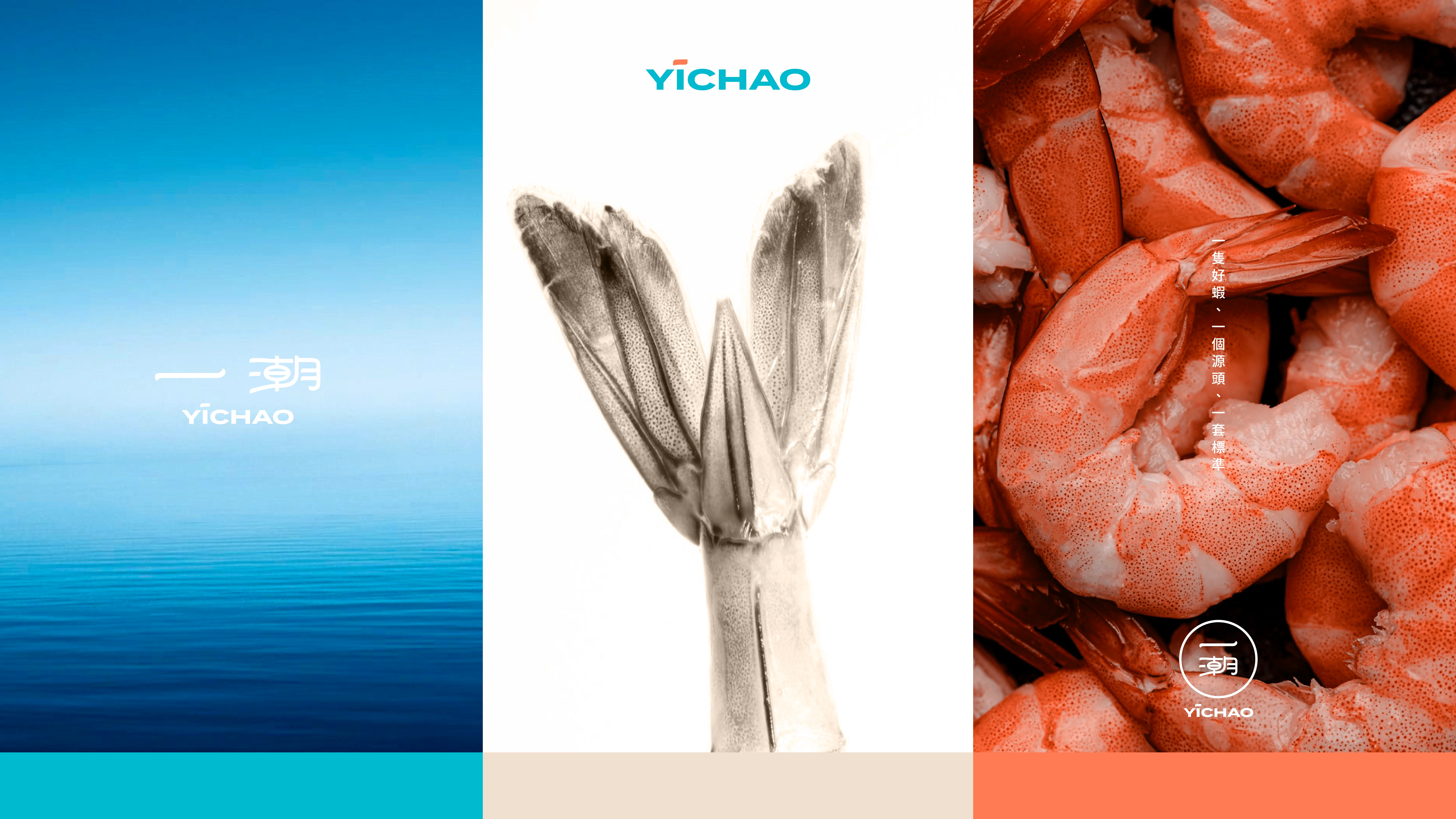
PROJECT OVERVIEW
Yichao is a Taiwanese seafood brand developed by Yuren, a team of young professionals with backgrounds in medical laboratory science and aquaculture.
The brand raises white shrimp in high-salinity seawater without antibiotics, supported by herbal probiotics, traceable production standards, independent testing and full cold-chain management. The goal was to translate this highly controlled process into a brand that feels trustworthy, fresh and approachable—not overly technical or distant.
THE CHALLENGE
Seafood brands often rely on similar images of oceans, waves and shrimp. Yichao needed an identity that could communicate not only freshness, but also the care, transparency and discipline behind every product.
The challenge was to balance scientific credibility with the warmth and appetite appeal expected from a consumer food brand.
BRAND IDEA
One shrimp. One source. One standard.
From aquaculture and quality control to cold-chain delivery and the dining table, every step is connected. This complete journey became the foundation of the visual system.
LOGO CONCEPT
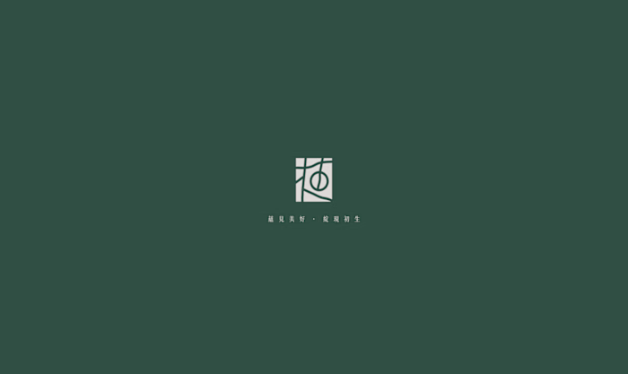
The Chinese name “一潮” was redrawn as the central brand mark. Its connected structure creates movement and continuity, while the circular form represents the complete journey from source to table.
Using the name itself as the primary symbol makes the identity direct and memorable, reflecting the brand’s commitment to showing consumers how its products are raised, managed and delivered.
COLOR SYSTEM
Ocean blue communicates purity, expertise and trust. Shrimp orange introduces freshness, energy and appetite appeal, while warm beige and brown tones connect the identity to prepared foods and the dining experience.
SUPPORTING GRAPHICS
Three supporting symbols were created around the ideas of ocean, freshness and flavor. Flowing lines represent seawater, a rounded shrimp form expresses freshness, and an upward flame represents cooking, warmth and aroma.
PACKAGING DIRECTION
The proposed packaging directions focus on visibility and interaction. Transparent areas allow customers to see the product directly, while tactile details and net-inspired structures connect the packaging to the aquaculture story.
The objective is to make product quality feel visible and tangible before the package is opened.
OUTCOME
The proposed identity gives Yichao a clear foundation for communicating trust, freshness and traceability. It turns a complex production process into a visual story that consumers can quickly understand—from one carefully raised shrimp to the final dining experience.
ROLE
Brand Strategy, Logo Design, Visual Identity, Color System, Supporting Graphics, Packaging Direction and Presentation Design.
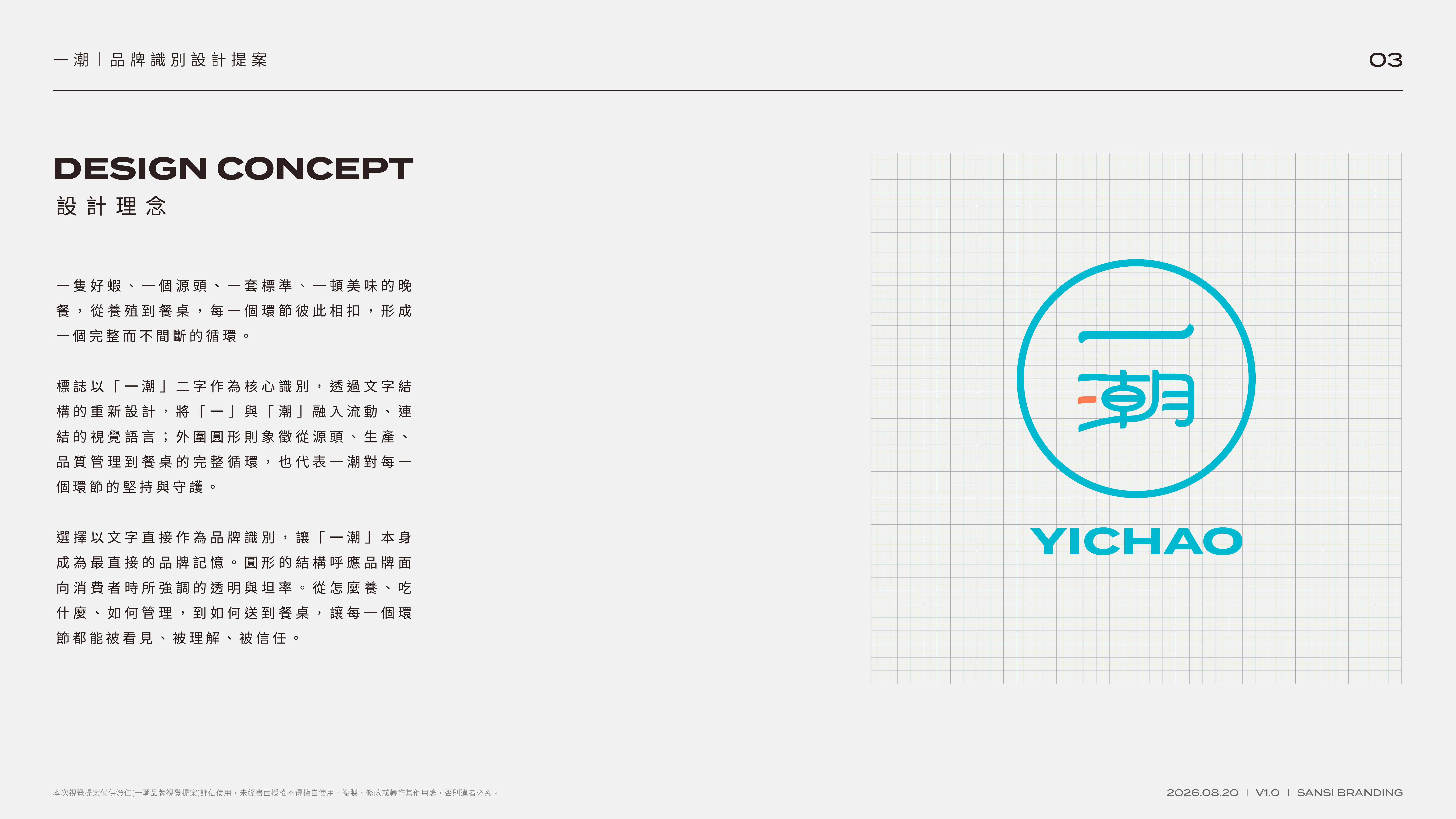
Logo concept — a connected circular mark representing the complete journey from source to table.
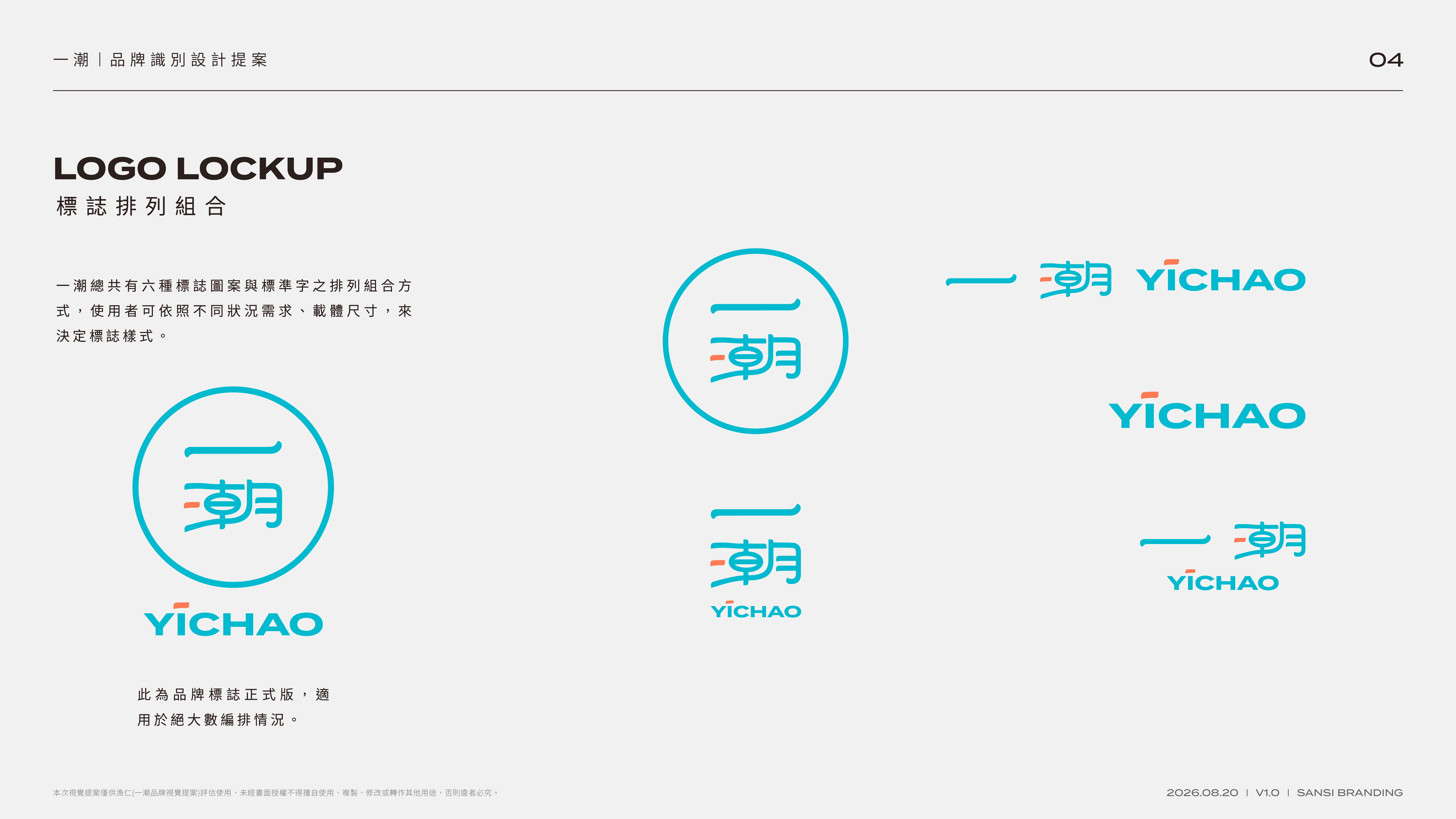
A flexible logo system designed for different formats, scales and brand touchpoints.
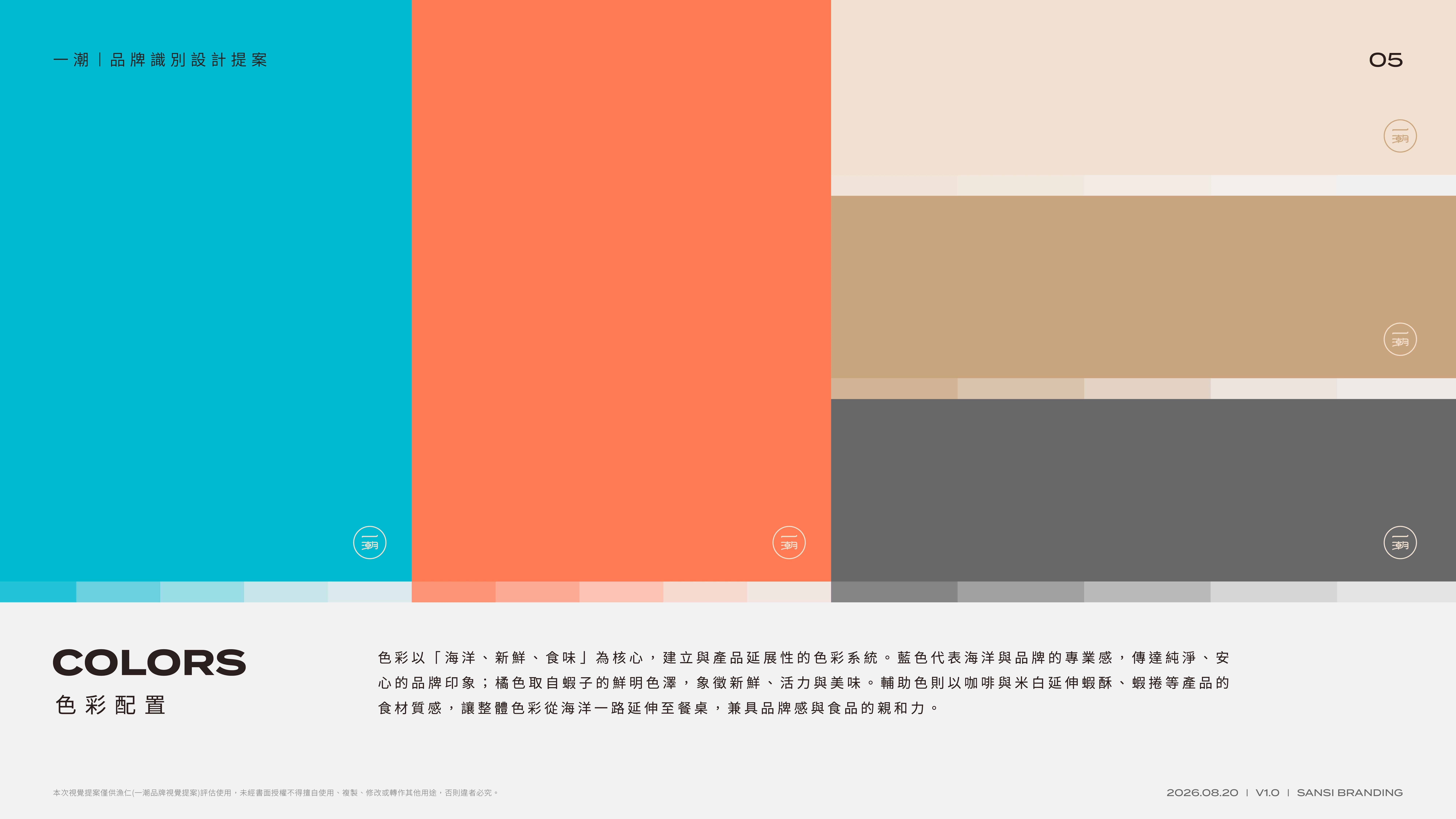
The palette moves from ocean to table: trustworthy blue, fresh shrimp orange and warm food-inspired neutrals.
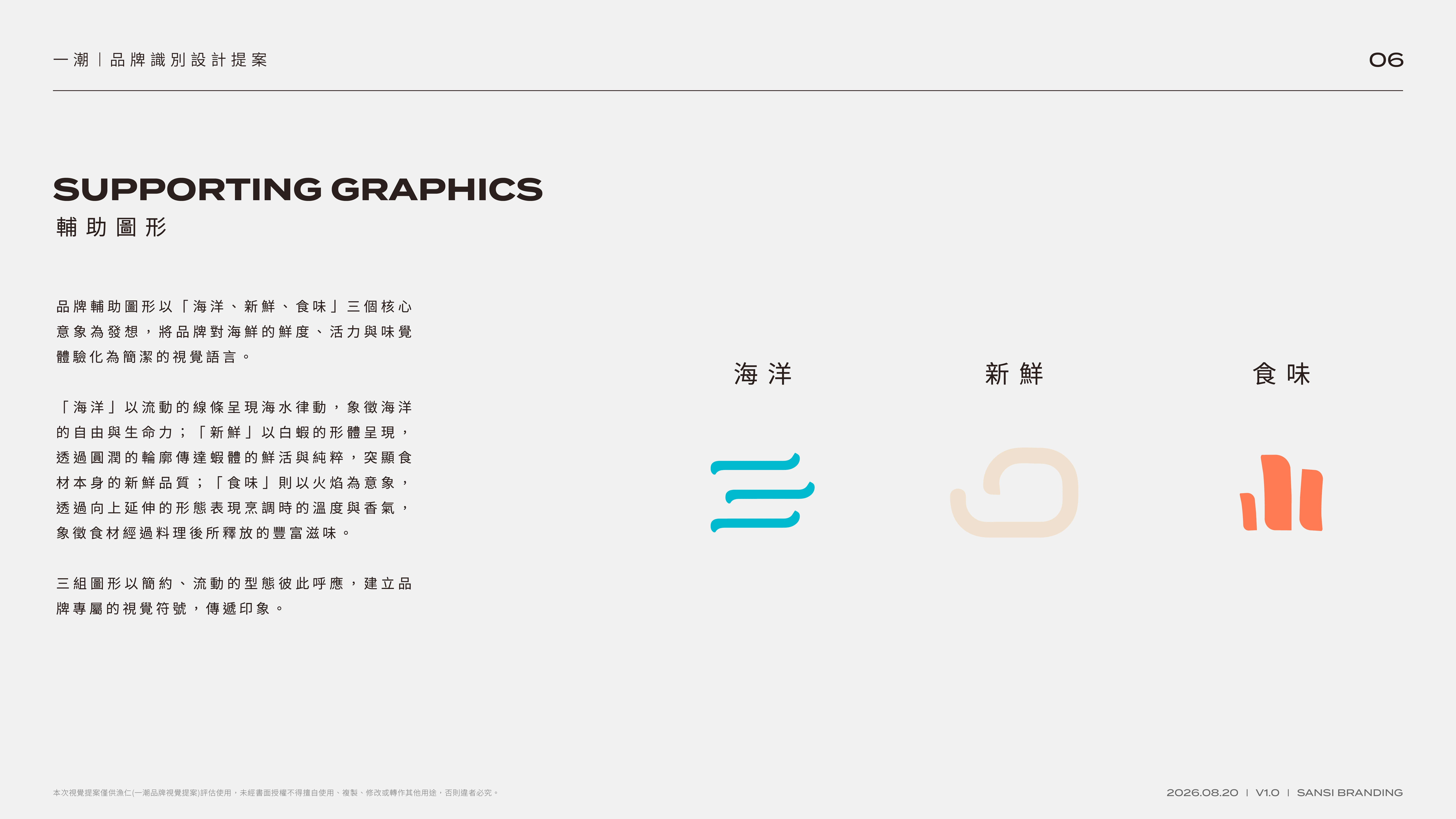
Supporting symbols translate ocean, freshness and flavor into a simple visual language.
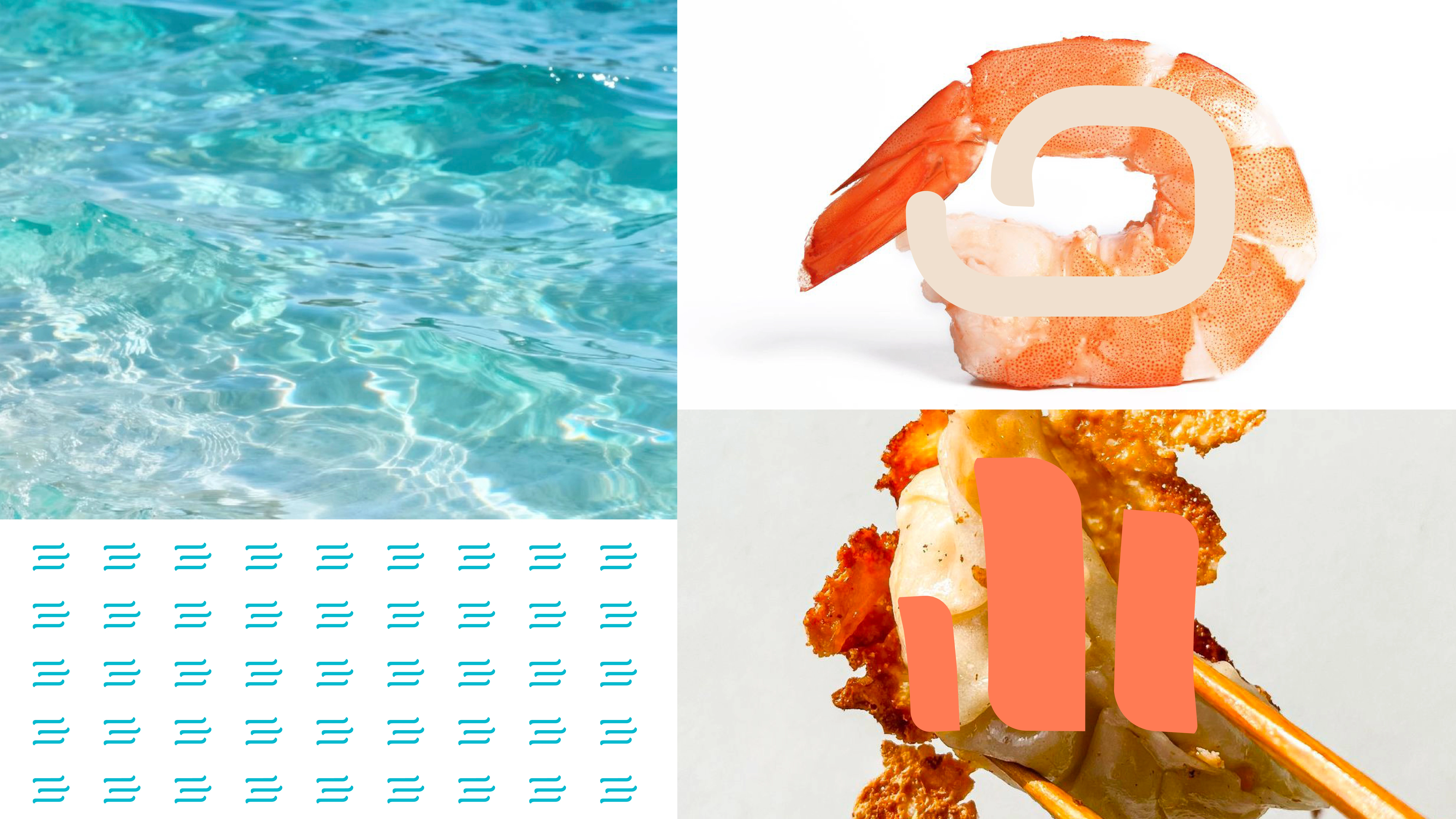
The graphic system extends across imagery and layouts while keeping the brand recognizable.
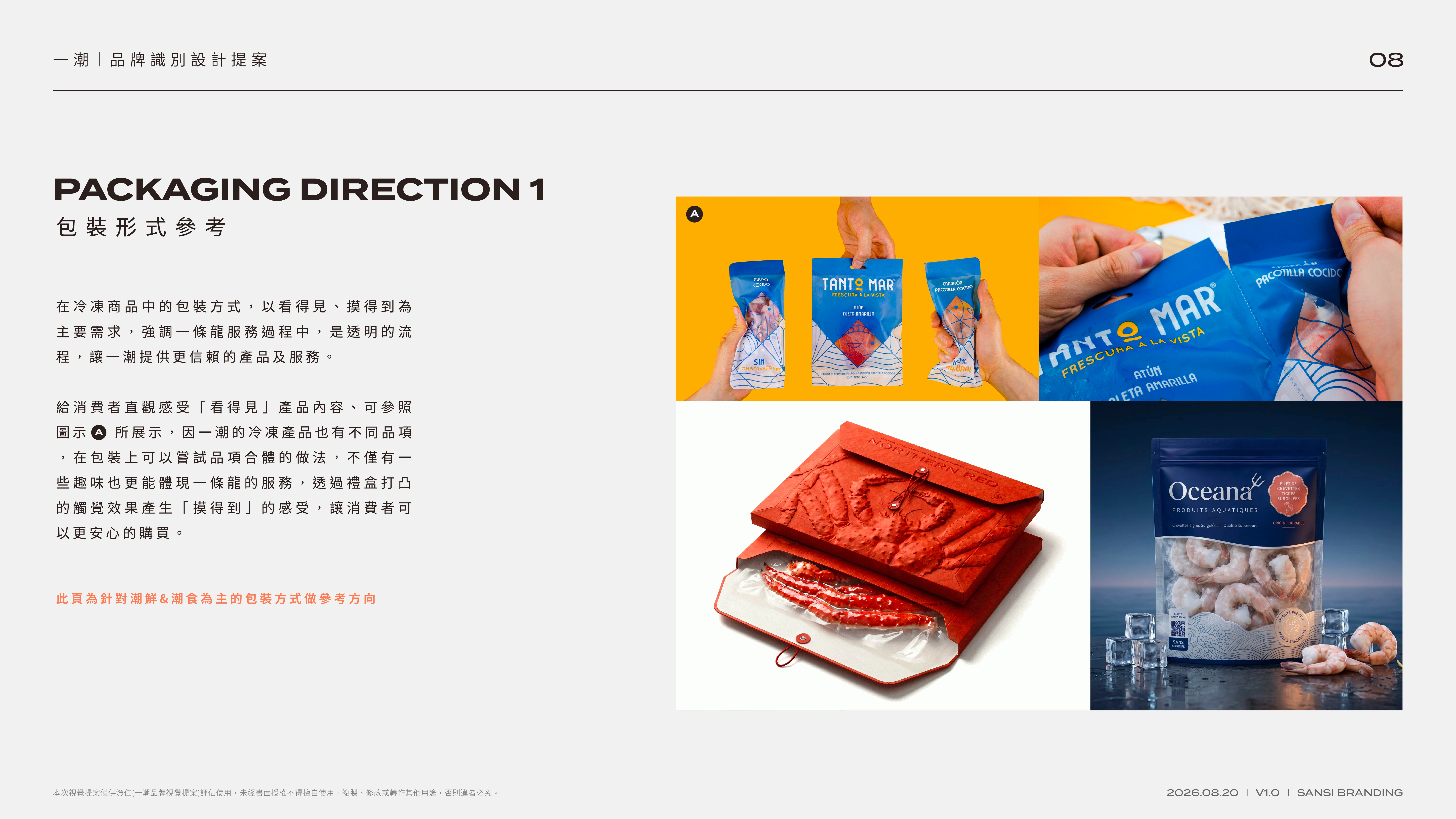
Packaging direction 01 — visible product windows and tactile details make transparency part of the experience.
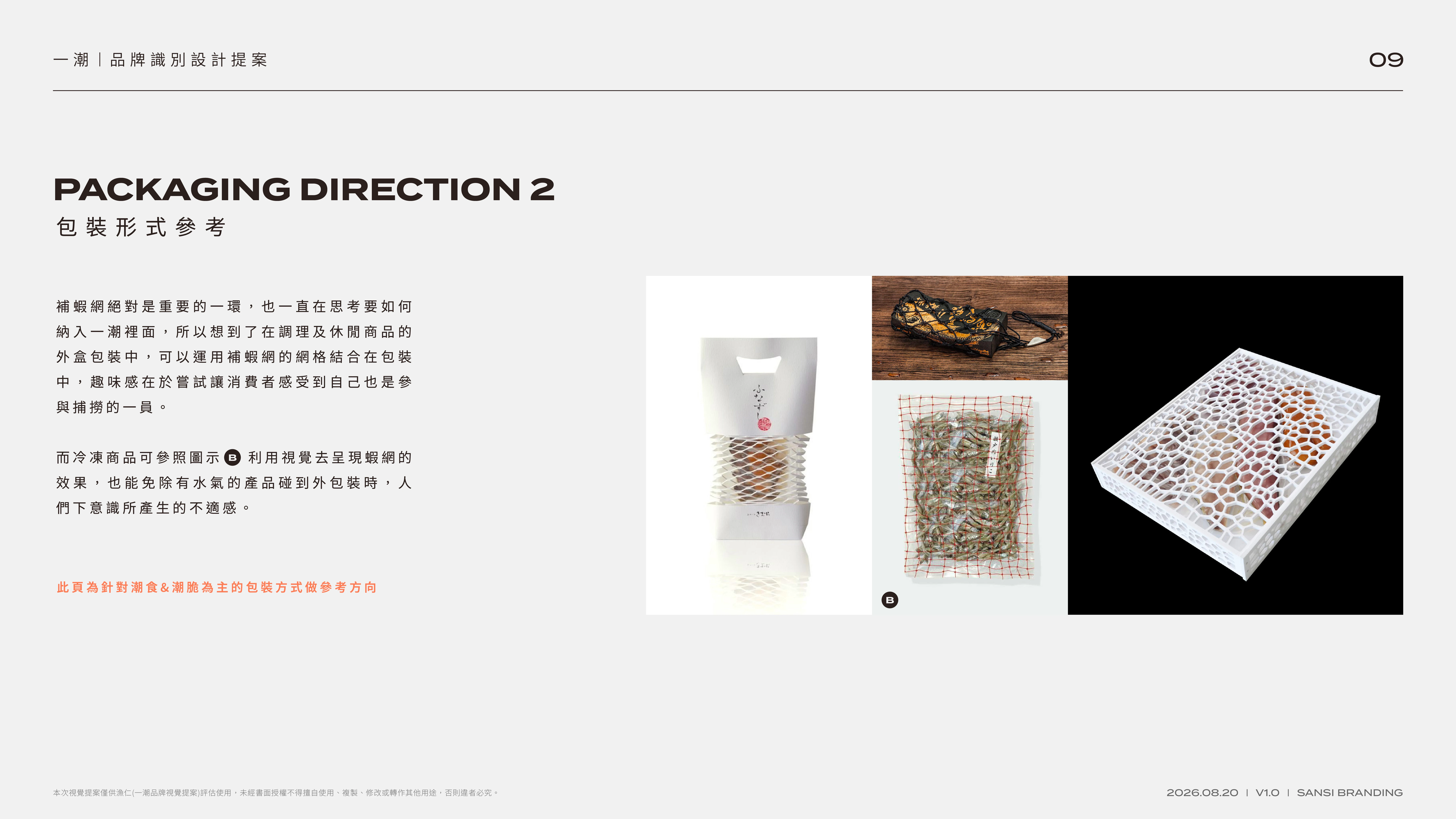
Packaging direction 02 — net-inspired structures connect the packaging to the aquaculture story.
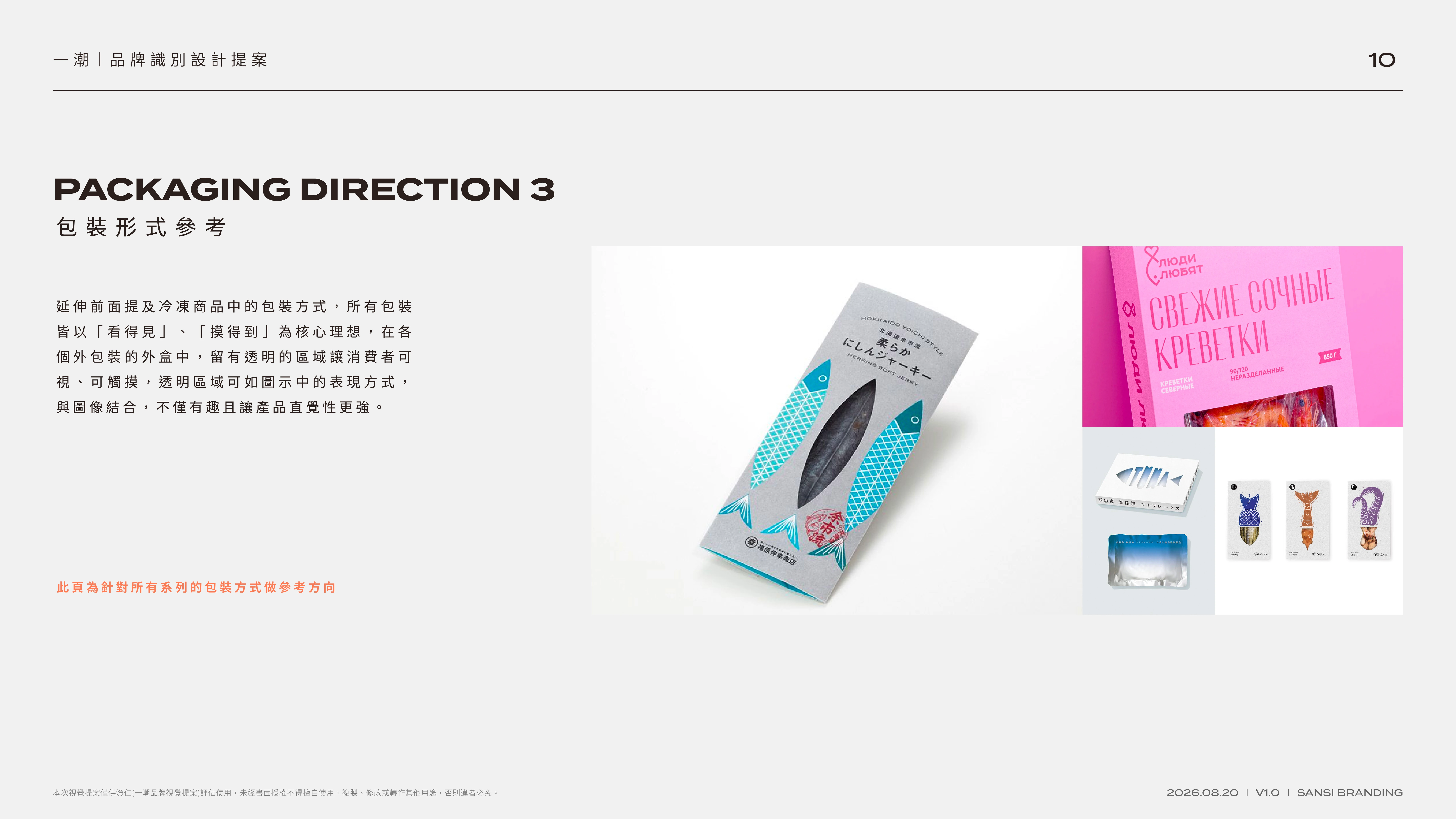
Packaging direction 03 — transparent areas turn product visibility into a direct signal of freshness and trust.
Like this project
Posted Sep 21, 2026
A seafood identity system turning scientific aquaculture, traceable sourcing and farm-to-table freshness into a clear visual story.