IFORY - Corporate Identity & Brand Application System

Sansi Branding


PROJECT OVERVIEW
IFORY needed a practical corporate identity system that could remain recognizable across everyday business communication, event materials, internal documents, and digital presentations.
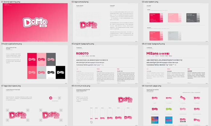
The project developed the core logo into a structured set of standards covering construction, spacing, minimum size, approved colors, typography, and incorrect use. The system was then extended across a range of physical and digital applications to demonstrate how the brand should work in practice.
THE CHALLENGE
The identity needed to feel professional and dependable while retaining enough energy to stand out in corporate and event environments. It also had to remain clear at small sizes, adapt to different backgrounds, and work consistently across materials created by different teams and suppliers.
The challenge was therefore not only to define the visual identity, but also to create rules that made it easy to reproduce accurately.
LOGO SYSTEM
The IFORY wordmark uses compact, rounded forms to create a friendly but confident visual presence. Multiple color directions were explored to test how the mark could shift in tone while retaining a recognizable structure.
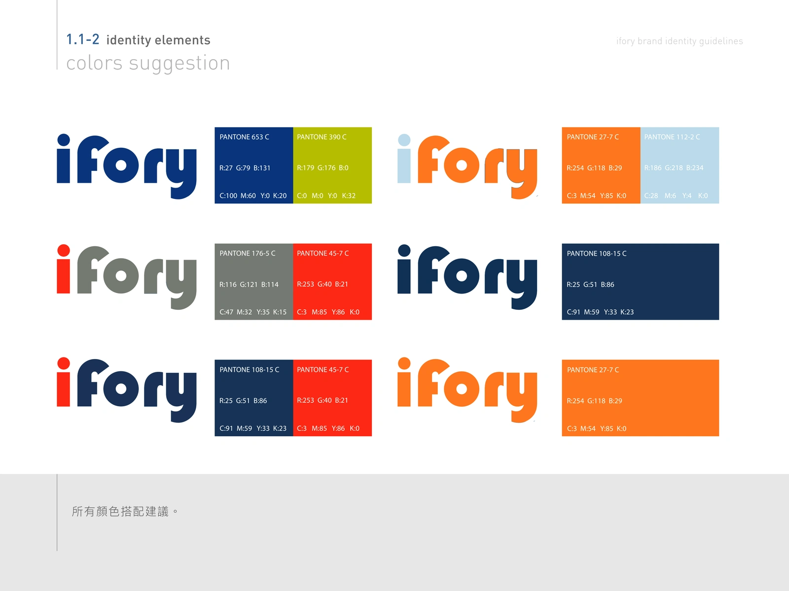
Logo color explorations and approved directions
Precise proportions, clear-space requirements, and minimum sizes were documented so the logo would remain legible and balanced across both print and digital use.
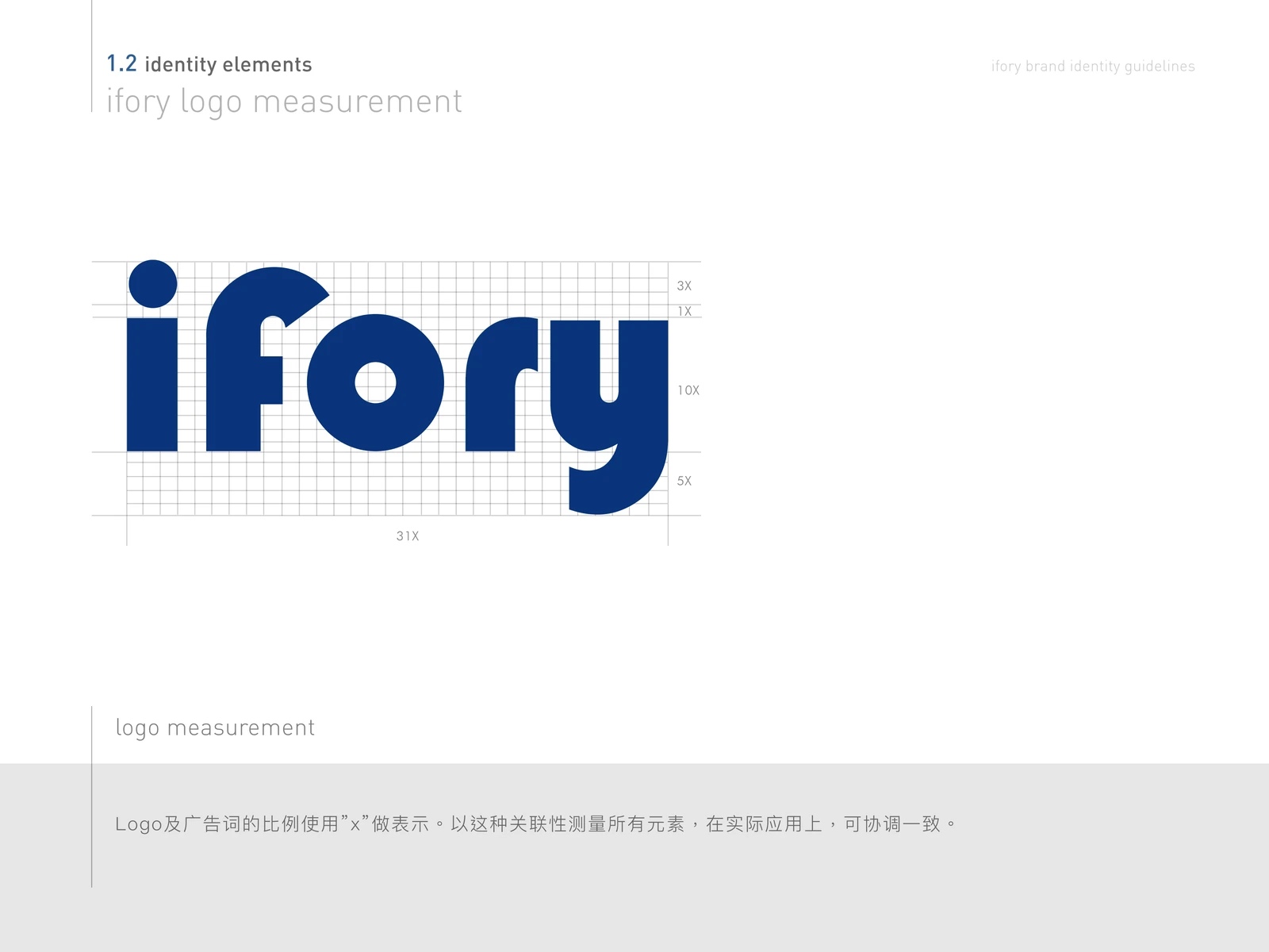
Logo construction, spacing, and minimum-size standards
USAGE GUIDELINES
The guide identifies common errors such as distortion, rotation, outlines, unauthorized effects, insufficient contrast, and changes to the relationship between the symbol and wordmark.
By showing both approved and incorrect examples, the system helps internal teams and external partners protect the identity without needing constant design supervision.
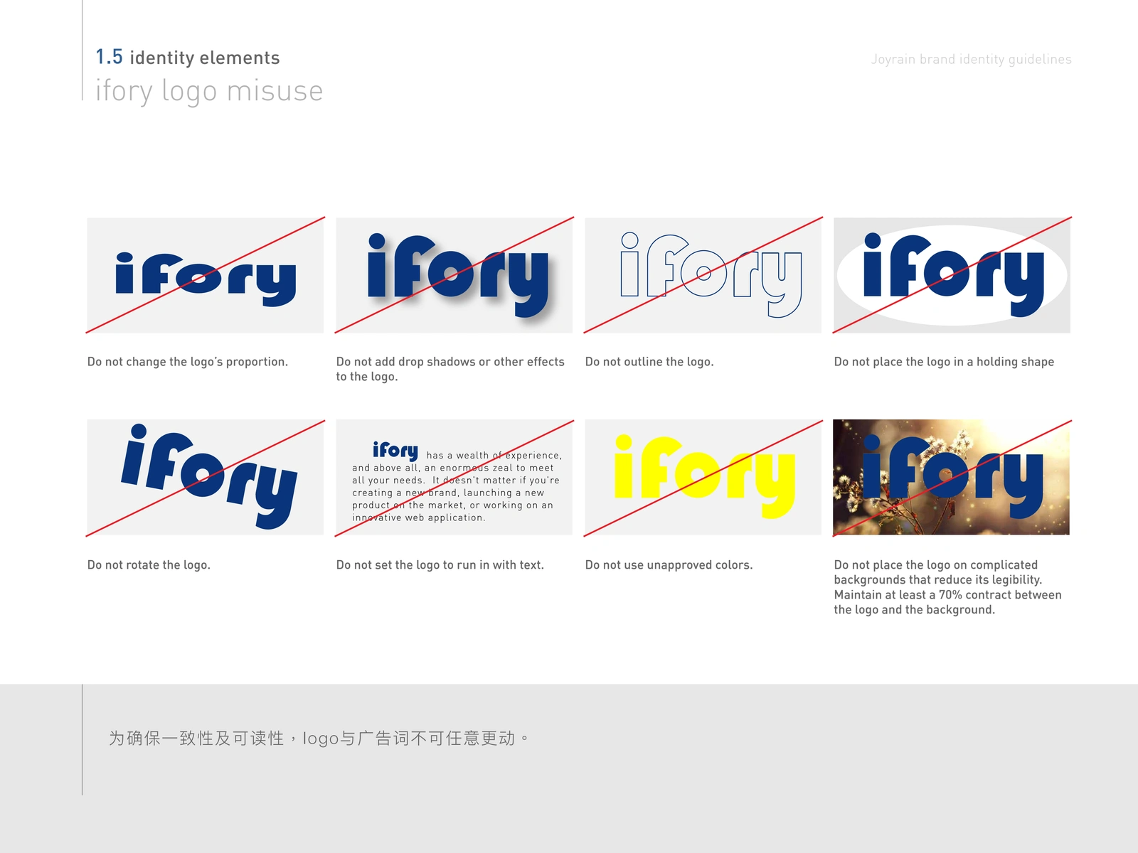
Incorrect-use examples for reliable brand reproduction
COLOR & TYPOGRAPHY
The palette combines a dependable deep blue with energetic lime and orange accents, supported by neutral tones. This creates a system that can move between formal corporate communication and more visible event or promotional materials.
Production values were documented to maintain consistent color across different media.
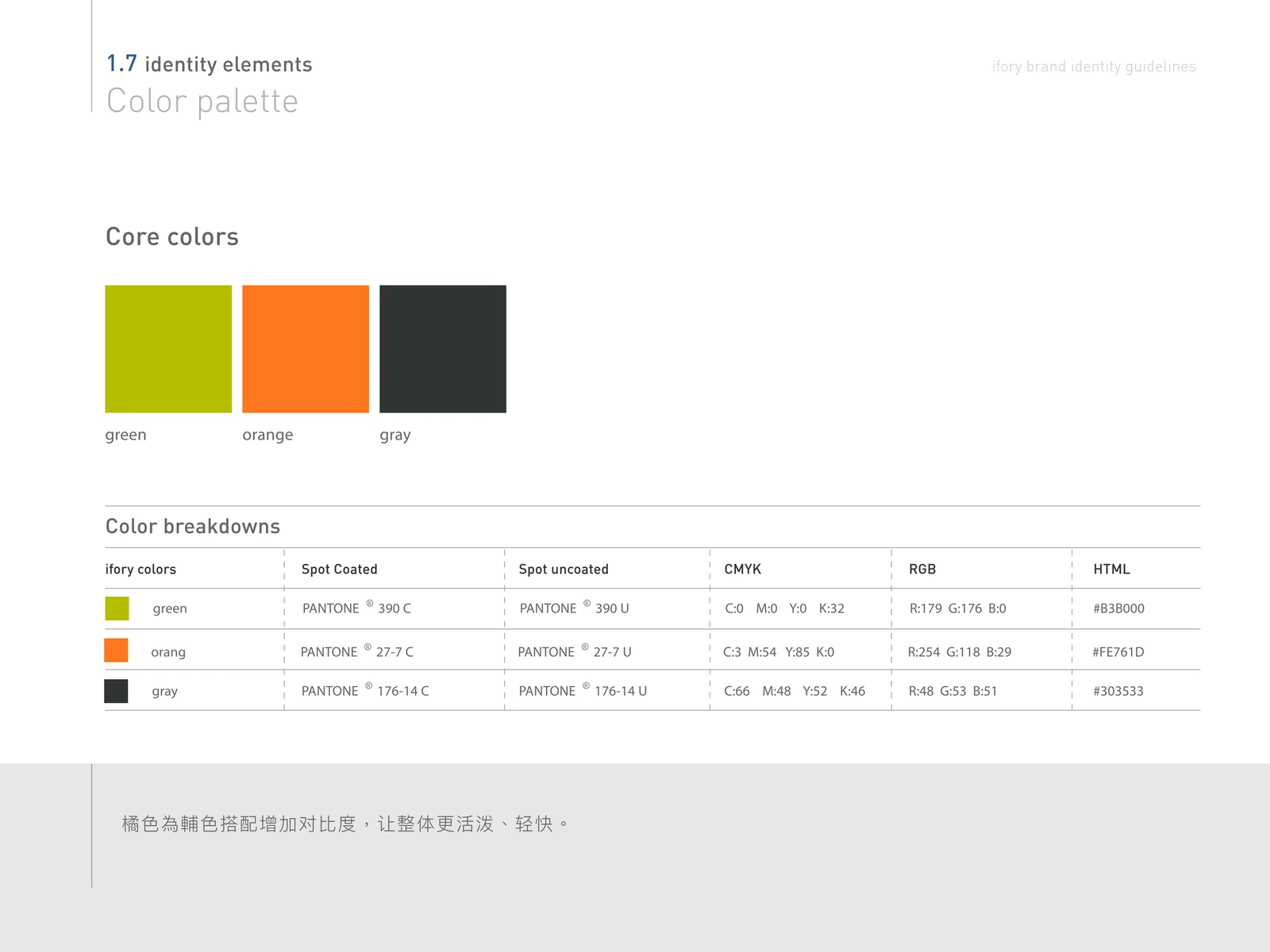
Core brand colors and production specifications
The typography system defines preferred and alternate fonts for practical use across documents and presentations. Clear typographic choices ensure that the brand remains readable and consistent, even when original font resources are unavailable.
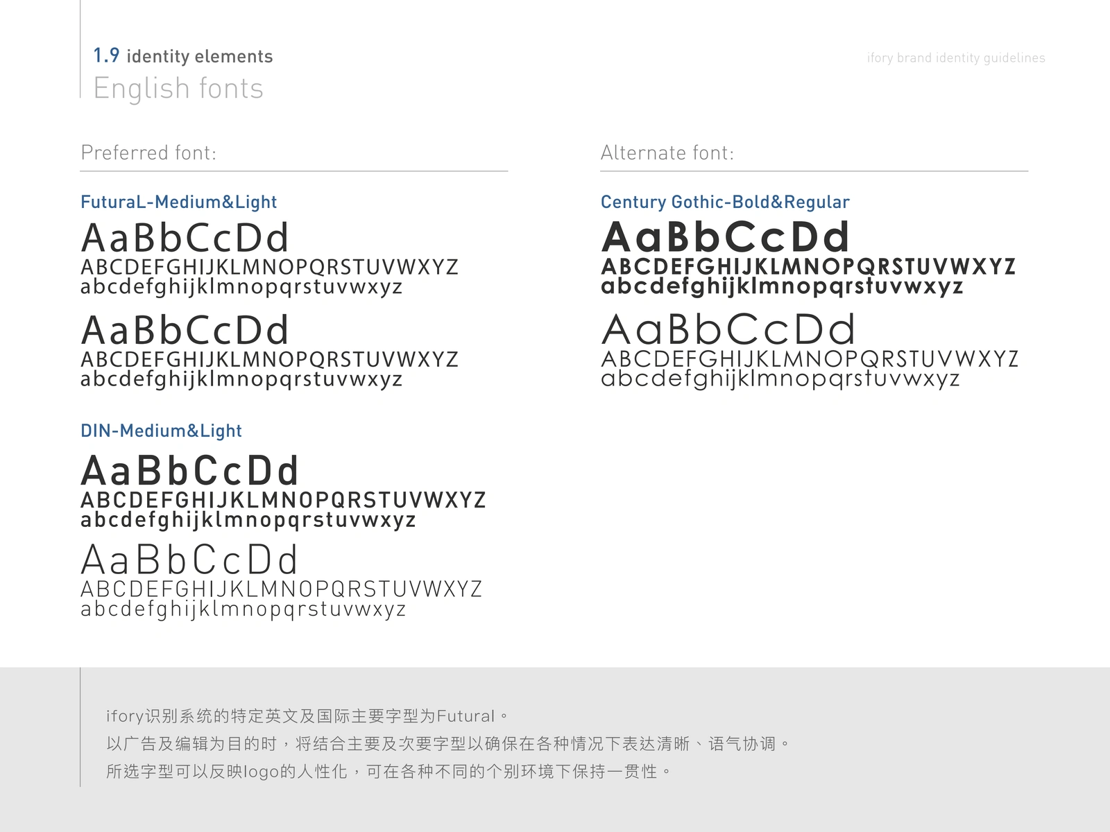
Preferred and alternate English typefaces
BRAND APPLICATIONS
The system was applied to frequently used business materials to demonstrate how the identity moves beyond the guideline document.
Business cards use a restrained blue-and-white layout that gives the logo strong visibility while keeping contact information clear and professional.
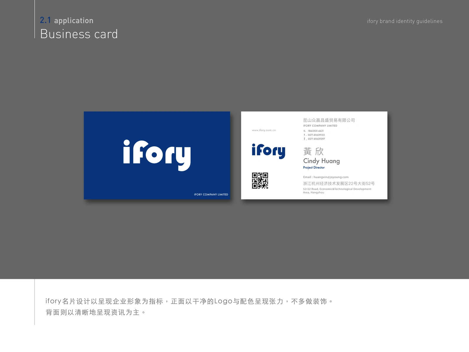
Corporate business card application
Employee ID cards extend the same hierarchy and color system into an internal operational format, balancing identification requirements with brand consistency.
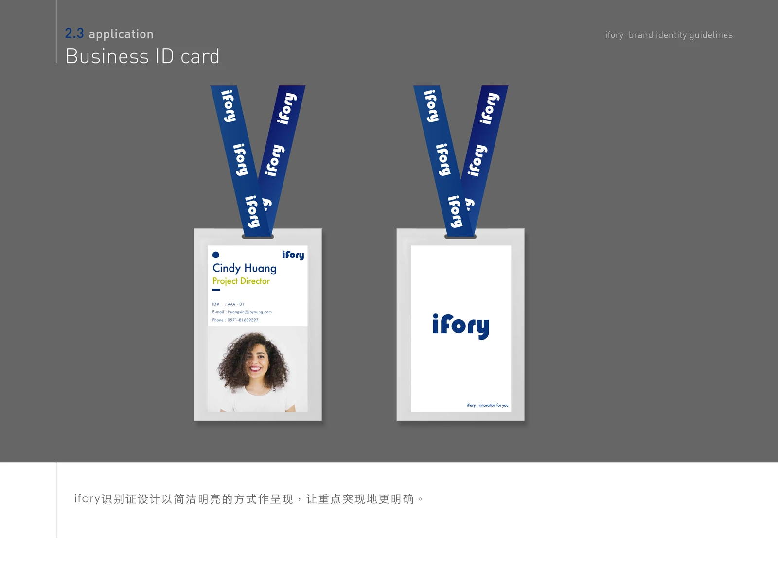
Employee identification card system
Event invitations demonstrate how the identity can support more expressive campaign imagery while preserving recognizable brand elements and information hierarchy.
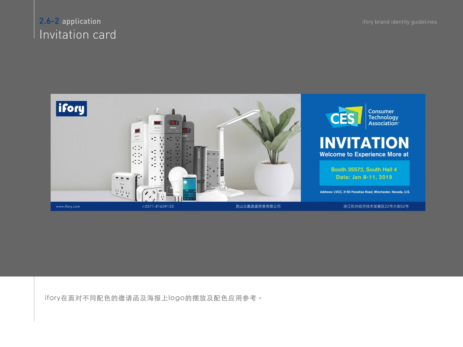
Event invitation and conference communication
Presentation templates provide teams with a repeatable structure for internal and client-facing communication, including cover layouts, content pages, charts, and closing slides.
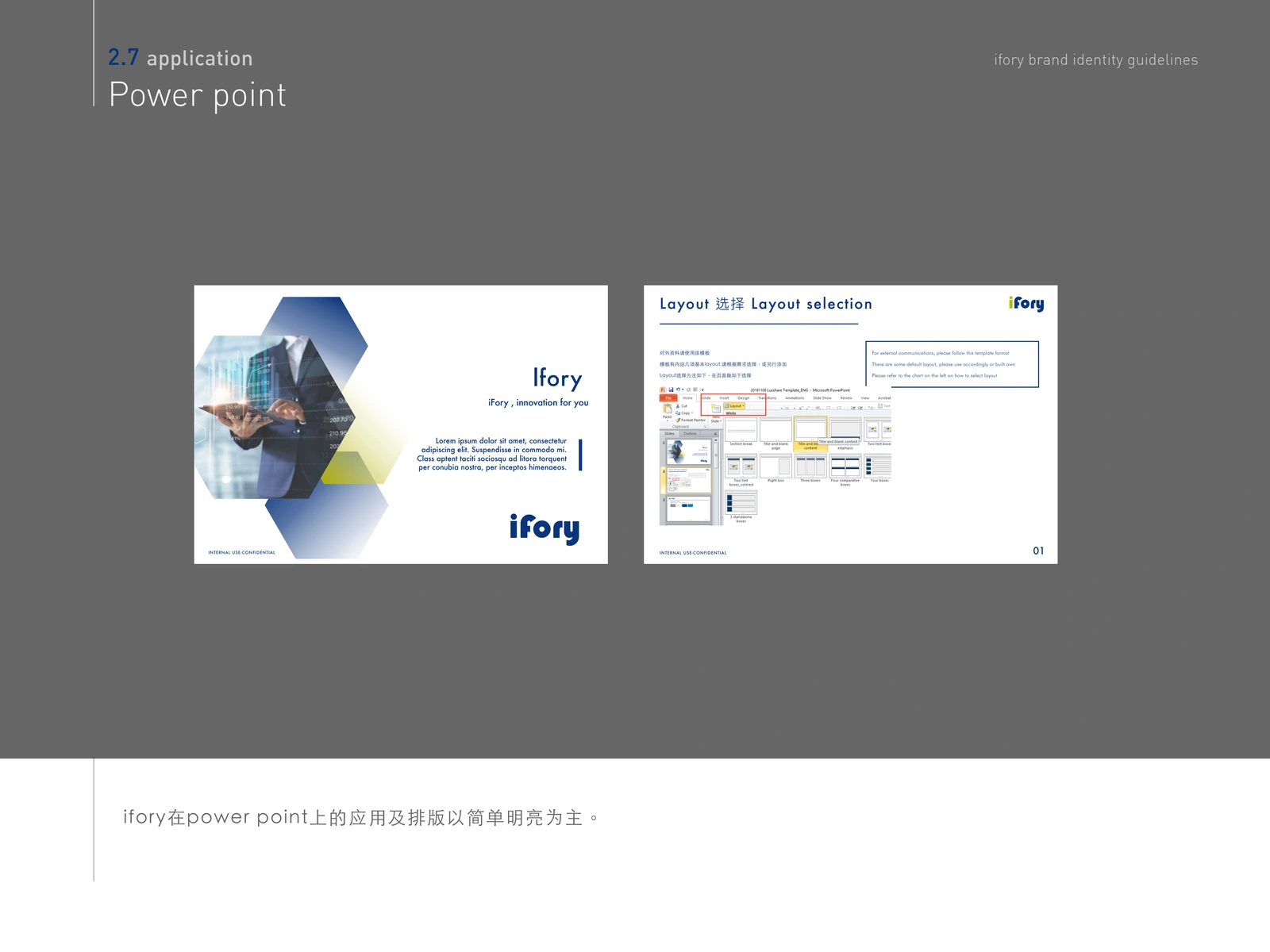
Branded presentation template system
OUTCOME
The completed CIS turns IFORY's logo into a practical and scalable corporate identity. Clear rules reduce inconsistency, while the application examples show how the system can remain recognizable across print, events, employee materials, and presentations.
The result gives future teams and suppliers a reliable framework for producing new brand communication without weakening the core identity.
ROLE
Corporate Identity Design, Logo Usage Guidelines, Color System, Typography System, Brand Applications, and Brand Manual Layout.
Recommended skills
Brand Designer
Graphic Designer
Logo Designer
Recommended tools
Adobe Illustrator
Adobe InDesign
Adobe Photoshop
Like this project
Posted Aug 24, 2026
Developed a corporate identity system for IFORY, defining logo, color, typography, and applications across print, events, and presentations.