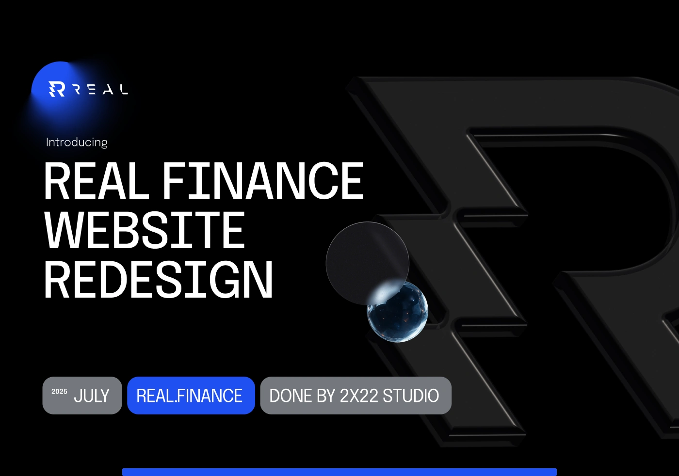
UX/UI Overhaul for Real.Finance
Nikolay Byutyunev
OUR APPROACH
We started where it matters most — at the root.
Through workshops, audits, and founder interviews, we got clear on what makes Real different:
Their no-buzzword approach to DeFi.
Their ambition to onboard traditional finance players.
Their belief that credibility doesn’t have to be boring.
So instead of designing a site full of gimmicks, we focused on designing trust.
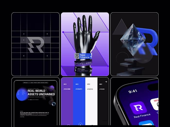
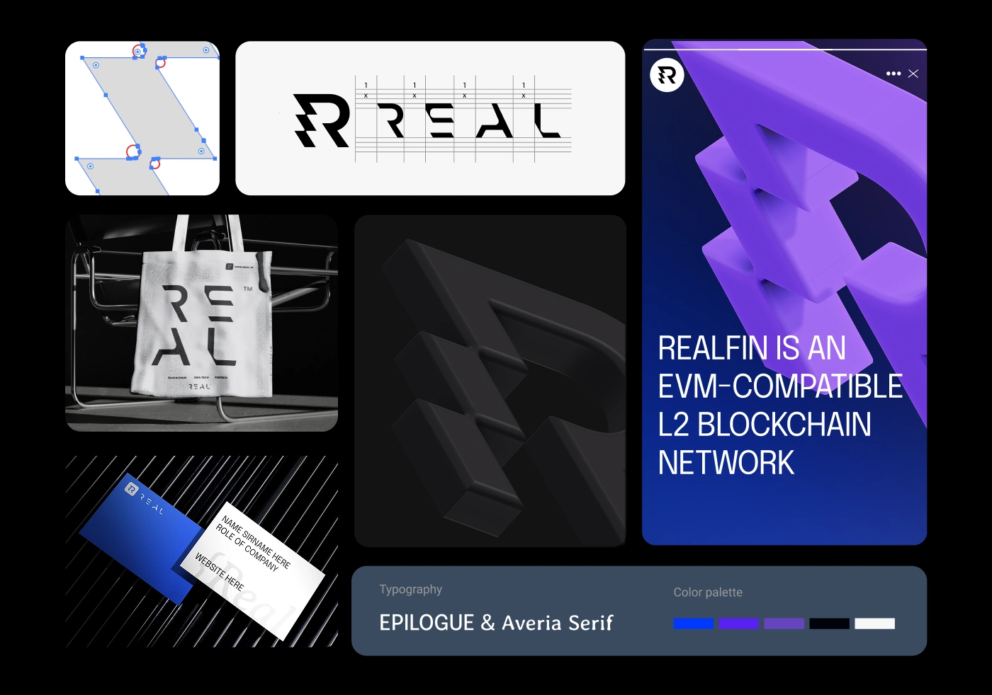
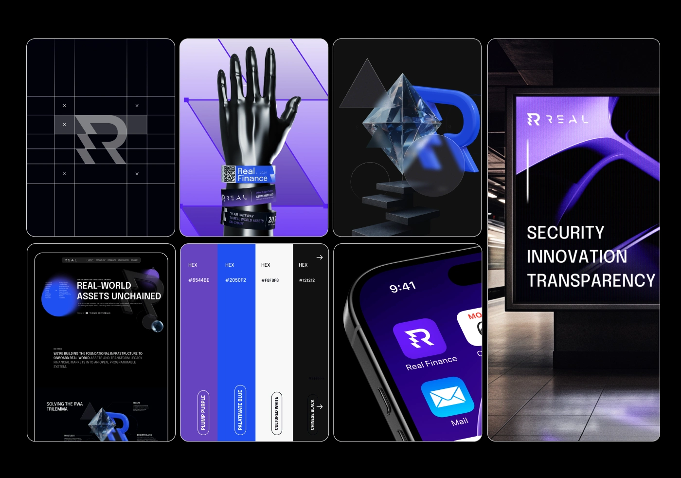
BRAND IDENTITY REBUILT
We kicked things off with a visual direction deck, analyzing not just blockchain aesthetics, but timeless brand markers from finance, tech, and lifestyle industries.
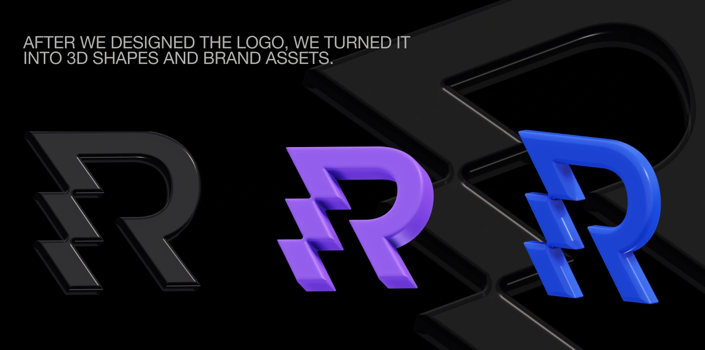
We crafted a custom logotype — a wordmark that was bold, open, and unapologetically REAL.
Then came the “R” icon.
A geometric form that’s more than a letter, it’s a symbol. Inspired by asset movement and transaction flow. Strong enough to stand alone. Minimal enough to live on a coin.
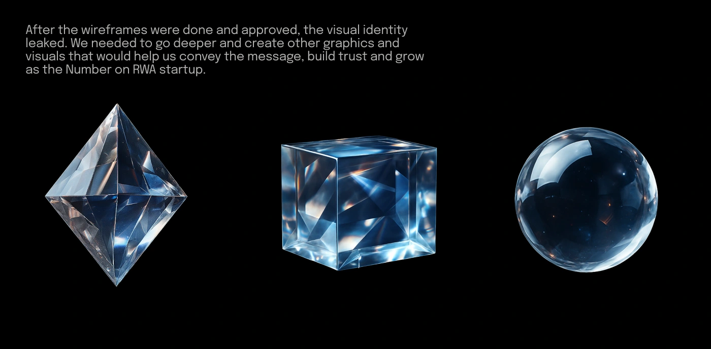
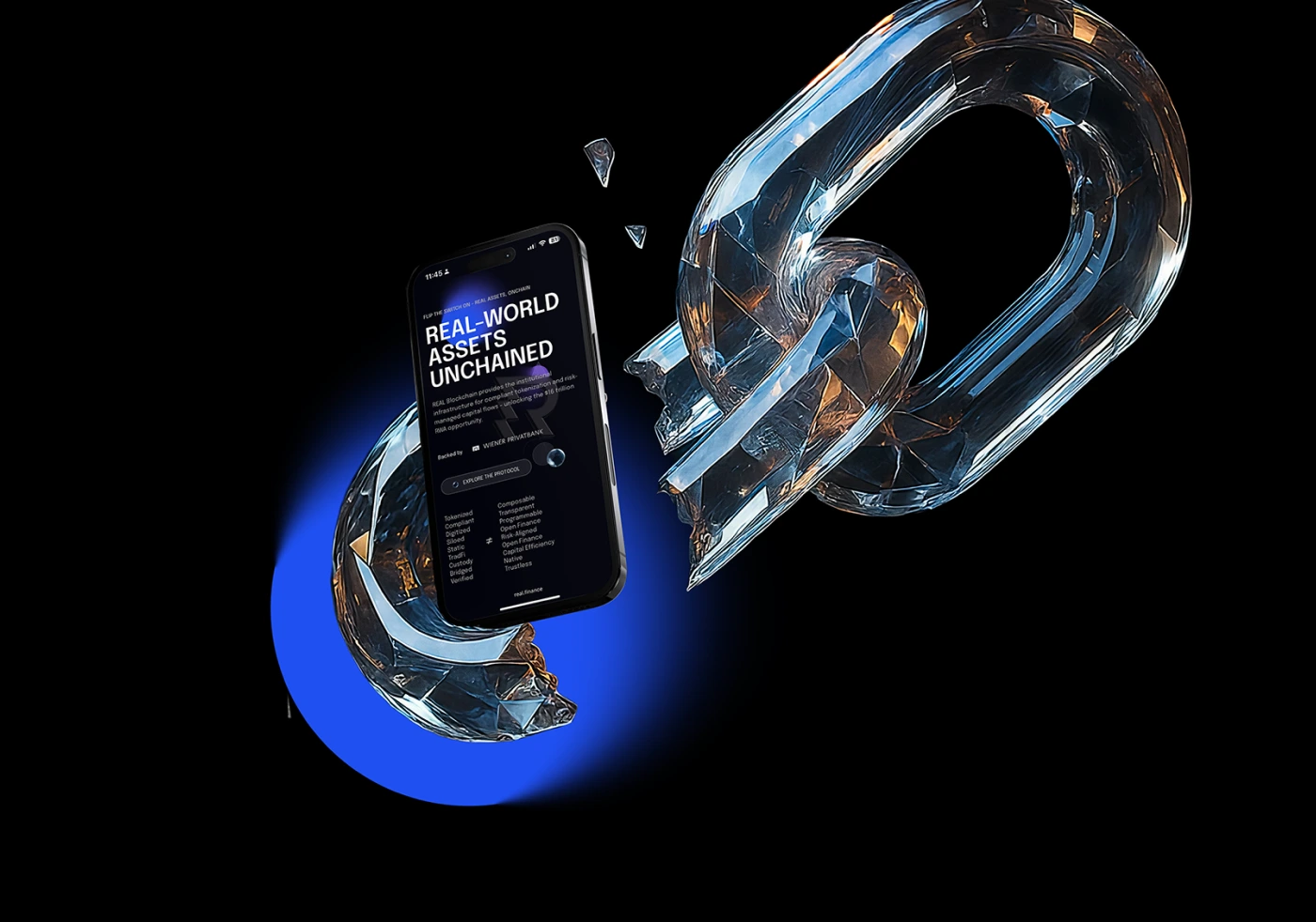
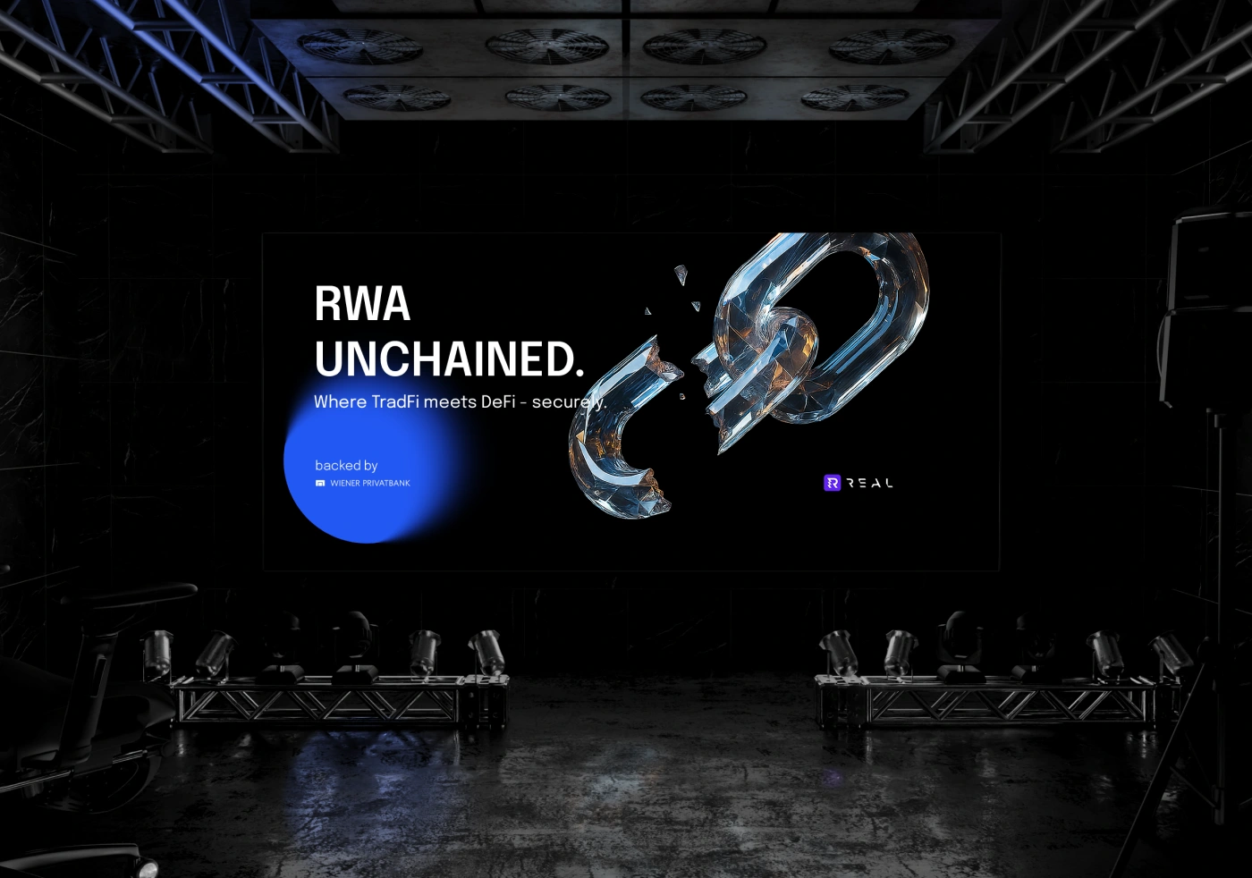
We paired that with a refined color system (bold but mature), a tech-meets-editorial typography system, and visual metaphors like diamond glass, crystal chains, and shattered TradFi symbols.
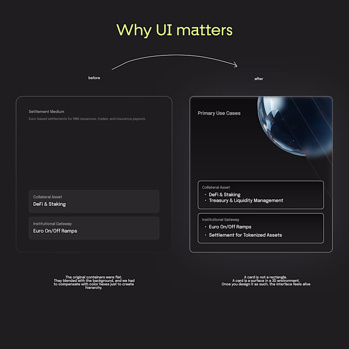
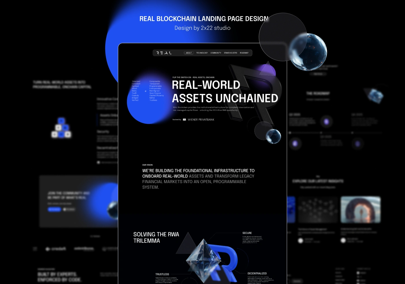
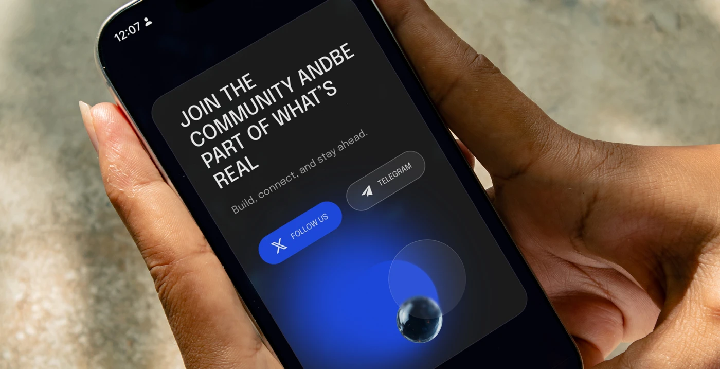
FROM SAFE TO STRIKING
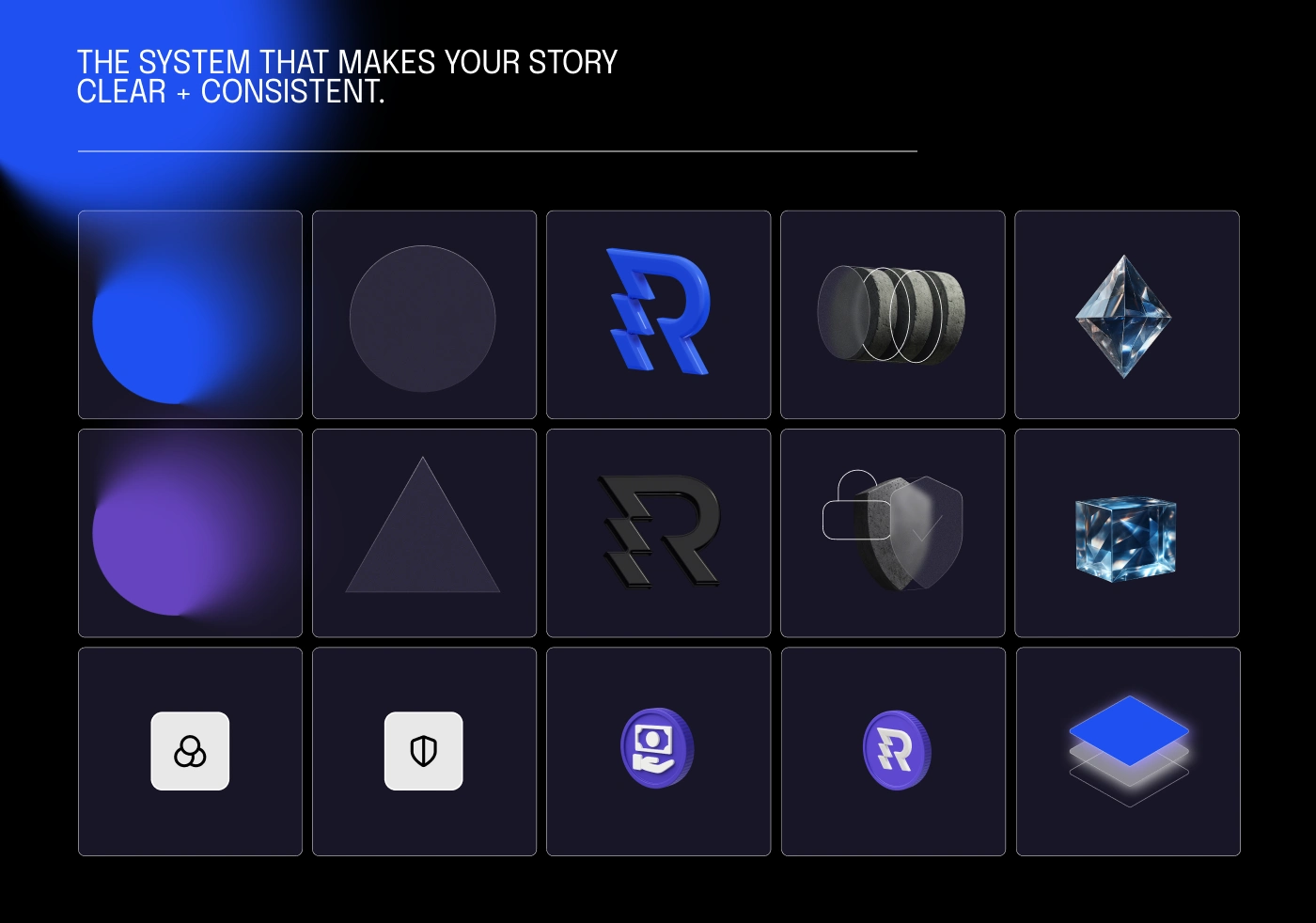
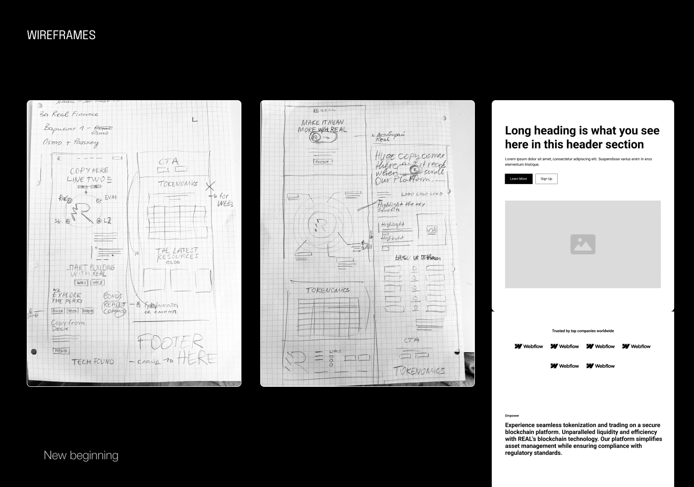
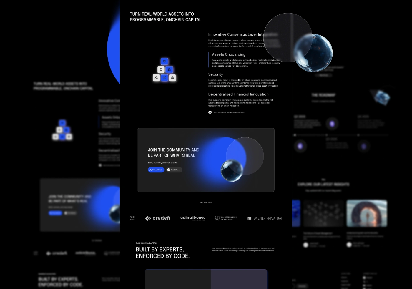
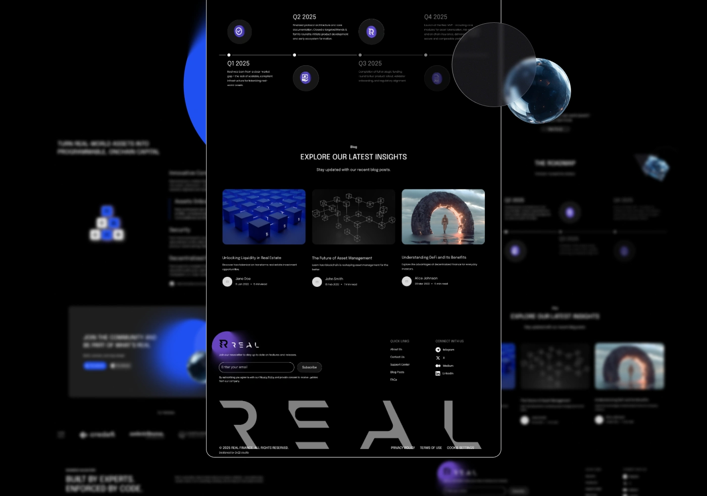
Once the identity was locked, we reimagined the entire UX/UI in Figma.
Our mission: Make it unforgettable.
No stock patterns. No fluff. No “safe” components.
We designed for emotion, not just function.
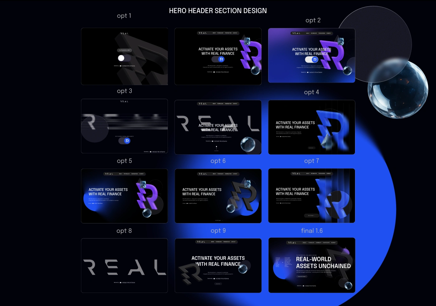
12+ homepage iterations
4 custom 3D icon sets
Dozens of glass-like visuals, brutalist slabs, broken chains, and cosmic backdrops
A whole ecosystem of Web3 metaphors visualized
But design alone isn’t the finish line.

Like this project
Posted Oct 6, 2025
Rebuilt brand identity and reimagined UX/UI for Real in DeFi industry. The new brand and website didn’t just get attention, It converted to 4M secured fund rsng
Likes
1
Views
9
Timeline
May 1, 2025 - Dec 8, 2025
Clients
Real