
Nikolay Byutyunev
I build visual identities and websites for SaaS and fintech
Ready for work
Nikolay is ready for their next project!
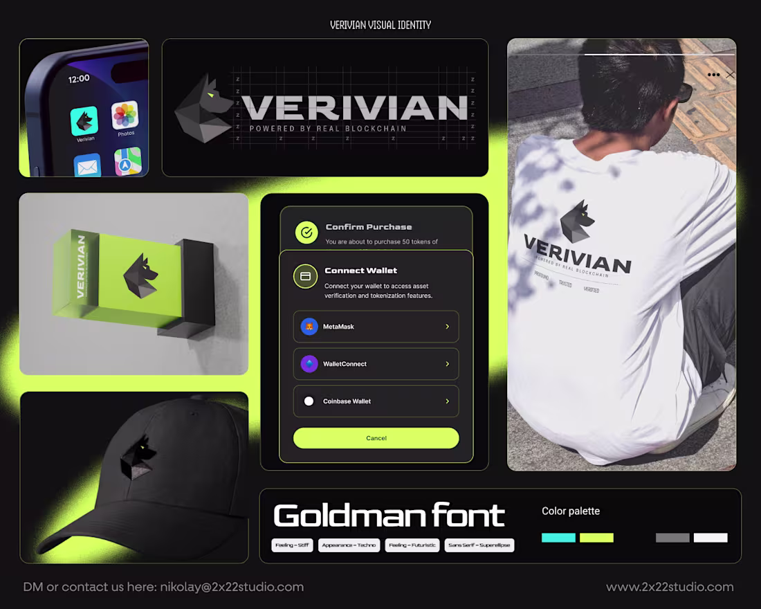
Excited to share something cool for a verification project in the Web3/Crypto world, we are also working on a dapp for this.
The design is based on the idea that the watchdog is known for security, alert, resilience, trust (you can basically trust your life with a well-trained dog), and the elements of the mark will be strongly used around for backgrounds, patterns, sub-graphic collections, and more. So excited.
Wait until Q1 ends; more are coming out soon.
1
36
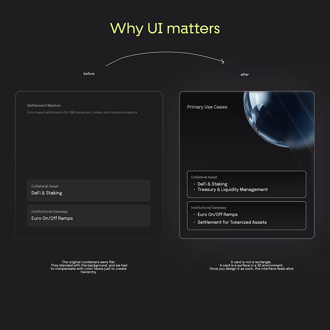
Progress thinking is the new UI design.
You know how sometimes you build something fast to get moving?
That was us with Real’s first UI components (you know the cards, blocks, etc.)
It looked clean, it worked, and honestly, it was perfect for v1.
They blended too much into the background. No depth. No hierarchy. No sense of what matters more.
So we rebuilt the whole thing.
We added light, subtle gradients, a bit of glow, and brought in the 3D sphere that’s part of Real’s identity.
And the funny part?
Same content… totally different experience.
Now the cards lift off the page. They feel intentional. You immediately know where to look. It’s like giving the interface a bit of personality.
Developers usually bring logic.
Designers add feeling to that logic.
We at 2x22 studio call it the sweet spot.
2
17
116
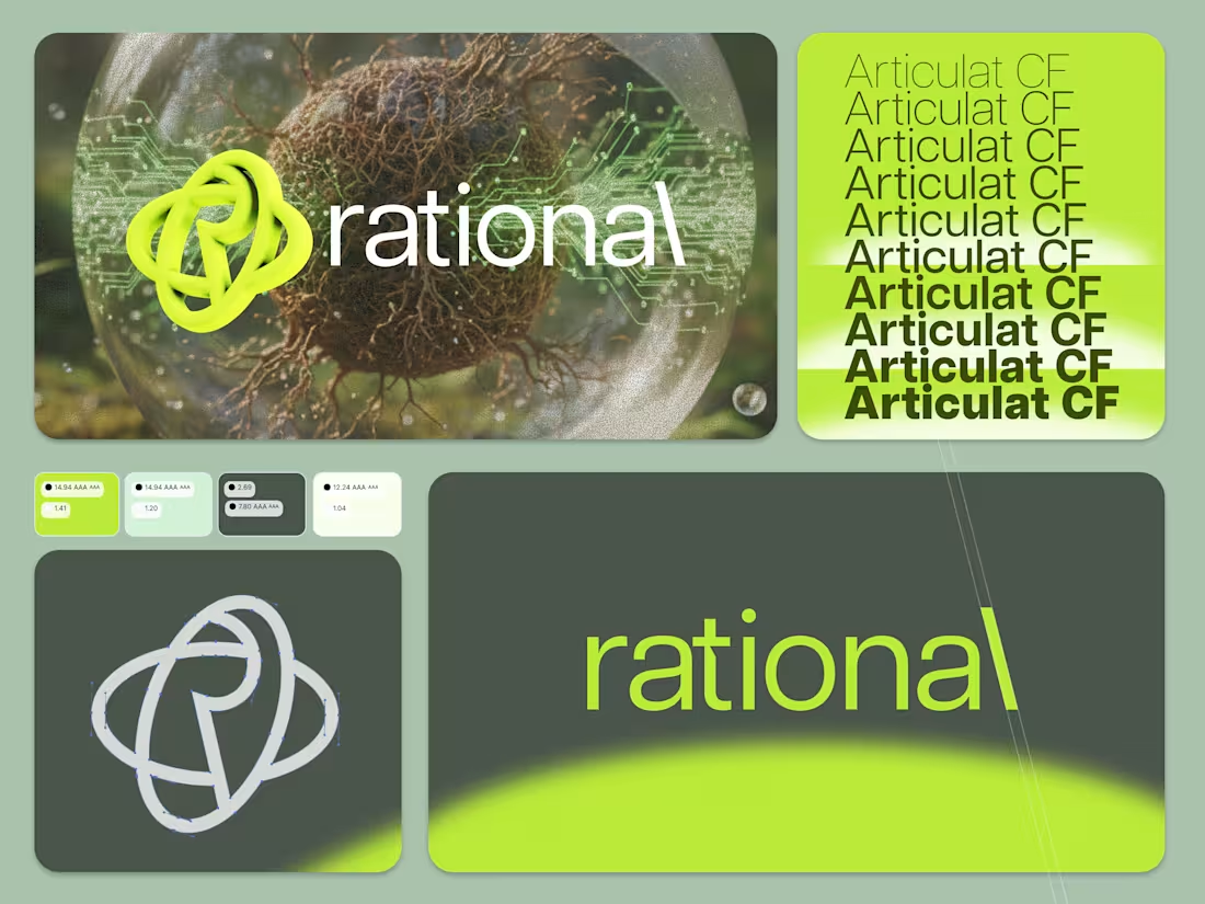
What started as a late-night design experiment turned into Rational: a brand so weirdly alive that it stopped feeling imaginary.
Rational isn’t about crypto, really.
It’s about making sense of the chaos we call the internet
of everything. It’s a world where moss meets math,
where learning feels like photosynthesis,
and where a dashboard greets you like an old friend.
The idea?
Explain cryptocurrency to your grandmother… and help her make sense of it.
Somewhere between caffeine addiction and curiosity,
I built a fake company that somehow became a real philosophy:
From chaos to clarity.
If this feels too real for an imaginary brand,
that’s the point.
Now after I've test it through figma make, I'll spin it through @Lovable and give it to the team to really teach myself about #tokenization #rwa and blockchain
2
16
143
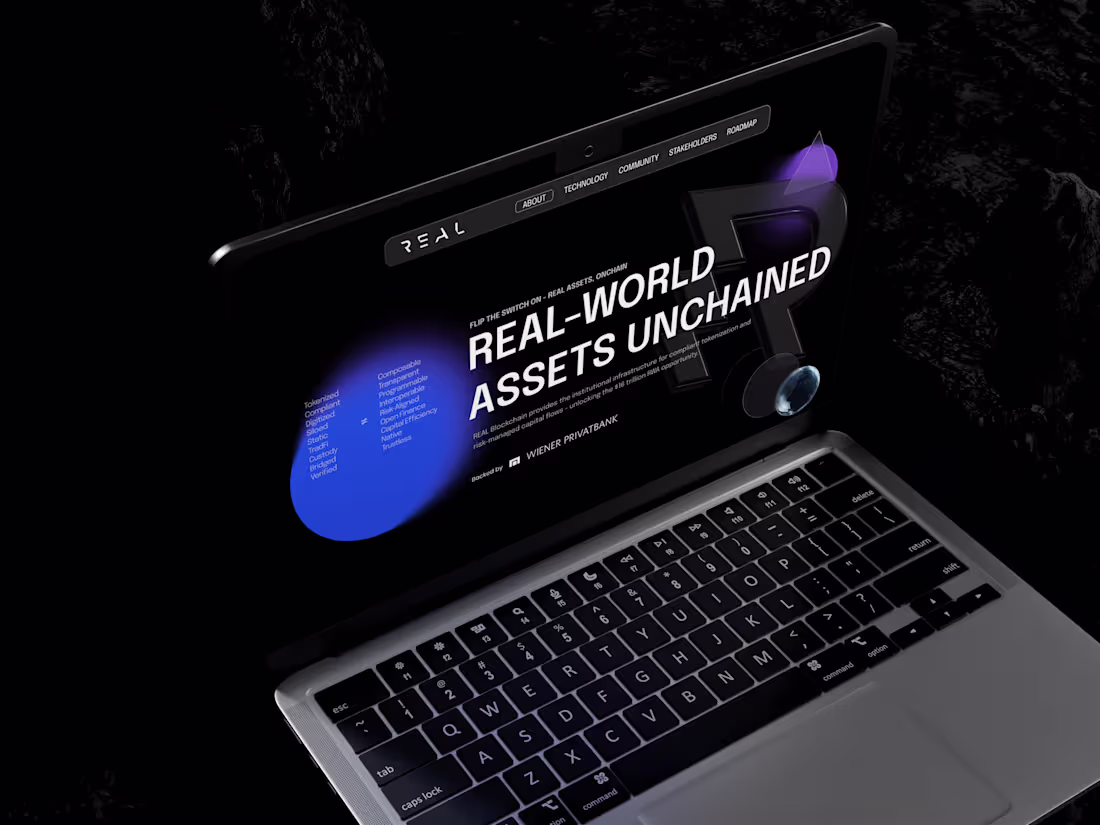
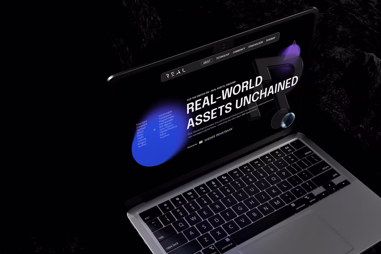
UX/UI Overhaul for Real.Finance
1
9
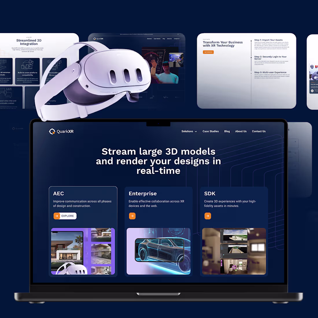
UI Design and Strategy Collaboration with QuarkXR
0
1
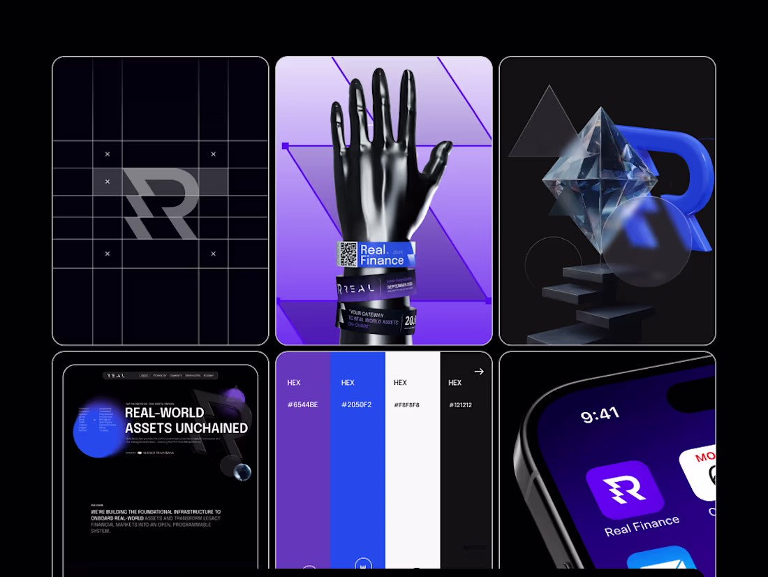
Real Finance Rebranding Project
1
4