Real Finance Rebranding Project
Nikolay Byutyunev
The beginning of a new era for our RWA client real.finance
THE OPPORTUNITY
Real Finance is a blockchain startup. And like many in the space, they faced the uphill task of securing funding, convincing investors, building a product — and a belief.
Back in 2023, their old corporate identity served its purpose. At the time, the blockchain world was flooded with sleek, tech-styled websites and futuristic promises—but few real solutions. Real Finance took the opposite route: to win over corporate and finance-first stakeholders with clarity and credibility.
By 2025, the market had changed. Investors wanted more than buzzwords. They wanted confidence, conviction—and brands that stood for something.
That’s when they brought us in.
To help connect the dots. To turn a solid company into a magnetic presence.
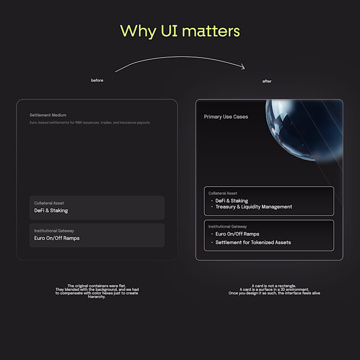
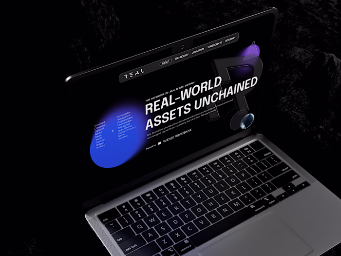
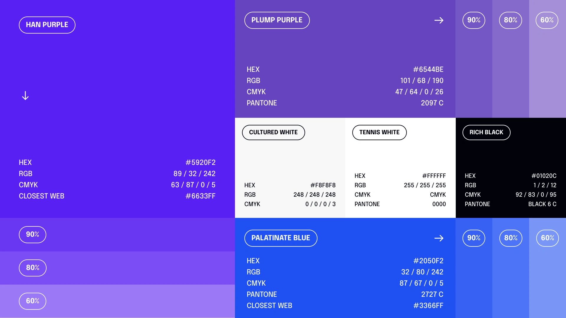
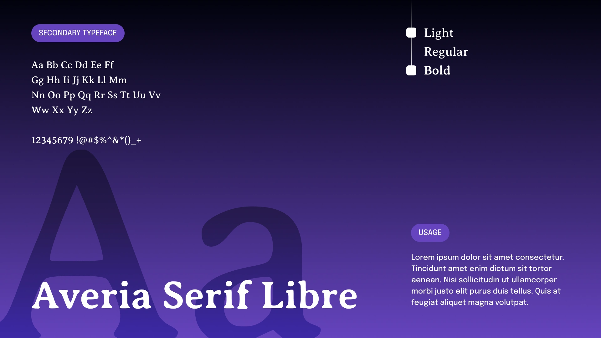
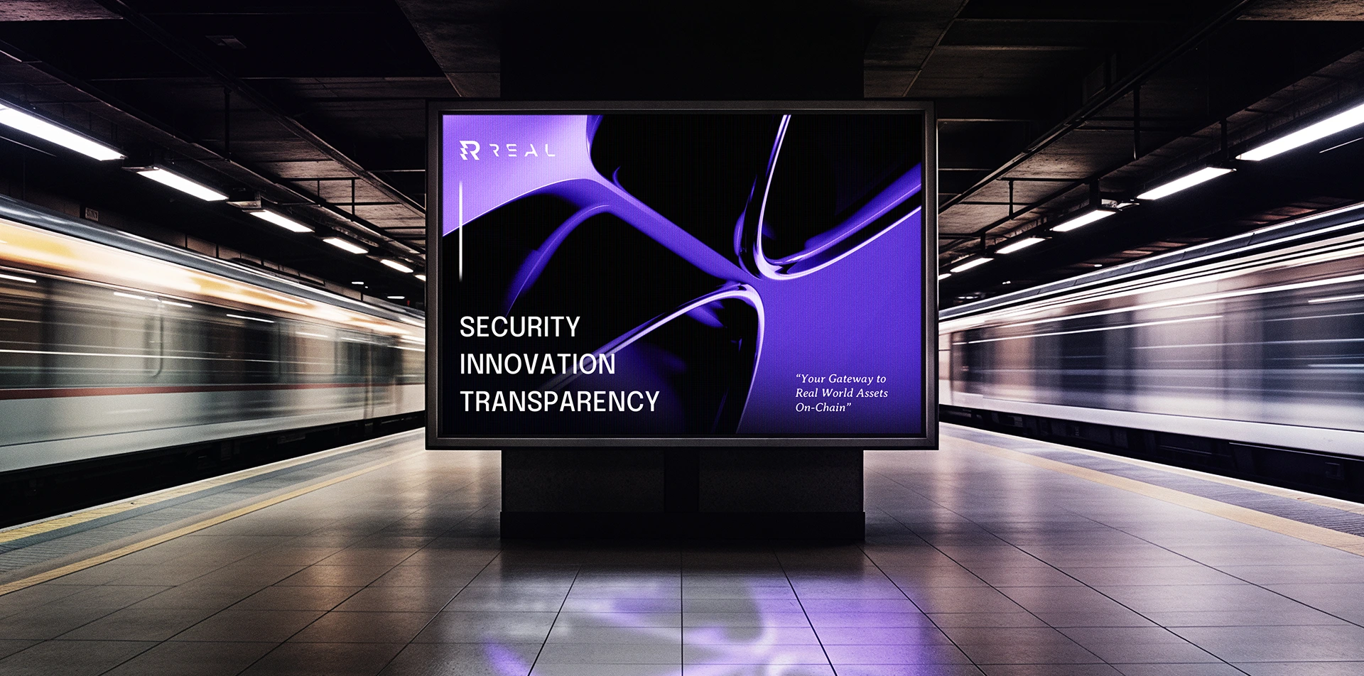
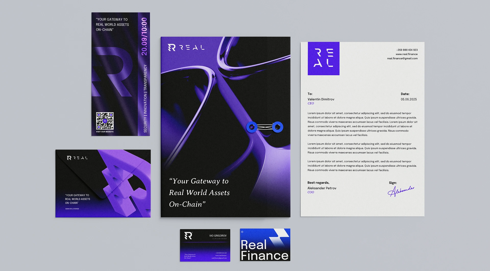
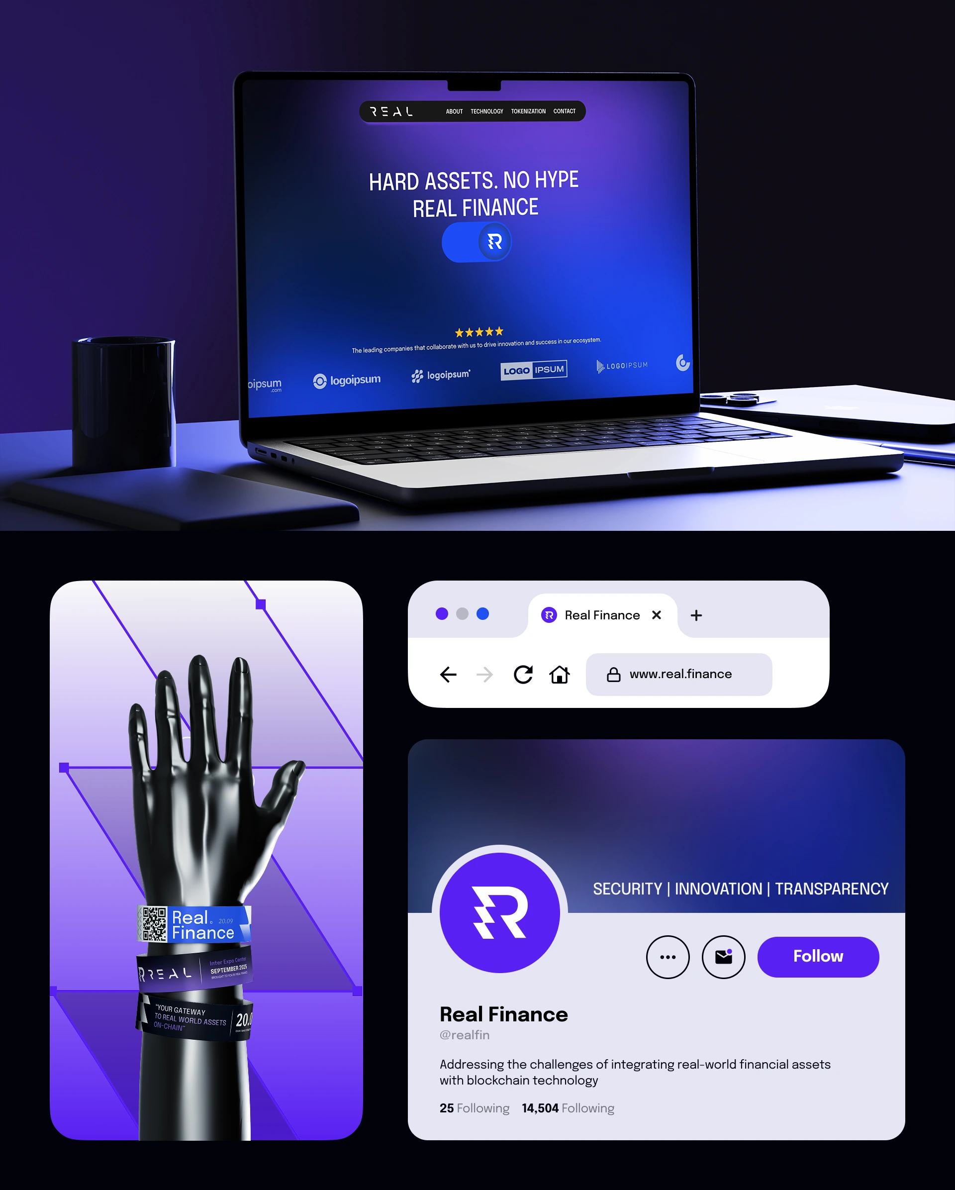
We started from the ground up — rethinking the logo, color system, typography, and tone of voice. Then we overhauled the entire UI/UX to feel sharper, bolder, and more aligned with their true value.
Our final push? Bringing it all to life in Webflow.
This wasn’t just a rebrand.
It was a shift in posture.
A story told without saying too much.


What We Did
We kicked things off with a deep discovery session—diving into Real’s long-term vision, current pain points, and the evolving landscape of Web3. Together, we mapped out not just what needed to change, but where Real wanted to go.
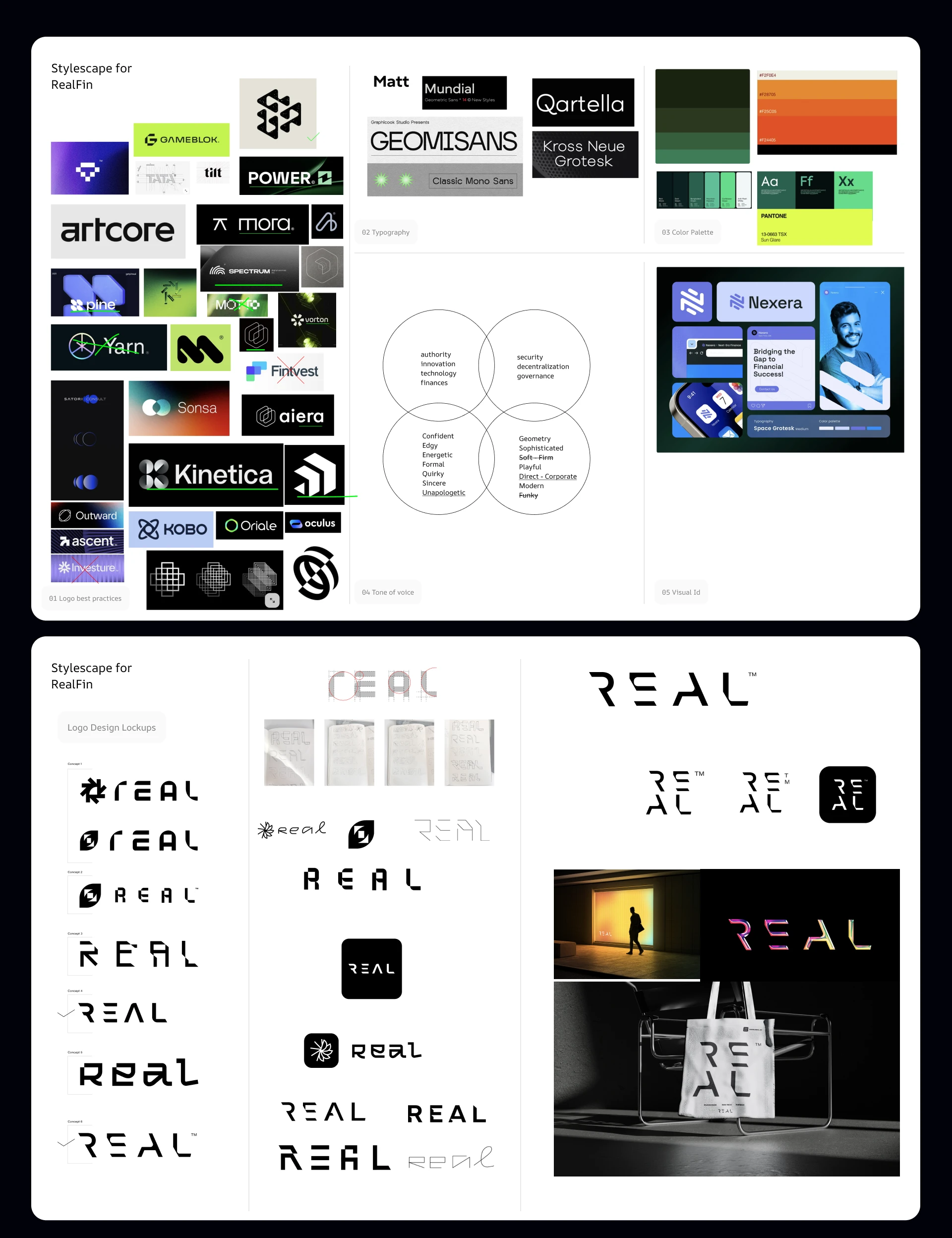
From there, we built a visual direction deck—analyzing the best practices in logo design, not just in blockchain, but across timeless, trusted brands. We explored multiple directions, narrowing down to a few that felt bold enough to carry the Real name forward.
It wasn’t a straight line.
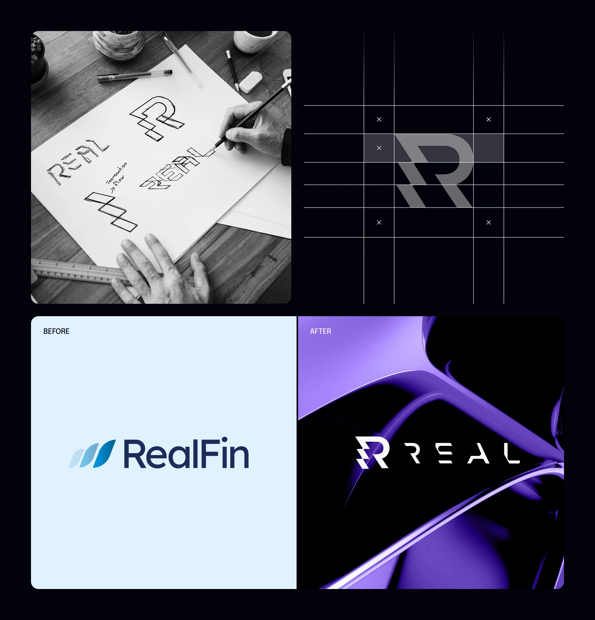
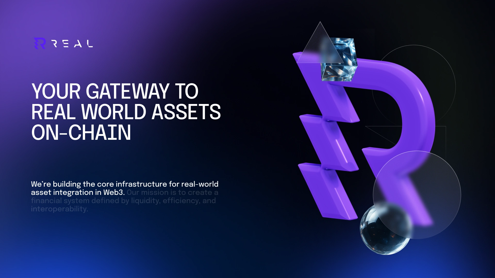
But once we started sketching, a unique direction emerged: a cut-out wordmark that almost challenged the readability of “REAL”—spacious, confident, a little rebellious.
Still, something was missing.
We needed a symbol — something iconic. A mark that could work as an app icon or even represent a future Real coin.
That’s how the "R" icon was born. Inspired by the angular cuts of the custom typeface, we redesigned the leg of the R to reflect a transaction in motion—a seamless transfer of real-world assets into crypto.
A small detail.
A big idea, And a symbol of everything Real stands for.
Thanks for scrolling.
If you’d like to work with us — and design the next generation of Web3 brands,
say hello at:
📩
🌐 www.2x22studio.com
Like this project
Posted Oct 3, 2025
Rebranded Real Finance the world best RWA startup that was stuck with the old corporate image, not being able to move forward.
Likes
1
Views
4
Timeline
May 1, 2025 - Aug 20, 2025
Clients
Credefi