Progress thinking is the new UI design. You know how sometim...
Progress thinking is the new UI design.
You know how sometimes you build something fast to get moving?
That was us with Real’s first UI components (you know the cards, blocks, etc.)
It looked clean, it worked, and honestly, it was perfect for v1.
They blended too much into the background. No depth. No hierarchy. No sense of what matters more.
So we rebuilt the whole thing.
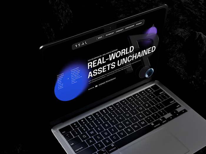
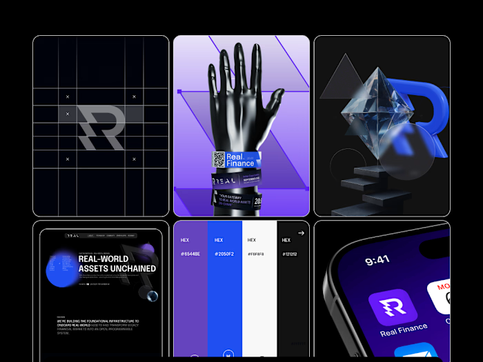
We added light, subtle gradients, a bit of glow, and brought in the 3D sphere that’s part of Real’s identity.
And the funny part?
Same content… totally different experience.
Now the cards lift off the page. They feel intentional. You immediately know where to look. It’s like giving the interface a bit of personality.
Developers usually bring logic.
Designers add feeling to that logic.
We at 2x22 studio call it the sweet spot.
Like this project
Posted Dec 12, 2025
Progress thinking is the new UI design. You know how sometimes you build something fast to get moving? That was us with Real’s first UI components (you kn...
Likes
0
Views
0


