Guest House Landing Page Design

Ihor Yarchuk

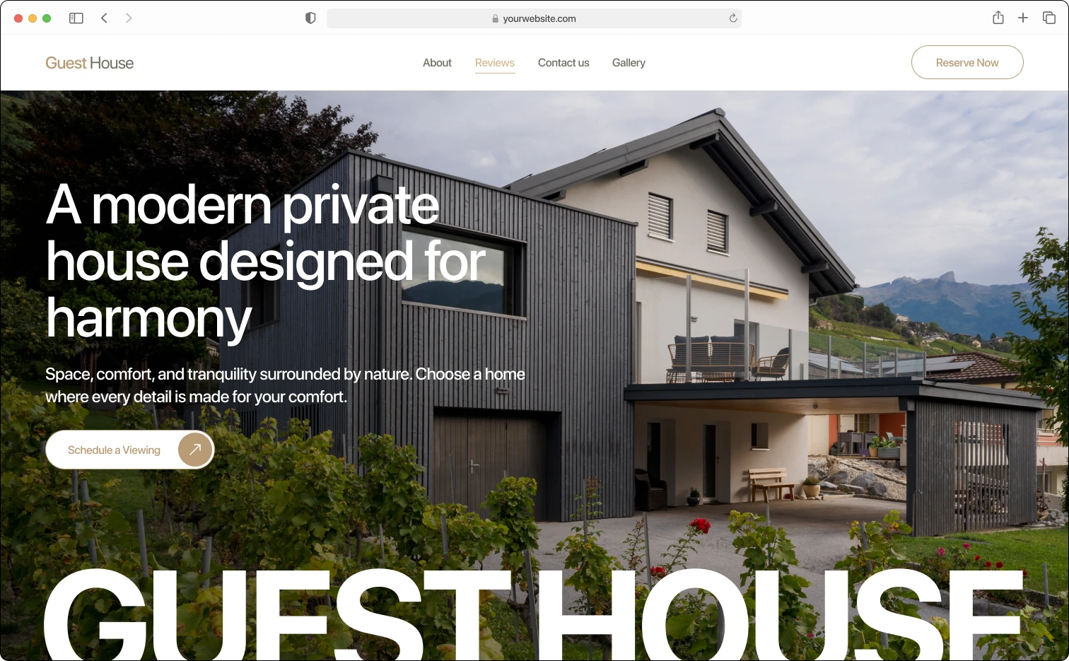
Guest House - Landing Page Design
Project Type: Landing Page Design
Client: Guest House
Duration: 7 days
About Company:
Guest House is a private rental property offering accommodation in a residential setting. The business operates in the short-term rental market and needed a web presence that would communicate comfort, authenticity, and trust to potential guests considering a booking.
Problem:
The client needed a landing page that could present the property clearly and convert visitors into booking inquiries. The design had to feel warm and personal rather than generic, standing apart from standard rental platform aesthetics while still being easy to navigate and read on any device.
Process:
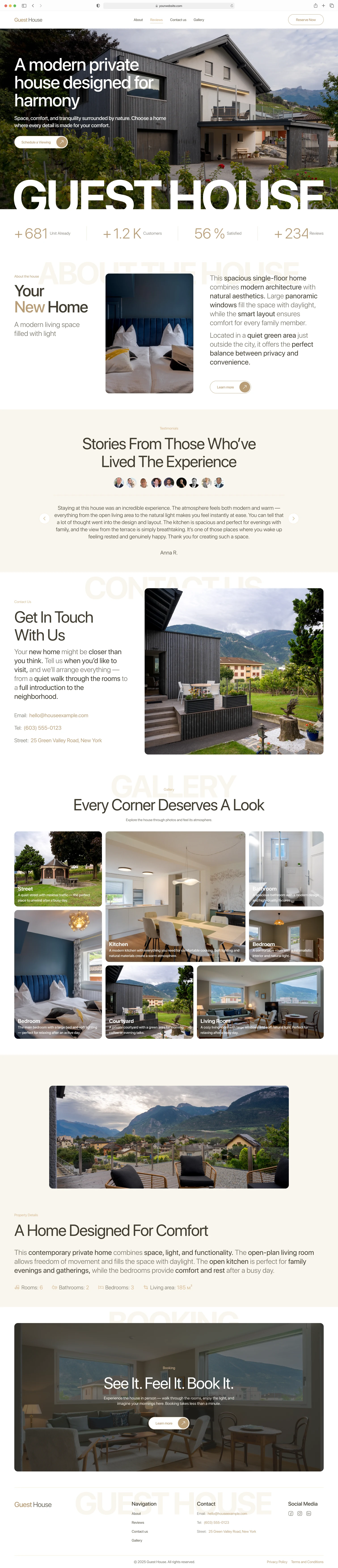
As the sole designer on this project, I began by establishing the visual language around the property's character - a warm cream palette (F9F5ED) with a muted amber accent (B99C76) and large-scale SF Pro Display Bold headlines used as section anchors throughout the page. The page structure was built section by section: a full-bleed hero with photography and a primary CTA, an About the house block combining descriptive text with property imagery, a Testimonials section on a contrasting warm background, a Contact Us block with a contact form alongside a photo, a Gallery with a multi-image grid, a Property Details section with an interactive hover-state component, and a Booking block. The footer closes with brand navigation and legal links. Three colour theme variants (Orange, Green, Blue) were developed in parallel to give the client options. A mobile version was designed for all sections, and Privacy Policy and Terms pages were included in the delivery.
Solution & Outcome:
The result is a complete single-property landing page covering the full visitor journey from first impression to booking inquiry. The warm, photography-driven design reinforces the personal nature of the property and positions it clearly outside the visual language of large rental platforms. The component system includes interactive button states and animated navigation, with all pages delivered in desktop and mobile breakpoints.
Tools: Figma
Like this project
Posted May 19, 2026
Designed a warm, photography-driven landing page for a private rental property to convert visitors into booking inquiries.