Smoking Astronauts – Futuristic Fashion UI/UX
Ihor Yarchuk
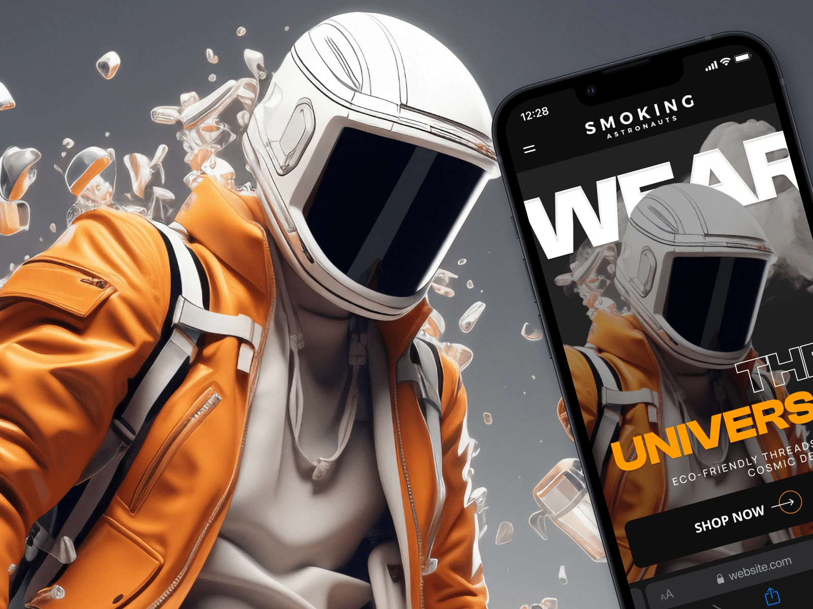
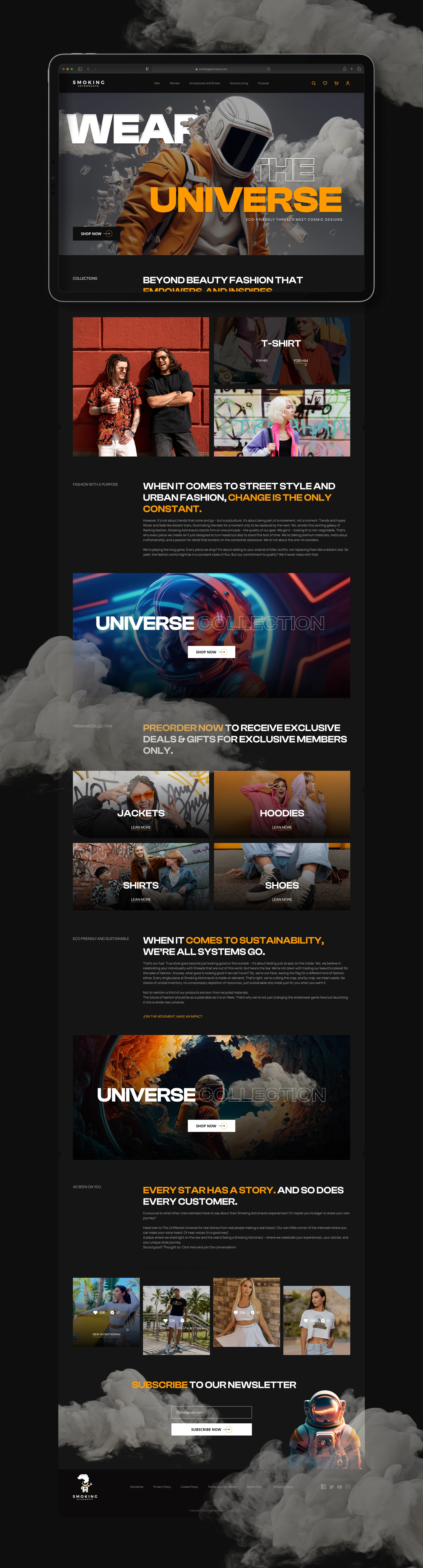
Smoking Astronauts - Landing Page Design
Project Type: Landing Page Design
Client: Smoking Astronauts
Duration: 5 days
About Company:
Smoking Astronauts is a sustainable streetwear brand built on the principle of on-demand production. Every item is made when ordered, eliminating unsold inventory and unnecessary waste. A third of their products are made from recycled materials. The brand positions itself as a movement rather than a trend - celebrating individuality while committing to a fashion ethos that does not trade the planet for style.
Problem:
The brand needed a landing page that could carry a strong visual identity and communicate two things simultaneously - bold streetwear aesthetics and a genuine sustainability message. The challenge was to make eco-conscious values feel native to the culture rather than preachy, while presenting multiple product collections in a way that drives exploration and purchase intent.
Process:
As the sole designer on this project, I started by analyzing the brand voice - cosmic, confident, and community-driven. The page structure was built around editorial sections, each anchored by a large typographic headline and supported by product imagery. I used a dark background with an amber accent to create a premium street feel. Collections were presented as full-bleed image blocks with category labels and inline CTAs. A dedicated sustainability section and a community-focused block were integrated into the flow to support the brand narrative without breaking the visual rhythm.
Solution & Outcome:
The result is a single-page desktop layout that moves from hero to collections to brand story to community engagement and closes with a newsletter block. The typography pairing of Clash Display and Manrope creates contrast between expressive headlines and readable body text. The amber accent color is used selectively to guide attention and highlight key phrases within headlines. The design delivers a cohesive visual language that positions the brand confidently within the premium streetwear space while making sustainability feel like a core identity rather than a footnote.
Tools: Figma
Role: UI/UX Designer (solo)
Like this project
Posted Mar 4, 2025
Designed a futuristic streetwear landing page with immersive visuals, strategic CTAs, and a mobile-first layout for enhanced engagement and navigation.
Likes
1
Views
8
Timeline
Nov 21, 2024 - Nov 28, 2024
Clients
Smoking Astronauts