SFZ Accountancy Website Design

Ihor Yarchuk


SFZ Accountancy - Website UI Design
Project Type: Website Design
Client: SFZ Accountancy
Duration: 7 days
About Company: SFZ Accountancy is a modern accounting firm serving entrepreneurs and SMEs in the Netherlands. The firm combines professional compliance expertise with a forward-thinking, personal approach to financial advisory.
Problem: The client needed a website that could communicate both credibility and approachability - standing apart from traditional accounting firms while clearly presenting three distinct service areas to different types of business clients.
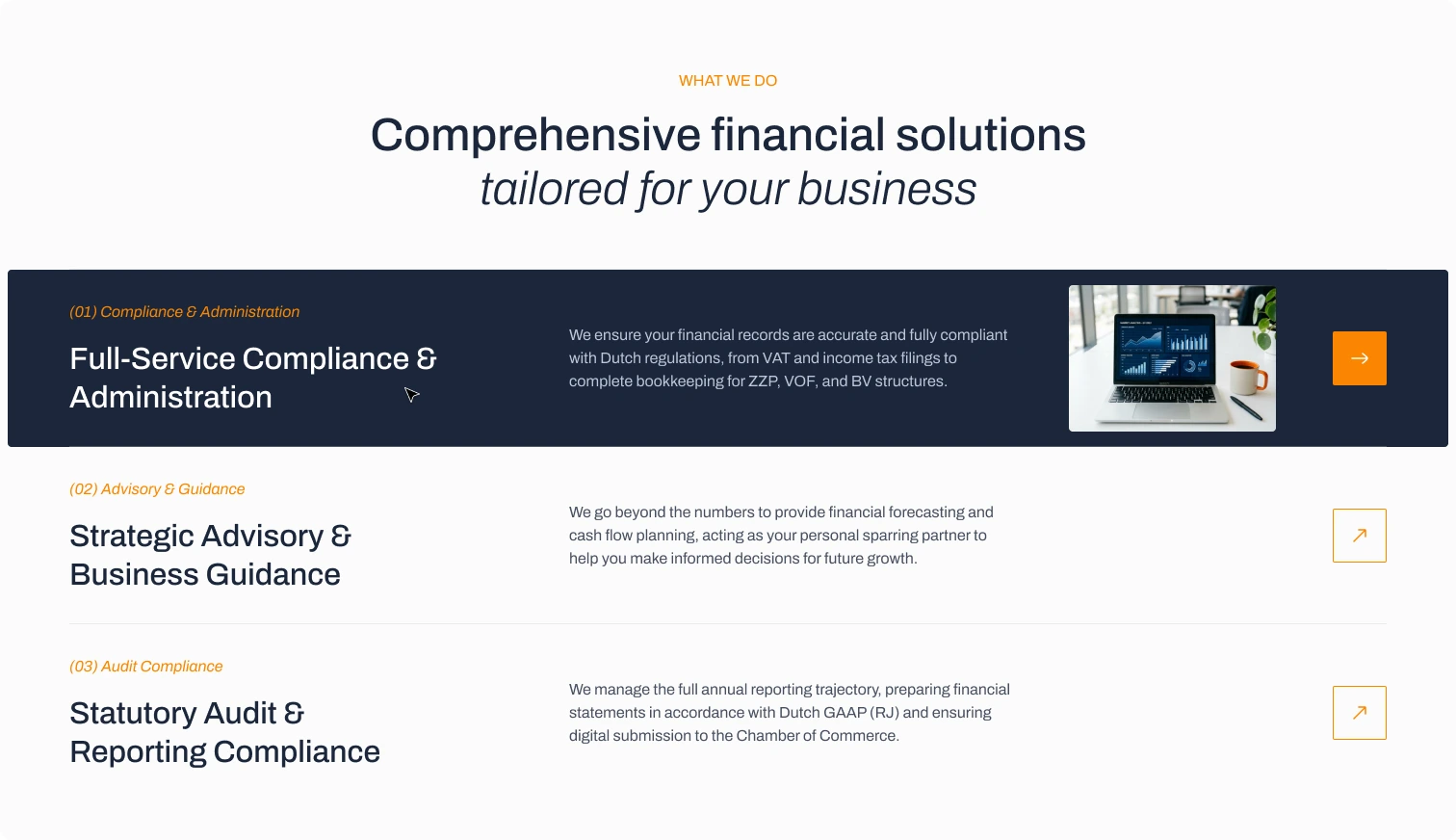
Process: As the sole designer on this project, I structured the site across three pages - Home, Services, and Contact - with mobile versions for each. The Home page opens with a full-bleed hero using photography and a strong headline, followed by a values card grid, a services overview with expandable rows, and a credentials section with partner logos. The dark navy and orange palette was chosen to signal professionalism with a modern edge. Archivo was used throughout for its clean, neutral character across both display and body sizes.
Solution & Outcome: The result is a complete three-page website with a consistent component system covering desktop and mobile breakpoints. The services section presents three clearly separated tracks - Compliance & Administration, Advisory & Guidance, and Audit Compliance - each with supporting detail and a direct CTA.
Tools: Figma





Like this project
Posted May 20, 2026
Designed a clean, professional website for a Dutch accounting firm serving entrepreneurs and SMEs across three pages with mobile versions.
Likes
0
Views
11
Timeline
Mar 1, 2026 - Mar 8, 2026