
Client: CPP Services (Private) Limited, Karachi
Product: Custom packaging, labels, POS rolls, machinery and raw material
Platform: Framer
Role: Audit, design, motion, front-end build
Scope: 7 pages
Year: 2026
The Setup
CPP Services converts paper and prints packaging in Karachi, from a factory in Korangi Industrial Area and a head office in DHA. It runs three divisions (printing and packaging, self-adhesive labels and POS rolls, machinery and raw material) covering 22 product lines across five industries. Edenrobe, Ideas by Gul Ahmed and Pak Suzuki are on its client list, and it is the exclusive agent in Pakistan for two international companies.
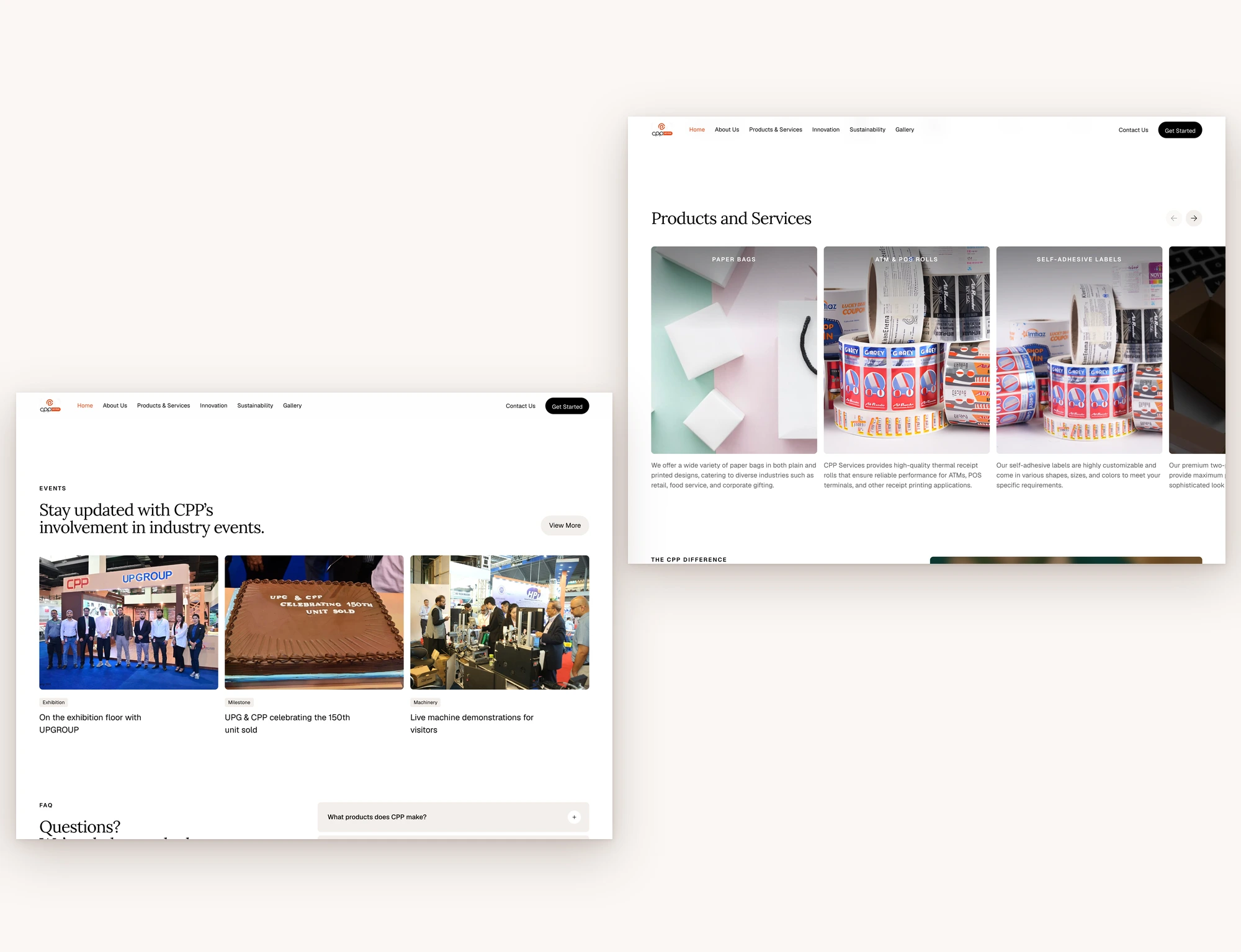
The business had real proof: named brands, exhibition photos, a milestone with a partner (“UPG & CPP celebrating 150th unit sold”). The website didn’t show any of it until a buyer scrolled. Its first screen was a stock photo, one headline and one orange button.
The Tension
The supplier was credible. The site read like a draft.
CPP sells to brand and procurement teams who check a supplier before they ask for a quote. When I read all 7 pages on 17 November 2026, a buyer would have found these:
Every page title was the bare address, so the browser tab read “https://cpp.com.pk”.
The contact page showed an “Email” heading with nothing under it, and the phone number wasn’t a tap-to-call link.
13 buttons pointed to “#”, including the three “Click here” buttons under the product divisions.
The homepage said “since 2000” and the About page said “Founded in 2010”.
Each slip is small. Together they made a buyer work harder to trust a supplier that had already earned it.
The Decision
The obvious move was a new theme with stock imagery and fresh copy. I went a different direction: keep every word CPP had written and change how it is presented.
The structure and motion follow a consulting template I admired, Bailey Hart by 108 Supply. I measured its layout, type and motion, then rebuilt it around CPP’s content and CPP orange.
Their words, not mine. Every headline, description and pillar on the site is CPP’s own copy, quoted whole. I wrote only interface text, such as button labels and FAQ questions, and their answers are CPP’s sentences.
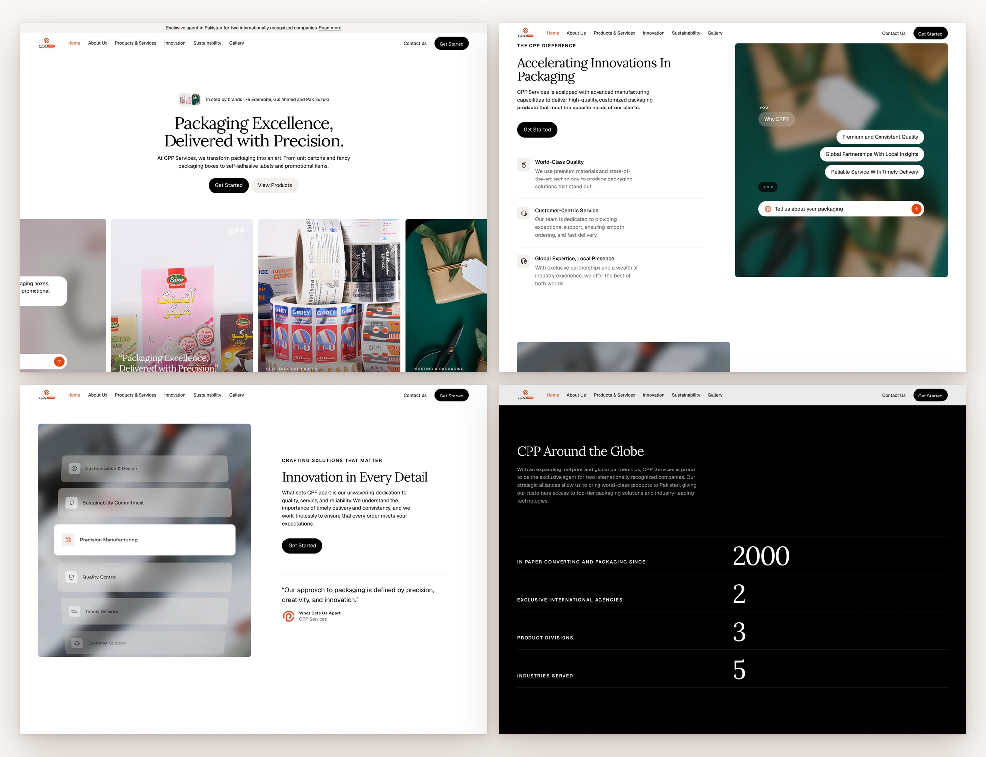
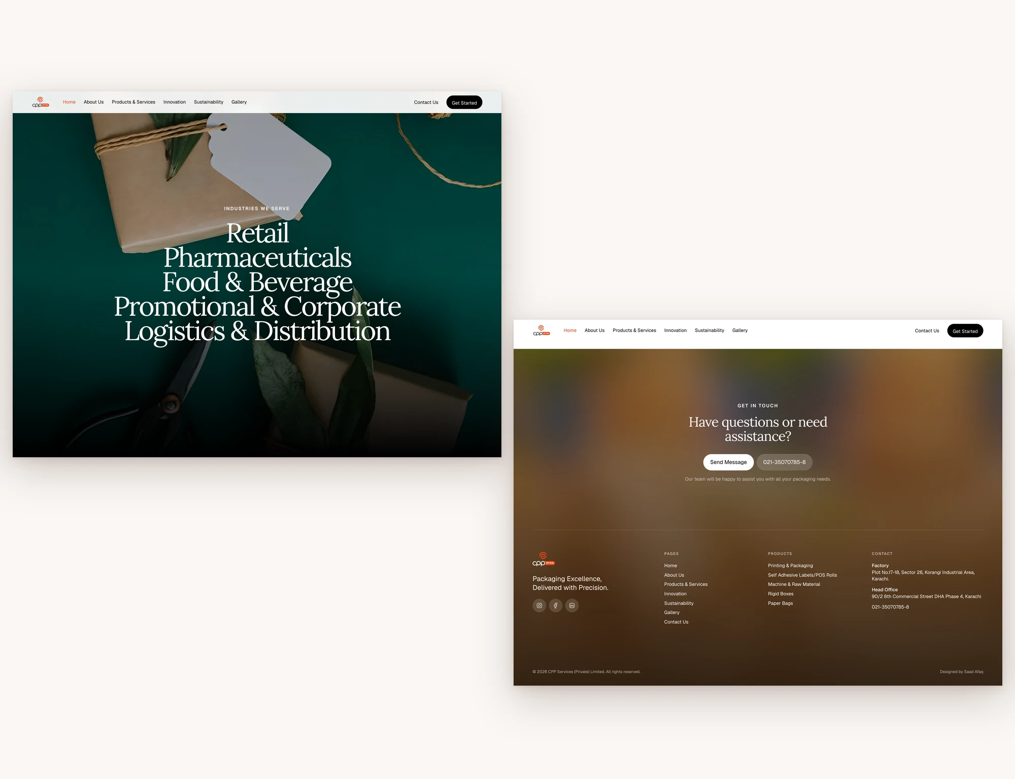
Proof in the first screen. The opening line names Edenrobe, Gul Ahmed and Pak Suzuki. A row of real product photos rises under the headline, where the old site had stock imagery.
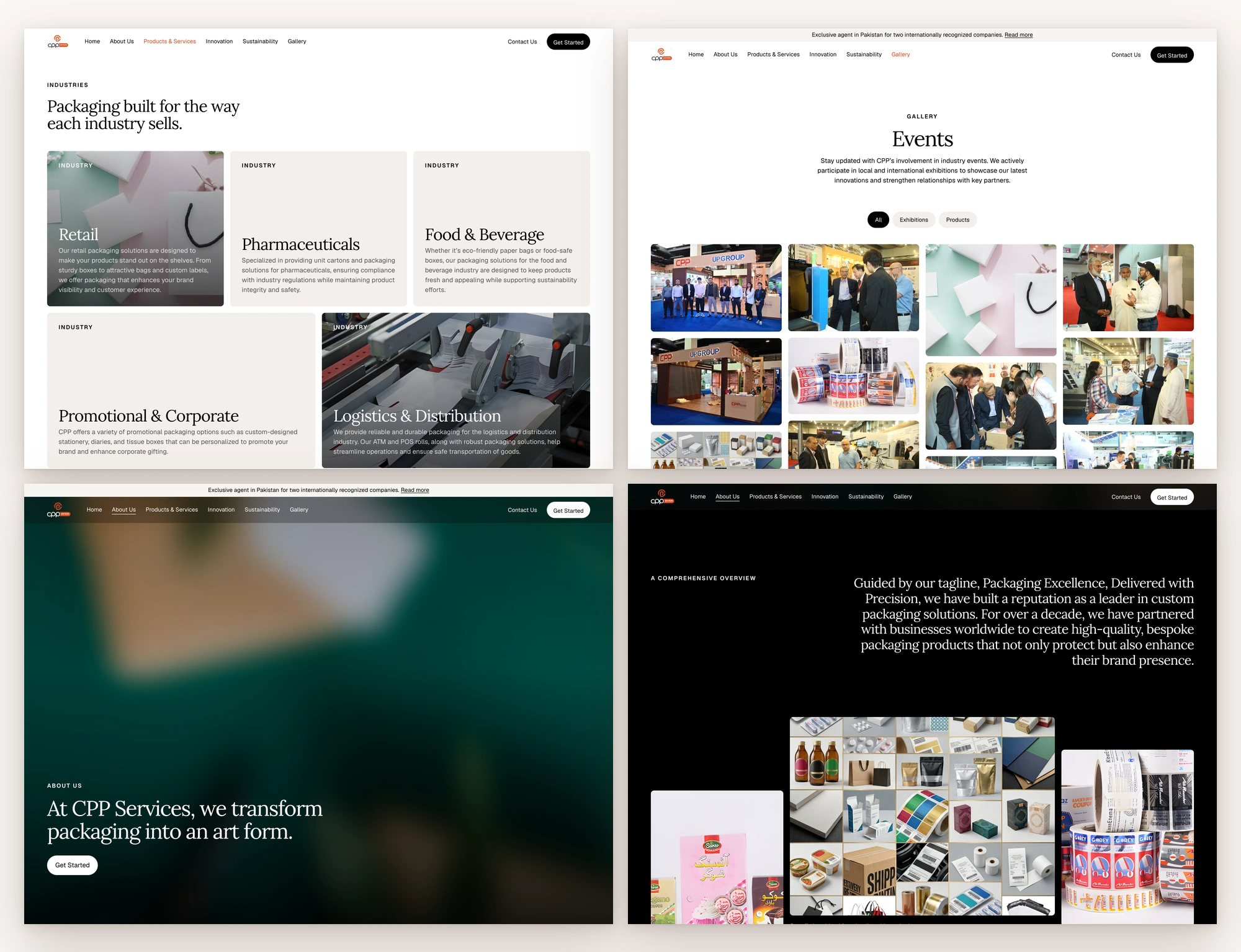
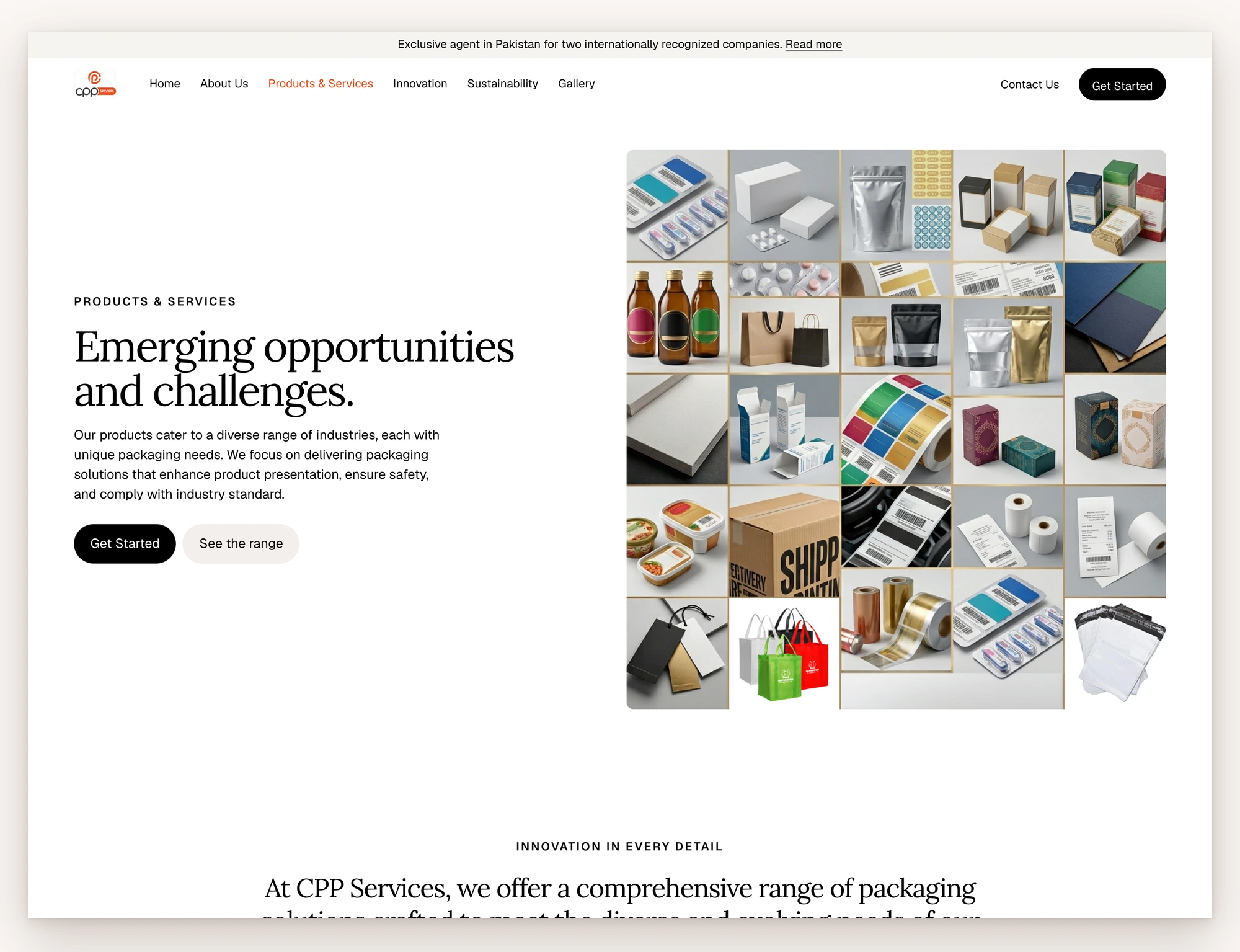
Built around how buyers search. A pharma buyer looks for pharma packaging first, so the Products page leads with the five industries, then the seven product lines, then all 22 items by division.
Motion that carries content. The CPP Difference arrives as a chat that answers “Why CPP?”. The six working principles move through a pinned 3D list as you scroll. The five industries light up one at a time over a full-screen photo.
Fix the photos rather than hide them. Three key product photos existed only at 405 pixels wide. I upscaled them 4× with Real-ESRGAN instead of blurring them into backgrounds.
No new platform. The design is meant to be rebuilt on CPP’s existing WordPress, so their team keeps editing the way it does today.
The Build
Pages | 7: Home, About, Products & Services, Innovation, Sustainability, Gallery, Contact
Sections | 3 to 13 per page; 13 on the homepage
Motion | 4 auto-scrolling tickers that slow on hover, 2 card carousels, 2 pinned scroll scenes, count-up stats, staged chat sequences, and 220 scroll reveals across the site
Images | 4 key photos upscaled 4× (405 → 1620 px wide; 773 → 2000 px), 565 KB in total as WebP
Page code | 49–60 KB of HTML per page, no framework; Iconoir icons and Google Fonts only
Gallery | 44 photos with a filter and a full-screen viewer that works with the keyboard
Accessibility | Reduced-motion support, labelled menus, accordions and carousels, focus returned when the viewer closes, alt text on content images
Quality gates | 0 defects on all 7 pages in my code linter; checked at 1440 and 375 px wide with no horizontal scroll
Audit | 18 findings on the live site, each with the page, the exact words and the fix
The Impact
A first-time visitor now sees who CPP works for, what it makes and two ways forward (Get Started or View Products) before scrolling.
Before this project, a buyer had to scroll past a stock photo to find a client name and had no address to send a specification to. After it, the contact page has a short form, both Karachi addresses, directions to the factory, and a phone number that dials on tap. The Products page answers “do they make what I need?” by industry first.
The hardest part wasn’t the motion. It was keeping CPP’s copy exactly as written while the site around it changed completely. Where their own pages contradicted each other, such as the founding year, I flagged the conflict for CPP to settle rather than picking one.
The site isn’t live yet, so I haven’t added launch metrics. Once it ships, the numbers to track are quote requests from the contact form, taps on the phone number, Search Console impressions for CPP’s product searches, and clicks from the homepage into Products.
The Takeaway
A manufacturer’s proof usually exists already. It sits in the gallery, the client list and the product range, out of the buyer’s sight.
Redesign the order in which a buyer meets that proof before you write a single new word.
0 likes · 0 views · Nov 17, 2026
A first-time visitor now sees who CPP works for, what it makes and two ways forward (Get Started or View Products) before scrolling.


