
Client: Caraïbe Skin™
Product: Luxury Shimmer Body Oil ·
Platform: Shopify
Role: Design, motion system, front-end build
Year: 2026
The Setup
Caraïbe Skin sells one product: a $75 luxury shimmer body oil, made in the USA from castor, MCT, organic pomegranate and jojoba oils with a natural mica shimmer. It's vegan and paraben-free. Its whole promise is a feeling: island light on your skin, a vacation without the passport.
The packaging lives up to that promise. Copper glitter glass, a gold dropper and sun-soaked photography from the beach. The website didn't. It ran on a default Shopify theme with stock fonts, flat olive and brown blocks, and a review carousel that repeated the same four quotes three times.
The Tension
The product was luxury. The storefront was a template.
A $75 body oil is an impulse purchase that has to feel considered. People buying it decide in seconds, mostly on a phone, mostly from a social link. What they landed on was a page that looked like every other Shopify store. The product photography was sized for thumbnails. The strongest proof points (vegan, paraben-free, no transfer to clothes, a 30-day money-back guarantee) were buried mid-page in the same weight as everything else. Nothing on the page moved, and nothing on the page felt like the Caribbean.
The brand had already done the hard work: the formula, the bottle, the shoot. The site was spending that equity instead of compounding it.
The Decision
The easy move was a new theme and a colour swap. I went a different direction: treat the storefront as a motion system, not a set of pages.
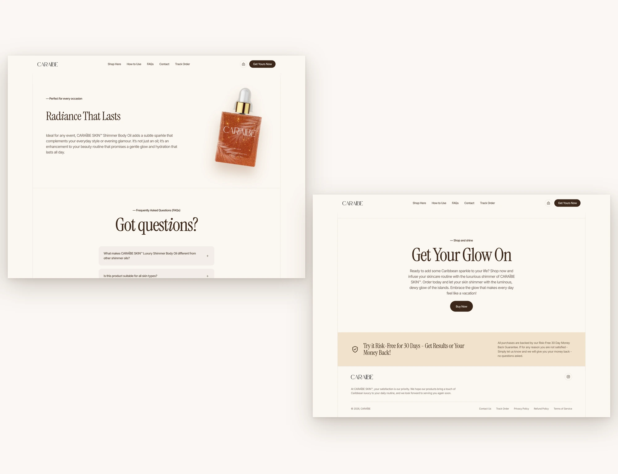
I studied a premium editorial beauty reference frame by frame. I measured its fonts, spacing, colour weights and every animation from the live page rather than eyeballing screenshots. Then I rebuilt that structure for Caraïbe, with the client's own brand on top:
One material, not a collage of effects. Every duration and easing comes from a shared set of motion tokens. Entrances use one curve and exits a faster one, and the staggers follow the same rhythm across both pages.
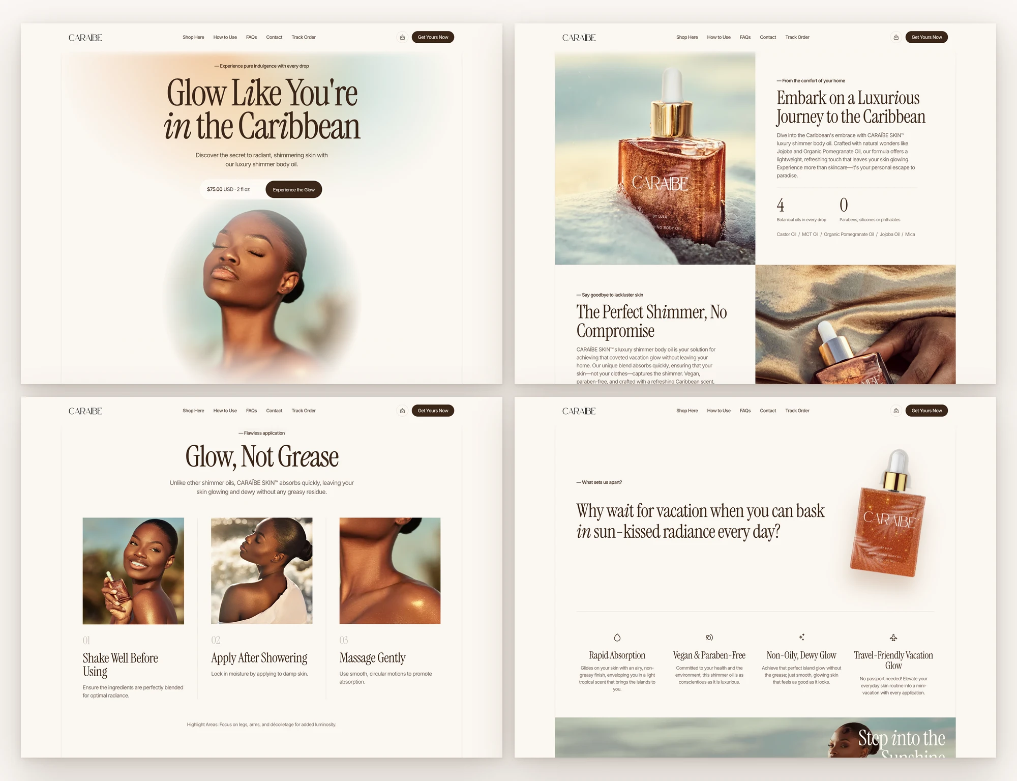
Brand colours from the brand's own world. Lavender and mint became copper, honey, sea glass and sand, pulled straight from the client's beach and sky photography. Text went to a deep espresso that holds accessible contrast even at reduced opacity.
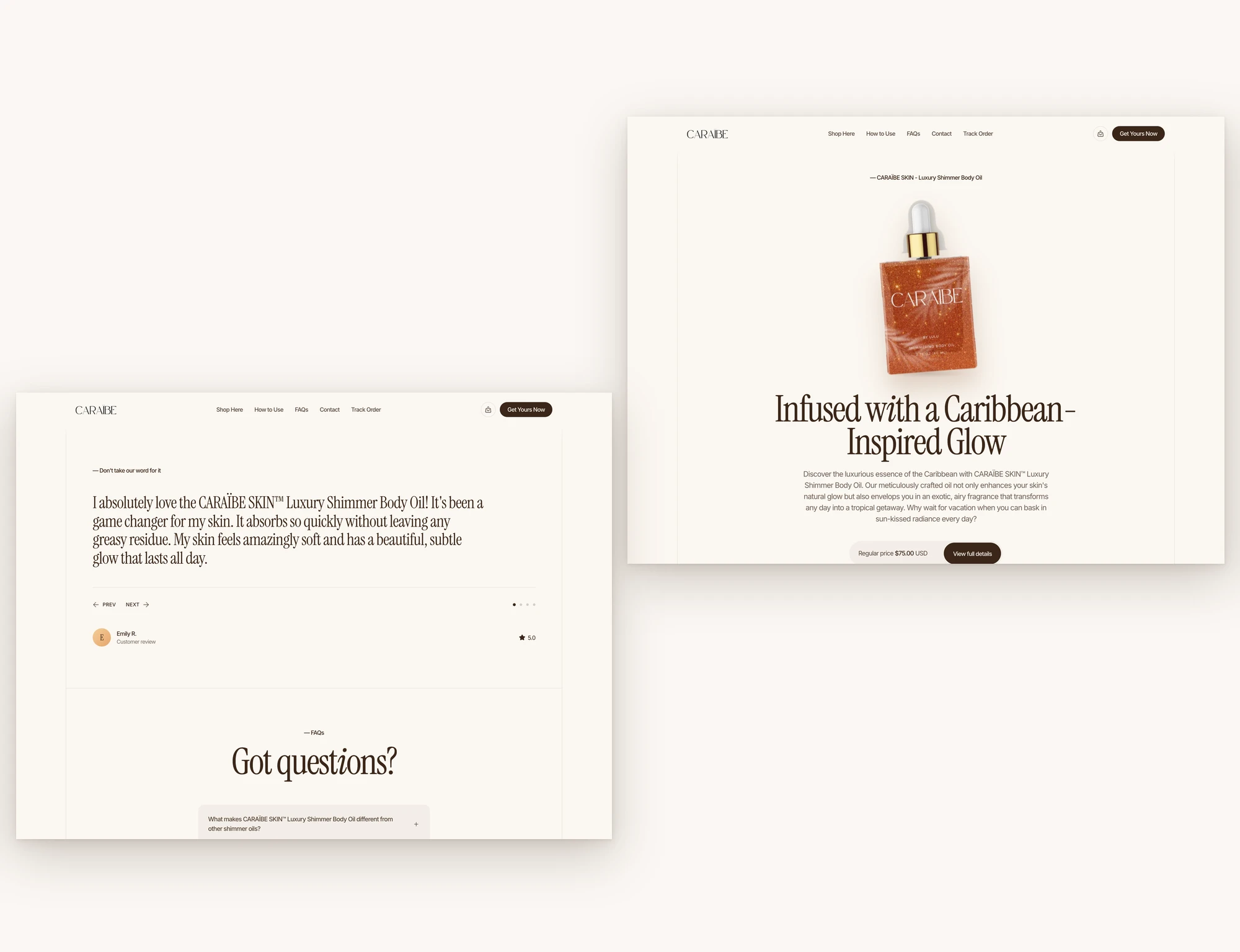
Motion that tells the story. The headline blurs in word by word like heat haze. A 20-second gradient drifts behind it in sunset and sea tones. The bottle floats, and in one section it tilts in 3D under the cursor. Proof points scroll past in a marquee. The lifestyle photo moves at its own parallax speed.
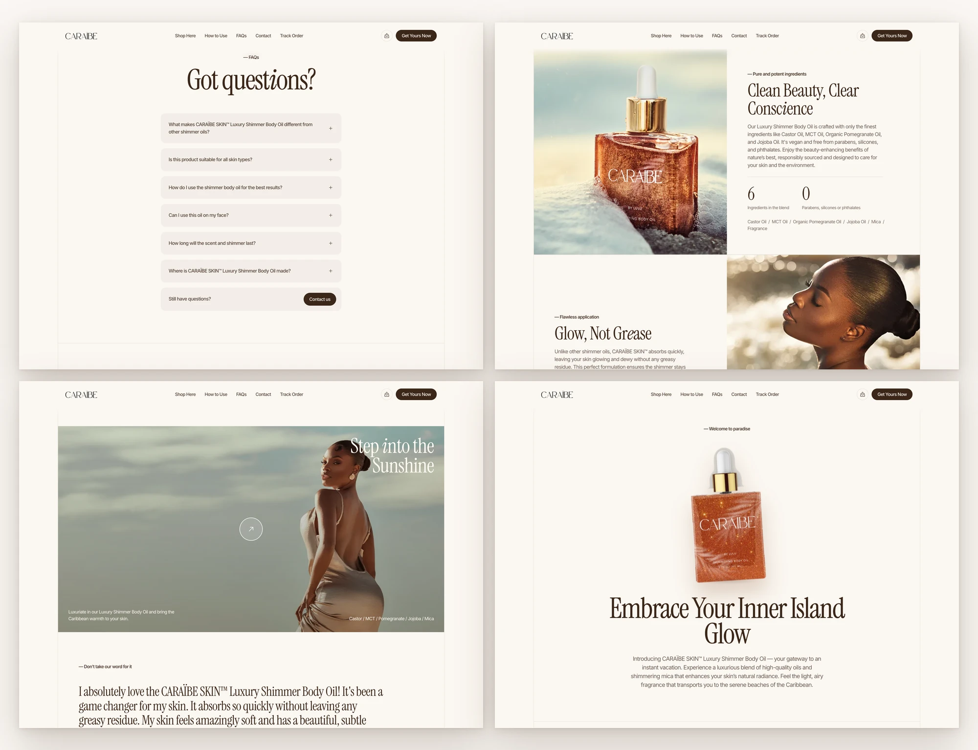
The client's copy, word for word. I didn't rewrite a single sentence of brand copy. Every headline, description, ingredient note, review and FAQ answer was carried over exactly; only the presentation changed.
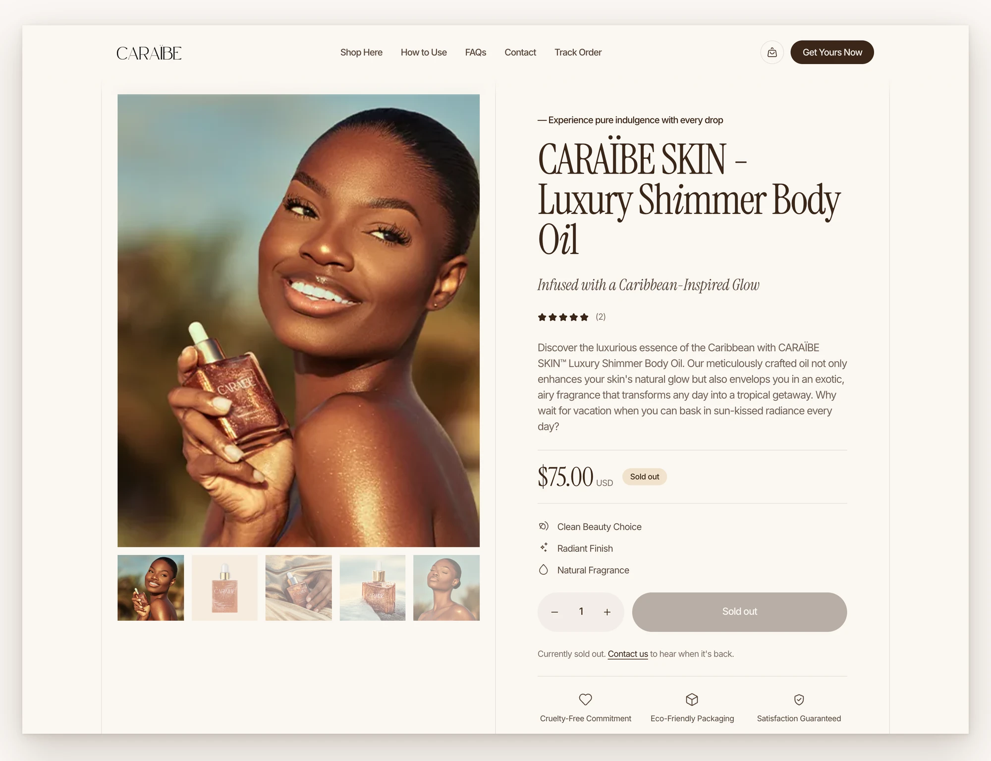
A product page that sells. A gallery that stays pinned while the details scroll, a quantity stepper wired to Shopify's cart link, ingredient, how-to-use and safety panels, a trust row, and a sticky buy bar that appears once the main button scrolls away. The sold-out state is a single flag, so the page is ready the day stock returns.
Performance and access built in, not added later. No animation library: everything runs on CSS plus a few lines of JavaScript that only work while an element is on screen. Animations only touch position and opacity. Users who turn on reduced motion get every piece of content instantly with nothing moving. Keyboard focus is visible everywhere, and the page reads fully with JavaScript switched off.
The Build
Templates | 2 (homepage, product page), 10 sections each
Motion | Hero blur-in, 20s gradient loop, 112 scroll reveals, 2 marquees, floating bottle, 3D tilt, parallax band, review crossfade, accordions, sticky buy bar
Image weight | 4.4 MB of source photography → 448 KB in WebP (about 90% lighter)
Page code | About 56 KB (home) and 66 KB (product), with no framework
Accessibility | Reduced-motion version, readable without JavaScript, keyboard focus states, semantic landmarks
Quality gates | Code linter and copy check passed on both pages with zero defects
The Impact
The redesign changes what a first-time visitor sees in the first five seconds. They see the product as the brand imagined it, with the price and the main button visible on load, and the proof points no longer buried.
Before this project, the store looked like the platform it was built on. After it, the store looks like the bottle. A buyer coming from Instagram lands somewhere that feels continuous with the shoot that brought them there. The product page now answers the questions that stall a $75 purchase: what's in it, how to use it, whether it stains clothes, what happens if they don't like it. It answers them in the order a buyer asks.
The hardest part wasn't the motion. It was restraint. A single-product store doesn't need more features; it needs every element to earn its place. One standout moment per screen, one curve for every entrance, one voice for every line of copy.
The site isn't live yet, so I haven't added launch metrics. Once it ships, the numbers to track are mobile conversion rate, add-to-cart rate from social traffic, hero bounce rate and Core Web Vitals.
The Takeaway
Small brands don't lose to big brands on product. They lose on the first impression.
When the product is the story, the storefront should feel like the product, not like the platform it runs on.
0 likes · 0 views · Nov 17, 2026
The redesign changes what a first-time visitor sees in the first five seconds. They see the product as the brand imagined it, with the proof points.


