
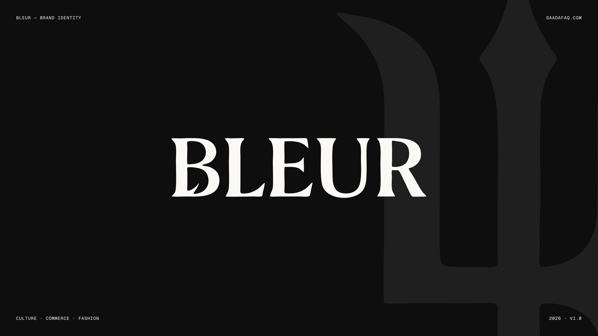
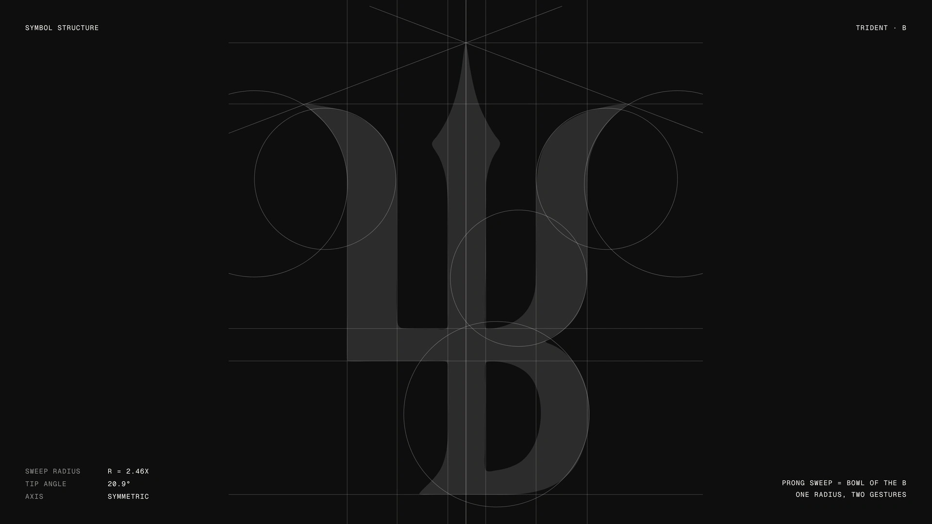
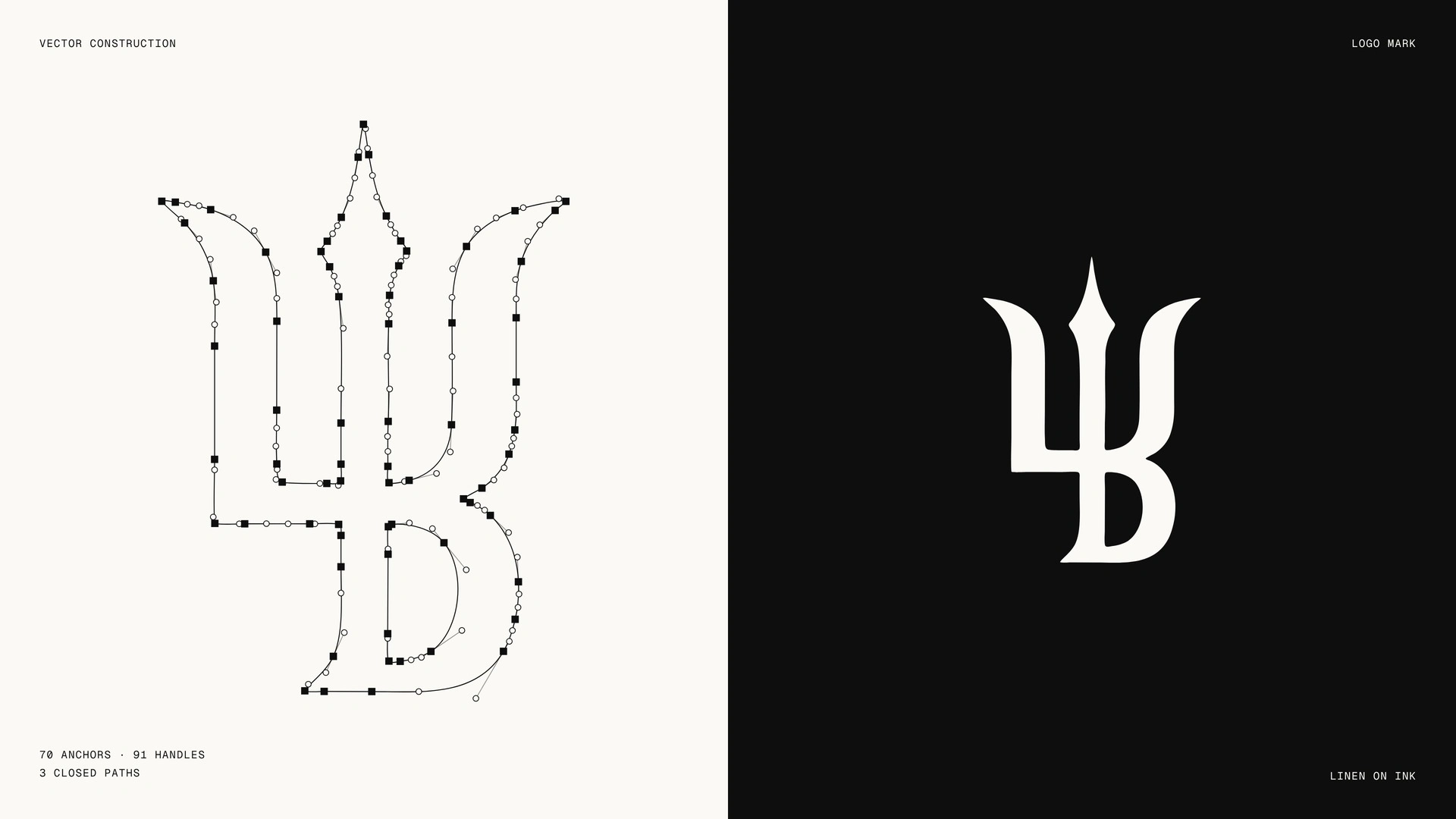
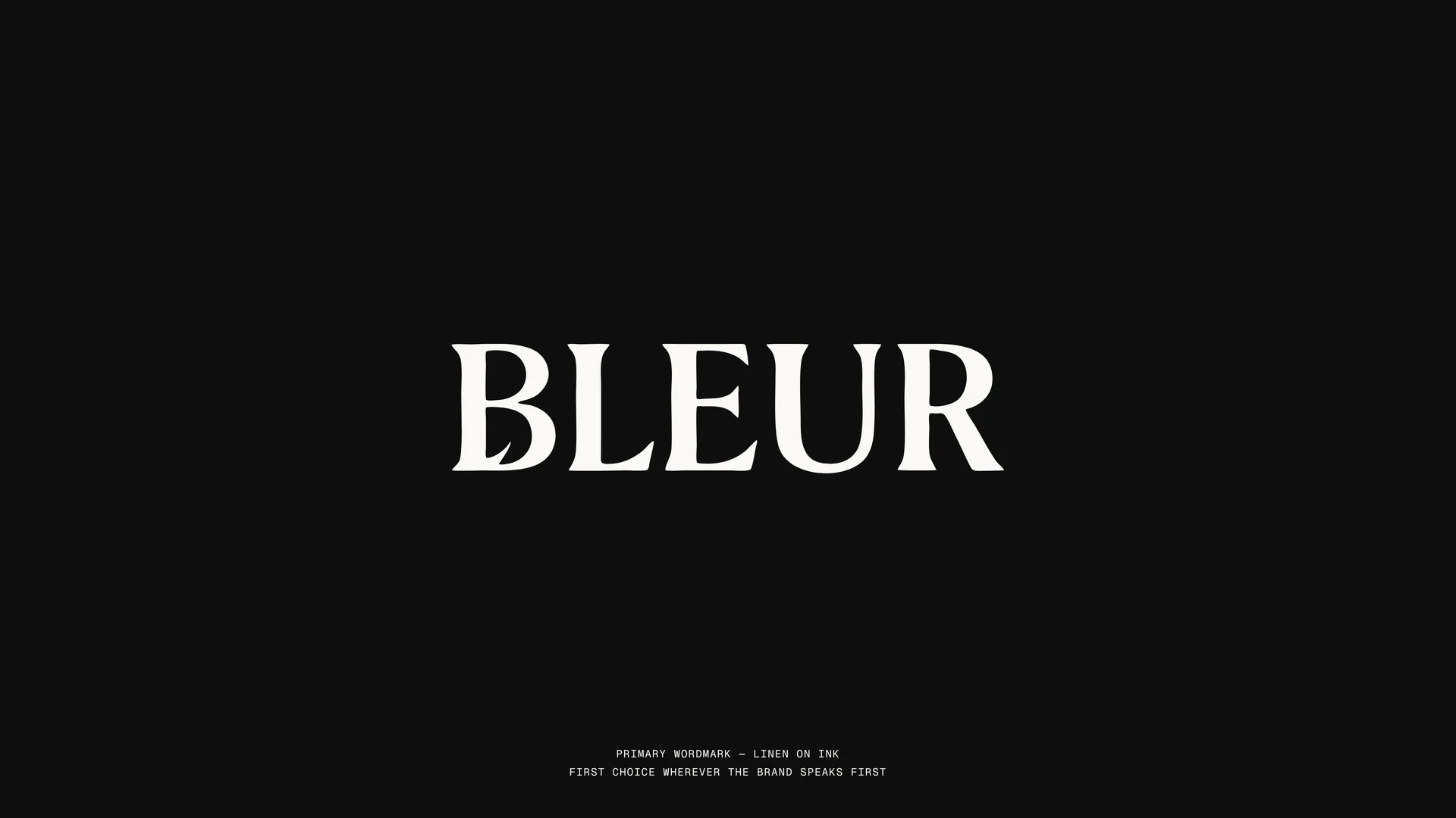
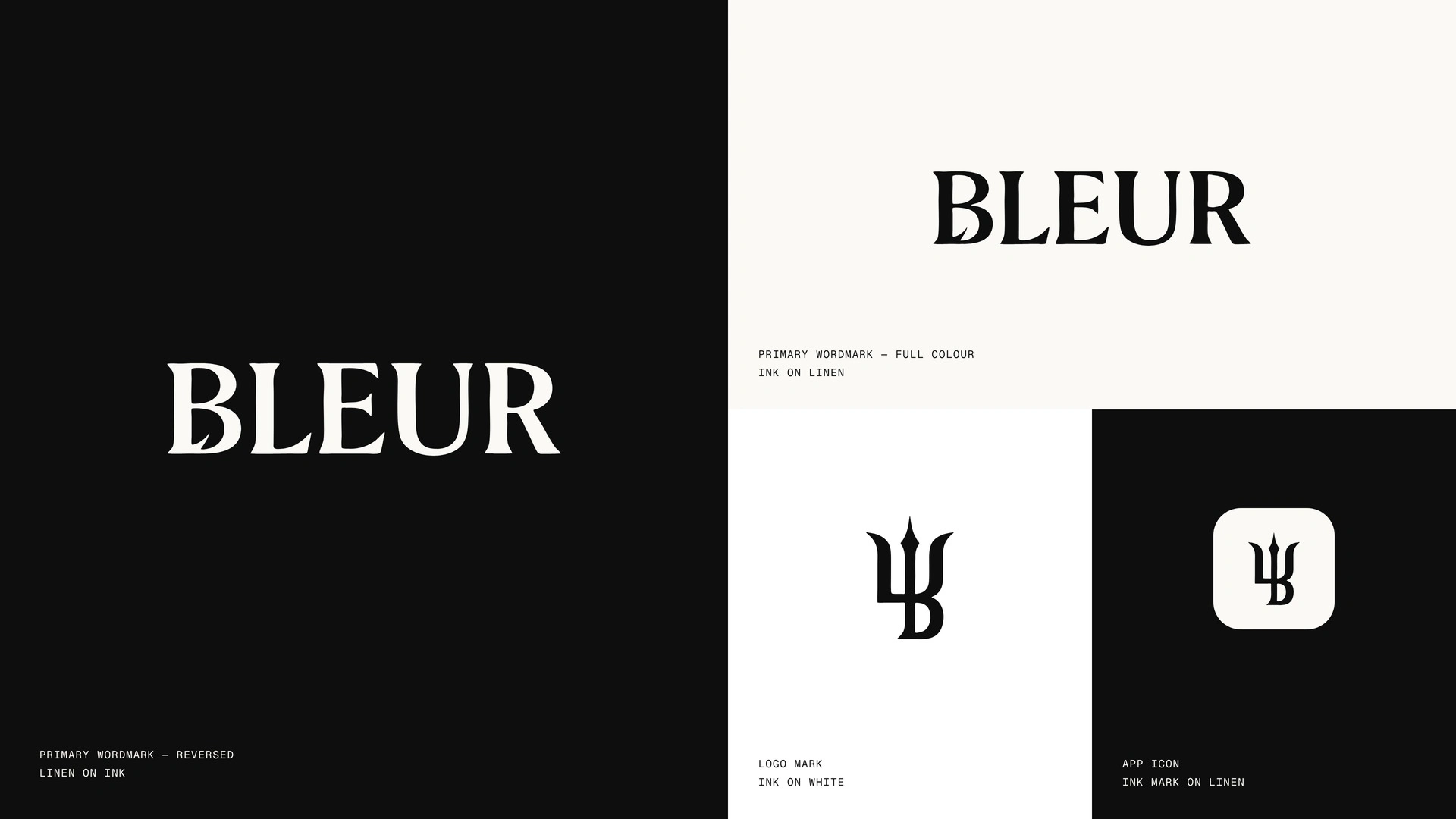
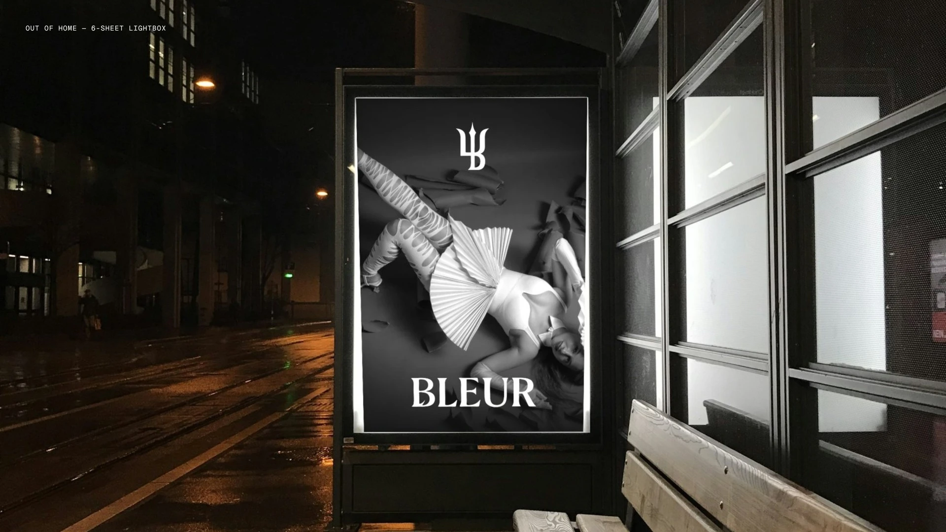
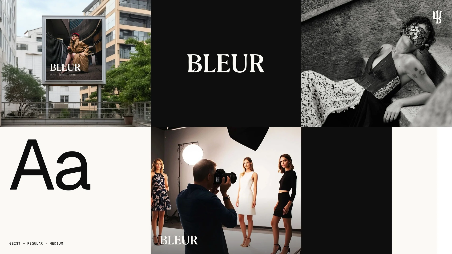
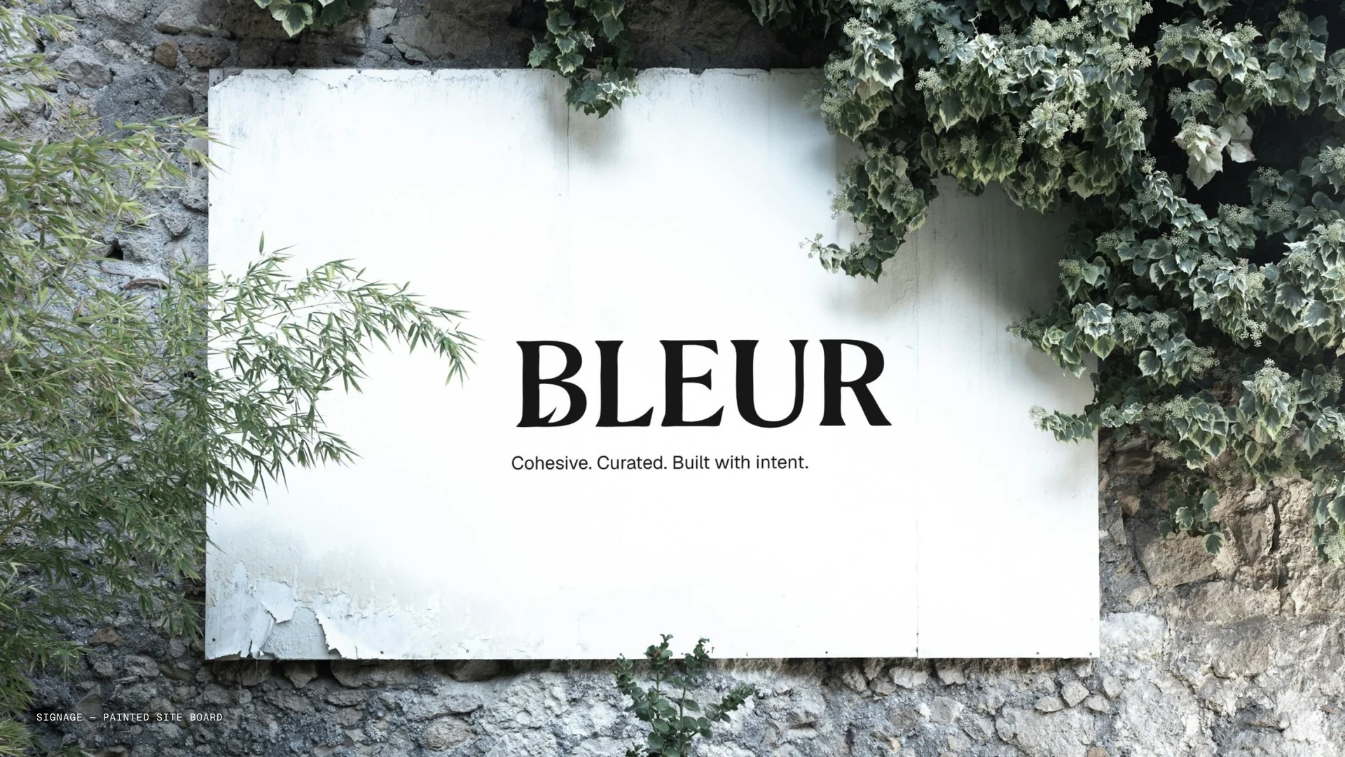
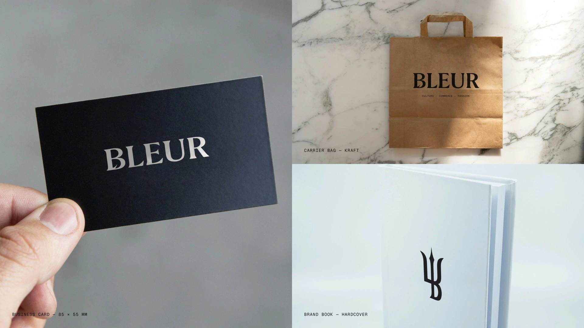
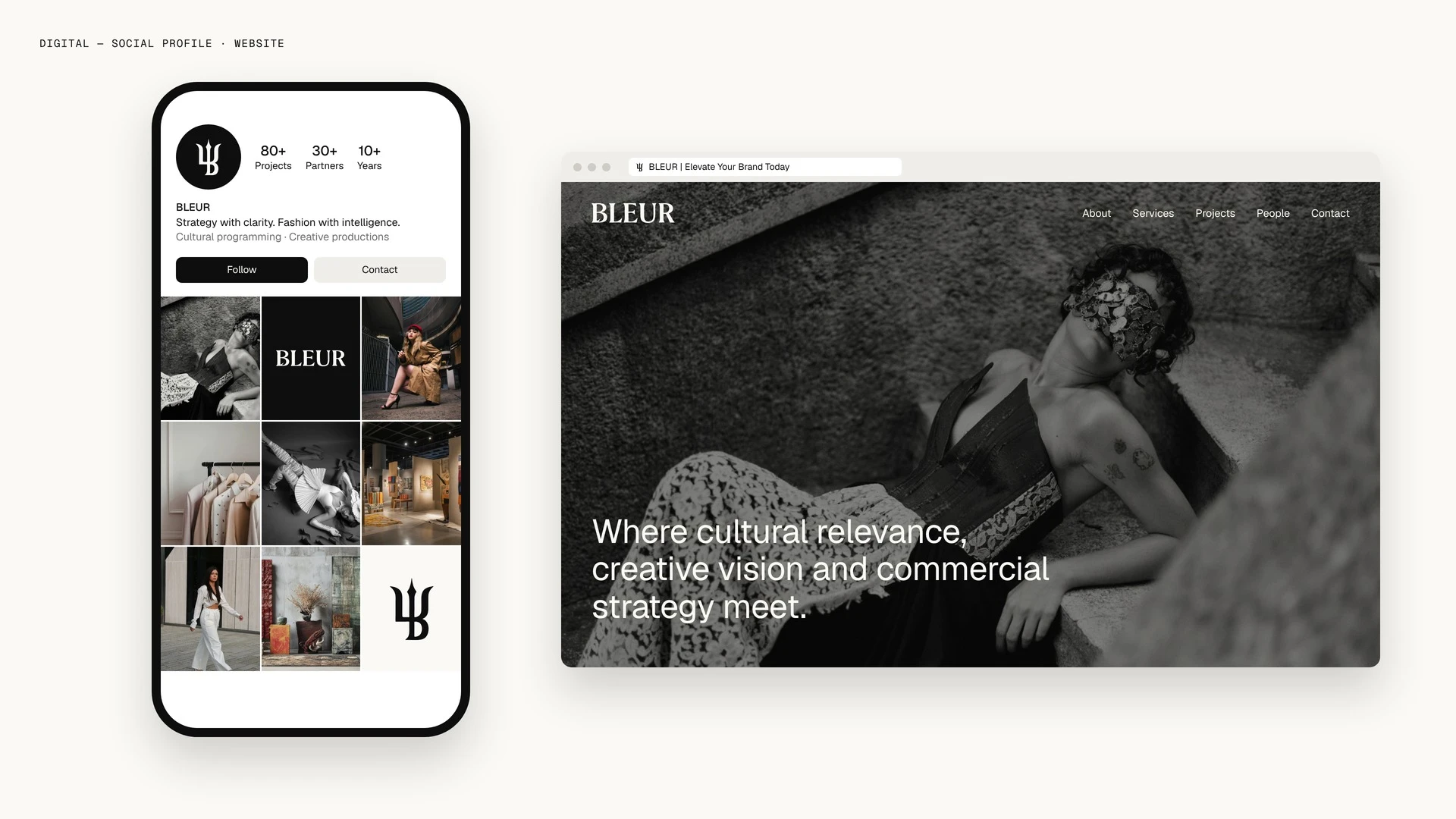
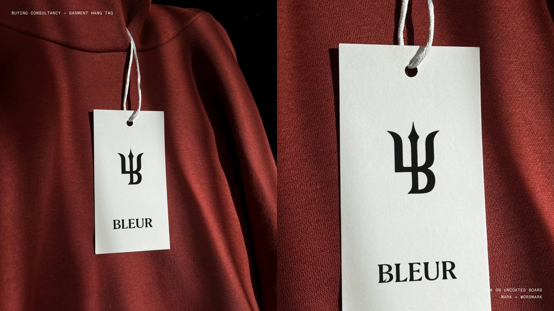
Bleur sells cultural programming, creative production and buying, so its brand had to look like judgement. I built the mark on one radius: the trident’s sweep is the bowl of the B. Three colours, two type weights, one symbol that holds from hang tag to billboard crop.
For consultancy founders who sell taste but look like everyone else.
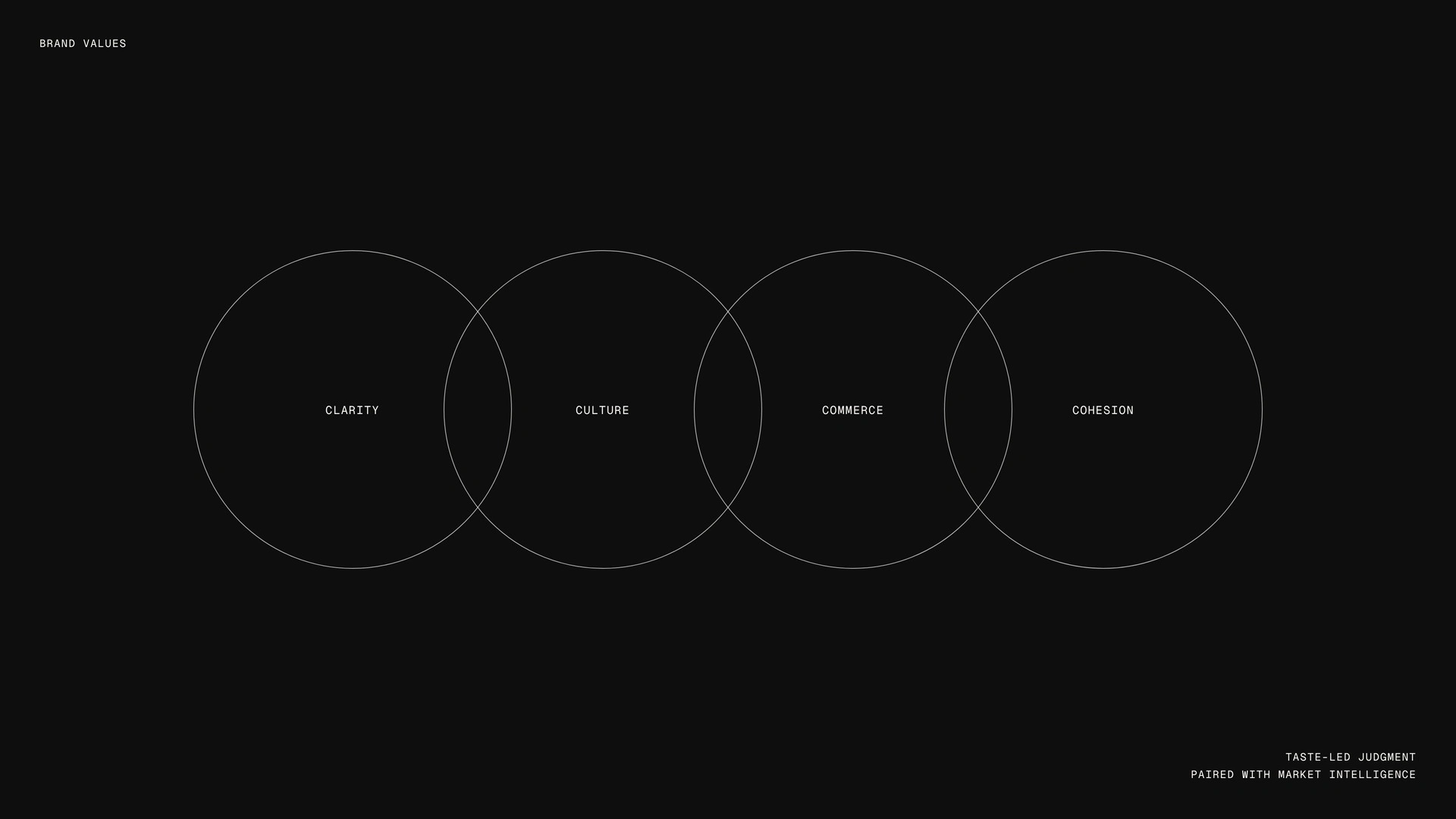
Bleur works across cultural programming, creative production and buying. Buyers want rigour. Creatives want an eye. Lean one way and you lose the other.
Left to defaults, a firm like this gets a thin serif and a beige palette. A tailor’s jacket with no label in it.
Three things changed:
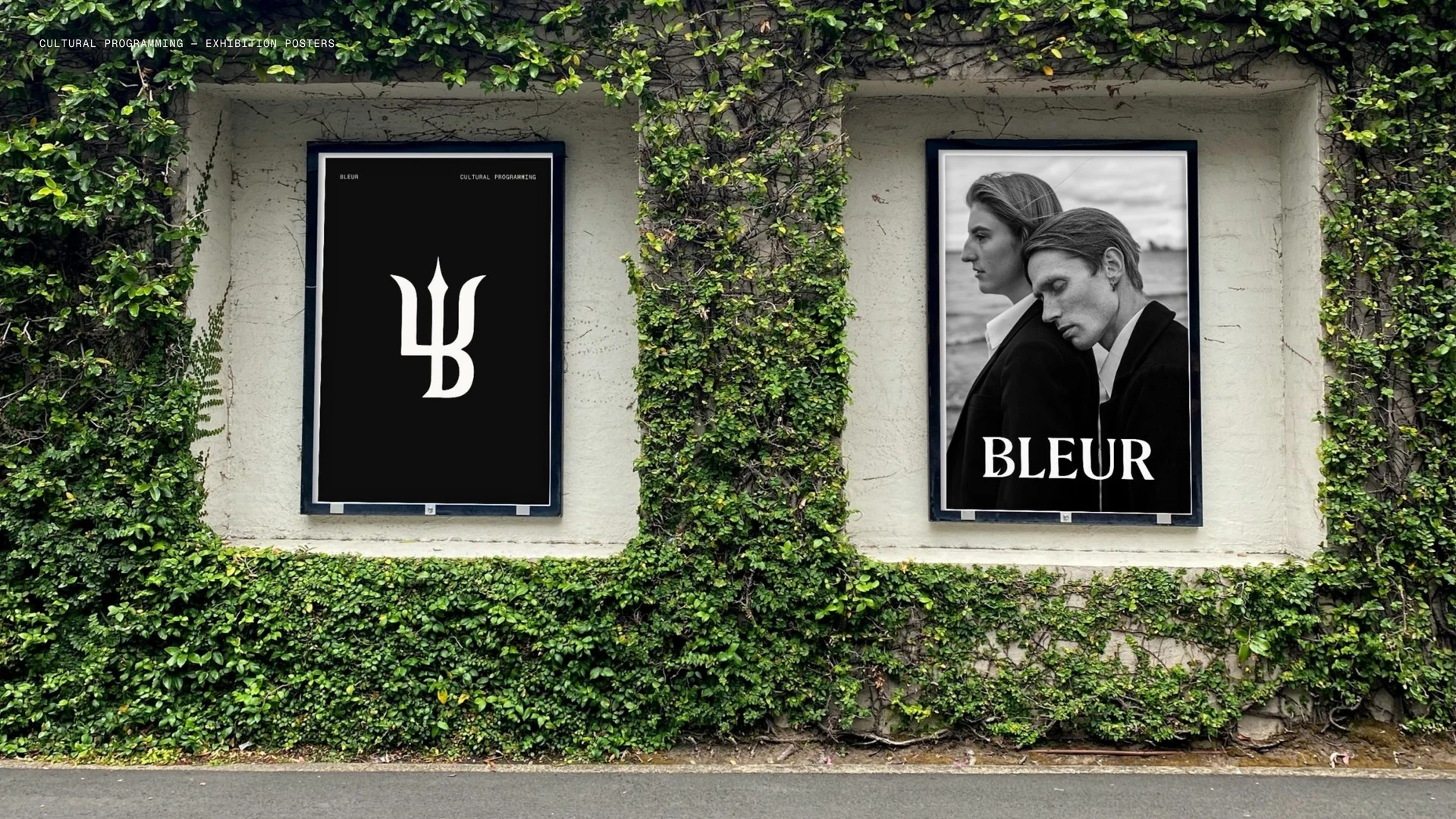
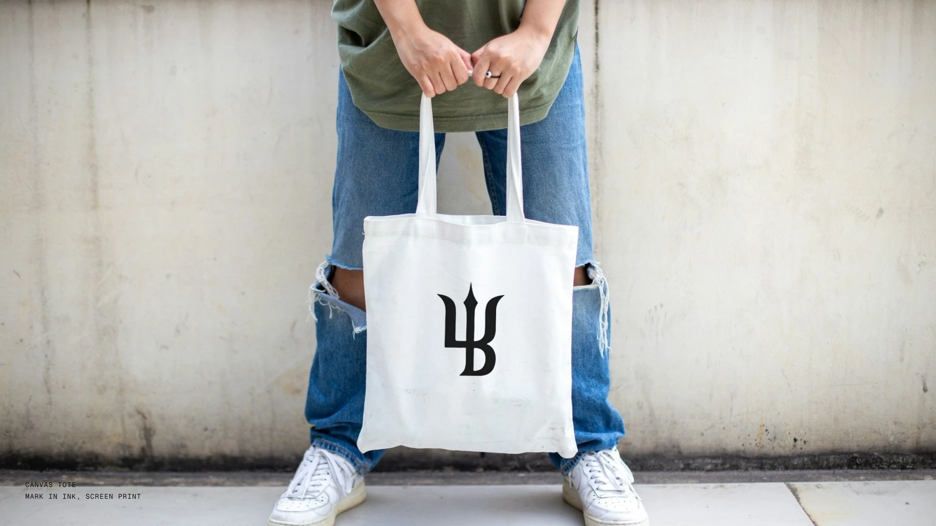
One shape does two jobs. The trident’s sweep is the bowl of the B, so symbol and name are one drawing.
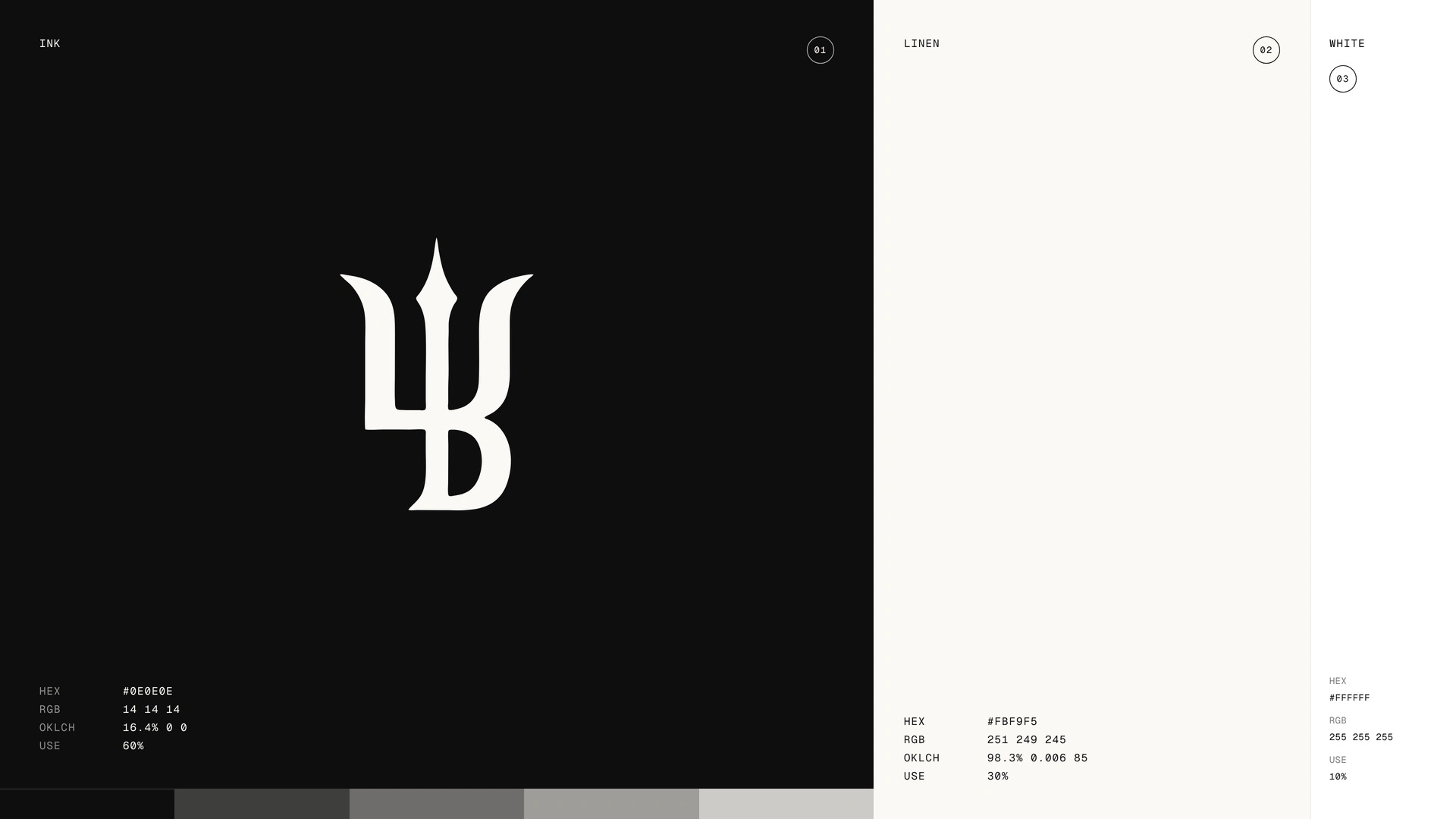
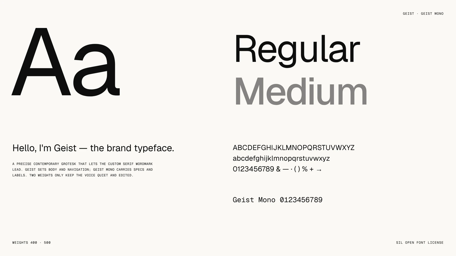
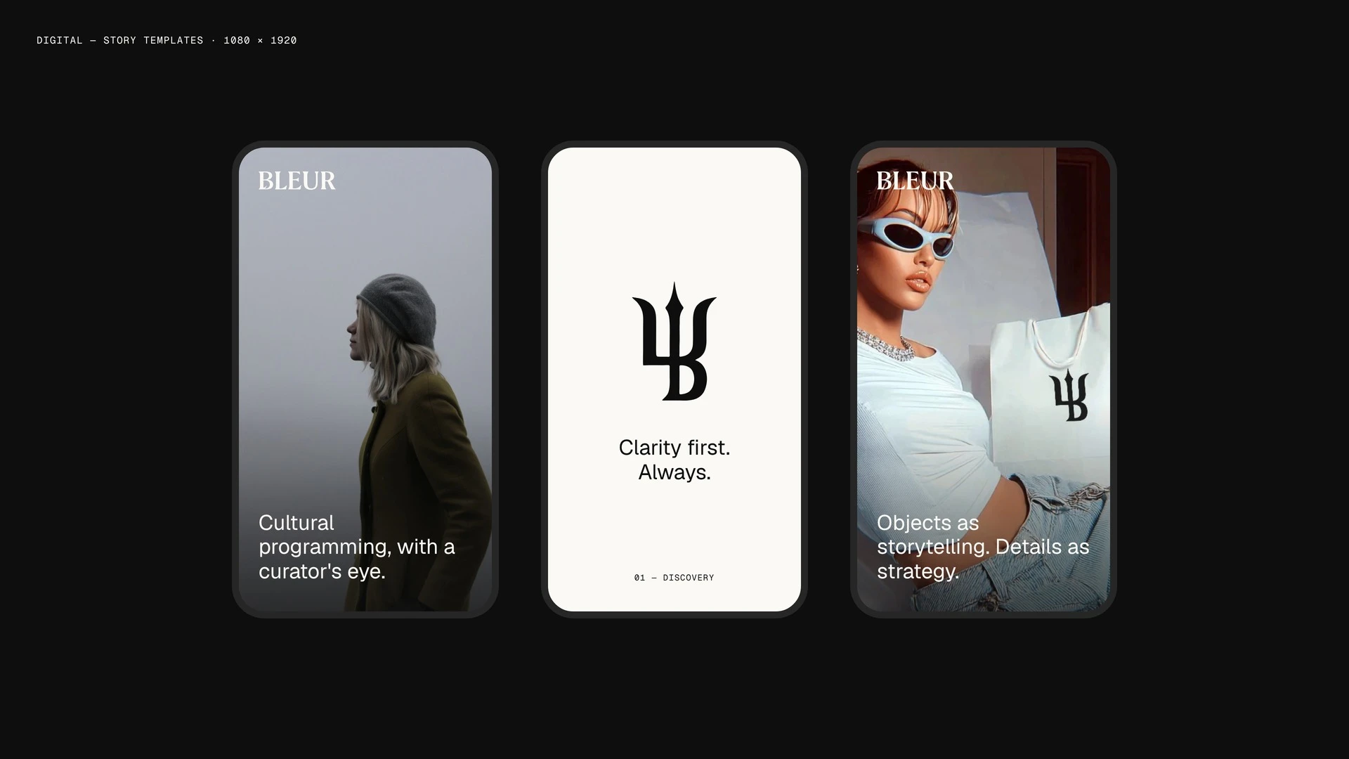
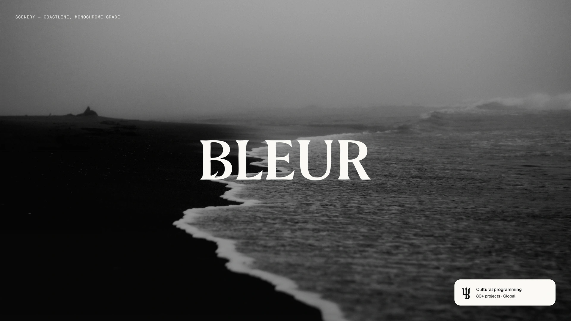
Three colours, two type weights: ink, linen, white. The photography carries the mood.
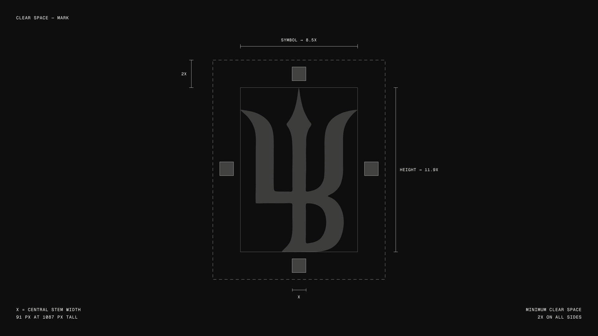
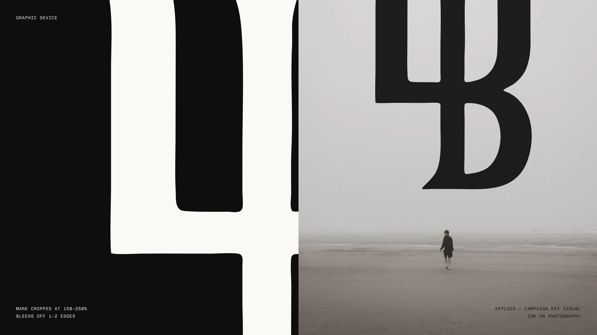
The mark crops to 150–250% and bleeds off the edge, so a slice of it still reads as Bleur.
The obvious route was a wordmark and a B in a circle. I drew a trident on one radius instead. A consultancy sells judgement, so its mark has to show some before anyone reads a word.
Tools got me to options fast. Choosing which one earned the job was my call.
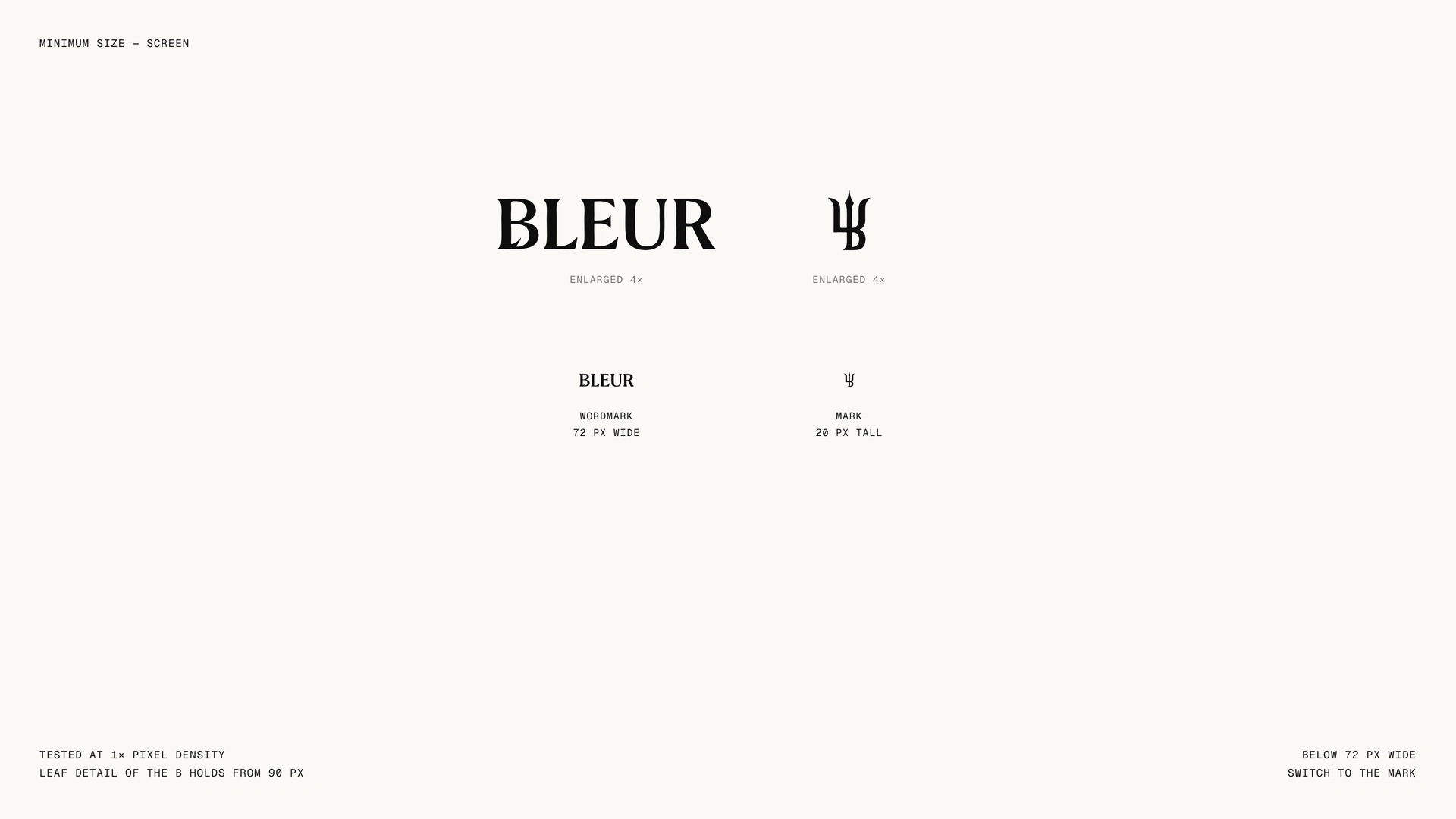
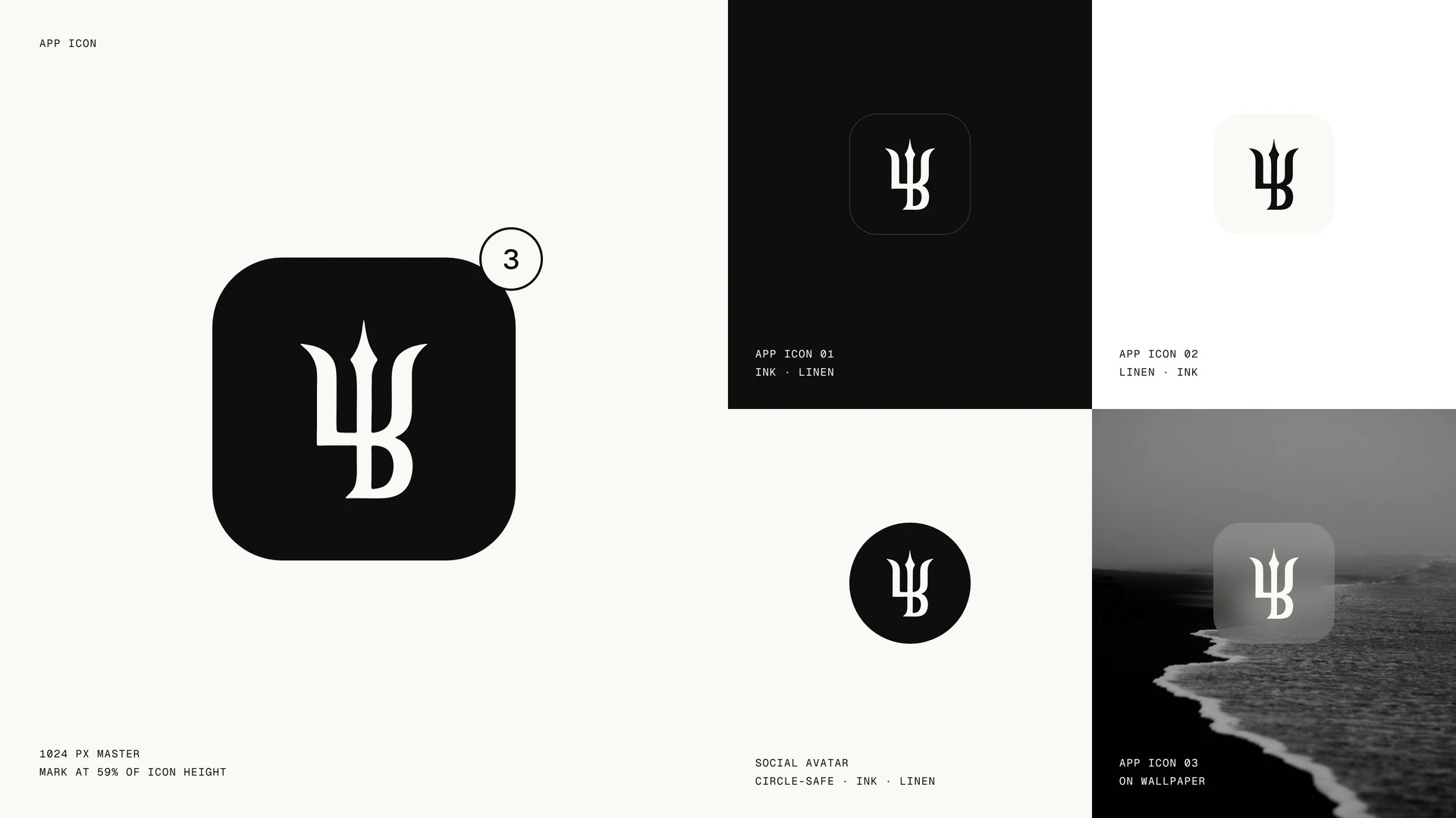
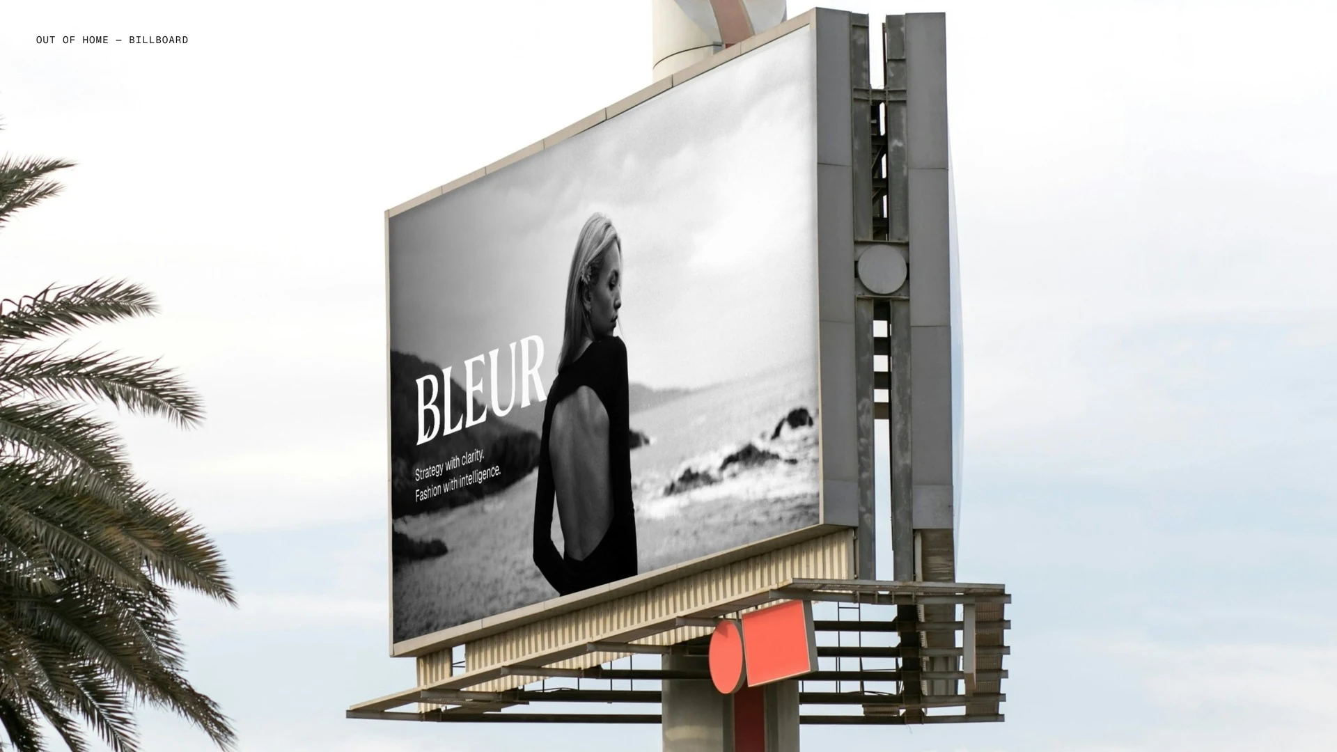
The result: one mark that holds on a hang tag, an app icon and a billboard crop, in three colours.
If your firm sells judgement but looks like everyone else’s, send me what you do. I’ll tell you the first shape I’d draw.

0 likes · 4 views · Nov 5, 2026
One radius, one symbol: Bleur’s trident-B holds from app icon to billboard crop in three colours and two type weights.


