
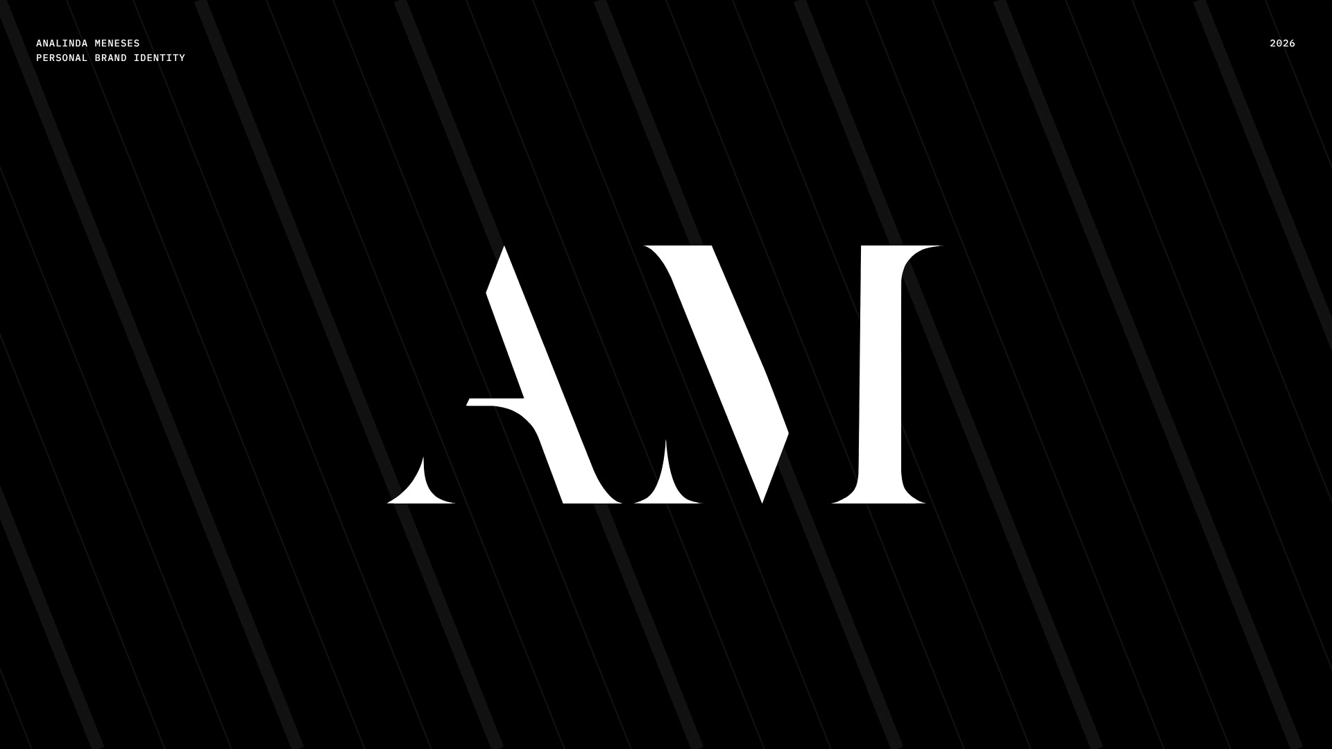
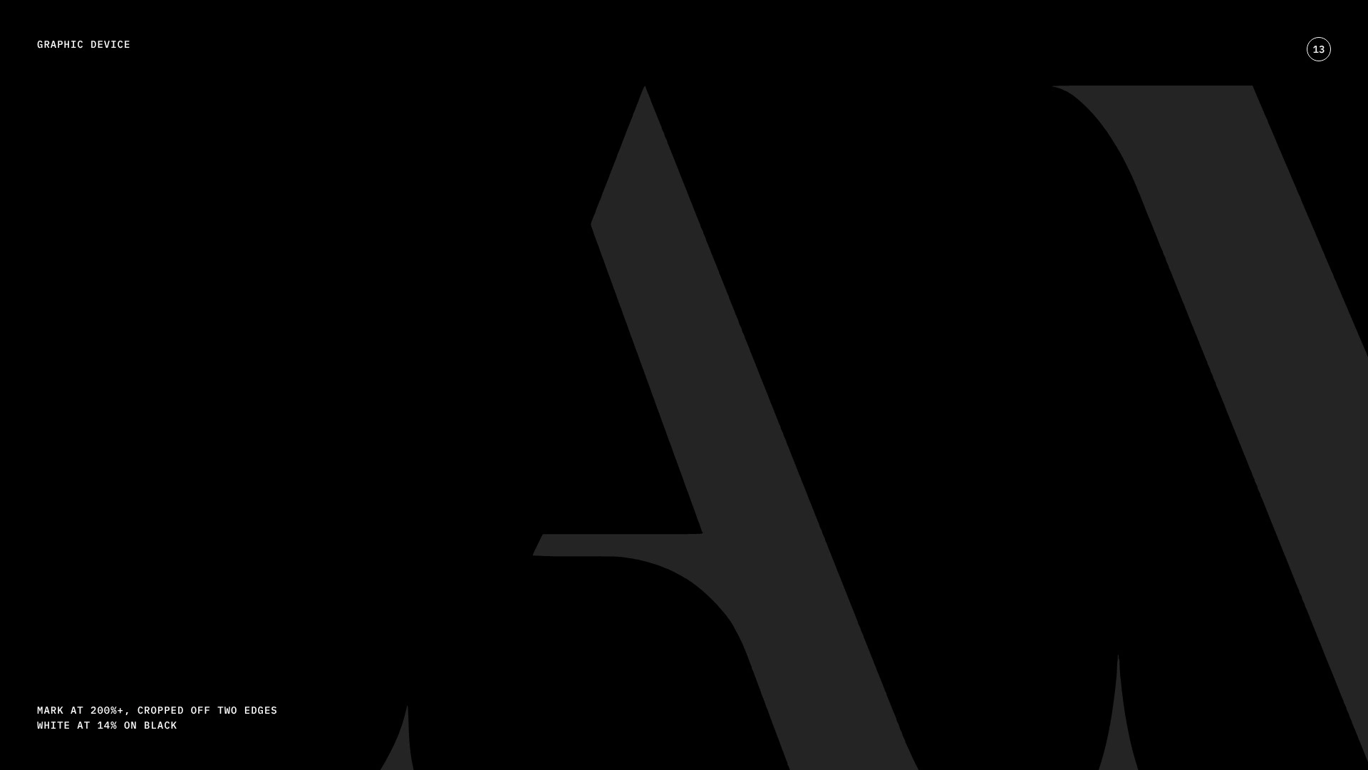
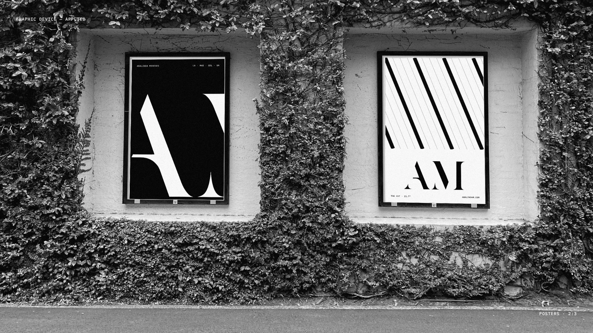
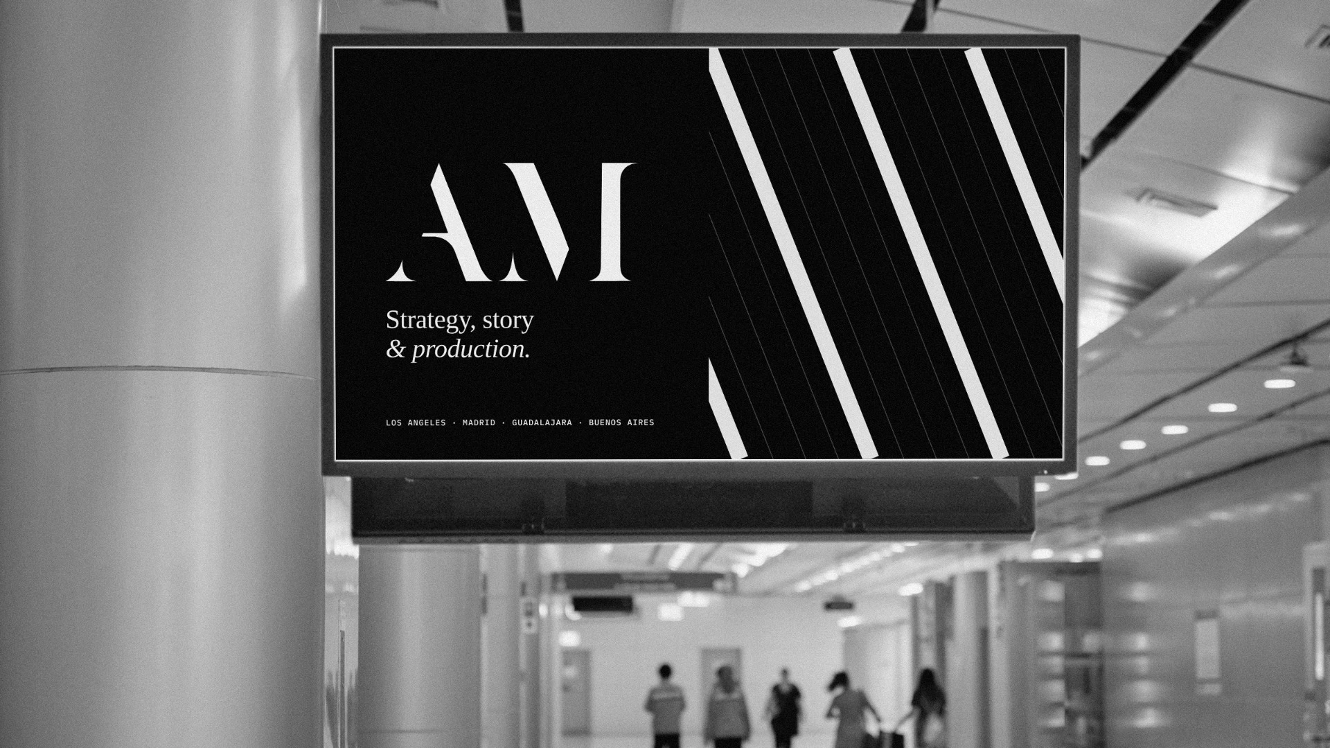
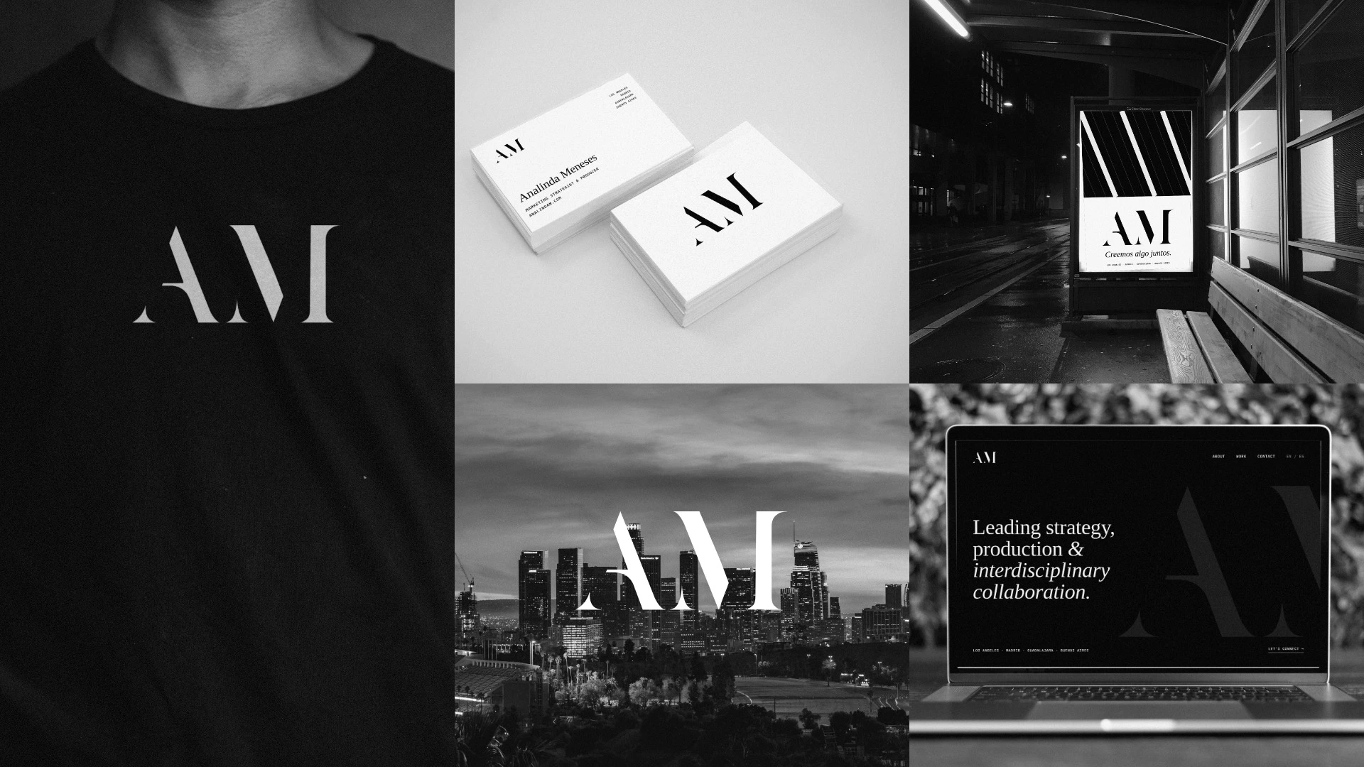
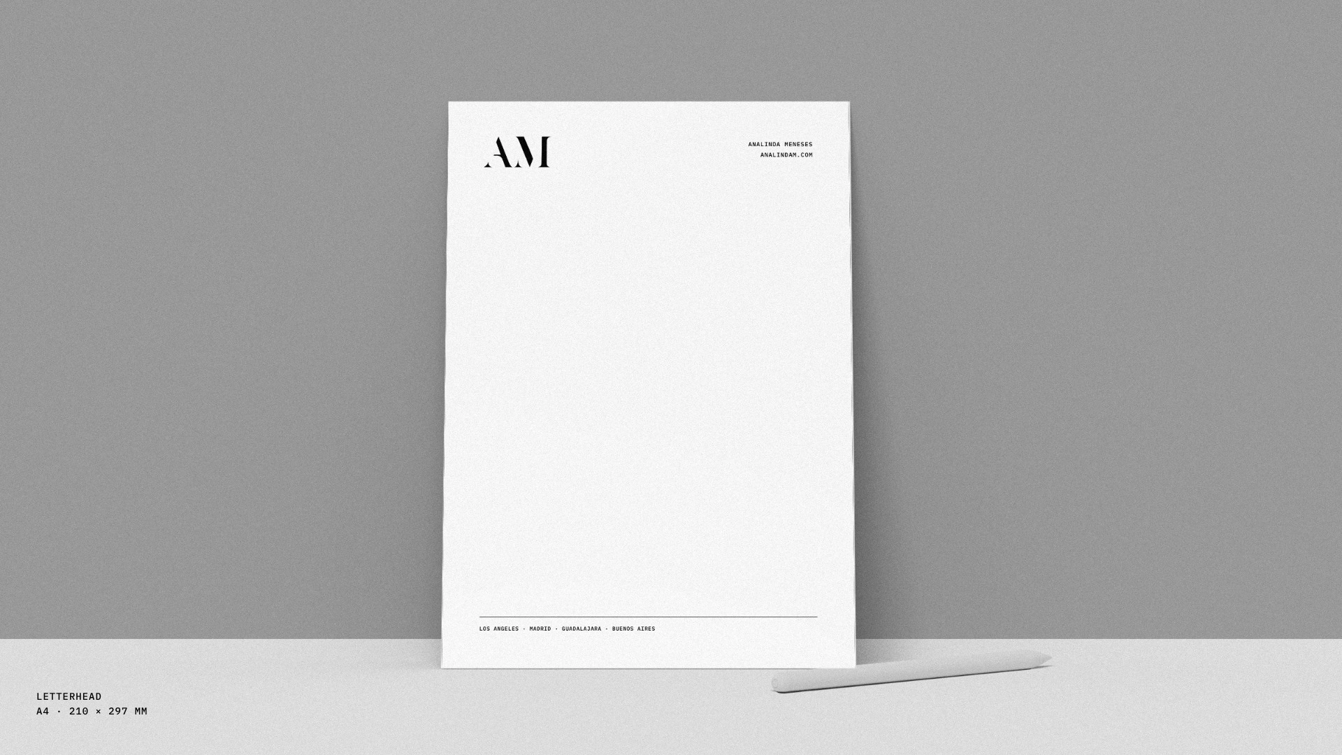
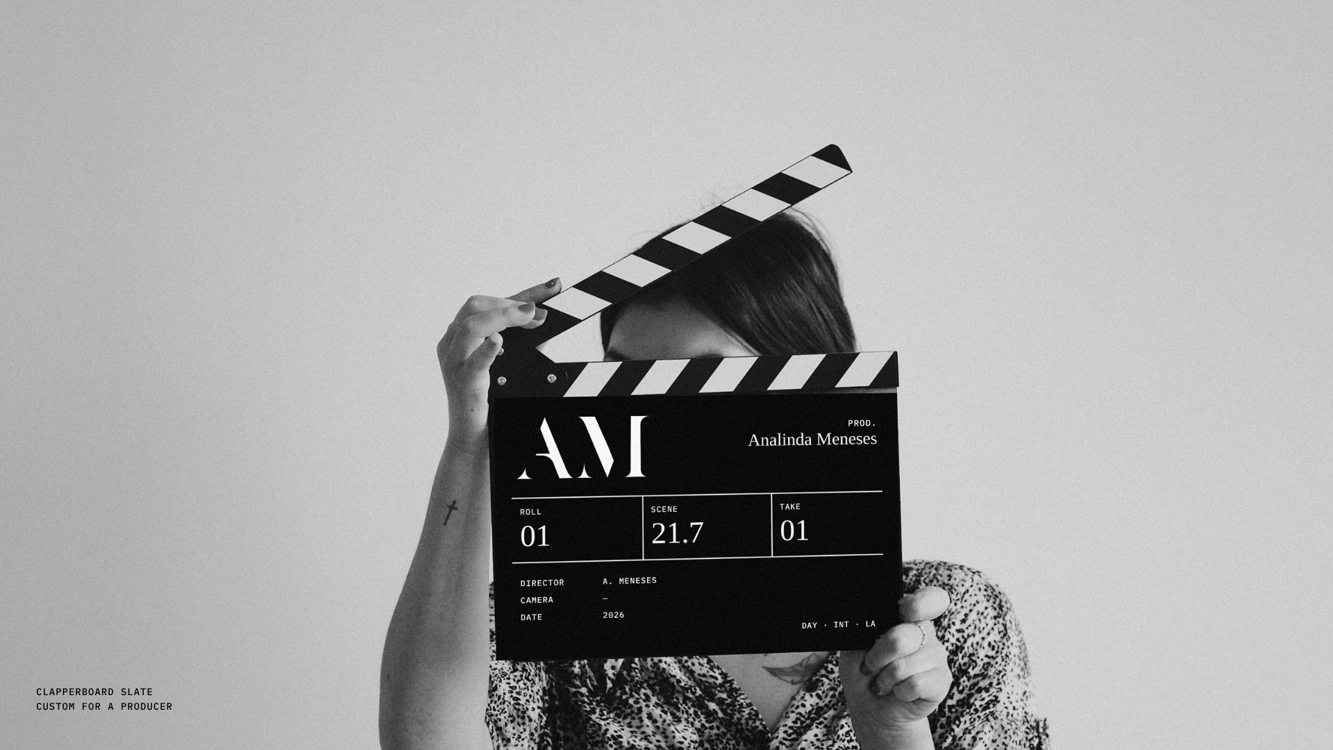
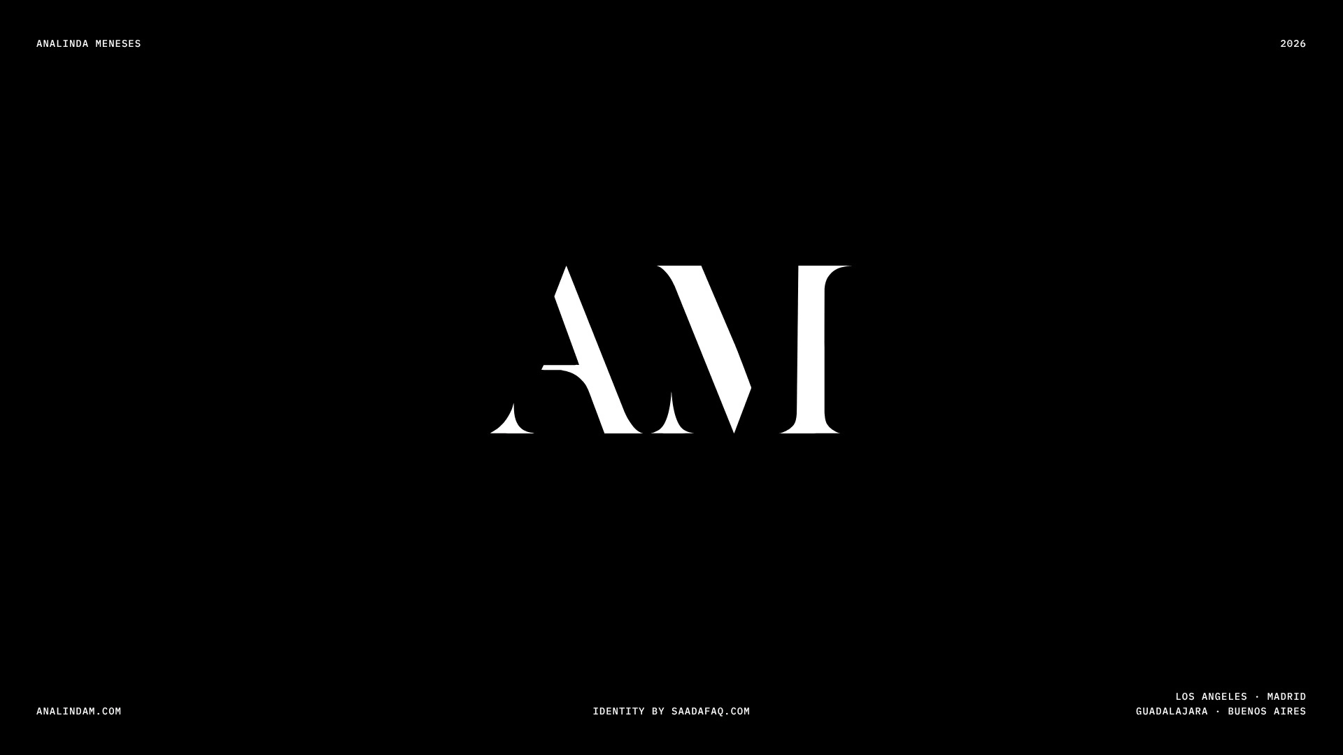
Analinda Meneses is a strategist and producer who started behind the camera. Her identity was her name in capital letters. I cut one 21.7° line through an A and M, kept it black and white, and ran the mark oversized behind her homepage. The same angle shows up on her clapperboard as Scene 21.7. One idea, used everywhere.
For strategists whose reputation is bigger than their logo.
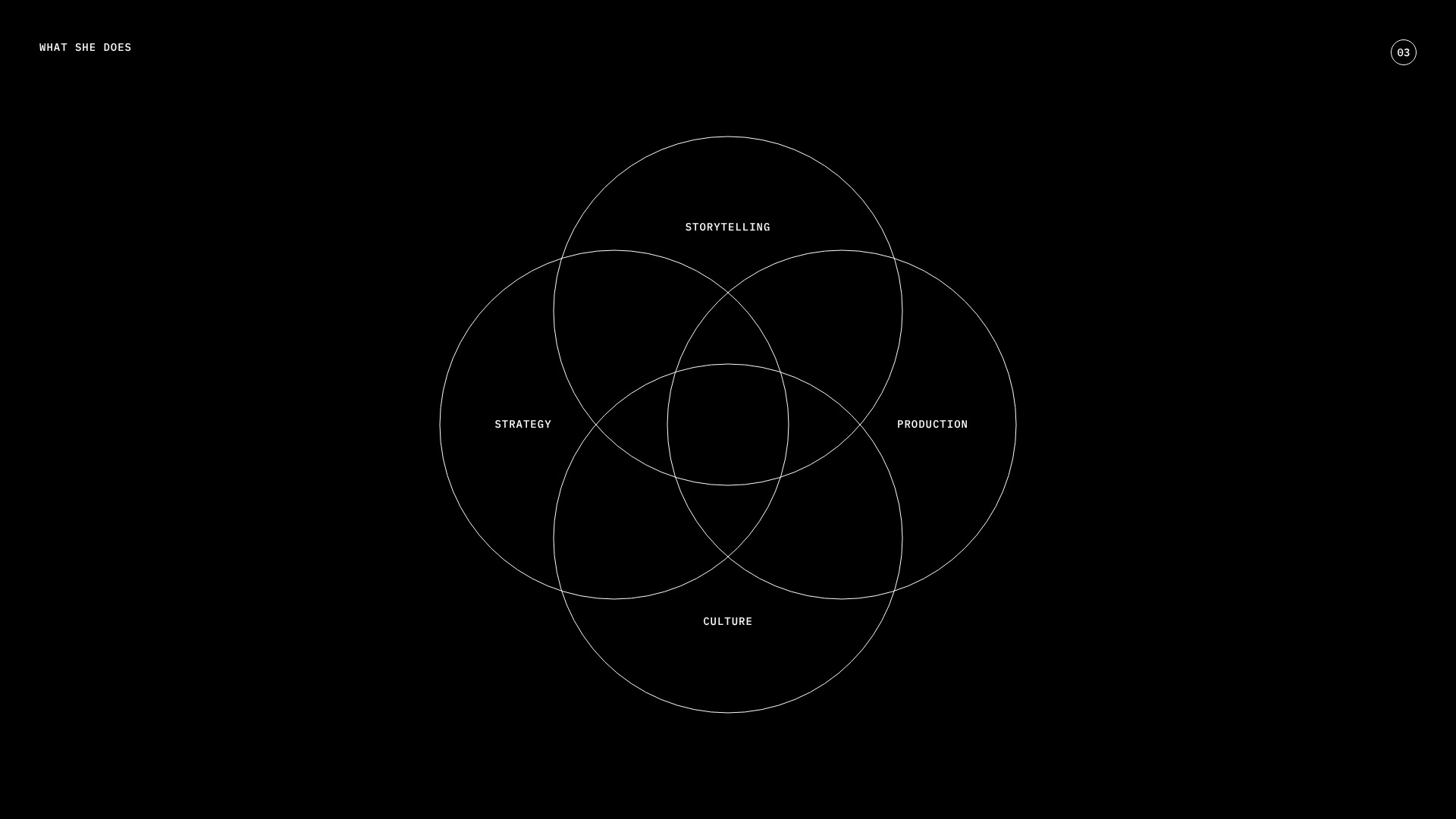
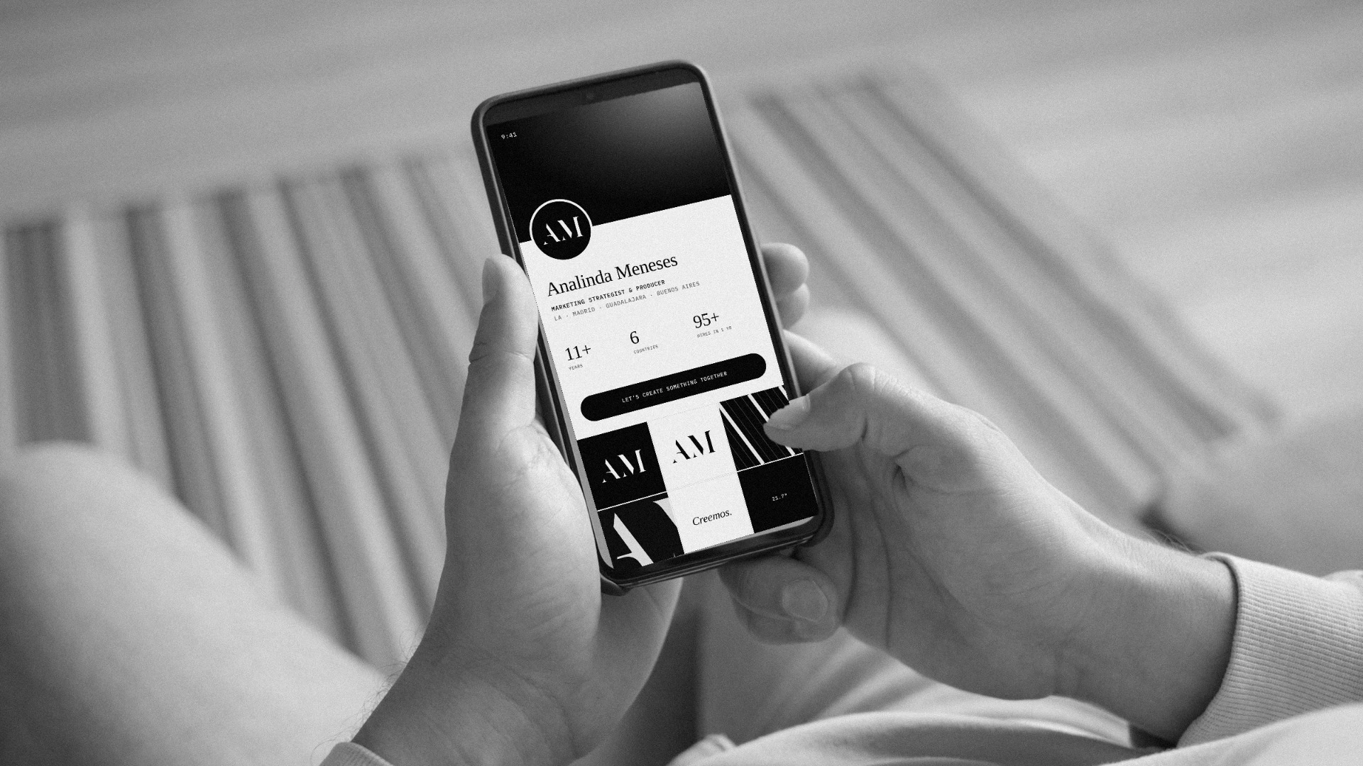
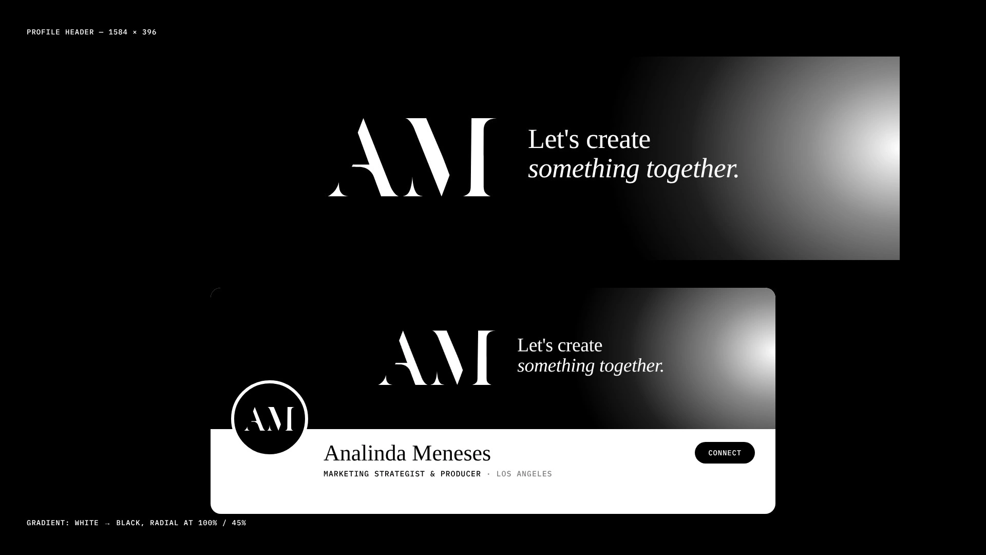
Analinda Meneses has 11+ years in the work and a team across four cities. Her header was her name in capital letters, a name tag on someone who should be on stage.
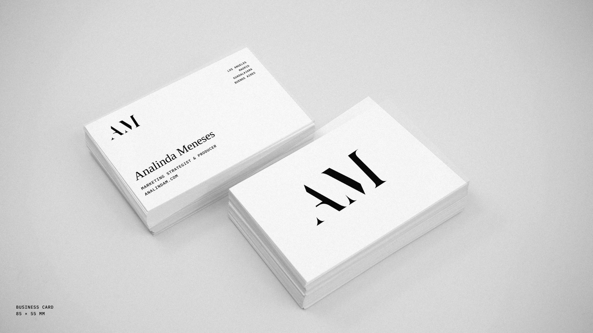
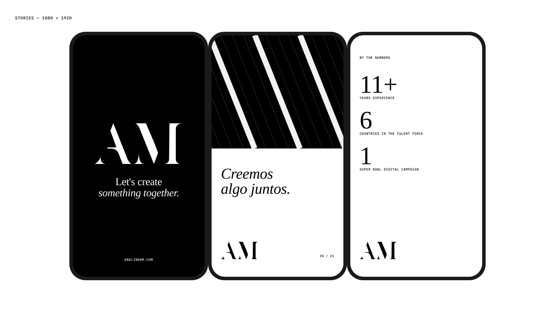
She needed to look like the senior strategist she is, in English and Spanish.
Three things changed:
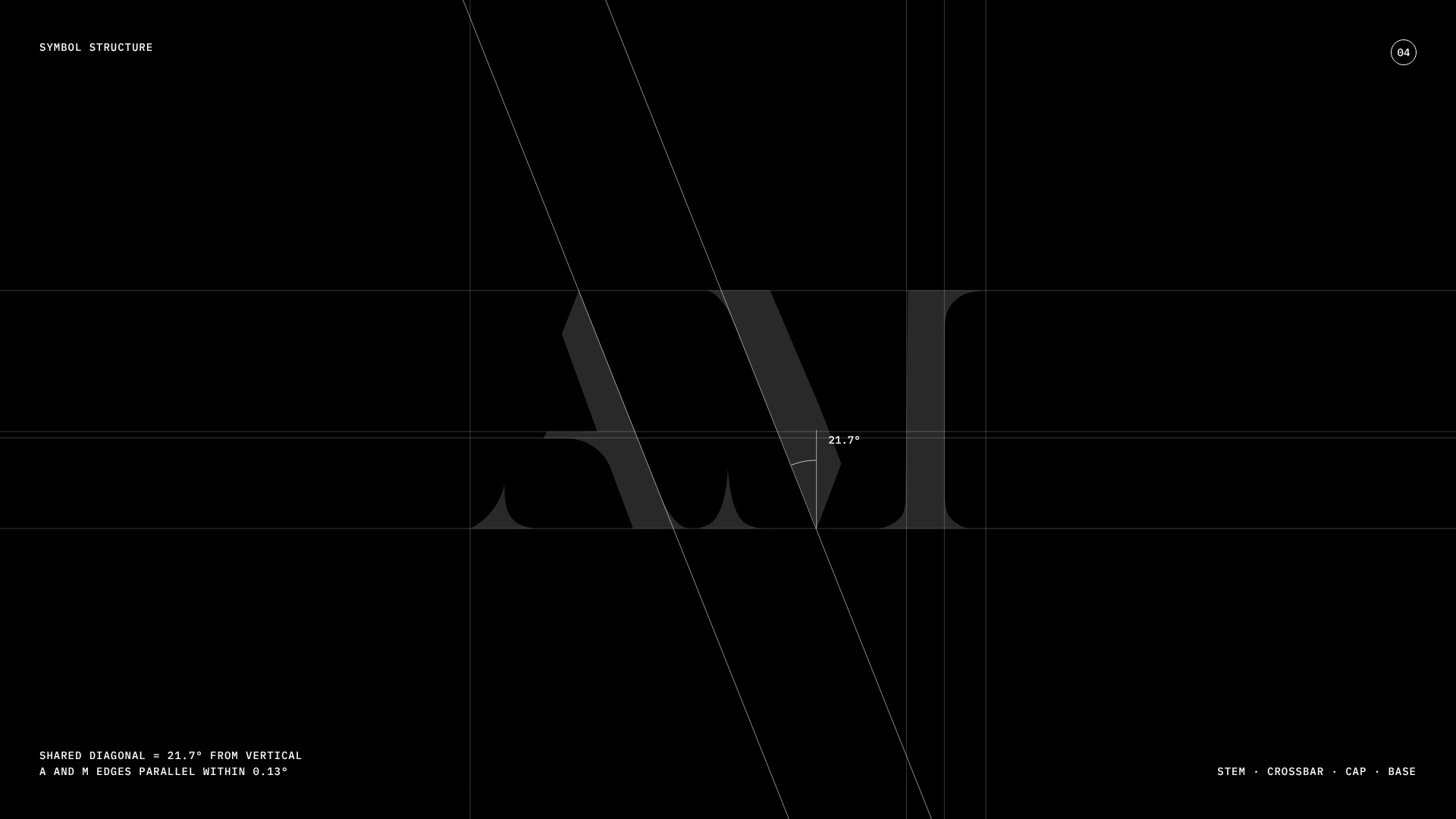
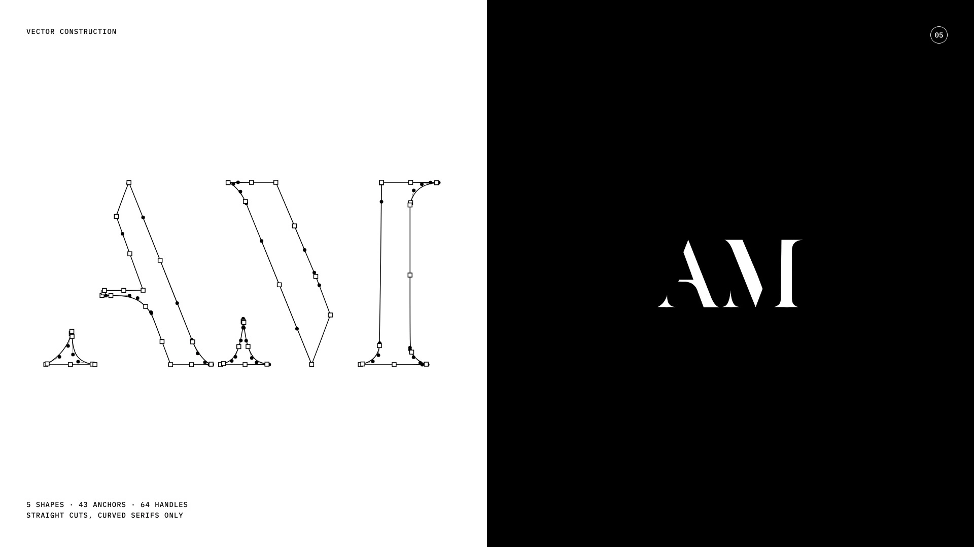
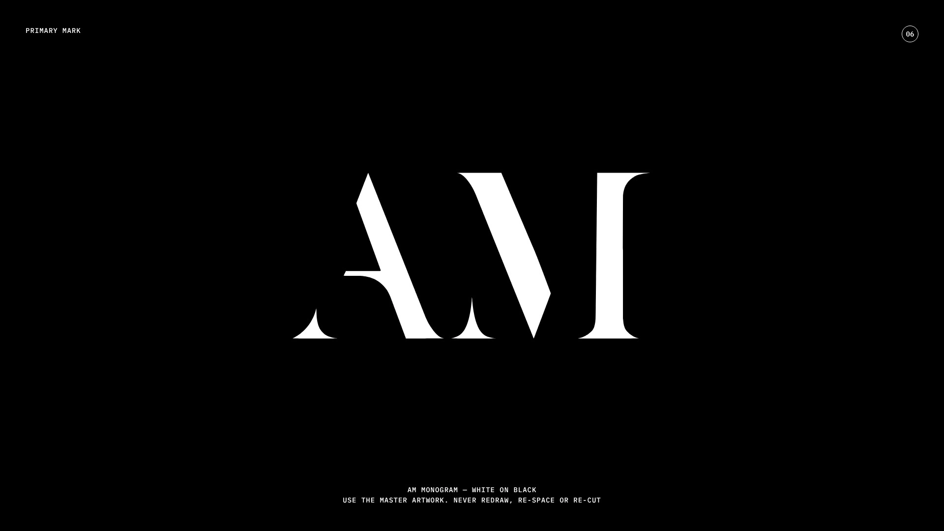
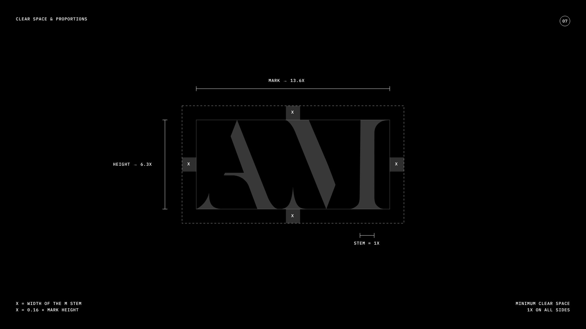
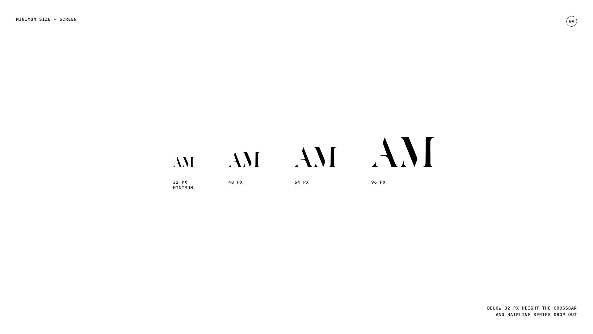
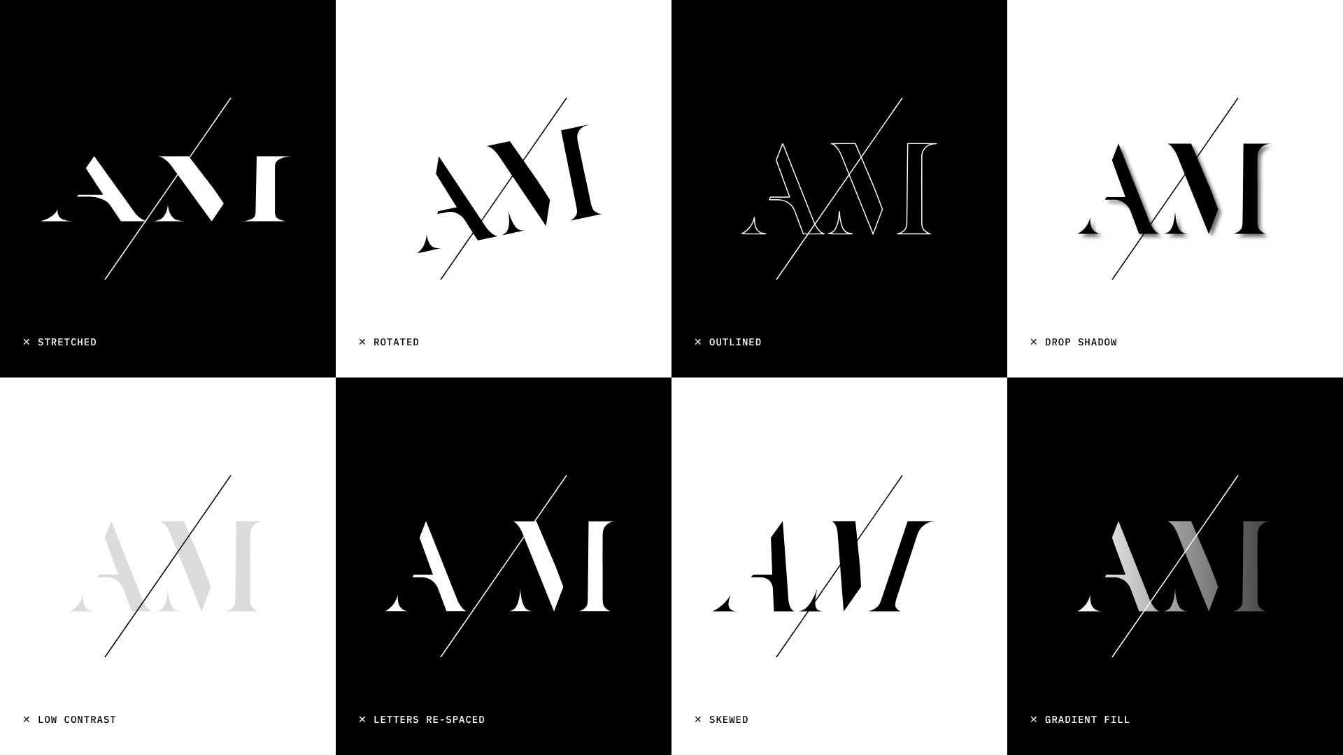
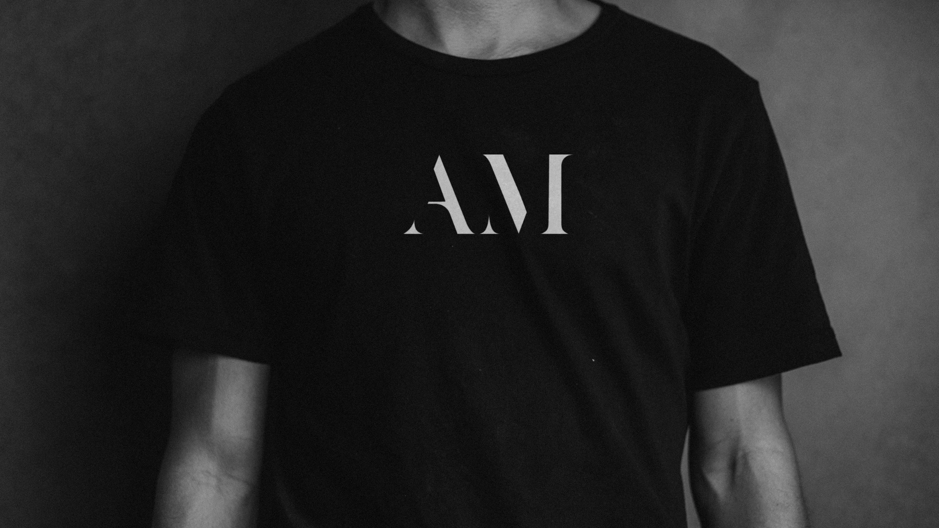
One 21.7° cut runs through both letters, so A and M read as one mark.
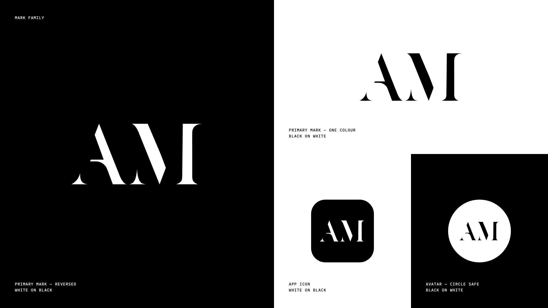
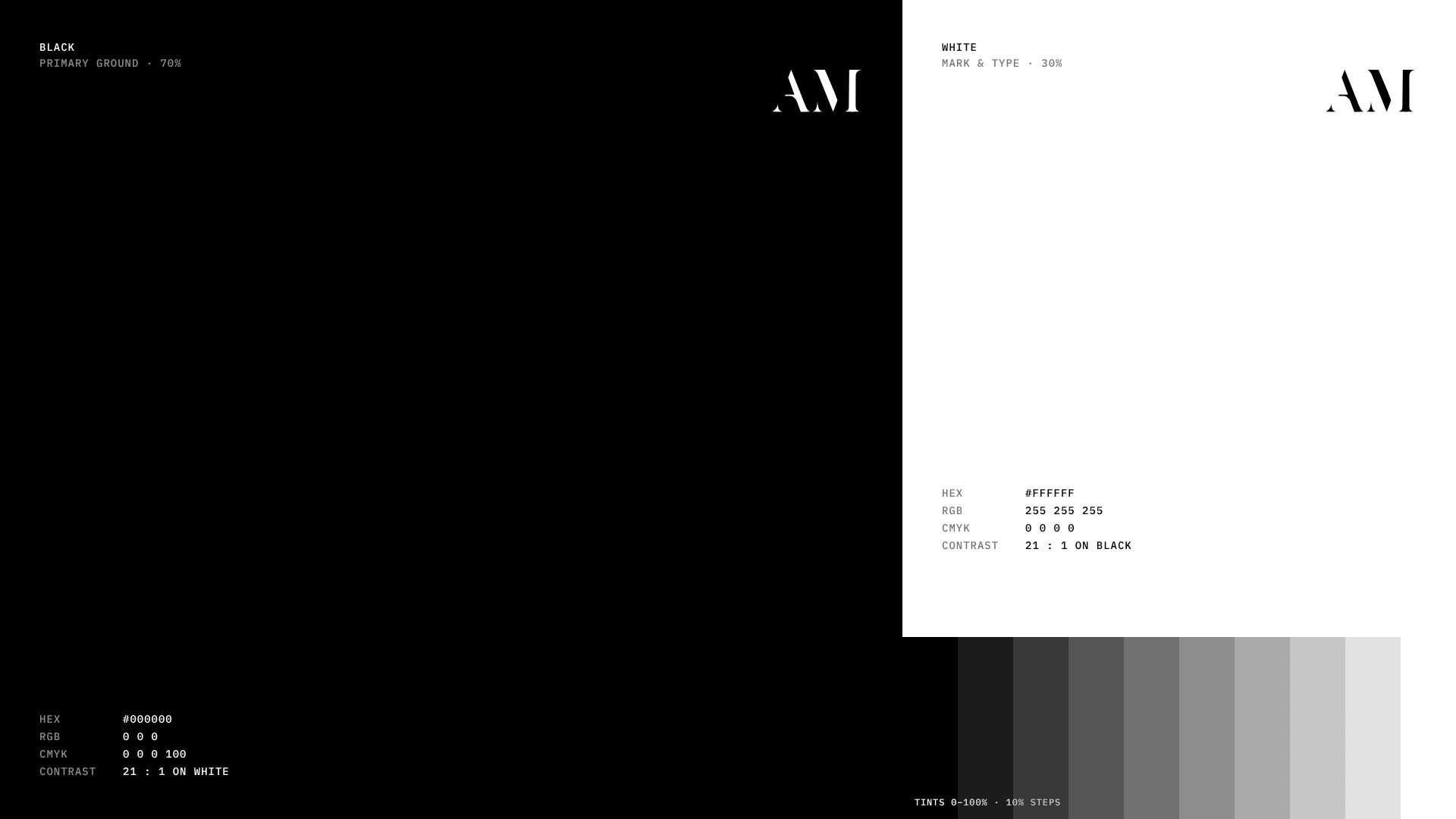
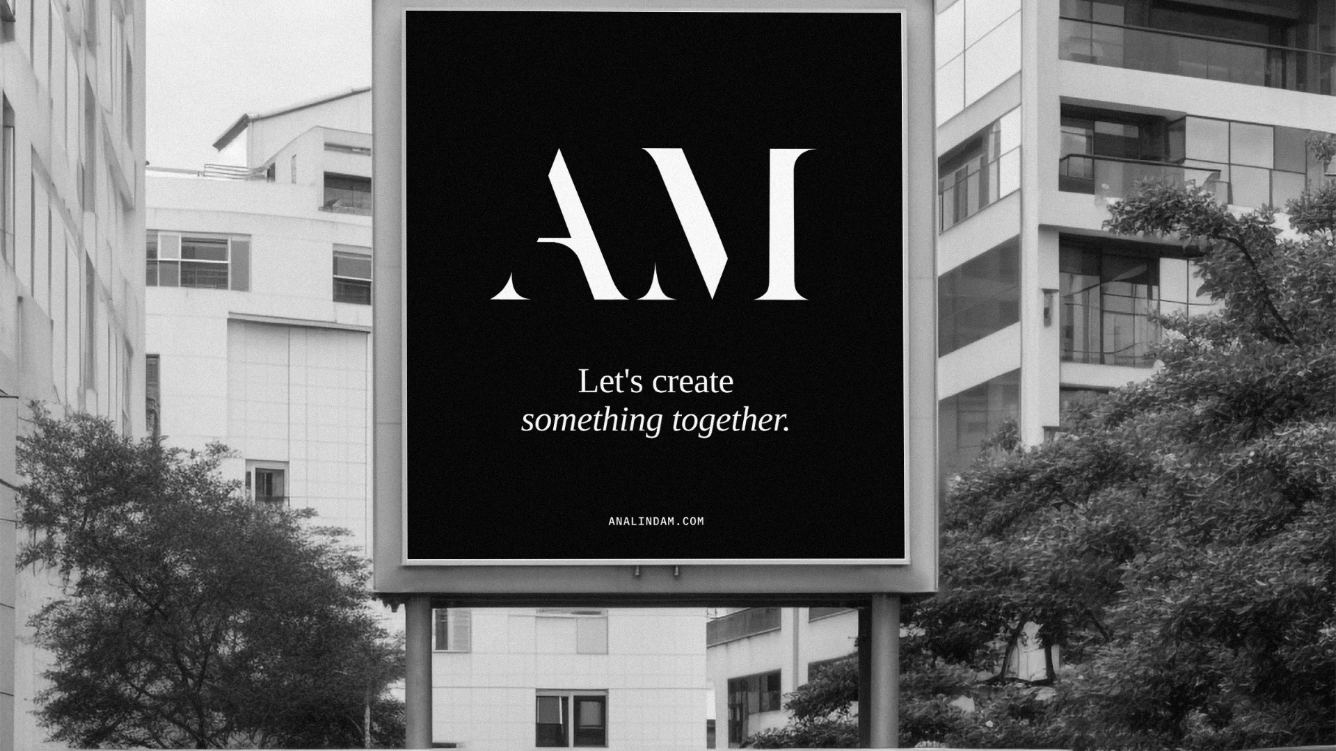
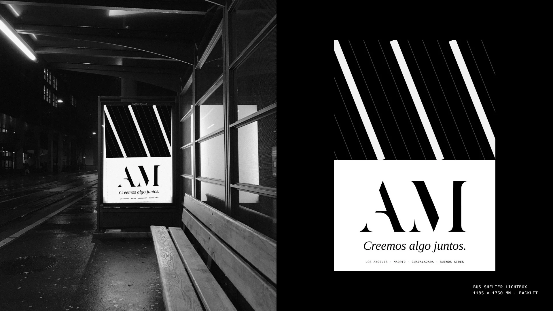
Black and white only, so she looks like the same person in every city.
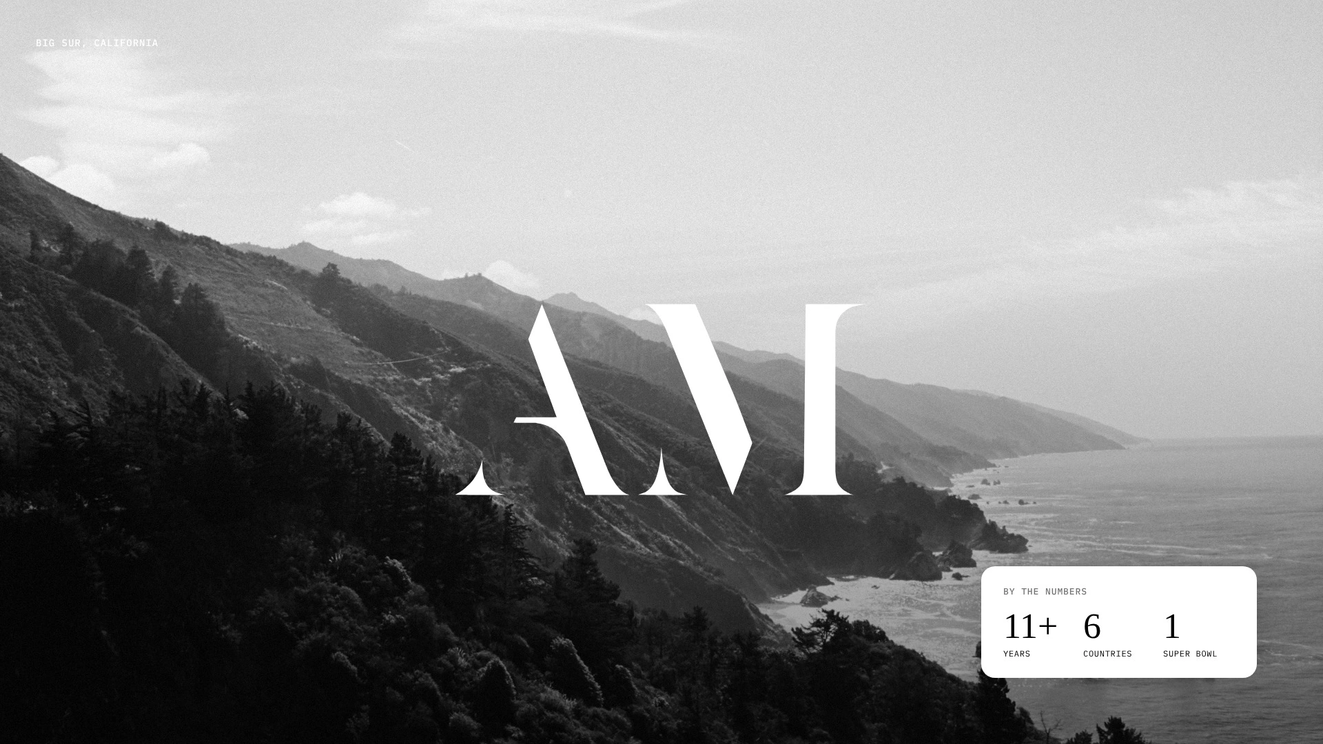
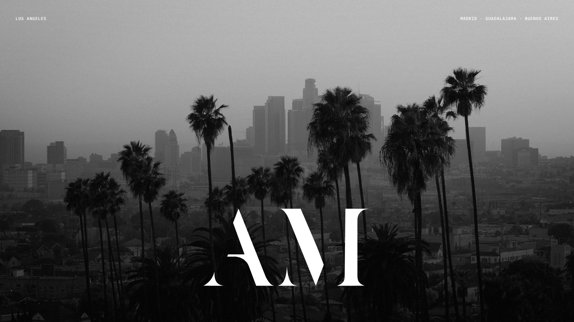
The mark, enlarged and cropped, sits behind her homepage headline.
The default monogram is two initials in a soft serif with a gold accent. I used her story instead. She started behind a camera, so the cut is a film cut, and it returns on her clapperboard as Scene 21.7. Every mockup is a real photo with the artwork placed by hand. No AI imagery.
AI helped me test directions fast. I chose the angle and every crop.
Her A and M edges run parallel within 0.13°.
If your name is doing a brand’s job, send me your site and I’ll tell you the first thing I’d change.

0 likes · 0 views · Nov 5, 2026
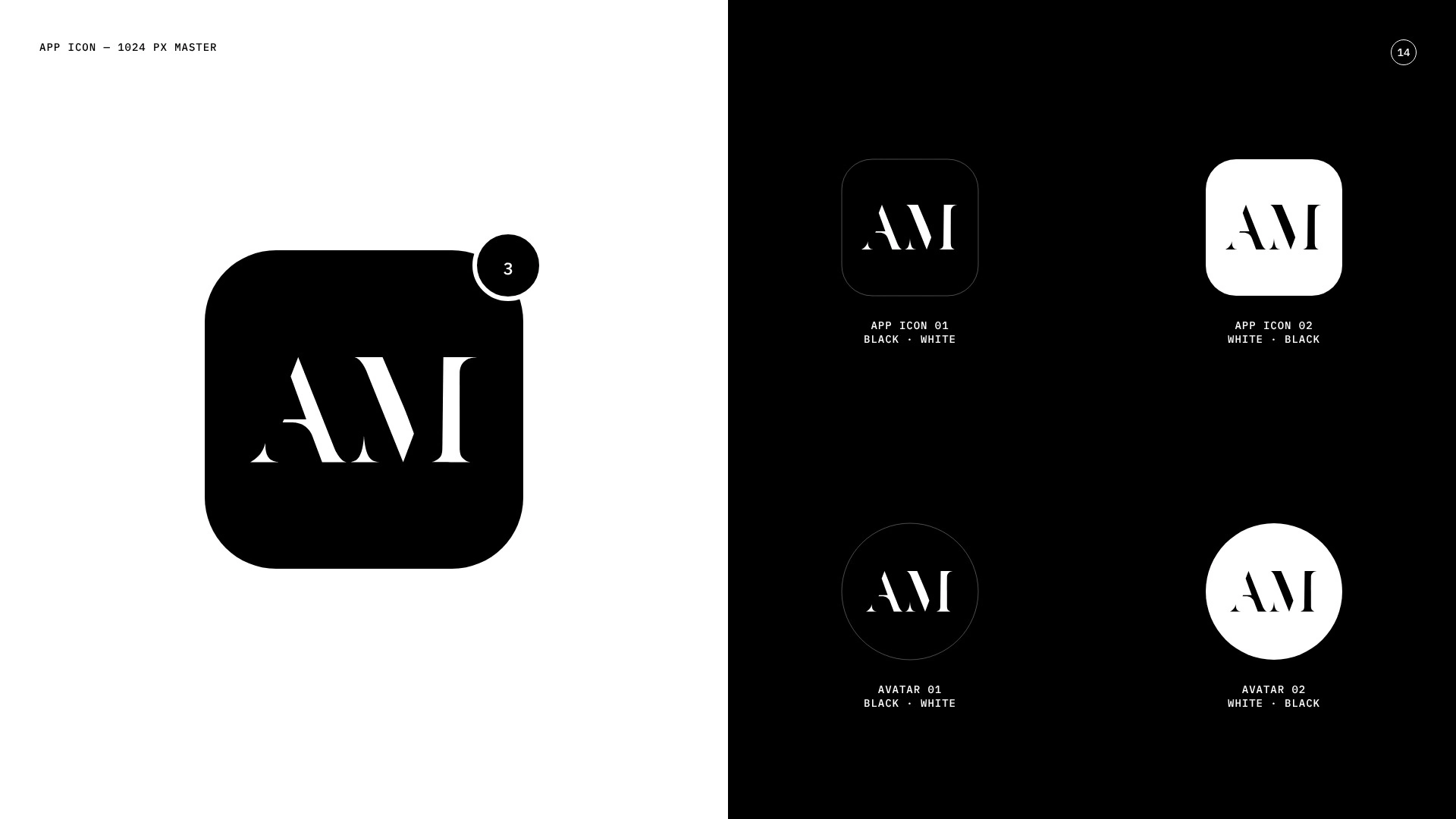
Analinda Meneses’ monogram: the A and M share one 21.7° cut, parallel within 0.13°. The same number appears on her clapperboard.


