
Setup
Alpinebear is a Sialkot manufacturer on Pasrur Road. It has made gloves since 2006 and bags since 2010, mostly for international buyers. Its Pakistan store, alpinebear.net (alpinebear.pk redirects to it), sells backpacks, pouches and gloves direct to local customers. The Bird Nest Ultra, a 23L travel backpack at Rs.15,995, is the hero product. The store has a 4.2 rating from 66 Google reviews.
I audited the store on 14 November 2026 and proposed a full redesign. This case study covers that redesign: 16 pages designed on a single canvas, plus a working HTML prototype of the four core shopping pages (home, shop, product, cart).
Tension
The company makes its own bags, but the store looked like a reseller's. The audit found:
No first impression. The homepage opened on "- HOT SELLING ITEMS -" with no hero, no promise and no reason to trust the store.
Stale and broken signals. "Discount Ends After 15 May 2026" and "Shipping Begins 10 July 2026" were still live. The listed number was 0332 6993777, but the tap-to-call link dialled +92 303 6997777. The menu read "Complaim", the footer read "Catagories", and the sitemap still had leftover pages ("contactsss", "avada-faqs").
The product hidden by the sales pitch. Most product photos carried an "ADD YOUR LOGO" overlay.
The real advantage left unsaid. The store never showed that the bags are cut and stitched in the company's own factory. That is what separates a maker from the many importers selling similar bags online.
The design question was how to make a Pakistani shopper trust this store enough to pay Rs.15,995 for a backpack they can't touch first. It also had to fit how people in Pakistan actually buy online: cash on delivery, WhatsApp, and a check before paying.
Decision
1. Lead with the factory, not with discounts.
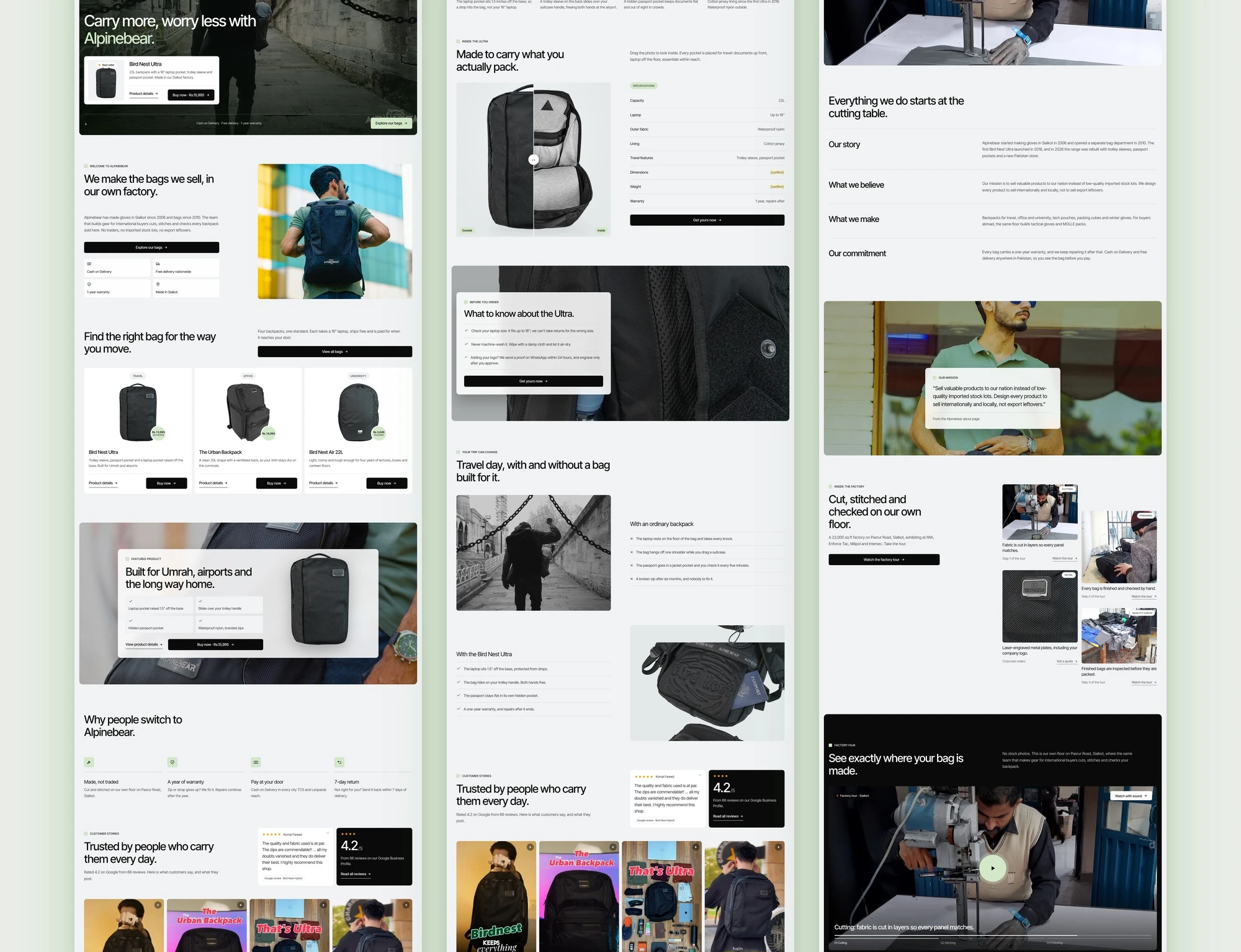
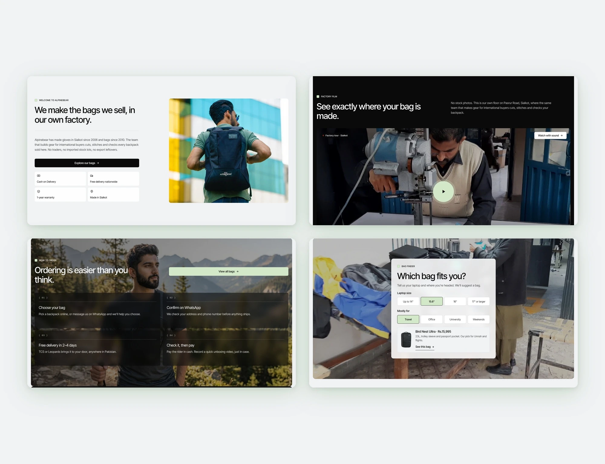
The homepage says "We make the bags we sell, in our own factory" before any product grid. A dedicated factory film section shows cutting, stitching and checking, and is labelled "No stock photos." Every photo on the site is Alpinebear's own or a credited Unsplash landscape. No reviews, testimonials or numbers were invented.
2. Answer the cash-on-delivery customer's questions on the page.
Cash on Delivery, free delivery with TCS or Leopards, a 1-year warranty and a 7-day return sit next to every buy button. They aren't hidden in the footer. A four-step "Ordering is easier than you think" section walks first-time buyers through it: choose, confirm on WhatsApp, delivery in 2–4 days, check it, then pay.
3. Make WhatsApp a first-class checkout path.
Every product has "Order on WhatsApp" next to "Add to cart", because many buyers here prefer to talk to a person before paying.
4. Help people choose.
The bag finder asks two questions: laptop size and main use. It then recommends one bag. A before/after slider on the product page compares travel day with an ordinary backpack and with the Bird Nest Ultra.
5. Borrow a proven layout, not a generic template.
At the owner's direction, the structure follows a clean, card-based reference layout: floating pill navigation, a full-bleed hero with a product card, rounded section panels inside a side gutter, and a strong dark footer. It is capped at 1440px. It suits a product-led store without looking like a default Shopify theme.
Rejected along the way:
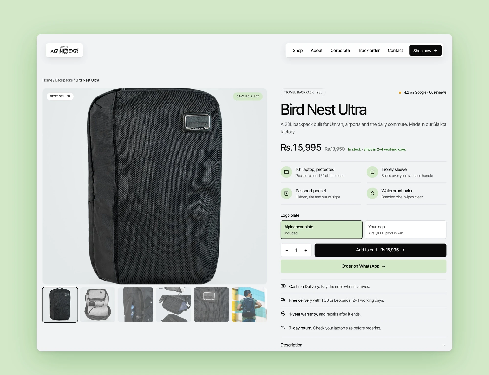
An editorial, magazine-style product page. It looked good, but it pushed the price and buy box below the fold. I reverted it and kept a classic gallery plus buy panel, and redesigned only the four key feature points.
A product hero on the product page. It was replaced by gallery-first, because shoppers came to see the bag.
Build
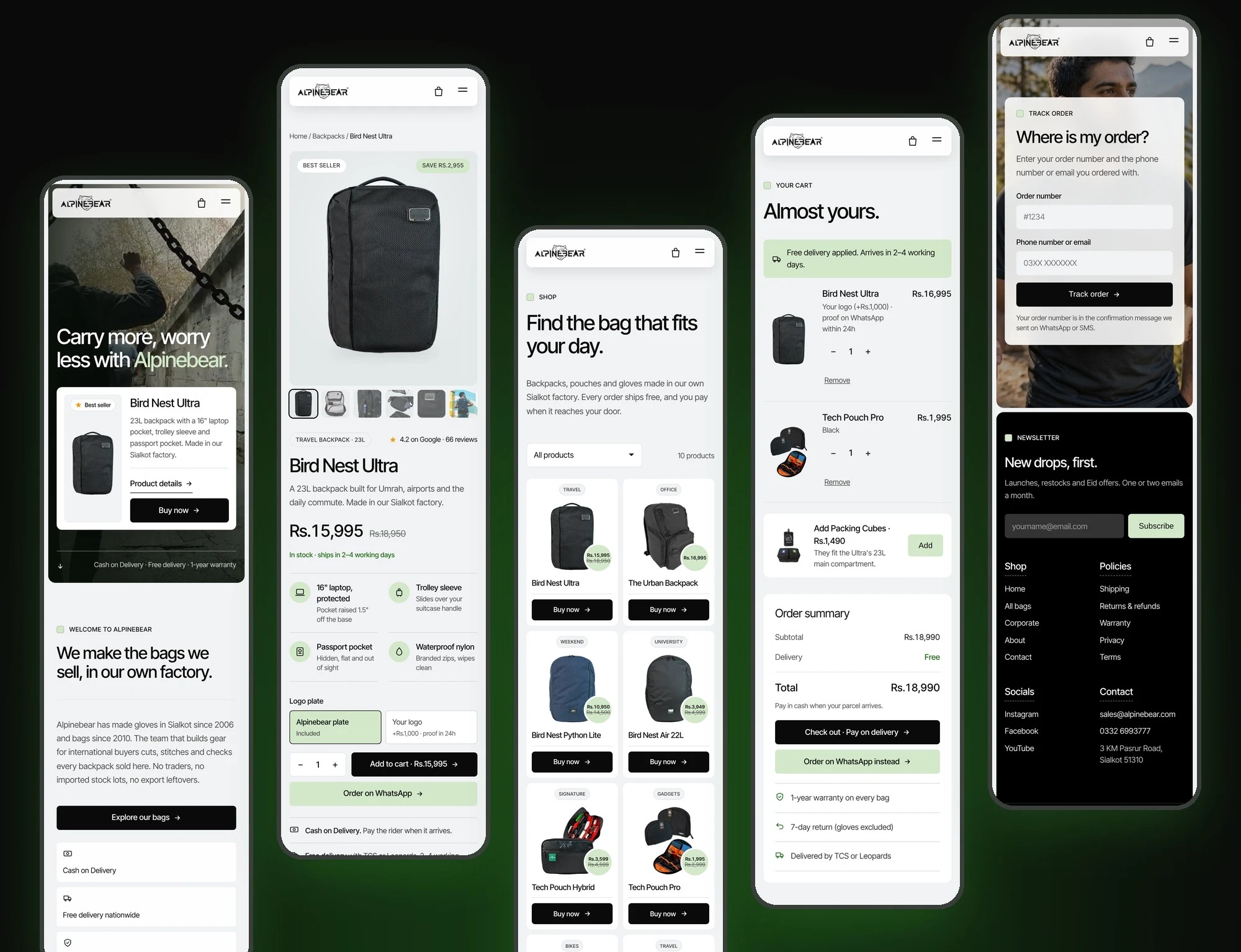
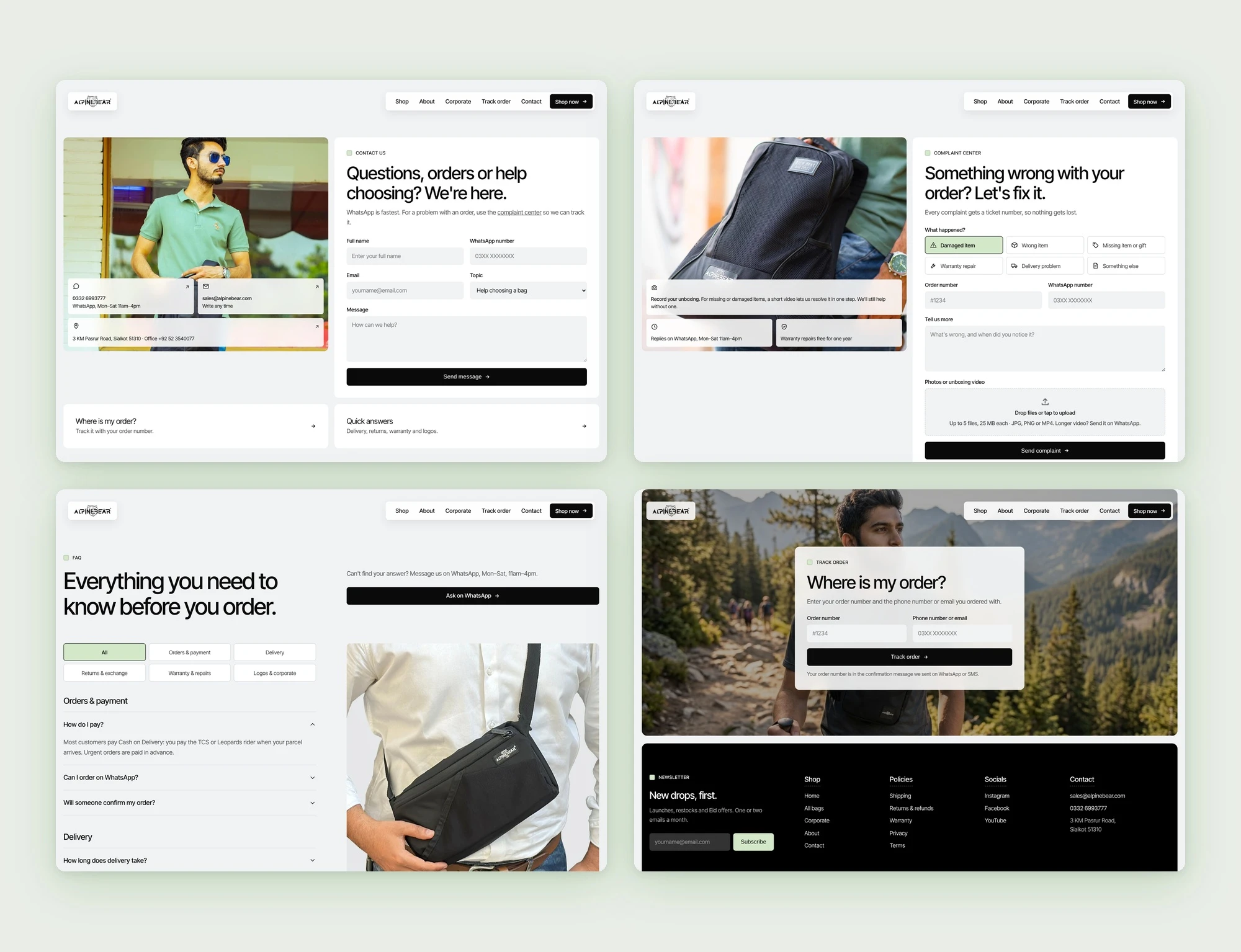
16 pages on one design canvas: home, shop, product, cart, about, corporate orders, contact, complaint centre, order tracking, FAQ, shipping, returns, warranty, privacy, terms and 404. Each has a desktop and a 390px mobile version.
One system throughout: Inter only, black and white with a single green accent, 14px-radius panels, pill buttons, and an 8px/20px site gutter.
Responsive by container, not by viewport: each page uses CSS container queries, so the same file renders correctly in the canvas's desktop and mobile frames. The hero headline scales with
clamp(), so a larger desktop size never inflates the mobile one.Mobile choices: a swipeable carousel for the three homepage bestsellers and a 2-column grid on the shop page, so a phone screen shows products rather than one oversized card.
Working interactions: a factory film with chapters and a cross-fade, the bag finder, the before/after compare slider, the gallery, a buy box with a live total, the logo-plate option (+Rs.1,000), a cart with quantities, FAQ filtering, a complaint form with validation and order tracking.
Standalone HTML prototype: home, shop, product and cart exported as self-contained pages with inlined images, so the owner can open them with no login.
Every interaction tested in a headless browser before handover.
Open before launch:
the Ultra's exact dimensions and weight;
staff count;
the correct phone number;
final return-policy wording;
legal text for the Privacy and Terms pages;
an email tool for the newsletter;
the real factory video file;
written permission for product photos and model releases.
Takeaway
For a manufacturer selling at home, the strongest conversion feature is often the truth it has never told: we make this ourselves. The second strongest is respecting how people actually pay. In Pakistan that means cash on delivery, WhatsApp and checking the parcel before paying. Showing the factory, stating the guarantees plainly and removing every stale or broken detail does more for trust than any discount banner.
What I'd do differently: start with the owner's real numbers (orders, COD refusals, top WhatsApp questions) before designing, so the first version is aimed at a measured problem rather than an audited one.
0 likes · 3 views · Nov 5, 2026
Alpinebear’s redesign replaces a 22-product homepage of mixed promos with four bags, four small items and one promise: look first, pay later.


