
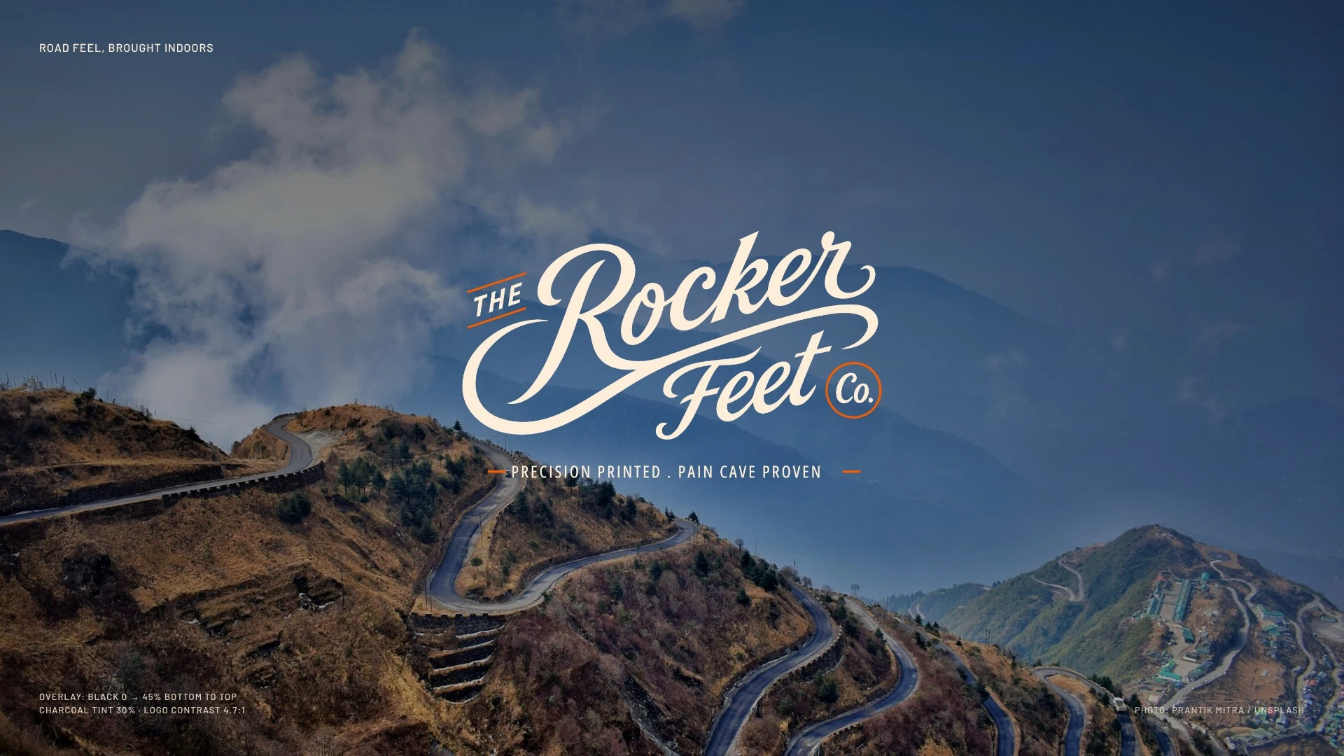
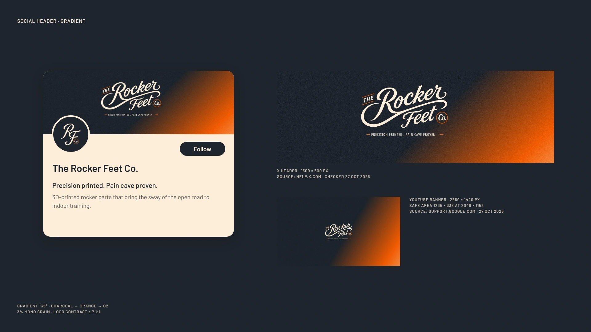
Rocker Feet makes 3D-printed rocker parts in a category of marketplace listings. I built the brand around the sway: a script logo with a moving swash, charcoal for the pain cave, orange only as the signal. Now one mark runs from a monogram tee to a billboard. Own a product that looks like a listing? Send me the page.
For makers whose parts are better engineered than their brand looks.
The Rocker Feet Co. makes 3D-printed rocker parts for indoor trainers. The category sells through marketplace listings and tennis-ball hacks. They wanted to charge for precision and be remembered by riders who spend hours in a pain cave.
Three things changed:
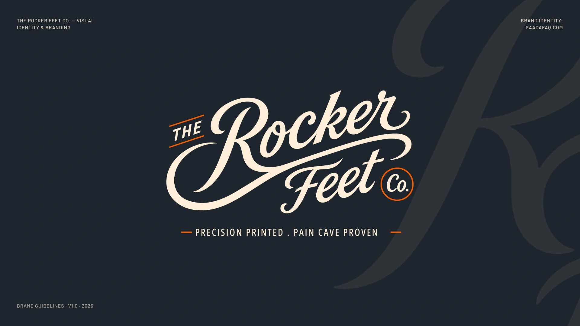
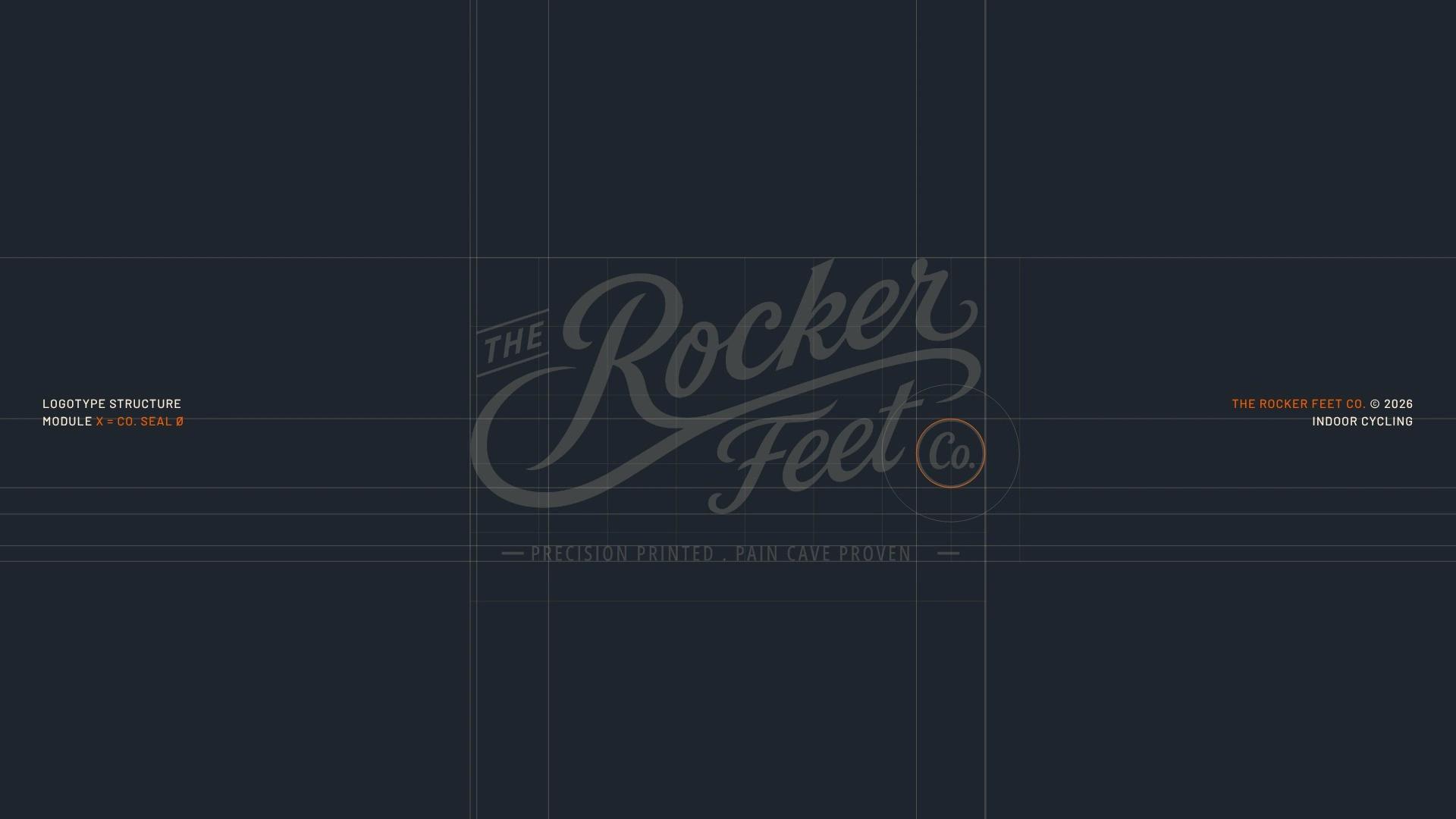
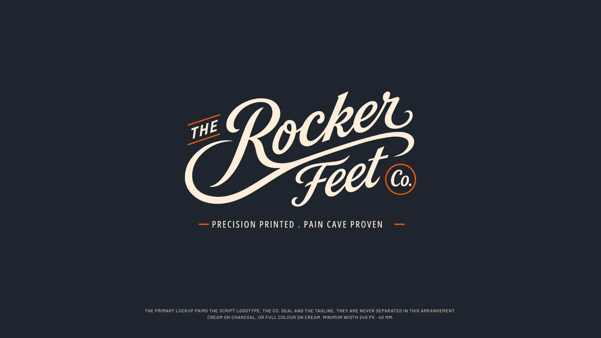
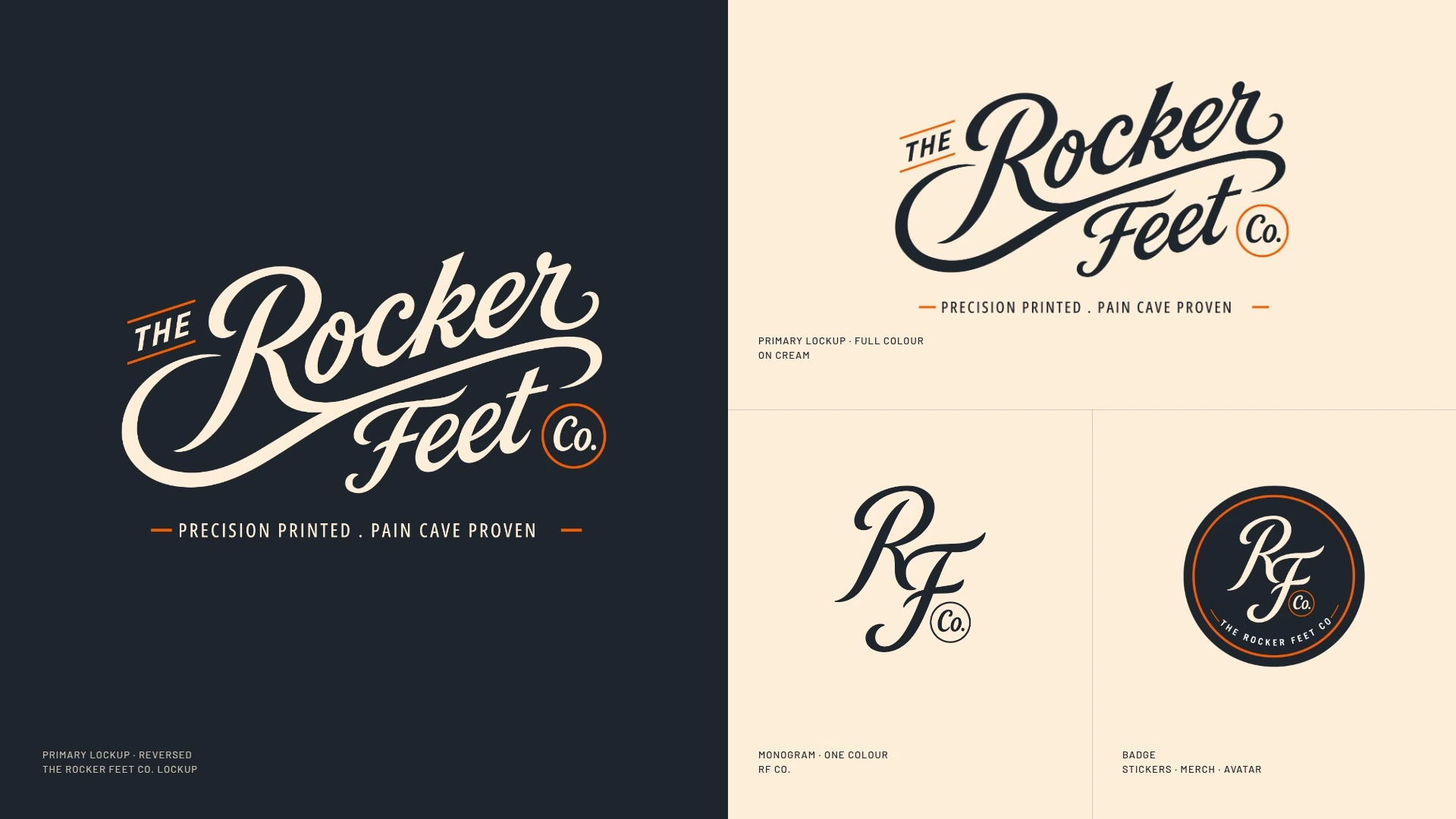
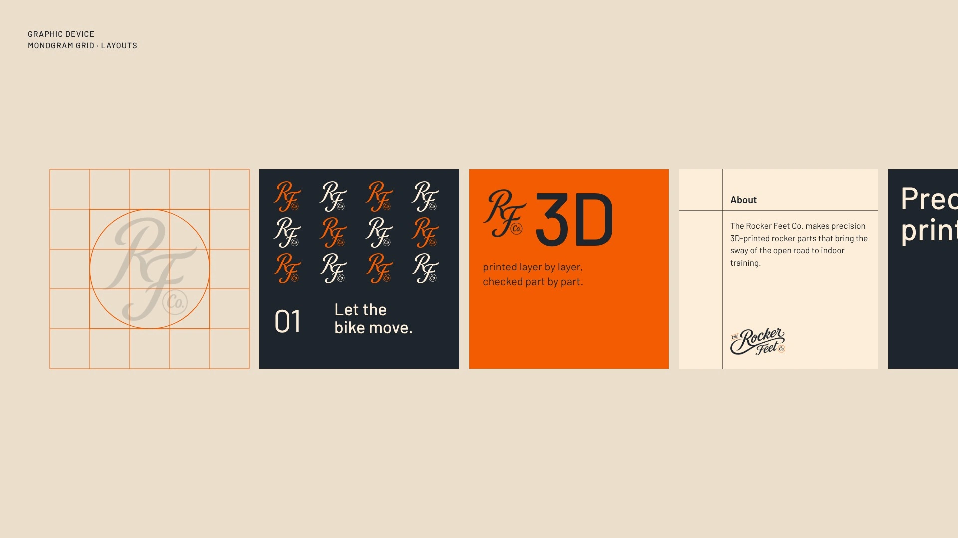
The script logo’s long swash became the sway the product adds to a trainer.
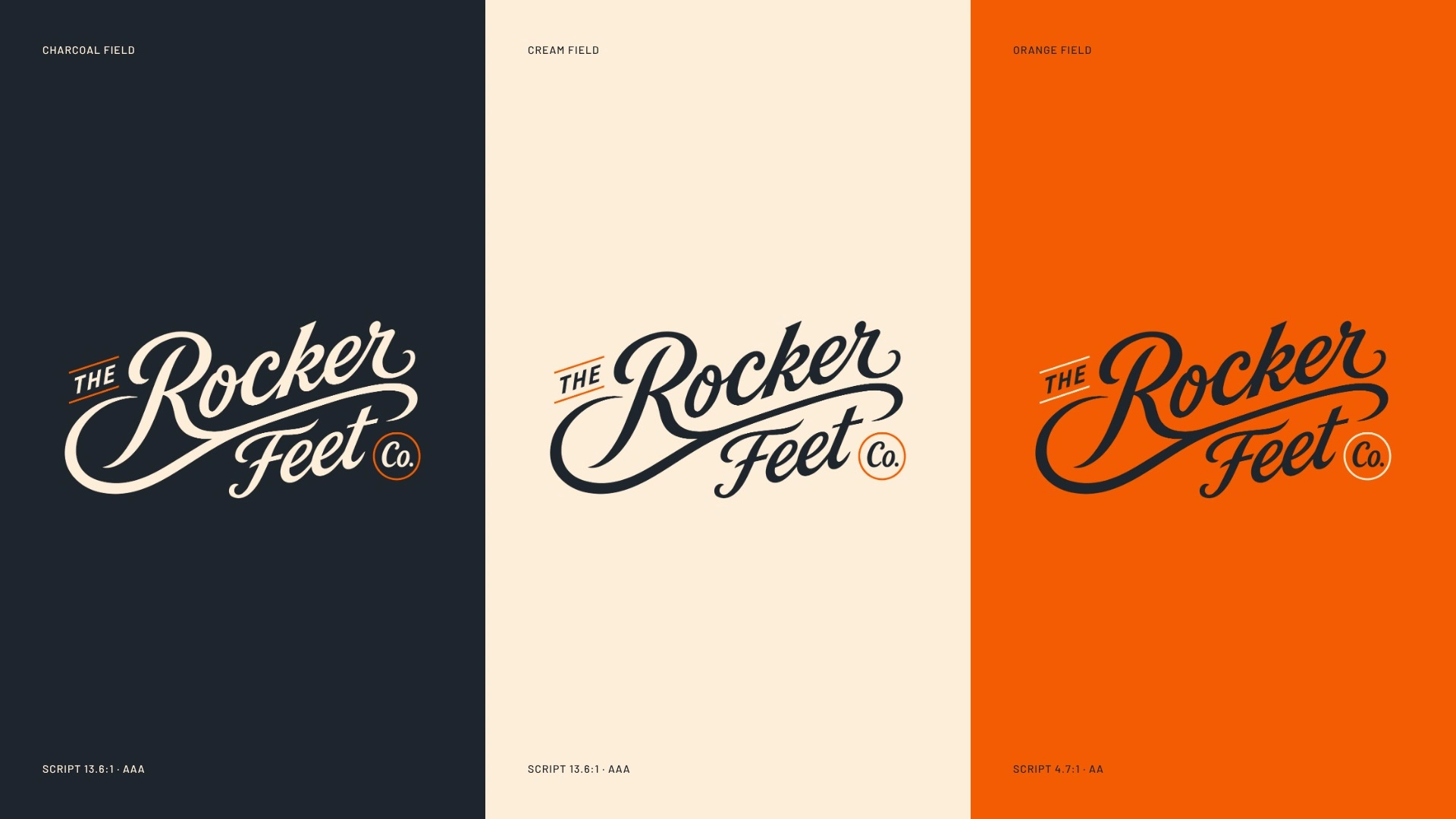
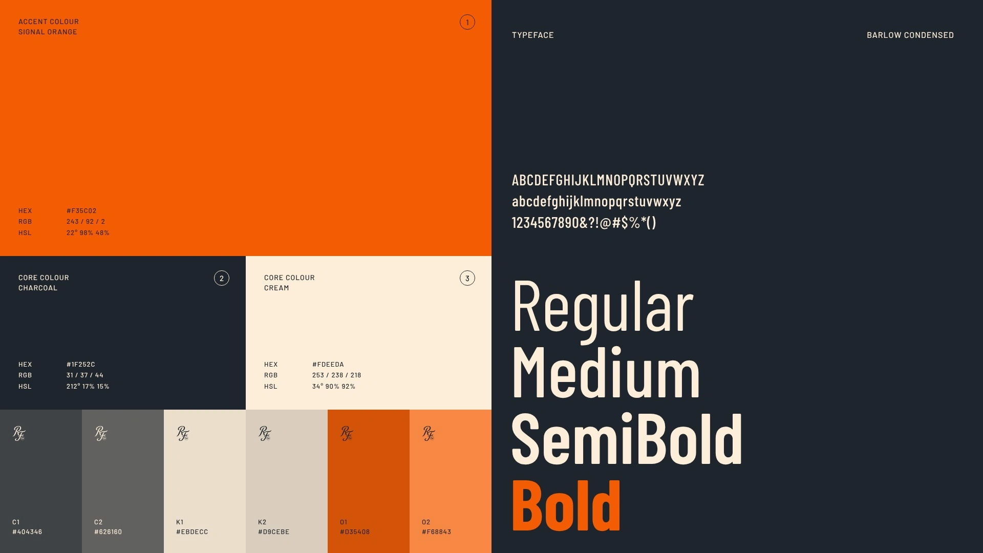
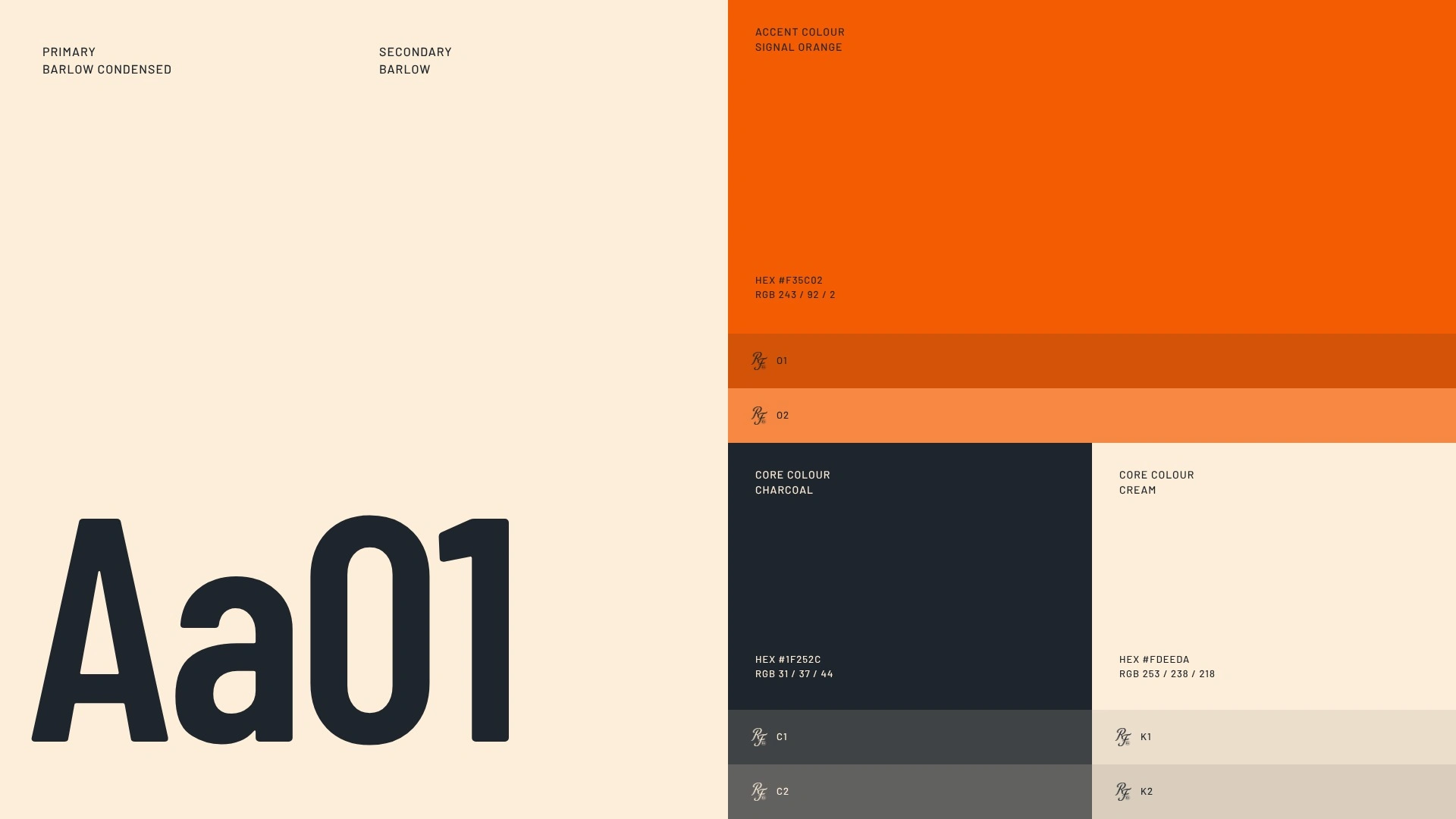
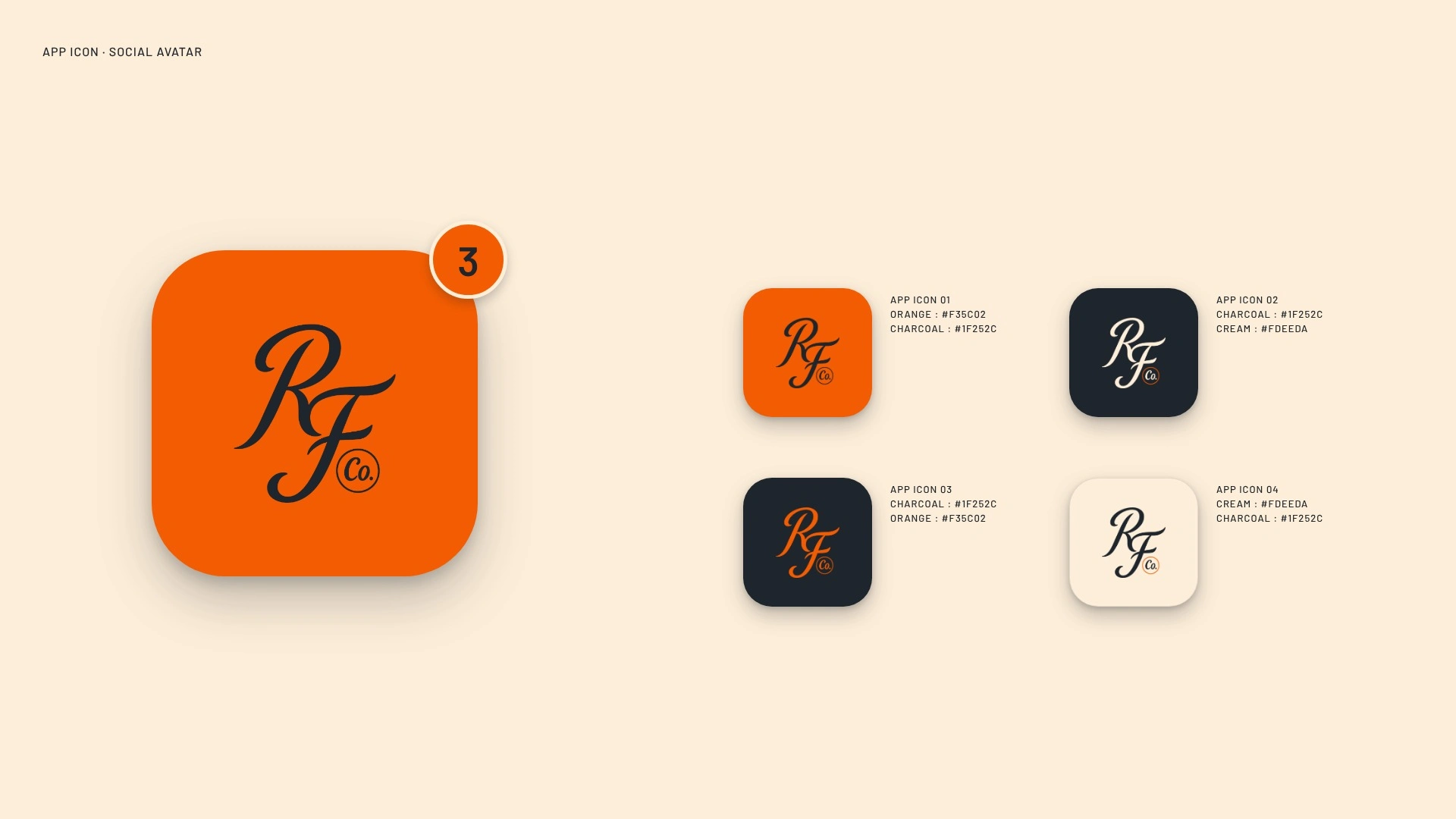
Charcoal for the pain cave, cream for the lettering, orange only as the signal.
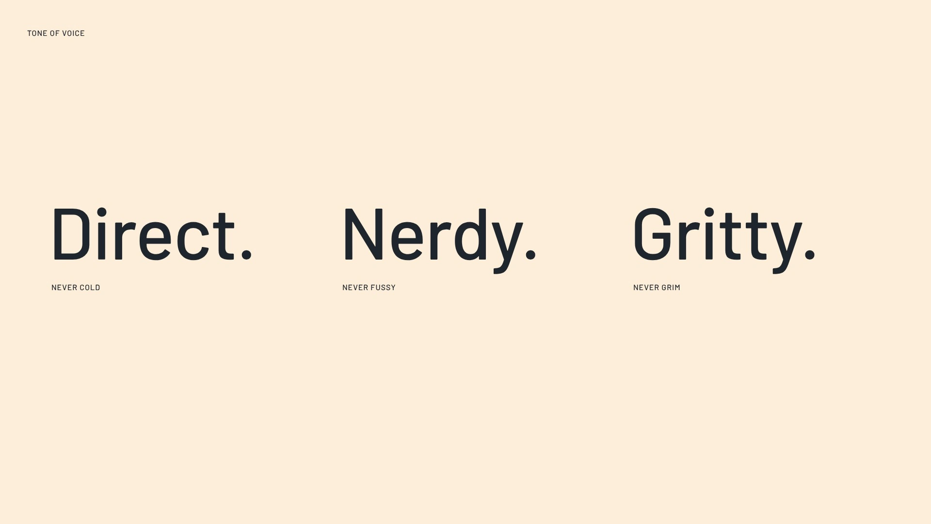
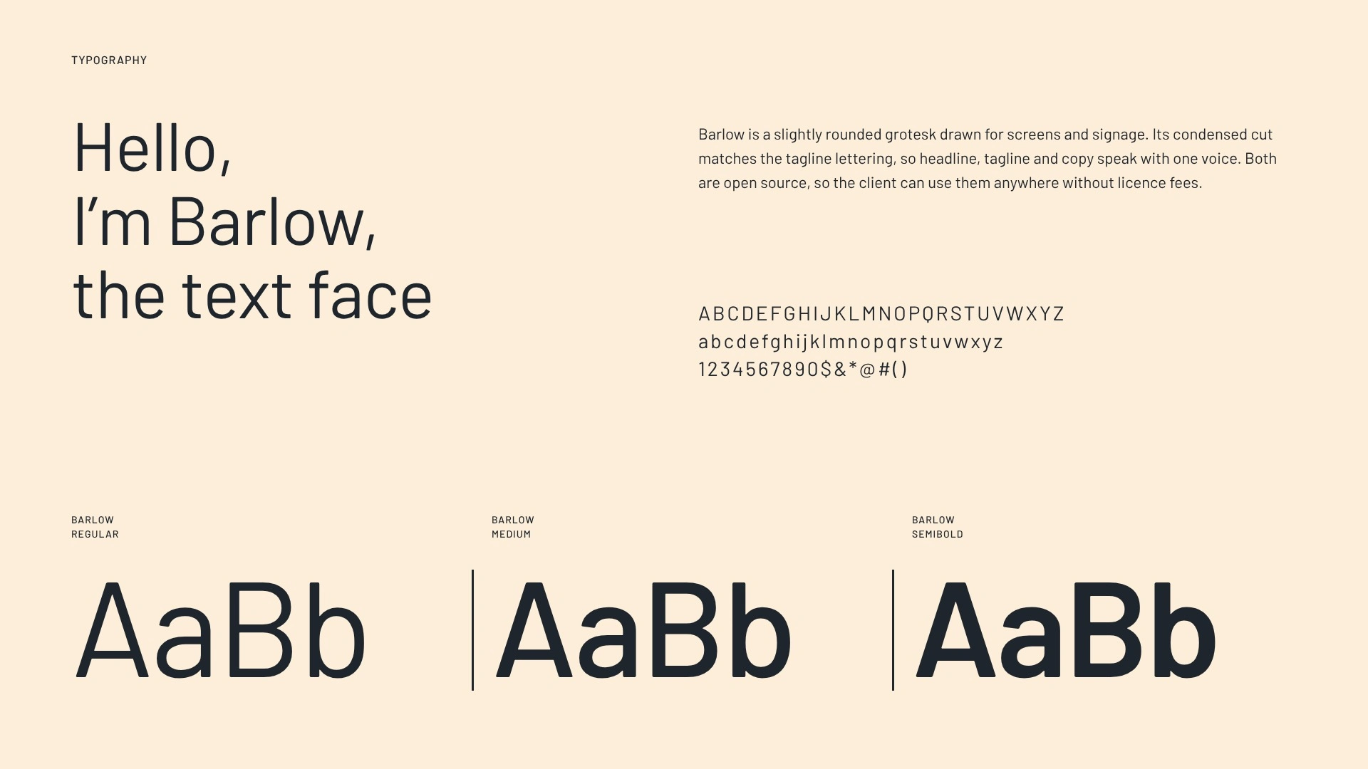
Direct, nerdy, gritty copy makes a spec line and a billboard sound like one company.
Most of the category looks like a part number in a bin.
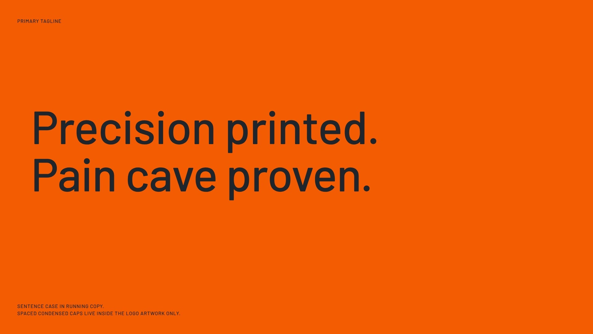
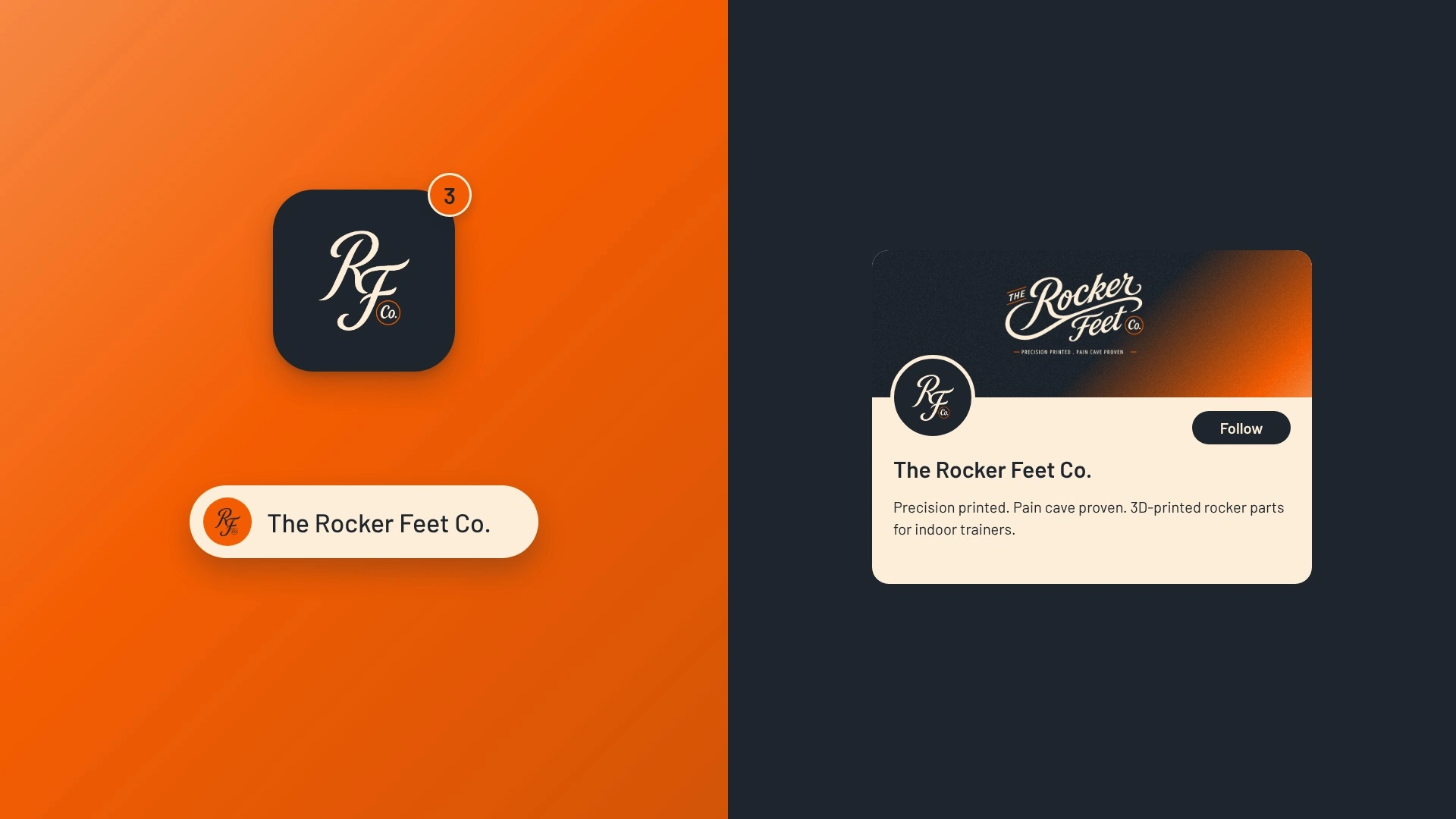
The default for printed hardware is a black badge with a hex grid or a bolt, and a quick AI draft hands you that first. I went the other way: a script logotype, because the product sells sway. The tagline, “Precision printed. Pain cave proven.”, carries the engineering claim so the script doesn’t have to.
AI got me to first directions fast. I picked the script, the palette and every word.
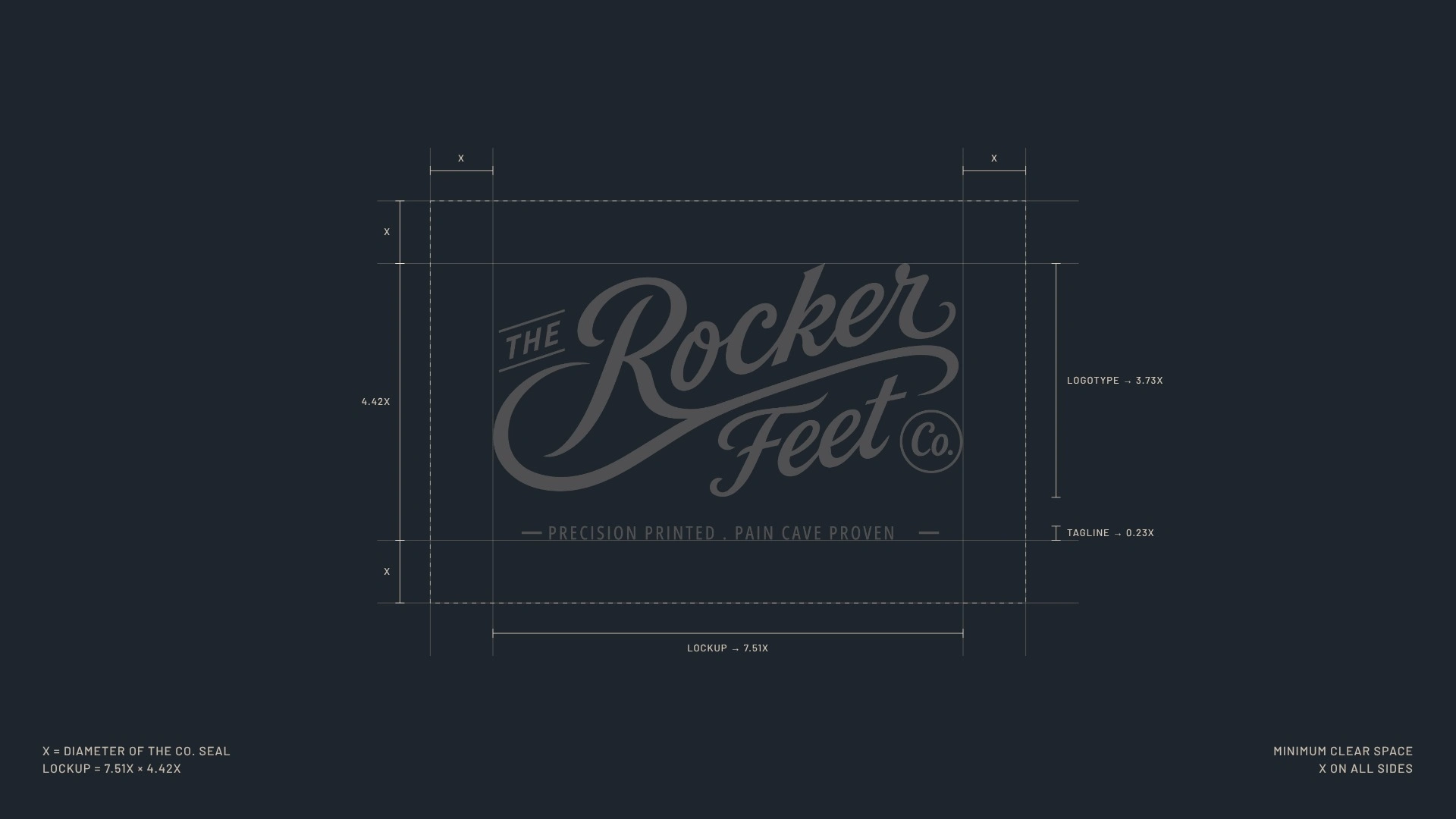
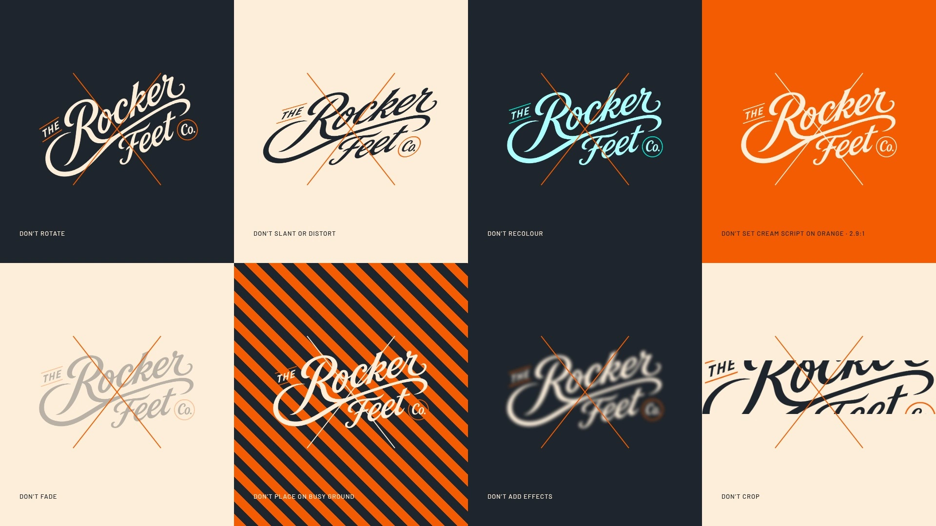
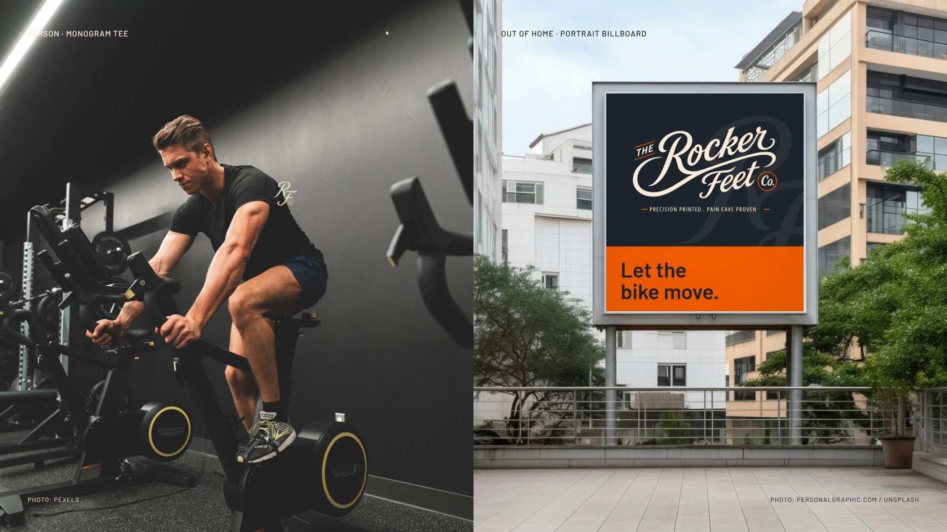
Now the same mark runs from a monogram tee to a portrait billboard to a ride-stats card, unchanged.
If your product looks like a listing, send me the page. I’ll tell you the first thing I’d fix.
0 likes · 2 views · Nov 5, 2026
Rocker Feet’s mark now runs from a monogram tee to a billboard without changing, built around the sway the product adds.


